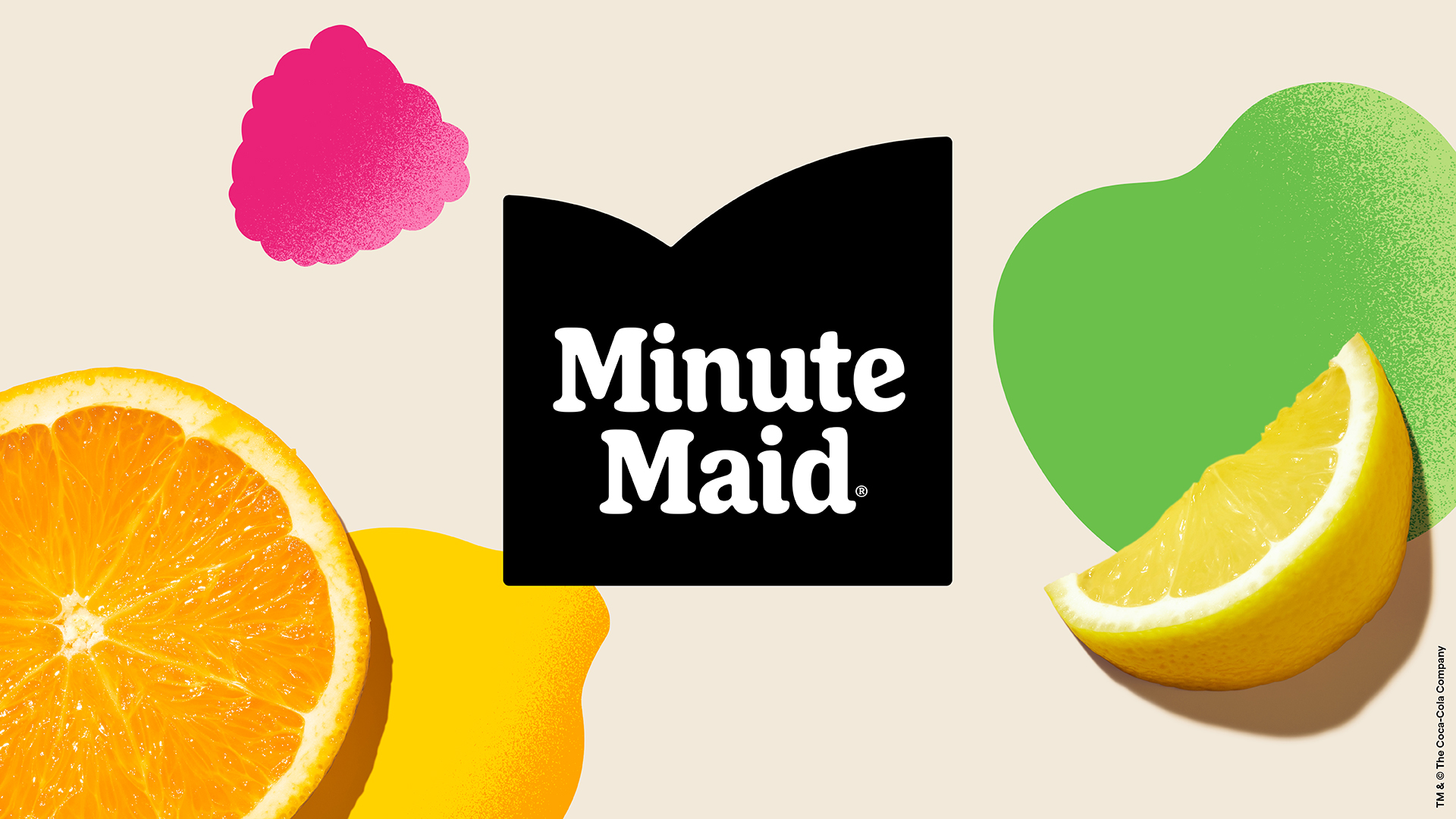
Minute Maid is the world's largest juice brand, and is also known as Cappy in Europe and Africa, and del Valle in Latin America. The juice brand previously had disparate identities across the globe, but for the first time in 77 years, they are now united with a singular look, following work from Jones Knowles Ritchie, as well as Grey, VMLY&R and Landor&Fitch.
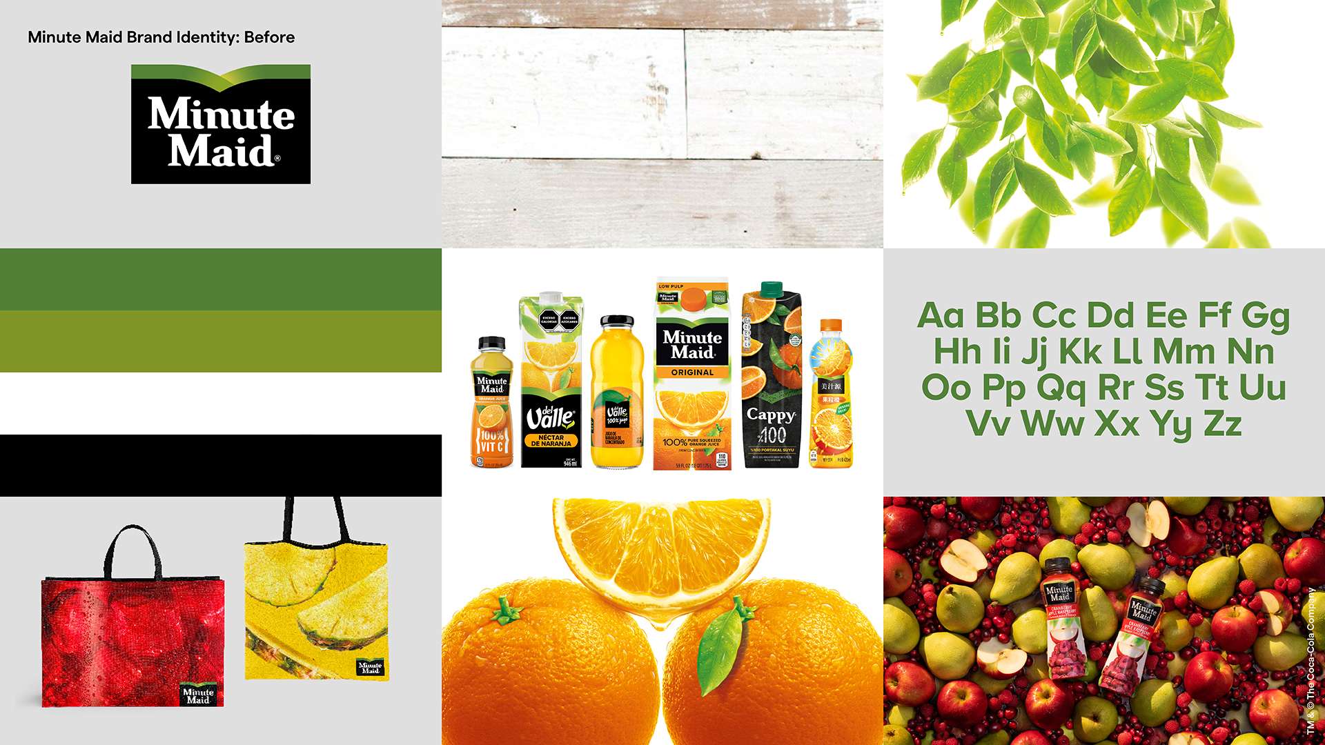
The new campaign builds on the previous logo (see below) and creates a simpler, cleaner look that feels more modern. If you want some tips on rebranding, then see our how to design a logo piece.
"We felt the Minute Maid family was due for an elevation to the icon it truly is," says Rapha Abreu, global vice president of design, the Coca-Cola Company. "With this move, we are thinking about our brand holistically – developing a flexible global design system centered on what makes Minute Maid unique – and defining and evolving our distinctive assets so they can be adopted locally to connect with consumers around the world."
The colours for the new look are "inspired by nature and energising photography to capture attention instantly and evoke the feeling of enjoyment."
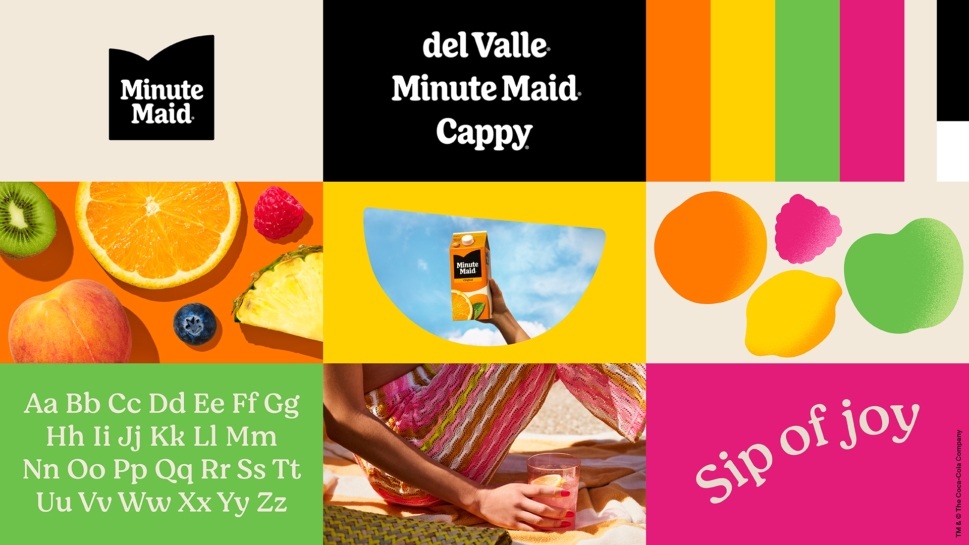
The clean and clear typography enhances the visuals without detracting from them. And the overall feel is summery and fresh – exactly what a juice brand should feel like.
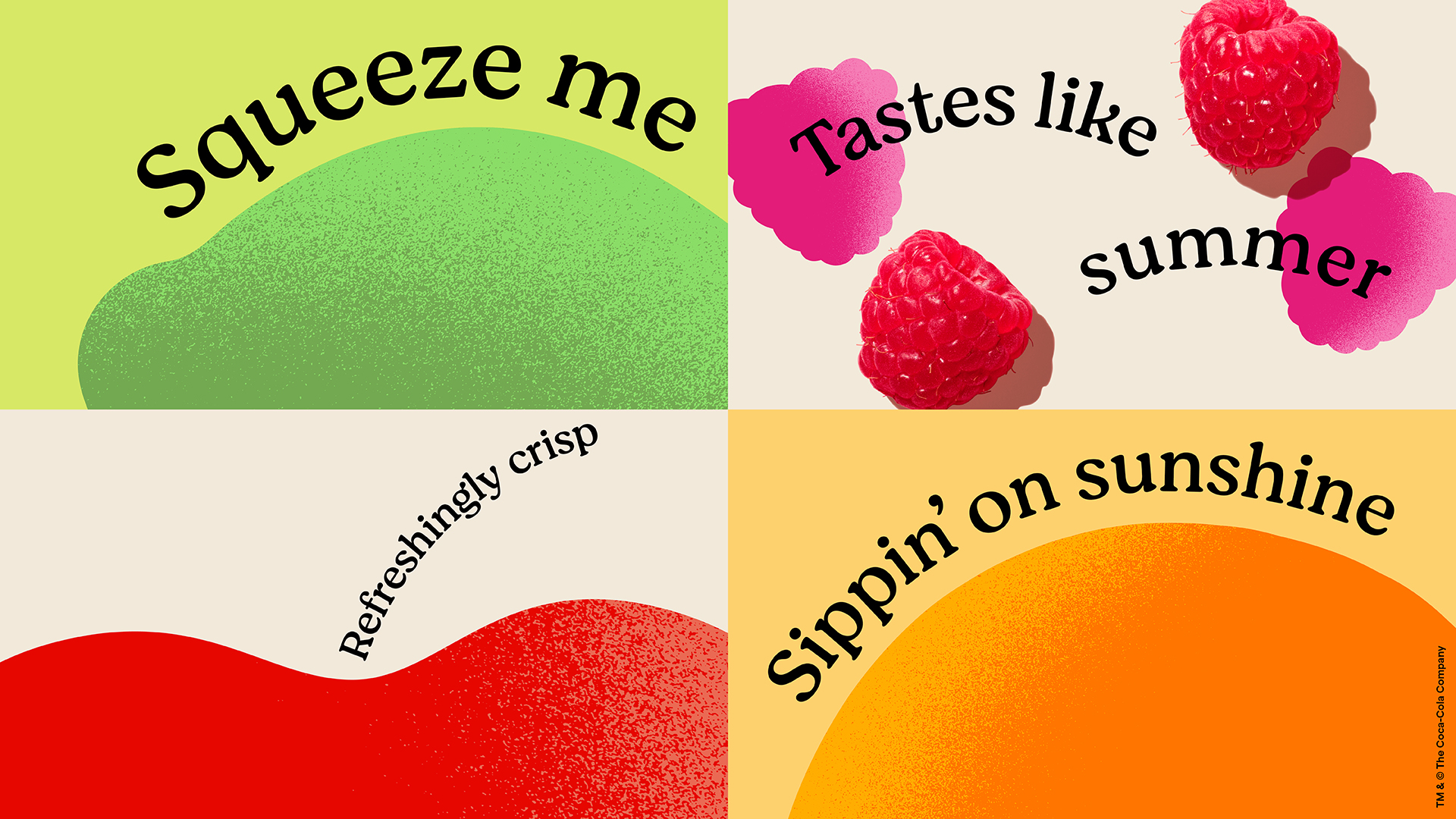
The decision to keep the different variations of the name is interesting. I guess it would be too big a leap to unite them all under one name, and that would require a much bigger campaign overall. This new look will be rolled out across the year.
Jones Knowles Ritchie has form when it comes to uniting drinks brands in one new identity, as it previously did the same for Fanta.
If you've created some great branding this year, then don't miss the chance to enter our awards scheme, the Brand Impact Awards.
