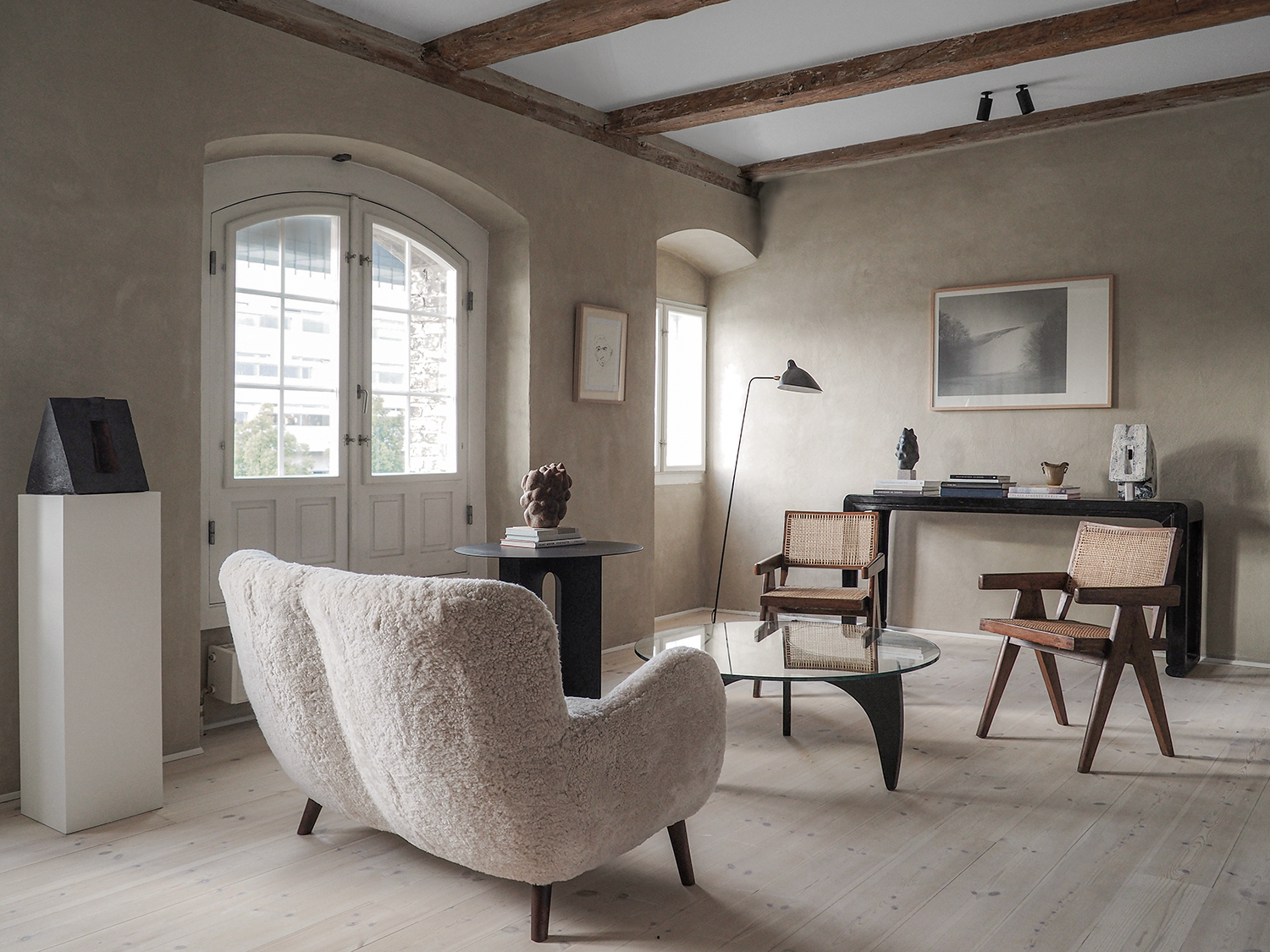
Meet minimaluxe. It's a new phrase the Livingetc team has coined to describe a design moment and movement that is taking over this decade.
As an interior design trend, minimaluxe has been taking shape (curved, irregular, soft) since 2020 and has now become a fully formed aesthetic era. Mid-pandemic, every designer we spoke to began referencing the emotional responses their decor evoked, and that understanding of how a home affects our moods has only increased. Collectively, we all seem to want to be calmed and uplifted.
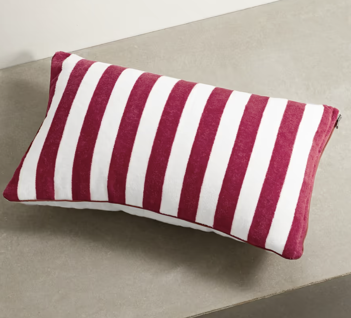
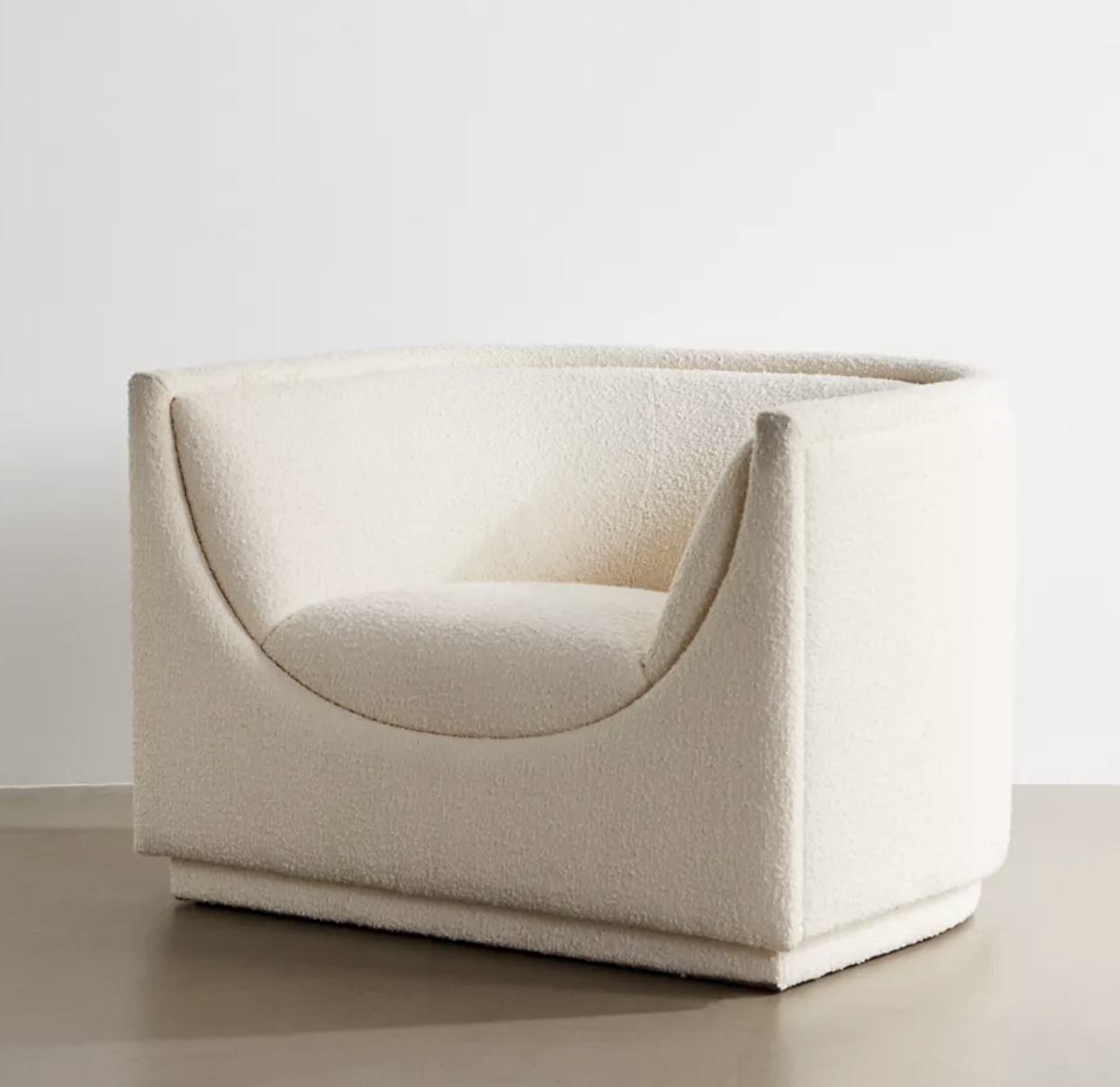
Out of this desire, the look we're calling minimaluxe has been born. It’s about paring back the visual clutter in order to celebrate the things that make you feel wonderful – what a luxury it is to be able to see the objets you love most! But it also tends to include tactile materials that elevate your home – bouclé, slubby linen, untreated wood, a contrast of smooth and naturally rough textures and a sense you can walk barefoot and feel safe.
Minimaluxe explained, and how to get the look
This is a mood that will inform all designers for the next decade, interpreting it as they will, and is a vibe you can fold into parts of your decor both big and small. It will make your home feel elevated, more expensive, and a calmer place to be. Here's how.
What are the defining characteristics of minimaluxe?
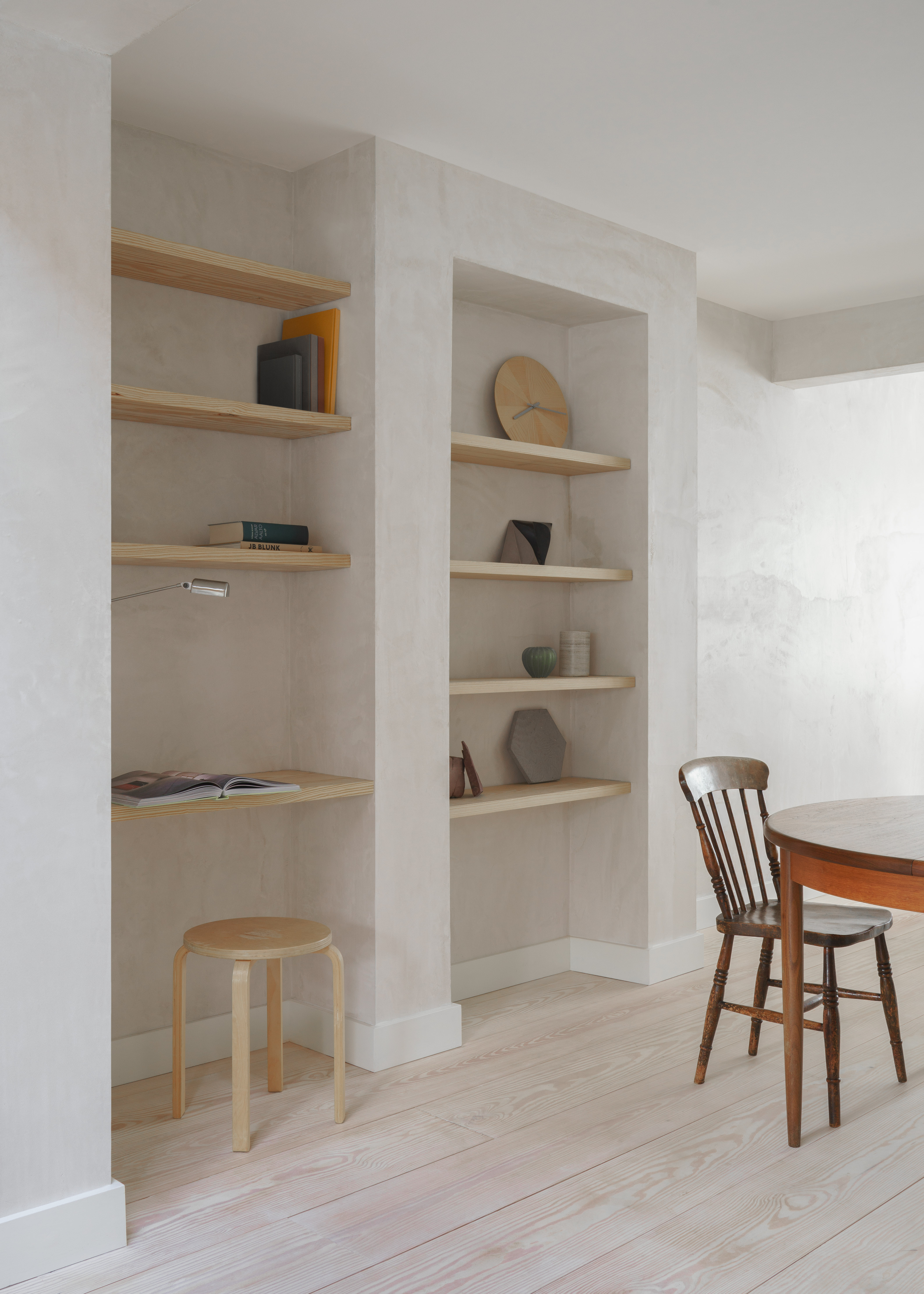
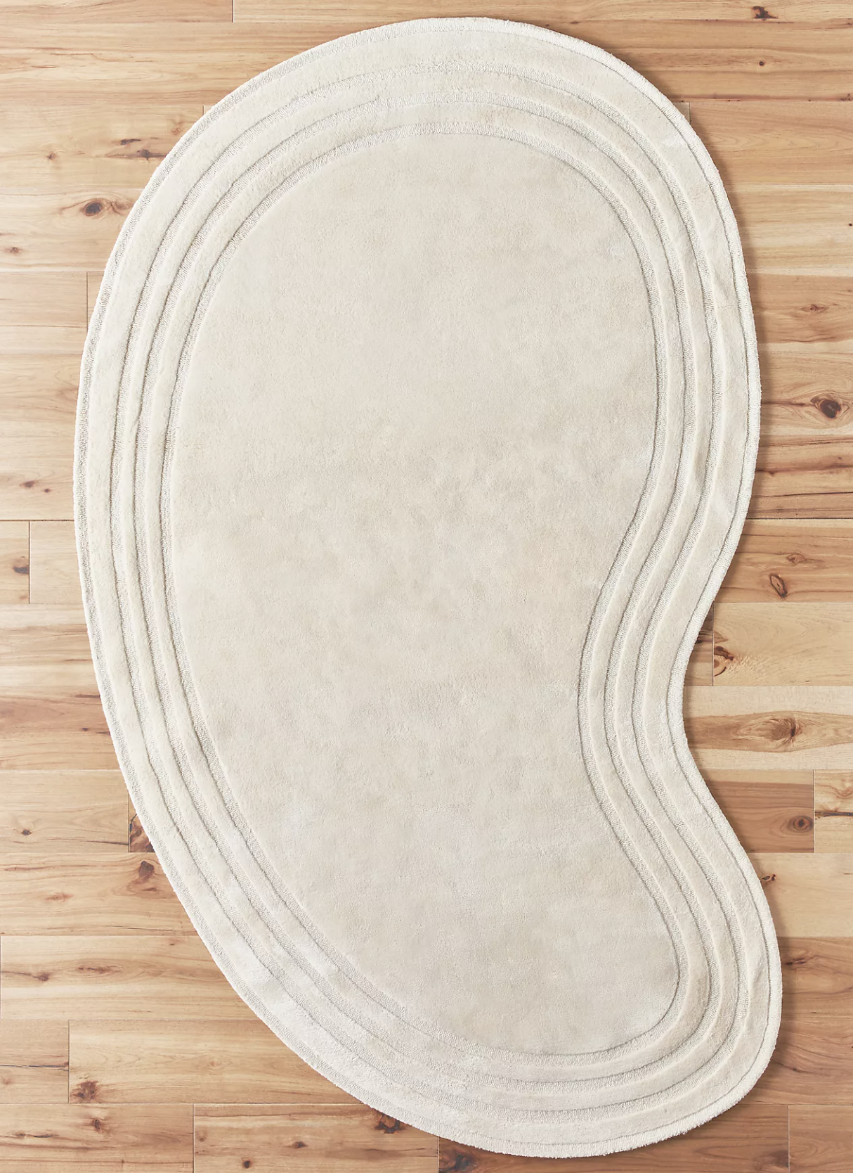
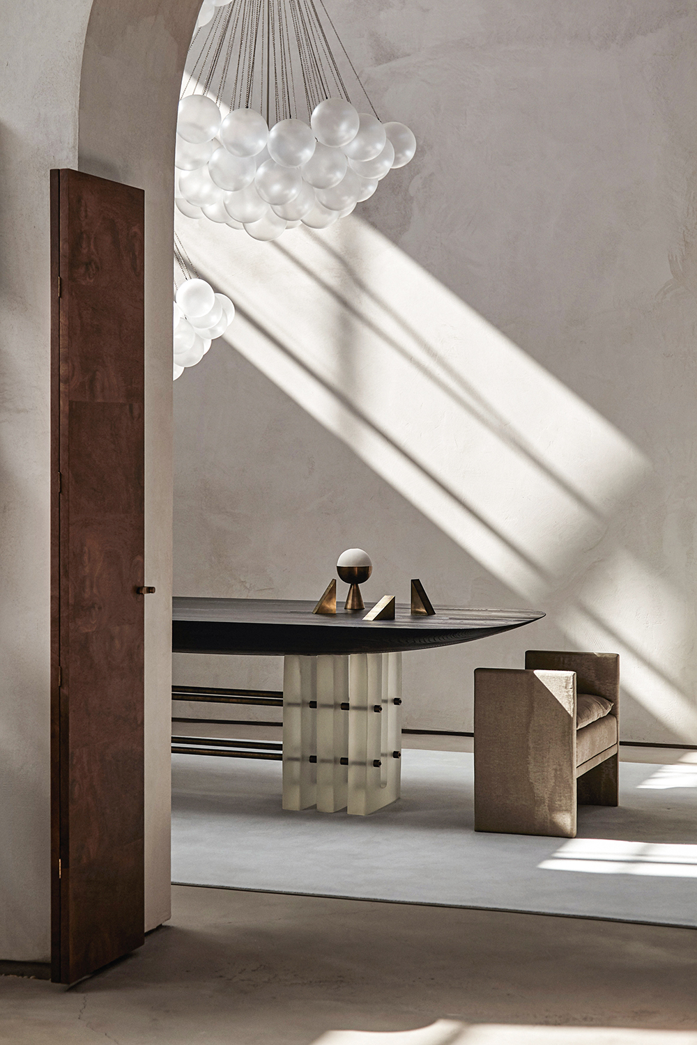
Sinuous lines and fluid forms have been enjoying their moment in the spotlight, and this organic trend is staying put. Eschew hard edges for soft, shapely pieces: choose seating that envelops you in its curves, lampshades with undulating scalloped edges, and highlight architectural features like arches if you’re lucky enough to have them.
Minimaluxe is about contrast done subtly: the best designers are creating interesting vignettes even within a single piece of furniture by experimenting with disparity. Play with the materials in your home’s palette: think natural wood next to concrete, hand-worn textures played off against gleam, and hard stone surfaces with soft edges.
It's a celebration of your favorite things. Unlike minimalism, it's not about a lack of stuff, but about choosing what you can see wisely, allowing space around them so you can really appreciate their beauty. Edit your possessions, declutter a little, and enjoy what's left behind.
The Japanese philosophy of wabi-sabi applies here: there’s beauty in imperfection, and organic materials and textures lend a tactility to a space that encourages a more mindful way of being. Find it in the unique wood grain in a piece of furniture, the threads and knots in a linen curtain, a brass tap with a patina developed over time, or a ceramic vase bearing traces of its maker.
In the most impressive spaces by interior designers and architects, the key feature was a palpable – almost monastic – sense of space and an abundance of natural light. You might not be able to change the shape of your room, but you can decorate to enhance height; likewise, encourage brightness by choosing simple, light colour palettes and dressing windows minimally (or not at all).
A motto to go by whatever the trend, but minimaluxe done well means your space should be sophisticated, but still comfortable. It’s in the layering of colour and textures, the elements that nod to your own personal style, and the extra touches that appeal to something beyond aesthetics. Designing for the senses will elevate your scheme further: turn over to find out how.
How to make your home more minimaluxe
Designers explain a few simple tenets of the minimaluxe movement that will enhance your home.
1. Choose the right materials
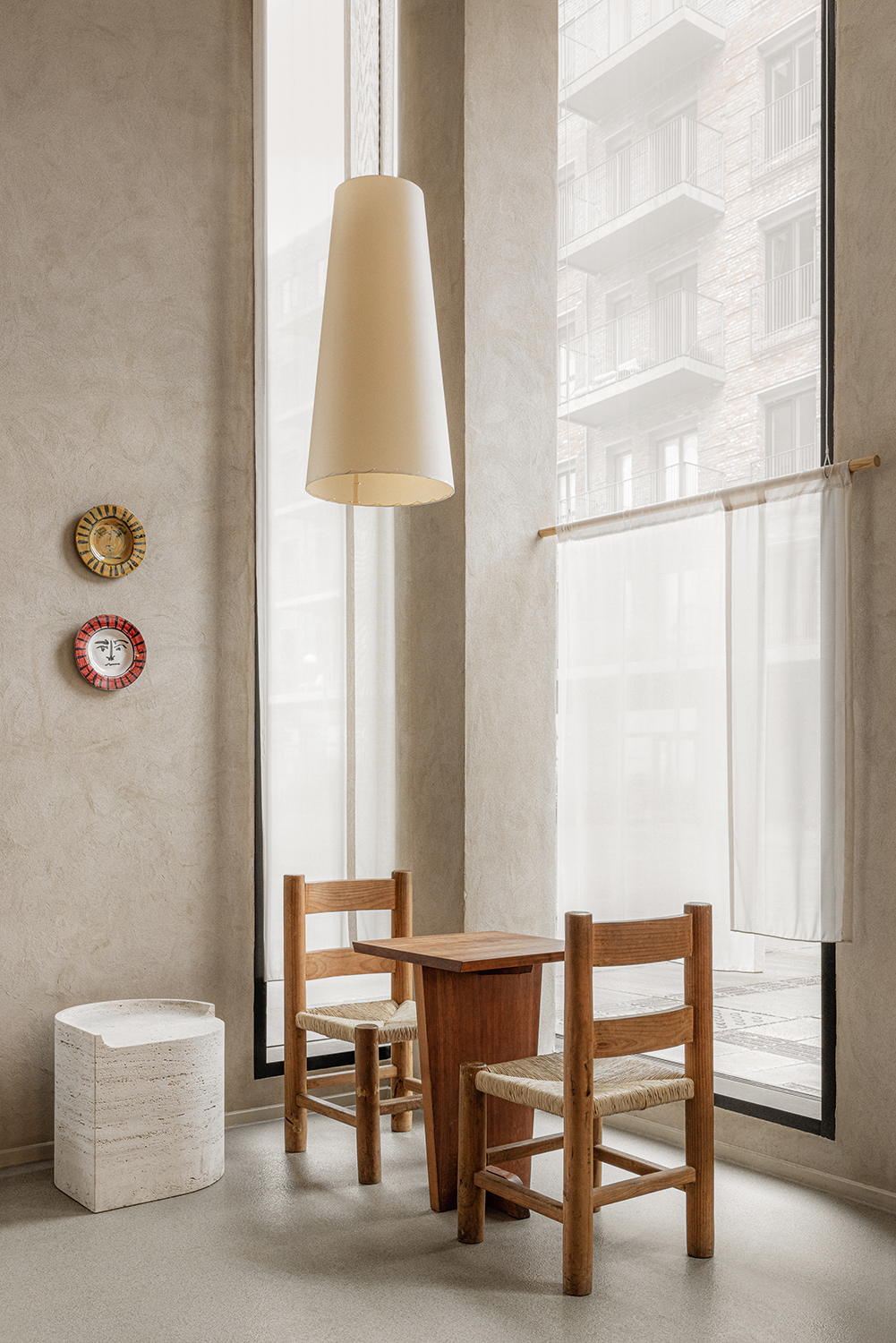
'Interiors relate to the body and mind in a very immediate way due to their scale and functionality. In my mind, materiality and tactility have the ability to ground, to bring the user to the ‘here and now’ through the immediate experience of space and object,' says architect Danielle Siggerud, who is a leading light in the minimaluxe aesthetic.
'I aim to create spaces that are balanced and carefully curated to achieve the sense of being at ease. I remove all that is unnecessary, stripping the room down to its essence, and the lighting, doors, fixtures, and storage become part of the structure. Everything you can touch gets a lot of attention, adding warmth, a sense of personality and presence. I am also conscious about using materials that age beautifully – in that way, the space evolves in time together with the user, transforming and carrying traces of a lived life.'
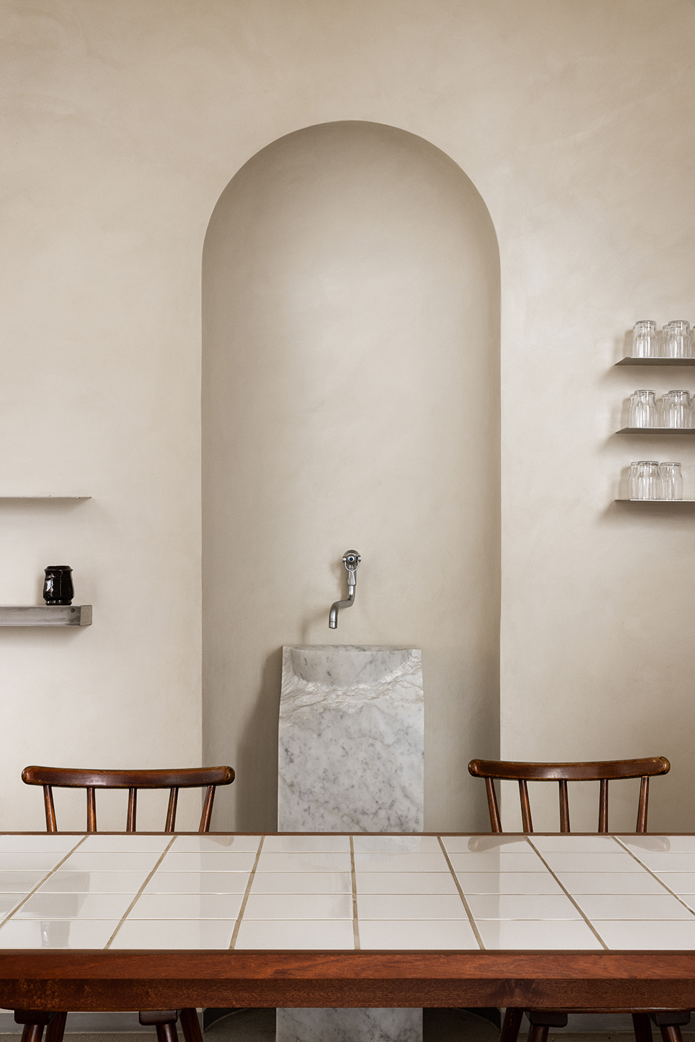
Danielle says that the way to make choices should be based on how they will feel to the touch. 'I often use tactility and the sensation of space as a design driver,' she says. 'We recently designed Anderssen & Maillard bakery in Nordhavn, Copenhagen, and clad a long mahogany table with tiles, which acts as a contrast to the other wooden tabletops in the bakery. You feel the cold sensation when touching the tile surface and hear the sound of placing your coffee cup: it’s a little reminder of being in the moment.'
2. Look for contrasts

'I love working with natural materials, especially stone and wood. It’s about creating balance and bringing out the qualities of each material,' Danielle says. 'By playing with contrasts – for example, cold and cold, smooth and textured – the materials and the space become elevated, lifting each other up. Natural materials, especially aged materials, add warmth, soul, and emotion. Objects and furniture made of artificial materials can be hard to connect with emotionally and sensorially and I tend to be mindful of that.'
3. Focus on durability
One of the plus points about the minimaluxe movement is that it should mean you have a more low maintenance home.
'Metals and harder textures like stone are usually stronger in terms of their functional qualities and durability, so should be used on surfaces you are in direct contact with, like a refined lever handle, faucets in the bathroom and a stainless-steel kitchen countertop,' Danielle says. 'But they can also be used unexpectedly. Stone is often associated with hard, cold feeling; [using it in an] organic shape is meant to provoke the conception of stone and soften the perception of it.'
4. Scent the right rooms
Minimaluxe is about finding ways to make your home feel as if it's looking after you, to become enriched by your surroundings. And that's where scent comes in. 'If I’m working from home and want to feel energised, I’ll choose an uplifting, citrus-based scent; in the evening, or if I’ve been at work all day, I prefer something woody,' says Stephanie Hannington-Suen, of home fragrance brand homework. 'We use Chinese cedarwood as a base for a lot of our blends: I find it really grounding. At the moment, my favourite combination is cedarwood, neroli and jasmine with a hint of lime – florals are helpful for a calming space.'
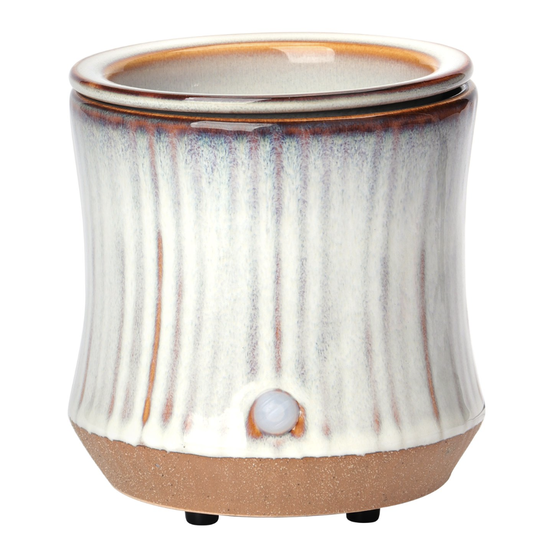
She suggests that a candle - a natural choice - isn't the best way to go, however. 'The most popular way to scent a home is a candle because you get the glow of a flame, but I prefer an oil burner,' she says. 'I find it scents a large room much better, and you don’t need to use much. I don’t love burning scents in kitchens and dining rooms: too often the smell of your food masks the scent, and the mix of the two can be off-putting. Scent is much better used in living rooms, bedrooms and bathrooms for a calming effect.'
5. Soften with textiles
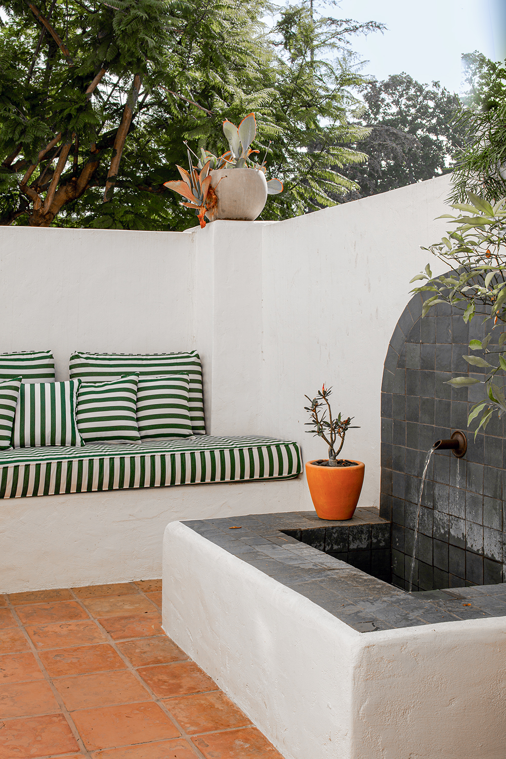
Sound in particular can affect your sense of wellbeing. Ensuring good acoustics is important for a pleasant environment in which you can unwind.
'The simplest solution is to add as many soft materials into your space as possible,.' says Justine Kontou, founder of Studio Kontou and an expert in sensorial interiors. 'Curtains, carpet, a rug, upholstered furniture and, of course, acoustic panels. The thicker and higher-pile the material, the more sound it absorbs. Even a full bookcase can help. Try to avoid using too many hard materials like concrete, steel and glass: instead, opt for wood, cork, wallpaper and carpet or a large living room rug.'
The best minimaluxe pieces to buy right now
