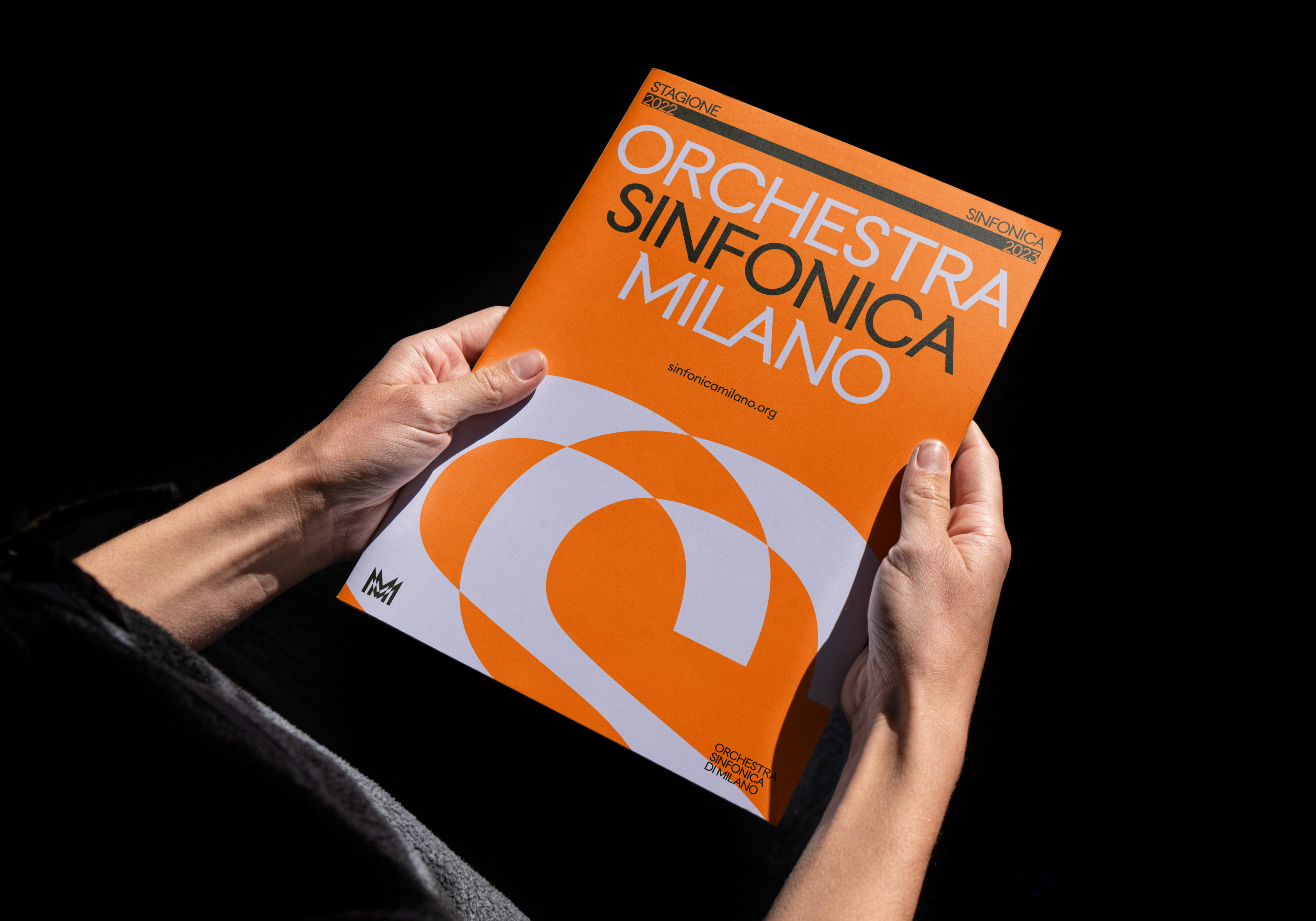
Milan Symphony Orchestra has unveiled a sleek new identity that celebrates the rich flavours of Milanese culture in a classy, contemporary visual refresh. Taking cues from the architecture, art and most importantly, the music of Milan, the new design system embodies the city in a delightful, multi-sensory celebration of creativity.
With a focus on connecting the orchestra's heritage with Milan's bustling modern culture, the new design system is an elevated homage to both past and present. The best rebrands expertly blend the essence of a brand's identity with a contemporary edge that sets it apart from the competition. With an immersive logo, sleek typography and a thoroughly fresh design system, Milan Symphony Orchestra's new identity is a harmonious feast for the eyes (and ears).
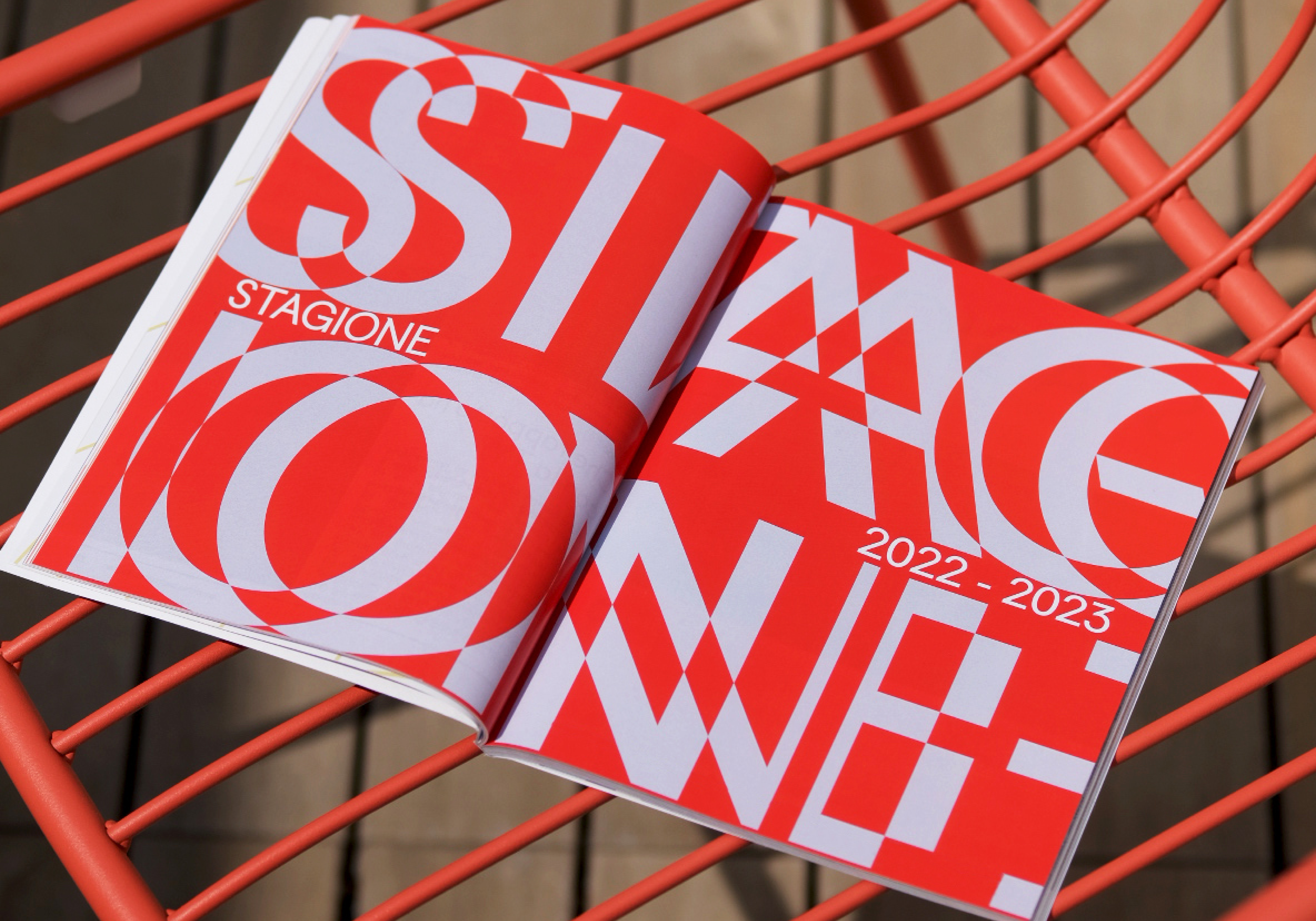
Created by brand specialists Landor, Milan Symphony Orchestra's identity was built around the foundational concept of 'Growing Uptempo.' Referencing not only the tempo of music (central to the orchestra's identity), but also Milan's "frenetic rhythms, futurism, and innovation," according to Landor's case study.
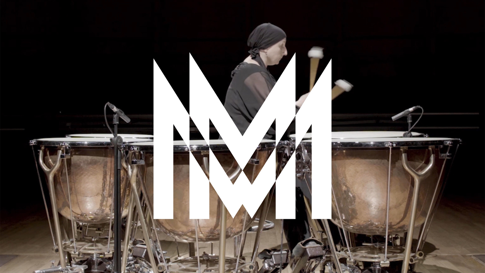
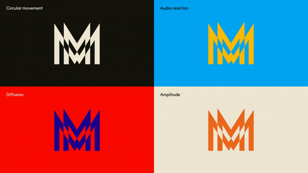
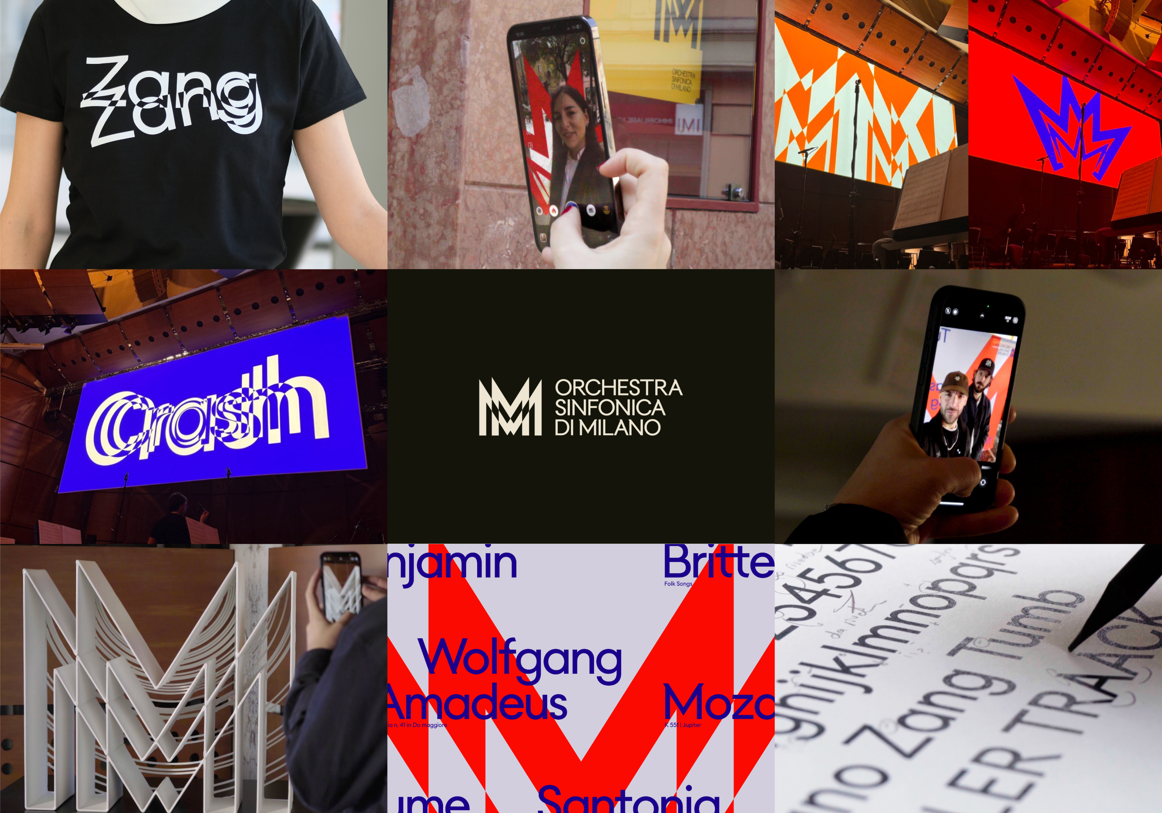
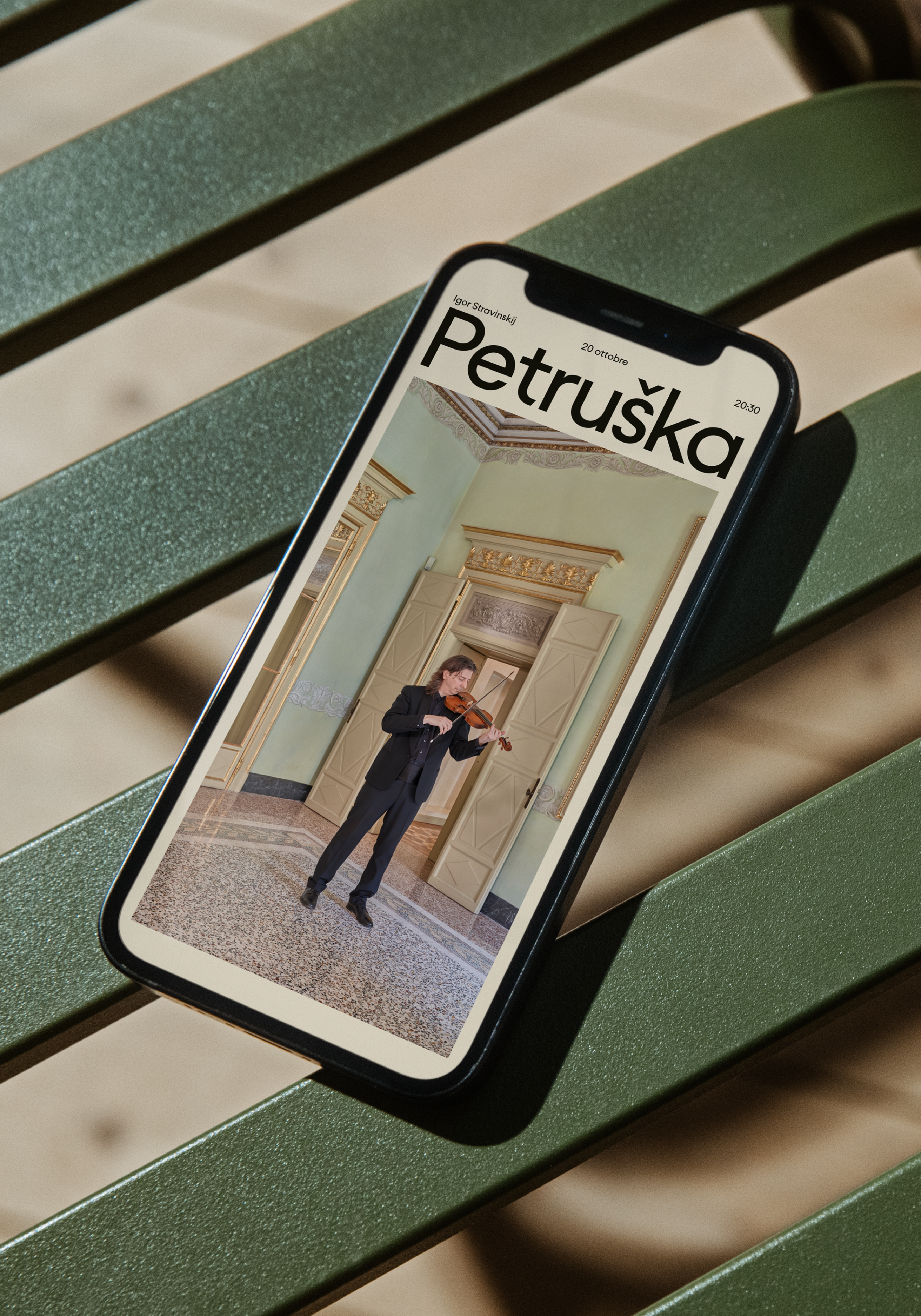
With this growth in mind, the Orchestra's new identity is an evolution of its previous visuals, integrating sound and movement to inform the design of the logo. Speaking to Creative Bloq, Teemu Suviala (Global Chief Creative Officer at Landor) and Mattia Castiglioni (Landor's Creative Director) shared that the new custom typeface became a "dynamic asset" that was "no longer confined to a static form."
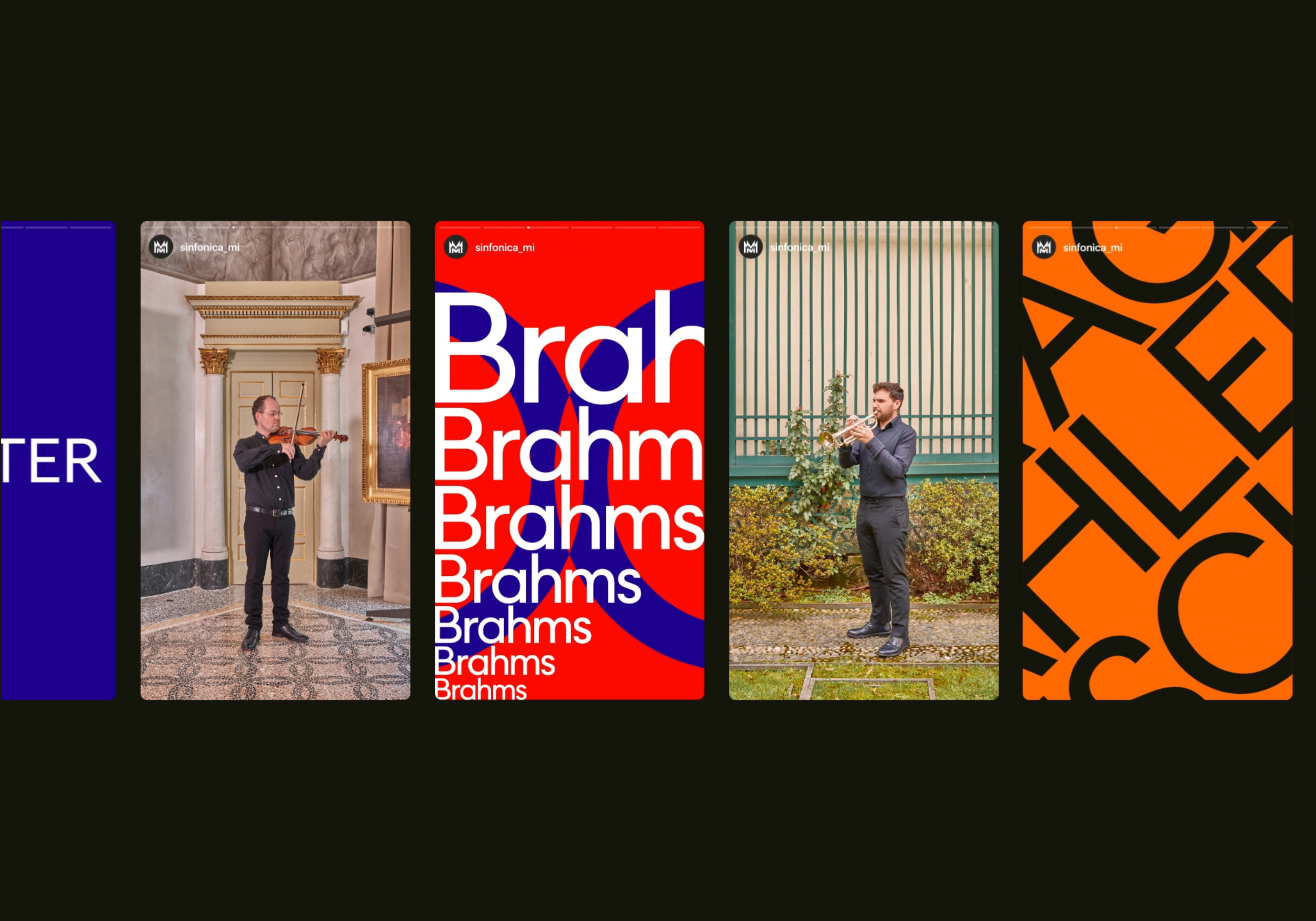
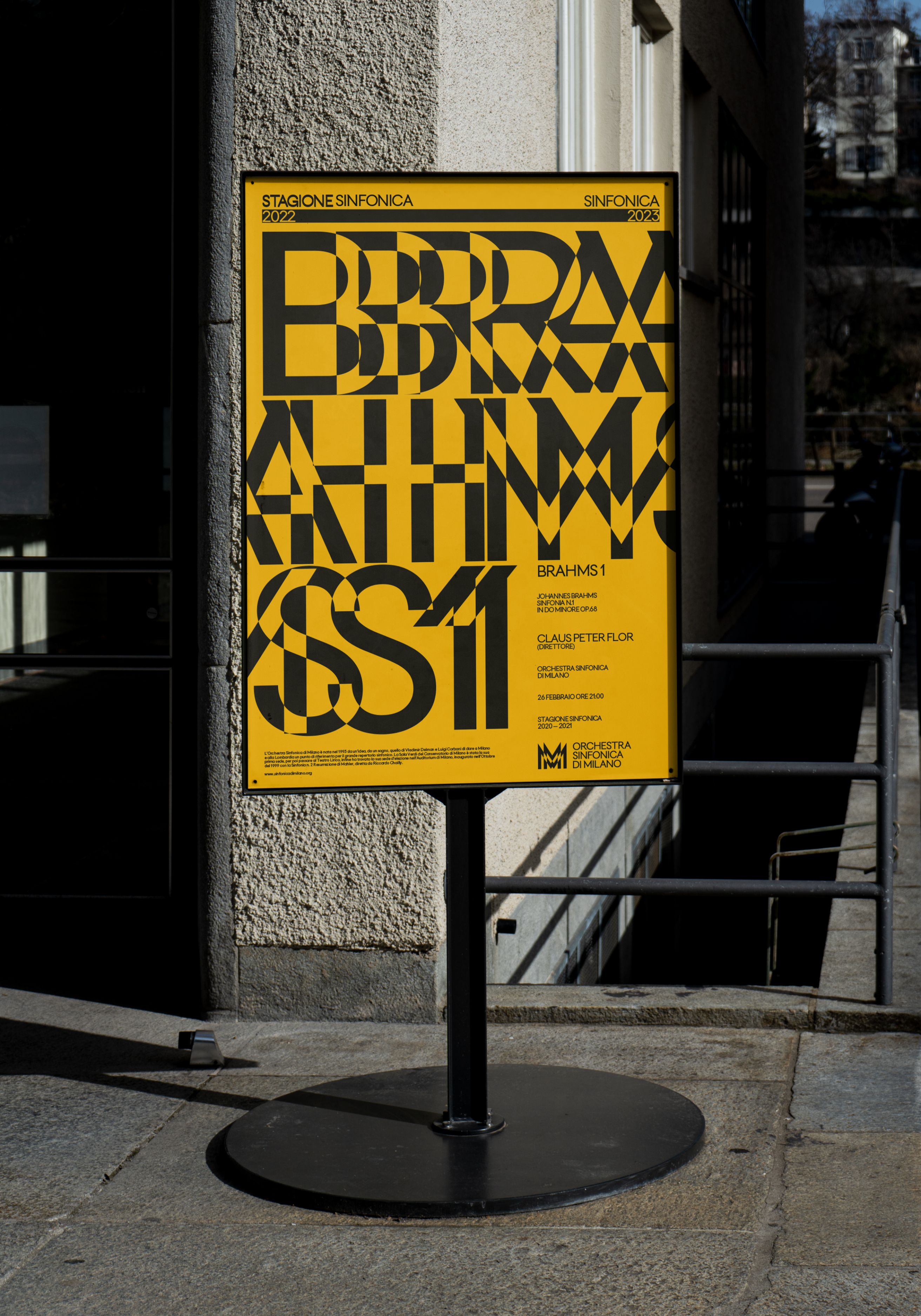
"The font interacts fluidly with the auditory elements of music. As the music plays, the typography responds in real-time—expanding, contracting, and duplicating in harmony with the musical rhythm, making the typography not just a vehicle for words but a vital part of the sensory experience," they add.
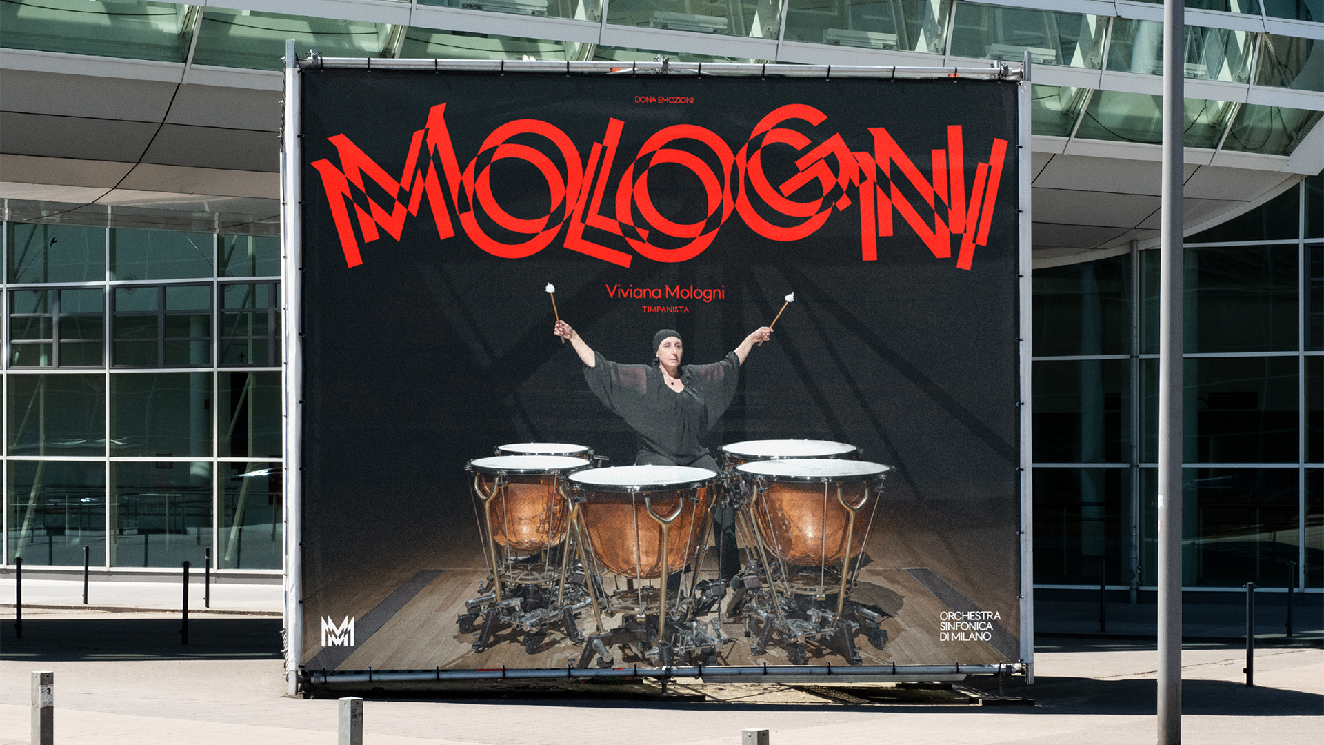
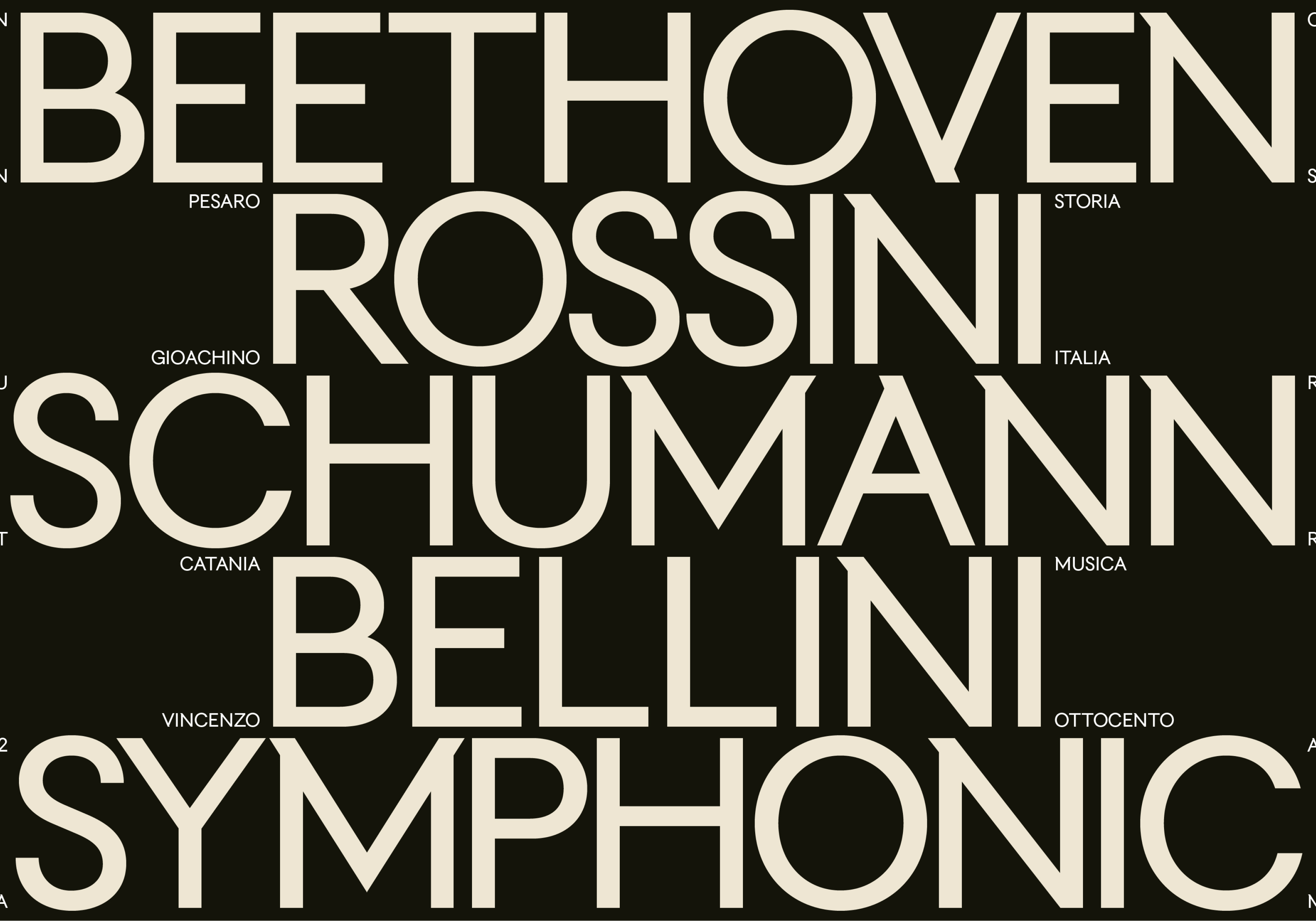
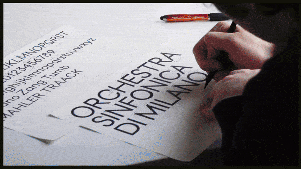
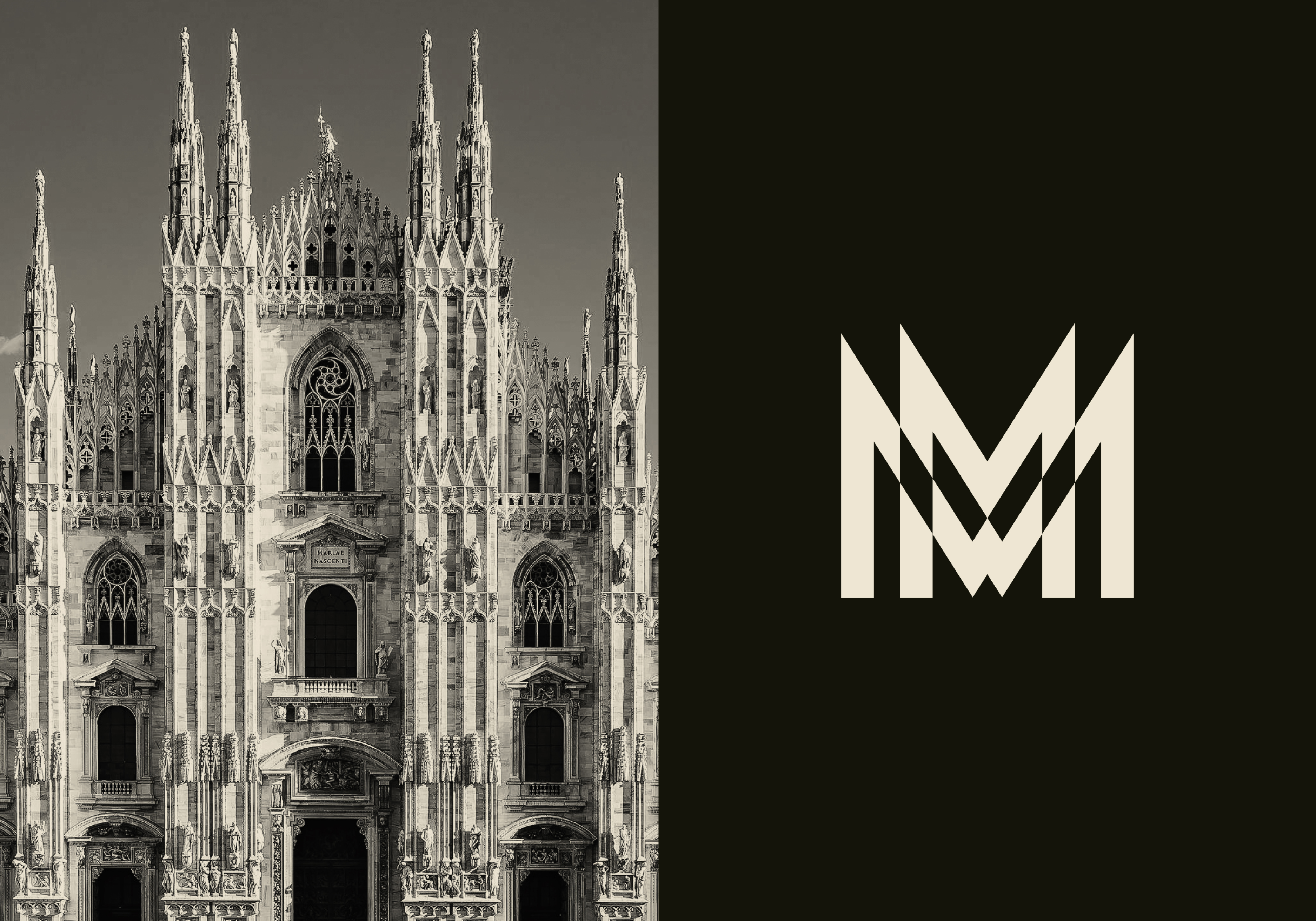
A bespoke typeface named Tumb Tumb was hand-crafted by Landor, taking inspiration from Milanese heritage. The design "captures the essence and spirit of the city's rich cultural history – and more specifically, echoing the angular architecture of the iconic Milan Cathedral [Duomo]" while the "linear structure of the alphabet reinterprets the rational characters of the 20th century in a contemporary key."
It was a rigorous project for the team who meticulously worked on a fitting design that would strike a chord with the orchestra's identity. "Our process involved numerous sketches and rigorous testing, ensuring that each character was refined to perfection," Teemu and Mattia told Creative Bloq. "We explored various iterations to ensure that the typeface not only looked aesthetically pleasing but also performed perfectly in diverse applications and media – and especially in motion," they add.
Accommodating the typography is a sleek sound wave design, adding both audio and visual immersion to the brand's identity. Representing both Music and Milan, the design is "deeply symbolic," according to Teemu and Mattia. "As Milan transcends its role as a mere geographical location. Over time, it has evolved into a global brand synonymous with cutting-edge design, high fashion, rich culture, and sophisticated style," they share.
"The Duomo can be considered an example of "Architecture in Motion" thanks to its towering Gothic elements that give a dynamic look and feel to the cathedral. What better symbol to tell the story of a place that continually reinvents itself?" they add.
The modern effortlessly coalesces with heritage in the new design system, creating a blend of history and contemporary style. "Colors and layouts inspired by art movement Futurism add both energy and balance to the overall experience, whereas photography and film add a layer of storytelling to it. It is a well-conducted symphony of aesthetic pieces, together defining this multifaced and multisensorial brand," the creatives share.
Venturing into more multifaceted branding and design styles is a key to Landor's mission. "We have entered an age of sonic renaissance- driven by streaming platforms, smart speakers, audiobooks and podcasts. This is why Landor has been heavily investing into and experimenting with sound – as one of the key sensorial elements of branding and design."
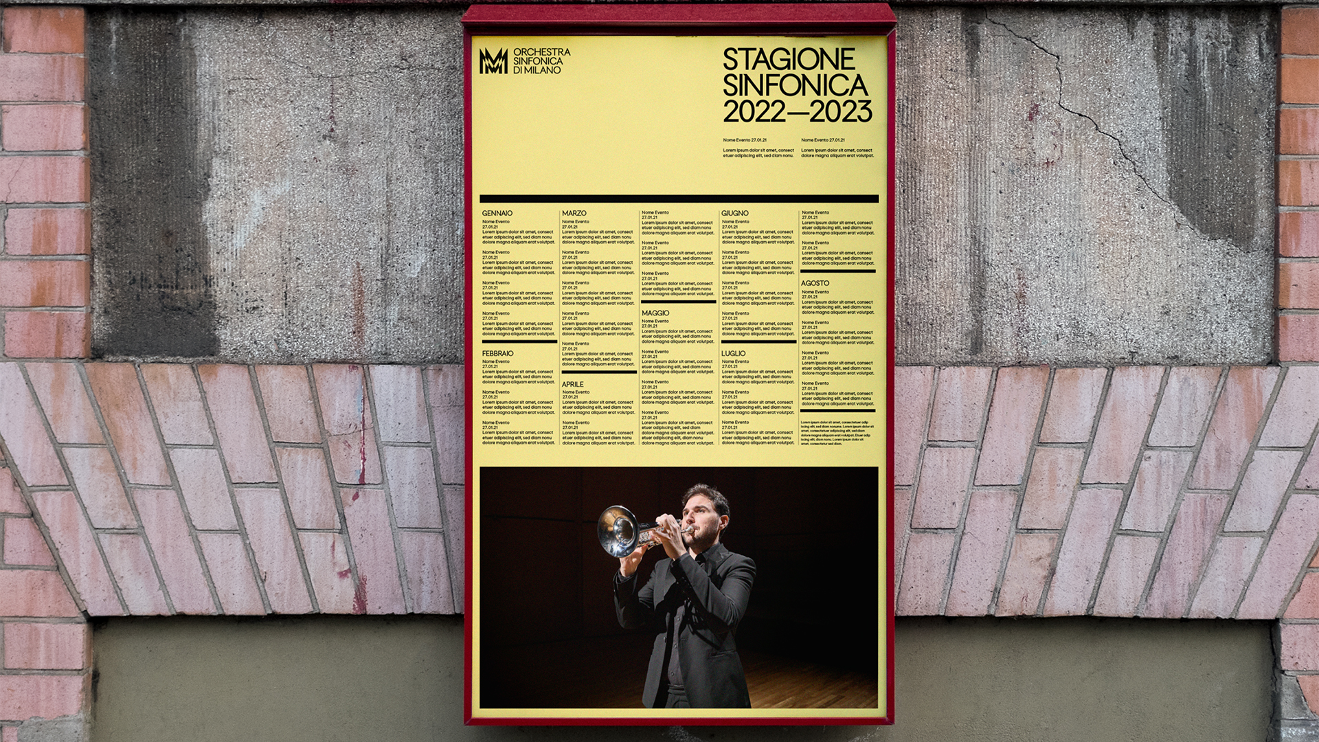
When asked what they were most proud of throughout the project, Teemu and Mattia shared: "The magic is really in the overall dynamic behaviours of the system – how the brand moves and interacts and constantly transforms into something different. The screens in the concert hall, the iconic logo sculpture in the theatre foyer, the tickets and fan merchandise – they all make us very, very proud of this inspiring identity."
For more inspiring designs, check out Landor's logo for the West Loop Community Organisation. If you're after more rebrand news, check out this stunning national park rebrand that's packed with natural symbolism.
Have you created some standout branding? Enter the Brand Impact Awards today.