What you need to know
- Last year, Microsoft unveiled a major UI update for Edge that would align it with Windows 11's design language.
- The new design featured rounded tabs and a heavier use of blur effects across the interface.
- Now, the company is scrapping the UI refresh, and is removing the flag to enable it from in an upcoming version of Edge.
In February 2023, Microsoft unveiled "the new Bing and Edge" during a special event at Microsoft's headquarters in Redmond. It was during this event where Microsoft unveiled Bing Chat, the service which eventually morphed into Microsoft Copilot. Bing and Edge were at the very forefront of this new AI era for Microsoft, and the company wanted to give Edge a fresh coat of paint to match.
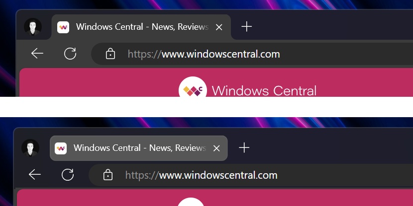
During the event, Microsoft's Yusef Mehdi announced on stage that Edge would be getting a refreshed design. He said, "we've just updated Edge with a new look and feel ... it's sleeker, it's lighter," and featured new rounded tab buttons and a much heavier use of blur effects across the browser window.
After years of basically looking exactly like Chrome, Microsoft was suddenly eager to give Edge its own identity, likely because it thought it was onto a winner with Bing Chat and Copilot. The new design also better aligned the browser with Windows 11 and Microsoft's design language. Take a look at the difference below.

It's been well over a year since this new UI refresh was announced, yet we haven't seen it launch in any official capacity. For a while, it was possible to enable the new interface via flags, but recent versions of Microsoft Edge now state that the flag is being discontinued soon, with the latest version of Edge Canary being the first to remove it completely.
A Microsoft spokesperson has now confirmed to Windows Central that the company is moving away from the rounded tabs design that was unveiled last year, which means Microsoft has scrapped plans to overhaul the Edge interface. Some remnants of the new design will stay, including the border around webpages and repositioned user button, but the bulk of the new design will no longer ship.
It's unclear what drove this decision, as the new interface was clean and did a great job at aligning with Windows 11's overall aesthetic. Now, the Edge browser will remain looking pretty much how it always has, which is to say a lot like Google Chrome. That's probably not a coincidence.


