
What you need to know
- Microsoft wants to make Edge less bloated by decluttering its Settings page.
- The company intends to add a new quick-access panel on the landing page for Edge Settings for easy accessibility and navigation.
- Microsoft intends to compress its long list of Edge Settings options by grouping them into subsections like a table of contents in a book.
Microsoft Edge is arguably one of the best Windows 11 browsers. However, users have often placed Microsoft under fire for making the software bloated with "unnecessary" features that might not be useful in the everyday use case.
As it happens, Microsoft might be on course to fix some of these issues. As first spotted by Leo Varela on X, Microsoft is seemingly revamping Microsoft Edge's Settings page, making it more organized.
Microsoft is testing a small change to the Edge Settings page (Canary), the different options in the navigation bar are now organized into groups (just like in Chrome):https://t.co/3wwOlzHQUi pic.twitter.com/5zBRfeMXHYJuly 26, 2024
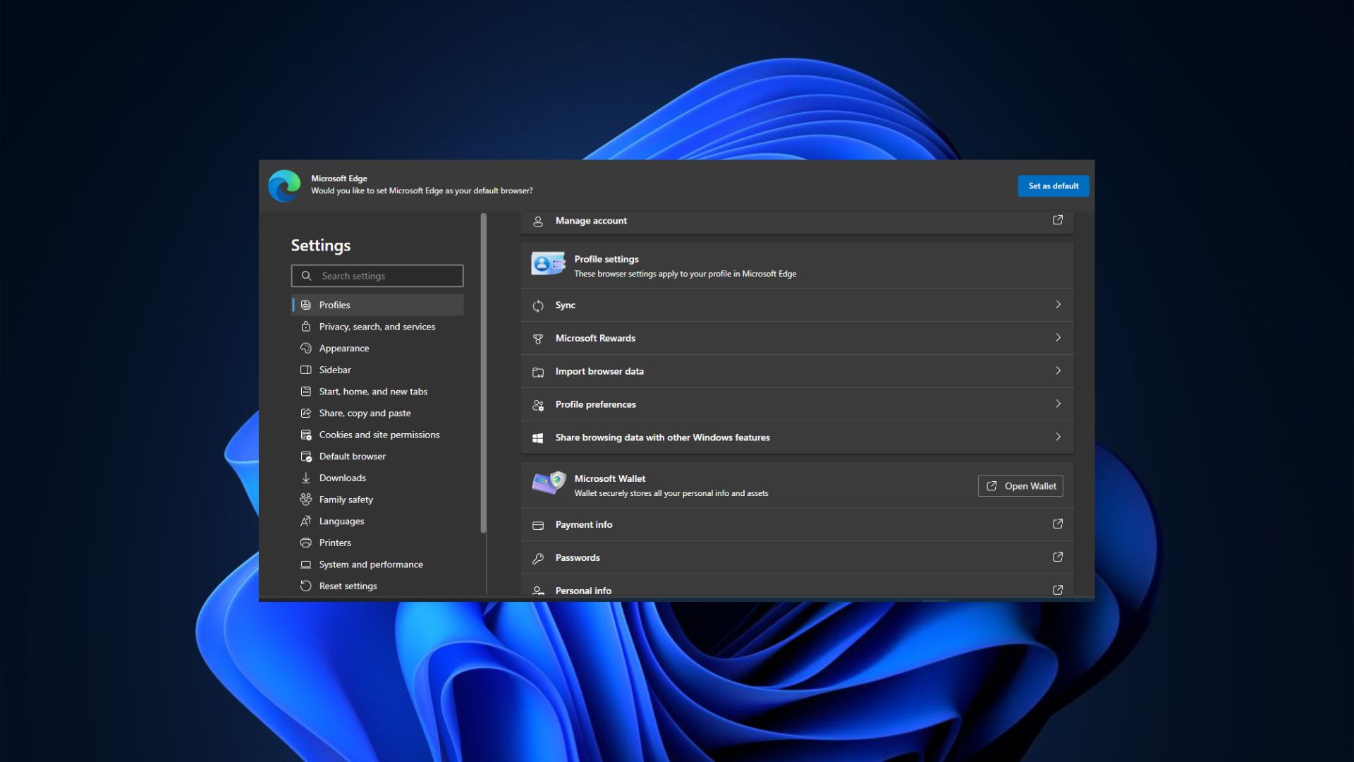
On the Microsoft 365 roadmap website, the company registered the anticipated changes under an entry titled: Microsoft Edge: Elevating top settings and improving settings page navigability. The company further details the steps it intends to take to make Microsoft Edge more user-friendly, including the addition of a new quick-access panel on the landing page for Edge Settings.
The panel will feature the most commonly used actions in the Settings menu for easy accessibility and navigation, allowing you to make changes and tweaks to your Settings configurations with fewer clicks. As highlighted in the entry, the changes are expected to start rolling out in October 2024 — but as is often the case, these plans may be subjected to change.
Microsoft also plans to bring one-click shortcuts for the most common options to Microsoft Edge's Settings submenus, including System and Performance or Appearance.
Another page that has been reorganized in Edge Canary is Privacy, search, and services, so there are now three revamped pages:https://t.co/IfG6ZJn9AE.https://t.co/rXL4iDS0Yv pic.twitter.com/P5NFA4RMlyAugust 21, 2024
Read more: Microsoft has scrapped Edge's big UI refresh with rounded tabs
Finally, the tech giant also intends to compress its long list of Settings options by grouping them into subsections — similar to a table of contents you'd find in a book.
Browser wars continue...
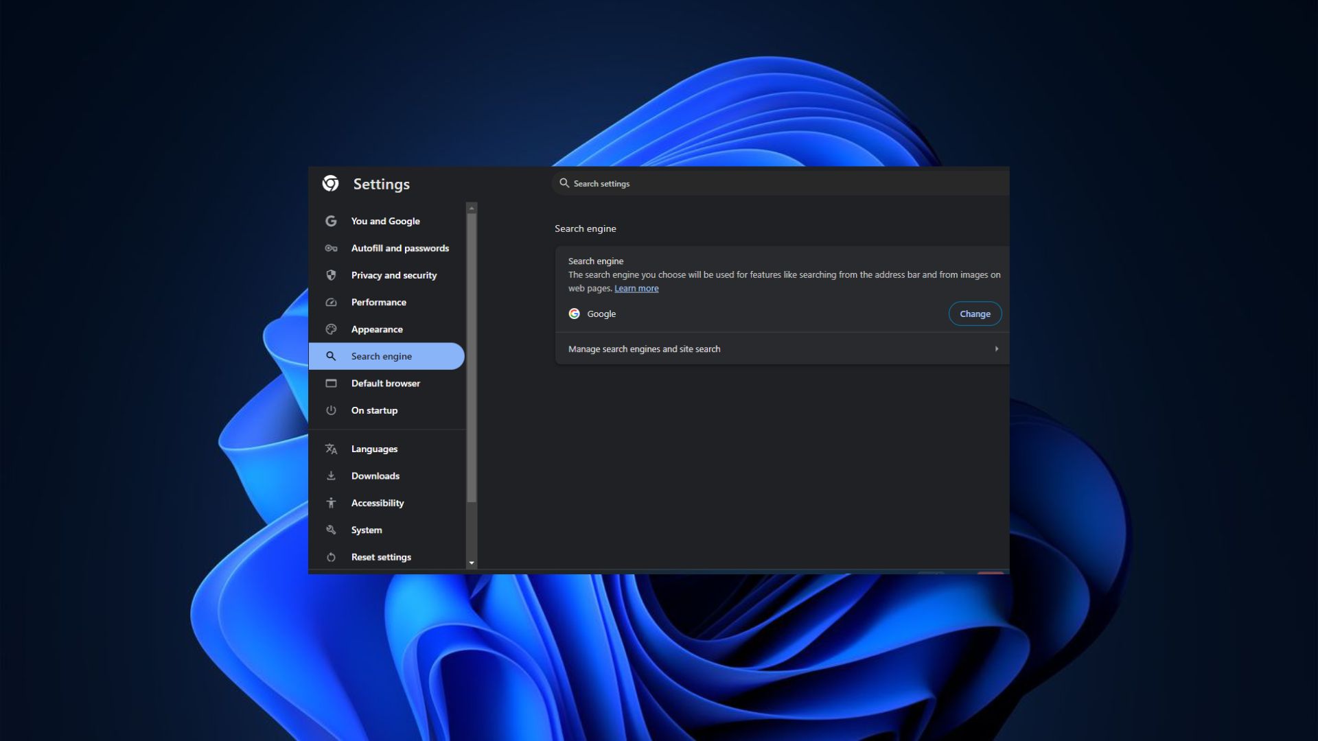
Comparing Microsoft Edge and Google Chrome's Settings pages, it's apparent that the latter seems well put together and easier to navigate. Admittedly, for less tech-savvy users, it might be a tad difficult to identify the exact location of a specific setting in Google Chrome. However, it features a search bar with suggestions to meet this specific need.
Microsoft is also testing showing you suggestions when you type in the centered search box on the Settings page: pic.twitter.com/fMXiin8B9yAugust 10, 2024
On the other hand, Microsoft Edge presents its Settings page in a cluttered manner, forcing the user to navigate through the page before identifying the specific option they are looking for. Similar to Google Chrome, Edge also features a search bar to make the process less daunting.
To this end, these are much-welcomed changes to Microsoft Edge's user experience and might perhaps present a new avenue to lure or get users to make it their default browser in Windows 11, potentially giving Google Chrome's dominant market share a run for its money.
Thanks for the tip, Leo Varela!
🎃The best early Black Friday deals🦃
- 🕹️Xbox Game Pass Ultimate (3-months) | $31.59 at CDKeys (Save $17!)
- 💻Samsung Galaxy Book4 Edge (X Elite) | $899.99 at Best Buy (Save $450!)
- 🎮Razer Wolverine V2 Chroma (Xbox & PC) | $99.99 at Amazon (Save $50!)
- 🕹️Starfield Premium Upgrade (Xbox & PC) | $27.69 at CDKeys (Save $7!)
- 💻ASUS Vivobook S 15 (X Elite) | $955 at Amazon (Save $345!)
- 🕹️Final Fantasy XVI (PC, Steam) | $43.79 at CDKeys (Save $6!)
- 💻Lenovo ThinkPad X1 Carbon | $1,481.48 at Lenovo (Save $1,368!)
- 🎮 Seagate Xbox Series X|S Card (2TB) | $249.99 at Best Buy (Save $110!)
- 🕹️Hi-Fi RUSH (PC, Steam) | $8.49 at CDKeys (Save $22!)
- 💻HP Victus 15.6 (RTX 4050) | $599 at Walmart (Save $380!)
- 🫙Seagate HDD Starfield Edition (2TB) | $79.99 at Best Buy (Save $30!)
- 🖱️Razer Basilisk V3 Wired Mouse | $44.99 at Best Buy (Save $25!)
- 🕹️Days Gone (PC, Steam) | $10.19 at CDKeys (Save $39!)
- 🖥️Lenovo ThinkStation P3 (Core i5 vPro) | $879.00 at Lenovo (Save $880!)