As expected when Nike
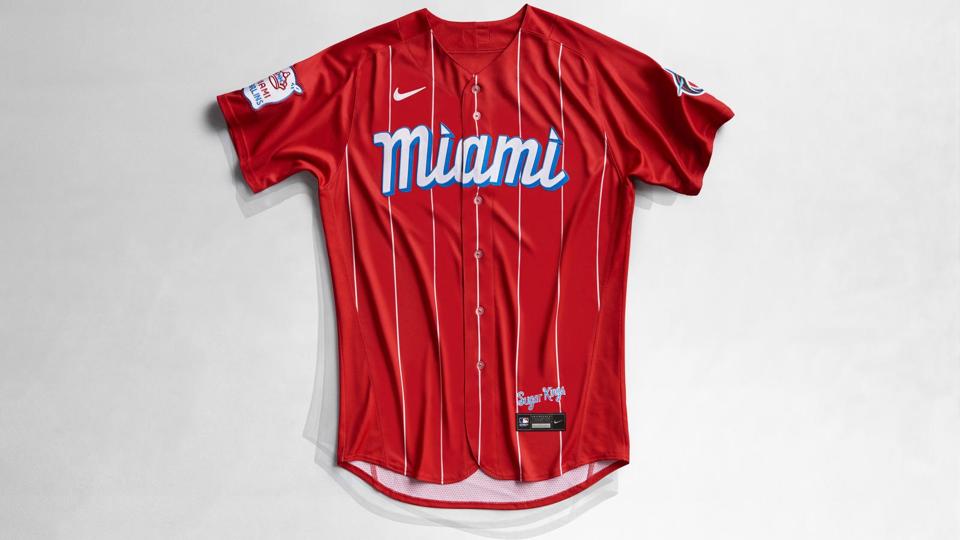
The Miami Marlins officially unveiled their City Connect uniforms today and while the color scheme is actually the exact same one that the Marlins are already using, the execution is unlike anything that we’ve seen from the Marlins or from Major League Baseball, in general. It’s to the point where it’s actually shocking that the City Connect uniform is using the same color scheme that the Marlins usually wear for their primary uniform set. Then again, it’s not everyday that you see a baseball uniform use white pinstripes on a red jersey.
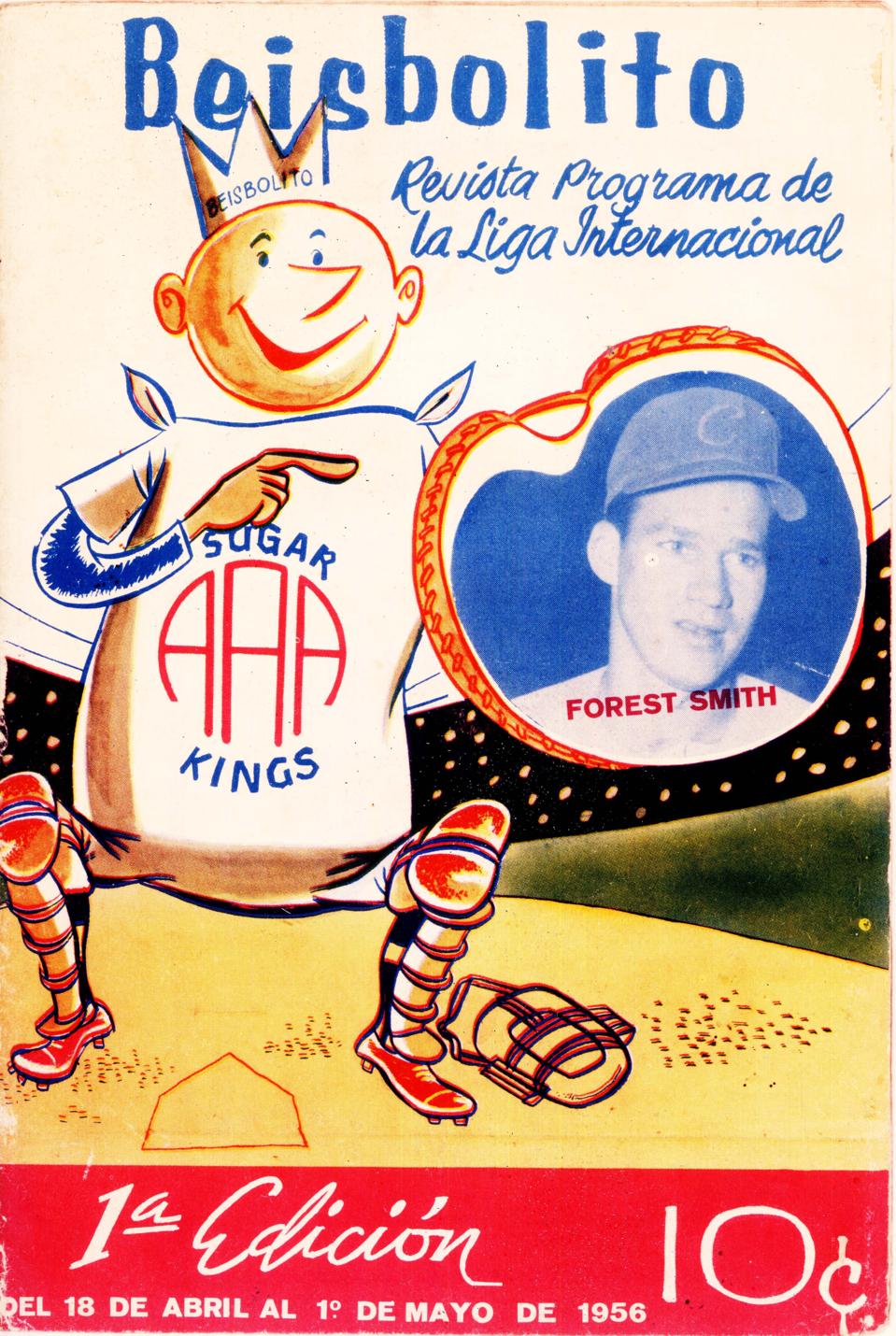
These uniforms serve as a bit of a modern take on what the old Havana Sugar Kings of Cuba used to wear during their eventful stint in the minor leagues during the 1950s. The minor league franchise that once called Havana its home eventually found itself in Jacksonville and in 2009, it became the Triple-A affiliate of the Marlins. In a round-about way, the Sugar Kings and the Marlins are distant cousins and this uniform serves as a tribute to the team that claimed the 1959 Triple-A championship.
The old Sugar Kings logo was used as inspiration for a new logo on both the right-hand sleeve of the jersey and on the hat as well. The retro Sugar Kings script design is also present right above the jock tag on the jersey. The “Miami” script logo across the chest is also done in a style that is similar to what you would see from the old handmade looks from that era. However, the best thing about this uniform is the color scheme, itself.

In the Marlins release that was linked above, the word “bold” was used multiple times and that’s probably the word that best describes the usage of the colors on this uniform. If anything, this is a bit of an example of just how much potential there is with these particular shades of red and blue for the Marlins. It’s a real shame that black is the dominant color on their normal uniforms, since this uniform is an example of what’s possible if the blue and red were the focal points of the uniform.
Overall, this jersey and hat combo for the Marlins is very, very solid and in terms of aesthetics, it’s far ahead of the City Connect offering that we saw from the Red Sox earlier this season. With that being said, there’s really no way to predict what’s in store for the White Sox, Cubs, Diamondbacks, Giants and Dodgers as their respective City Connect uniforms are unveiled. They could get something that is completely unimaginable for them to wear, or they could end up like the Marlins where they end up with a uniform that utilizes what they currently have better than how the normal uniform does so. Either way, this rollout of uniforms will not be boring and there’s plenty of anticipation about what the next uniform will look like.


