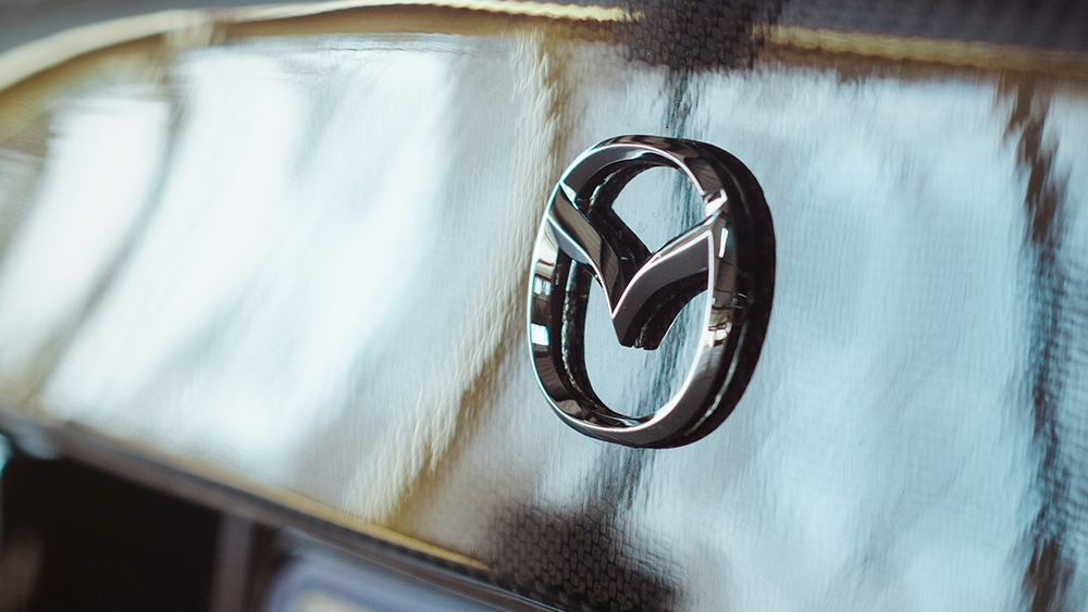
In July last year, Mazda subtly filed a trademark for a slick new logo, breaking the mould of its dated 3D design. The contemporary revamp is yet to launch officially, but its sleek new look is a huge leap for the brand, following the decline of skeuomorphic design across many of the modern car logos on the road today.
As we saw with the new Jaguar logo recently, redesigning a car brand emblem can be controversial, yet Mazda's simple yet contemporary upgrade was well received by many. A welcome evolution that was long overdue, the new Mazda emblem proves that subtle tweaks can make an outstanding difference to a well-loved logo.
When the original trademark was filed most information on the logo redesign was fairly under wraps, but multiple Japanese news outlets have since confirmed the new design is official. As of now, it's unclear whether the old logo will still be used alongside the contemporary design, but a formal announcement is expected in the coming days – potentially on the brand's 105th anniversary on 30 January.
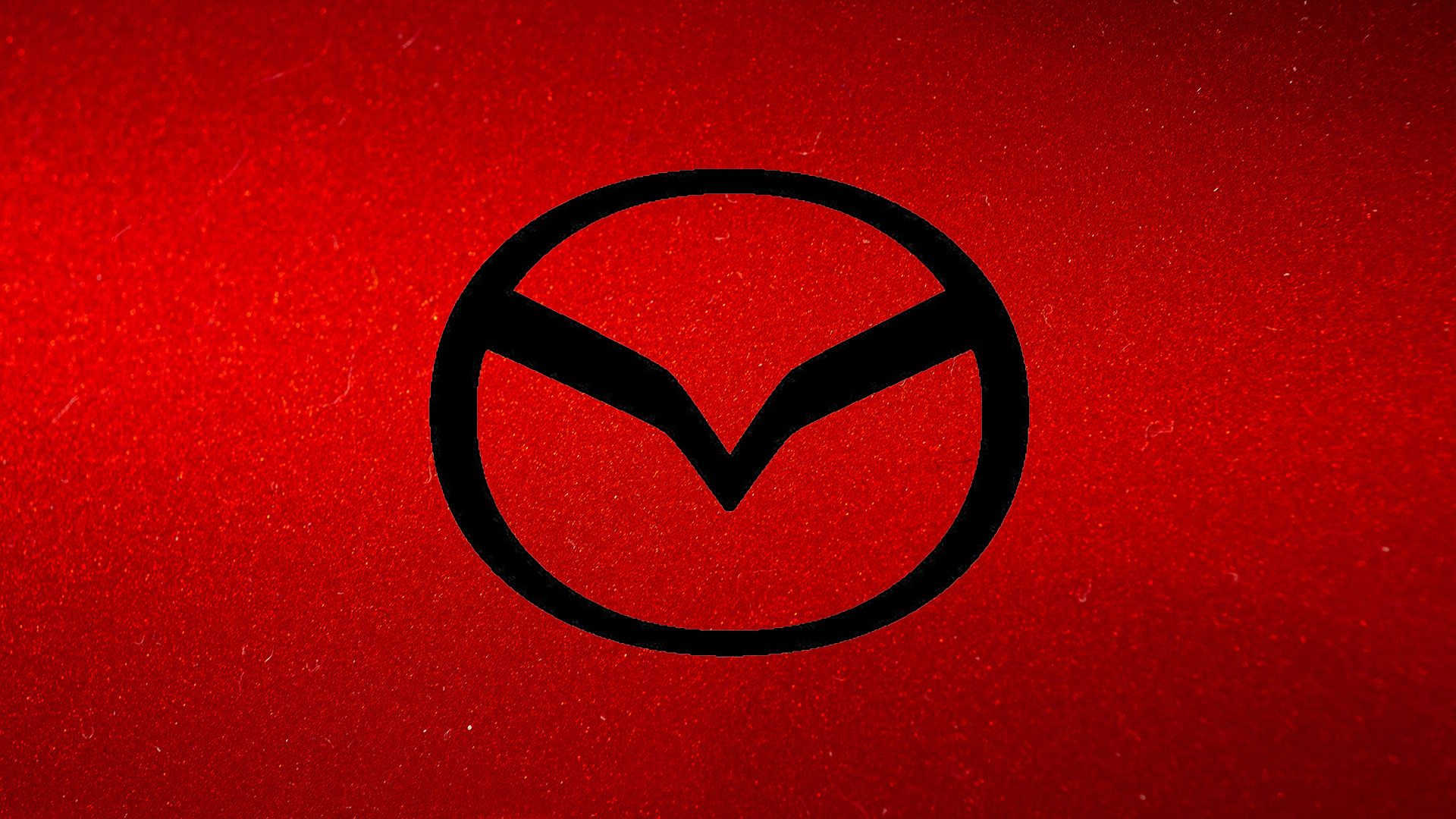
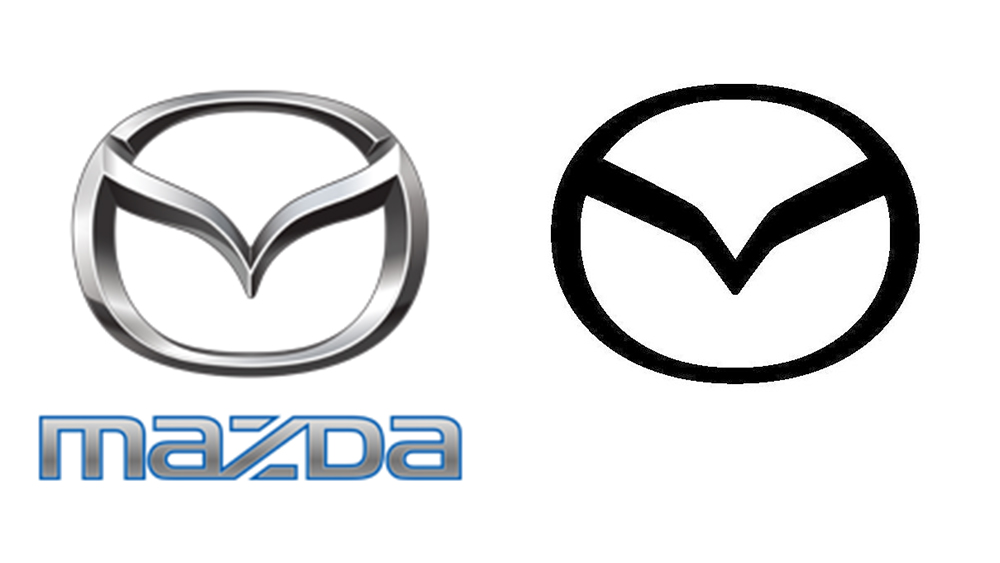
A closer inspection of the new Mazda logo reveals why it was so well received, with a simple yet striking black outline giving it a much-needed modern upgrade. The signature 'M' shaped wings have been refined for a sharper, more graphic appeal while the surrounding circular frame has been reshaped for a rounded, harmonious appearance. According to Car Scoops, Mazda claims that the redesign was created in part, to appear more legible on smartphones and laptop screens, prioritising bold modern precision over an elaborate redesign.
Mazda's logo has remained unchanged since 1997, so a contemporary refresh was naturally on the cards to appeal to a new generation. The minimalist look may not be the most flashy revamp, but its simple unfussy design is what makes it so strong (there's always the danger of overcomplicating it and ending up amongst the ranks of the worst car logo redesigns). For more car design news take a look at how this designer 'fixed' the controversial new Jaguar logo to the delight of fans.