Easter is on the horizon, so it was only right that we take a look back through the decorating archives of America's beloved TV personality, Martha Stewart, who is still inspiring our home decorating choices.
This time, Martha's entryway color idea caught our attention. A pale pistachio green color that designers and forecasters predict will dominate color trends in 2025. If you haven't already heard about pistachio green, where have you been?
Pale pistachio, the most-talked-about color of the year, is having a moment. And no wonder: post-pandemic, subtle neutrals such as steel grey and pure white are being replaced by warmer, more inviting neutrals. Timeless, elegant, calming – there is a lot to love about a serene pistachio scheme. Though this exact color is more ice cream in tone than the actual nut.
An amalgamation of yellow and green with a hint of cream, this shade has a cheerful, fresh feel and adds great depth to interiors. It is perfect for entrances and landings, and would work well as a background color for artwork. Color is a remarkable decorating medium and is an easy way to make your entryway more inviting.
Classic, calming, and synonymous with nature, pale pistachio green is a hue that keeps the peace, making it the ideal choice for the entrance to your home.
The color acts as an effective bridge between outdoors and inside when used in threshold spaces. When seen in enclosed rooms on wallpapers or furnishings, the color brings relief and reassurance and elegantly reminds us of the living world beyond our four walls. Pale green can refresh any room while adding a hint of nature. It works all year round, so don't be afraid to use it in the colder months too.
‘Decorating with neutrals, similar to one in Martha Stewart's home, while avoiding a minimal or stark atmosphere is a delicate balancing act between the natural light, artificial lighting, and the other textures and tones used throughout,' says Deborah Bass, director, Base Interior. 'Sampling on site, in various lights including artificial lighting, and at different times of day cannot be underestimated.’
Pale green color schemes have enormous scope as a mindful décor mainstay, and are also seen as an effective backdrop for other organic shades.
‘We are noticing a change to the use of softer hues, such as pistachio green, being used all over as a base color, just as neutrals have been used traditionally,’ says Ruth Mottershead, creative director at Little Greene. ‘These are very calming, positive shades with a timeless quality, that are muted but not enough that they fade into the background, so they work beautifully as a foil for similar earthy tones and richer colors, which can give a more dynamic effect.’
Shop the pistachio look
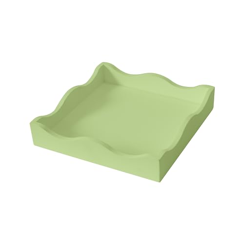
Bringing softness and shape to any space, scallops are having a moment right now. And what better way to introduce scallop-edging into you home than with this darling pistachio tray. You'll never forget your keys again.
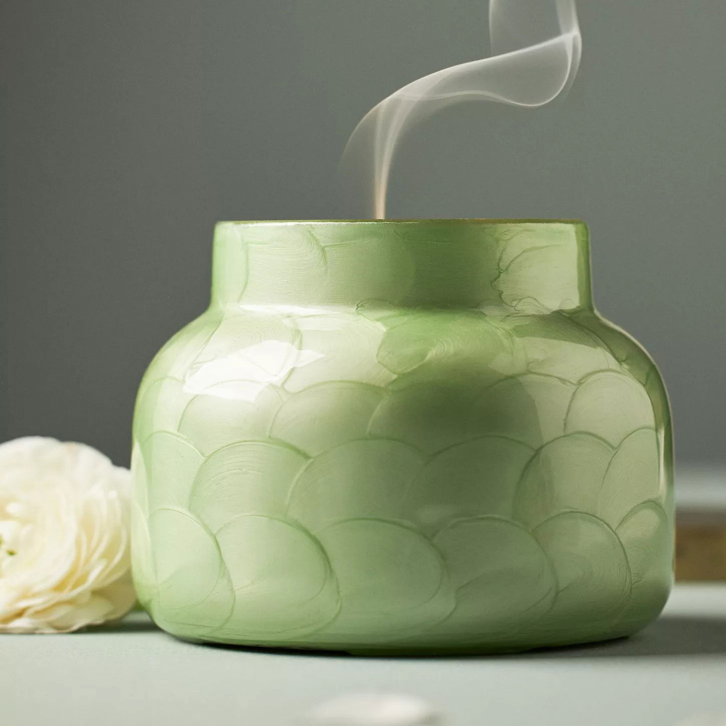
This iconic Mississippi-based candle and home-fragrance brand is known for intoxicating aromas, striking vessels, and clean formulas. Tip: The first time you light your candle, allow it to burn until the wax pool melts all the way to the edge; for a larger candle, this may take several hours. It will help your candle last longer.
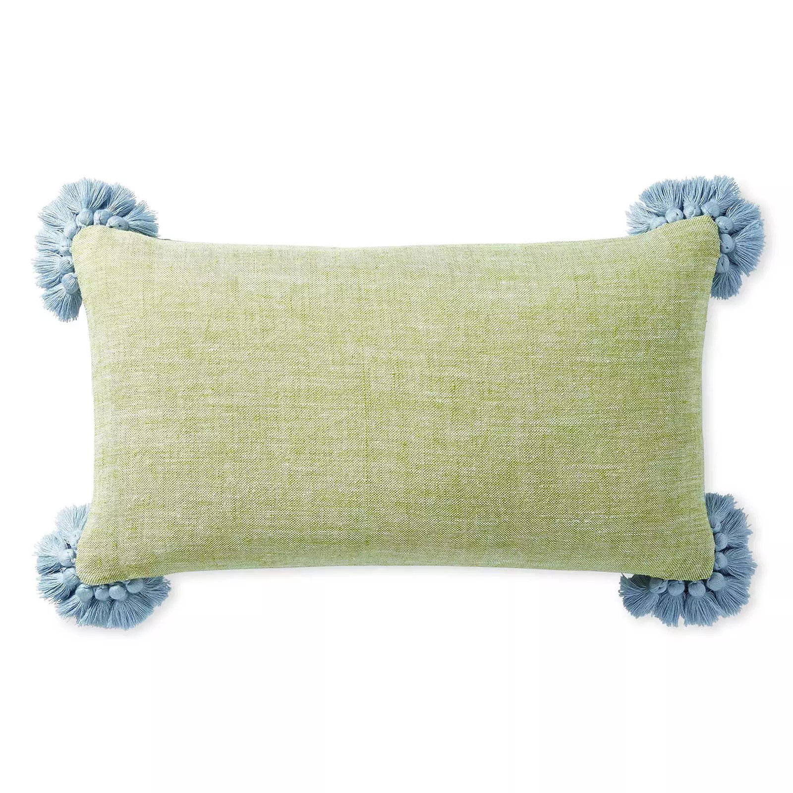
Sometimes it’s the littlest things that have the biggest impact, and this pistachio pillow cover is proof. Petite soft blue tassels on each corner are a nice counterpoint to the solid base. Textural linen brings beautiful texture and a relaxed sensibility.
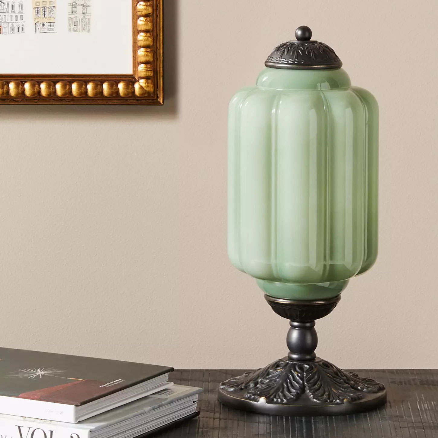
There is nothing I adore more than a vintage-inspired lamp. With a milk glass shade and an oiled brass base, this pale pistachio lamp brings feminine charm to any space.
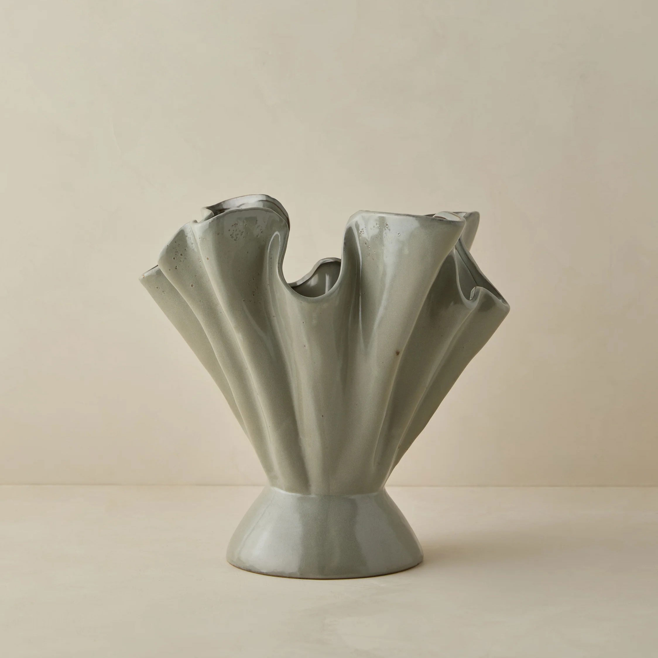
Add texture and dimension to your tabletop decor with this on-trend ruffled stoneware vase in a gray-green colorway. The reactive glaze creates an eye-catching finish unique to each piece.
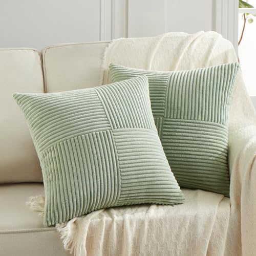
A best-selling item, with over 3,000 sold, this highly-rated throw pillow covers are a simple, cost-effective way to introduce a pale green hue to your entryway seating. They are so good, I've bought five.
With its graceful hue, pistachio green can be the perfect color for many rooms in the home, but it works best in spaces with certain orientations. Bluer-tinged tones can feel chilly in north-facing rooms, while south-facing areas make the greener traces appear more yellow. Pistachio has enormous scope as a mindful décor mainstay, and is also seen as an effective backdrop for other organic shades. You can't go wrong with 2025's favorite color.