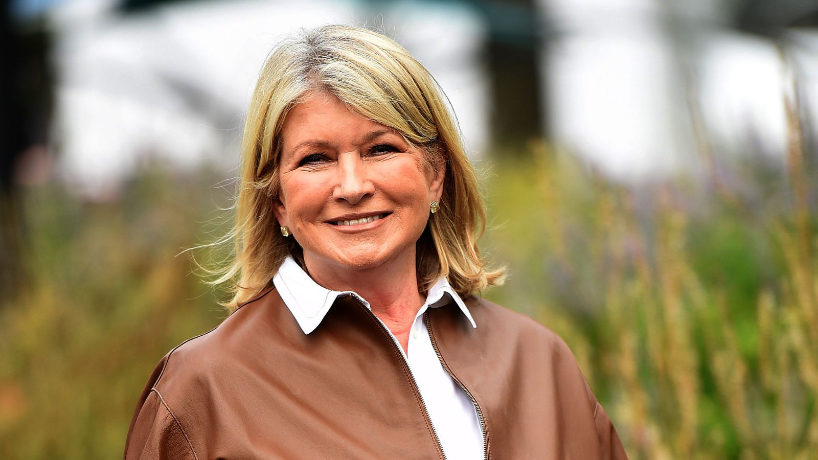
America's favorite TV personality Martha Stewart knows an interior design trend when she sees one. The mogul is a household name, and taking a look through her archives is always such a joyous task.
Martha has helped shape our homes for decades – products from her Martha Stewart Collection on Amazon take pride of place in my kitchen – so when she shared a throwback photo of her former culinary space, there was one thing I noticed; the calming gray-green color on the kitchen cabinets.
Pale green, also known as gray-green, is having a moment. And no wonder: post-pandemic, cooler neutrals such as gray and white are being replaced by warmer, more inviting neutrals. Timeless, elegant, calming – there is a lot to love about a serene gray-green color scheme.
An amalgamation of gray, green and blue-brown, this shade has a moody, sophisticated feel and adds great depth to kitchen cabinets. It is perfect for the heart of the home, and would work well as a background color for a heavily-veined marble backsplash or countertop. Color is a remarkable decorating medium and is an easy way to make a kitchen look more expensive.
Classic, calming and synonymous with nature, the color acts as a bridge between outdoors and inside when used in high-traffic spaces.
When seen in enclosed rooms on joinery and softer furnishings, the color brings relief and reassurance and elegantly reminds us of the living world beyond our four walls. Pale green can refresh any room while adding a hint of nature. It works all year round, so don't be afraid to use it in the colder months too.
‘Decorating with neutrals, similar to one in Martha Stewart's home, while avoiding a minimal or stark atmosphere is a delicate balancing act between the natural light, artificial lighting and the other textures and tones used throughout,' says Deborah Bass, director, Base Interior. 'Sampling on site, in various lights including artificial lighting, and at different times of day cannot be underestimated.’
Pale green-gray color schemes have enormous scope as a mindful décor mainstay, and is also seen as an effective backdrop for other organic shades. If you're too nervous to go for a green-tinged hue, try greige instead. It will have a similar effect, and isn't quite as daunting.
‘We are noticing a change to the use of softer hues, such as gray-green and greige, being used all over as a base color or on kitchen cabinets, just how neutrals have been used traditionally,’ says Ruth Mottershead, creative director at Little Greene. ‘These are very calming, positive shades with a timeless quality, that are muted but not enough that they fade into the background, so they work beautifully as a foil for similar earthy tones and richer colors, which can give a more dynamic effect.’
It's not the first time the TV darling has used this color trend in her home. Martha's Stewart's gray-green entryway is equally delightful.
Shop the look
Not planning on repainting your kitchen cabinets? You can still replicate the look with ease.
I've perused the Internet to find similar gray-green and greige (a combination of gray and beige) soft furnishings and accessories to help you set the scene.
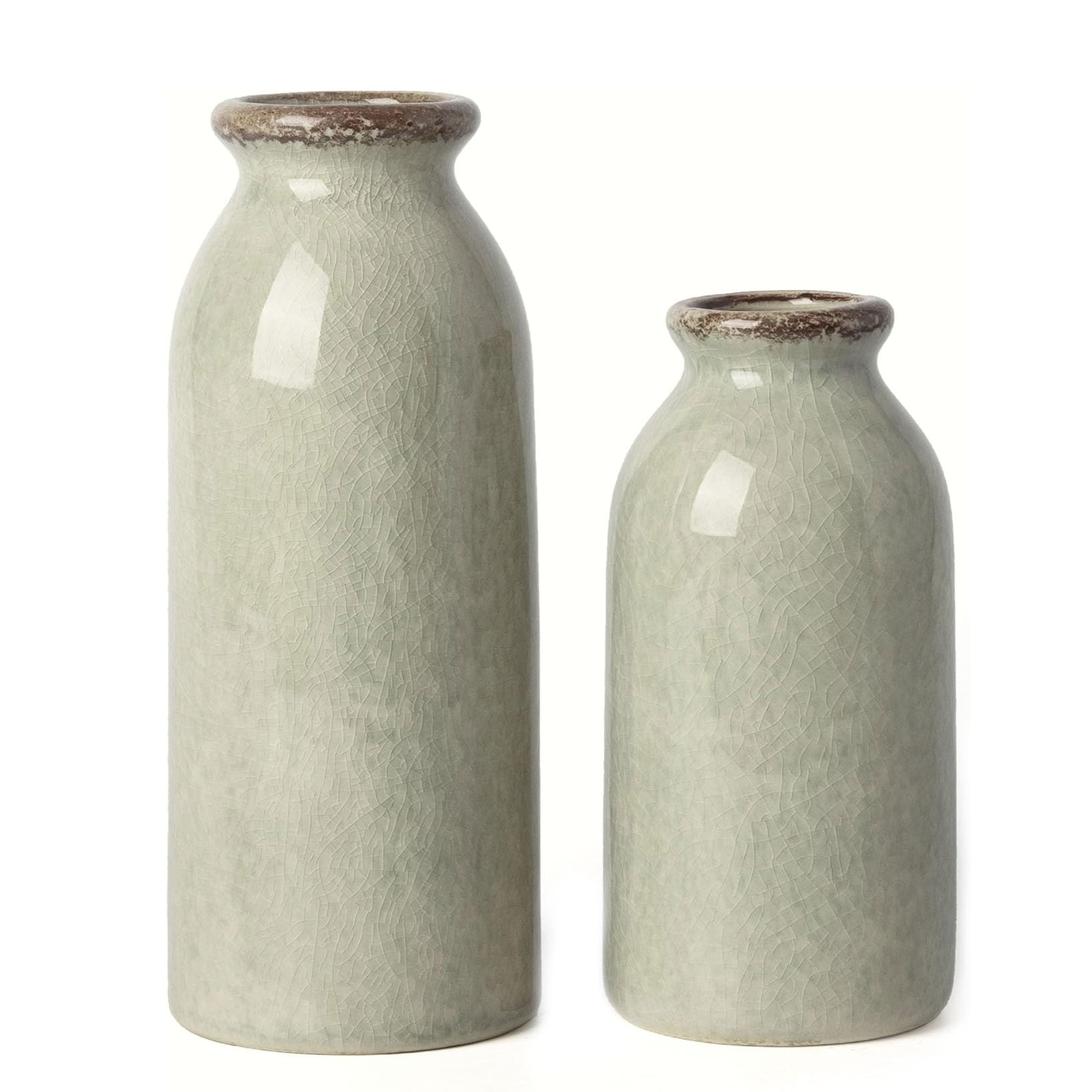
If painting your whole room green is not on the agenda, why not decorate with green furnishings and accessories instead? These delightful gray-green ceramic pots are just what you need to add a dash of this enduring color. Fill with Baby's-breath or eucalyptus for a calming aesthetic.
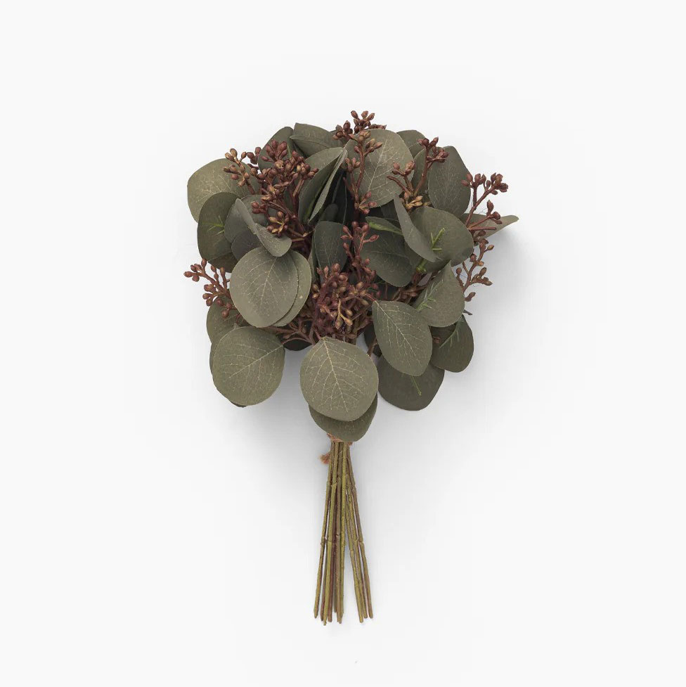
Ideal for styling with your gray-green vase, the life-like eucalyptus branches display the natural beauty of real eucalyptus found in nature. Full of texture and interest, the delicate bunch is guaranteed to bring life to your kitchen styling.
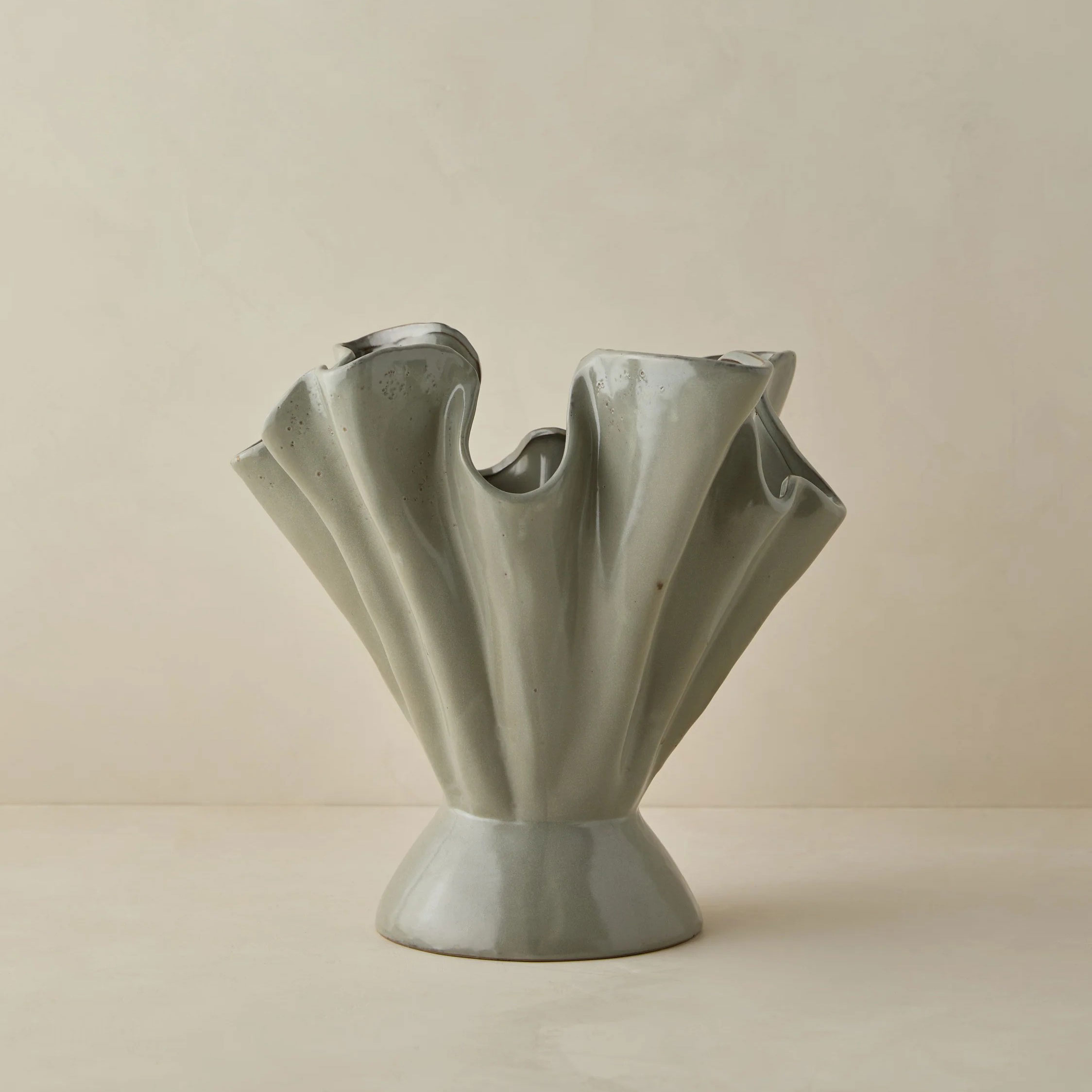
Add texture and dimension to your kitchen counterop or shelf decor with this on-trend ruffled stoneware vase in a gray-green colorway. The reactive glaze creates an eye-catching finish unique to each decorative piece. The Darcia will instantly make your kitchen look better.