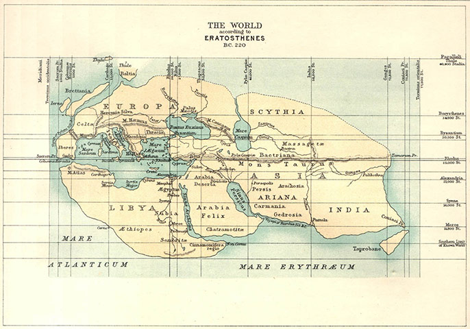
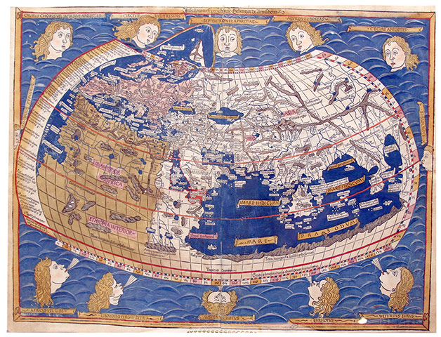
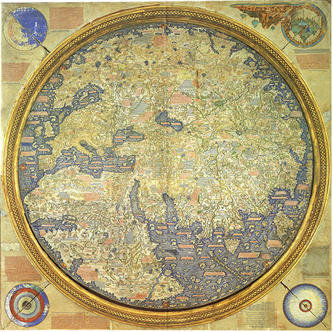
The World According to Eratosthenes – Eratosthenes (born 276 BC) began his treatsie Geographica shortly after becoming the third Librarian at The Great Library of Alexandria. His world map was drawn in about 194 BC. No contemporary version exists, this reproduction was made for a Victorian audience. Resembling a dinosaur skull it shows three recognisable continents: Europe to the north-east, Africa (described as Libya and Arabia) beneath it and Asia to the east, with the equator running through RhodesPhotograph: Courtesy of Profile BooksPtolemy's classic map of the world – Claudius Ptolemy, who lived between 90 and 170 AD, was arguably the world's first modern cartographer, with his Geographia listing thousands of cities and other locations. This interpretation of his map of the world, rendered in 1482 by German engraver Johannes Schnitzer of Armsheim, was drawn up along scientific principles – with lines of longitude and latitude, and a clear understanding of the spherical shape of the earth. Photograph: Courtesy of Profile BooksThe Fra Mauro map of the world – Mauro lived and worked on the Venetian island of Murano. His map of the world contains almost three thousand place names and a vast amount of explanatory text, and although it contained the usual misplaced rivers and regions, it is seen as a geographical masterpiece. Hovering between the old world and the new, and between the medieval depection of the earth as one round planisphere and the dual-hemisphere projection that emerged in the sixteenth century. Naval and trade charts drawn on his own travels were used in its making, but the descriptions of China, Japan and Java derived primarily from the travels of Marco Polo. A copy of the original, made for a Venetian lord, is displayed in the Biblioteca Marciana in Venice.Photograph: Profile books
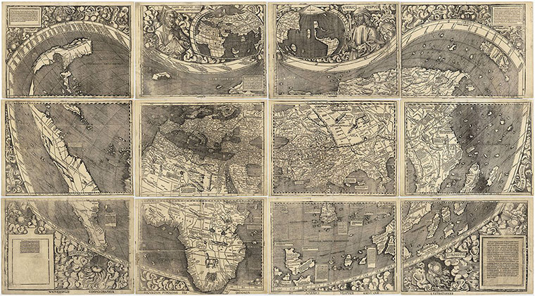
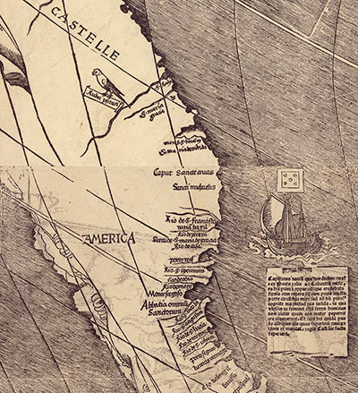
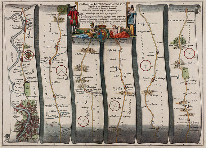
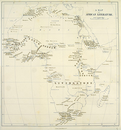
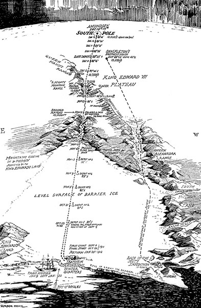
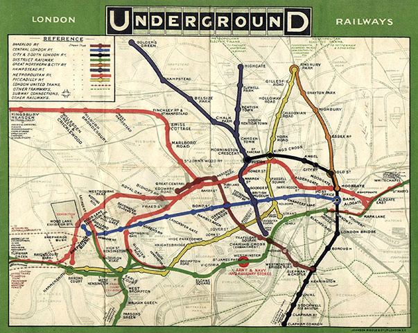
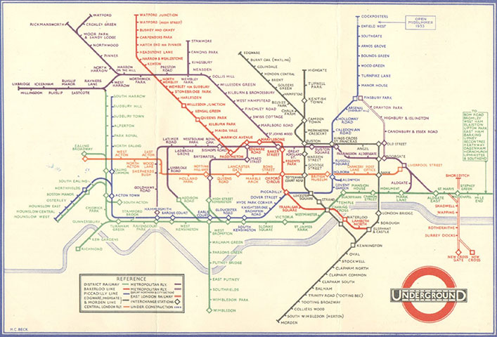
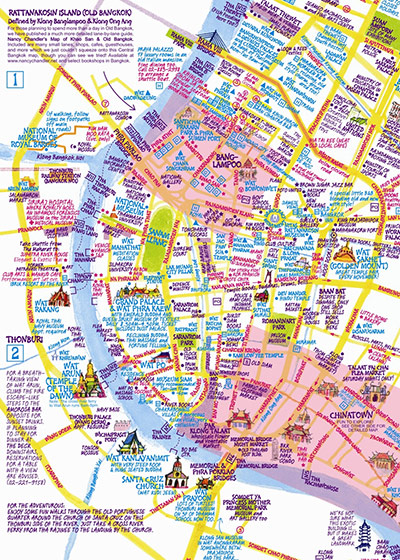
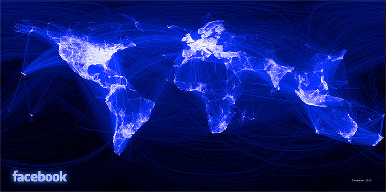
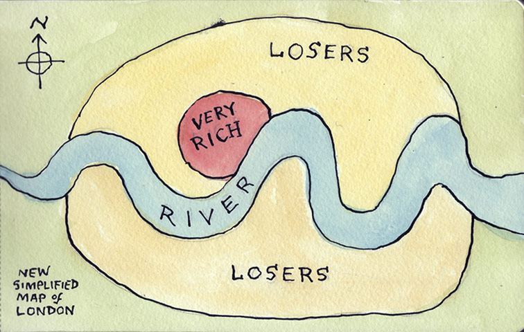
Waldseemüller map – consisting of 12 woodblocks, each showing a different section of the world, the Waldseemüller map, named after its principal draftsman, is roughly 8ft by 4ft when pieced together. Perhaps a thousand were printed at the beginning of the sixteenth century but only one copy survives, bought in 2003 for $10m – the highest sum ever paid for a single map – by the Library of Congress in Washington DC.Photograph: Courtesy of Profile BooksWaldseemüller's map – Made in 1507, Waldseemüller's map included a new continent in the western hemisphere: controversially named America (and not Columbus), and described as a land "of which the ancients make no mention." America was named after Amerigo Vespucci, a Florentine navigator who for a while worked for a bank in Seville that provided some of the funds for the early voyages of Christopher Columbus (Waldeseemuller was influenced by letters circulating at the time suggesting Vespucci landed on South America first). In a later map he labels South America Terra Incognita, but it was too late – the name America had already begun to appear on other maps, and it stuck.Photograph: Courtesy of Profile BooksJohn Ogilby's route from London to Cornwall – After the Great Fire of London, it became an imprisonable offence to depict the damage caused by the fire, but sketches and plans for a new city were widely encouraged, and several mapmakers set to work. Ogilby was by far the most ambitious. A large and Accurate Map of the City of London Ichnographically Describing all the Streets, Lanes, Alleys, Courts, Yards, Churches, Halls and Houses ... was first sold in January 1677. But this was only part of his grander Britannia project, a collection of 100 lavishly designed strip maps (the image here shows a detail of the route from London to Cornwall). They contained not only distances, but also suggestions as to where to stop for the night. It was one of the very first road atlases, and much copied.Photograph: Courtesy of Profile BooksLiterature of Africa – William Winwood Reade drew this thematic map of the Literature of Africa, a textual display showing where the key explorers of the late-eighteenth and nineteenth centuries had travelled – one of the earliest infographics. David Livingstone, the first to traverse the central width of the continent, straps the map like a belt, while Mungo Park and the French explorer Rene 'Caillie' both curve around the Niger. Stanley had located the fading Livingstone near the shore of Lake Tanganyika by the time the map was drawn, but he was yet to set off on his own big discoveries to Lake Victoria and beyond, so barely features.Photograph: Courtesy of Rare Books Division, Princeton University LibraryAmundsen's route to the pole – Antarctica has long been described as the last place on earth to be mapped, and vast areas remain cartographically white and silent. This map, compiled by Englishman Gordon Home from telegraph reports, appeared in a book by Roald Amundsen published in 1912. Its principal attraction is narrative, with the map serving as a vivid adventure diary. Members at the Royal Geographical Society would not have been amused by the fact that Scott and Co had apparently yet to reach the pole.Photograph: Courtesy of Profile BooksThe first A-Z – The first A to Z Atlas and Guide to London and Suburbs with House Numbers Containing Large Coloured Map Giving 23,000 streets' was published in the mid 1930s. Myth has it that its creator, Phyllis Pearsall, trudged along those 23,000 streets herself, painstakingly documenting them on index cards which she arranged in alphabetically order and kept in shoe boxes. The reality was more prosaic; she relied primarily on information from the Ordnance Survey and local councils. The map was rejected by most outlets apart from WH Smith which ordered 1,250 copies. Within weeks, she was receiving orders from every railway station bookstall in the south of England. Photograph: Cassini PublishingEarly Underground map, 1908 – before Harry Beck's circuit diagram overhauled its geography, the free pocket maps were inconsistent and chaotic, although frequently beautiful. Because the lines were owned by different companies, they often refused to acknowledge the existence of other lines, making changing trains a lottery.Photograph: London Transport MusuemBeck's circuit diagram of London Underground – Harry Beck's graphic and non-geographic interpretation of the underground network, for which he was paid a few pounds, has become one one of the most enduring symbols of London. Only a map in the loosest sense, it has inspired many artists and satirists to create their own interpretations, most famously Simon Patterson’s Great Bear from 1992, which replaced station names with footballers, philosophers and Hollywood film stars. Photograph: Courtesy of London Transport MuseumNancy Chandler's 3D map of Bangkok – Numerous academic studies have found no truth in the stereotype about men being better map readers than women. But some conclude that men design maps for other men, and that women read maps differently, using landmarks and fixtures to navigate, rather than broad spatial cues (large areas and flat lines). Nancy Chandler has been producing highly successful '3-D' maps of Thailand for the past two decades. They look crowded and chaotic but feature hand-drawn landmarks and useful text, as well as colour coding for different attractions. Her maps are bought and used predominantly by women. Photograph: Courtesy of Nancy Chandler, nancychandler.netFacebook's world map – in December 2010 Facebook released a new map of the world that was as astonishing as it was beautiful. Using the company's central data on its members, an intern called Paul Butler had taken their latitudinal and longitudinal coordinates and linked those to the coordinates of the places where they had connections. Facebook had about 500 million members at that time, so Butler anticipated a bit of a mess; instead not only were the continents visible, certain international borders were apparent as well (but note the virtual absence of China). It was the embodiment of what Facebook founder Mark Zuckerberg had said. "The idea isn't that Facebook is one new community, but it's mapping out all the different communities that exist in the world already".Photograph: Courtesy of FacebookThe New Simplified Map of London – The digital revolution may have transformed mapping, but even in the age of the infographic, sometimes it's the simplest, quirkiest hand-drawn maps that reveal the grreatest truths, like this one created by a user on a Flickr site devoted to 'maps from memory'.Photograph: Ellis Nadler
Sign up to read this article
Read news from 100’s of titles, curated specifically for you.