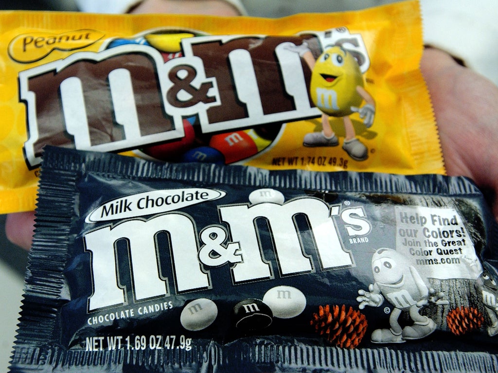
M&M characters have received makeovers to fit into a “more dynamic, progressive world,” candymaker Mars Wrigley has announced.
The new designs are supposed to be more community-oriented and to focus more on the characters’ “personalities, rather than their gender”.
In 1997, the green M&M was given white go-go boots, which have now been replaced by “cool, laid-back sneakers to reflect her effortless confidence,” according to the company.
The redesign comes after Mars has been criticised for the green M&M’s focus on being sexy in their marketing.
The company said the green M&M will be “better represented to reflect confidence and empowerment, as a strong female, and known for much more than her boots”.
The new marketing strategy will also show the green M&M and the brown M&M having a better relationship to show a “force supporting women”.
They will be “throwing shine and not shade,” the company added. At times, the green and brown M&M’s have been adversarial in ads, at other moments they have been friendly, and at yet other times they have been seen as more than that, such as in a viral tweet from 2015 in which they can be seen holding hands on a beach.
While the brown M&M won’t lose the heels, they will be lowered, the company said.
Mars said the orange M&M is “one of the most relatable characters with Gen-Z,” because it’s the “most anxious generation”.
They said the character will “embrace his true self, worries and all,” but added that the shoelaces will be tied, in line with the carefulness of the character.
The red M&M has been seen as a bully in previous marketing, but will now be more friendly in the updated campaigns.
M&M will also move away from having the same proportions to include all shapes and sizes of the sweets in their ads.
The company said these interventions are aimed at showing the value of “self-expression” and the “power of community”.
The president of Mars Wrigley North America, Anton Vincent, told CNN that they’re trying to make the characters more “current” and “representative of our consumer”.
He said the new shoes are “a subtle cue, but it’s a cue people really pick up on”.
The logo will now stand up straight instead of resting on its side, to emphasize the ampersand.
While the changes are small, the co-founder of marketing company Metaforce, David Camp, told CNN that “every brand has to continuously reinvent itself to remain relevant”.
M&Ms were introduced in 1941 and the characters started being used to market the sweets in 1954. Red and yellow M&Ms were initially used to advertise the regular and peanut versions, but other characters joined in the 1990s with brown being added in 2012.
Mr Vincent said the company aims to show “a little bit more gender balance” in their marketing and that the changes “gives us a good platform to talk about the whole idea around belonging”.
He added that the company is going to “focus on the characters as it relates to the total brand, and then building ourselves a platform to be able to advocate and talk about this idea”.


