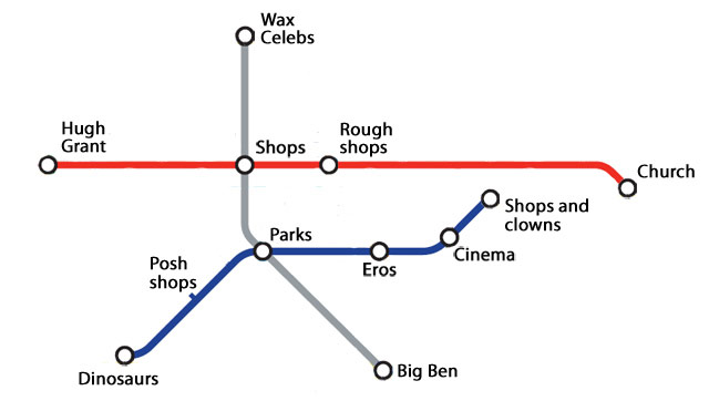
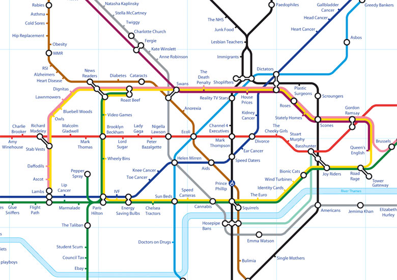
Just the basics. The Londonist reduced Tube map. Photograph: LondonistThe Daily Mail's map of outrage by The Poke. Says Londonist: "The Piccadilly stops, for example, are all forms of cancer, including immigrant cancer and Facebook cancer … Hammersmith and City pink, meanwhile, is reserved for blue-top favourites such as house prices, Kate Middleton and swans." Full sizePhotograph: The Poke1974 spoof from Monty Python. Full sizePhotograph: Great Wen
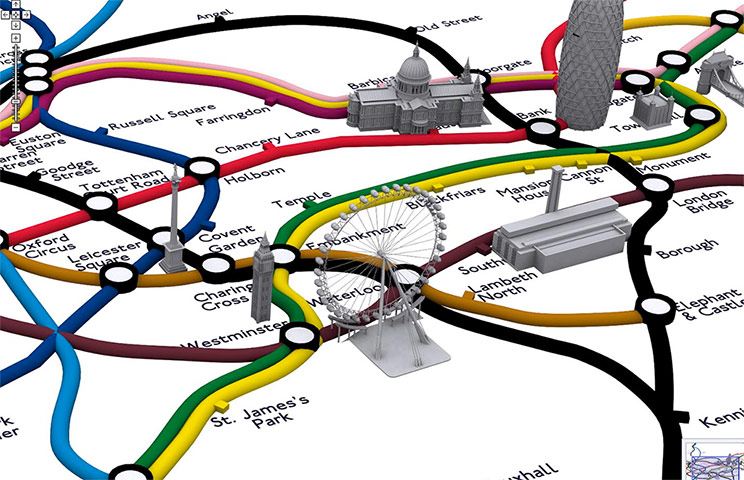
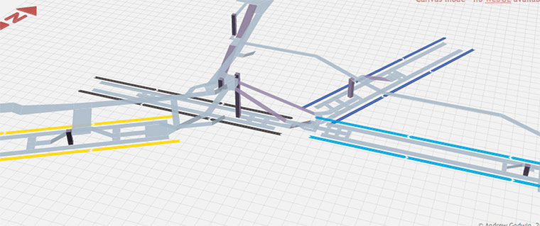
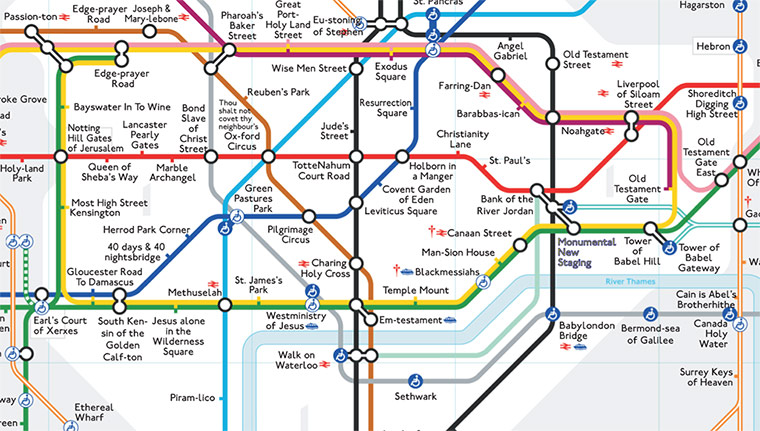
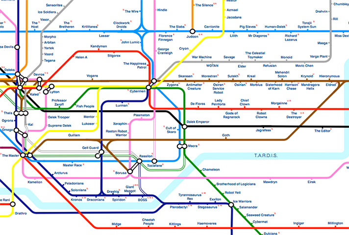
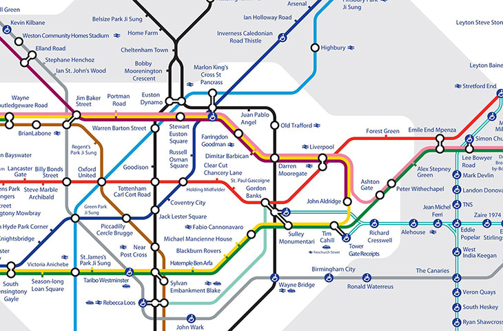
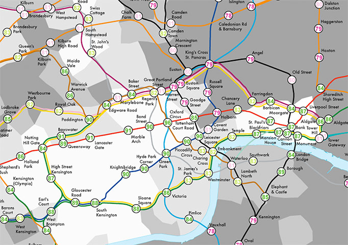
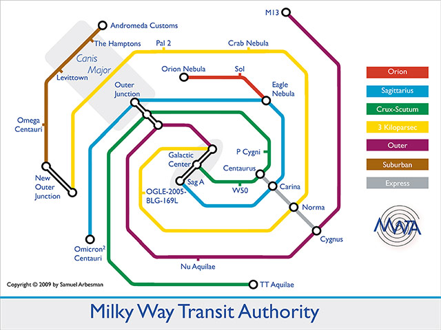
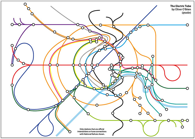
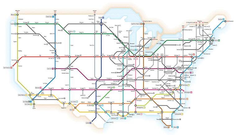
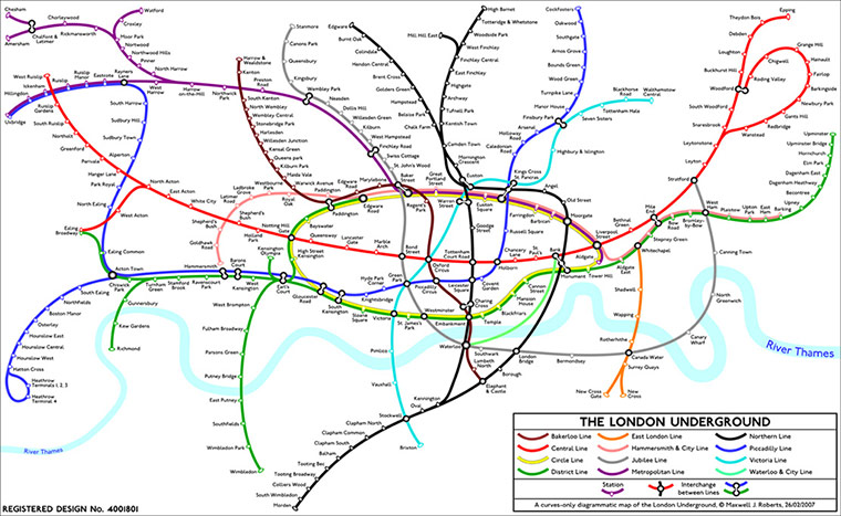
There have been a number of attempts to show tube stations where they really are but this map by Andy Hudson-Smith of the Digital Urban blog goes one step further by rendering landmarks too. Full sizePhotograph: Andy Hudson-SmithLondon's underground labyrinths are hard to imagine from the surface, so what do they really look like? Andrew Godwin created this project based on his knowledge of the stations themselves - and while they might not be architecturally 100% correct, they do illustrate the layouts of these huge underground hubs. And it's wonderfully rendered in HTML5. Full sizePhotograph: Andrew GodwinThe fleshpots of the capital given a religious makeover by James Eaglesfield, drawing on Bible references. Full sizePhotograph: James EaglesfieldThe Tube map for Doctor Who fans by Crispian Jago. Full sizePhotograph: Crispian JagoMap by the Football Supporters Federation. Can you find Rebecca Loos? Full size Photograph: FSFMap in the style of Charles Rennie Mackintosh at the time of his death in 1928. It's by Maxwell Roberts with sets of parallel lines, squares and exaggerated right angles that are the hallmarks of the early twentieth century Scottish designer. Read morePhotograph: Maxwell RobertsUCL academic James Cheshire has found a way to make the tube map meaningful again. His Lives on the Line project takes ultra local-level life expectancy data and maps it with London's underground stations - see how it varies across the capital. Full sizePhotograph: James CheshireHarvard's Samuel Arbesman created this image of the Milky Way in the style of the Tube map. "Our galaxy is unimaginably vast, and we really have no idea what is out there," he says. "This map is an attempt to approach our galaxy with a bit more familiarity than usual and get people thinking about long-term possibilities in outer space." Full sizePhotograph: Samuel ArbesmanWhat difference did adding the London Overground to the network make? This map by Oliver O'Brien shows Transport for London's network and the main intersections - all joined together. Says O'Brien: "I was also thinking about physics when creating the diagram – specifically Feynmann diagrams, bubble chamber traces, particle physics collisions, magnetic flow lines and electrical circuit diagrams. Hence why I’ve called it the Electric Tube." Full sizePhotograph: Oliver O'BrienEisenhower's US Interstate road system by Cameron Booth. Full sizePhotograph: Cameron BoothAll the diagonals and zig-zags replaced by lovely curvy lines by Maxwell Roberts. Read morePhotograph: Maxwell Roberts
Sign up to read this article
Read news from 100’s of titles, curated specifically for you.