The world of branding is filled with jargon – especially when it comes to the language of logos. Whether wordmark, icon or symbol, each iteration has its own unique qualities and purposes to fit particular projects, so it's best to know your brandmarks from your emblems when you're working in the design sphere.
While the terminology often gets thrown around interchangeably, knowing how and when to implement each unique logo style can be crucial to capturing the right style for your project. In this back-to-basics guide, we'll walk you through some of the most common design terms, covering what they are and when to use them (check out our best free logo maker guide and tips on how to design a logo if you're starting from square one).
What is a logo?
- In a nutshell: Graphic that identifies a brand
Let's start with the fundamentals. What actually is a logo anyway? We'll define it as a single, simple design that represents and identifies a brand.
Essentially, a logo is the cornerstone of a brand's visual identity, serving as a recognisable representation across all marketing and branding efforts.
Note that 'logo' is an all-encompassing term which can take many forms, including wordmarks, symbols, icons, or a combination of these elements. For some choice examples, check out our guide to the best logos of all time.
What is a brandmark/symbol logo?
- In a nutshell: Text-free logo
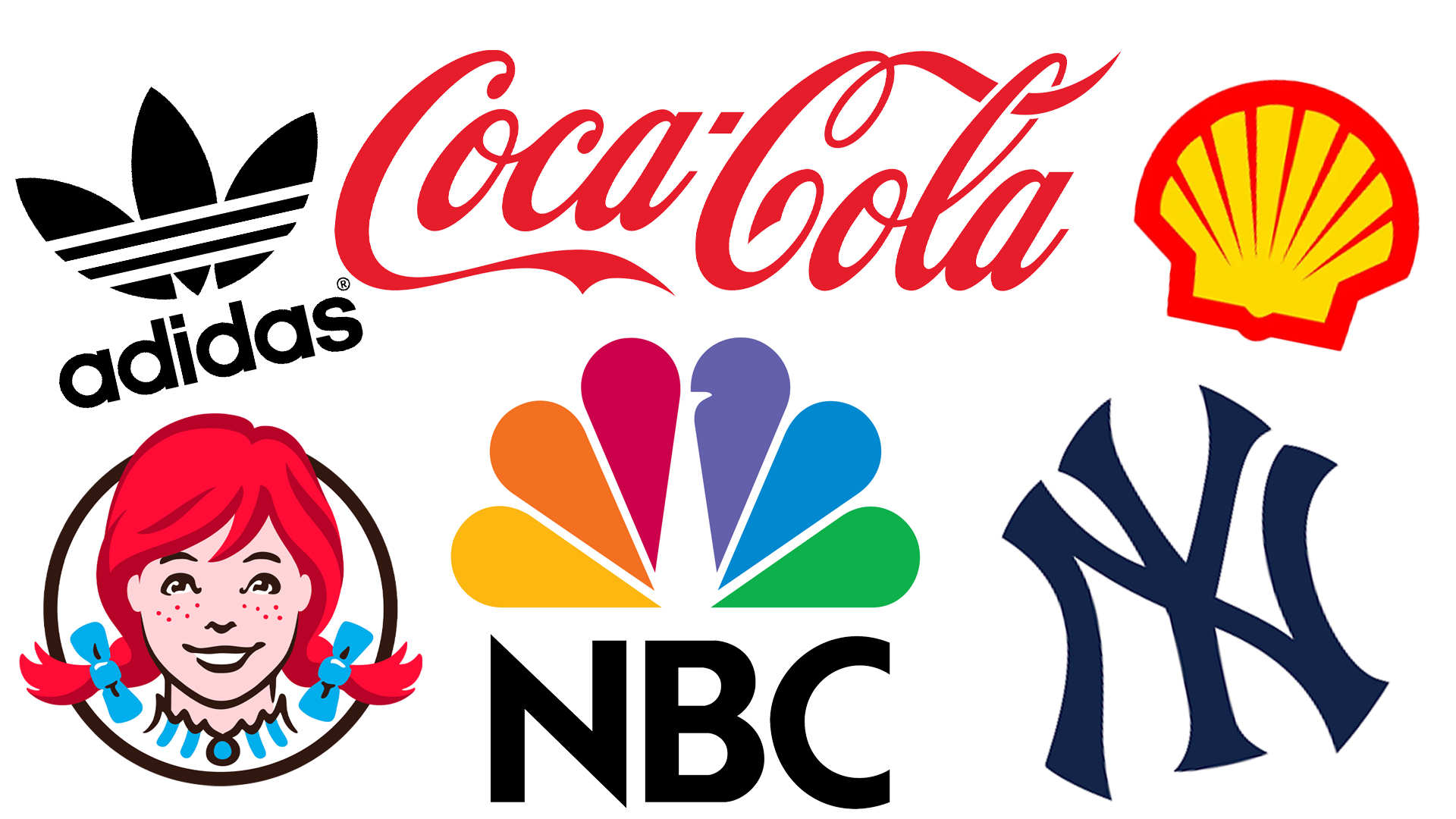
A symbol logo or brandmark is a logo that's purely graphic. In other words, it's a visual metaphor that conveys meaning without relying on words.
Brandmarks can be abstract or representational and are often used in conjunction with wordmarks or lettermarks (see below) to create a cohesive logo design. Well-known examples include the Snapchat ghost, the Instagram camera icon, the Target bullseye and the Nike swoosh. For more details, see our article famous textless logos and why they work.
Remember, though, that not all symbols are symbol logos. For example, the representations of different genders you might see on a bathroom door are symbols, but they're not symbol logos because they represent an idea rather than a brand.
What is an icon?
- In a nutshell: Not a logo
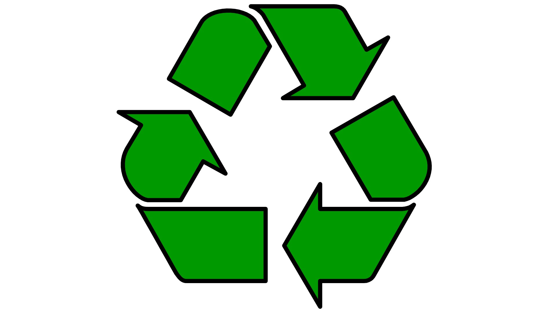
In graphic design, an icon is a simple image that represents something else. Icons are often used in digital applications, such as app icons, website favicons, or social media profile pictures, as well as in physical spaces. Icons can be abstract or literal representations of a brand's product, service, or concept. They're typically flat, minimalistic, and highly stylised.
Well-known examples of icons include the recycling symbol, the power button and the play button. Emojis are also icons: in fact, they used to be called emoticons. If you need to make an icon yourself, see our article on killer icon design tips.
It's worth noting that sometimes, a symbol logo can be used as an icon. For example, the Apple symbol logo is often used as an icon within the iPhone interface. So in other words, an icon can be a logo, but that doesn't mean all icons are logos.
Unfortunately, the language police can't get everywhere, and so you'll sometimes read or hear people talking about "icon logos", when referring to symbol logos being used as icons, such as the Apple example we just gave. However, this is not a commonly accepted term, so mind you don't use it yourself.
What is a wordmark/logotype?
- In a nutshell: Text logo
A wordmark or logotype is a logo made entirely of text, typically the brand or company's name. The focus is on the typography, using font style, colour and spacing to create a distinct and memorable brand identity. This type of logo is commonly used by companies that prioritise the brand name as the primary visual identifier.
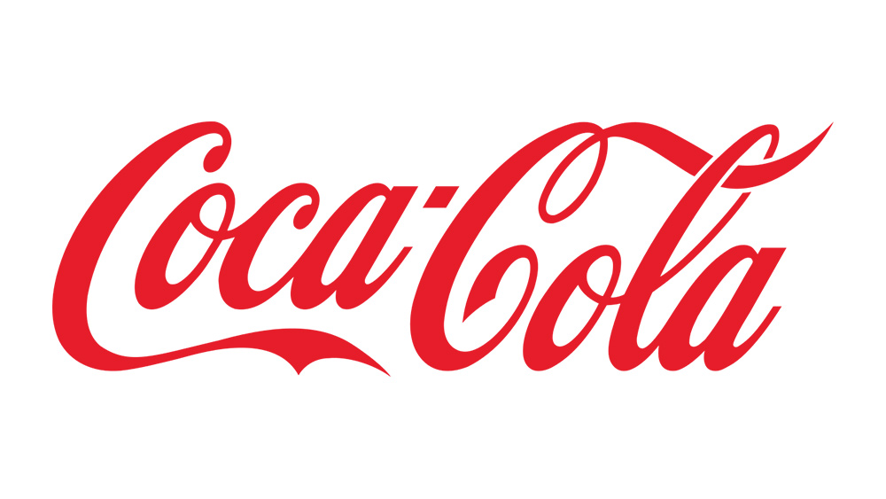
Well-known examples include Google's multicoloured wordmark, Netflix's curved workmark, Coca-Cola's script wordmark, Disney's signature style wordmark and Sony's capitalised wordmark. You'll find some of the finest in our roundup of the best typographic logos.
What is a lettermark/monogram?

- In a nutshell: Logo made with 1-2 letters
A lettermark or monogram is a logo design that consists solely of a few letters; typically the brand's initials. These highly simplified logos are useful in situations where space is limited or when the brand is very well-established and recognisable by its initials alone.
Well-known examples of lettermarks include the two linked C's of Chanel, the combined L and V of Louis Vitton, and the N/Y combination of the New York Yankees. For more, see our roundup of the best monogram logos.
At what point a lettermark becomes a wordmark is quite fuzzy. Some designers refer to logos with three or even four initials, such as the HBO or NASA logos, as a lettermark, while others keep the definition to two. We count ourselves among the latter, though as far as we can see there's no universally agreed rule here.
What is a brandmark?

- In a nutshell: Logo combining graphic + wordmark
A brandmark is a combination of a symbol and a wordmark, forming a comprehensive logo design. This term is often used interchangeably with 'logo' as it combines both the graphical and textual elements that represent a brand.
Well known examples include the full versions of the Adidas logo (trefoil + wordmark), Dove logo (dove symbol + wordmark), the Apple logo (half-eaten Apple + wordmark) and Amazon logo (wordmark + smiling arrow).
What is a combination logo?
- In a nutshell: Complex logo
A combination logo or mark is a logo design that incorporates multiple elements, such as a symbol, wordmark and tagline. This type of logo is often used when a brand wants to convey a more complex message or identity, combining both visual and textual elements in a unified manner.
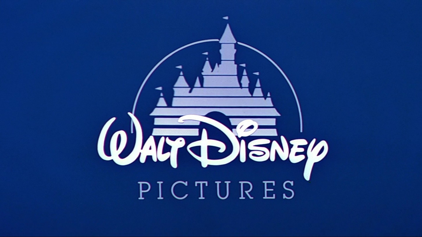
The difference between a combination mark and a brandmark is quite subtle, then, and basically comes down to the level of complexity. Examples of combination marks include the full versions of the KFC logo (wordmark + Colonel Sander's illustration), Domino's Pizza logo (wordmark + multi-sectioned domino graphic) and the Walt Disney Pictures logo (wordmark, Cinderella's Castle graphic and bold, curved line).
What is a logo lockup?
- In a nutshell: Specific arrangement of logo elements
A logo lockup refers to the specific arrangement and spatial relationship between the various elements of a logo, such as the symbol, wordmark and tagline. It ensures consistent and proper usage of the logo across different applications and media, and is typically used in defining brandmarks or combination logos.
What is an emblem logo?
- In a nutshell: Logo with border
An emblem logo is a logo that encloses elements within a specific shape or border, such as a circle, shield, or crest. This type of logo is often associated with traditional or heritage brands, lending a sense of authenticity and longevity.
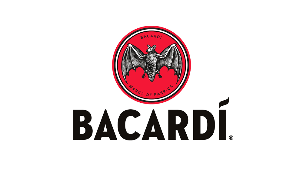
Examples include the Harley-Davidson emblem logo, which features the motorcycle brand's name within a shield, with wings spread out above it; the Warner Bros emblem logo, which features the WB initials superimposed on a shield; the Bacardi rum emblem logo, which features a bat device within a shield; and the Manchester United FC logo, featuring a devil holding a pitchfork within a shield.
What is a mascot logo?
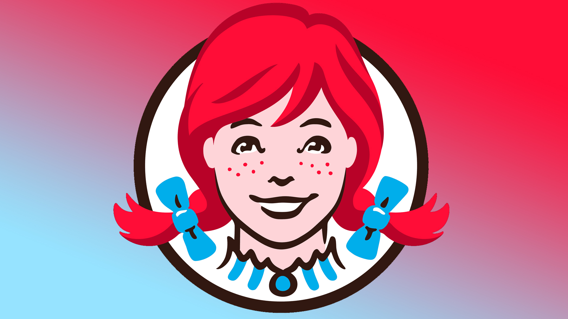
- In a nutshell: A brand personified
A mascot logo is a character or personified representation of a brand's identity or values. Mascot logos are commonly used by sports teams, educational institutions, or companies targeting children or families. They can be highly recognisable and memorable, helping to create a strong emotional connection with the brand.
Examples of mascot logos include the Pringles logo, which features the head of a moustachioed man; the Wendy's logo, which features the eponymous young girl with pigtails; the Quaker Oats logo, which features a smiling Quaker figure; and the Monopoly logo, which features a rich man in a top hat.