
As chosen by our judges, a panel made up of Livingetc’s senior editorial team. Global brand director Sarah Spiteri, executive editor Pip Rich, editor (digital) Hugh Metcalf and deputy editor (print) Ellen Finch sifted through all the many, many entries. Here, the brand's lead creatives explain how best to use these award-winning designs.
Best paint colour: Mochi by Little Greene
Creative director Ruth Mottershead reveals the versatility of this neutral shade
Mochi is a warm neutral with just a hint of pink that brings an element of lightness and elegance, making it an incredibly versatile colour. It offers a natural backdrop, and yet still has character and personality, creating a soothing and gentle environment. It works harmoniously in restful spaces, such as a bedrooms or sitting rooms.
Because Mochi is so versatile, it allows you to add deeper accent colours or gentle fresher whites to help zone areas. Consider pairing with deeper brown like our Scullery on skirting and doors and bright white like our Shirting on the ceiling. Alternatively, bring out the sweeter pink tones by pairing with other pinks, or highlight the earthier tones with gentle greens or cool greys.
Perfect for use in ‘all-over’ schemes in both contemporary and traditional settings, this delightful neutral hue works really well in a colour-drenched room as an alternative to white, grey or stone.
best paint collection: The Art of Nature by House of Hackney
Frieda Gormley, co-founder, explains how to work with this palette
Nature was our muse for this collection of around 60 paint colours, taking inspiration from the earthy pigments of our garden in Cornwall and ensuring that we have harmony, too.
There are no rules to pairing them – everything here works with everything else. But I do love colour washing – taking the same colour over the dado, coving and ceiling rose. If you’re pairing any of these with our wallpapers then I’d suggest picking the background colour seen in the print for use as the paint on the walls.
We’re known for greens, and I’m a huge fan of Nephrite (above), which I’ve painted most of my house in. It’s dark and grassy – pair it with Astera, a rich cream.
Or err towards our plaster palettes, where roseand fungi colours come together. They make rooms very architectural, and turn spaces into places you can scheme and dream.
BEST PLAIN FABRIC COLLECTION: Linara by Romo
Emily Mould, director of Design and Excellence at The Romo Group, on the adaptability of this collection
Linara is loved for its irresistible peach-skin texture, which is wonderfully soft to the touch, as well as its versatility. With an incredibly supple handle, beautiful drapability, relaxed look and extremely practical nature, Linara is equally stunning as drapes as it is on upholstery. We see it on everything from sofas and curtains to bedspreads, bedheads and dining chairs.
The Linara palette is ever-evolving, with 25 new shades recently added. These fresco-style tones, such as Tawny, Soft Jade, Hoya and Copper, are the perfect foundation for calm and restful palettes or can be layered with bolder and brighter tones and patterns for a more playful look.
See the full Linara collection here
BEST FABRIC: Baléares Paloma by Élitis

Artistic director Ariane Dalle on using this beaded fabric
This fabric warms the atmosphere around it, immediately dressing up the room it’s in. Its blend of cotton, linen and wooden beads is unique. It’s only suitable for curtains, and comes in a width of 142cm – I’d advise you to enjoy the beauty of its craftsmanship and the play of its irregular lines.
See more of Baléares Paloma here
Best Textured Fabric: Classic Bouclés by Johnstons of Elgin
Amanda Jack, head of Home, opens up about the allure of bouclé
Made with 100% wool and woven in our Scottish mills, our bouclé fabrics are ideal for all upholstery and soft furnishings. Available in 10 colours, they are soft enough to accentuate any shape or style, and the subtle variations in texture create a captivating play of light and shadow, adding depth and dimension.
See more of the Classic Bouclés here
BEST PANEL WALLPAPER DESIGN: La Perle by Arte
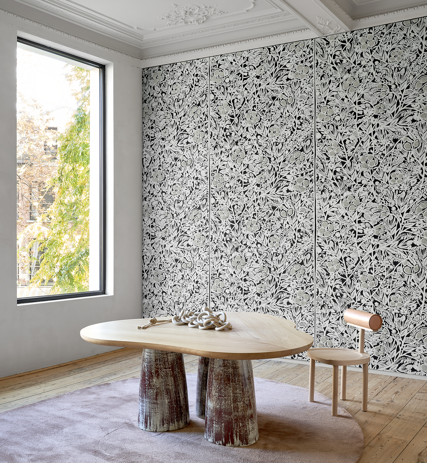
Arte’s Philippe Desart on the joy of this graphic mural
The La Perle design is a beautifully layered wallcovering with such depth of painstaking attention to detail, with hand embroidery and elegant stitching a key part of the lengthy design process. Like in haute couture, the hand-finished elements of this design add a touch of sophistication and unique detailing. It is a showstopping design that creates an instant focal point, whether it is across just one wall or the entire room.
With such a striking design it is a good idea to begin with this wallcovering as the starting point for a scheme. It is heavily patterned but the colour palette is restrained within a monochromatic combination, making it surprisingly easy to scheme with. Choose colours from within the monochromatic palette, or for an injection of personality why not add an additional pop of colour into the mix? The stylised floral detailing is very flexible and looks fantastic with modern furniture, as well as providing a brilliant contrast to striped or plain upholstery and furnishings.
BEST INNOVATION IN DECORATING: The Imprint collection by Weitzner
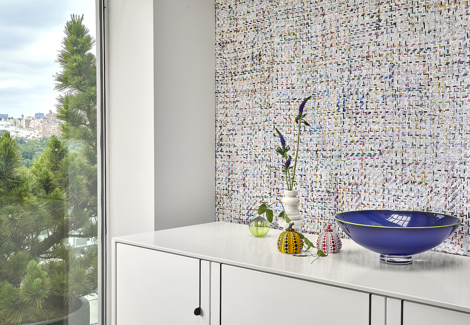
Founder Lori Weitzner explains how she’s moving decor forward
Innovation, for me, comes in many forms. But in our work, it
often involves reimagining classically beautiful designs and materials and imbuing them with technical features.
We always want to push the envelope on what a textile or wallcovering can be because that is the innovation that inspires us and our clients. We focus on the creation of new and often unexpected designs. It’s that twist that makes a product desirable.
Up to Date [above] is one of my favourites in the collection. It uses
the ancient handcraft of plaiting, combined with machine technology to paperback. It recycles used magazines and most importantly, it supports an artisan community.