
The Princess Diana Accessory Meghan Markle Keeps Styling Into Every Celebrity Look
Meghan Markle's navy Ralph Lauren gown and Princess Diana's Cartier watch prove that the best celebrity style moments are built on meaning, not just money.
Firearm Seizures in Mexico More Than Double Under Claudia Sheinbaum's Administration: Report

Estimates from Mexican authorities suggest that up to 500,000 firearms are smuggled annually from the U.S. into Mexico, though former agents from the Bureau of Alcohol, Tobacco, Firearms and Explosives believe the number could reach 1 million.
Hundreds of titles - just one subscription!

On sale for a limited time only, get 25% off for the first 3 months.
How Orlando City Could Line Up With World Cup Winner Antoine Griezmann

The Atlético Madrid star is set to join the MLS side after the World Cup this summer.
CDC dilemma: Nominee may need both MAHA and science chops
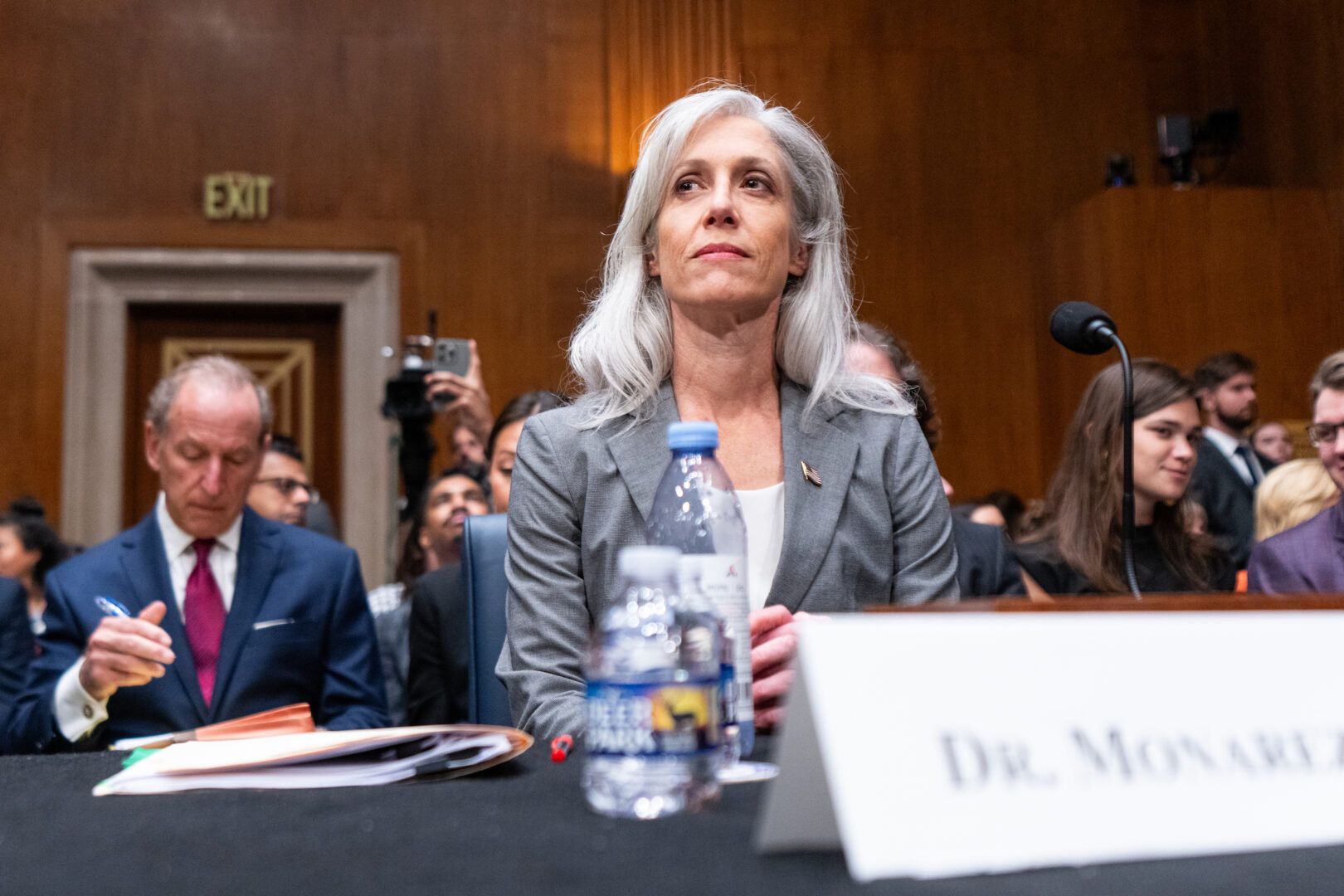
As a deadline arrives this week to nominate a Centers for Disease Control and Prevention director, some Republicans are skeptical the administration will find someone who can check all the boxes necessary for confirmation. The candidate will need the “Make America Healthy Again” mindset of Secretary Robert F. Kennedy Jr.’s…
Inside Prom Trends 2026: NYC High School Students Predict the Next Teen Fashion Style Wave

NYC teens spill: Hottest prom trends 2026 in teen fashion style. From dresses to accessories, get the looks high schoolers are obsessing over.
Pentagon to issue new press credentials and remove media offices after court ruling

Journalists will now work from an "annex" situated on the Pentagon grounds but outside the main structure
Pentagon revises rules for journalists after lawsuit loss, raising press group's ire
Press groups accused the Trump administration of placing fresh restrictions on journalists with the new policy.
Couples share 30% of their gut bacteria. Here’s how that may affect health

When living with a partner, you might be sharing more than just the same home, lifestyle and interests. You might also share various microscopic organisms residing on and in you.
How Much Money Did Netflix Lose Over Meghan Markle’s Deal? An Insider Speaks Out

That's a lot of zeroes.
Trump’s sanctions against a UN human rights expert show free speech is dying

Francesca Albanese recommended ICC arrests and investigations over Gaza. Who will be the administration’s next target?

A pink veil across the fields: Thousands flock to Greece’s peach blossoms
A veil of blossoming trees unfolds each spring across the plains of Greece’s largest peach-producing region
"If it were made today, it would sound like Green Day or a metal band." How a neurotic 19-year-old and a guitarist with a razor created the blueprint for metal and punk

The story of the song that schooled Metallica's James Hetfield
Hundreds of titles - just one subscription!

On sale for a limited time only, get 25% off for the first 3 months.
Canary : A Beautiful Singing Bird for Your Home

What Colors Are Canaries? <p>A stunning red canary displaying its rich, vibrant plumage, known for its unique color and cheerful singing that brightens any home.</p> In the wild, canaries flaunt a vibrant yellow color with undertones of green and black. In captivity, you'll discover that canaries appear in three common…
Van Morrison to receive Jazz FM lifetime achievement award

The Belfast-born musician has released more than 40 studio albums across more than six decades.
This is the best spot to plant jasmine and turn a wall or fence into a fragrant floral display this summer

Encourage as many blooms as possible!
Banana vs Dates: Which Gives More Energy? Full Comparison

Both bananas and dates are highly nutritious fruits that are commonly found in most Indian households. In fact, being natural sweeteners, these fruits are frequently used for preparing snacks and smoothies as well. However, a question that continually arises, especially among fitness enthusiasts, is whether bananas or dates are better…
Plant-Based Diet for Heart Reversal, Cholesterol Reduction, and Easy Recipe Ideas Backed by Research

Discover how a plant-based diet may support heart reversal, cholesterol reduction, and long-term heart health, plus practical recipe ideas inspired by emerging research.
As demand for GLP-1 pills and shots surges, healthy habits are still key

Use of blockbuster anti-obesity drugs like Wegovy and Zepbound is growing, with about 1 in 8 adults in the U.S. saying they currently take the medications
Bird Enrichment: Toys And Activities For Captive Birds
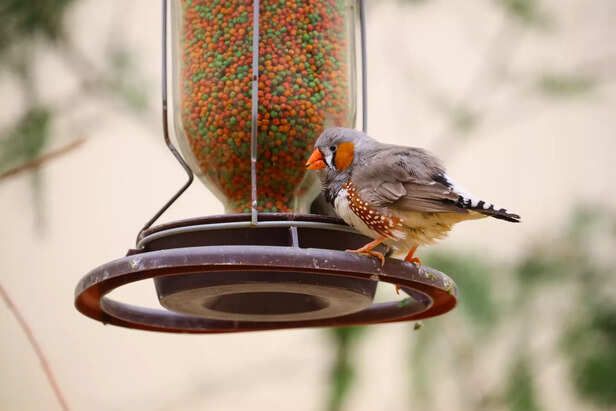
Birds are highly intelligent and social creatures. In the wild, they spend most of their day foraging, exploring, and interacting with other birds. Captive birds, however, often face a lack of stimulation. Without mental and physical activities, birds can develop boredom, stress, and even destructive behaviors. Enrichment is essential for…
The Pilates double toe tap is my go-to for strengthening my deep abdominal muscles, protecting my spine and building stability in my pelvis — here’s how to do it

Here's how to do Pilates double toe taps.

Firearm Seizures in Mexico More Than Double Under Claudia Sheinbaum's Administration: Report
Estimates from Mexican authorities suggest that up to 500,000 firearms are smuggled annually from the U.S. into Mexico, though former agents from the Bureau of Alcohol, Tobacco, Firearms and Explosives believe the number could reach 1 million.
CDC dilemma: Nominee may need both MAHA and science chops

As a deadline arrives this week to nominate a Centers for Disease Control and Prevention director, some Republicans are skeptical the administration will find someone who can check all the boxes necessary for confirmation. The candidate will need the “Make America Healthy Again” mindset of Secretary Robert F. Kennedy Jr.’s…
Hundreds of titles - just one subscription!

On sale for a limited time only, get 25% off for the first 3 months.
Pentagon to issue new press credentials and remove media offices after court ruling

Journalists will now work from an "annex" situated on the Pentagon grounds but outside the main structure
Bill Cosby to pay $19 million in 1972 sexual assault case

The ruling comes nearly five years after Cosby was released from a Pennsylvania prison
Judge cites 'stand your ground' law in clearing 3 more Florida officers in shooting of a UPS driver

A South Florida judge has cleared three more police officers of wrongdoing in the shooting death of a UPS driver who had been taken hostage during a 2019 robbery
US quadruple amputee cornhole champion arrested on suspicion of murder

Dayton Webber, 27, accused over shooting death of Bradrick Wells in Maryland, reportedly after argument inside car
Kim Jong Un calls Pyongyang's nuclear status irreversible, warns against 'most hostile' South Korea

North Korean leader Kim Jong Un has said his country will not give up its nuclear weapons and will continue with a hard-line stance, calling South Korea its “most hostile” state and accusing the United States of “state terrorism.” He signalled readiness for either confrontation or dialogue, while talks with…
Stories of survival emerge from deadly New York airport collision as officials investigate its cause

Investigators are continuing to delve into what caused the high speed crash between an Air Canada jet and a fire truck at New York’s LaGuardia Airport
Trump news at a glance: president touts ‘strong talks’ with Iran that Iran says have not happened

Trump teased a deal could soon be reached to end his war on Iran, which Tehran denied – key US politics stories from Monday 23 March at a glance
Ukraine war briefing: Russia setting up long-range drone bases in Belarus, Zelenskyy says

Ukraine president vows to respond to move that would draw Belarus more directly into the war; EU anger at Hungary over Russia information sharing. What we know on day 1,490

Workers who fall for ‘corporate bullshit’ may be worse at their jobs, study finds
New study finds that employees impressed by corporate speak may be least equipped to make effective decisions
Trump administration to pay TotalEnergies $1bn to drop US offshore wind project

Washington will refund a French energy giant to exit US offshore wind plans, fuelling criticism from environmental groups.
Hundreds of titles - just one subscription!

On sale for a limited time only, get 25% off for the first 3 months.
Workers' job market gloom has increased dramatically over the past few years, Gallup survey finds

A new Gallup survey finds that Americans’ outlook on the job market is increasingly pessimistic
Soybeans Sees Monday Strength

Soybeans posted gains of 2 ¼ to 7 ¼ cents in the front months on Monday. The cmdtyView national average Cash Bean price was up 3 3/4 cents at $10.90 1/4. Soymeal futures were down $1.00 to $2.00, with Soy Oil futures up 7 to 26 points. Bean oil was...
Kalshi and Polymarket rush to ban insider trading as senators move to curb prediction markets

Kalshi and Polymarket are tightening their rules on insider trading as Congress appears to be moving closer to cracking down on prediction markets
Dollar Declines and Gold Plunges in Hopes Iran War Will Soon End

The dollar index (DXY00 ) fell to a 1.5-week low on Monday and finished down by -0.65%. The dollar gave up overnight gains and turned lower as stocks rallied sharply after President Trump postponed attacks against Iranian energy infrastructure and power plants for five days following the start of talks...
Chipotle’s Chicken Al Pastor Is Back on the Menu, and So's Growth

Chipotle’s traffic is rebounding thanks to chicken al pastor, and with analyst support building, the stock may be setting up for a strong comeback rally.
Crude Oil Prices Plunge on Hopes of Peace Talks to End the Iran War
.jpg)
April WTI crude oil (CLJ26 ) on Monday closed down -10.10 (-10.28%), and April RBOB gasoline (RBJ26 ) closed down -0.3045 (-9.42%). Crude oil and gasoline prices gave up an overnight advance and plunged on Monday, with crude falling to a 1.5-week low and gasoline dropping to a 1-week low....
XL men’s store sees sales fall by 6% as Americans turn to weight-loss drugs

The CEO of DXL said of GLP-1 drugs, ‘We didn't think it was going to be impacting the business as much at the level we think today it is’
Microsoft is putting an end to microslop on Windows 11 — commits to reducing Copilot across system apps and interfaces

As part of Microsoft's big set of sweeping changes coming to Windows 11, the company has confirmed plans to reduce where Copilot and AI experiences appear across the OS.

Trump’s sanctions against a UN human rights expert show free speech is dying
Francesca Albanese recommended ICC arrests and investigations over Gaza. Who will be the administration’s next target?
How COVID turned America against science — and what it will take to win it back
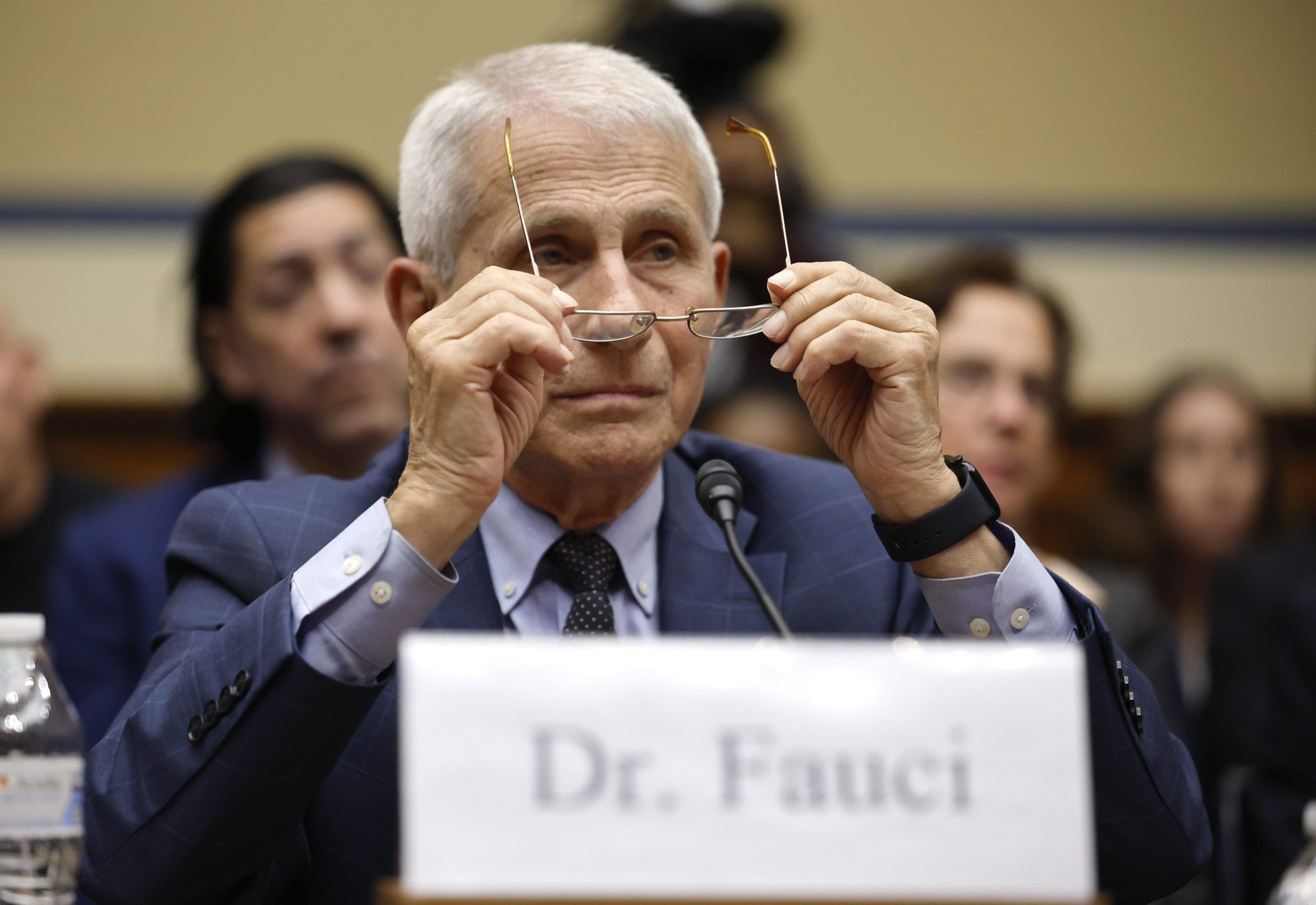
Tony Fauci was not just jerking the country around.
Hundreds of titles - just one subscription!

On sale for a limited time only, get 25% off for the first 3 months.
D4vd Case Update: Celeste Rivas Accused of Knowing About D4vd's Other Victims, Reports Say

Unverified social media claims suggest Celeste Rivas may have known about D4vd's alleged other victims, adding new speculation to the case and intensifying online scrutiny.
What happens to C-suite ambition when the next generation inherits wealth early

Corporate America may have to compete less on compensation and more on purpose.
Journal of Free Speech Law: "Anti-Zionism and Title VI: College and University Responsibility," by David E. Bernstein
The article is here; the Introduction: Since Hamas's October 7, 2023 attack on southern Israel, the start of the subsequent war… The post Journal of Free Speech Law: "Anti-Zionism and Title VI: College and University Responsibility," by David E. Bernstein appeared first on Reason.com.
Judges bow down to Donald Trump’s will, appoint a judge who is ‘in line with President Trump’s agenda’

Apparently, throwing a tantrum still works for Trump.
Molly Miller, ‘pretty privilege’ and women’s basketball’s beauty trap

Arizona State’s head coach has turned around a losing program. Unsurprisingly, much of the discourse on the internet was not based on her leadership skills
How Much You’d Need Saved To Replace a Social Security Check

Here's how much would retirees need saved to generate the same monthly income as a Social Security check.
Trump's 'Shutdown-Proof' Plan Reveals Why ICE Agents Are Still Paid While TSA Workers Struggle Without Pay

Trump's 'shutdown-proof' plan reveals why ICE agents are paid during the 2026 government shutdown while TSA workers struggle unpaid, causing airport chaos
‘Our health systems are going to collapse’: Can AI save the healthcare industry?

“The opportunity is here to use this intelligence revolution to transform healthcare completely so we can lower the burden of disease and make sure that the citizens across Europe and the world can have better health outcomes in the future,” the CEO of HealthAI told The Big Question.

Couples share 30% of their gut bacteria. Here’s how that may affect health
When living with a partner, you might be sharing more than just the same home, lifestyle and interests. You might also share various microscopic organisms residing on and in you.
Valerie Perrine, Superman and Lenny actor, dies aged 82

Perrine gained notoriety for a naked TV role and was acclaimed for her roles opposite Gene Hackman, Dustin Hoffman and Jeff Bridges
Hundreds of titles - just one subscription!

On sale for a limited time only, get 25% off for the first 3 months.
4chan Sends Hilarious, Hamster-Filled Reminder That U.S. Companies Need Not Follow British Speech Regulations
"We are not in the mood to discuss the matter further, and have not been in the mood for 250 years."
‘Riding Shotgun’

With Free Range Productions, Michelle Pitcher digs deep into a conviction involving a dubious hypnosis technique.
21 Times Celebrities Shamelessly Lied And People Did Not Go Easy On Them

Celebrities probably lie all the time – it's part of their job. However, sometimes they get caught in a lie by experienced internet sleuths who will stop at no lengths to fact-check their problematic faves. Remember that time Kylie Jenner claimed to have never tried cereal? Or when Soulja Boy…
Jon Stewart jokes about chaos as ‘The Bachelorette’ season gets pulled after scandal

Jon Stewart opened his latest commentary by welcoming viewers back from the weekend, though his greeting quickly turned into a sharp jab at the state of current events.
Woman rents Texas Airbnb, then questions her life choices after secret room discovered in ceiling

We wouldn't sleep a wink.
Why Kris Jenner Is Pretty 'Who Cares' When It Comes To Negative Fan Reactions To Stuff That Happens On The Show

Like water off a momager's back.
One Thing Dwayne Johnson Was Extremely Mindful Of With The Moana Live-Action Film (Since The Animated Is 'So Good')

It clearly wasn't that hair.
When does Daredevil: Born Again season 2 take place in the MCU – and is it a prequel to Spider-Man: Brand New Day?

A larger look at how Daredevil: Born Again season 2 fits into the MCU timeline

Corpus Christi is scrambling to ward off a water crisis. Here’s a guide to its water projects.
From drilling groundwater wells to recycling wastewater, Corpus Christi has launched a host of projects as it races against the clock to find more water.
UK ‘urgently’ needs more domestic oil and gas from North Sea, trade body says

A report by Offshore Energies UK warned maintaining domestic supply is essential for energy security and affordability.
Hundreds of titles - just one subscription!

On sale for a limited time only, get 25% off for the first 3 months.
Africa’s solar boom was built on artificially cheap Chinese pricing – ‘that era is now ending’

Solar is Africa’s cheapest energy source. Changes to price incentives on Chinese imports could push prices up.
Asia boosts coal use as Iran war squeezes global LNG supplies

Asian countries are burning more coal to keep power going as the war in the Middle East disrupts other fossil fuel supplies
UK must drill in North Sea to strengthen its energy supply, trade body warns

The report warns UK risks growing dependence on energy imports at a time of heightened global instability
Dead gardens, dusty cars: Frustrated Corpus Christi residents take precautions as water crisis nears
The city’s water supply has been nearly depleted by a prolonged drought and a recent boom of oil refineries in the area. Locals have been limiting outdoor watering, shower time and car washes.
Weather tracker: high pressure over western US likely to spread east

Unusual US heat expected to stay, while Canada braces for Arctic blast and Canary Islands endure Storm Therese
Brit holiday islands battered by decade-worst storm as 70mph winds and torrential rain hit Tenerife and La Palma

Gusts of up to 70mph have been felt in the Canary Islands and the bad weather is expected to continue
Allergy season is here. Here’s how to keep your symptoms at bay

An allergist says nasal sprays are among the most effective treatments, but are often used incorrectly
UAE weather alert: Heavy rain, thunder and traffic chaos hit Dubai and Abu Dhabi — Safety warnings issued

Unstable weather has brought sudden showers, strong winds, and reduced visibility across the UAE, particularly impacting Dubai and Abu Dhabi. Motorists are urged to drive cautiously as authorities confirm ongoing unsettled conditions with rainfall expected to continue for the next six days.

Corpus Christi is scrambling to ward off a water crisis. Here’s a guide to its water projects.
From drilling groundwater wells to recycling wastewater, Corpus Christi has launched a host of projects as it races against the clock to find more water.
Texas will ban smokeable hemp cannabis on March 31. Here’s what you need to know.
New rules from state health officials ban smokeable intoxicating hemp products, including pre-rolled joints and hemp flower.
Hundreds of titles - just one subscription!

On sale for a limited time only, get 25% off for the first 3 months.
Taylor Goldenstein and Lomi Kriel join Texas Tribune’s revamped investigative team
The Texas Tribune has added some new faces to the roster who will be digging deep and investigating some of the state’s most urgent and interesting storylines.
Dallara sportscar's UK debut and a special Fiesta among Donington Park BARC highlights

A busy event at Donington Park last weekend featured a multitude of tin-tops, but a Dallara EXP making its debut was among the sportscar highlights, while a special Ford Fiesta creation also turned heads
Texas Education Agency orders public schools to remove mentions of Cesar Chavez from lessons
Schools were also directed to cancel or change celebrations of the late civil rights leader amid allegations of sexual abuse.
Dead gardens, dusty cars: Frustrated Corpus Christi residents take precautions as water crisis nears
The city’s water supply has been nearly depleted by a prolonged drought and a recent boom of oil refineries in the area. Locals have been limiting outdoor watering, shower time and car washes.
Feds plan to install 536 miles of floating barriers on Rio Grande to deter migrants
The government is installing the first 17 miles of industrial-grade buoys in Brownsville. Experts warn the buoys could intensify flooding and change the river’s course.
U.S. Embassy In Israel Organizing Border Crossings Through Jordan Via Bus
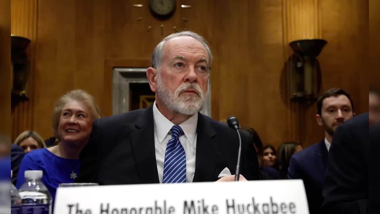
The U.S. Embassy in Israel is now organizing departures from the country via Jordan as the war in Iran continues.
Blocked from Texas vouchers, this private Islamic school wants a chance to prove its pro-America values
Several Islamic schools sued Texas for excluding them from the voucher program. Iman Academy is instead calling for fairness while hoping to be judged by its work — not stereotypes.
Russia Maintains Ambiguity About Alleged Oil Shipments To Cuba, Which Would Need To Evade U.S. Blockade

Russia is maintaining ambiguity about whether it is sending fuel to Cuba, a move that would mean evading an ongoing U.S. blockade.

US court allows lawsuit over student visa revocations to proceed; a move welcomed by education associations
It was in end-March last year, that TOI broke the story of international students waking up to emails from US agencies of their F-1 visa revocation and/or termination of SEVIS records.
Firearm Seizures in Mexico More Than Double Under Claudia Sheinbaum's Administration: Report

Estimates from Mexican authorities suggest that up to 500,000 firearms are smuggled annually from the U.S. into Mexico, though former agents from the Bureau of Alcohol, Tobacco, Firearms and Explosives believe the number could reach 1 million.
Hundreds of titles - just one subscription!

On sale for a limited time only, get 25% off for the first 3 months.
Middle East crisis live: Iran dismisses Trump claim of talks; von der Leyen says global energy situation is ‘critical’

Iranian parliament speaker says ‘no negotiations’ held with US, as Trump postpones energy strikes for five days
Indiaspora report recommends stronger OCI card in new report on Indian diaspora

Indiaspora, a nonprofit organisation comprising global Indian leaders across diverse sectors, released its ‘India and its Diaspora: Partners in Progress’ report on Monday. The publication explores the growing influence of the Indian diaspora in shaping the nation’s future through business, innovation, philanthropy, and the arts.
Senate confirms Trump loyalist Markwayne Mullin as homeland security secretary

Oklahoma senator, confirmed in 54-45 vote, replaces Kristi Noem to lead president’s immigration crackdown
‘The whole country is doing it’: how illegal kidney traders target Pakistan’s desperate brick kiln workers

Enslaved by debt, victims often feel compelled to sell an organ to repay loans – but can find themselves even worse off after the procedure
Albanese urged to help Australians struggling with fuel crisis, as NZ offers first-of-its-kind cash relief

David Pocock says a flat 25% export levy on gas producers could redirect ‘wartime profits’ to struggling Australians
Here are the still-alive Iranian leaders who could strike a U.S. peace deal
Since the Iran war began, there has been uncertainty about who's in charge of the country.
Police Baffled as They Probe How Cornhole Player with No Arms or Legs Allegedly Shot Man Dead

A Maryland cornhole player and quadruple amputee faces murder charges in a fatal shooting, with police yet to explain how he allegedly fired a gun and drove.
Nirav Modi appears in person to fight Rs 100 crore Bank of India case in London
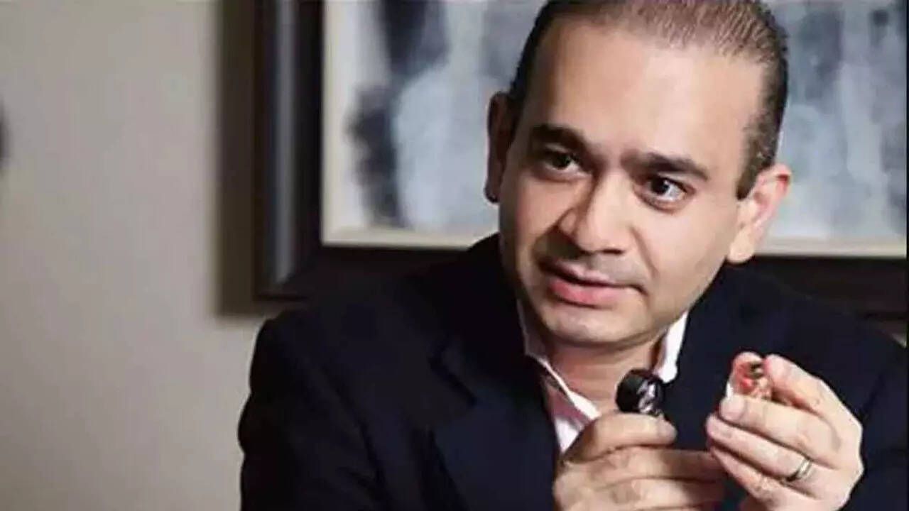
Fugitive jeweller Nirav Modi appeared in a London court to contest a Rs 100 crore claim by Bank of India. The bank seeks repayment of a loan to his company, Firestar Diamond, for which Modi provided a personal guarantee.

Senate confirms Mullin as DHS secretary
The vote comes as DHS is at the center of a shutdown fight over funding.
More Than 11,000 U.S. Citizen Children Have Had Parents Detained by ICE, Report Finds

More than 11,000 parents of U.S. citizen children were detained by Immigration and Customs Enforcement during the first seven months of President Donald Trump's second term.
Hundreds of titles - just one subscription!

On sale for a limited time only, get 25% off for the first 3 months.
Republicans seek elusive path to restoring DHS funding
Reconciliation may be Republicans' only path forward.
The First Rule Of Traveling Is Never Stop Moving
Never wait until it is too late.
Venezuela's Delcy Rodríguez Allegedly Hired Former US Lawmaker in $50M Bid to Influence Trump White House

Prosecutors allege that Venezuela's interim President Delcy Rodríguez authorized a $50 million contract to hire former U.S. congressman David Rivera to lobby the Trump administration as a federal trial examining the alleged influence campaign began Monday in Miami.
GOP fight to replace McConnell turns ugly over immigration
The primary is shaping up to be one of the cycle's most bruising intra-party battles.
It's Elementary, My Dear Watson
The 2000 and 2020 elections are still on the Justices' minds.
Racist Chat Linked to GOP-Affiliated Students Fuels 'Chilling Effect' at Florida University

A racist group chat tied to GOP-affiliated student leaders at Florida International University has intensified concerns among students and faculty, who say the fallout is unfolding in a broader campus climate that discourages open discussion of race and racism.
Justice Gorsuch's Recusal in Glynn Environmental Coalition v. Sea Island Acquisition
One of my favorite hobbies is scanning the Supreme Court's orders list and trying to figure out why a Justice… The post Justice Gorsuch's Recusal in <i>Glynn Environmental Coalition v. Sea Island Acquisition</i> appeared first on Reason.com.
Court Rejects Women Inmates' Objections to California Law Related to Housing of "Transgender, Nonbinary, or Intersex" Inmates
The court's reasoning mostly turns on a conclusion that much of the prison behavior that plaintiffs complained about wasn't dictated by that particular law.

Trump’s sanctions against a UN human rights expert show free speech is dying
Francesca Albanese recommended ICC arrests and investigations over Gaza. Who will be the administration’s next target?
The Peaky Blinders film is pandering to these populist times – I should know, the Nazi in it is my father

The film-makers would say they’re making drama, not history. But this is not the moment for yet another second world war film with a heroic myth, says author Francis Beckett
Hundreds of titles - just one subscription!

On sale for a limited time only, get 25% off for the first 3 months.
Like avocado on jalebi: The manufactured appeal of ‘bhajan clubbing’

On a Saturday evening, a bhajan clubbing event was organised by the Rekha Gupta government at the Indian Institute of Technology (IIT), Delhi.
Voices: Britain’s most vulnerable must be protected from the soaring cost of the Iran crisis

THE INDEPENDENT VIEW: Editorial: As Donald Trump’s war inflicts greater pain on British household bills than we have seen in years, every lever must be pulled to give those who can least afford the hurt the greatest help
Pete Hegseth is promoting a nihilist cult of death

The Trump administration is embracing violence for the sake of violence
The Guardian view on France after Macron: local elections offer clues to seeing off the far-right threat

Editorial: Victories in Paris and Marseille suggest a united left can reclaim centre-ground voters. But the end of Macronism is leaving a complex political landscape
The Guardian view on Trump’s Iran ‘talks’: a war, a pause – and a distraction

Editorial: The US president claims progress in talks with Iran, but uncertainty persists. Meanwhile, Israel advances West Bank annexation under cover of a crisis
A war and maybe an unprecedented depression: it’s Trump’s mania, but now all of us will pay the price

It has been possible to observe this presidency in abstract terms, but no more. The consequences of the Iran attack will affect our lives and our politics, says Guardian columnist Polly Toynbee
Jean-Luc Mélenchon is problematic, but ostracising France’s radical left is a failed strategy

It may be time for a new generation to lead La France Insoumise. But local elections have shown the movement’s resilience, says Guardian Europe columnist Rokhaya Diallo
Do we have to keep talking about AI? The machines are always one step ahead

Whether you want to free it or regulate it into submission, one thing is clear: this new technology is moving so fast that we can’t fully grasp it, says Zoe Williams
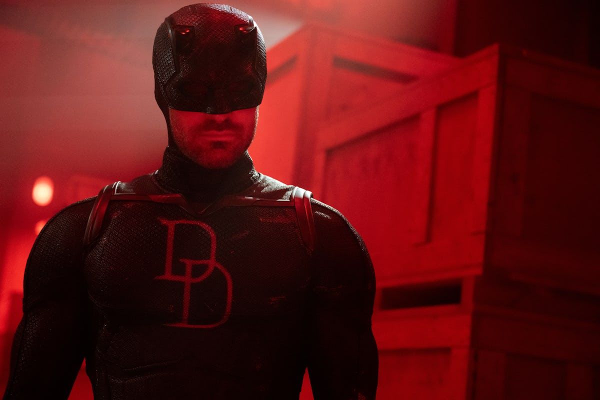
'Daredevil: Born Again' Season 2 Release Date, Time, Trailer, And Plot For The MCU Series
Everything you need to know to cach up on Matt Murdock's latest chapter.
Neighbor In Fight With ‘Reacher’ Star Alan Ritchson Breaks Silence As Sources Dispute His Story

“Mr Ritchson needs professional help if it is true. His mental health is at stake…”
Hundreds of titles - just one subscription!

On sale for a limited time only, get 25% off for the first 3 months.
New 'Mandalorian And Grogu' Teaser Just Revealed A Forgotten 'Clone Wars' Character

Marrok's back, in live-action form.
27 Years Ago, Nicholas Brendon Made 'Buffy's Wackiest One-Off Episode — And Changed TV Forever

The late actor may have played a sidekick on 'Buffy the Vampire Slayer,' but he was the show's greatest strength.
Best 'Pokémon TCG Perfect Order' Cards: Top Meta Picks, Combos, and Must-Have Collectibles

Check the best "Pokémon TCG Perfect Order" cards, from meta-defining picks like Meowth ex to powerful combos and must-have collectible artwork.
Mike Colter Hints the Return of Luke Cage: In Daredevil 2?

While speaking on a panel, The Latin Times asked Mike Colter whether he would reprise his iconic Marvel role in the future, and he replied that it "makes sense."
Hannah Montana Star Miley Cyrus Calls Alex Cooper 'Kinda Creepy' for Being Superfan and Moving Next Door

Miley Cyrus humorously teases podcast host Alex Cooper during the Hannah Montana 20th Anniversary Special, calling her 'kinda creepy' for being a superfan turned neighbor.
EXCLUSIVE: James Ortiz Says He Built Rocky in 'Project Hail Mary' With Body Language, Trauma, and 'Latina Mom' and Italian Nonna Energy

Puerto Rican descendant James Ortiz did not have a face to work with when he set out to make Rocky feel alive in 'Project Hail Mary'. No expressive eyes, no smile, no human shorthand. What he had instead was posture, rhythm, awkwardness, and memory, including the kind that comes from…
'For All Mankind' Season 5 Review: Apple's Space Epic Is Still One Of The Bravest Sci-Fi Shows Of All Time

'For All Mankind' Season 5 pushes the show further than ever before. Here's why this season feels so different and why it's still the boldest sci-fi series of the 21st century.
‘It’s got real sass!’ Irvine Welsh chooses new life for Trainspotting as a stage musical

Production based on 1993 novel opens at Theatre Royal Haymarket in London in July, with original songs co-written by the author

Inside Prom Trends 2026: NYC High School Students Predict the Next Teen Fashion Style Wave
NYC teens spill: Hottest prom trends 2026 in teen fashion style. From dresses to accessories, get the looks high schoolers are obsessing over.
Honey Skin Care Review: Do Manuka Honey Organic Skin Products Actually Work?

Curious about honey based beauty? This honey skin care review explores Manuka honey benefits and the popularity of organic skin products.
Hundreds of titles - just one subscription!

On sale for a limited time only, get 25% off for the first 3 months.
The Heeled Flip-Flop Is Hailey Bieber's Favorite Celebrity Style Weapon for Spring 2026
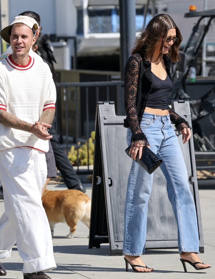
The heeled flip-flop is not going anywhere. Hailey Bieber's spring 2026 styling proves why this silhouette leads every shoe trends 2026 conversation.
The Princess Diana Accessory Meghan Markle Keeps Styling Into Every Celebrity Look

Meghan Markle's navy Ralph Lauren gown and Princess Diana's Cartier watch prove that the best celebrity style moments are built on meaning, not just money.
From Chanel to Saint Laurent: The Statement Jewelry Ruling Jewelry Trends 2026

Oversized hoops, beaded chokers, mixed metals, and baroque pearls. Jewelry trends 2026 are maximalist and intentional—here is the statement jewelry leading the charge.
Van Morrison to be honoured with lifetime achievement award

Sir Van Morrison is to be honoured with a lifetime achievement award at the Jazz FM Awards 2026, taking place in central London next month. The 80-year-old Northern Irish musician stated that jazz and blues have consistently been at the core of his musical work. Morrison boasts a career spanning…
Let them eat 1,600 cakes: inside Australia’s first Cake Picnic

Cakes are artfully presented and then happily devoured as global phenomenon descends on Melbourne
Mary Berry shares personal heartbreak behind new book
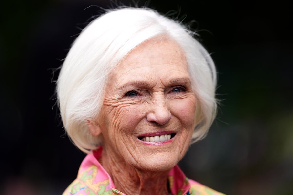
TV chef Mary Berry is releasing her first gardening book, My Gardening Life, a horticultural memoir and guide published just before her 91st birthday. She shares that gardening became a significant source of comfort and therapy after the tragic death of her son, William, in a 1989 car accident. Berry's…
High Low Fashion vs Head-to-Toe Designer: Luxury Styling Tips for Outfit Balance

High low fashion beats full-designer dressing when outfit balance is the goal. A stylist-backed guide to mixing investment pieces with accessible finds in 2026.
Zendaya Fashion Through the Years: 10 Red Carpet Looks That Made Her a Celebrity Style Icon

Mugler robots, Margiela garden gowns, and a bridal white Louis Vuitton suit. These are the 10 Zendaya red carpet looks that made her a celebrity style icon.

How Social Media Effects on Teens Spark Rising Anxiety and Mental Health Concerns
Discover how social media effects contribute to rising teen anxiety, supported by mental health studies, coping strategies, and parental tips for protecting adolescent well-being online.
Cold Showers vs Hot Showers: Key Health Benefits, Risks, and Which One Is Right for You

Cold shower benefits vs hot shower health explained. Learn which is better for recovery, circulation, sleep, and overall wellness.
Hundreds of titles - just one subscription!

On sale for a limited time only, get 25% off for the first 3 months.
Sleep Paralysis Brain Activity Explained: Why Your Mind Stays Awake While Body Sleeps

Sleep paralysis brain activity blends REM atonia, hallucinations, and fear circuits, revealing neuroscience insights and strategies to manage episodes effectively.
According To Mitch Churi, Your Morning Routine Is Boring!

You really can't ever know what's going on in other people's houses.
Government announces crackdown on racist and antisemitic doctors in NHS

It’s described as the biggest overhaul of the General Medical Council in four decades
Small daily lifestyle changes can reduce heart attack risk, new study finds

A new study has found that small lifestyle changes can make a big difference when it comes to reducing heart attack risk
Ultra processed foods linked to infertility and pregnancy issues, study says

Eating less ultra-processed food, especially around the time of conception and pregnancy, is better for both parents and embryos, researchers say
How dying patients in palliative care face ‘postcode lottery’ in their final days

Those in end-of-life care facing ‘postcode lottery,’ a report from MPs says
Grandson of Man Utd legend died after being put in ‘unsafe sleeping position’, inquest hears

Madison Bruce Smith was found unresponsive by his father, ex-Leeds United and Fulham striker Matt Smith, on the morning of October 18 2024
Landmark UK prostate cancer screening trial begins with first men tested

Trial will inform future population-wide prostate cancer screening programmes for men

How Orlando City Could Line Up With World Cup Winner Antoine Griezmann
The Atlético Madrid star is set to join the MLS side after the World Cup this summer.
Mercedes-AMG Teases 'The Most Extreme Black Series Ever'

Mercedes-AMG has finally revealed the identity of its Track Sport prototype, which it has been teasing for a few months. As we suspected when the first photos surfaced, it’s effectively a two-in-one supercar. It previews not only a new GT3 racing machine but also a street-legal Black Series model developed…
Hundreds of titles - just one subscription!

On sale for a limited time only, get 25% off for the first 3 months.
Why a Pete Crow-Armstrong Contract Extension Was a No-Brainer for the Cubs

The Cubs locked down their franchise star for the foreseeable future.
How Pistons’ Unlikely Heroes Snapped Lakers’ Nine-Game Winning Streak

The Lakers can lose after all.
Rossi Won the Motogp Genetic Lottery, Others Paid Hefty Prices

Valentino Rossi revealed that he never suffered from arm pump while racing, saying he won the 'genetic lottery.' Unlike Dani Pedrosa, who said he was sometimes riding with one arm.
Why the 76ers' Jared McCain Trade Isn't As Bad As It Looks

Jared McCain is the one who got away in another lost season for the 76ers.
International Female Ride Day Turns 20! Here's How To Celebrate This Year

It's actually pretty easy! If you're a woman, get out and ride on May 2. And if you're not a woman, support women riders today and every day!
Bucks Waive Cam Thomas After Short 18-Game Stint

Milwaukee is moving on.
Audi's F1 Boss Is Already Leaving For A Rival Team: Report

Audi has had a slow start in its 2026 Formula 1 debut. The team has just two points and currently sits in eighth place overall after two races. But apparently, Team Principal Jonathan Wheatley has seen enough.
Polaris Set To Close a Former Joint Indian Motorcycle Plant, With 200 People Laid Off

Polaris' Osceola plant, which once produced power plants for newly sold Indian Motorcycles, as well as engines and other parts for the brand's off-road segment, is set to be shuttered by the end of 2026.

The Tesla Semi Might Get Automated And Wireless Charging
Two company executives told Jay Leno that the Semi could just drive over a pad to initiate a charging session in the future.
Tesla Finally Breaks Its 13-Month Sales Losing Streak in Europe

For a little over a year, Tesla’s might has been on the decline in Europe. That stopped in February.
Hundreds of titles - just one subscription!

On sale for a limited time only, get 25% off for the first 3 months.
‘Kids say they take a quick look at TikTok’: a new kind of distracted driving is on the rise

As watching videos, using touchscreens, and even livestreaming behind the wheel become more common, experts warn of increased risk of crashes
Subaru's Next Electric SUV Will Be Revealed Next Week. Here's A Teaser.

Subaru already added two new EVs to its lineup this year. A third is coming soon—and it could be the biggest yet.
Jay Leno Says The Tesla Semi’s Biggest Advantage Isn’t Its Range

Even though it can drive 500 miles on one charge, it’s the lower running costs that Jay believes will make the production-spec Tesla Semi truck popular.
The Mercedes GLC EV Isn’t Just A Great Electric Car. It’s A Great Mercedes

Driving the new Mercedes GLC EV around the roads of Portugal highlighted that while it's a solid electric vehicle, more importantly, it's also a great Mercedes.
Faraday Future Cleared By SEC After Years-Long Investigation

The startup was being investigated over potentially fake sales numbers and “false and misleading statements.”
Most EV Fast Chargers Are Built In Months. Ionna Just Built One In 5 Days

The up-and-coming EV charging operator wants to expand fast, so it’s breaking the mould.
The First BMW With A NACS Charge Port Is Already Here, And It’s Not The iX3 Or i3

BMW quietly updated one of its existing EVs with a native Tesla-style NACS charge port. But the details are a little weird.
Amount of AI-generated child sexual abuse material found online surged in 2025

Internet Watch Foundation verified 8,029 pieces of realistic AI-made content, with 65% of videos in worst category

Scientists take antimatter on first road trip as they study how to navigate with ultra-sensitive cargo
The entire process is expected to take about four hours
Scientists find 2 'failed stars' that may have a second chance to shine bright — by getting together

"Failed star" brown dwarfs may get a second chance to shine by colliding and merging to birth a new star.
Hundreds of titles - just one subscription!

On sale for a limited time only, get 25% off for the first 3 months.
10 major differences between the 'Project Hail Mary' book and movie

Ryland Grace's world-saving adventure saw a few changes during the jump from the page to the screen; here are ten big differences we spotted.
2nd-ever test flight of NASA's 'quiet' X-59 supersonic jet cut short by glitch

NASA's "quiet" supersonic X-59 jet took to the skies for the second time ever on Friday (March 20), but it didn't stay up for long.
Rare daytime fireball may have dropped meteorites on Texas: Here's where to find them

The fireball shattered with the force of 26 tons of TNT, potentially spreading shards over a swathe of Texas land.
Astrophotographer spies Thor's Helmet shining 15,000 light-years away in spectacular photo

A massive stellar wind bubble sculpts the nebula into the shape of the Norse god's famous helmet.
Triangulum Galaxy dazzles in psychedelic color | Space photo of the day for March 23, 2026

Astronomers captured a colorful new portrait of the Triangulum Galaxy, revealing complex clouds of gas in between the galaxy's 40 billion stars.
Northern lights dazzle worldwide as strong G3 geomagnetic storm sparks stunning show (photos)

Powerful geomagnetic storms sent the northern lights dancing far beyond the poles, delivering a spectacular show across the world.
‘Profit prioritised over welfare’: UK’s premier exotic animal hospital to close

Pet owners fear there is no viable alternative service after Great Western Exotics owner deems business unviable
Are mysterious 'Little Red Dots' discovered by the James Webb Space Telescope actually baby galaxies under construction?

What if the mysterious 'Little Red Dots' aren't baby black holes, but rather globular clusters in their messy, glorious formation?

More North Sea drilling will put UK at mercy of fossil fuel markets, ministers say
Ed Miliband says only clean power will provide ‘energy sovereignty’ amid opposition calls for oil and gas expansion
‘It smells like a rancid fish and chip shop’: at sea with the Antarctic’s krill supertrawlers

The fishery is regulated but experts say it is wrecking the food chain. Gordon Peake joined a Sea Shepherd mission to observe the giant ships compete for catch
Hundreds of titles - just one subscription!

On sale for a limited time only, get 25% off for the first 3 months.
What are zettajoules – and what do they tell us about Earth’s energy imbalance?

When James Prescott Joule lent his name to a unit of energy, he could not have foreseen today’s alarming calculations
Eel fisher takes on authorities at Belfast court over pollution in UK’s largest lake

Declan Conlon will argue officials have failed to act despite clear evidence of the ecological collapse of Lough Neagh
Country diary: The miracle of bursting buds – tiny yet astoundingly powerful

Welburn, North Yorkshire: Limited to the garden, I’m able to admire up close how buds are, very literally, a force of nature
Ministers delay new rules for low-carbon housing in England

Homes built from March 2028 will produce 75% less greenhouse gas emissions than those built according to existing 2013 standards
Shooting restricted for six British wild birds to halt population decline

Woodcocks and pochard, pintail and goldeneye ducks among threatened species protected by proposals
Europe’s ‘staggering’ clean power gains undermined by failure to phase out fuel-burning machines

The EU’s reluctance to replace petrol cars and gas boilers keep it hooked on foreign fuels, say industry groups
Nearly half of migratory species in decline as UN summit opens

A UN summit on migratory species opens in Brazil on Monday as scientists warn that the long journeys of whales, fish, birds and other animals are being disrupted by climate change and human activity – with risks for ecosystems, food supplies and coastal economies.
‘There’s biological treasure here’: Chile’s endemic seals gain protection with new marine park

Sixty years after the discovery of a colony of Juan Fernández fur seals, previously thought to be extinct, a landmark agreement extends ‘no take’ zone around the wildlife-rich archipelago

Walking with the weavers 200 years after the Lancashire uprising
Former mill towns in the West Pennine Moors tell the story of the workers’ rebellion against power looms, the new machines decimating their livelihoods
Share a tip on a trip to Spain

Tell us about your favourite break in Spain, whether it was by the beach, in the town or deep in the countryside – the best tip wins £200 towards a Coolstays break
Hundreds of titles - just one subscription!

On sale for a limited time only, get 25% off for the first 3 months.
‘You’d be pushed to find a more soul-stirring landscape in Scotland’: walking in Beinn Eighe

It isn’t only climbers who get misty-eyed about the awe-inspiring mountains and ancient pinewoods of Britain’s first national nature reserve, created 75 years ago
Scrambling, walking and swimming in splendid isolation: 75 years of the UK’s national parks

Our writer first hiked in the Lake District, Eryri and Dartmoor in the 1970s. Their beauty remains unrivalled, but they are more popular than ever. So, here’s how to avoid the crowds
How London’s most studious area just got cooler

Bloomsbury looks set to blossom with a clutch of characterful new openings and a multi-million-pound investment plan. Angelina Villa-Clarke gets to the heart of this underrated quarter
Royal Caribbean suddenly cuts 20 cruises just days after Carnival canceled 11 sailings, report says

Royal Caribbean canceled cruises scheduled for next year, while Carnival’s cancellations affected sailings set for the fall
‘Tastes of salt, smells of coffee’: why Trieste is one of Italy’s best food cities

The historic port is a cosmopolitan gateway to global flavours and traditions. And it’s barely on the tourist trail. Take a tour …
How to spend 48 hours in Andermatt: a traditional Swiss resort with a most modern edge
.jpeg)
Two days to take the Alpine air? Here’s where to stay and where to go
A celebration of wildness and wonder: the Peak District national park at 75

The wild moors and gentle dales of the UK’s oldest national park are just as inviting today as they were when it was created in 1951
5 under-the-radar spots for a crowd-free spring escape

Find true escapism in these little-known regions, islands and countries, where tourists are blissfully thin on the ground
