It seems that nothing ignites a design debate these days quite like a new Google logo. And the tech giant has been treating us to new designs at a phenomenal rate lately as it continues to update its logos following the introduction of its Material You design language.
The latest victim – sorry, subject – is the Google Play Books logo. I actually like it myself. But I think I might be the only one (see our pick of the best logos for designs we can all agree on).

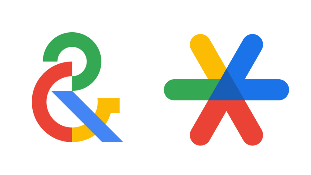
In recent months, we've been given a new Google Fi Wireless logo, which tried to do so many things at once. We've also seen the previously drab but elegant (and, God forbid, distinct) Google Arts & Culture logo and Google Authenticator logo succumb to multicolour madness.
It's this insistence on using the Google brand colours for everything that has been most criticised in previous Google logo designs. It's all very good to have a consistent brand identity, but that shouldn't make it harder to find the app we want on our phones because everything looks the same.
If you're one of the people who feel that way, you'll be relieved to learn that Google hasn't tried to use all of its colours for the new Google Play Books logo. In fact, it's gone for blue alone. But it doesn't look much like a book anymore either. Instead, it's a much simpler affair. Retaining the blue version of the Google Play 'play button' logo, the only nod towards literature is now a bookmark icon overlaid in a lighter shade of blue in the upper left portion of the design.
I see that the design team got bored again. 😐https://t.co/LHsCC7u1pJMay 8, 2023
OK, so that bookmark does make it look a little like the arrow's run a prize in the village fair, but I think it does many of the things an app logo should. It's simple but distinctive, and most crucially it should be easy to find among other Google app icons. But it's still getting panned (there really is no pleasing people).
"I see that the design team got bored again," commented the full-time Google detractor Killed by Google on Twitter. "I am pretty sure that Google causes PMMs in the industry to have minor strokes every time they try to mentally process their naming and icon strategy," the CMS expert Mark Demeny commented.
While the criticism of some of the implementations of the design language will no doubt continue, it's been fascinating to see the videos exploring how Google made Material You. For more inspiration for your own logo designs, see our guide to how to design a logo. You might also want to invest in the best graphic design software (or see the best Creative Cloud prices below).