The goal for this workshop is to design a robot concept that's rich in detail while simplifying the entire process. I’m excited to share my approach to creating robots with 2D art techniques, and will demonstrate this with an example made for my personal project MACHIMERA.
In this case, I need a design for a quadruped robot inspired by a creature, but in a way that avoids fully resembling any real-life animal. To achieve this, I decide to combine photobashing with digital painting (read the best digital art software guide for a rundown of apps to use, you may also want one of the best drawing tablets).
Before I get to work, it's helpful to gather reference images showing various machines, vehicles and devices. Images of engines and cables, as well as textiles, fabrics, and anything else that fits with the concept and aesthetic we want to achieve will come in handy.
01. Sketching a silhouette
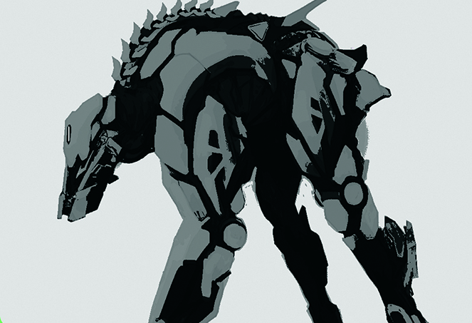
When planning the concept, the first and most important step is defining the robot's silhouette. At this stage, it’s worth considering dividing its structure into the armoured and exposed regions. In this case, the light grey areas are designated for armour, while the darker ones represent all the exposed parts of the robot – soft fabrics, cables and artificial muscles.
02 Using colour sparingly
Limiting yourself to a maximum of three values will help you distinguish different types of robot parts more easily and keep your design organised. At this stage, don't worry too much about shadows; we’ll just use simple, soft lighting to avoid the complexity of dramatic shading. This allows us to focus on the functionality of our machine’s shapes.
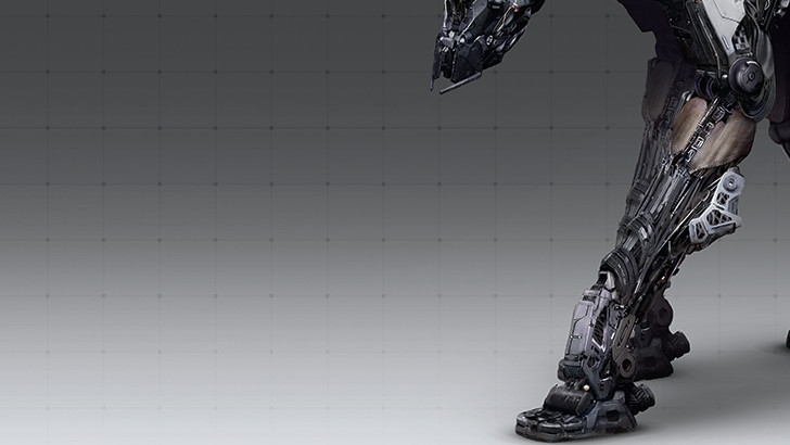
03. Incorporating fine details
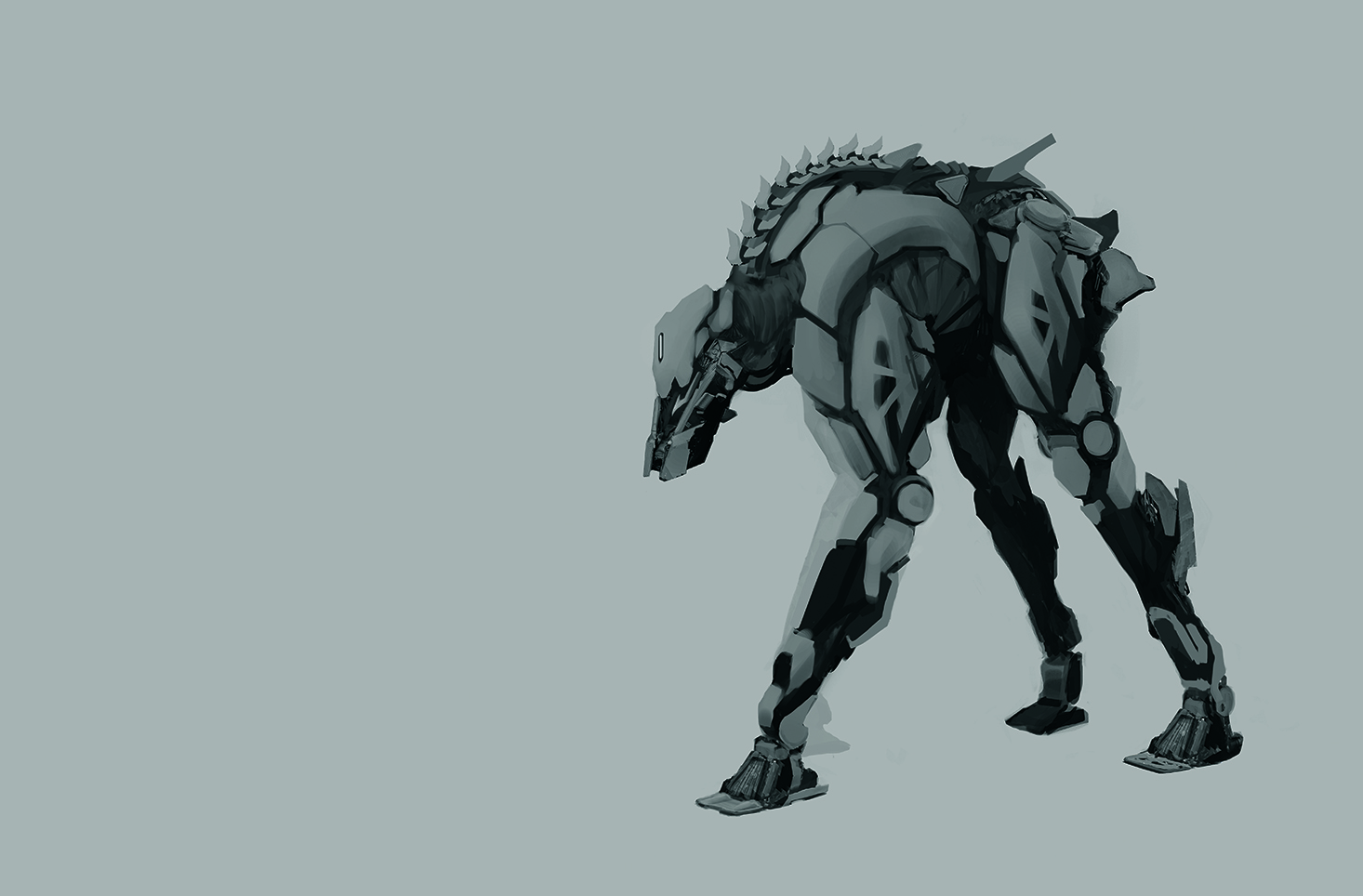
To get a natural look and work faster, keep perspective simple. Remember, you're creating a concept, not an illustration. For the same reason, I recommend avoiding dynamic shadows. It’s best to think of a main, diffused light source rather than creating something more dramatic. Paint details by hand for a more natural look, and use black and white to focus on the design.
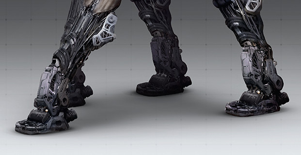
04. Planning with a grid
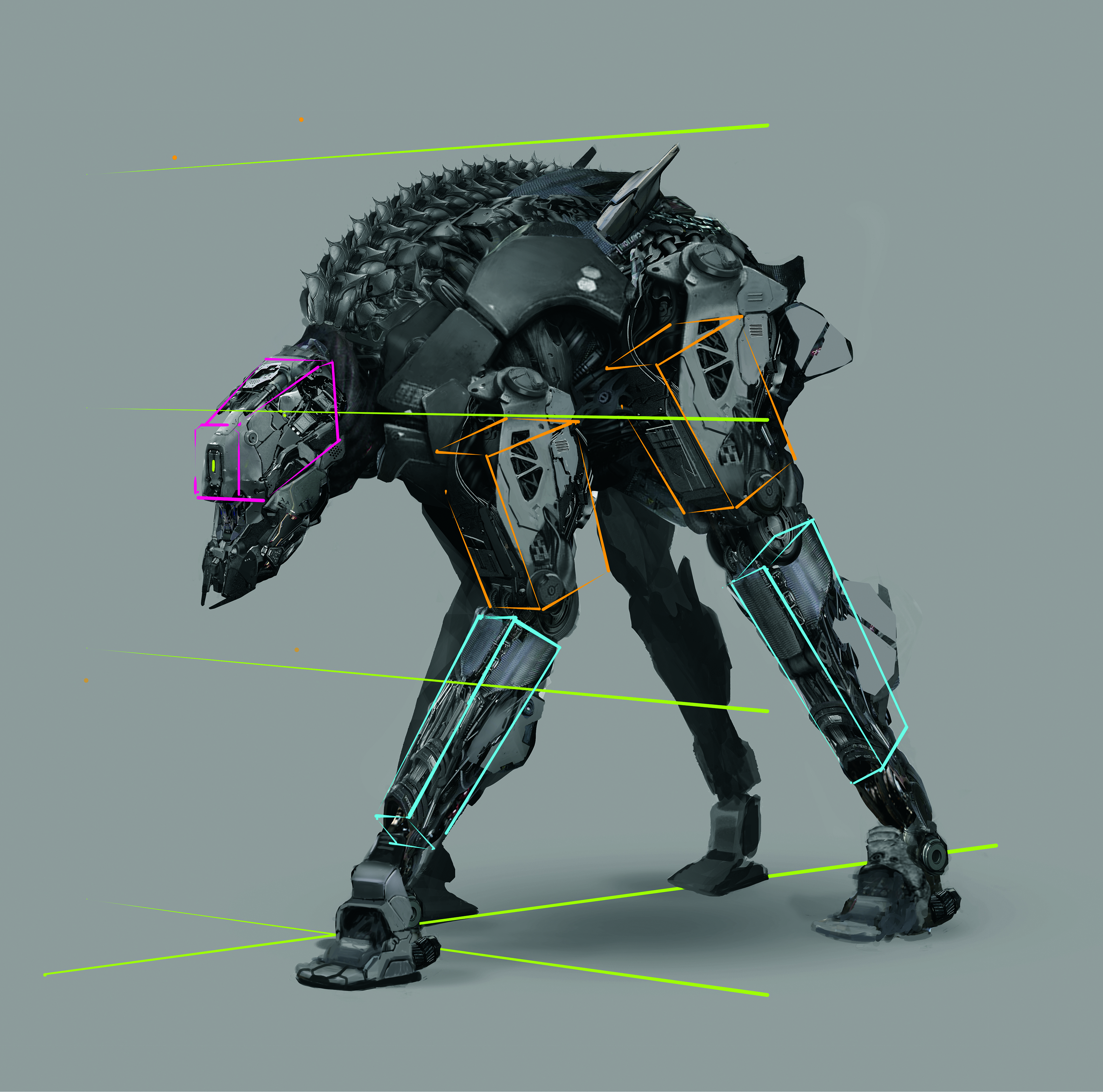
To simplify grasping perspective while working, you can sketch a rough grid to guide the overall design. However, when drawing a posed character, keep in mind that each body part will have its own alignment relative to the others. I recommend not sticking too rigidly to the lines or being overly precise, as this can slow you down and make the design appear stiff. Since it’s a concept, there’s no need to obsess over perfect perspective. Also, remember that the pose doesn't have to be overly dynamic; keeping it simple lets you focus more on the design itself.
05. Using a background trick
To elevate the presentation, consider adding a gradient background with a softly fading pattern. This will introduce depth to the image, bringing a focus to the forefront and making our robotic creature stand out. A well-placed shadow beneath the character will further ground the machine in 3D space, enhancing its realism in the process.
06. Maintain your vision
Keeping everything in greyscale eliminates distractions caused by colour, making it easier to focus on the design itself and control the values. To quickly convert a color image to black and white in Photoshop, use the shortcut Alt+Shift+Ctrl+B.
07. Advice for using a colour palette
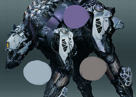
Restricting yourself to a simple colour scheme helps establish a clear and cohesive aesthetic for your design. Since our robot is already rich in detail, adding too many colours could result in visual chaos and overwhelm the composition. I chose three main colours and added them to different parts of the robot.
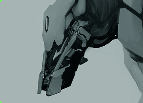
08. Photobashing new elements
Once you’ve established the silhouette of your robot, you can start cutting out elements from photos of machines and adapt them to fit the shapes you want to create. Don’t hesitate to stretch, cut and modify them. At this point, we’re not concerned with the details.
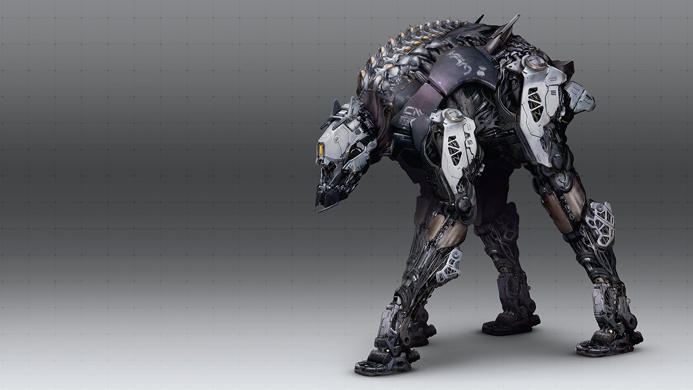
09. Adding colours and finalising
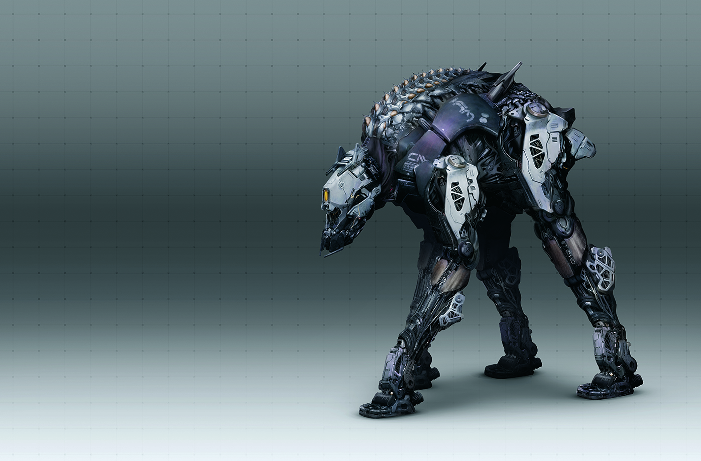
For cohesion, I focused on warm shades of purple, copper and cool bluetones, with colours on separate blending layers. Typically I use Soft Light or Overlay, but you can experiment with Color Dodgeor Multiply. To save time, I copied already established design elements from the legs and adjusted for the pose. Finally, refined details and add effects like glowing eyes.
This content originally appeared in ImagineFX magazine, the world's leading digital art and fantasy art magazine. ImagineFX is on sale in the UK, Europe, United States, Canada, Australia and more. Limited numbers of ImagineFX print editions are available for delivery from our online store (the shipping costs are included in all prices)