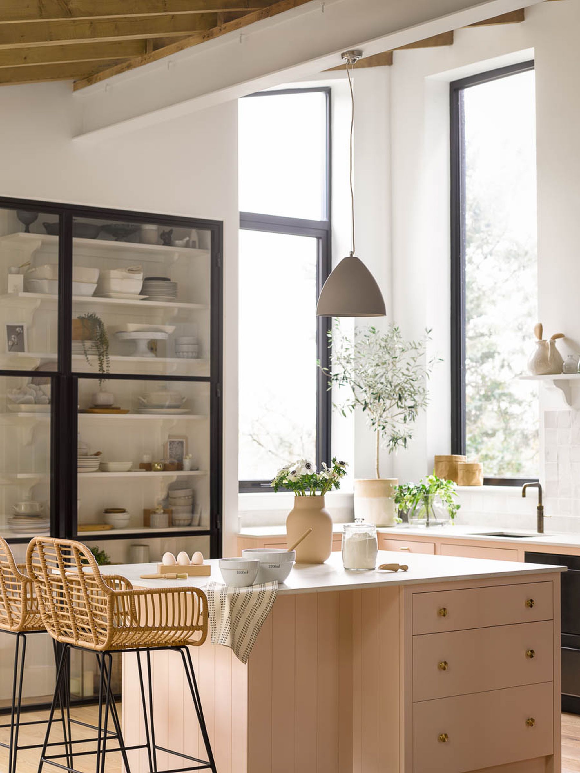
Quiet, luxurious, and elegant, pink beige is one of the key colors celebrated by Jessica Alba in her family kitchen – and this carefully curated space is proof of the versatility of this incredible hue.
The search for the ideal kitchen cabinet color is not as easy as it would initially appear. Pink can feel too sickly sweet and sugary, while trying to warm it up means possibly straying into magnolia territory. Pink beige is a beautiful middle ground.
However, this color isn't new. Shades of pink-toned beige are extremely versatile and have been a popular choice in interiors for centuries. Of all the variations, blush, salmon pink, and peach have the edge over others as they share orange undertones and warm characteristics.
At first blush, this season's pink-beige pickings might seem somewhat clichéd – after all, Barbiecore and quiet luxury have been the most talked about trends of the year. But look again. Pink has grown up, trading its sweet reputation for a more muted, sophisticated, and earthy look. While beige has shed its dull, dated, and boring connotations.
'There is an exciting duality to this grown-up color trend – it's soft and delicate, yet strong and composed,' says Paula Taylor, color and trend specialist at Graham & Brown. 'The upshot is a calm, cocooning shade that's excellent for kitchens and living rooms, indeed any room where you want a serene feel.
'The warming undertones of pink beige are particularly suited to north- or west-facing rooms, which typically see less light,' advises Jane Rockett, co-founder of Rockett St George. 'In these spaces, cooling tones of crips white, light blue, and bright green can feel impersonal and color.'

With its clear ties to the natural world, pink beige is used for painting accent walls and brightening a living space with splashes of color that symbolize and promote health and vitality.
‘Due to its close relationship with orange and brown shades, the color is mood-boosting without becoming overwhelming like many red shades. On the other hand, with more muted and subtle tones, pink beige can become a good choice to enhance quiet confidence and serenity,’ enthuses Sarah Lloyd, senior brand manager at Valspar.
Ruth Motteshead, creative director at Little Greene, agrees that softer pink-beige hues can act as a neutral base for any decorating projects. ‘They are reminiscent of natural plaster shades, with earthy undertones that add warmth to a space to provide a color highlight or act as a neutral base for introducing bolder colors.’
If you are looking for color contrast, Andy Greenall, creative director at Paint & Paper Library suggests ‘contrasting pink-beige shades with teals, cool whites, darker blues and greys. Or add natural finishes and combine with warmer neutrals for a sumptuous feel.’


