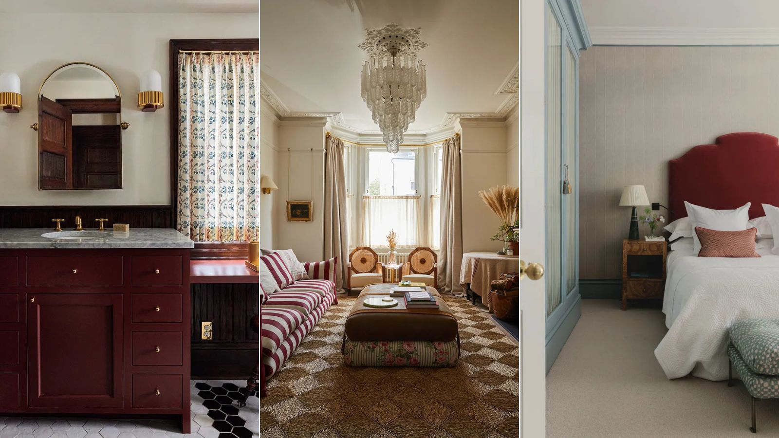
The Unexpected Red Theory took Tiktok by storm earlier this year. It put forward the notion that a pop of red in an otherwise non-red scheme can lift a room, elevate it, and make it more dynamic and chic. A simple trick that follows the principle of a slick of red lipstick to finish an outfit, the perfect final flourish.
Normally, I don't have much luck with TikTok interior design trends. Flashes in the pan (does anyone remember crustacean-core?), they tend to go as quickly as they peak, and can be gimmicky rather than routed in good design. But this one has stuck around, primarily because it's right.
'I'm always cautious of things that are a hot trend, but I too believe in the Unexpected Red Theory,' says the Minneapolis-based designer Anne McDonald. Who says she has been using red in this way for years, long before it was a viral moment - and will continue to do so.
And many designers are in agreement with her that this 'trend' is in fact not a trend at all but a timeless way to decorate with a bold color. Turns out I was wrong that everyone would be over the Unexpected Red Theory by now, here's why designers are still loving the look months on.
Red is a timeless shade
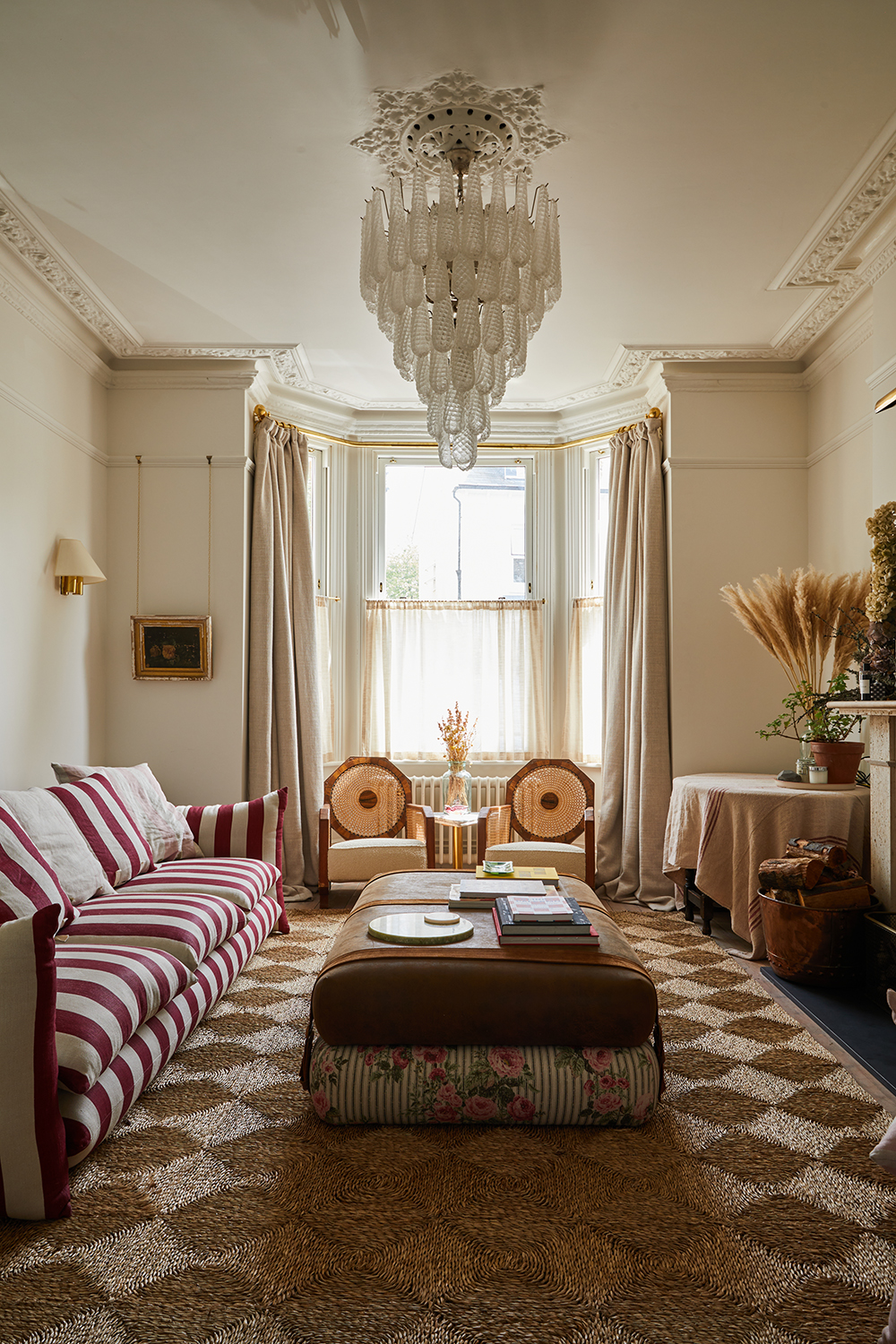
Angus Buchanan is arguably one of the designers who kickstarted the Unexpected Red Theory. His design agency Buchanan Studio's Studio chair appeared time and time again when the trend first came about and can be credited with being the genesis of both the deckchair stripe trend and the love for a burst of deep red.
'Red still elevates a space,' he says. 'And that red of the Studio chair fabric is just the perfect one. You'll love it for a long time, it's timeless and long-lasting and works just as well in a Miami beach house or a Scottish castle. Red is that one hero shade that stands out, that can make you think differently about a room when you add a dash of it.'
Red balances neutral schemes
A desire to create neutral spaces to relax in is very 2025, and designers are finding new ways to use beige tones in order to soothe you. But what feels most current is to make sure that not everything in the room is neutral, and instead to have one moment that catches the eye and lifts the spirits.
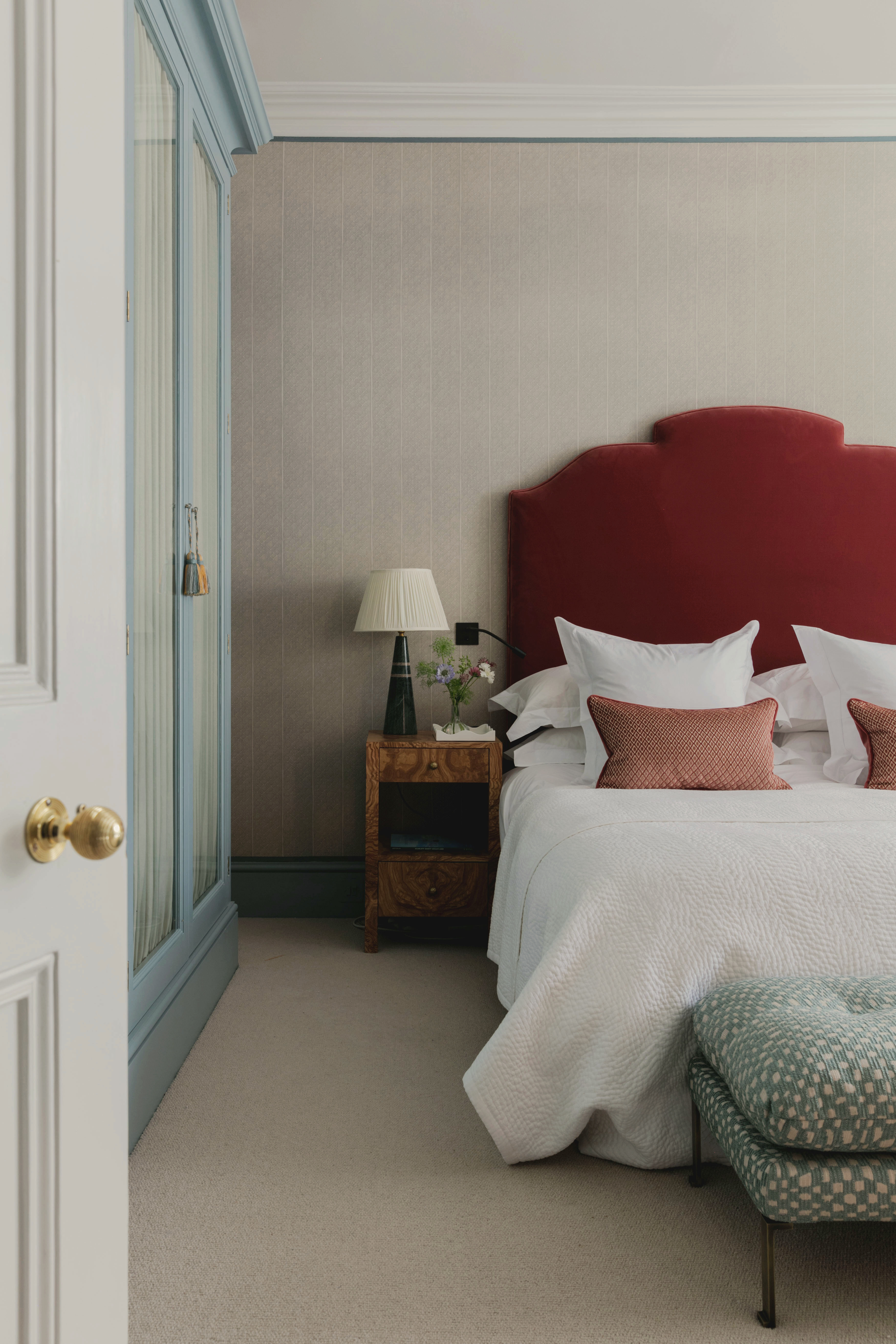
'I like to pair taupe with stronger hues such as deep reds and rusty tones,' says the designer Tiffany Duggan of Studio Duggan. 'It’s a wonderfully warm shade which can feel beautifully contemporary when used correctly, but without a more saturated counterpart it can feel a little 90s.'
Saturated counterpart, you say? Step forward Unexpected Red Theory, seen here in the burst of deep red Tiffany used on the headboard of this otherwise neutral bedroom. 'A few pops of red add a little fun and balance to the scheme,' she says.
The Unexpected Red Theory aligns with classic design rules
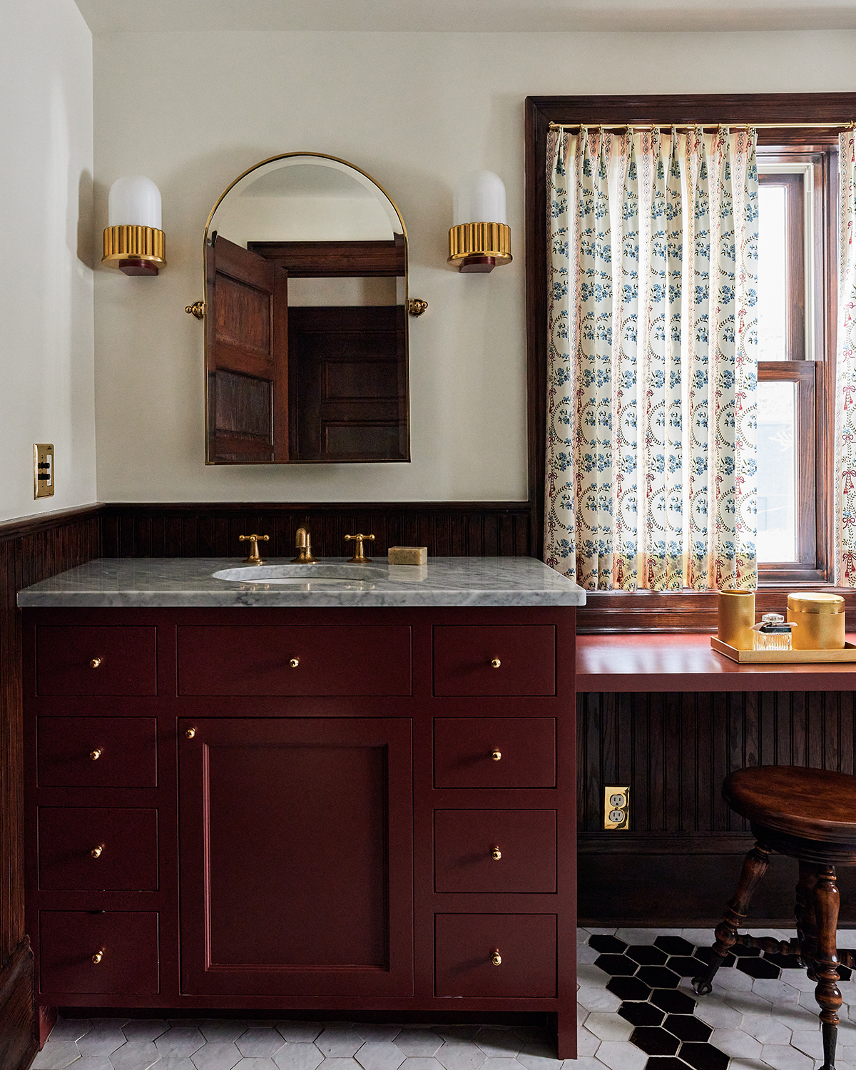
'In classic design, there is the theory of repetition, and how you can use it to create a sense of harmony,' designer Anne McDonald explains. 'But too much repetition can get boring, so that's where the theory of tension comes in. If you disrupt the repetition with an unexpected element then you're likely to create a scheme that gives you a current of excitement.' And that's the basis of the Unexpected Red Theory.
When choosing the right red, Anne currently favors oxblood, seen above on this vanity unit in an otherwise classic bathroom she designed. 'When you bring in red, you get a hit of sexiness,' Anne says. 'And for rooms where the lights are low, it's a color that feels good on the skin.'
The rise in popularity of portable, cordless lamps has made bringing softer light into any room easy than ever. This one from Amazon is super affordable and would be perfect for adding a pop of red to a kitchen.
Throw blankets are a simple way to add a pop of red. This has that rich deep red designer's favor when it comes to the Unexpected Red Theory, plus it nails two trends in one with its vintage-y vibe.
This kind of almost brown, almost red shade is the perfect hue for the Unexpected Red Theory, it adds a hint of warmth and color and will create just enough contrast with a neutral scheme. Throw this pillow on a beige sofa or combine with cream bedding for a luxurious look.
Angus Buchanan says that the Unexpected Red Theory 'is not a silver bullet,' meaning that it won't be a magic fix that works every time. 'Though it's about the closest thing you can get,' he adds.
Anne McDonald explains a little further. 'I don't think you can just insert a red accent pillow and be done with it,' she says. 'That feels way too contrived. Instead, you need to find a balance, to pair red with the right cool tones so that it really pops. Olive greens, deep blues and turquoise are good counterparts.'
It truly seems like the Unexpected Red Theory is here to stay, taking in richer tones like burgundy and oxblood, but sticking with the theme of sophisticated yet enlivening spaces. 'It can be both smart and formal or grounded and relaxed,' Anne says. A color for all occasions.


