The US state of Minnesota has a new flag, and it's a massive but much-needed change. But alas the memes have begun.
The new design is the result of a competition, although the winning submission was further tweaked to arrive at the final design. There were plenty of amusing proposals on the way, and we'll look at some of those below, as well as the controversy. But it could be one of the best rebrands of 2023.
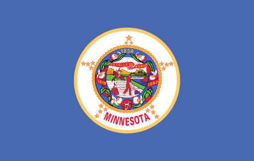
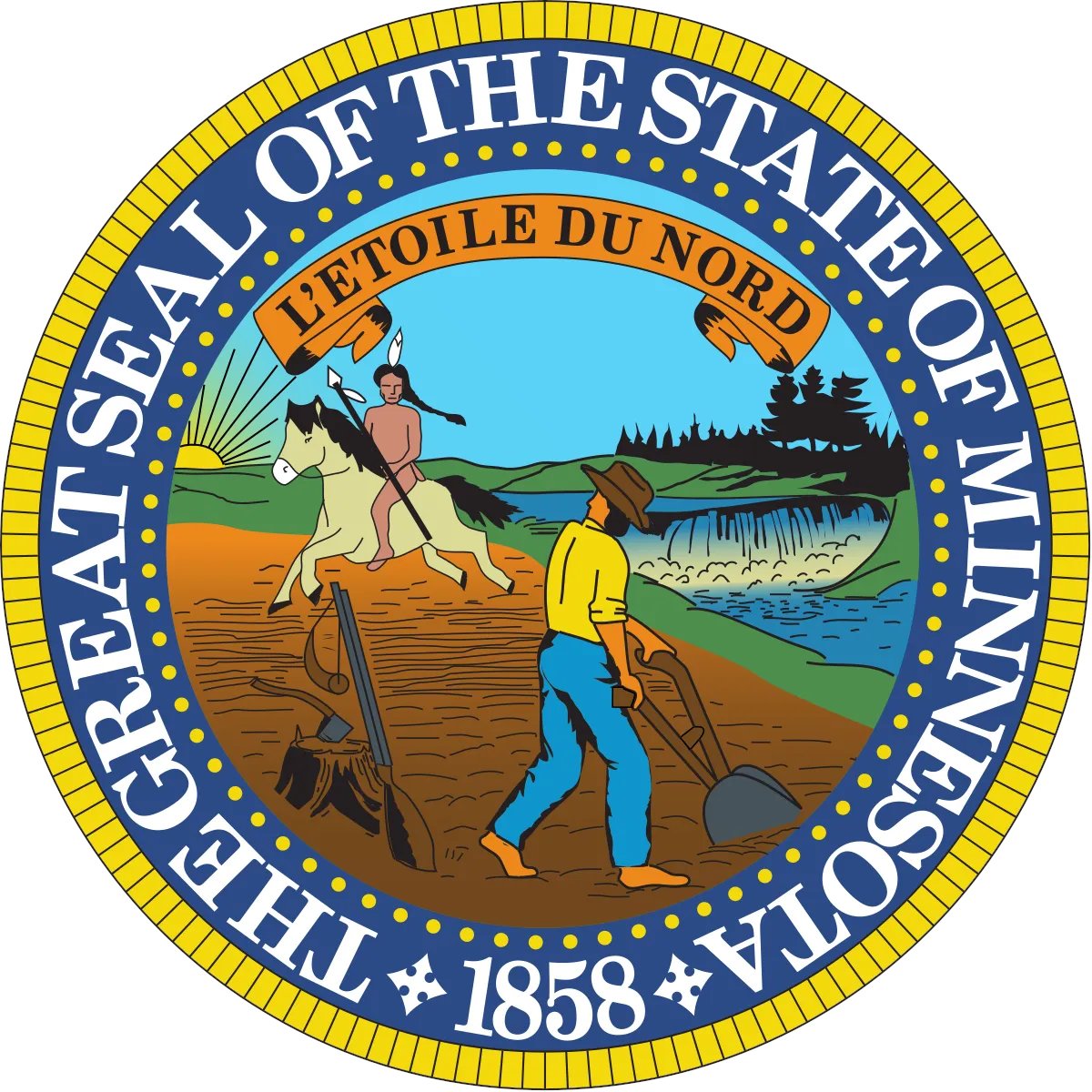
A couple of year's ago, France changed the shade of blue in its flag and nobody really noticed. But The Minnesota flag has come in for a complete redesign. That might sound unusual, but it was long overdue. The new flag is a big improvement over the previous, cartoon-like design, which depicted a farmer and a native American riding a horse over his former land. People had been calling for a redesign for decades.
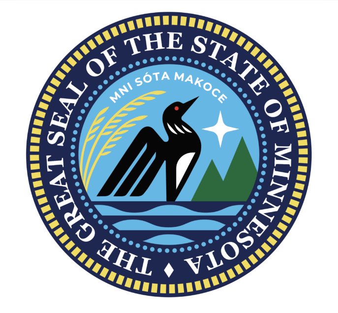
The new design is simple and easily remembered, and it packs in local symbolism with the North Star on the shape of the state itself and a sky blue background representing state's "10,000 Lakes".
It's based on a submission from Minnesota artist Andrew Prekker. He said in a statement on the website of the State Emblems Redesign Commission: “It’s such a rare privilege to be able to contribute to our state’s history in such a special way like this,” he said in a “It’s an achievement that I hope brings a lot of unity and pride to our land, and I will hold that fact with great honor for the rest of my life.”
He added that his goal was "to unite with this flag, not to separate us more,” hoping that “any culture can relate" to the design. Some think the flag looks like the flag of Somalia, apparently because it has a star on it, in which sense it looks like around a quarter of all world flags, including the US flag itself.
Now, some people claim that if you turn your head sideways and squint a lot, the new design vaguely looks like the flag of the Somalian state of Puntland (it doesn't, although it does feature a star, in which sense it resembles around a quarter of all flags in the world).
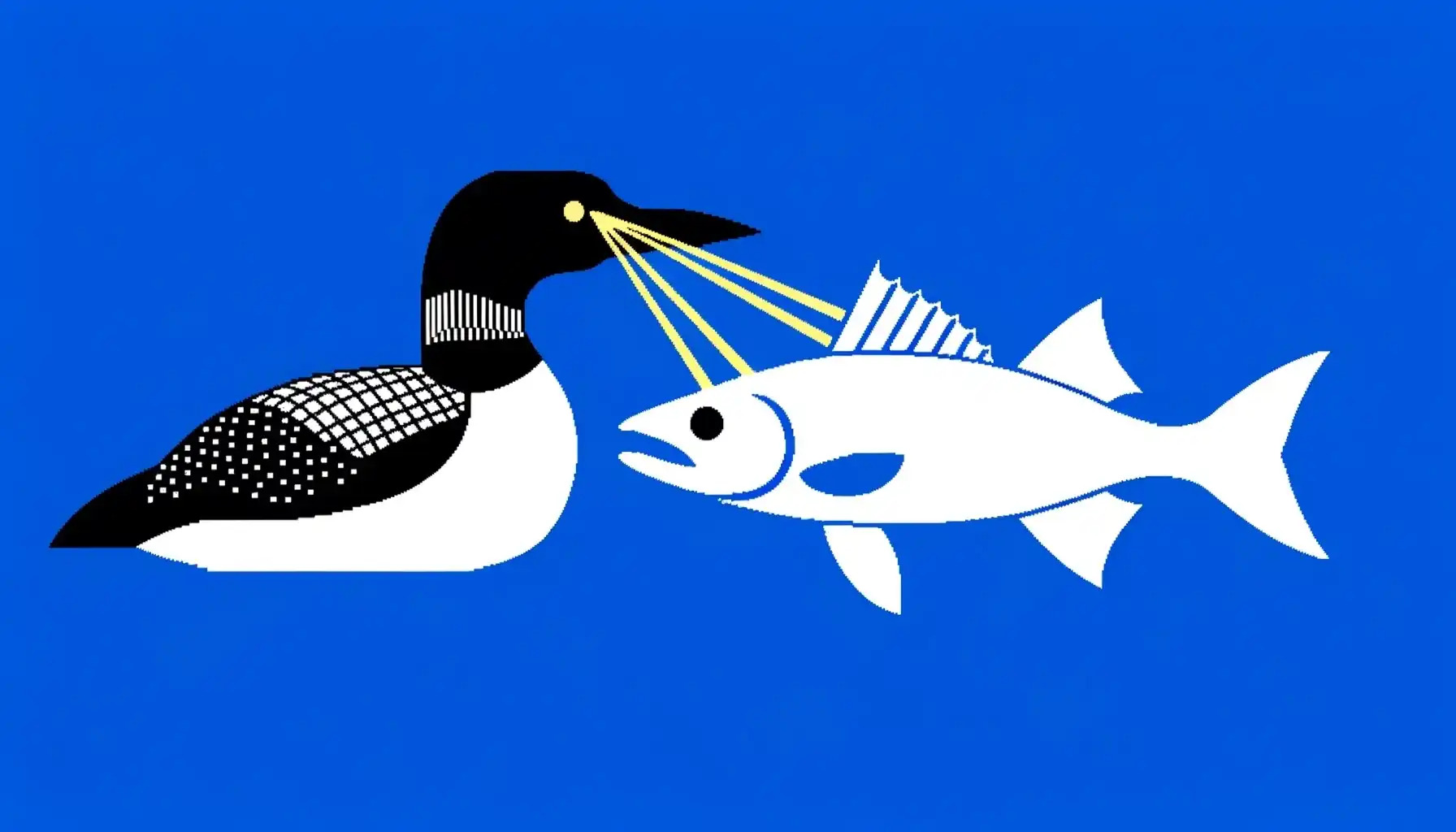
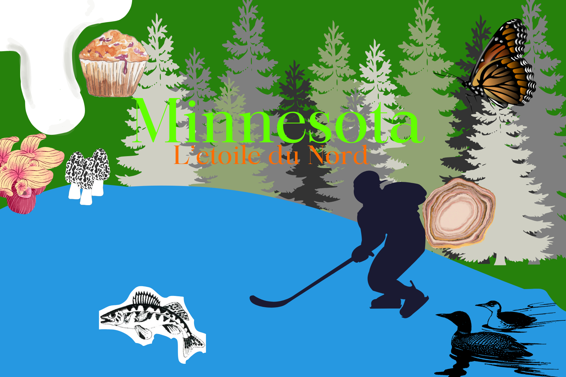
The competition to redesign the Minnesota flag began in the summer and received 2,500 submissions. Very many of them featured things associated with the state, such as the state bird, the loon, the North Star and the monarch butterfly. Some of the more unusual designs included a loon with laser eyes and a mosquito.
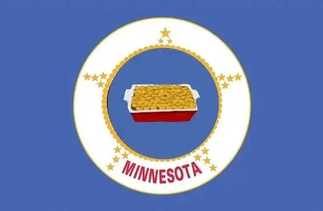
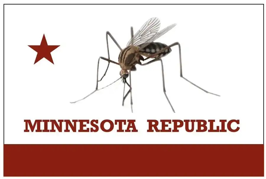

The whole process has brought the people of Minnesota together in a flood of memes.
I fixed it: pic.twitter.com/YZF1BOzrkSDecember 20, 2023
Minnesota officially has a new flag pic.twitter.com/bp8L38XlfxDecember 19, 2023
Minnesota missed a golden opportunity to continue our streak of being extra weird pic.twitter.com/4OBBFc5fjvDecember 18, 2023
Extremely sad how Minnesota cowed to the vexillology nerds and deprived us of a variety of sinister loon flags pic.twitter.com/0GoIzIiKHUDecember 19, 2023
Using the work sink and wondering what looked familiar pic.twitter.com/usVDQJ2UXiDecember 19, 2023
Finally, a new Minnesota flag I can stand behind pic.twitter.com/OD3CXOkr8cDecember 17, 2023
Finally, a new Minnesota flag I can stand behind pic.twitter.com/OD3CXOkr8cDecember 17, 2023
https://t.co/dgn3Aq0nWq pic.twitter.com/LjTIE1rmPCDecember 19, 2023
You know what I haven't seen yet? A Bernie Sanders Minnesota flag meme. pic.twitter.com/dVFer7MVXGDecember 21, 2023
pic.twitter.com/8p2EDJGULmDecember 19, 2023
People laugh, but it's one of the redesigns of the year. The others? We've made a pick of the best and worst logo designs of 2023. But one of the highlights for me was when Lego redesigned the Dune logo.