The spaces we occupy tend to be orthogonal by design – homes are often boxes and rectangles. But in the world of interior architecture, curves are making moves, softening right angles and bringing sculptural lines to straightforward layouts.
Curves are not a brand new interior design trend – we’ve all seen indoor arches and columns, after all. But a certain fluidity, especially when it comes to interior walls, is increasingly drawn to contemporary design, countering standard blueprints dominated by straight lines (which are often easier and cheaper to construct) with rounder, cozier forms.
‘Because organic shapes and roundness soften interiors, they are associated with a contemporary style that often breaks with classic styles such as Haussmannian,’ says Paris’ Florence Jallet of Batiik Studio, noting her city’s ubiquitous architectural style. These softer layouts aren’t just about aesthetics – wall curvatures look good because they feel good, wrapping us in the types of soothing lines and shapes we find in nature. This, according to many designers, can have an impact on our wellbeing.
‘As someone who values the role of design in promoting wellness, I firmly believe that incorporating a curved element into a space can have a profound impact on our state of mind,’ says Maggie Mo, co-founder of Hong Kong’s Starz Pasha. ‘It's no secret that spending time in natural surroundings can help us feel calm, peaceful, and rejuvenated.’
Straight lines aren’t out — they are certainly in demand — but a curve or two can round them out beautifully. Take a look at how this softer approach is making waves throughout interior architecture.
1. Create a partition
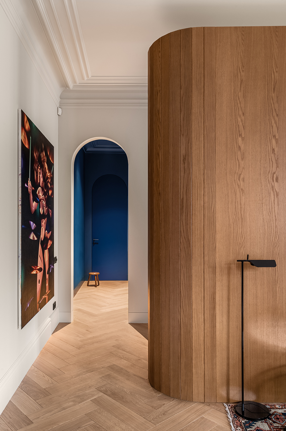
While designers often infuse curves by way of furniture and decor, this renovation took a permanent stand. Reaching toward the ceiling, a rounded timber wardrobe creates a voluminous feel in this modern bedroom while mirroring an arched doorway just around the bend.
According to the architect, Yevheniia Dubrovska, the curved unit softly partitions two zones within the same room and creates visual interest by ‘mixing up the flow’ of straight-lined interiors. The built-in unit required plenty of floor space to float, but it also didn’t require reworking existing interior walls – a clever way to cut corners, no doubt.
2. Break the sightline
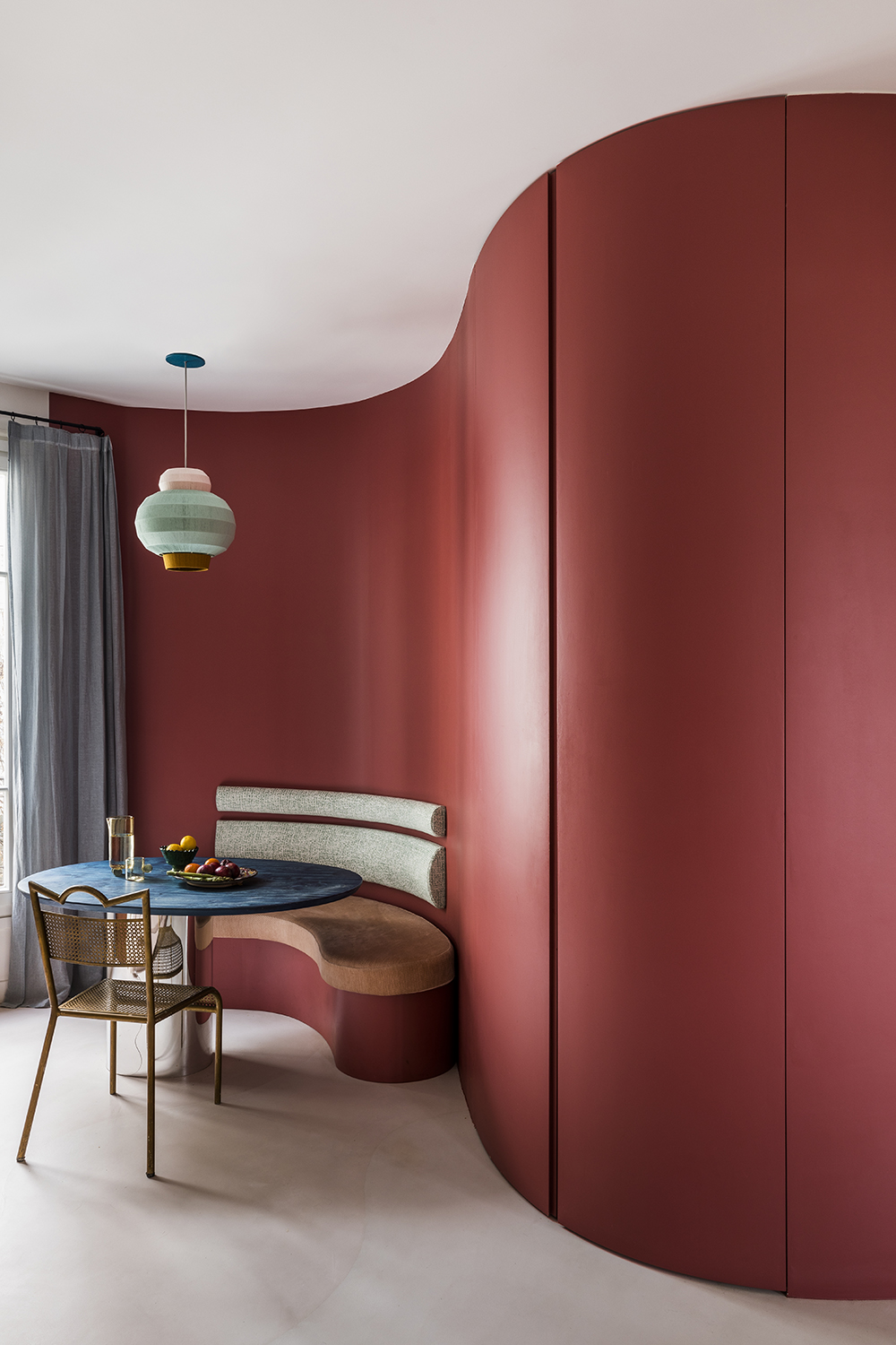
Shaking up the Haussmann style of an apartment in Paris, Batiik Studio created an all out intervention: a new curvilinear wall (which pockets a bathroom, home office, and storage cupboard) runs from the entrance to the kitchen. ‘The wall breaks the rhythm of the flat and creates perspectives through the views from the living rooms,’ explains co-founder Florence Jallet, noting the intention to open up the space. ‘It provides privacy for the kitchen seating area by enveloping it – we wanted a dining area in the kitchen that was intimate and comfortable.’
And if you want to make every curve count, Batiik Studio recommends coloring in your lines, using contoured elements as an eye-catching accent wall idea. ‘Our advice would be to think of this wall in colour, so that it takes on its full dimension,’ says Florence Jallet, who chose an eye-catching red to coat the curvaceous interior wall.
3. Smooth out angles

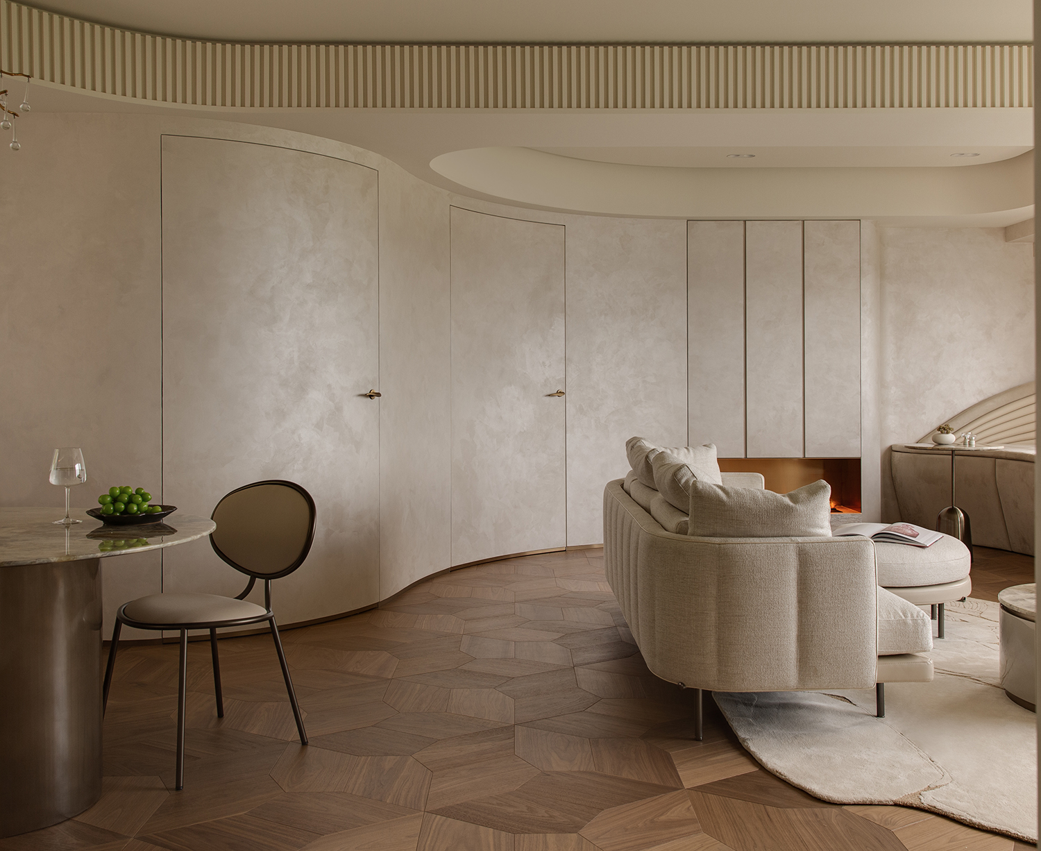
Soft curves unify a tricky layout with four different angles to create this sanctuary-like Hong Kong apartment. ‘We decided to smooth out the angles with one fluid, curvaceous wall,’ says Jay Leung, founder of Starz Pasha. Further harmonizing the space, a beige palette brings cohesion to various architectural surfaces. ‘If you're considering featuring curved walls in your space, a helpful tip is to use the same material and color pattern on the wall, shelves, and doors,’ adds Maggie Mo, the studio’s design director, of this neutral living room scheme. ‘This creates a unified appearance that ties the room together and emphasizes the beauty of the curve.’
A prime example of the minimaluxe trend, the walls also reflect the home’s natural surroundings viewed through wide windows. ‘Incorporating curves and fluidity into our design style is a beautiful way to bring the essence of nature into our living spaces and enhance our well-being,’ adds Maggie, who also chose a lotus-patterned wooden floor along with soft, curvaceous furniture to round out the look.
4. Choose a quarter round
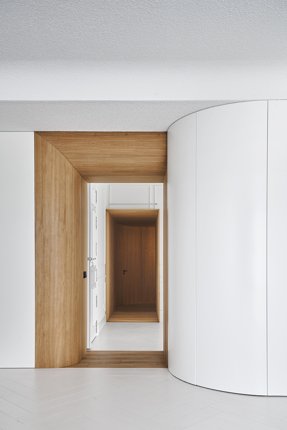
Inspired in part by the quarter round (a convex and fundamental shape found in woodworking that is a quarter of a circle, and often used for molding), architects applied bulbous architectural features throughout this Madrid apartment, from rounded doorways to curving corridors. And while the end result appears seamless, it was by no means priceless. ‘The experience in our office is that any curved surface, in general, whatever the material, is going to have a higher price than a linear or faceted solution,’ notes architect Gonzalo del Val, a soft warning that such elements are complex and certainly luxuries.
And naturally, when architectural details become more complicated, it’s even more important to find the right craftsman to pull them off. “Not all carpenters have the machinery and skill to build curved elements with good qualities,” adds del Val. “In many cases, precision tools, such as laser cutting, are needed to be effective in the work performed.” All in all, adding a curve will almost certainly bump your budget up a notch.
5. Design a spiral layout
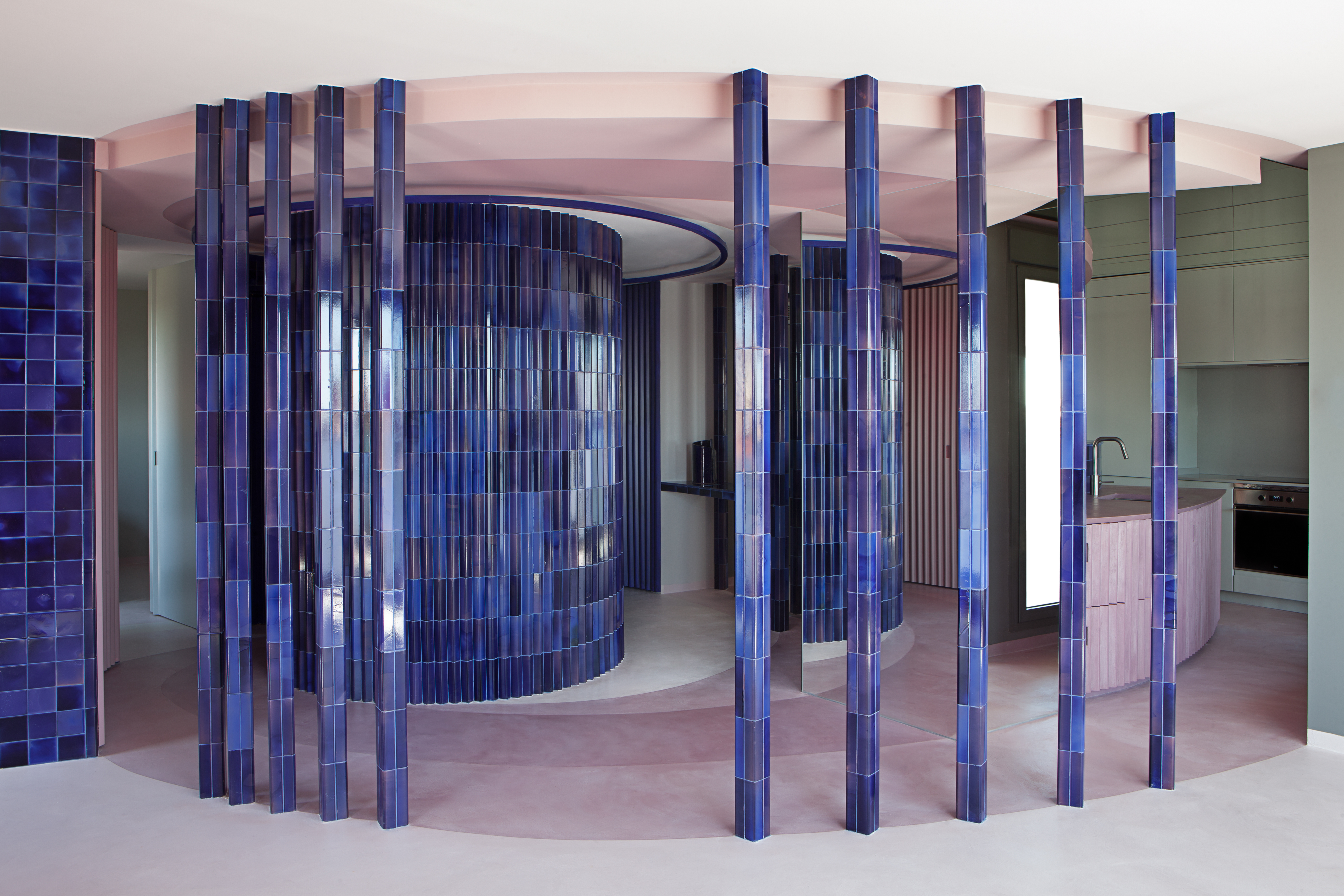
Inspired by the home’s owner, a dancer and choreographer, architect Raúl Almenara designed a layout that spirals – or shall we say twirls. Walls curve around a central shower as if performing a pirouette, creating a unique radial rhythm in the interior design throughout the home. To add dimension without interrupting the curvilinear path, Almenara covered the walls with notably small fluted ceramic tiles. ‘The use of the curve leads us to work with continuous or small-format materials,’ he says. ‘The large format would facet the curve on various faces that would break the sought-after fluidity.’
And while a swirling layout like this might not be everyone’s cup of tea, it’s nevertheless a lesson in how curves can fundamentally change the flow of interiors. “The most interesting thing is how the spiral causes different degrees of privacy, being able to have the most public uses at the beginning and the most private ones – bedroom or bathroom – at the end, without the need for doors,” adds Almenara. “This is where there is an architectural learning of how to take advantage of geometry in our favor.”
6. Create a sense of calm
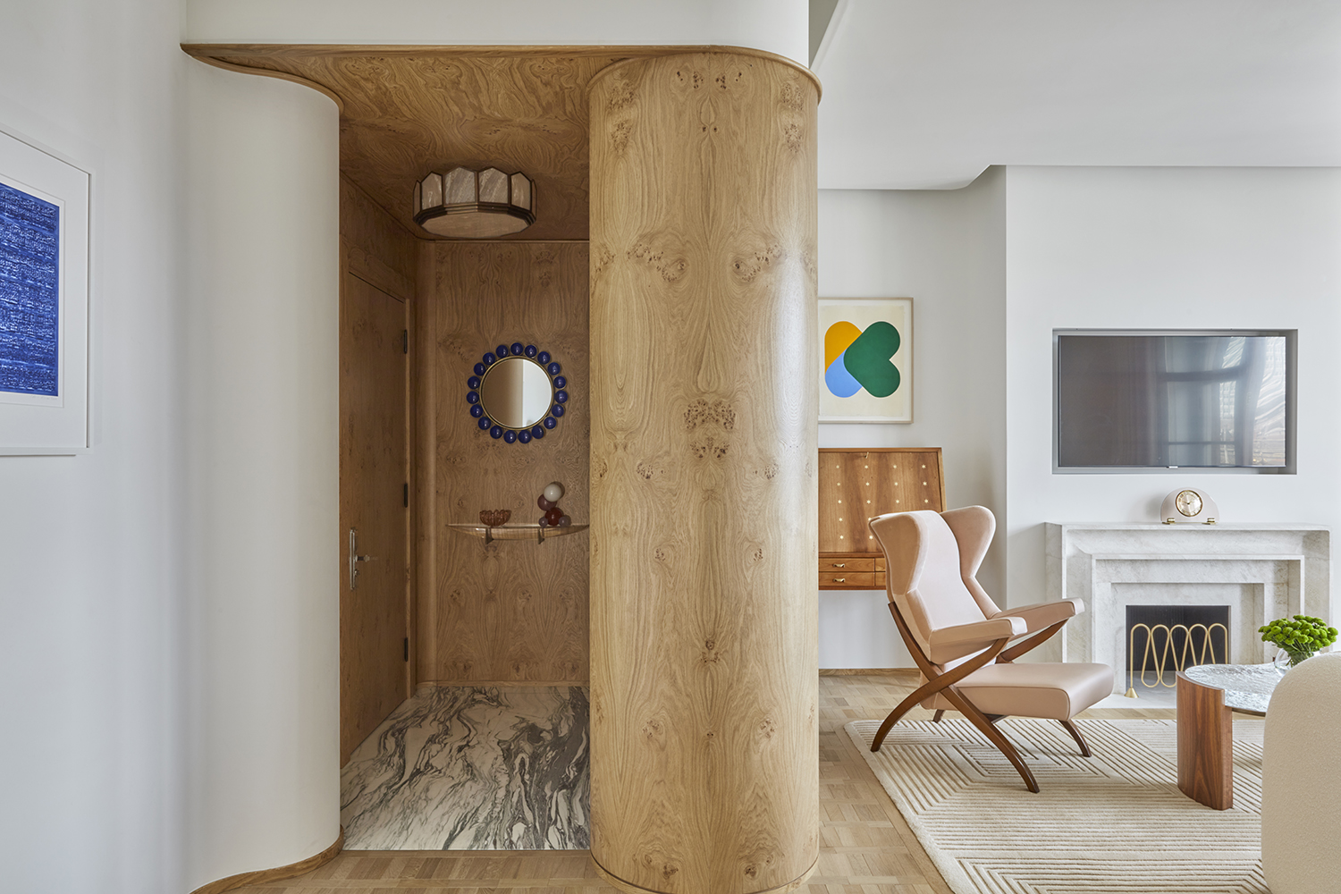
When it comes to comfort, home interiors are increasingly inspired by hospitality design. And as architects borrow sumptuous details from top-notch hotels, you’ll find plenty of inspiration from the recent redesign of this Claridge's suite by London’s Bryan O'Sullivan Studio, where soft curves flank the entryway.
‘There is something about the curved wall here which adds an immediate sense of calm to the room, as soon as you enter,’ says Bryan. ‘The soft rounded edges offer a different flow to the room in comparison to an angular wall. It feels inviting yet elegant and contemporary.’
7. Finish with texture
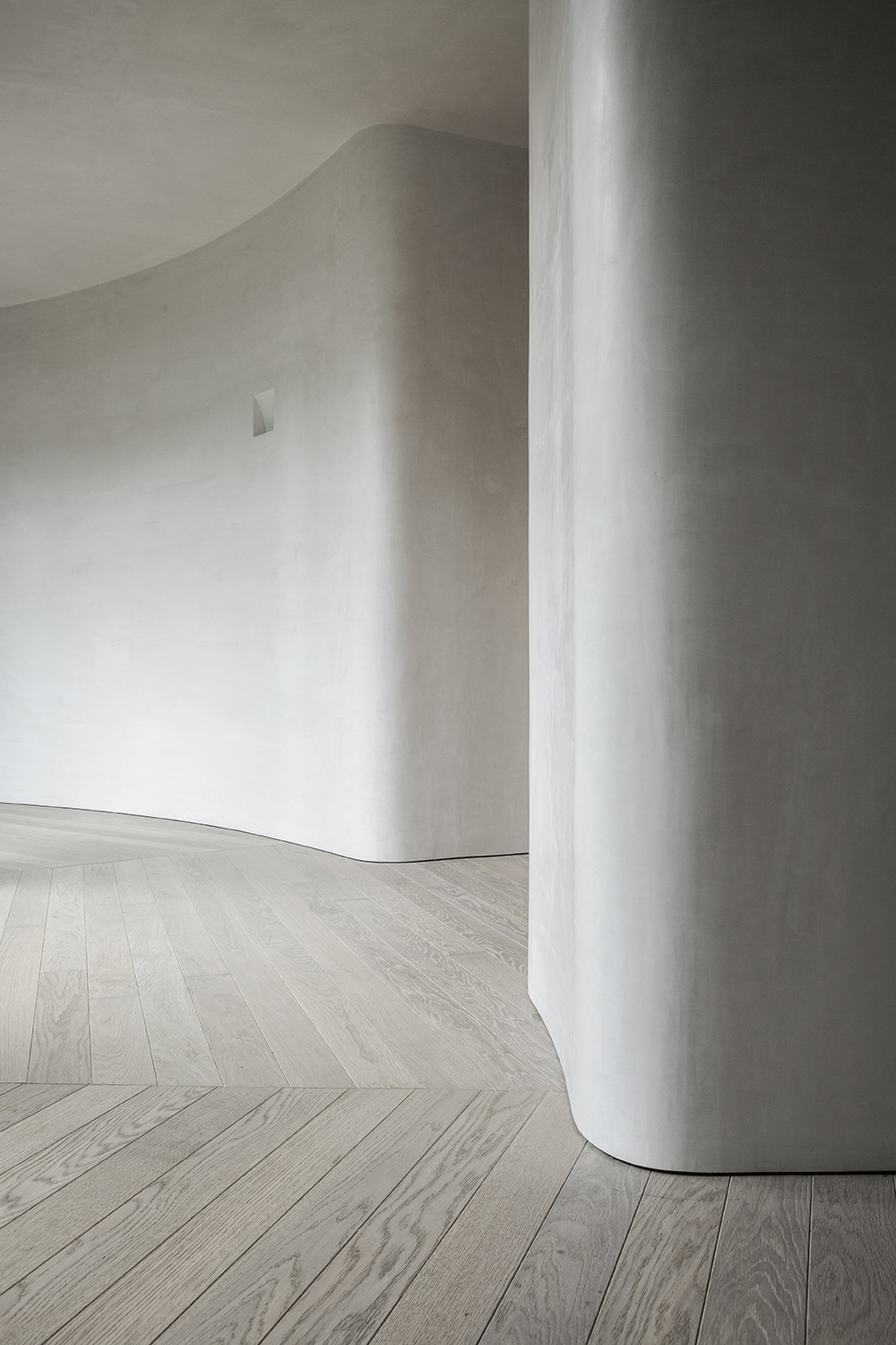
Working with an existing round floor plan (complete with a central patio), architects leaned into the curved layout by using a soft lime wash – bringing an extra smooth look to the walls – while a unique floorboard pattern matches the circular flow.
‘The lime walls helped us enhance the artisan expression of the curves and the wooden floorboard follows the icosahedral cutting of the windows that surround the patio,’ says architect Iker Ochotorena, founder of Madrid’s OOAA studio.

