While current next-gen consoles have been lacking when it comes to hardware-pushing, AAA titles over the last couple of years, the tide is starting to turn. Highly anticipated titles are finally making their way onto consoles, and few are more anticipated than Bethesda's Starfield.
Due out for Xbox on 6 September, the space exploration game looks visually stunning in the previews we've seen so far. And yet, a few days out from release, it looks like rival developers are arguing over the quality of... the start screen? (Planning to play Starfield next month? Check out the best 4K monitor deals for the ultimate experience.)
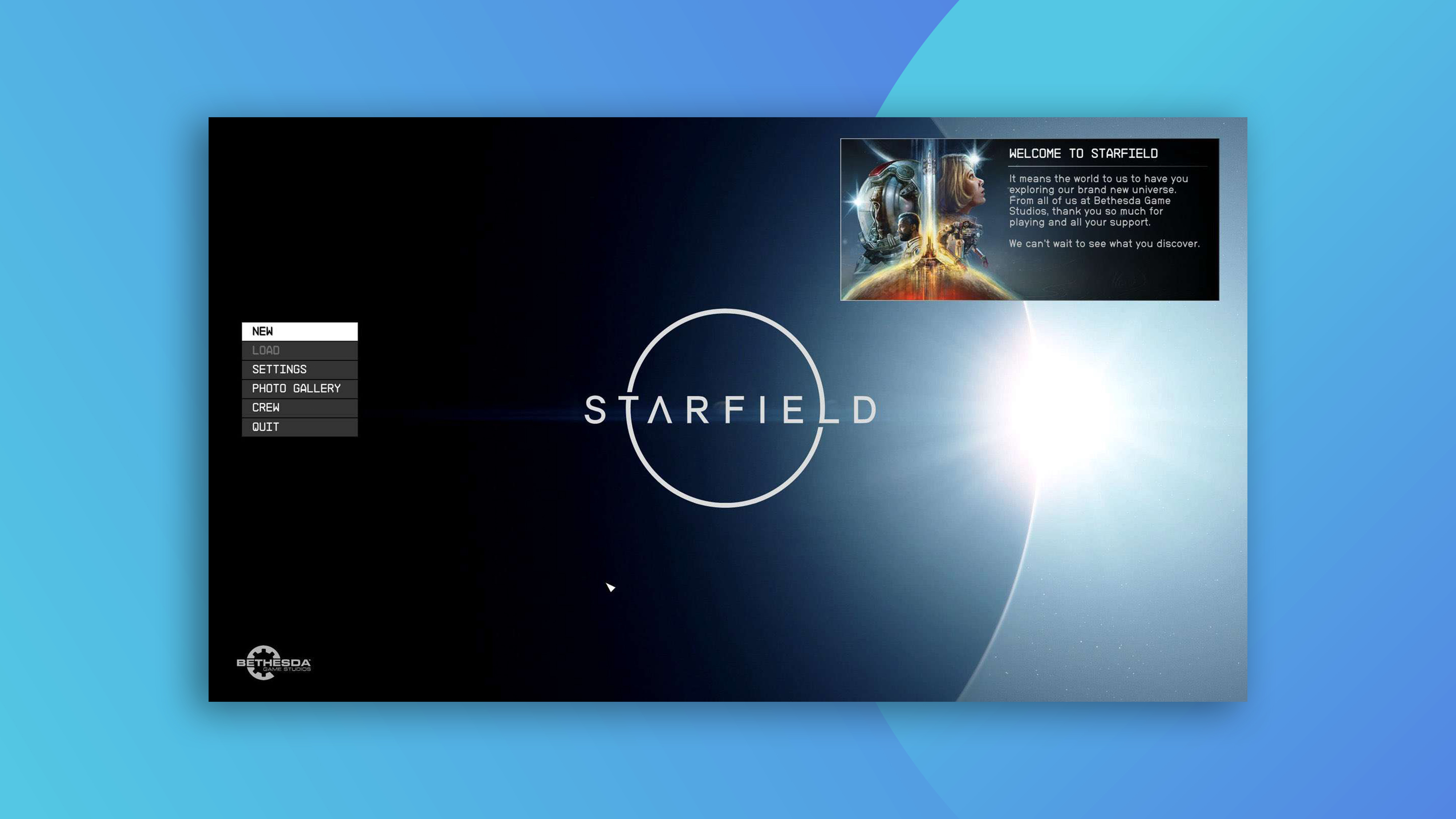
The physiognomy of start screens.The start screen of a game can reveal a lot about how rushed the team was and how much pride they took in their work.Starfield's start screen either shows hasty shipping deadlines by a passionate team overworked, or a team that didn't care. pic.twitter.com/Ok4gzQ3DVoAugust 19, 2023
One of the more bizarre Gaming Twitter dramas we've seen began when former game developer Mark Kern (who worked on StarCraft, World of Warcraft and Firefall) shared a screenshot of the start screen, suggesting it shows that the team was either "overworked" or "didn't care."
Kern's issue with it seems to be the simplicity of the UI. Sure, this is a pretty spartan design, featuring the (very cool) Starfield logo, a few basic options and, er, not much else. But then, for a game all about discovering uncharted worlds, isn't simplicity and openness kind of the point? And there's also the question of (whisper it): who cares? If the game is beautiful, we're hardly going to want to spend a lot of time looking at the start screen.
Bethesda’s head of publishing Pete Hines waded into the debate, commenting on one Tweet (above), "Questioning out a developer's "care" because you would have done it different is highly unprofessional coming from another "dev"".
Starfield is getting trashed on for its start screen. Here’s some of my favourite start screens: pic.twitter.com/zLOiA5cG6TAugust 20, 2023
What are we even doing here? Some of the best games of all time have had the most simplistic and basic start screens.Cut it out you filthy clout chasers.#Starfield pic.twitter.com/QxOJUNvi6QAugust 19, 2023
While the whole debate seems a little ridiculous, one silver lining is that it's provoked plenty of users to share examples of their favourite start screens from throughout the years (above), which is proving a delightful trip down gaming memory lane.


