
Used in decorating for centuries, serene dark blues have always been enduringly popular, harmonizing with many hues for gloriously diverse results, but are we finally falling out of love with this cocooning color?
While decorating with blue is still very much in vogue, navy blue room ideas might be slipping out of fashion. 1st Dibs was the first to pick up on its downturn – spotting its interest plummet by 43% in a 2022 survey. Navy blue was at its peak popularity back in 2020 when Pantone declared that ‘Classic Blue’ was the color of the year. There hasn’t been as much fanfare around the color since.
Let's be clear, navy blue is never going away – it will remain a staple in interior design – fresh new colors are coming through. Interestingly, navy blue’s origin story lies in conformity, since it began with the armed forces, with the navy’s uniform (hence navy blue), maybe it’s almost fitting to rebel away.
What is the new navy blue in interior design?
Cerulean blue is back in the zeitgeist when it comes to room color ideas. There’s been a slew of design connoisseurs with some blue sky thinking – whether it’s drenched in Blake Lively and Ryan Reynolds’ living room, or adorning a staircase of Ganni founders’ Copenhagen home, cerulean blue is here to stay.
‘Rich navy blues have long been a 'staple' in interiors with the dark inky tones creating a sumptuous and cozy feel. However we are seeing cerulean blue having a resurgence,’ says Caroline Aston, interior design and sales executive of House of Hackney.
‘Uplifting and optimistic, it evokes summer days and bright horizons. A really versatile tone that can be warmed up by accessorizing with golden accents but also acts as a perfect backdrop for splashes of color,’ adds Aston.
Despite its contemporary resurgence, it’s a color that’s steeped in spiritualism across history. The French call cerulean blue: blue céleste, a heavenly blue. Many Hindu Gods too, including Krishna, Shiva, and Rama are depicted with the color of the sky, a symbol of their affinity for the infinite.
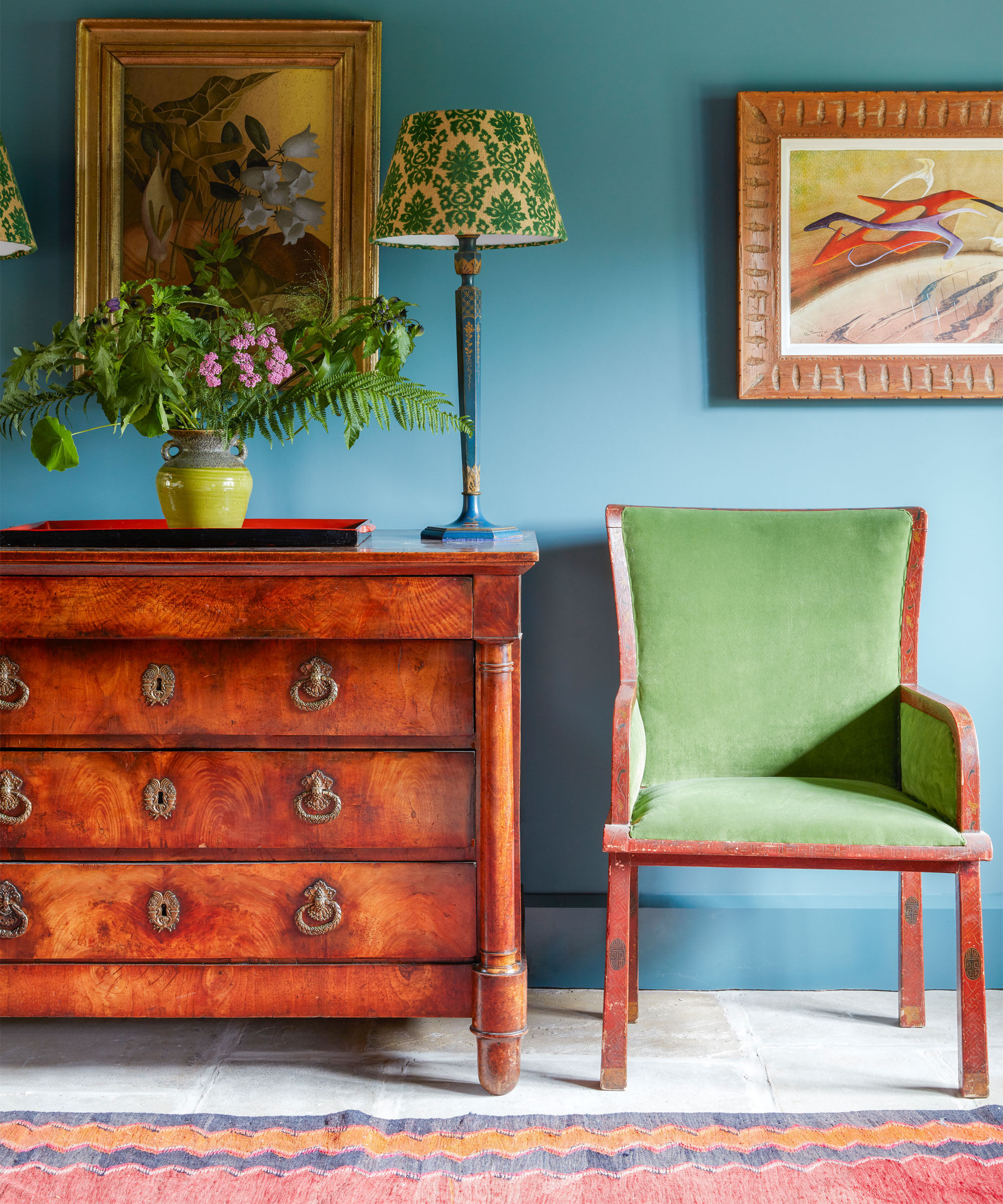
What can I paint my walls with instead of navy?
Cerulean blue might be a rebellion against a staple navy – but Tash Bradley, Lick’s director of interior design and color psychologist choosing a cerulean blue might also be seen as a ‘rebellion against restrained, “adult” color schemes. A primary color like a cerulean blue ‘has an inherent playfulness to them and encourages you to unleash your inner child.’
With cerulean blue, comes different opinions on whether to drench or accent. Tash Bradley advises that you run the risk of overwhelming a space and overstimulating a room, without offsetting the color in softer tones.
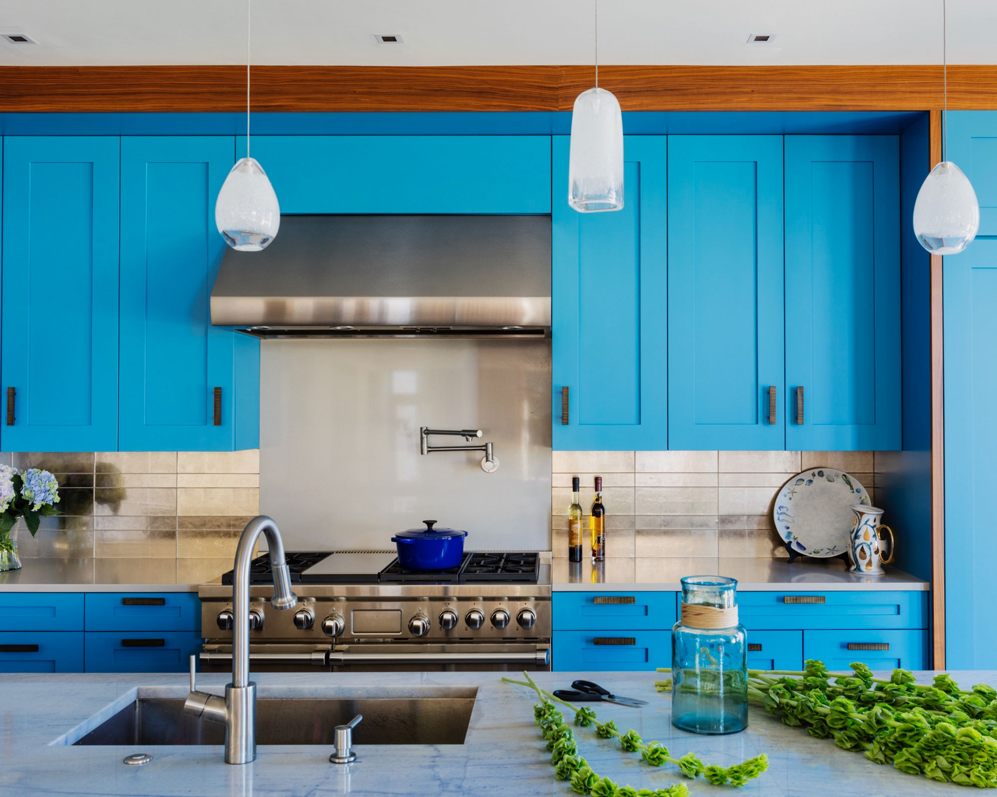
How do you decorate with cerulean blue?
‘I like to stick to the 60-30-10 rule,’ says Bradley; colors like cerulean blue ‘should only be used as 30% or 10% in a room, not 60%. If you ensure your primary colors are sub-dominant accents, you will enjoy their positive psychological traits. The colors will lift a room and inject it with bursts of joy. Where primary colors look best is against soft neutral backgrounds.' This line of thinking can work well for kitchen cabinetry, skirting boards, for example.
So if you decide to color drench a room in cerulean blue, make it a room that can meet the energy of a color like cerulean, like the laundry room, powder room, or if it’s a core room: like a kitchen, or bedroom, you could offset the saturation with yellows, and greens.
Edward Bulmer, who has launched his online course, A Guide to Pigments, Paints & Palettes with Create Academy, echoes this, saying that before applying cerulean blue to the walls, the choice comes down to the room it’s going in: ‘If you think of the color wheel, I would use blues toward the yellow end of the spectrum for bedrooms and everyday rooms, and leave those that are heading toward red for larger rooms, paneling and rooms that rely on artificial light.’
Bulmer adds that cerulean blue 'had good tonality' and is a 'great foil for lighter colors and stone and marble surfaces. It was the color of the cloth used for the uniforms of French infantrymen in the 19th century. It would have been based on indigo, the highly prized organic dye.'
1. How to use cerulean in an entryway
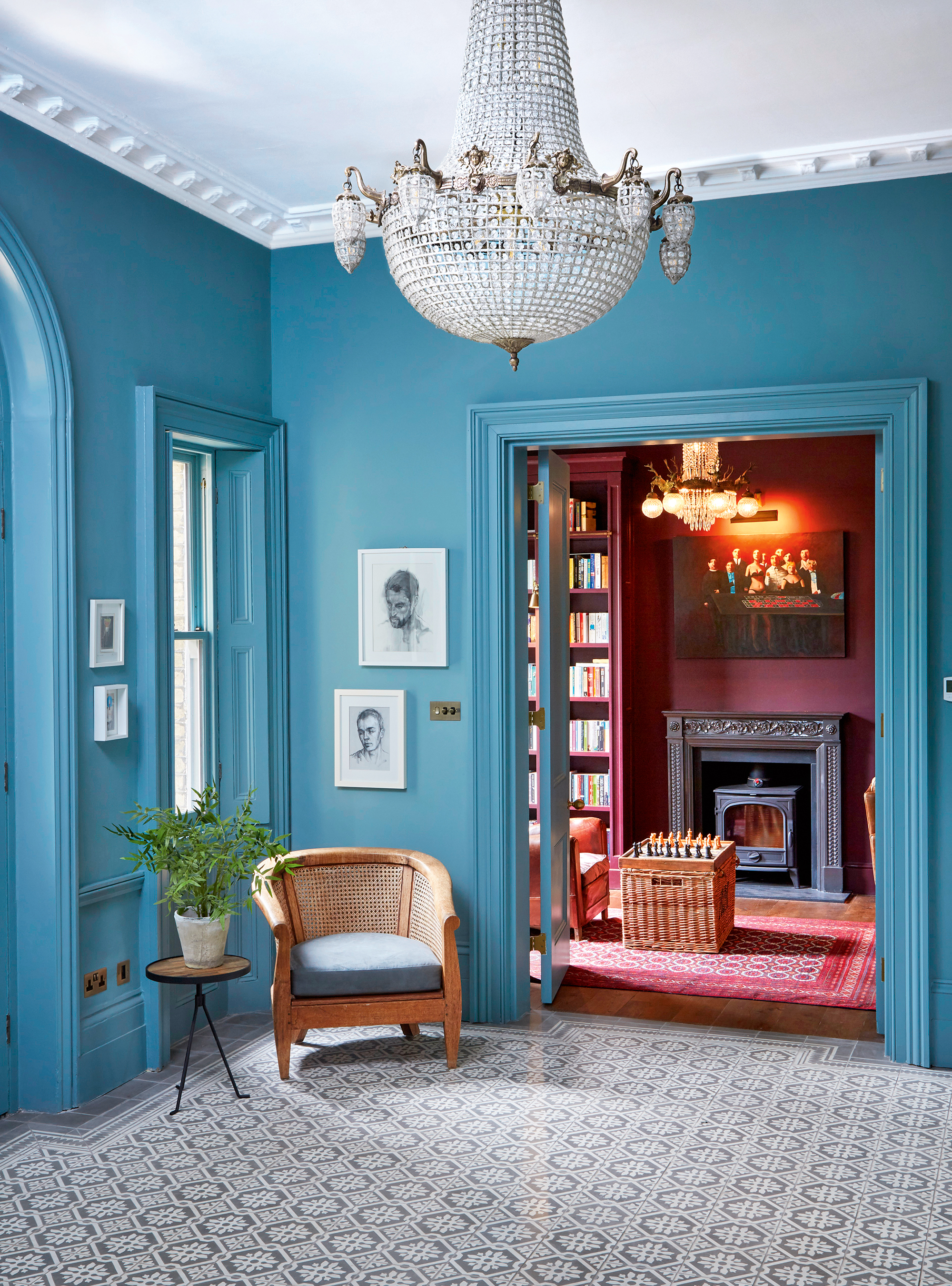
Of all the rooms, the entrance hall can often feel like an oversight. After work, we’ll throw our coats on a hanger, take off our shoes, and walk straight on through without much of a second look. But it’s a missed opportunity. And with a color like cerulean blue, an entrance hall can be transformed into a stunning artistic statement.
Farrow & Ball's creative director, Charlotte Cosby is particularly drawn to cerulean blue’s richness, where it can be ‘both invigorating and soothing in equal measure.’ It’s got versatility, she says, since it can ‘invoke a variety of themes, from coastal calm to a jewel-toned oasis. Its undertone of green is delightfully reminiscent of the ocean, particularly perfect for the warmer summer months, and it will retain a touch of warmth and comfort moving into winter.’
2. How to use cerulean in a bedroom
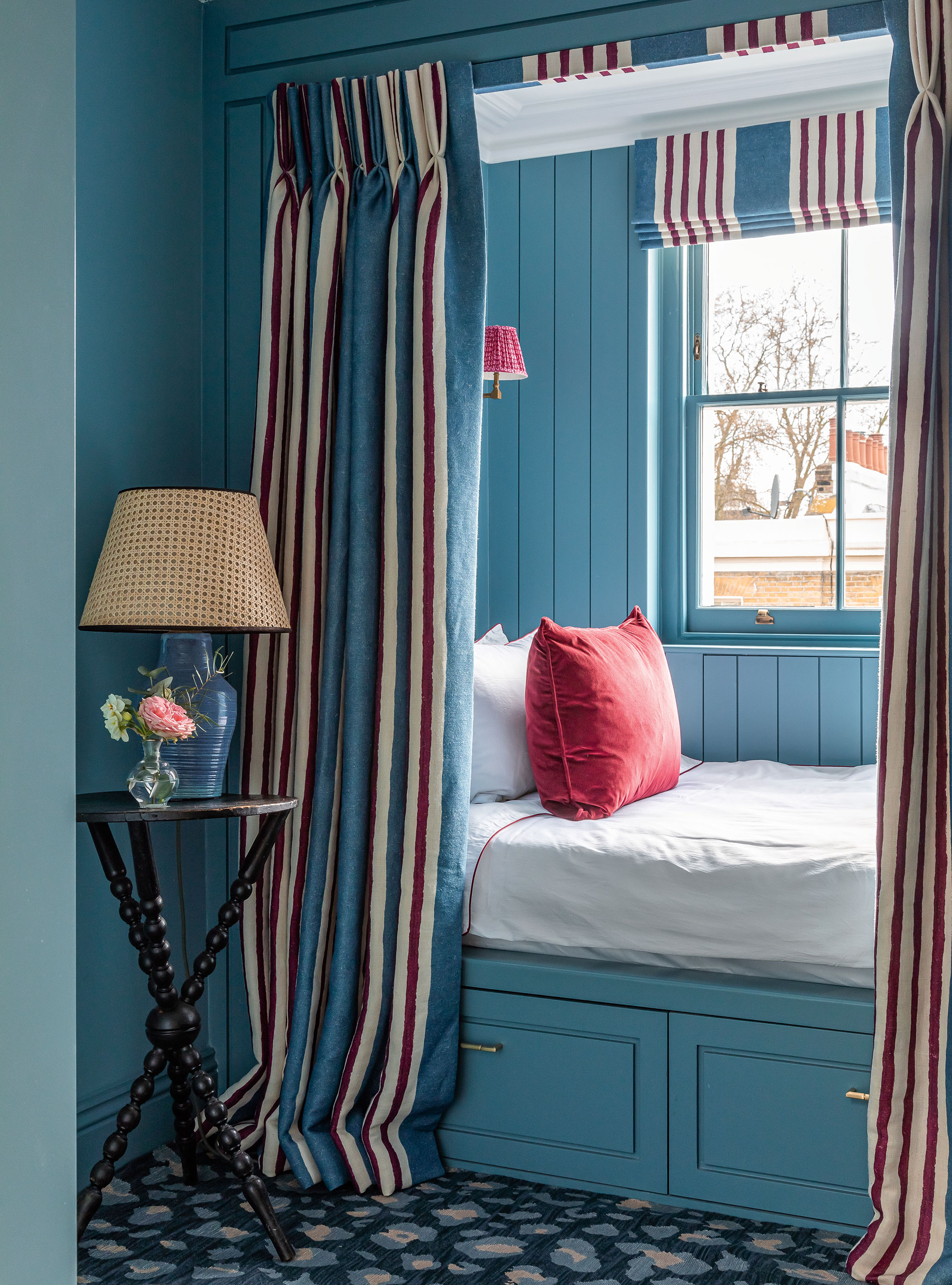
‘This rich and warm mid-blue can work particularly well in a bedroom’ says Edward Bulmer, ‘whilst it is a vibrant shade it has a softness and calmness, its mid-weight allows it to carry the depth of the headboard without being overbearing. That is why we always formulate our blues using ‘Prussian Blue’ and natural Ochre. This gives them a warmth from it being on the green side of the spectrum.’
A color like cerulean, decorated with subtle accents of red or pink can really create a stunning effect too, as shown in the above bedroom, designed by Barlow & Barlow.
3. How to use cerulean in the hall
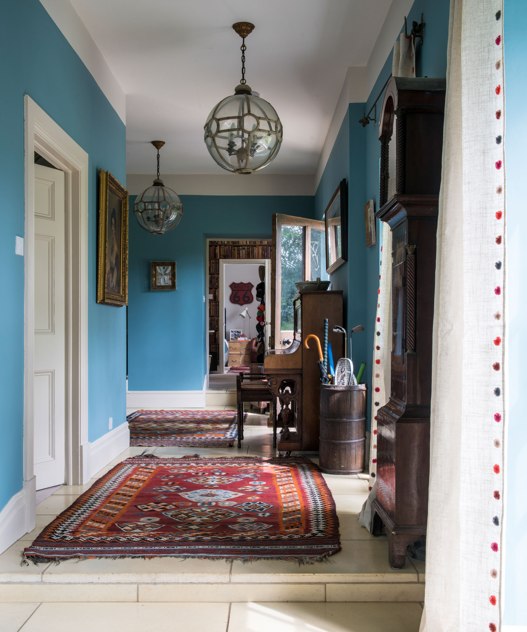
Another exquisite place to experiment with cerulean is in halls and corridors. With its connection to the outside world, from deep waters to vast skies, decorating with cerulean is renowned to make us feel more relaxed and content, having been named one of the best colors to make a room feel happy by paint experts, creating a peaceful and relaxing indoor-outdoor atmosphere for your hallway ideas.
The beauty of working with cerulean in these 'transitional' spaces is that it can pretty much work with any other color, allowing you to be both bold and subtle with your accent colors and wall decor.
4. How to use cerulean in kitchen
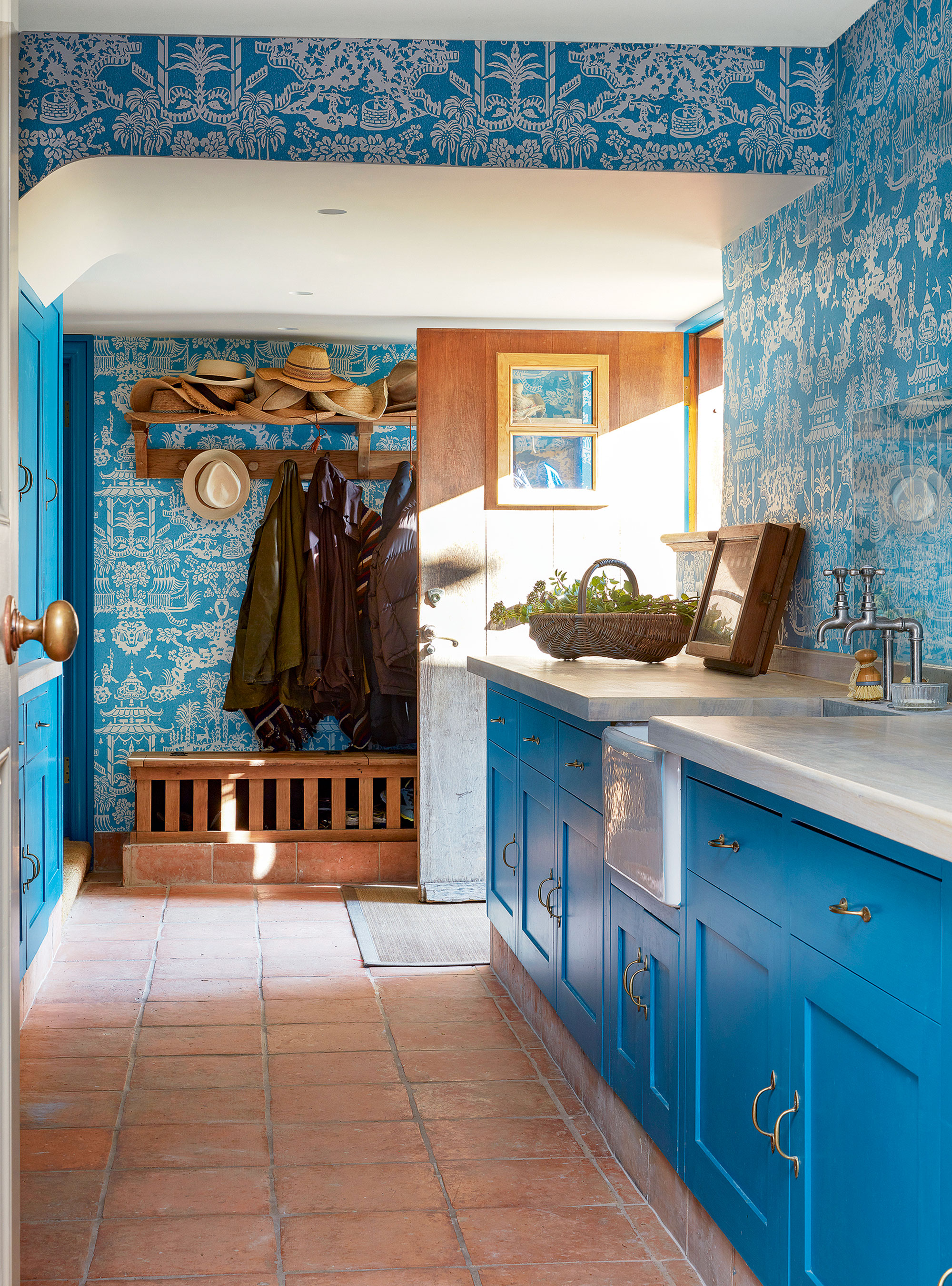
Whether you opt for a subtle hint or go all out, stay on trend this year with a beautiful blue kitchen.
Neither too light nor dark, and a perfect companion to aged timber, stone, and white-painted woodwork, mid-blues make a harmonious choice for period homes. Bright blues, like cerulean, are perfect for adding an elegant splash of color to a country kitchen.


