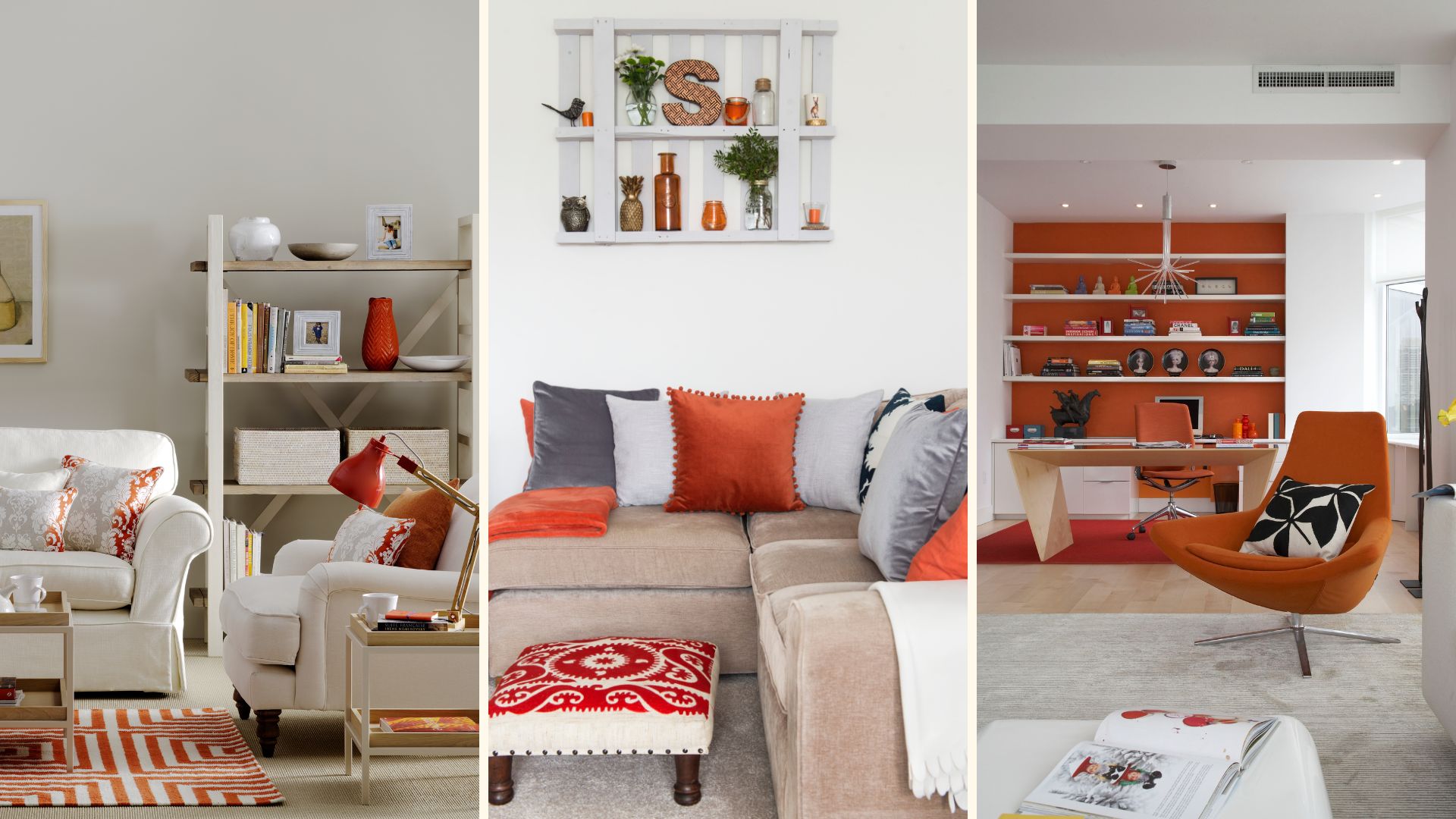
Renowned interior designer Kelly Hoppen CBE is famous for her muted colour palettes and 'quiet luxury' curated interiors. For this reason, her recent accent colour recommendation proved somewhat unexpected and surprising – yet highly inspirational.
With Kelly's penchant for muted quiet luxury interior schemes, the exclusive M&S X Kelly Hoppen collaboration offers a taster of her signature design style, we might have predicted the interior designer leaning more towards Pantone's Colour of the Year 2025 Mocha Mousse as a 'safe' accent colour.
But no her recent suggestion for a 'wonderful' accent colour is orange, a far cry from the muted neutral palette the interior designer is famous for. It's all the inspiration we need to perk up our homes with bright hues this January.
2025 inspiration: Kelly Hoppen's orange accent colour advice
The highly acclaimed designer shared her fondness of this punchy accent colour as a way to incorporate warming layers of bolder tones into an otherwise neutral colour scheme – an easy way to make a statement when decorating with magnolia perhaps? It's definitely given us food for thought to brighten up our own homes with bolder colour choices.
"East meets West with French grandeur," writes Kelly Hoppen in the post she shared with her fans on Instagram @kellyhoppen. Explaining her surprising accent colour of choice Kelly says: "Orange is a wonderful layer to incorporate, complemented by taupe and black accents."
"All of this is also about texture, here I have used it with paint, velvet, flower and striped fabrics mixed with black borders to create a wow and contrast."
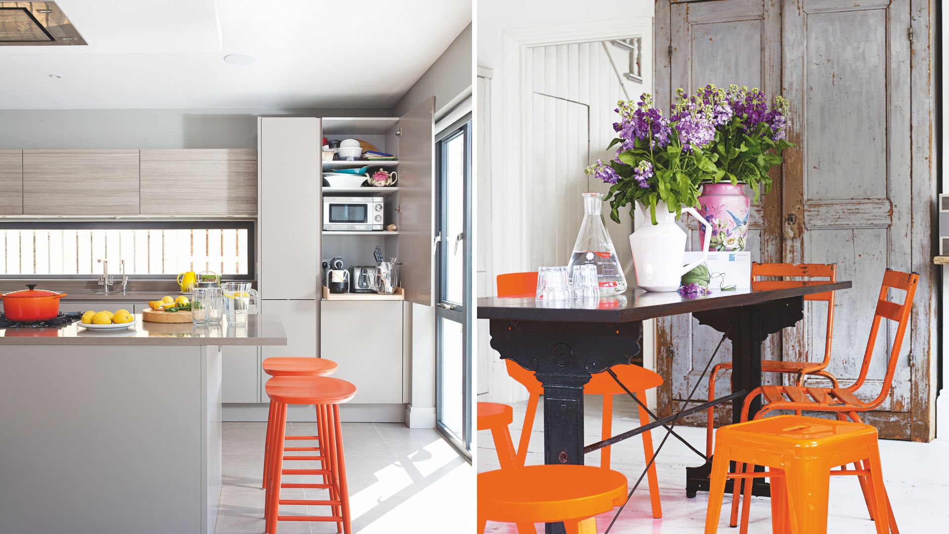
The application of orange as an accent colour to complement soft neutrals and strong black creates a striking contrast that instantly enlivens the scheme, in any room.
The beauty is that you can add colour with so many different disciplines as Kelly touches on. To dip your toe into the look you can add soft furnishings or if you're feeling brave you can indulge in a splash of paint for a more permanent commitment to the statement colour.
"Think of it as a recipe you are cooking, adding more ingredients and herbs until it tastes perfect," says Kelly poetically about introducing accent colours.
Get the look: orange accent accessories
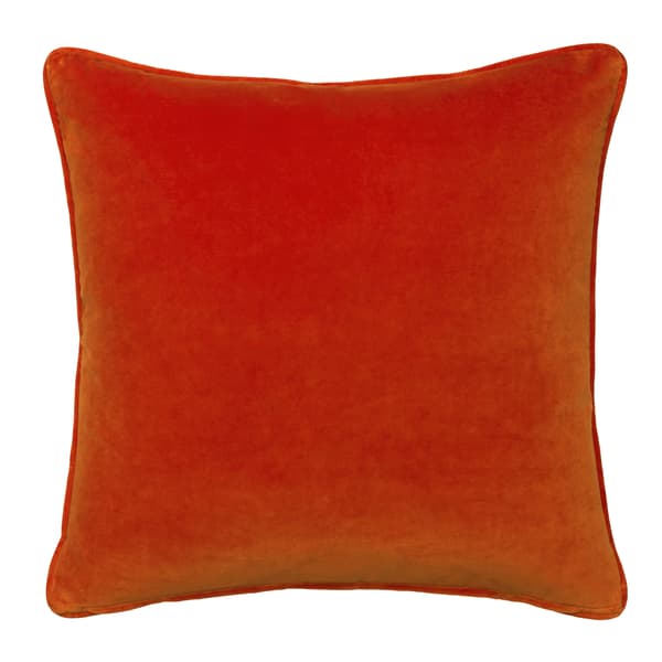
RRP: £89 | This luxurious, super soft velvet orange cushion by high-end design brand Andrew Martin is made from 100% cotton pile velvet woven in the valleys of Tuscany. The vibrant shade of orange is also highly practical thanks to an eco-stain repellent and anti-crease finish to help with any spills.
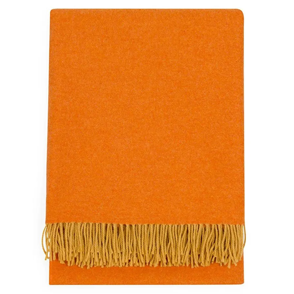
RRP: £119 now £95 | This luxurious orange throw is woven in Ireland using the finest Merino Wool. The comforting layer measures 150cm by 180cm and features decorative tasselled edging to make it even more aesthetically appealing wherever it's styled – sofa, armchair or across the foot of a bed.
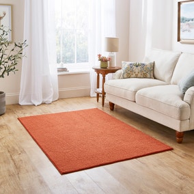
RRP: £19–£89 | This statement block of punchy orange is made all the more impactful thanks to the boucle texture. The tactile material ensures it feels as good underfoot as it looks while enhancing the decor.
In her own words, taken from the book Kelly Hoppen's Essential Style Solutions for Every Home, the interior designer says: "When it comes to interior colour schemes, people typically associate my work with a neutral palette. Chic, soothing and endlessly versatile, neutrals are anything but boring. I love using them because they provide the perfect, quiet. easy backdrop for so many looks, materials and styles of furniture and furnishings – not to mention accent colours."
"Contrary to what many people think, I'm by no means allergic to colour and I love the extra dimension that cleverly selected accents can bring to a space," says Kelly in her insightful book. "Used in the right way, colour accents inject instant energy and vitality."
The use of vibrant shades of orange in a decorating project is certainly a bold way to embrace the dopamine decor trend.
"As a rule, less is more when you are introducing accent colours," says Kelly in her insightful book. "One well-chosen colour that complements your scheme, creates the right mood for the space in question and reflects your personality and sense of fun will have a far greater impact than three different hues scattered throughout."
Of course, like all colours, the spectrum of orange shades is varied meaning there's a saturation to suit all tastes. If you love a more modern contemporary white interior you may choose to stick to a bolder bright orange similar to Kelly's interior scheme to ensure the shade is truer and sharper.
Whereas if you have more of a rustic aesthetic where a bright shade might feel too jarring you could choose more grounded shades of burnt orange and Amber – still in the same colour palette but less primary than true orange.
What with Kelly Hoppen's seal of approval for striking orange and the announcement of Dulux's colour of the year 2025 'True Joy' – a vibrant shade of sunshine yellow – maybe this is the year to embrace bold citrus shades to enliven neutral-coloured rooms.
If orange isn't your preferred tone of choice you can still take inspiration from Kelly's bold choice and swap in a warm accent tone that aligns more with your taste – perhaps pink or red?


