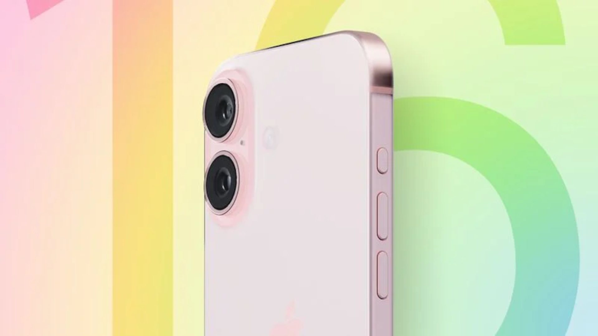
One of the big iPhone 16 rumors that’s been floating around for a while is that Apple will be adding a brand new Capture button to all four devices launching later this month. Set to live on the lower right side of the phones, this Capture button is supposed to be able to open and control the camera app.
For long-time iPhone users, this does sound like it could potentially be very useful. Opening the camera app is a bit of a pain right now, especially if you’re in a hurry, and the quickest option is to use the lock screen shortcut — which isn’t all that fast.
But Android users should know that there is a better way, and it’s something Apple could easily have copied a long time ago.
Double tap to shoot

Buttons on smartphones are few and far between — that’s one of the key reasons why they work so well. But this also means that the power and volume keys can pull double or even triple duty, depending on what phone you use, with various gestures and combinations that let you do more things.
The power button is no exception, offering a bunch of features beyond turning the display (or phone) on and off. In fact, on iPhone double-tapping the power button opens up Apple Pay, making it slightly more convenient to use your phone instead of a credit card.
But that’s not what happens on Android. On Google-powered phones double-tapping the power button actually opens the camera — regardless of whether your phone is locked and what it’s doing. And that can be a huge help if you want to capture a photo or video quickly. Like the time I saw a DeLorean traveling down the highway from an overhead bridge. On the back of a truck, too, so there was no chance of it hitting 88mph on the way to Cardiff.

All the talk about the Capture button and how it could speed up the process of opening the iPhone’s camera app got me thinking about Android’s system. It’s the kind of feature where once you know about it there’s absolutely no going back — even if you do sometimes wind up locking your phone by mistake.
Two quick taps, the camera opens, and then you get to hit the shutter and capture whatever it is you’re looking at. No messing about with menus, or shortcuts, and absolutely no need to add an extra button that would make former iPhone design chief Jony Ive weep in shame.
Admittedly bringing this exact feature to the iPhone would need some things to change. The Apple Pay shortcut is pretty convenient, and the Android equivalent would not be an appropriate substitute. Because it’s basically the same as how Apple treats the camera right now, with quick access only available from the lock screen or pull-down Quick Settings menu.
Maybe Apple could find a new place for the Apple Pay shortcut. Perhaps pressing and holding the power button, since that currently isn’t being used for anything right now. Or, heck, use that method as a camera shortcut if Apple Pay absolutely has to stay where it is. But it feels like there are better ways to quick launch the camera without having to add a whole new button.
It may not be that simple
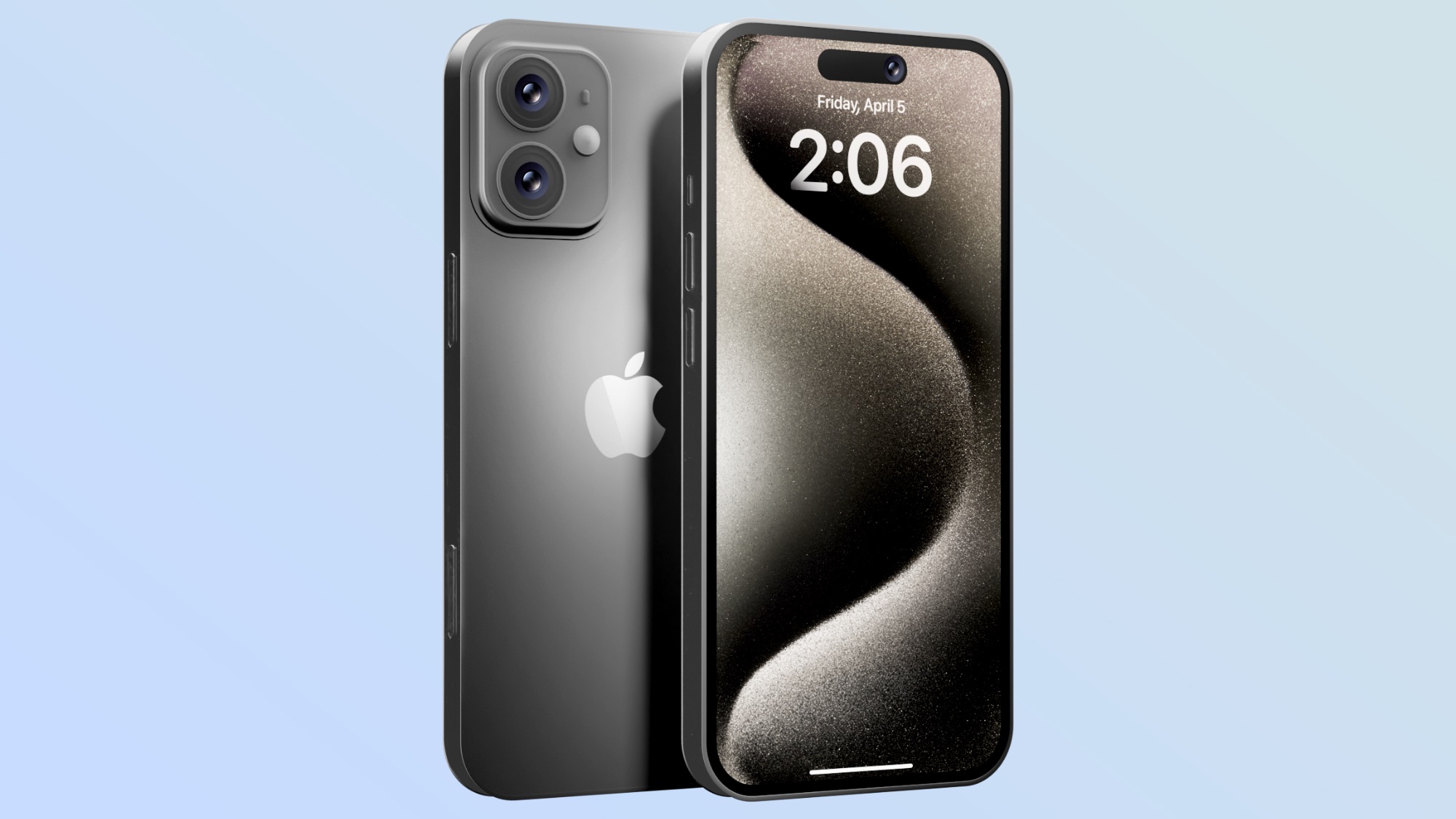
The truth of the matter is, however, that the Capture button may be a little more complicated than a button for opening the Camera app and controlling the shutter. Not that being able to do either of those things more easily is a bad thing, but some rumors suggest Apple knows full well that it’s not the kind of thing you need to add a whole new button for.
One of the earliest rumors claimed that Apple could add “force sensor functionality” to the Capture button, allowing it to detect differing levels of physical pressure. In other words, the Capture button could be programmed to do different things based on how hard you press it. So a single tap could activate the shutter, while a little more force could trigger a video recording.
A different rumor claims that this feature may actually be a safety measure to avoid accidental use, and ensure you don’t take photos or videos unless you definitely meant to. But that rumor later went on to suggest that the button may also support swiping gestures that could be used as a zooming feature or to help focus the camera.
While that may not be of immediate interest to the casual iPhone user, being able to control focus without using the touchscreen could be very useful if you like to use the iPhone’s manual camera controls. The same goes for helping to keep a steady shot while you zoom in on a subject.
We haven’t heard a whole lot more about the Capture button, but those few rumors do suggest that it’s going to be a lot more versatile than a plain-old button. Which is as it should be. If the boring-regular power and volume buttons can perform multiple functions, then so should the Capture button and any other things Apple adds to the iPhone’s exterior in future.
Capture button bottom Line
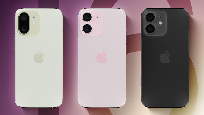
Who knows — maybe Apple has some amazing tricks up its sleeve that will make the Capture button a must-have component on all future iPhones. Something a little more robust and productive than simply opening the camera app a little faster. But that’s not to say that some of the Capture button’s rumored features aren’t a little redundant.
After all, speedy camera access could be implemented without brand new hardware, and wouldn’t necessarily need to be exclusive to pricey new phones. Sure, it’s annoying to try and open the camera and accidentally lock your phone. But it’s not like Face ID wouldn’t immediately unlock everything as soon as you were within sight of the cameras.
At the very least Apple could give its users a little more choice over how various button combinations behave. The company has been pushing that angle a lot in recent years, and the extra customization freedom coming to the home screen in iOS 18 or iOS 18's Control Center are the perfect example of that. So there’s no reason why Apple can’t keep pushing that angle letting people better personalize their iPhone experience in less obvious ways.


