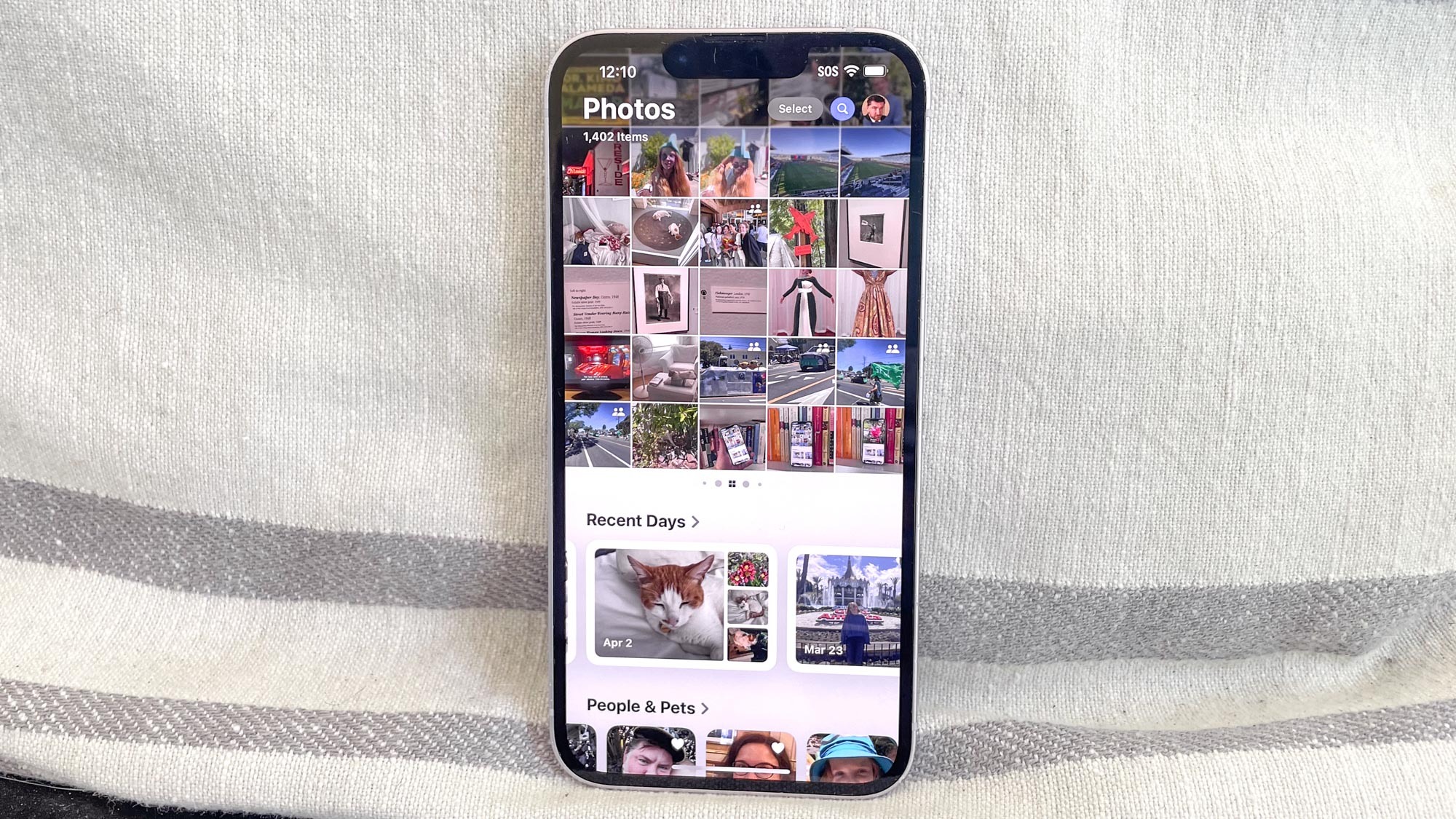
Once you fire up the iOS 18 public beta, you may not notice many immediate differences between Apple's upcoming iPhone software update and the current version of iOS. That is, unless your first stop happens to be the Photos app, in which things look quite different indeed.
When previewing iOS 18 at WWDC 2024 in June, Apple called the revamped version of Photos the most significant overhaul in the app's history. It's hard to argue with Apple's claim, as the tabbed interface found in the iOS 17 version of the app has given way to a single-screen view where your photo library, albums and dynamically adjusting photo collections are all just a scroll away.
Whenever faced with a redesigned version of something we're all accustomed to, our first instinct may be to muster up our best Comic Book Guy impersonation and declared that what we're looking at the worst update ever. As I noted in my iOS 18 public beta hands-on, the new look Photos certainly takes some getting used to. Maybe over time, I thought, my initial resistance may melt away as I get accustomed to where Apple's moved things.
It's been about two weeks since the iOS 18 public beta became available, and while that may not seem like a lot of time, I have been dabbling with the developer beta for a month before that. At this point I'm not prepared to declare the Photos overhaul an unqualified success, there are more things I like about the new-look app than I don't like (though the things I don't like I really don't like.)
Here are some early thoughts on iOS 18's take on Photos, focusing largely on the things that Apple's gotten right.
iOS 18 Photos: A brief recap
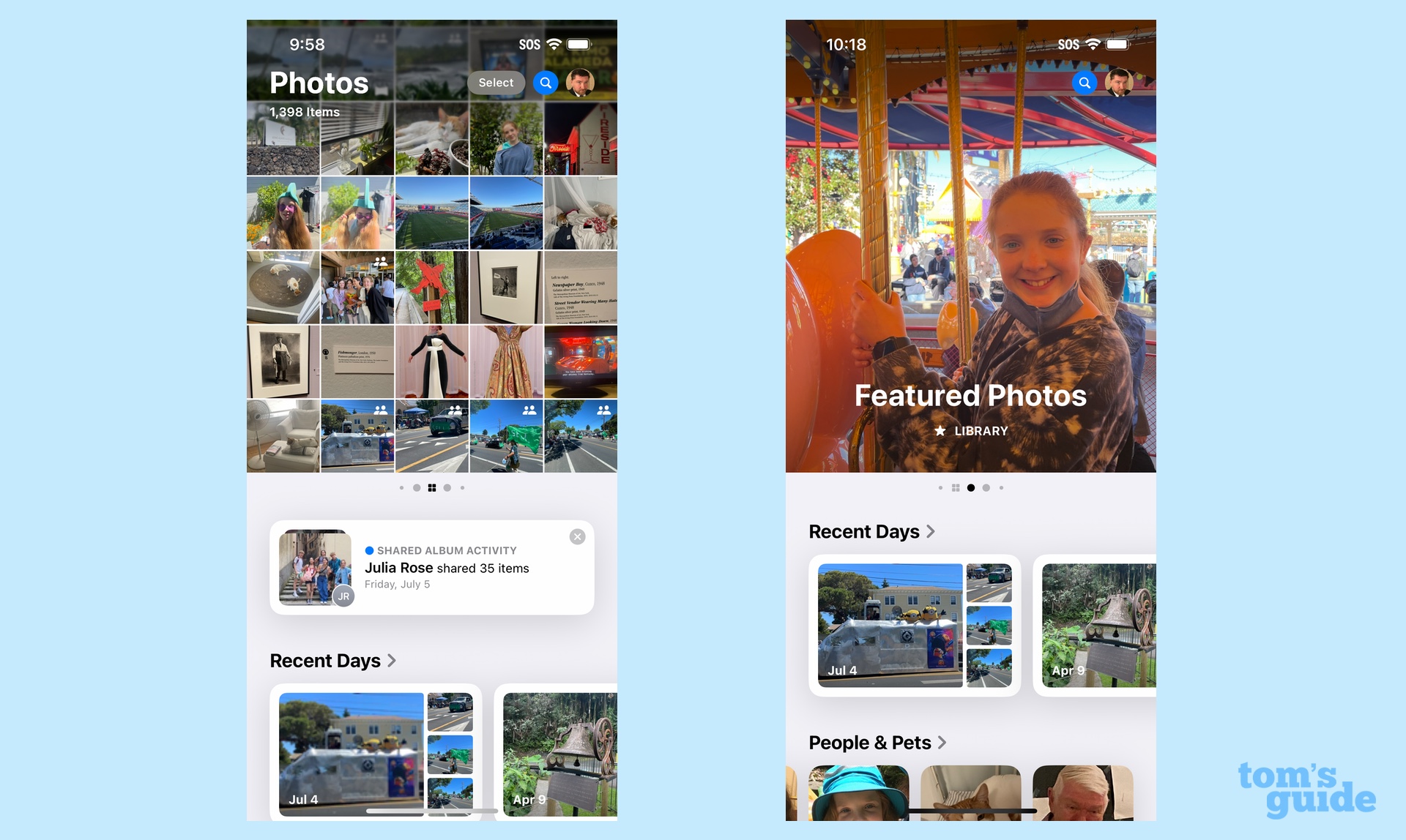
Just in case you haven't tried out iOS 18 for yourself or read any of the iOS 18 Photos previews, here's a quick summary of what's changed. When you launch the app in iOS 18, everything's on on screen, with your photo library visible in the upper half of your phone's display and a series of photo collections appearing just beneath.
A downward swipe takes you into the photo library, where you'll see all your photos be default, though you can drill own into Months or Years views. A filter tool lets you adjust the order photos appear (date captured vs. how recently they were added), and you've also got some control over viewing options. Filters also let you bring out certain types of images — your favorites, just videos, or photos you edited — or hide things like screenshots.
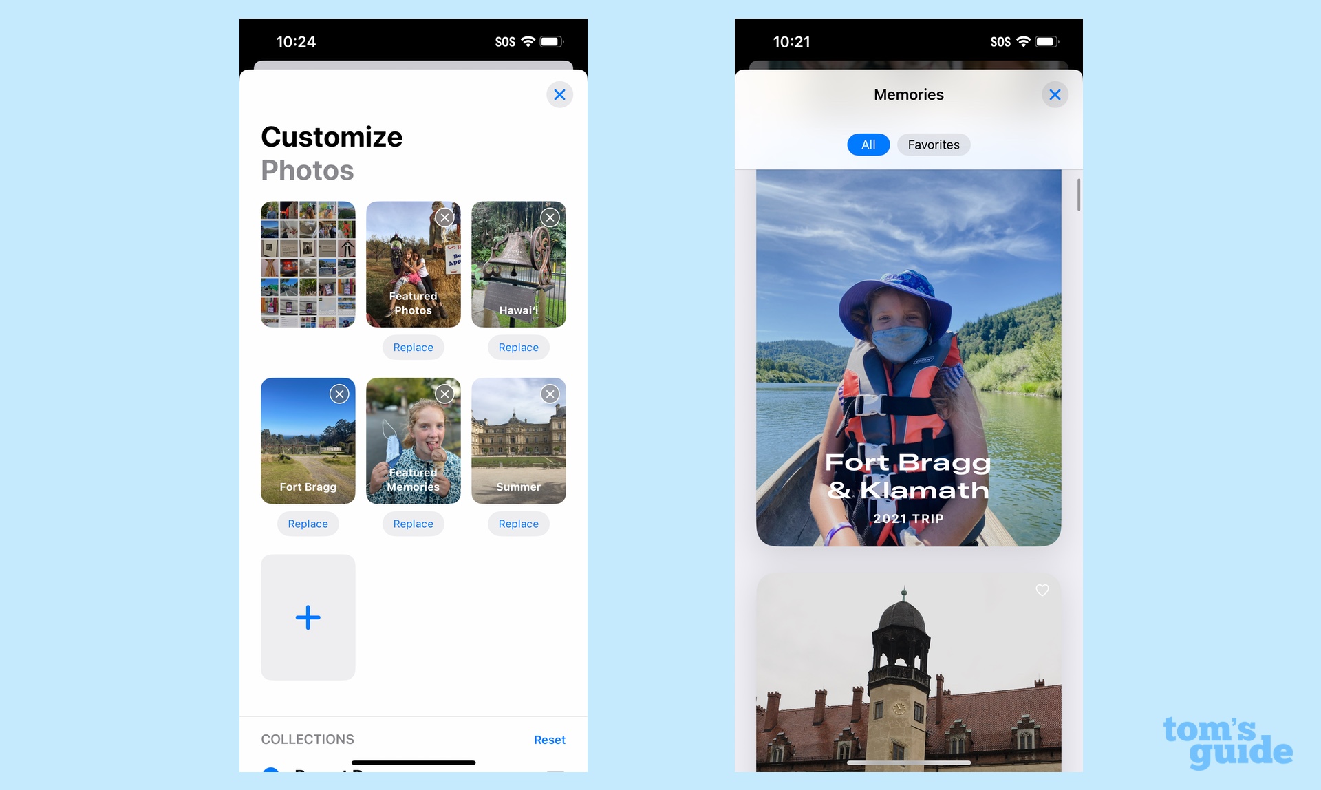
From the main view of the Photos app, you can also swipe right or left on your photo library, revealing different collections that the app has put together of your photos. If you want, you can customize which collections show up in the carousel. (For more on how to do to this, check out our guide on customizing the iOS 18 Photos app.)
As for those collections living below the photo library, you'll see a strip of photos you've taken in recent days, along with groups like People & Pets, Memories, Trips, and collections that you've pinned — another element of Photos you can customize. Keep scrolling and you'll find links to your photo albums, shared albums, media types and the utilities Apple includes in Photos like the tool for merging duplicate images.
iOS 18 Photos: What I like
Lots of curated albums
One of the things I've come to appreciate about Photos over the years is how it surfaces some of my favorite photos without me having to do a blessed thing. Sure, I can assemble an album, flag it as a favorite, and revisit it whenever I want to relive a memorable trip or family gathering, but Photos does a pretty good job of doing that without my intervention. In fact, I've set up a home screen widget where a new image from my photo library surfaces ever day, just to cheer me up during work hours.
Well, there's more where that came from in iOS 18 Photos. From the carousel of collections living alongside my photo library to the other grouped photos I can find with an upward swipe, my best photos figure to be easy to find in this new iteration of the app. And if I am motivated to create an album of favorites, it's easy enough to make sure that's part of the mix.
More control over what appears
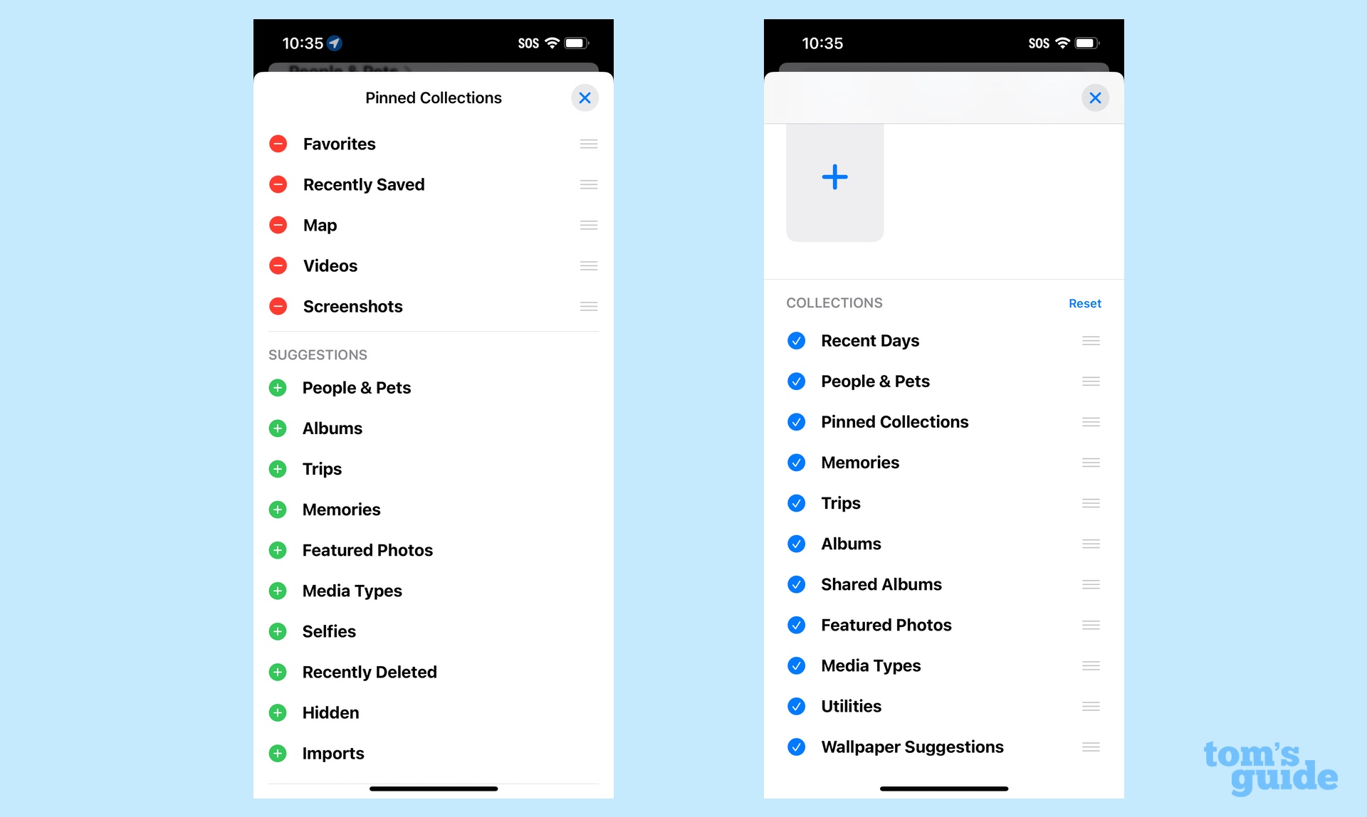
Speaking of controlling the look of the app, the new Photos certainly provides plenty of customization tools — maybe not as extensive as the ones to customize your home screen in iOS 18, but enough to put your stamp on what appears where.
By my count, there are three separate places, you can exert control over what the Photos app shows. Keep swiping left or right from your photo library and you'll eventually hit a customization screen that lets you set which collections show up in the carousel and in what order. The Pinned Collections can be modified, of course, and if you keep scrolling all the way to the bottom of the lone Photos screen, there's a customize command that once again gives you a way to reorder collections in your carousel.
But with this customize command, you can also rearrange things to appear in a different order within the app. Want your Trips photos to appear above People & Pets? Move it up the screen. Want the Memories collections to disappear entirely? Just tap the checkbox to remove them.
The search filters really help you find things
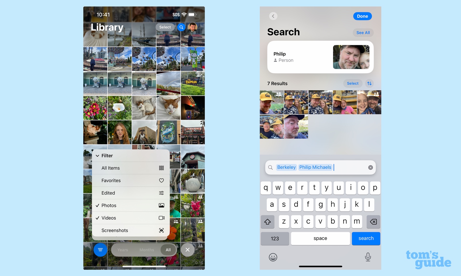
I'll be the first to argue that the new look for Photos can be a little bit intimidating, especially if you've got an oversized photo library. But those filter tools that float up to the bottom of the screen really help remove some of the clutter by letting you drill down to find the kinds of images you're looking for.
It's an occupational hazard that my photo library gets clogged up with screenshots (particularly when I'm writing about new features in a major iOS update, just to cite a random example). The filter tool lets me filter out those screenshots so that I'm only looking at photos and videos when I scroll through my library.
Search tools as a whole seem better in iOS 18 Photos as I can type in phrases like "baseball in 2019" and get photos from a trip I took to watch baseball games in Texas that year. I can add multiple search terms like "Berkeley" and my name to pull up all the photos I appear in from that particular city.
Easy access to utilities
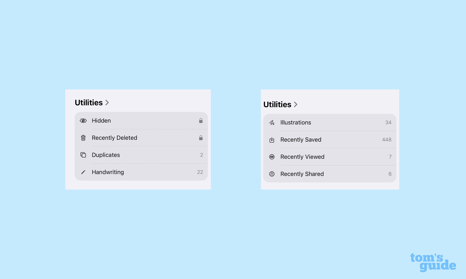
The addition of a Hidden Photos folder in a previous iOS update was a welcome one, as it gave you a place to stash photos you didn't necessarily want the rest of the world to see. The trouble is, it's not always easy to find that Hidden Photos folder — in the iOS 17 version of the app, you've got to tap on the Albums tab and then scroll until you find the Utilities section.
Because iOS 18 makes Photos a single scrollable interface, the Utilities section and the Hidden Photos folder is just a quick trip down the page. And if you want to move it up higher, you can thanks to the previously mentioned customization features.
Don't worry that making Hidden Photos easier to find makes it less secure — you still need to unlock the folder with Face ID to access it. The same thing goes for recently deleted photos, which is located right next to the Hidden Photos folder.
Wallpaper suggestions
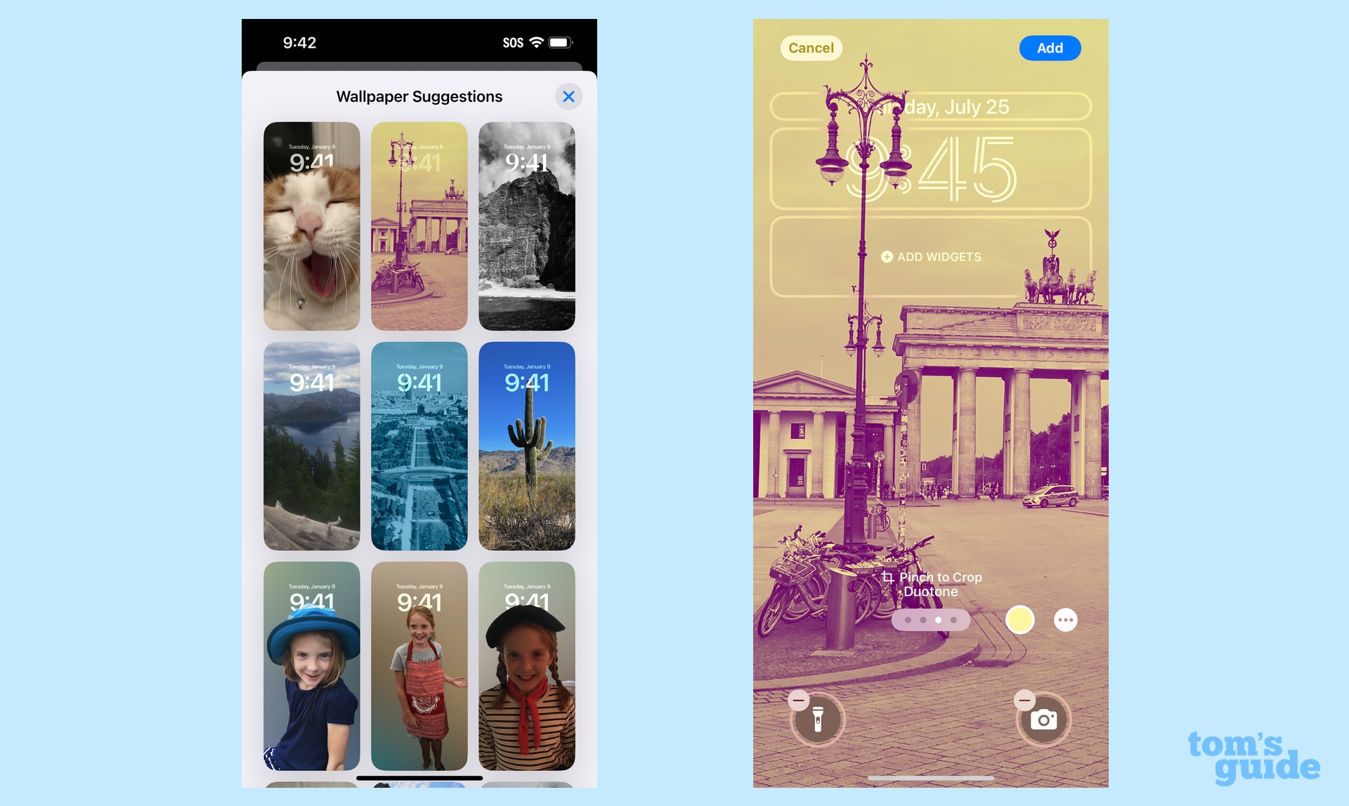
I don't always have the best eye for assembling stylish-looking lock screen or home screen wallpapers, so I appreciate that very bottom of the Photos app in iOS 18 includes wallpaper suggestions. Here, the app takes some of your photos that would look good in the iPhone's aspect ratio and adds any filters to create a stylized look. It's a great way for finding inspiration to create your own design — or just cut to the chase and use a pre-assembled wallpaper if it truly strikes your fancy.
iOS 18 Photos: What I don't like
The old tabs were easier to navigate
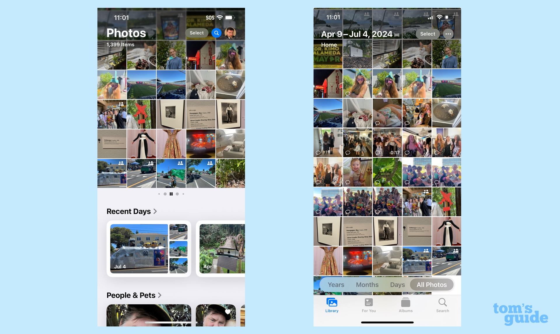
While I appreciate that iOS 18 Photos lets me rearrange blocks of photos to my liking, I really found the old tab-based interface a lot more pleasing to the eye. When I wanted to spend time in my photos library, I could hang out in that tab until it was time to see what collections had been automatically created in the For You section. And if there was a particular album of mine I wanted to see, it was pretty easy to tap on Albums.
Now? There's a lot of scrolling and a feeling I might be missing something, even though that's the exact opposite of what Apple's out to achieve with this revamp.
It's very likely this complaint will fade over time as iOS 18 PHotos becomes familiar. But at the moment, pour one out for my poor dead navigational tabs — too beautiful to live in a world of much larger photo collections.
That carousel is hard to spot
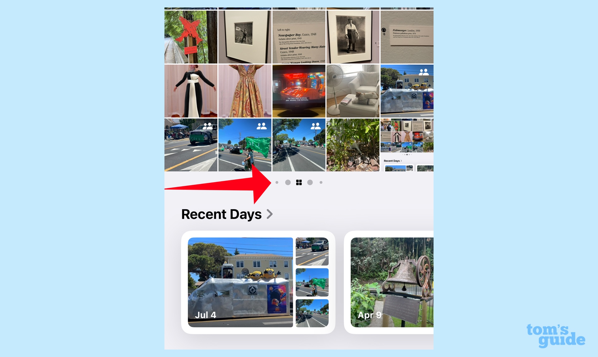
Apple's visual cue that there's something at the top of the app besides the photo library uses a handful of dots just below the main interface. If you've got a smaller iPhone — even a 6.1-inch screen — these dots are not very easy to spot. So chances are the only reason you might know there's a carousel up there is that I just told you there was. Or, if you like me, you made an accidental swipe and were surprised to see a photo collection swing into place on the screen.
I think Apple would do well to make those dots bigger or to add some other visual cue like arrows on either side of the photo library interface. That way, you know that there's something to explore there and that iOS 18 Photos isn't just a series of up and down swipes to navigate
