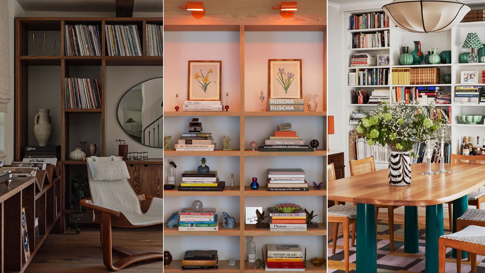
This year, bookshelf styling has been more top of mind than ever for interior designers and homeowners alike. With the bookshelf wealth trend taking off in early 2024, and loads of characterful design styles following suit, our feeds have been full of gorgeous, eclectic book looks.
But styling a bookshelf right can be a bit more tricky than first meets the eye. With decor, artwork, and, of course, books to incorporate, quite a lot goes into the perfect bookshelf design scheme. Mistakes are easily made, and once one small item's out of place, the whole endeavor can start to feel overwhelming.
To hear how to style a bookshelf with style, we spoke with interior designers, who shared the styling mistakes they see most often. With these missteps in mind before you begin, you'll be right on track to a bookshelf wealth-worthy statement fit for any interior design style. Here's what the experts say you should steer well clear of.
17 bookshelf styling mistakes to avoid
These are the top 17 considerations to keep in mind when styling your shelves, according to interior designers.
1. Treating shelves as simple storage
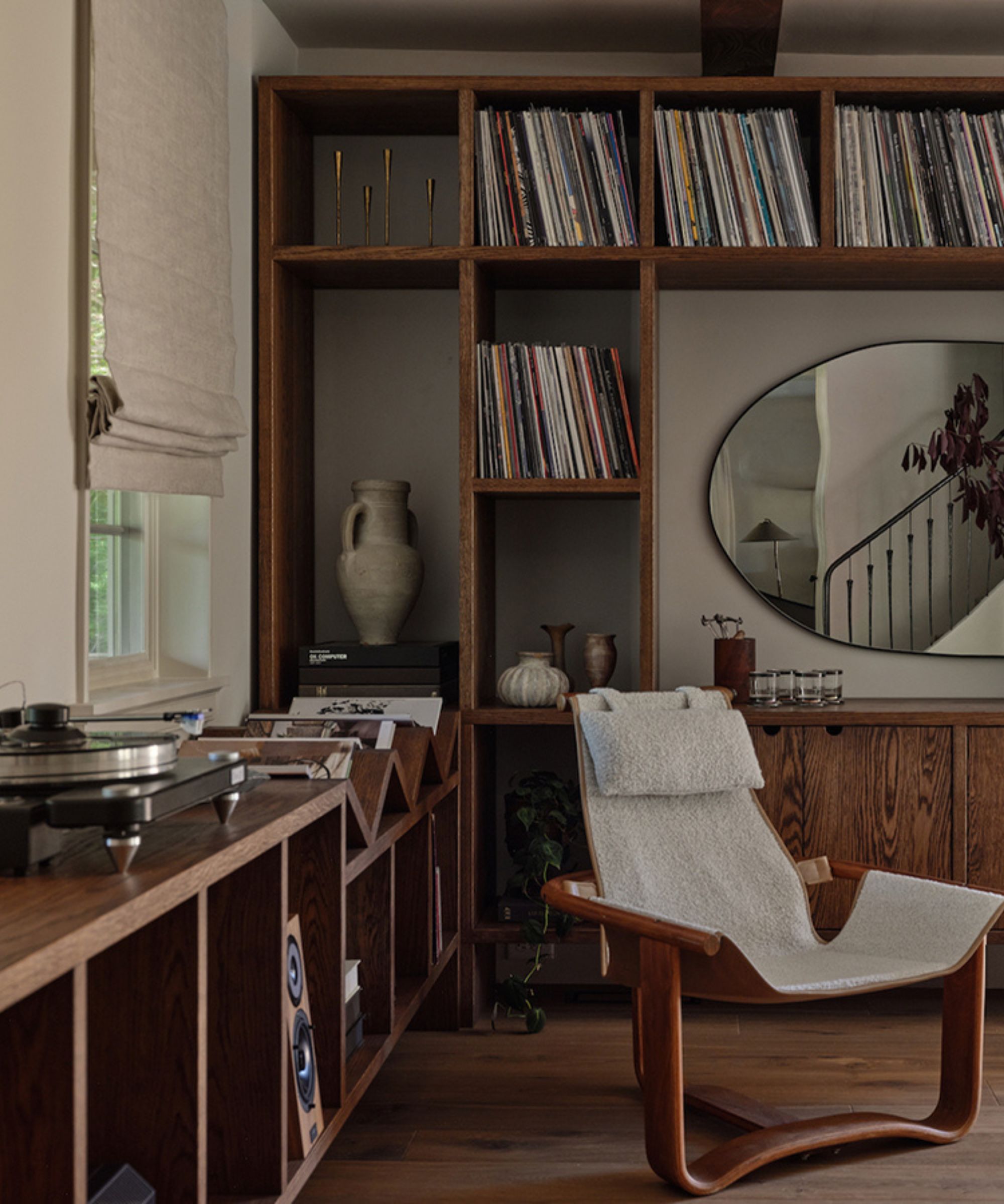
'Ultimately, the art of storytelling is key to curating a beautiful bookshelf. Carefully selecting items that hold personal significance or evoke cherished memories imbues the space with authenticity and charm,' says Janet Zev, founder and principal of Westport Design Projects.
The first mistake you'll want to avoid when styling your shelves is ignoring their enormous design potential. Janet, along with many other designers, says that the bookshelf represents far more than a source of storage. She recommends decorating with 'beloved novels, travel souvenirs, or family heirlooms' to reflect your 'unique narrative' and invite 'guests to embark on a journey of discovery.'
Jodi Peterman, CEO and founder of Elizabeth Erin Designs, agrees, saying that a beautifully styled bookshelf both 'reflects your personality and enhances your home decor.' She continues: 'Remember, a well-styled bookshelf is not just about aesthetics but also about telling your unique story through the items you display.'
Bookshelves, being part of your home's overall atmosphere, can also have quite the impact on your well-being and state of mind. Louise Bradley, founder and principal of her eponymous international firm, says this is why she 'curates designs to keep tranquility and peacefulness at the forefront of our clients' homes.'
'Bookshelves are often seen as just "a storage solution" but, we encourage people to see bookshelves beyond that. They can also be the perfect piece of furniture to showcase meaningful objects and memories, infusing the space with warmth and personality,' says Louise.
2. Forgoing a cohesive color scheme
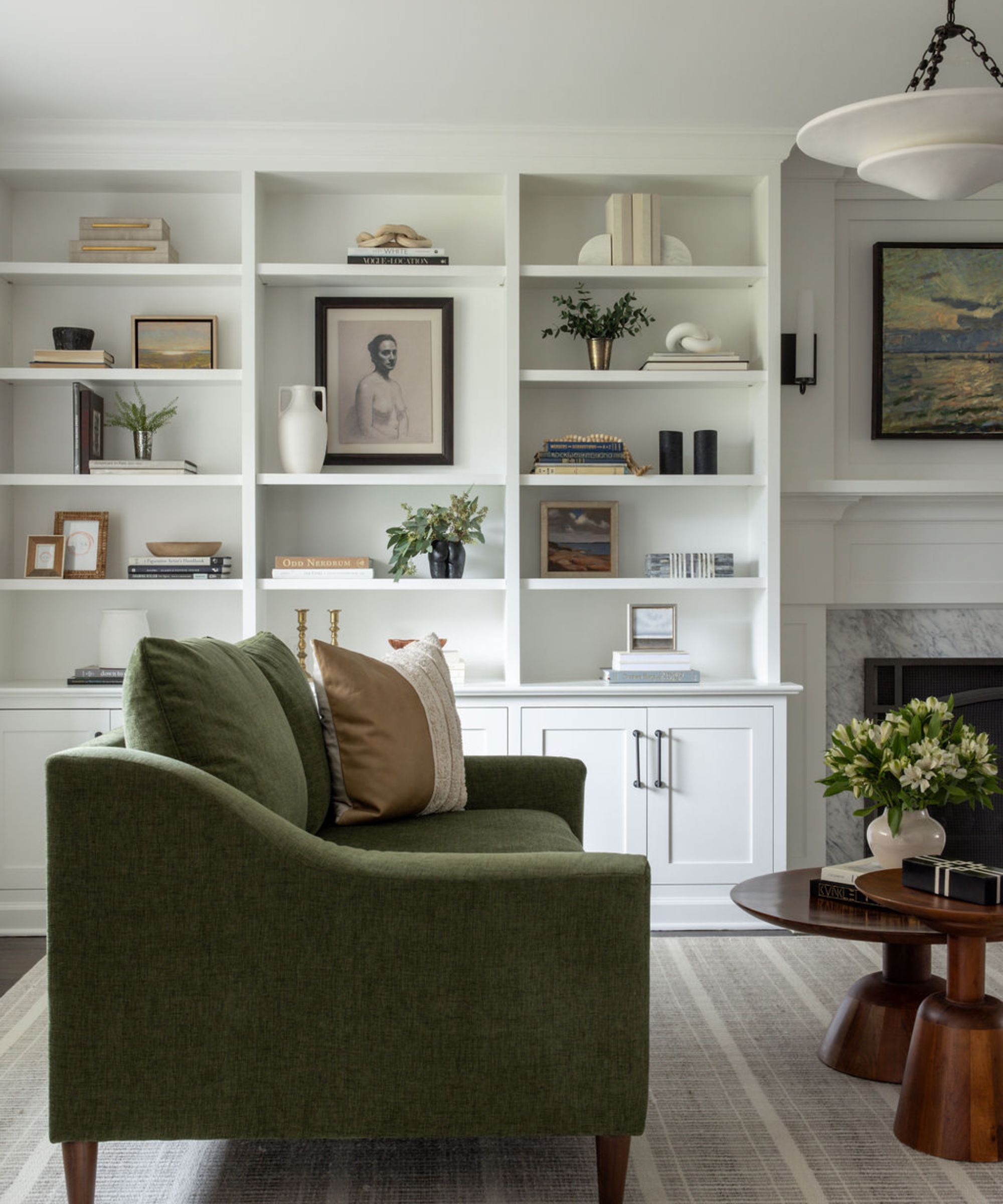
'One common mistake we've seen is not creating a cohesive color story,' says Blair Moore, creative director and principal designer of Moore House Design. 'You want harmony, so use tones that are already present in the space and place items intentionally to complement the overall design.'
Going in with a concrete color scheme in mind is key, and Blair adds that you'll want to spread darker hues out so as not to overwhelm the eye. When trying to create a 'harmonious blend,' prioritizing a calming color palette throughout goes a long way. Andrea West, interior designer and owner of Andrea West Design, adds that this approach automatically makes a bookshelf 'extra beautiful and dramatic.'
'We love doing a lighter color scheme for the accessories when styling a darker bookshelf and stick to tones of whites, creams, and light greys in all the books, vases, and sculptural objects to make it look cohesive throughout,' says Andrea.
Jessica Manela, senior interior designer with Connecticut-based Tusk Home + Design, suggests choosing two or three main colors to start off with, then building from there. An additional pop of unexpected color elevates the whole look, she says.
'Selecting items that are black, white, and in wood tones offers consistency with a layered look, without distracting the eye with many different colors scattered throughout,' says Jessica. 'Incorporating a natural element with real or faux greenery, in addition to your two to three colors, adds depth and texture and can help with utilizing the vertical space. If you place different green tones at various heights strategically, that can serve as a thread of continuity across the shelves.'
3. Not varying the decor
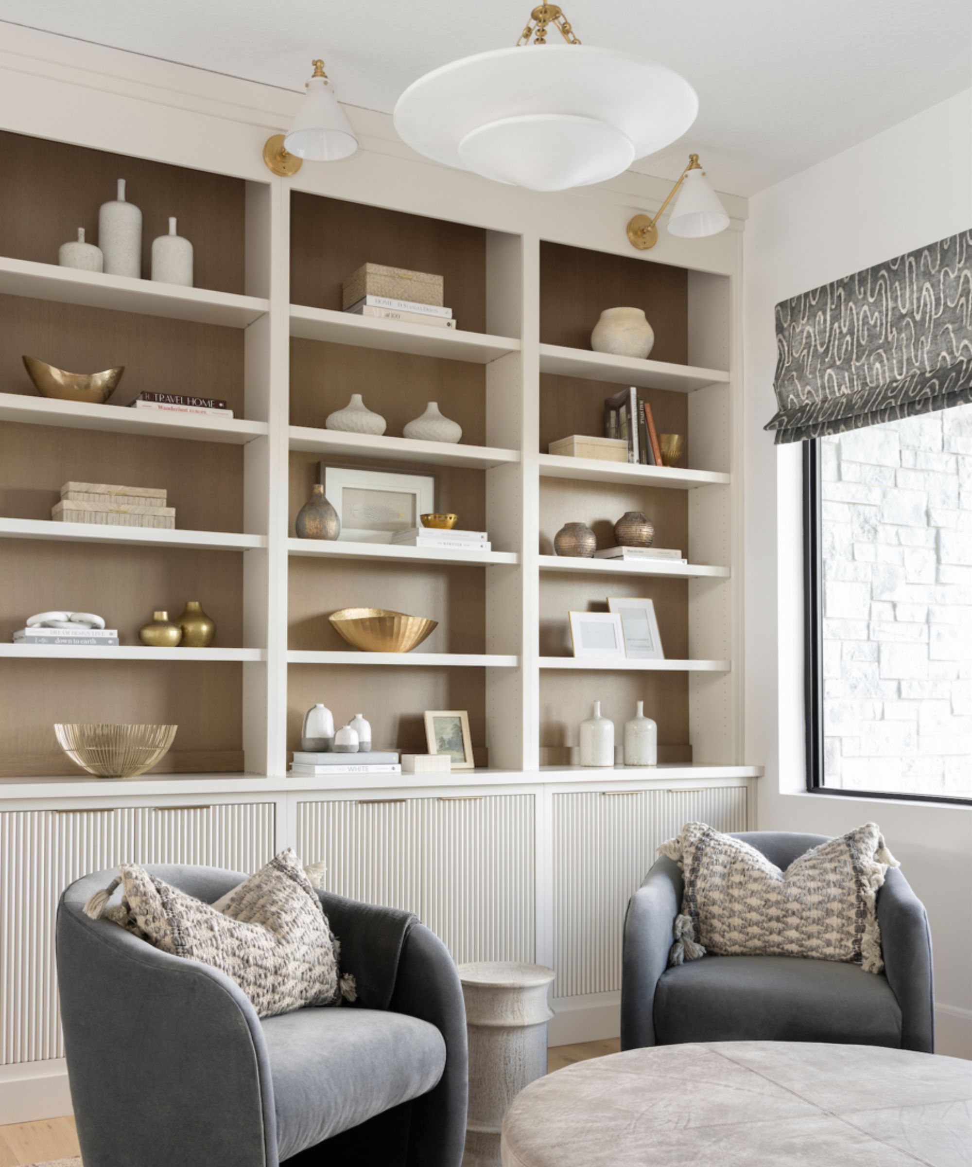
A wide range of home decor (in addition to the books) is necessary when crafting a stylish shelf, and Andrea says a 'variety of shapes and sizes' is key. 'We always like to use round sculptural pieces paired with stacks of linear books, smaller picture frames layered in front of larger art pieces,' she says.
'While curating your pieces, think through how each piece can style with another. Our most useful tip is to add in extra layers to help ground and give extra height to objects such as layering in a book or two beneath smaller sculptural objects or bowls. We also love adding in trays and larger pieces of artwork that lean against the very back of the bookshelf,' she continues.
Janet adds that 'achieving a harmonious blend of form and function on the bookshelves' takes them 'from ordinary to exceptional' quite quickly. 'I try to focus on diversifying materials, textures, and heights when styling shelves to avoid monotony. Mixing books with decorative objects like sculptures or framed artwork adds depth and visual interest to the space. Incorporating natural elements such as potted plants brings life and warmth indoors, fostering a connection with the outdoors,' she says.
4. Bringing in too many books
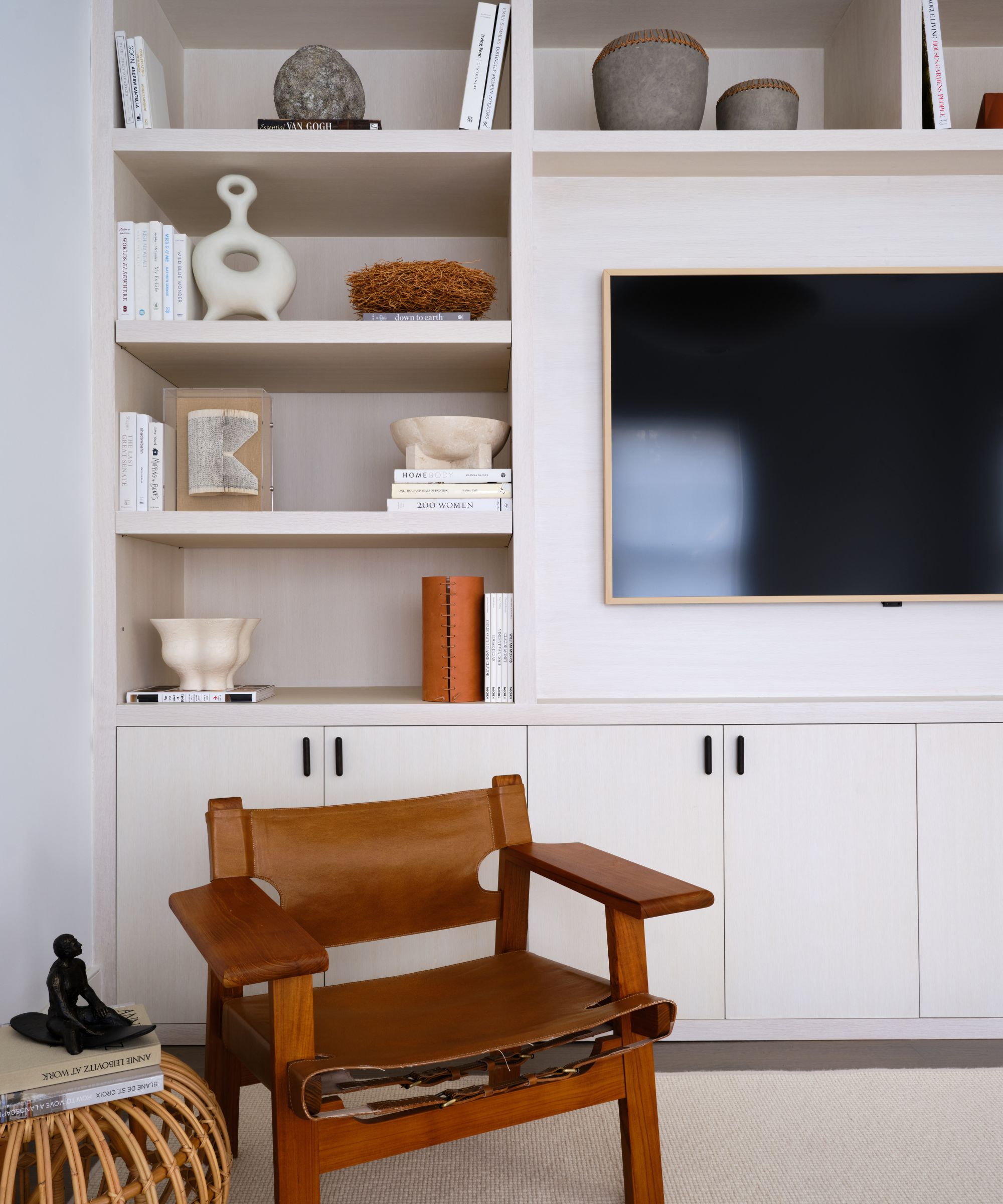
'While books are the main attraction, overloading your shelves can make them look cluttered,' says Jodi. 'Mix in decorative items like vases, framed photos, and small sculptures to create visual interest and balance. Aim for a mix of different shapes, sizes, and textures. This variety will make your bookshelf more dynamic and visually appealing.'
Books are paramount in styling bookshelves – they're in the name, after all. But too many books, and too little decor, can leave your shelves looking messy and over the top. There's a fine line between bookshelf wealth and an overwhelming design scheme.
Brianna Untener, founder and principal of New York City-based Brianna Scott Interiors, says that books 'that are too large and sticking out beyond the shelf' also contribute to a too-messy bookshelf look.
I avoid overfilling the shelves,' she says. 'This way, you can actually see and enjoy the items you have on display... I always recommend paring back the accessories so that you have less items competing with each other.'
5. Ignoring your personality
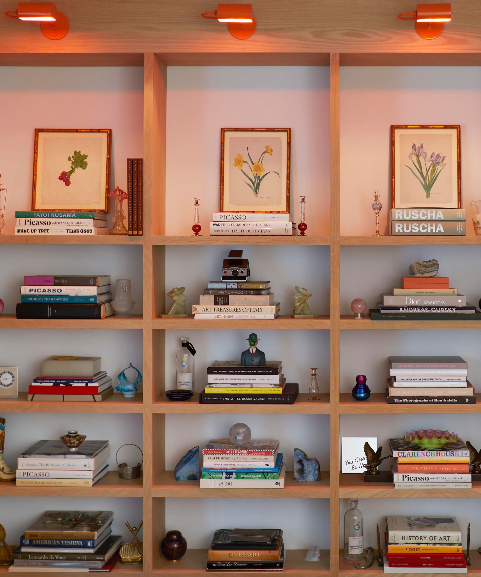
'The biggest mistake I have seen is not letting your shelves reflect you, your personality!' says Tina Priestly, professional home organizer and owner of Ready, Set, Refresh. 'Fill the shelves with stuff you love and ditch the clutter. This means ditching used coffee mugs and TV remotes – they don't belong here.'
Tina suggests 'letting your style shine' through your bookshelves, loading them up with the items and memories that make you special. The bookshelf isn't meant to look staged or impersonal – it has a place in your unique home, and should reflect that from every nook and cranny.
'Incorporating personal mementos adds a layer of authenticity and personality to your bookshelf,' adds Jessica. 'Display family photos, heirlooms, or souvenirs from your travels to infuse your space with memories and meaning.' And Jodi agrees: 'If you don't incorporate items from your travels or personal collections, the shelves will look like they belong in a store rather than your home.'
Charlie Hellstern, founder and principal of Seattle-based Charlie Hellstern Interior Design, adds that the possibilities here are truly endless, and dictated by your personal life and interests.
'I think that bookshelves are a perfect opportunity to express your personality, culture, and values,' she says. 'You could create your own cabinet of curiosities of objects that bring you joy. I like to use glass vases for beach rocks and forest mosses from projects we’ve traveled to for inspiration.'
6. Skipping the greenery
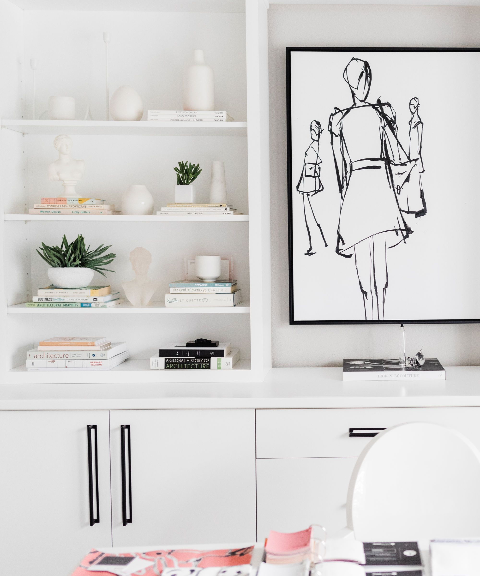
'Greenery is the secret weapon for stunning shelves,' says Ayten Nadeau, founder and principal designer of North Carolina-based I-TEN DESIGNS. 'If you lack daylight, opt for high-quality faux plants that look just as good. The right greenery elevates your decor, adding vibrant color and a touch of nature's beauty.'
Bringing the outdoors in, and injecting your home with a bit more life, is more trendy than ever, but also contributes to a timeless design style. Decorate with plants, real or faux, along with your books, artwork, and decorative objects for a dynamic look that exudes character and charm.
'Plants add a touch of nature and can make your shelves feel more lively and inviting,' adds Jodi. 'I prefer using faux plants from NDI Florals and grass balls to add a pop of freshness.'
7. Forgetting functionality
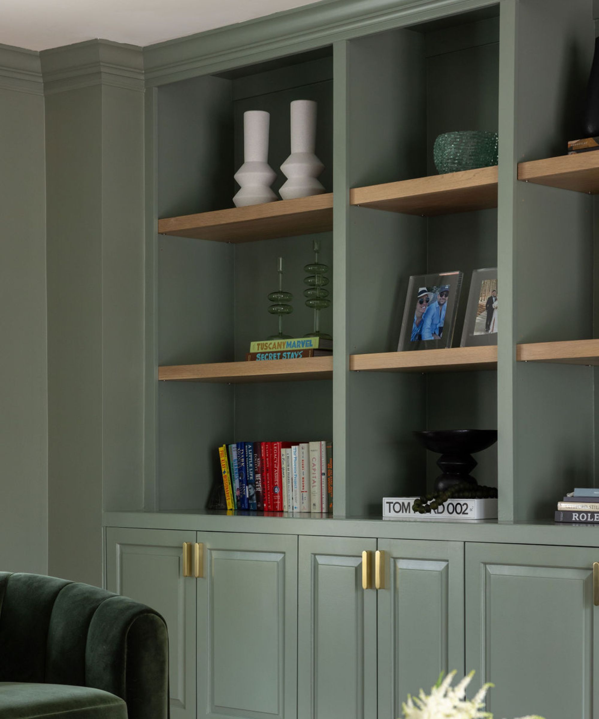
Your bookshelves should be stylish and stunning, but you can't forget about functionality along the way. After all, the shelves won't do much good if you can't get through to the books you're storing within the design scheme.
Kate Winnington, principal designer at Delaware-based C&E Furniture, says that though it's 'tempting to fill every inch' of the scheme, 'a crowded shelf can look messy' and impede daily usage. That's why organizing a bookshelf with accessibility in mind is key.
'Arrangements that are purely for show and not functional can be frustrating, especially if you need to access items regularly,' she says. 'Leave some breathing room. Empty spaces can help avoid a cluttered appearance and make standout pieces shine.'
8. Cluttering the shelves
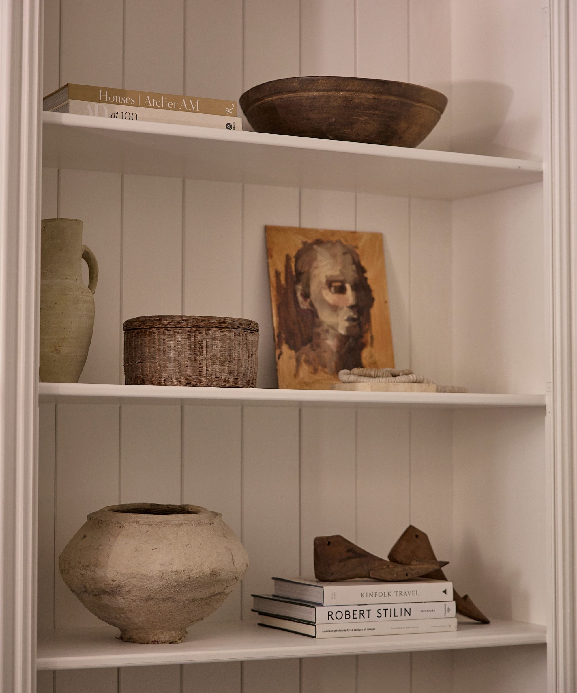
'Less is often more when styling bookshelves,' says Tina. 'This works for glass, wood, floating, barrister, traditional, or corner. Embrace the idea of minimalism by refreshing your shelf display. "Everything has a place and there is a place for everything" is my motto here. Choose quality over quantity, and let each carefully selected item speak volumes about your personal style and aesthetic taste.'
You'll want a bookshelf that looks styled always, but never overdone. Brianna says the best approach is to use every inch of the space wisely. 'Don't just fill it with any accessory you can find. I always recommend putting things together like a few books that coordinate in color, mixed in with pairs of accessories and a few framed photos,' she says.
Christiane Lemieux, founder of modern luxury brand Lemieux et Cie, says she's 'crazy about bookshelves,' but cautions against a collection of books, decor, and more that gets out of control. To achieve a stunning end result, she says patience and consideration are key.
'People should avoid too many things!' she says. 'I think the compulsion is to stack books end to end. Bookshelves can be curated for books and display and be very beautiful with some air and consideration. All the best stylists remove everything and then build the shelves back carefully, often using their iPhone pictures as guides. Less is more, think museum and sometimes color grouping helps. This will result in real shelf wealth.'
9. Sticking with symmetry
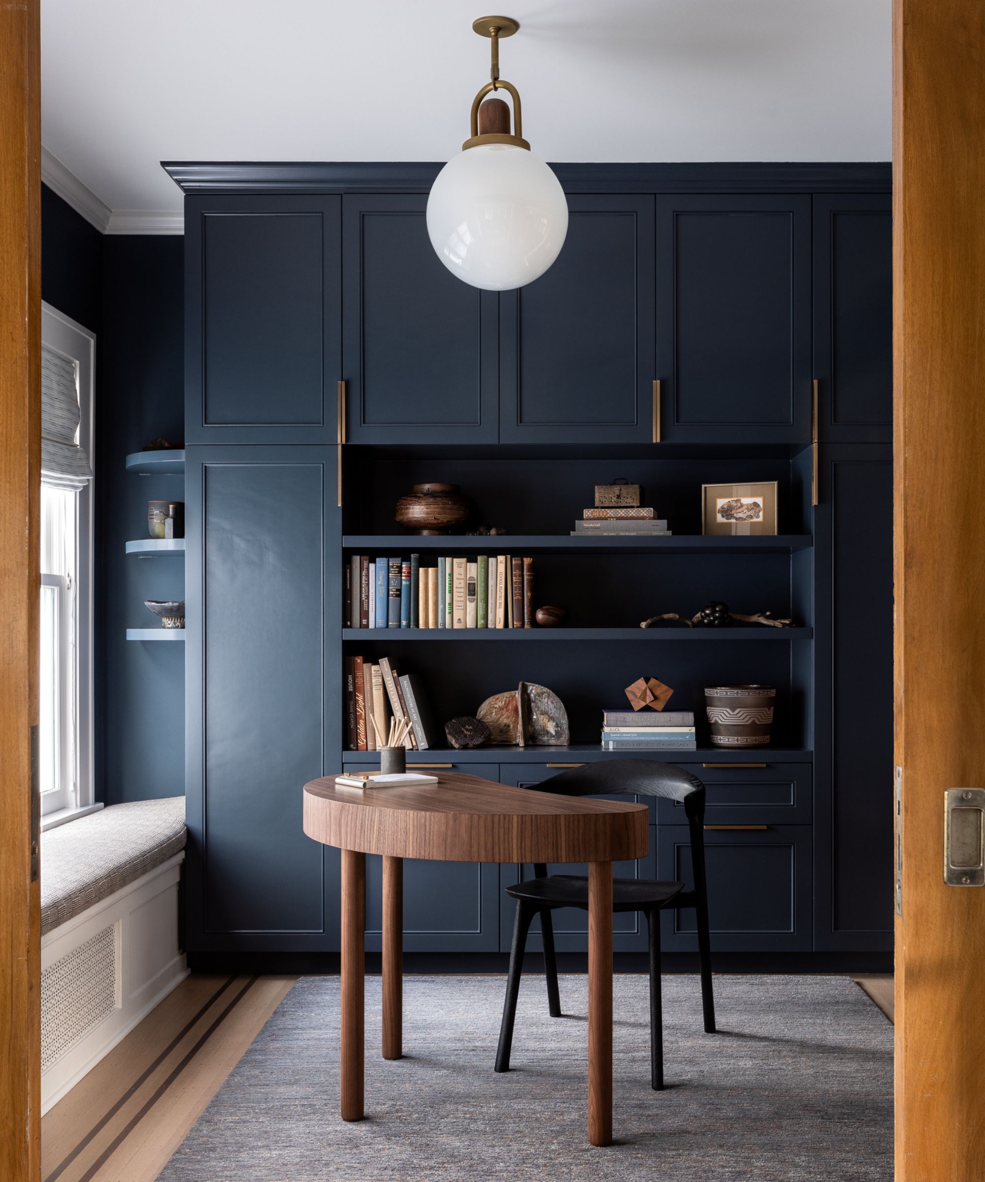
Symmetry is a classic technique for design success, but bookshelf styling calls for a bit more spontaneity. Designers say that balance is far more important than symmetry here. Blair explains that 'a curated bookshelf should tell a dynamic and layered story.' She calls 'obvious symmetry' a 'pitfall' of the bookshelf styling process, and encourages a more asymmetrical approach.
'To create visual interest, steer clear of overly symmetrical displays. Varying the colors, scales, shapes, and types of items you showcase can help with this,' says Blair. 'This approach not only breaks monotony but also adds depth and character to your bookshelf. Strive for a balance that feels organic and lived-in. This approach adds character and a sense of authenticity to the space.'
Jodi shares that layering your decor helps loads with achieving this organic, natural look, and says she often will lean a photo against the back of the bookshelf for dimension and interest. She also groups similar items together, not spreading them out for a traditionally symmetrical design scheme.
'This could be by color, type, or theme. For instance, group a few blue vases of different sizes to create a cohesive look. If one side feels heavier, add or remove items to achieve balance. This will make the arrangement pleasing to the eye,' says Jodi.
10. Ignoring the back wall
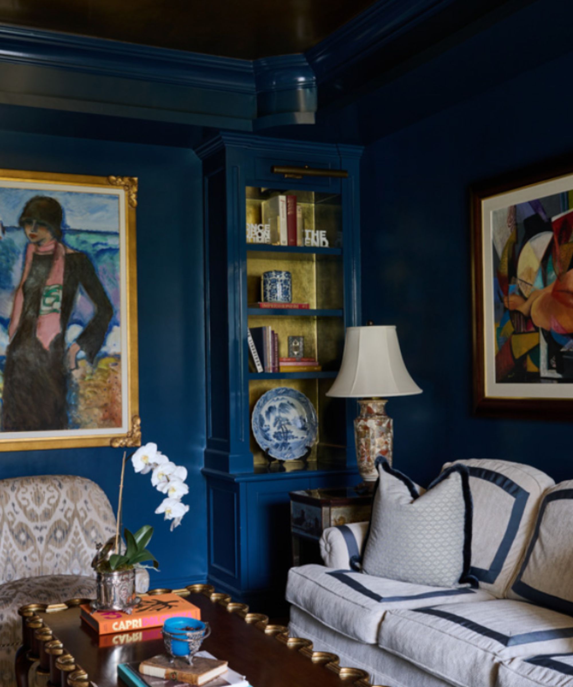
When placing and rearranging items on the shelves, it's easy to forget about the furniture itself, but designers say the backdrop of your vignettes is just as important. Ayten suggests taking some time to consider the color, depth, and texture of your shelves first, and letting that guide your design decisions throughout the process.
'Dark walls love light objects, and white walls crave contrast! Achieve balance by understanding your preferences and the existing elements in your space before you start styling,' says Ayten.
If your styled shelves are looking a bit bland, wallpaper makes a great last-minute addition, as does a coat of fresh, bold paint. No matter your interior design style, there's a stunning shelf backdrop out there just for you.
11. Keeping to small pieces
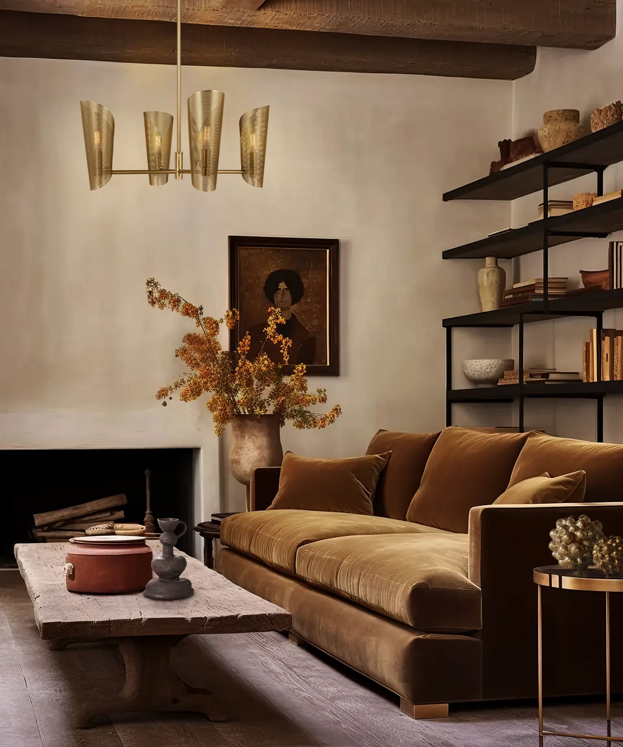
'When curating your pieces for styling a bookshelf, we recommend avoiding too many small pieces,' says Andrea. 'When styled with too many small-scale accessories, bookshelves can quickly become too busy and look more cluttered than designed.'
Small pieces of decor build up quite quickly, and they're often the easiest items to collect. But designers say too many tiny items can make for a messy look, rather than a stylish design scheme. Marina Hanisch, founder and principal of New York City-based Marina Hanisch Interiors and part of the New York Design Center Access to Design program, says layering in bigger decor picks is an easy fix for this design hang-up.
'Bookshelves serve as a perfect canvas for showcasing small art pieces, adding visual interest, and maximizing storage beyond just books. When styling a bookshelf, it's great to include one larger decorative item or two smaller ones for each stack of books,' says Marina.
12. Using all one texture
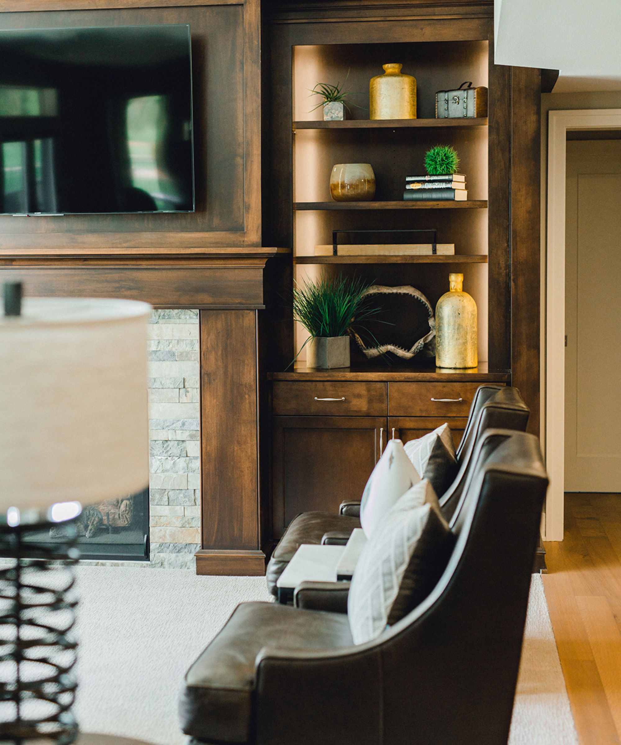
Just as contrast is important when it comes to clutter, it's an important consideration when it comes to texture. Ayten reminds us that 'contrast isn't just light versus dark.' She recommends mixing new and old, smooth and rough, and glass with plastic for a 'wow factor.'
'Playing with texture adds depth and dimension to your bookshelf. Mix and match materials such as wood, metal, and ceramics to create visual contrast and tactile interest. Incorporating textiles like woven baskets or fabric-covered books can also add warmth and softness to your display,' adds Jessica.
Blair agrees, saying this ranks high on the list of mistakes her firm sees in bookshelf styling quite often. She recommends blending lush, cozy materials in with books and frames, which sometimes seem sharp and overwhelming to the eye.
'Another issue we see is overloading shelves with smooth, glossy items, which can feel monotonous. Adding a variety of textures – such as woven baskets, rough ceramics, or soft textiles – adds depth and tactile interest to the arrangement,' says Blair.
13. Stacking all books the same
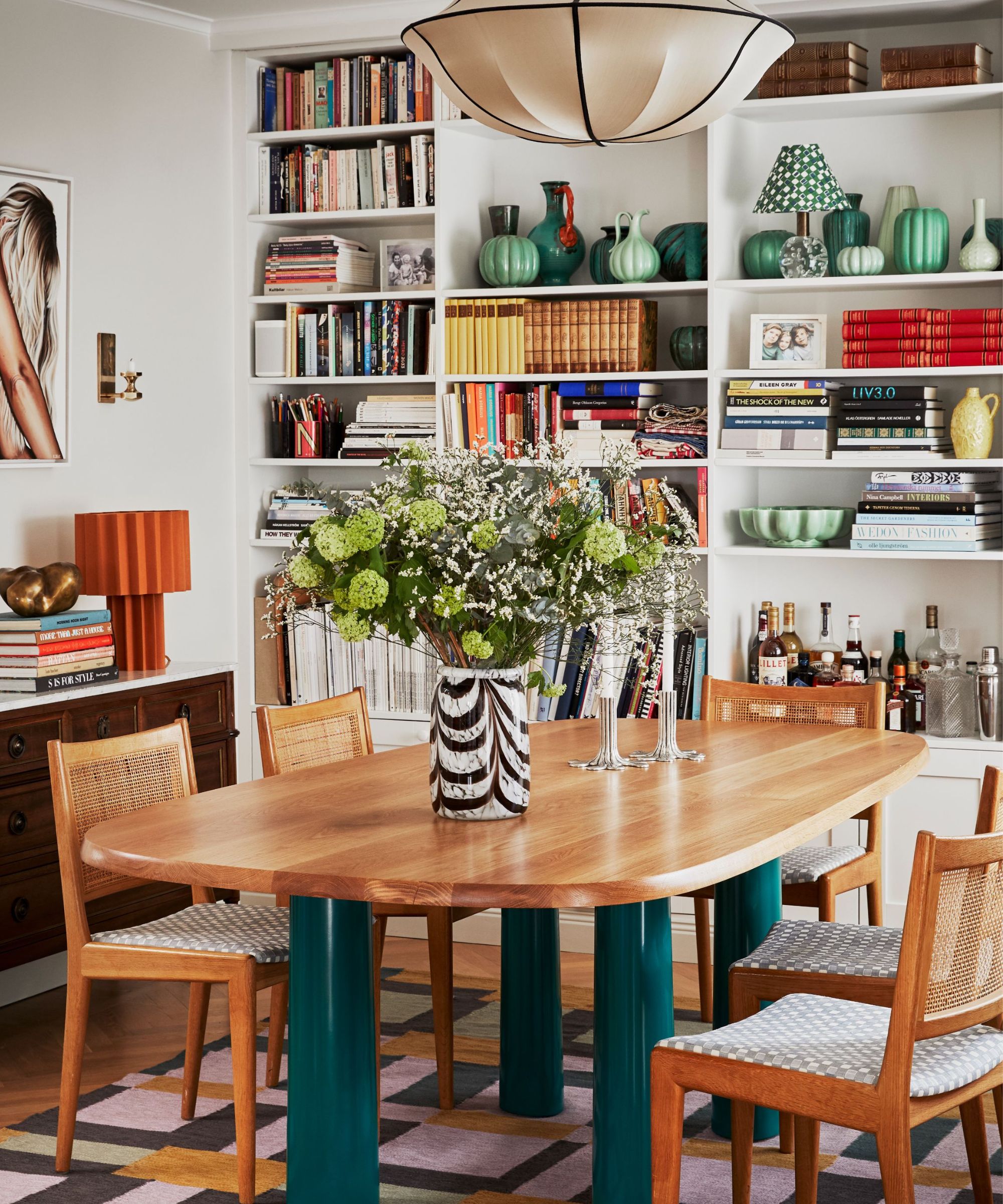
'My top tips for styling a bookshelf is to get really wordly and interesting with it. I like to include frames, objects, sculptures, family heirlooms along with books. I like to take breaks and step back when working on my shelfies to make sure I am creating a balanced vision,' says interior designer Sasha Bikoff.
Sasha says that the way we store books has room for more creativity, and suggests a more haphazard approach to stacking. Experiment with unconventional book storage methods, go for vertical and horizontal stacks, and don't be fussy about books that don't match the mold, she says.
'I would avoid stacking books all in the same way. I don’t think the monotonous look is very interesting. Also do not worry about the heights or widths of books when stacking, it;s more interesting to be free with the shelves! It's almost the organized chaos method,' she continues.
14. Not taking photos
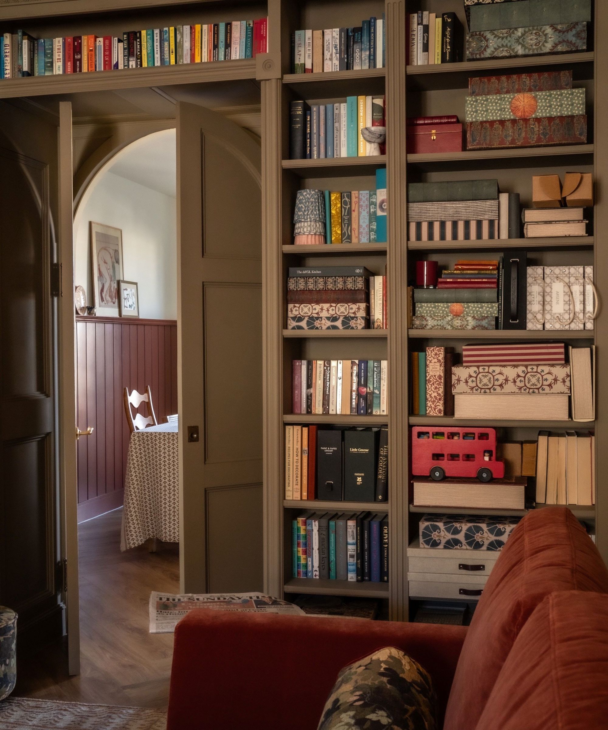
'If you feel stuck or sense something isn’t quite right, take a step back or snap a quick photo. This will help you see if the pieces are working together and whether there are points of visual intrigue and dynamism. A successful arrangement should captivate and engage rather than fall flat,' says Blair.
Even the most successful designers need to pause and reassess every once in a while, and snapping photos as you go is a surefire way to keep the design scheme under control. When you're layering and arranging so many items of so many different kinds, it can be easy to feel overwhelmed, and this approach allows you to zoom out (quite literally) and see the bigger picture.
'Curate your collection, edit the books that must stay on your shelves, and follow these designer tips to achieve that timeless, curated look. You’ll want to take photos so you can replicate the arrangement in case you move,' adds Ayten.
15. Wasting vertical space
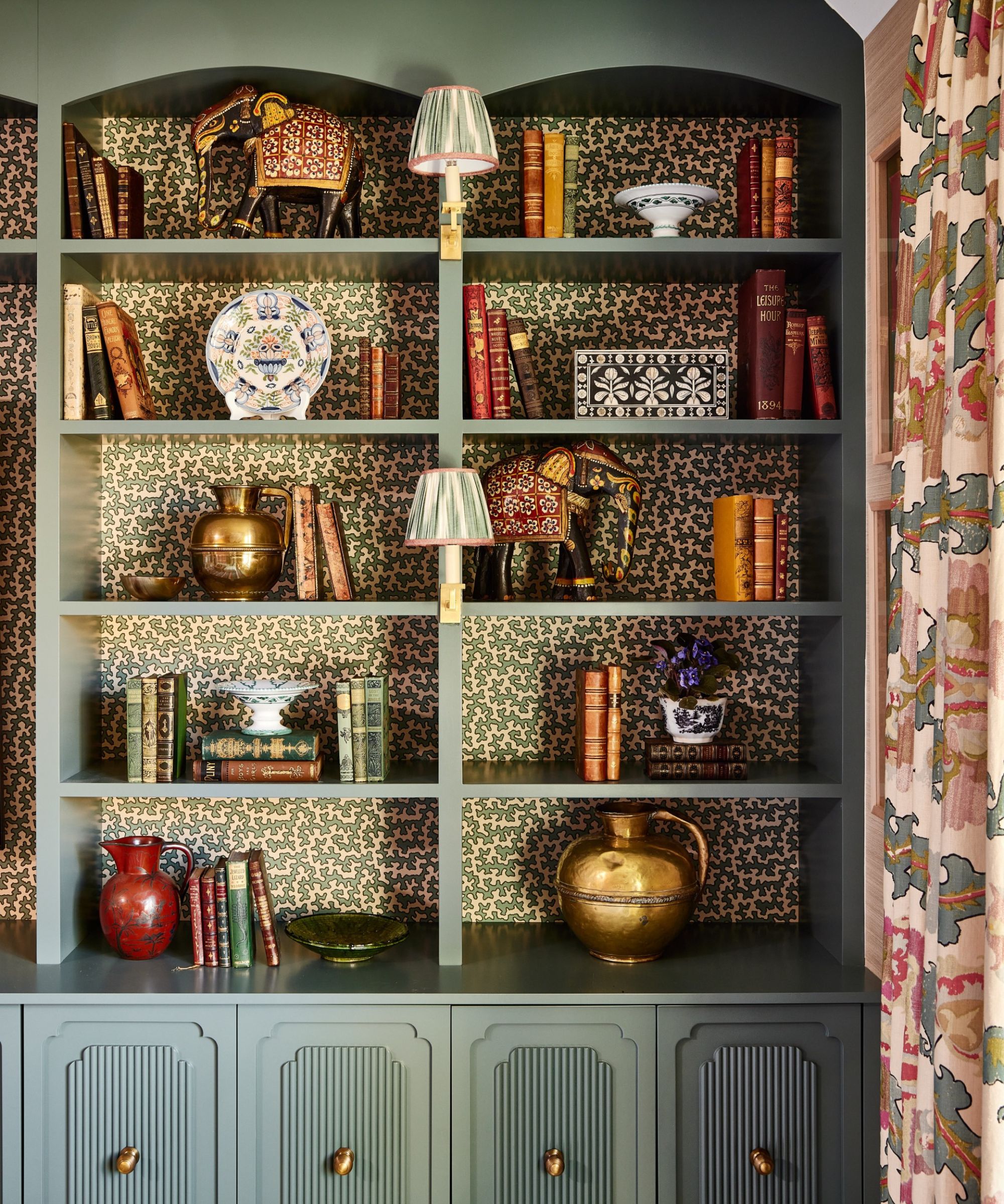
When creating vignettes of any kind, vertical space is of the utmost importance, and bookshelf vignettes are no exception. 'Utilize vertical space by incorporating tall items such as vases, sculptures, plants, or art. This not only maximizes storage but also adds height and drama to your display, making the room feel balanced and layered,' Jessica suggests.
'Varying the heights and sizes of items on your shelves keeps the eye moving. Use bookends or a substantial weighted item to hold books upright, create height, and mix in smaller items for variety,' adds Jodi.
16. Avoiding empty space
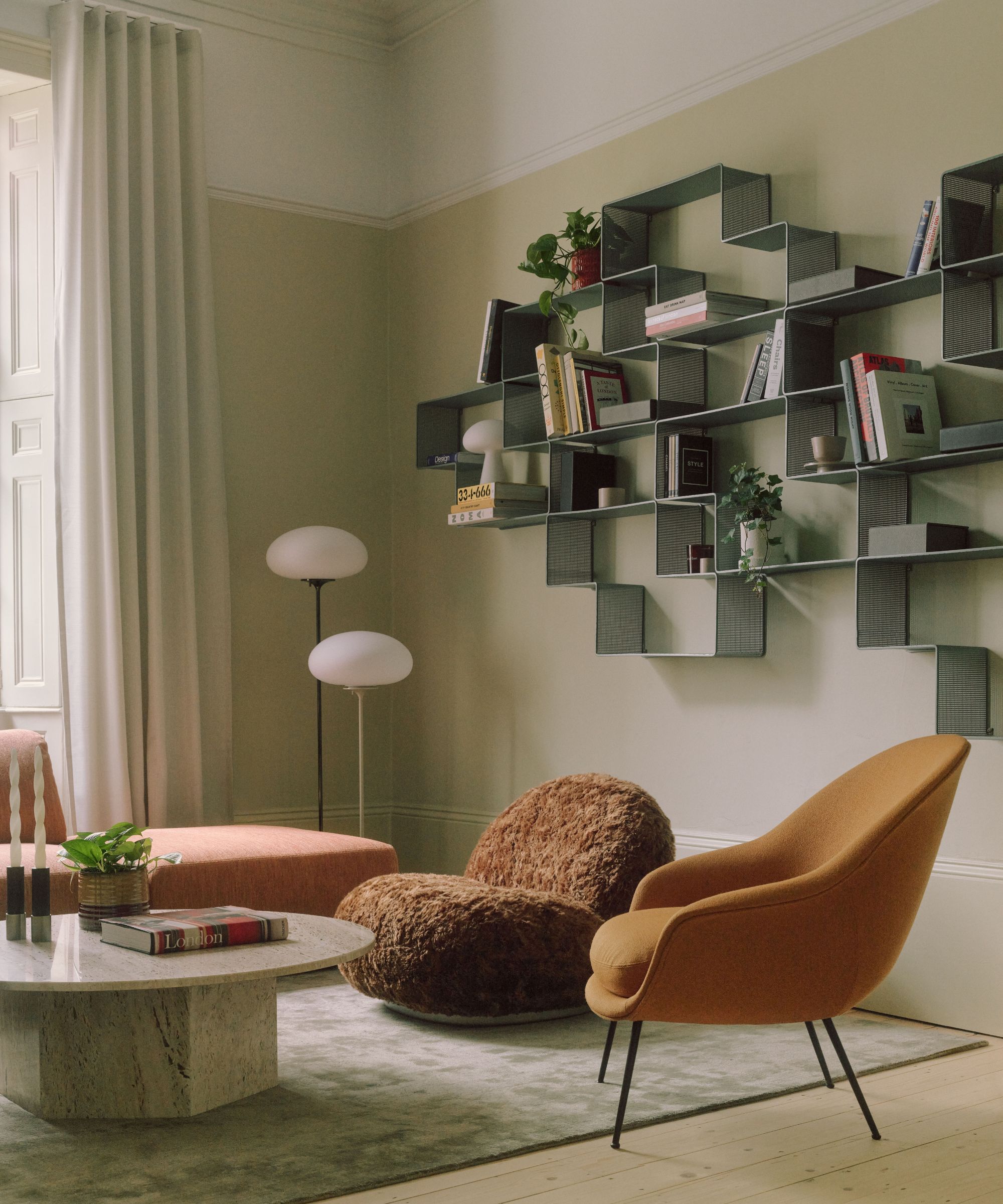
In bookshelf styling, negative space is just as important as the areas you decorate, and it's an important concept to keep in mind all throughout the design process.
Ayten says that, at the end of the day, 'empty spaces are your friends,' explaining that 'they help your favorite items stand out.' Leave a bit of room to breathe alongside your decor pieces, and you won't be left with a cluttered or overbearing bookshelf reveal.
'Always allow for some negative space to give accessories room to be appreciated, and to avoid a cluttered look. This creates balance, visual interest, and a more dynamic display,' says Jessica.
'Sometimes, less is more,' adds Blair. 'Embracing negative space can help the eye focus on specific details within the arrangement. Avoid striving for perfection or symmetry; instead, aim for a lived-in feel that exudes soul and character.'
17. Overthinking it all
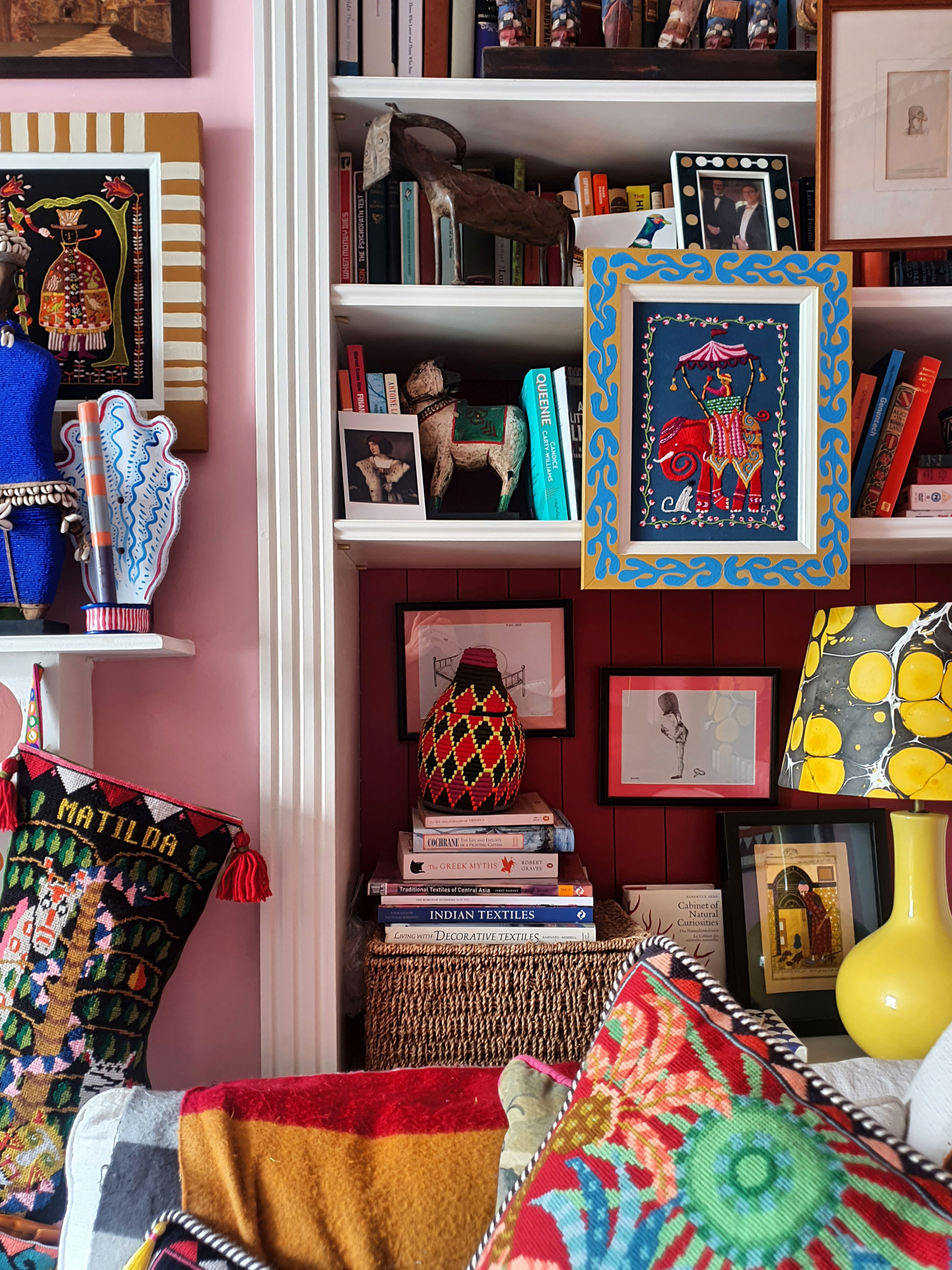
These designer-approved tips are helpful benchmarks, but the most important rule of bookshelf styling is not to overthink. After everything, your bookshelf should make you happy, and complement the rest of your space. Blair suggests that you 'avoid overthinking' when embarking on a bookshelf styling project.
'Although it might seem straightforward, don't overthink your arrangement. Trust your instincts and let your natural inclinations guide you. An effortless look often exudes the most charm,' she says.
'Placing items randomly without overthinking scale or type allows for a more natural arrangement. Then, step back and assess the overall look, removing or rearranging items as needed until the composition feels right,' she concludes.
You're now equipped to take on any bookshelf styling endeavor like an expert. Vary your decor, express your personality, and don't overthink the end result. The best bookshelves are characterful conversation-starters, and that's more than enough.


