Deciding what shade to paint with can be an overwhelming, off-putting task. Even if you've narrowed down the undertones, color family, or light sensitivity you're after, the options are still nearly endless. And while you're on the right track if you've picked out a brand, the array of shades and finishes offered by that brand alone often only leads to more stress.
To help point you in the right direction, we spoke with interior designers to get their lists of go-to shades from Benjamin Moore – and the final list includes Benjamin Moore best-sellers and more niche selections. Here's a rundown of designers' favorite shades to decorate with, grouped by color family – your perfect shade awaits.
Designers' go-to Benjamin Moore paint colors
From deep, moody blues to clean, crisp whites, these interior designers have included hues across the rainbow in their selections of go-to shades. Here are the paint colors you'll want to add to your own list of favorites.
1. White paints
White paint may seem simple, but it's often the most difficult hue to narrow down. Getting the undertones and light sensitivity right can make or break a room. Luckily, designers have accrued some favorites over the years, and now they're sharing the shades that work in any space.
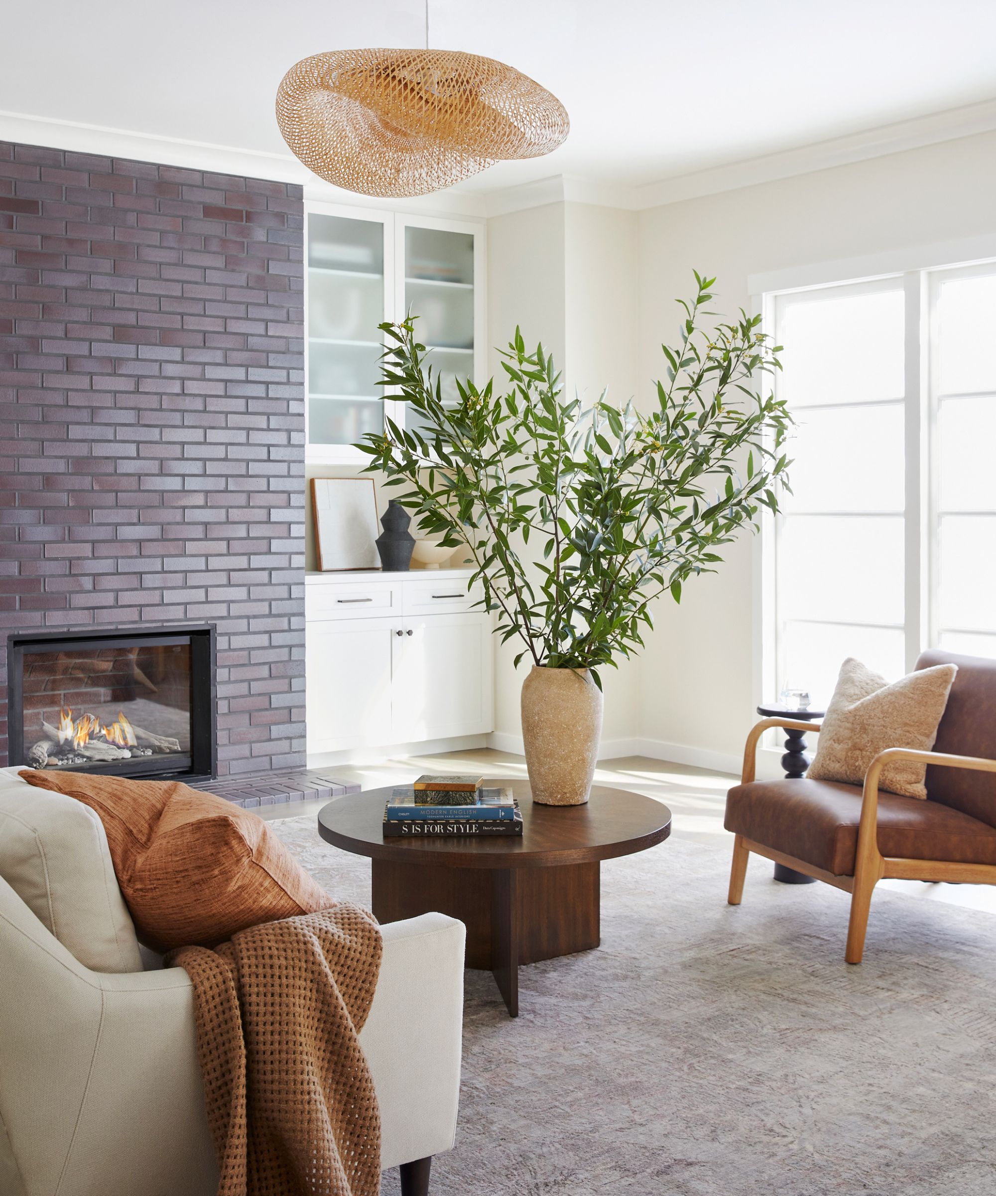
Alice Chiu, interior designer and founder of Miss Alice Designs, says Cloud White – a 'soft, warm white with a taupe undertone' – is one of her go-to colors. Giving off a cream-like hue but not leaning too 'yellowish,' it's an excellent base shade for any room, and shines in this living room design, pictured above.
'Cloud White pairs well with crisp whites such as Chantilly Lace for a subtle contrast, and earthy tones such as terracotta, greens, and browns for a touch of nature. It's perfect for living rooms, bedrooms and kitchens,' says Alice. She adds that dark accents really make the creamy white hue pop.
For another classic warm white, Kyle O'Donnell and Christopher Sale of Gramercy Designs turn to Simply White. With 'the slightest hint of warmth that softens it perfectly,' they say this shade is versatile in application: 'It complements natural wood finishes, veined stone, and tile particularly well.'
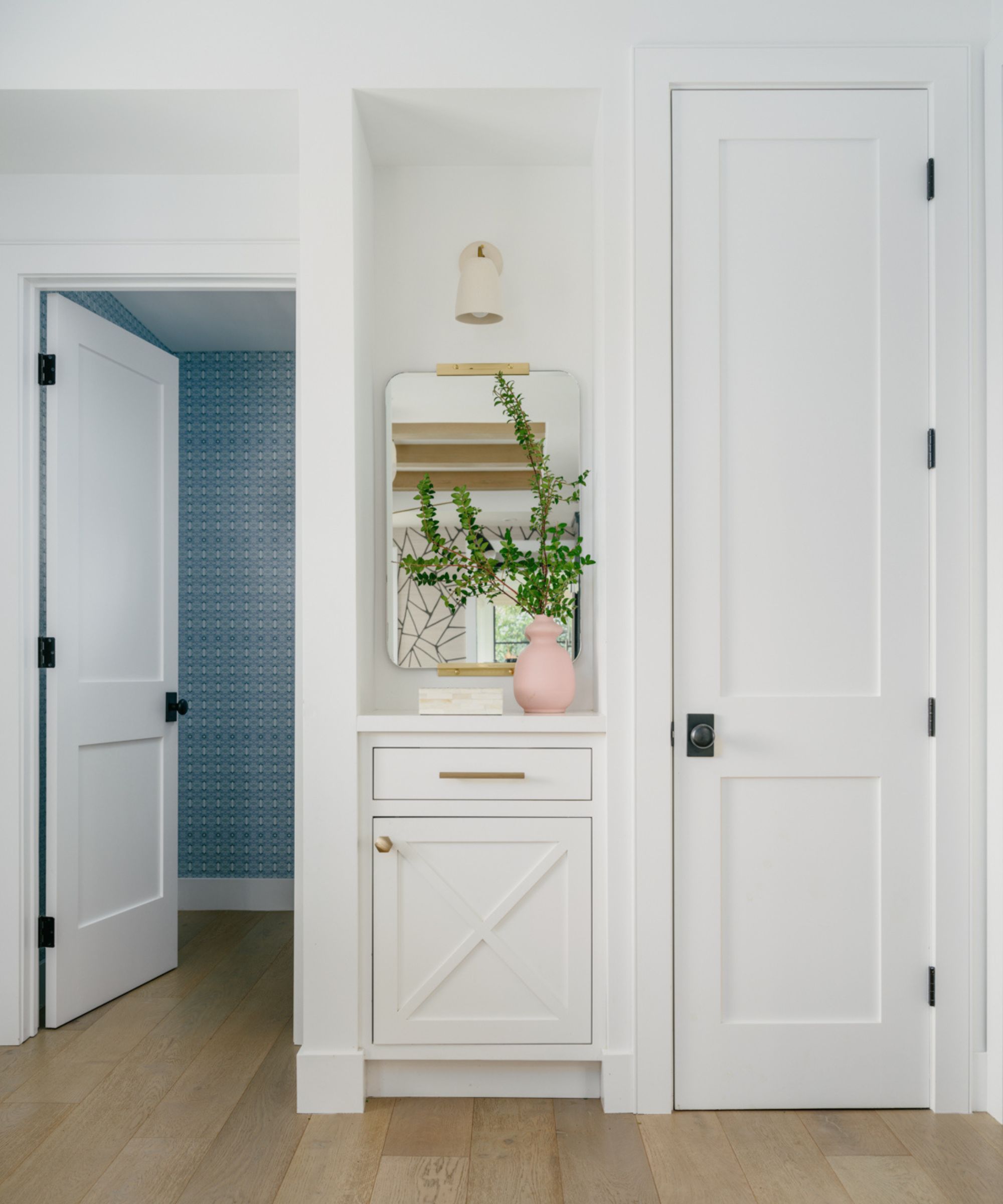
For a cleaner white shade that doesn't bring much warmth, Kendra Nash – principal designer of Nash Design Group – says she loves Chantilly Lace.
'When it comes to the perfect white, Chantilly Lace reigns supreme with its pure, crisp hue devoid of any unwanted undertones,' she says.
Artem Kropovinsky, principal designer and founder of New York City-based Arsight, agrees, calling Chantilly Lace a 'brilliant white.' He says its simplicity allows for easy pairing with other colors, and an increased appreciation of other design details present in the space.
Benjamin Moore's Swiss Coffee is perhaps the most well-loved white on the market. Calling it 'every designer's go-to for a well-balanced, warm white,' Nicole Cullum – interior designer and founder of Color Caravan – says the shade is timeless, and suited to a wide array of lighting schemes. Shea McGee's recent home renovation offers a beautiful example of Swiss Coffee in action – it provides a stunning base in nearly every room of the house.
'Benjamin Moore's Swiss Coffee is a paint color I return to time and again. It's so versatile and sophisticated. At its heart, this paint is a warm neutral, but it has the slightest bit of green in the undertone which makes it perfect for pairing with cooler tones or jewel tones as well. I find that Swiss Coffee works particularly well in French country design motifs and modern organic ones,' says Kathy Kuo, interior designer and CEO of Kathy Kuo Home.
2. Gray paints
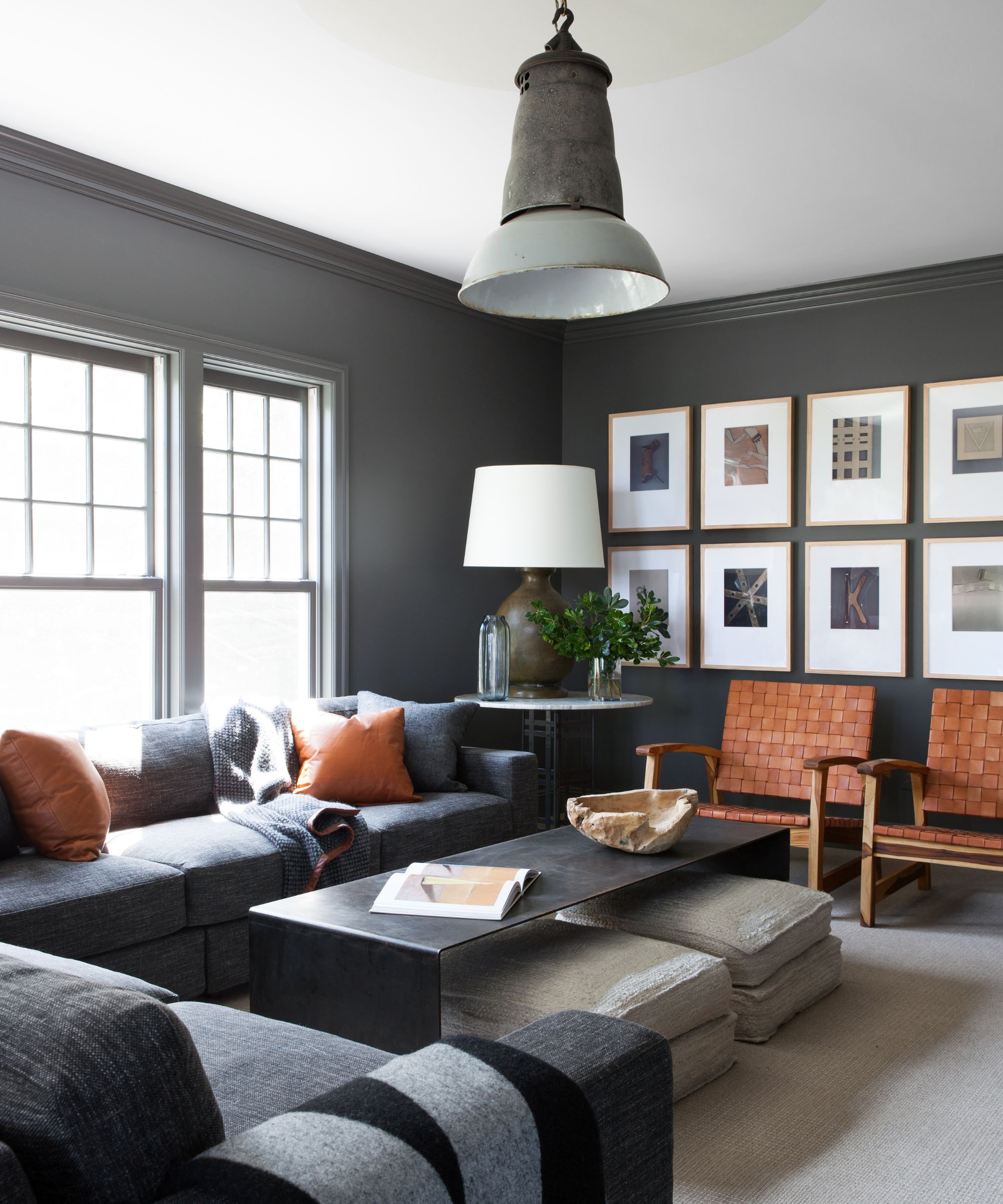
When it comes to gray, there's a wide array to work with. From deep charcoal to barely-there hues, painting a space gray can lead to an endless host of aesthetics. To introduce a moody atmosphere to a room, Nicole often turns to a designer favorite, Kendall Charcoal. She says it adds drama without making a space too dark or dreary.
'This color plays well with a variety of different color schemes and gives that great pop of contrast against lighter neutrals and accent colors,' she says.
Dan Mazzarini, principal director of BHDM Design and founder of Archive by Dan Mazzarini, used Kendall Charcoal to decorate this sleek, sophisticated living room. He calls it a 'cocoon color,' inspiring warmth and coziness at first glance.
'I've used it in homes libraries, hearth rooms, and bedrooms, and it's unanimously loved by clients. Don't be afraid of the dark – the outcome is cozy, soft, and almost velvety in appearance. I recommend a flat finish,' says Dan.
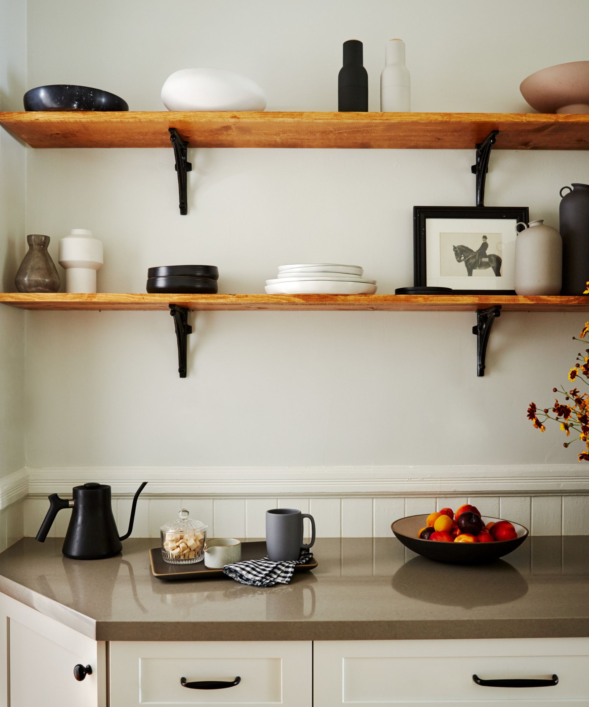
For a much lighter take on gray, Alice says her favorite Benjamin Moore color 'hands down' is Gray Owl, a 'perfect neutral that works with any style, from classic to modern.' Both Bobby Berk and Shea McGee have been known to use and love this hue as well.
In this kitchen, pictured above, Alice paired the calming color with darker cabinetry and hardware for a stunning sense of juxtaposition.
'It's a refreshing and versatile gray that can exhibit a blue or green undertone depending on the natural light, the surrounding furniture, and the materials in the space. It works beautifully with black decorative accents for a modern look, and creates a nice contrast with white trim for a classic feel,' she says.
Nicole adds Stonington Gray to the mix of go-to shades, calling it 'very versatile' and noting its silver-like undertones: 'This color can easily flow between warm and cool color palettes without a drastic shift in the color.'
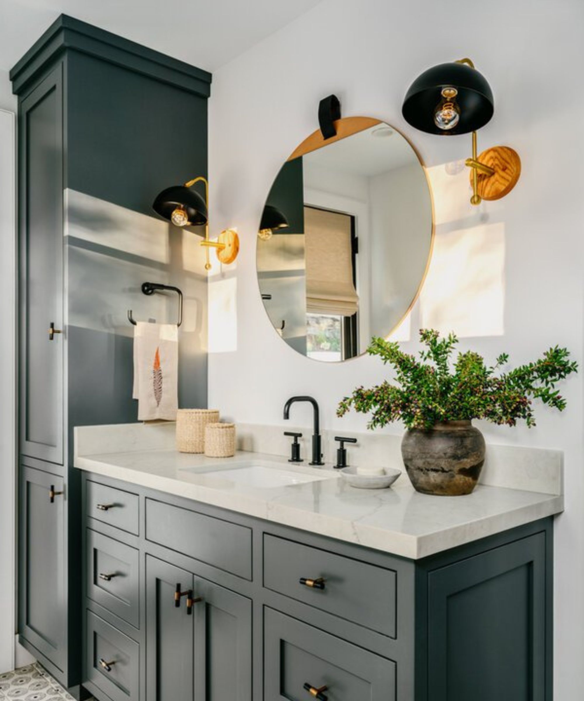
In this bathroom, pictured above, Kendra used Kitty Gray to bring drama and intensity to the cabinetry, which contrasts beautifully with the room's crisp, white walls.
'Kitty Gray by Benjamin Moore is one of my trusted choices for a rich gray paint. Its chameleon-like quality subtly reflects surrounding tones – from hints of green, to blue, or simply a true classic gray – adapting to its environment effortlessly,' says Kendra.
3. Black paints
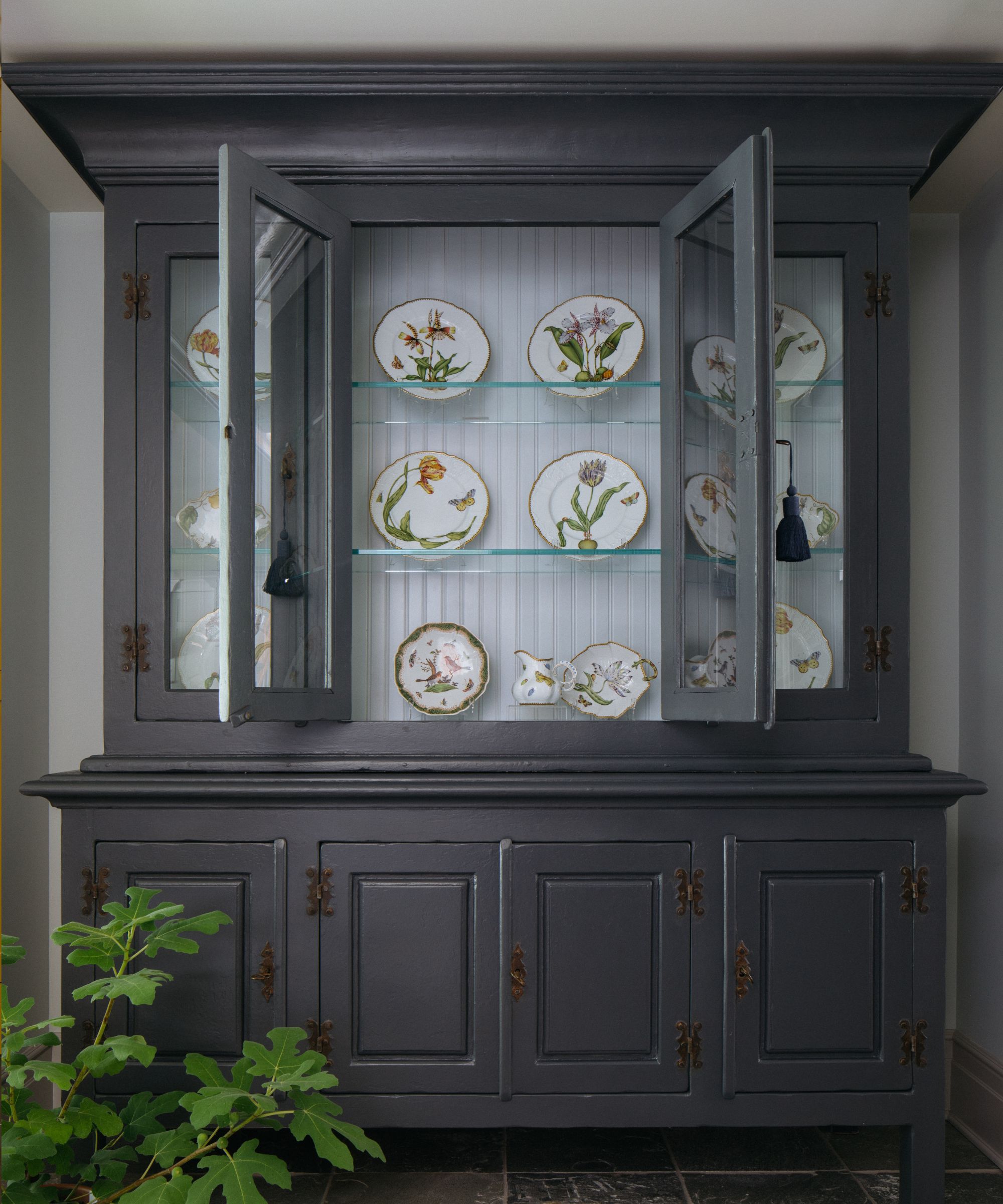
Decorating with black can be tricky in any space, bringing impact and interest immediately. But Elizabeth Drake, founder and principal designer of her eponymous design firm, discovered a shade that works wonderfully in a wide range of rooms –without taking over. She used Benjamin Moore's Wrought Iron to bring new life to this hand-painted display cabinet, pictured above.
'Wrought Ironis a pretty color which is deep and rich, but not too heavy-handed for displaying hand-painted china,' says Elizabeth.
Nicole adds that Iron Mountain, is a stunning shade that 'straddles the valley between a warm and cool soft black.' She says it gives excellent contrast while still bringing a softness that can't be found in many pure black shades. Nicole also turns to Onyx often, she says.
'Rich and luxurious, Onyx steals the show on walls and cabinetry. This earthy black looks stunning with warm or bright whites, and comes to life against light neutral colors or bold accent colors like reds and oranges,' says Nicole.
4. Blue paints
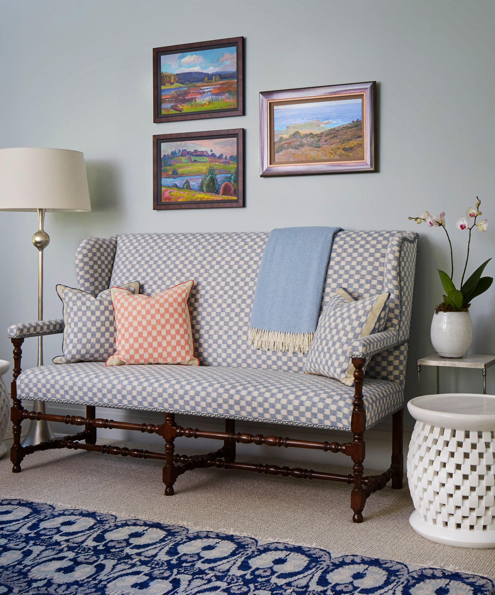
Blue rooms are certainly stunning, and the color family has been trending in 2024. But with so many variations to choose from, it's wise to turn to designers' advice before making a final selection for your space. Elizabeth says another of her go-to Benjamin Moore shades is Palace Pearl, pictured above in this serene entryway.
'Great for soft backdrops without being bland or too bright, this color is particularly nice with rich olive greens,' she says.
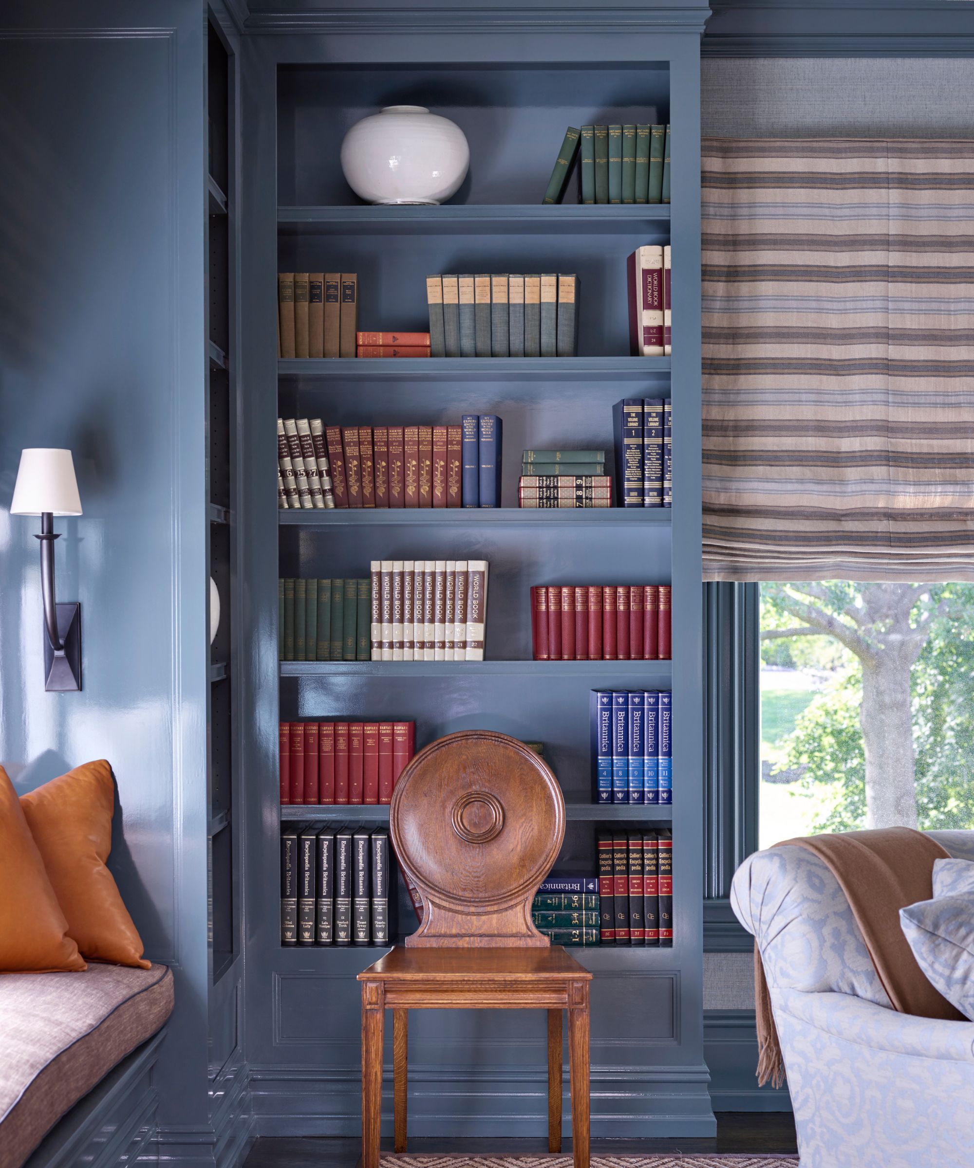
Though Templeton Gray doesn't sound like it'd carry too much blue, Dan says it's one of his favorite blue shades to decorate with. Part of the brand's Historical Colors Collection, Dan says Templeton Gray is highly requested.
'It sounds like it will be a gray, but it's definitely a blue with both gray and green in it, and another fabulous "chameleon color," as I like to call them. It takes on the character of the other decor in the room. I love it on doors, to distinguish kitchen islands, and for entire libraries to add depth and bold interest,' he says.
Kyle and Christopher of Gramercy Design add Van Deusen Blue to the list, noting its timeless, age-defiant qualities.
'We've used this beautiful shade of blue in kids' rooms. Used on trim, it provides a versatile backdrop that injects a fun dose of color, while containing enough subtlety and complexity to have longevity through the college years or even conversion to an office or study,' they say.
5. Green paints
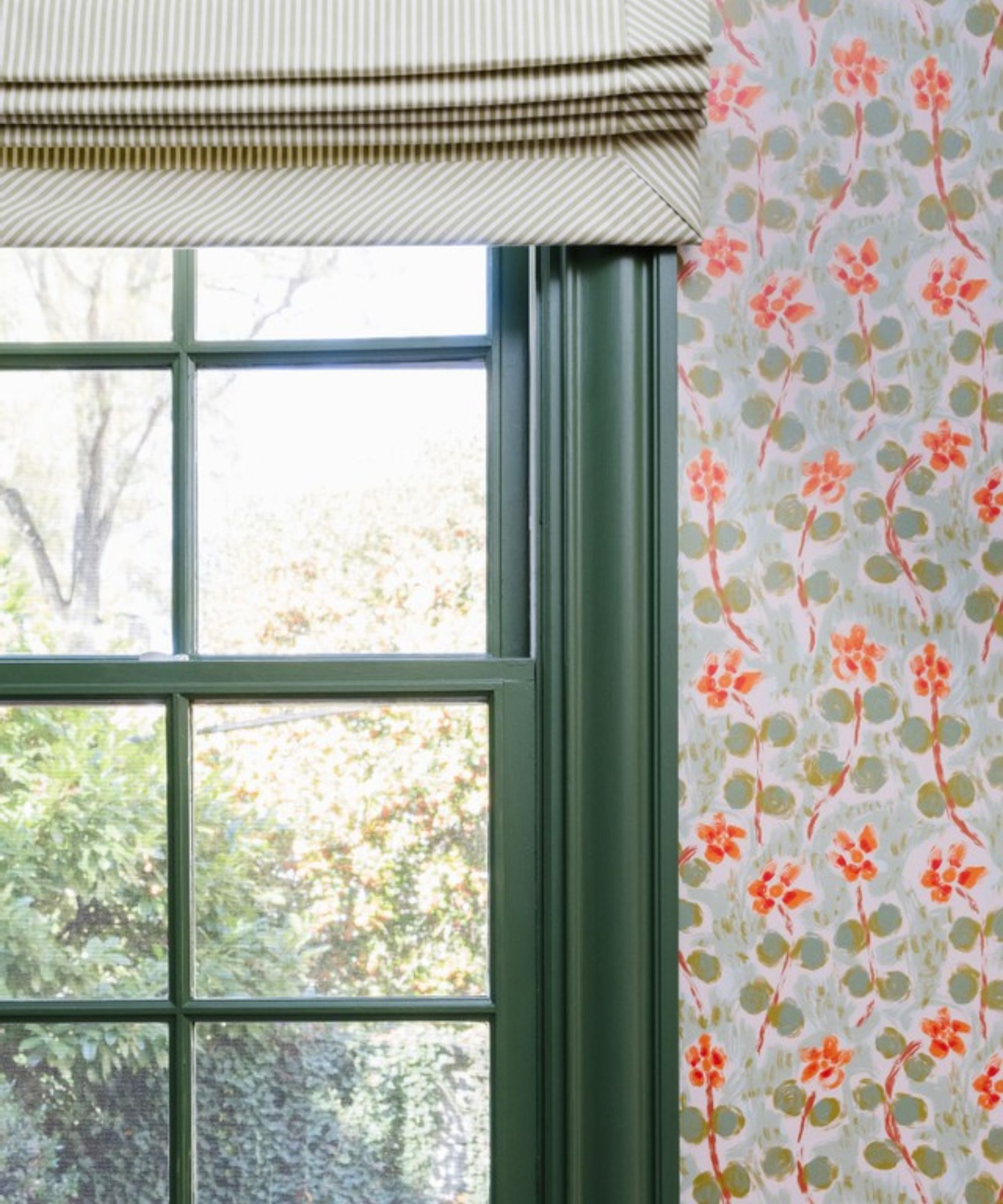
Green rooms are all the rage at the moment, and the color stuns in just about any design style – ranging from sage to hunter, there's something for everyone.
Caroline Brackett, principal designer of Caroline Brackett Studio of Design, says she often opts for dark and versatile Peale Green when designing 'vanities, moody spaces or updated front doors.' The shade stuns next to vibrant wallpaper on this windowpane, pictured above.
Nicole adds that when it comes to green shades, 'few colors can stand the test of time like Saybrook Sage: 'It’s historical and modern all at the same time. Saybrook Sage looks amazing on cabinetry and gives excellent contrast with warm whites and light neutrals.'
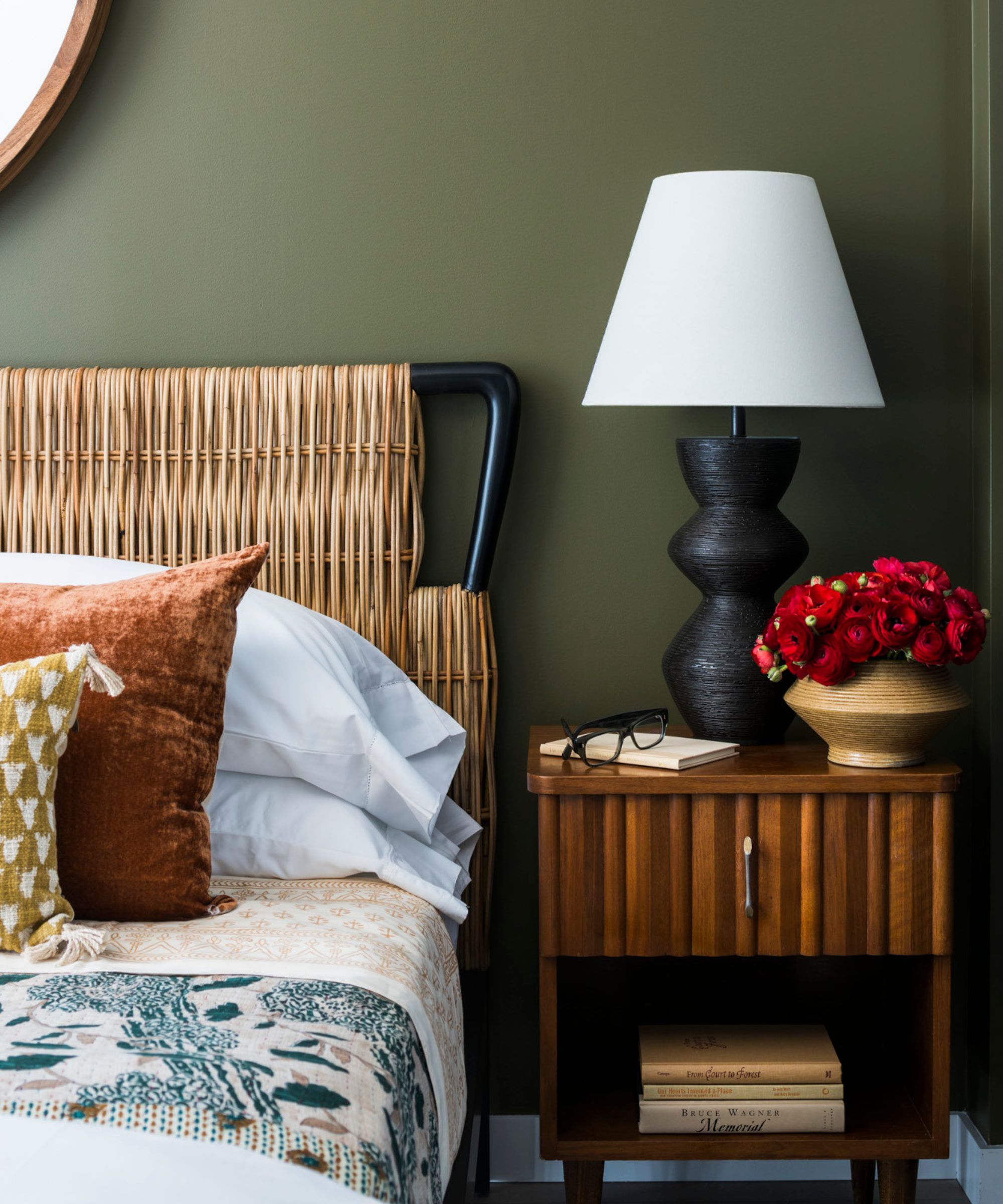
Mediterranean Olive, pictured in this chic yet cozy bedroom, is another go-to green for Dan. He says BHDM Designs have used the shade for 'both walls and millwork, and in different sheens for a rich wash of color.'
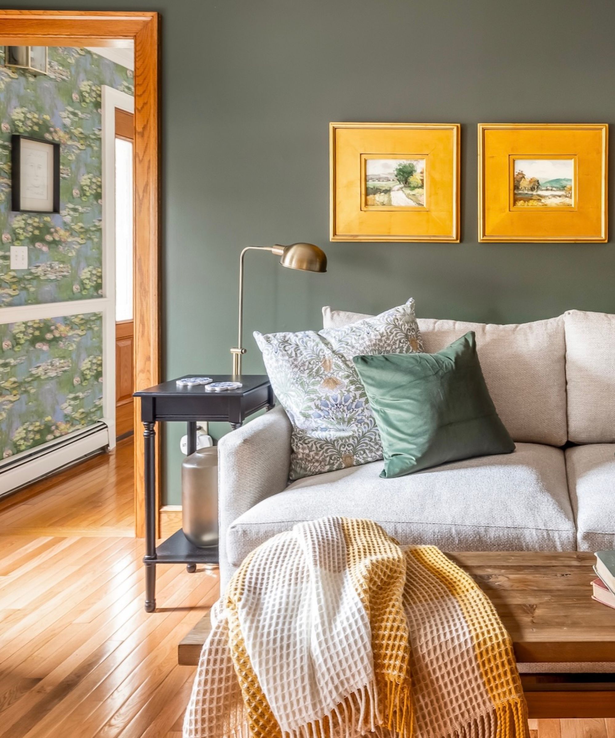
In this transitional living room, designed by Veronica Colby – founder of Evergreen Design Co. – Benjamin Moore's Chimichurri proves why it's one of the designer's go-to shades. Bringing a 'deep, rich' look to the space, it pairs beautifully with bright gold accents and classic hardwood floor.
6. Red paints
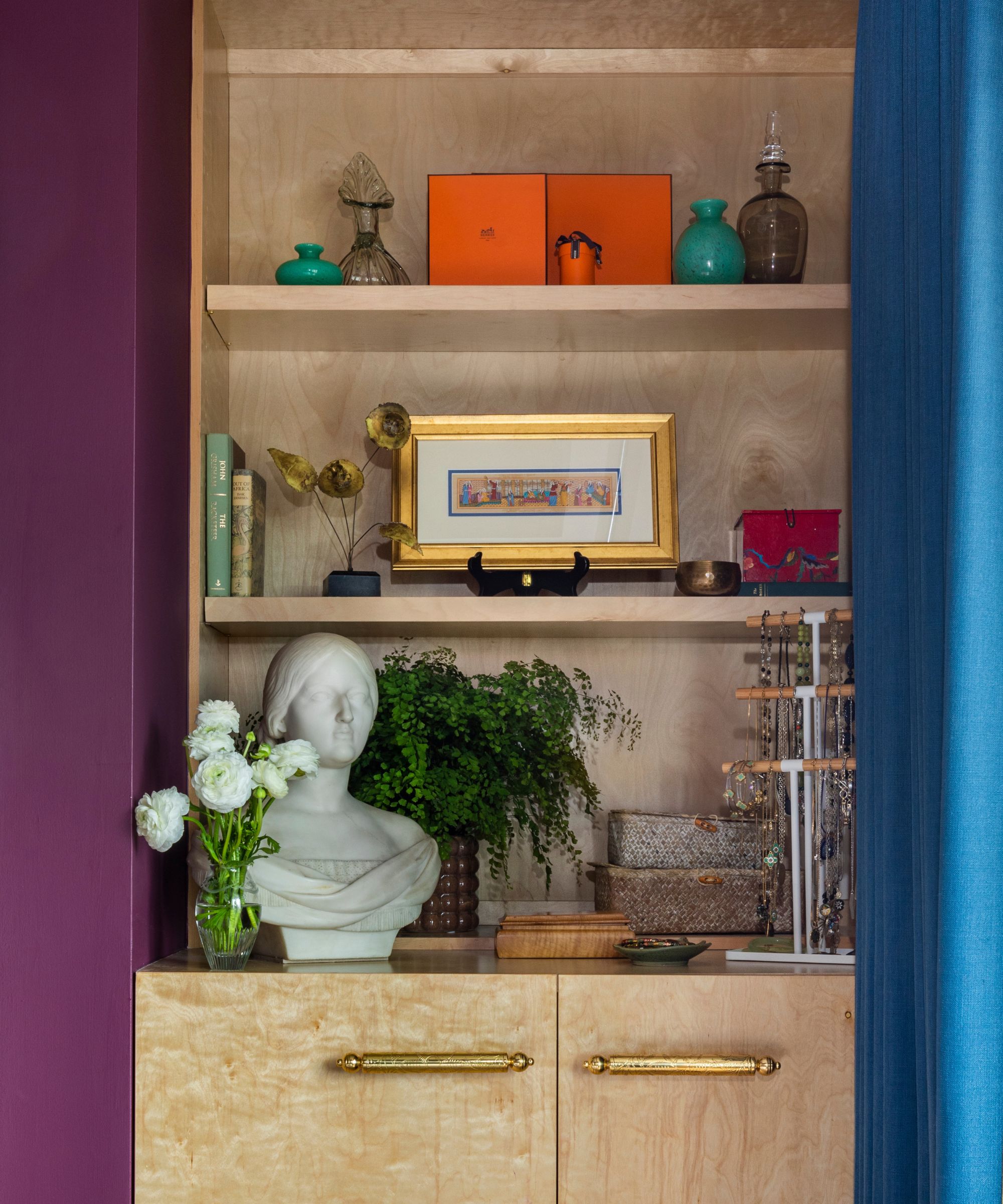
The 'unexpected red theory' took over social media early this year, so it's no surprise that select red hues made designers' lists for Benjamin Moore favorites. Emily June Spanos, principal and founder of Emily June Designs, says Bordeaux Red – a gorgeous mix of deep red and purple tones, pictured above – adds character and charm.
'I am passionate about color – the bolder the better! In this bedroom I used a deep, vibrant Bordeaux color to add a punch of drama against pale wood millwork,' says Emily.
Nicole adds that Boston Brick, another of her favorites, emulates the terracotta hues that have proved popular over the past several years, as earthy tones eclipse all-out neutral interiors.
'Boston Brick takes the best notes from terracotta, and adds a hint of historical red to balance out the orange tones. This gives it a gorgeous, rosy tint with a muted earthy brown orange base that acts like a real life beauty filter in your room,' says Nicole.
7. Pink and purple paints
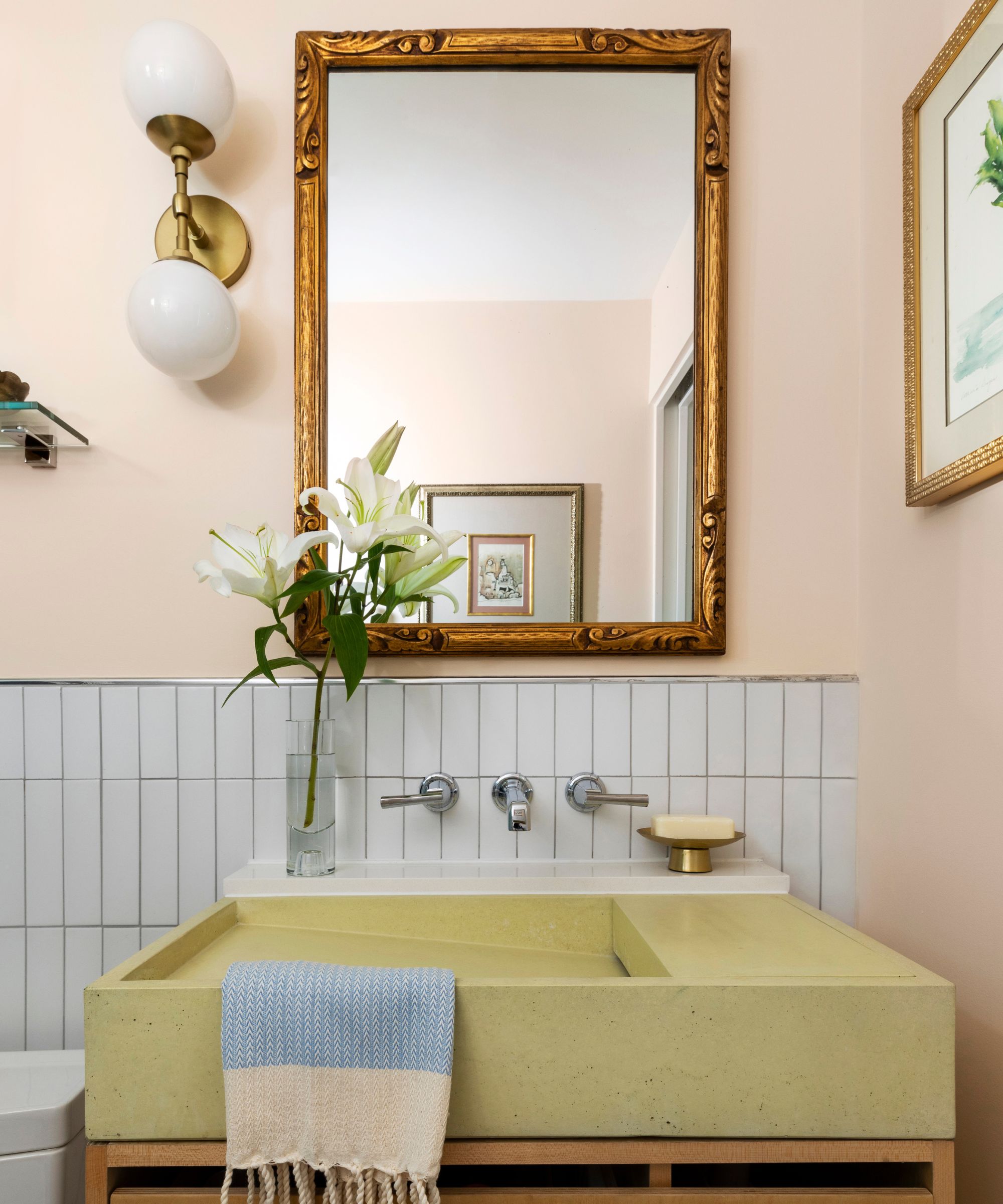
Decorating with purples and pinks can be tricky, but these designers have found a few favorites. Emily says that Benjamin Moore's Arizona Peach is the perfect 'pale pink or blush' to swap out for white.
'Not only does it give a warm glow to the space, but it also complements so many other colors – it can really be used as a neutral!' she says.
Nicole adds that First Light, Peach Parfait, Lavender Mist, Lily Lavender, Shadow also make her list of go-to shades, spanning from dark and moody to light and uplifting.
8. Neutral paints
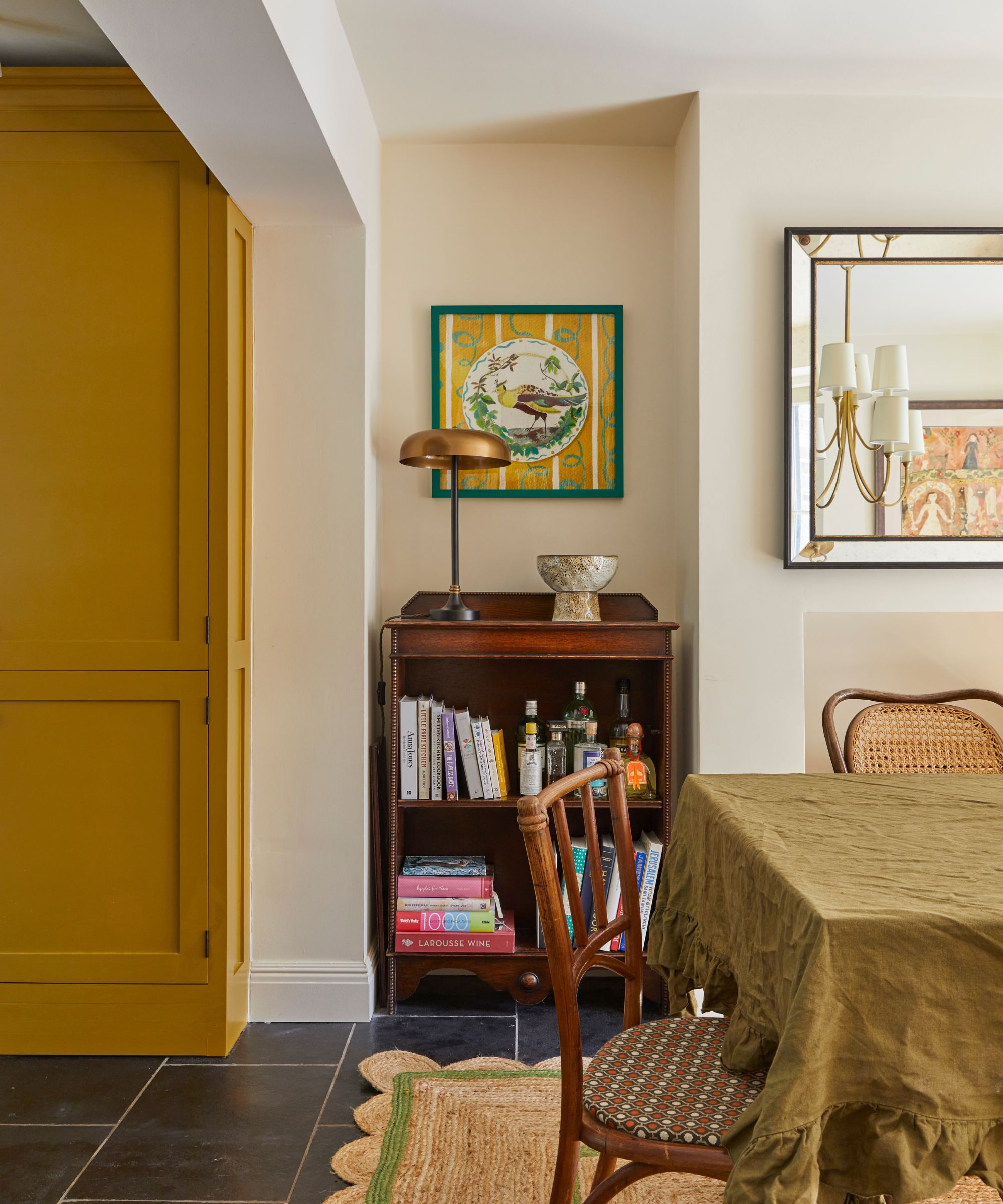
Designers love decorating with neutrals for their timeless appeal and warm embrace, so it's only natural that many neutral shades made their lists. Kyle and Christopher say that Fairview Taupe is 'the perfect shade of brown,' toeing the line between warm and cool with ease.
'It works equally well in monochromatic schemes and as a backdrop for moody shades of blue. We've used it in a cozy den and library, where we painted the millwork, trim and wall surfaces all the same color, and in a hallway vestibule off of a white room for a moment of contrast and drama. It also provides a great neutral backdrop for rich oil paintings or a collection of black-and-white photography,' they say.
Revere Pewter was mentioned by several designers for its versatility and warm undertones. Artem says the shade 'comfortably changes from one light setting to another,' adding that decorating with Revere Pewter brings a sense of comfort to any space.
Veronica says Pale Oak is another neutral favorite, bringing a bit more depth than some of her other go-to hues. 'The key difference between Pale Oak and Plaster of Paris is the undertones. While Plaster of Paris is well-balanced, Pale Oak leans toward taupe undertones. This lends itself better for people who want a little grey but not too much,' she says.
Jessica Shaw, director of interiors at The Turrett Collaborative, looks to Muslin 'for more color and a warmer hue.' 'When mixed with black, in particular black lacquer, you can achieve a classy, classic style,' she says.
These paint colors are versatile and ready to pair with any interior design style – the choice is yours. Equipped with design inspiration and some new favorite shades, you'll be set to refresh each and every room of your home.


