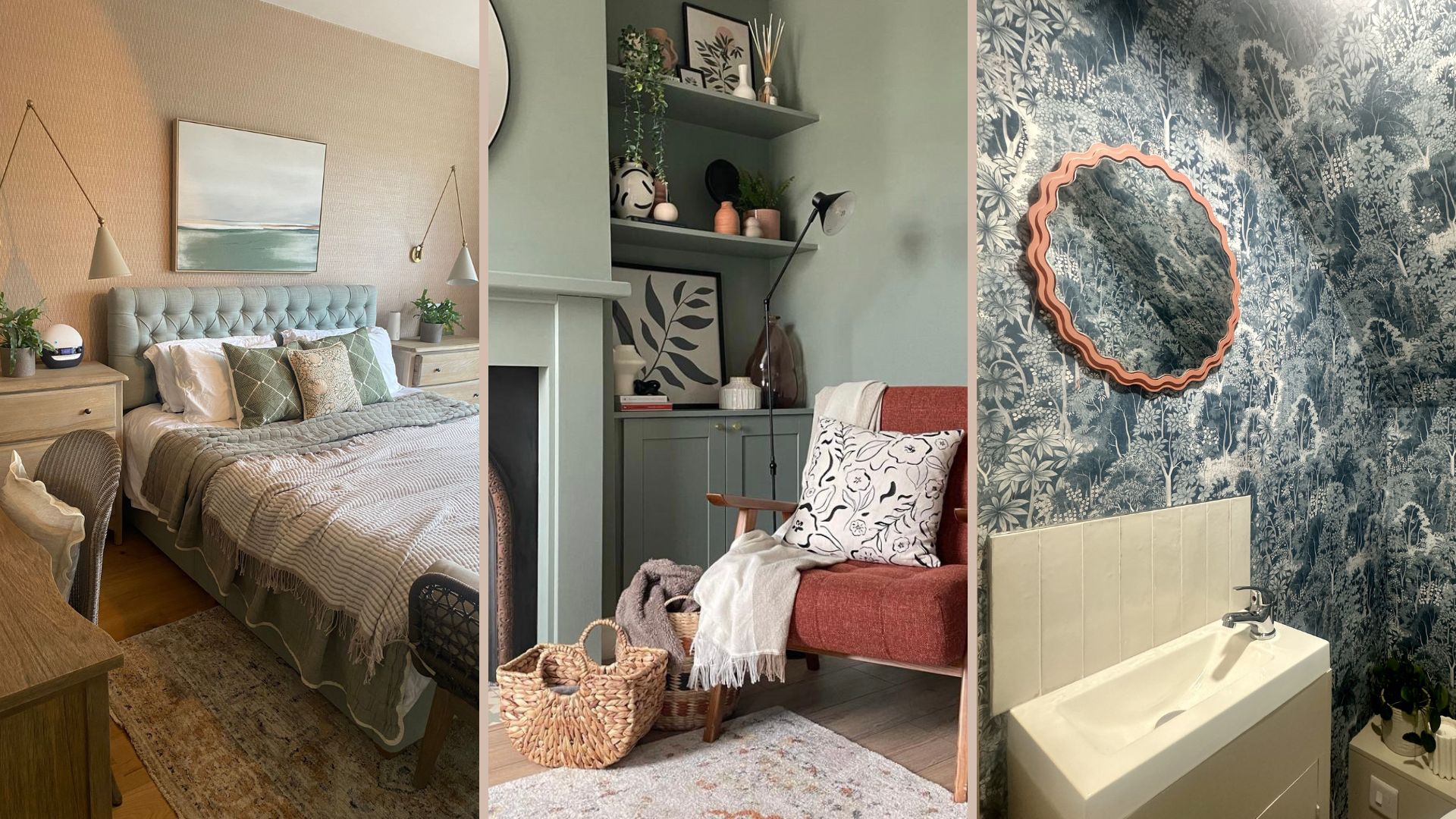
When redecorating a room in our home, our minds usually go straight to paint and paint charts. However, according to the experts, this is a mistake.
Considering paint first makes a lot of sense, given that the colour we put on the walls has a big impact on how the room feels, and painting is one of the first practical steps we take. However, according to the interior designers at The Living House, an interior design company based in Birmingham, paint should never be the first thing you decide on to avoid falling victim to common interior design mistakes.
Choosing your paint colour can be a little overwhelming, and deciding on the best living room paint colours for your space at the very start could mean you run into problems later on.
The best decorating timeline: recommended by interior designers
So rather than mulling over paint colour ideas for your hallway or researching the latest paint colour trends, The Living House designers recommend thinking carefully about how you'll really be using the room day to day, and which layout will facilitate that most effectively.
"It's like going to a wedding and choosing your shoes first," says Catherine Seagrave, an interior designer at The Living House. "You're much better off choosing your layout and large furniture items first, and going from there."
Here's the redecorating timeline they recommend to follow when planning to redecorate any room in your home.
1. Think about the function of the room
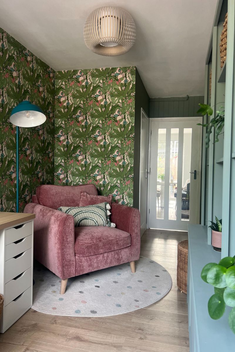
It's important to think about who will be using the space and what they'll be doing in there. "What will you need the room to do?" asks Sophie Clemson. "If you're going to be working from home, do you need space for that? If so, it’ll affect the layout."
Forget what you think the room "should" look like, and think about all the possible ways you might like to use the room. What would the dream scenario be and how can you maximise the space?
For example, your living room might need to flip between being a kids' play area in the daytime and a more adult space for watching TV or hosting friends in the evening. If your living room doubles up as a dining room, yoga space and where you hang your clothes to dry indoors, there needs to be space for all of these things to happen.
2. Find your layout
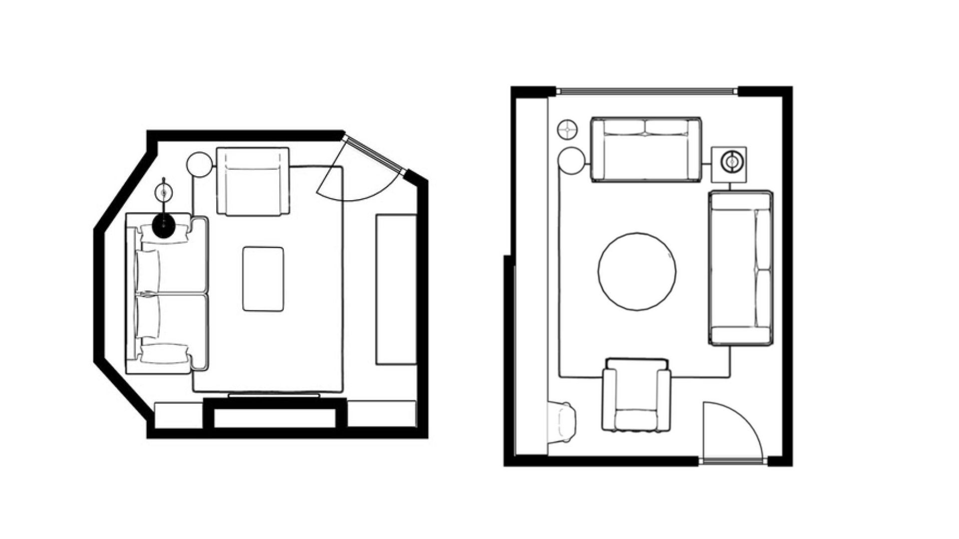
So you've listed all of the functions you'd like the room to deliver, now it's time to work out the layout that will make these functions possible. This is equally important for determining a small living room layout as when applying common bedroom layout rules.
Tackling layout early on prevents you from making costly mistakes when buying furniture. For instance, you'll know the exact size of your dining table you need, or that you need two sofas instead of a corner sofa.
"We always explore various layout options on Floor Planner to get the most out of the space for our clients – possibly things they haven't considered before. This is the first step in our design process," says Sophie.
When renovating, knowing your layout helps with choosing where your light switches and plug sockets should go, and it helps you decide on your focal point, which could be your fireplace, wallpaper, panelling behind a bed or bespoke shelving.
"If you have too many areas, it can become too distracting to the eye. It can end up feeling cluttered and busy and prevent things from feeling cohesive," Sophie explains.
3. Gather inspiration on Pinterest and Instagram
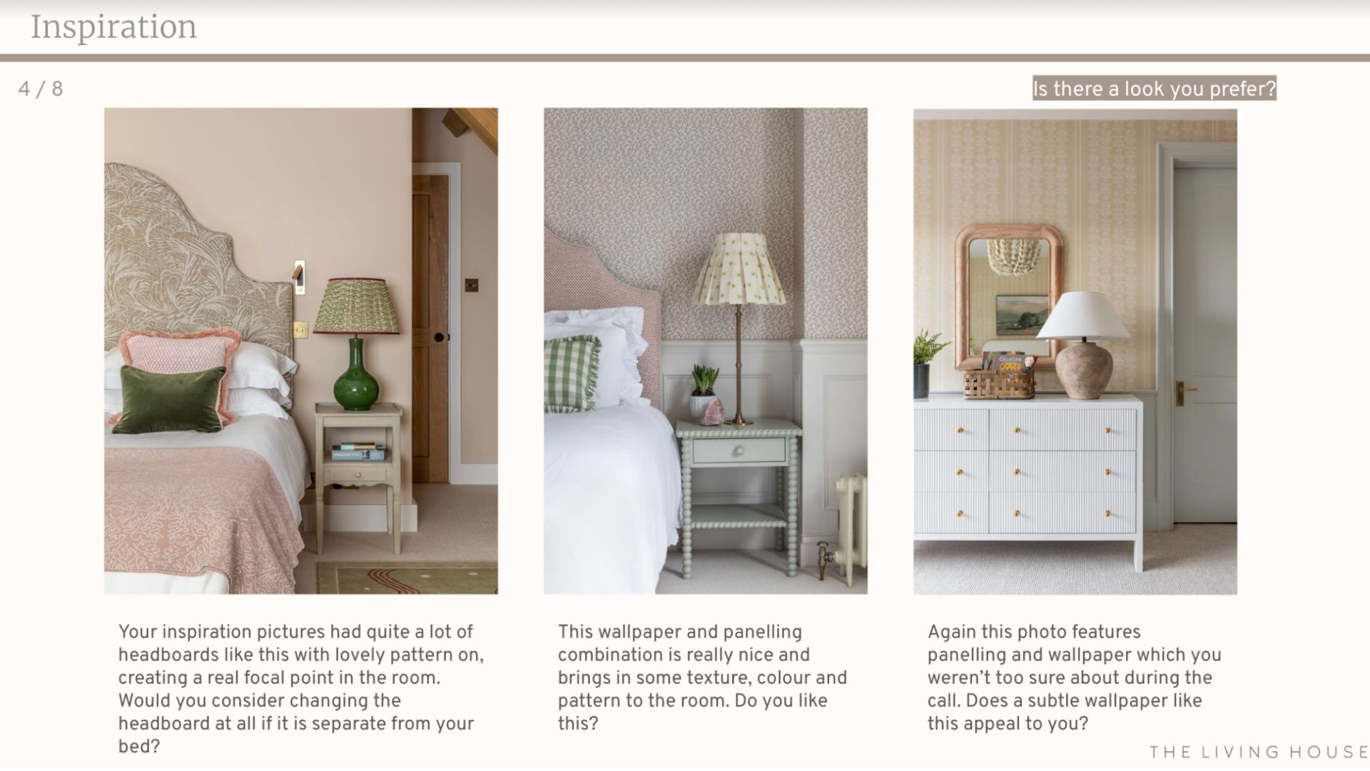
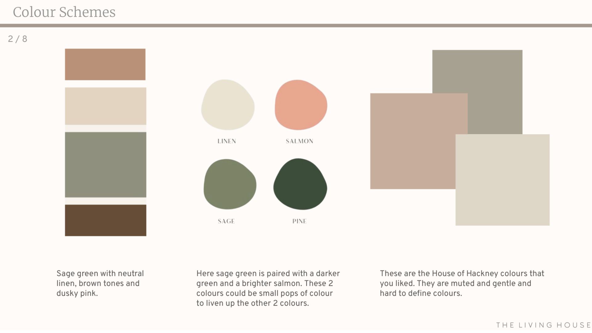
Next, look at inspirational images. "Looking at inspirational images on Pinterest starts the design journey," says Sophie. "Gathering images on Pinterest and Instagram can help you identify themes and styles that you're drawn to."
"Pinterest is also a good way to show what you mean to your partner," adds Becky Connolly. "It can help you understand each other better – one client recently said they wanted to use pink, meaning plaster pink, and her husband assumed she meant bubblegum pink. So when she showed him some inspirational images, he was much more on board with the idea.
"Not all of us have a visual or creative brain, and clients might like an image but not know how it could translate into their home, and that's where we come in."
4. Determine your colour palette to begin painting
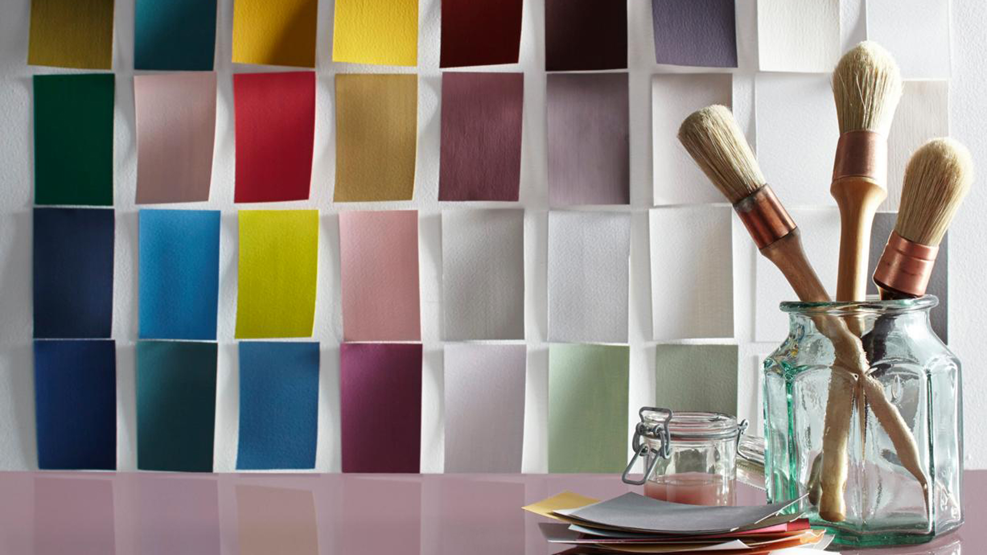
Check which way your room faces, because you'll need a warmer tone if it's north-facing. Then that guides the colours and tones for your soft furnishings, from curtains to sofas and beds.
If you're dealing with a small space, look at ways to make a room look bigger with paint, and if you want to create an uplifting space, you can choose one of our happy colours for any room, recommended by designers. If you are looking to make a dark room lighter you might wish to choose
If you find it hard to decide on colours, look for a fabric, piece of artwork or wallpaper that you really love and use that in your scheme. Then you can just use that as your jumping-off point for all of your colours.

£5.50 for a tester pot | Try Sophie Clemson's recommendation on your walls at home with a tester pot from Designer Paint. You can also order free colour cards on the Designer Paint website to compare their different warm neutrals.

RRP: £59 for 2.5L | Becky loves Calke Green by Farrow & Ball – it's great for creating a cosy living room and looks great under electric light in the evening. Combine it with James White, also by Farrow & Ball, on ceilings and upper parts of your walls, as this white has a green undertone.

RRP: £54 for 2.5L | Farrow & Ball's Vert de Terre is a fresh and soft green tone and another of The Living House's favourites. It has a blue undertone and is therefore less intense and a little cooler than other shades like Dulux's Overtly Olive or F&B's Cooking Apple Green.
5. Buy the main furniture items
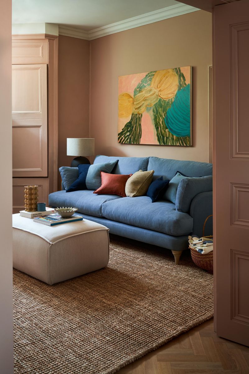
Once you've thought about function and layout after pinning inspirational images you'll have an idea of two or three colours to make up your colour palette, and then your paint colour decisions should come much more easily.
At this point, you're in a good position to start buying key items of furniture.
Most importantly, you won't find yourself struggling to match your sofa fabric to your paint colour. "Sofa fabric is a tricky one," says Catherine. "Sofa mistakes are common – sometimes clients are keen to have a corner sofa, but they just don't work in every space."
FAQs
What are the most common layout mistakes people make?
We often don't realise the different layout options available to us and end up falling into the most common interior design mistakes as a result.
"When clients have lived somewhere for a long time, they sometimes can't actually imagine reorienting the space," Catherine shares. If you've had your sofa and TV in the same spot for decades, you start to think that's the only place it can go. The Living House designers say clients are often blown away when they show them another layout that would work in the space.
"Often, clients copy the layout they saw on an architect's plan or just copy what the previous tenants have done. When we show them our layout suggestions, they usually say that they could never have imagined it."


