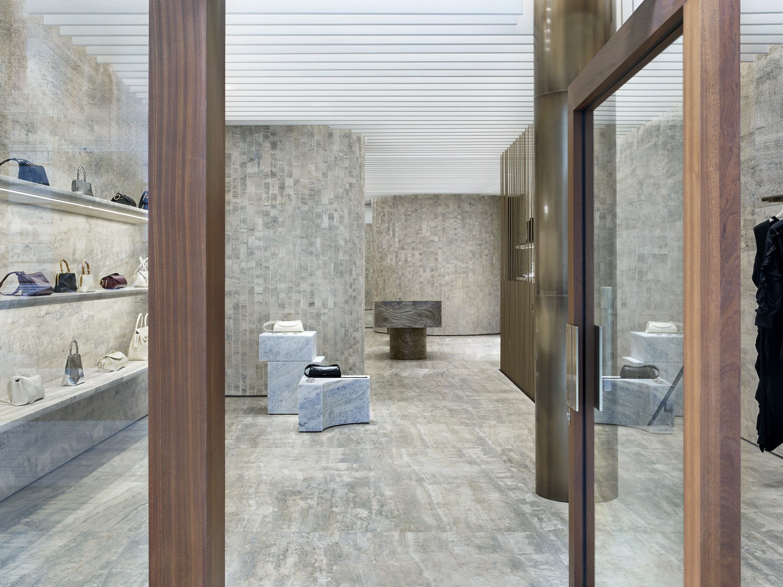
Lucie and Luke Meier’s vision for Jil Sander has been one of good taste, precision and restraint, enlivened by flourishes of unexpected adornment or poetic moments of handcraft. ‘[There’s] a nice tension between something very authentic, traditional, but then, skewed in a very modern way,’ Luke Meier told Wallpaper* last February. Then, he was talking about the brand’s A/W 2023 collection, though it is a statement that could apply to the pair’s approach to their tenure so far.
Such is the certainly the case for the pair’s new Jil Sander store, located on London’s Bond Street, which first opened in November 2023, though was inaugurated with a series of events last week. Conceived in partnership with Casper Mueller Kneer – an architectural practice with a rich history of collaboration on the design of fashion stores with brands including Saint Laurent, Celine and Lemaire – the store promises an ‘intimate’ journey into the Meiers’ Jil Sander universe, and is as meticulous and thoughtful as the pair’s collections.
Inside Lucie and Luke Meier’s new Jil Sander store in London
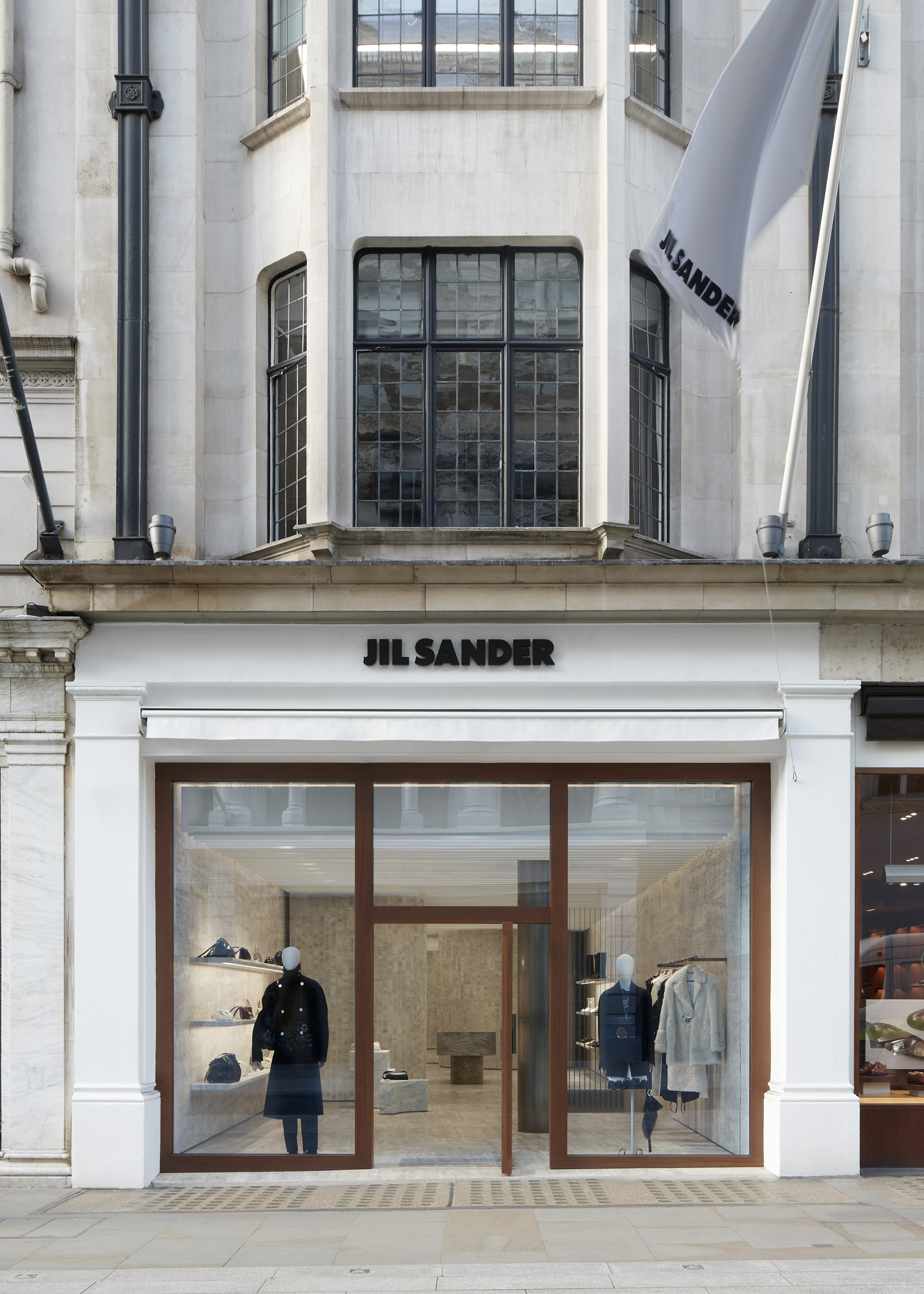
‘We reached out and the initial meeting we had was just an exchange, which I think is the way we start anything we do, whether it’s an architectural project, or collections,’ says Luke Meier of collaborating with the architects. ’They were familiar with Jil Sander and there was just an understanding on both sides, which always makes things move faster.’ Much of this process was intuitive, adds Lucie Meier, who says the store’s aesthetic – the first of a new concept, which will continue with a new outpost in Ginza, Tokyo later in the year – emerged from ’an inspiration board, where we collect ideas, or materials we get inspired by.’
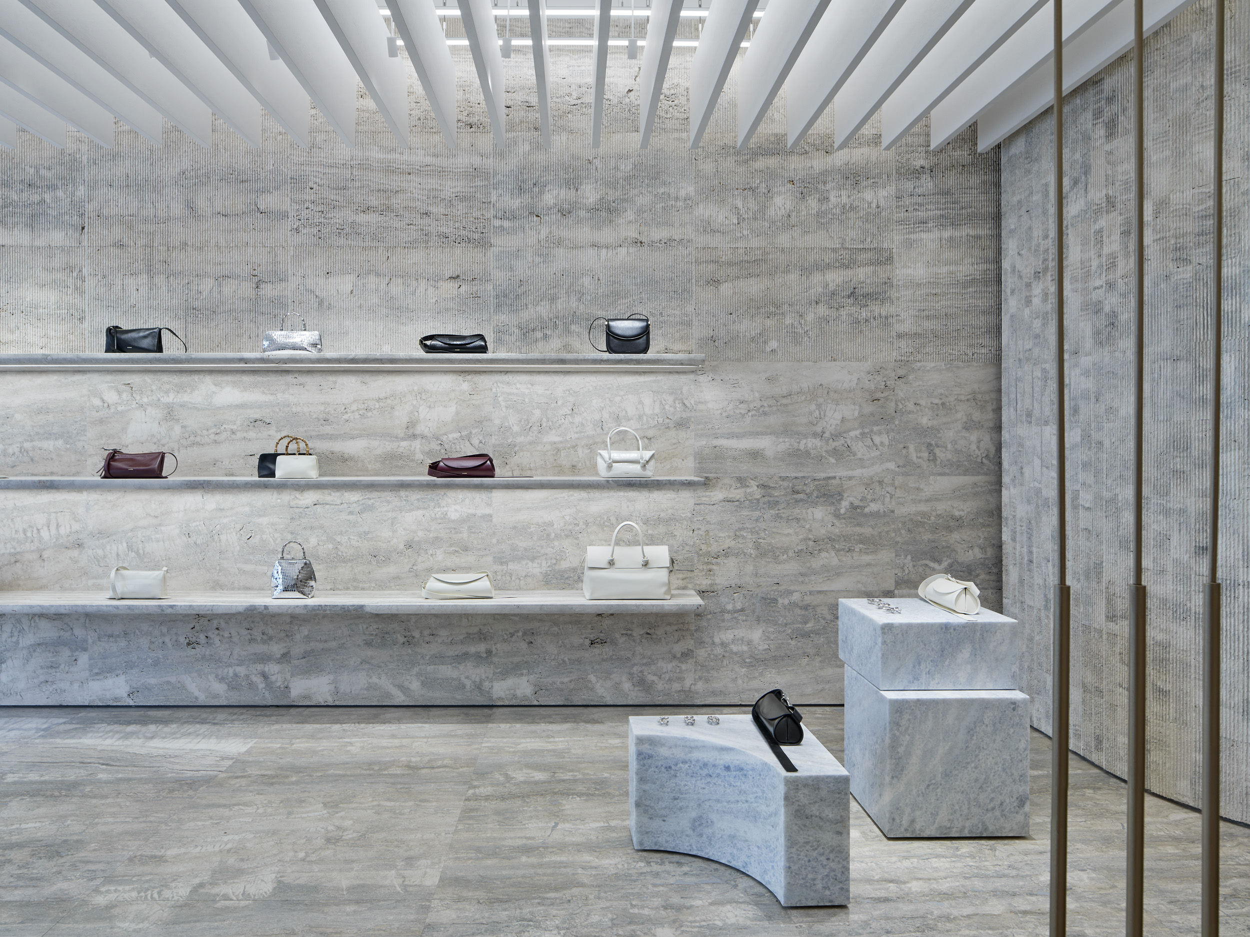
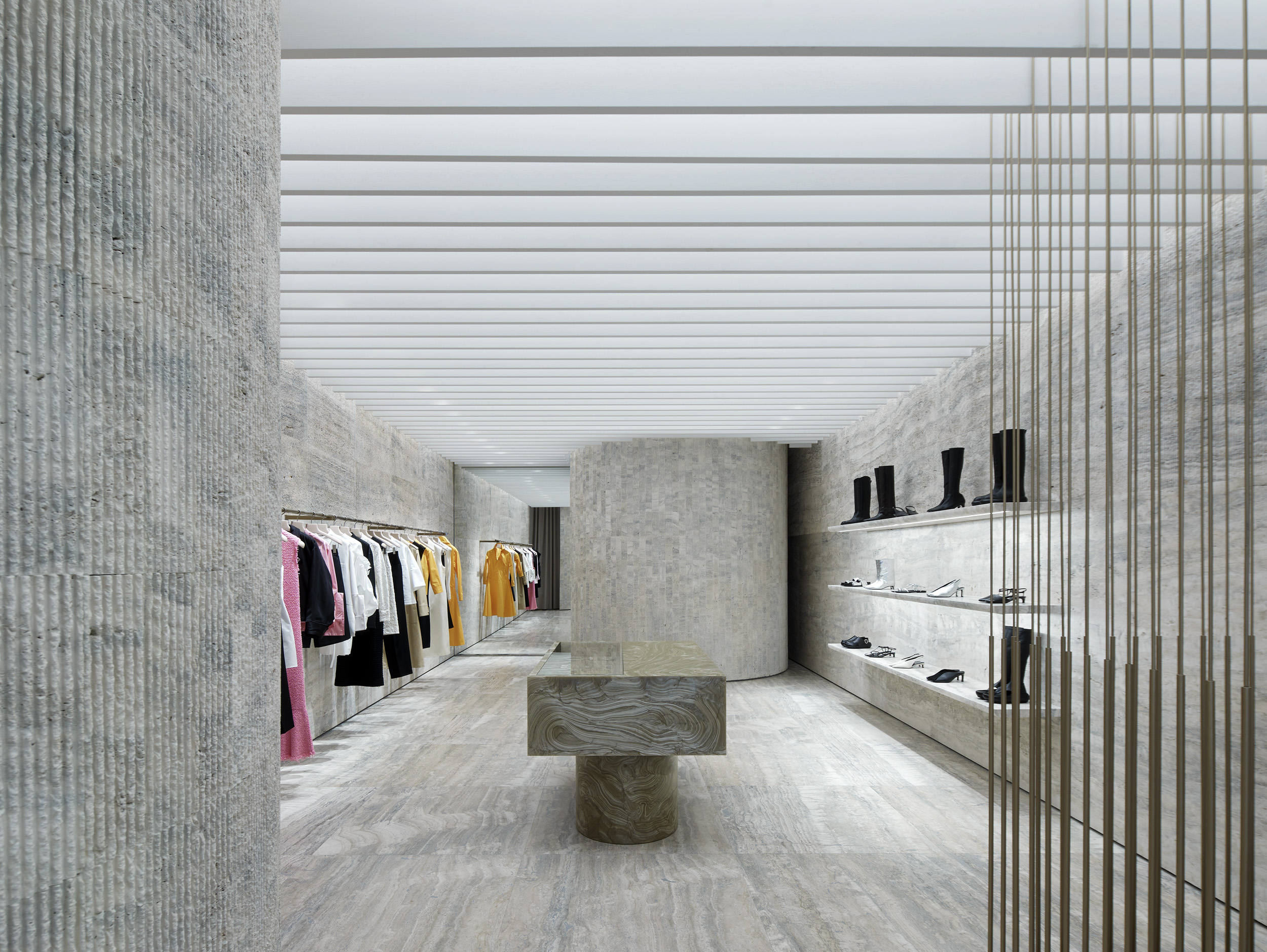
Indeed, materiality is at the heart of the project. Stone is the primary element of the store’s construction, with floors, walls and a staircase leading down to the basement floor hewn from travertine marble, some with geometric scored surfaces, others left with the material’s more natural undulating textures. ’The orientation of the veins, the continuation or disruption of patterns, it’s really a textural approach, but without overbearing the space,’ explains architect Olaf Kneer, who is co-founder of Casper Mueller Kneer alongside Marianne Mueller. ‘The beauty of this particular travertine is that in these couple of blocks of stone we found a lot of blue, which is something quite unusual in that it almost feels artificial.’
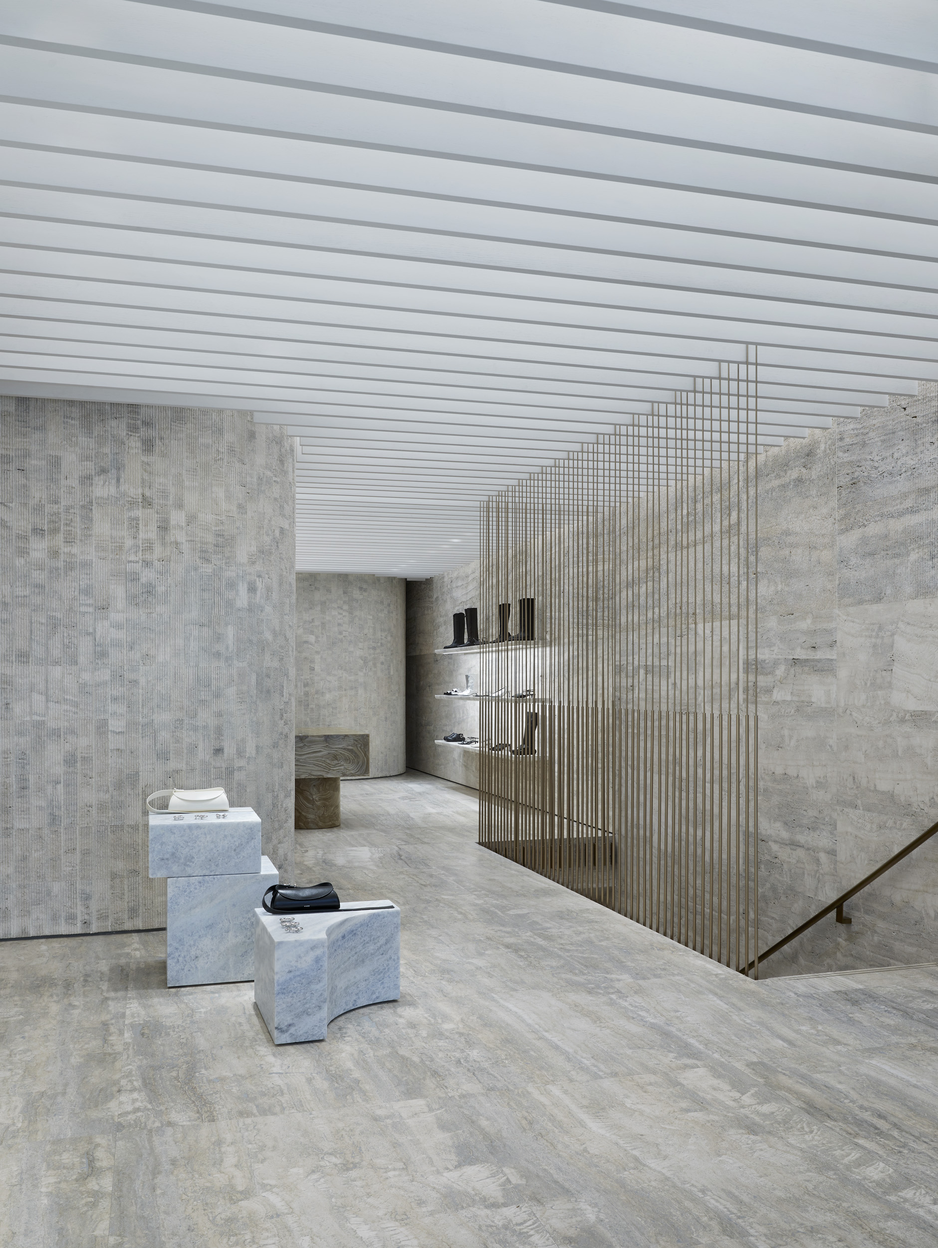
Mueller adds that stone surfaces are a solution to the fact that the contents of the store will change season on season, or even week on week (the architects note that the products currently on display are fairly monochrome, but that there are often bold flourishes of colour in the Meiers’ collections). ‘It provides a setting for the product to really be in the foreground,’ she says. ’[There is] a slight roughness to it, which gives the space an almost geological quality, as if it’s been carved from a single piece.’
‘I think that‘s the challenge – it’s a really evolving environment, because everything changes constantly, [whether] colour, texture, material,’ adds Luke Meier. ‘So in a way, the presentation of it all has to stand up no matter what happens in here. We all enjoyed this of making something not necessarily homogenous, but something that felt like one idea, rather than a mishmash of different surfaces.’
An inspiration for this approach was Carlo Scarpa, the Italian modernist architect who was best known for his monolithic marble and stone interventions in Venice. ‘I think he came up in the conversations about materiality, more than anything; we spoke a little bit about his water drainage systems in Venice, and the ideas of different levels [of stone],’ says Luke Meier. Mueller adds that Scarpa is evoked in ’conceptual ideas’ rather than anything more formal, ’a series of statements that run across the store levels, the ideas of levels and horizons – that became really important in thinking about the space.’
‘In a way, it’s how we work with fabric,’ says Luke Meier. ‘Because you can do all kinds of things with one fibre. It’s just really how you treat it, how you finish it, how you spin it out; the structure, the weaving, the brushing.’
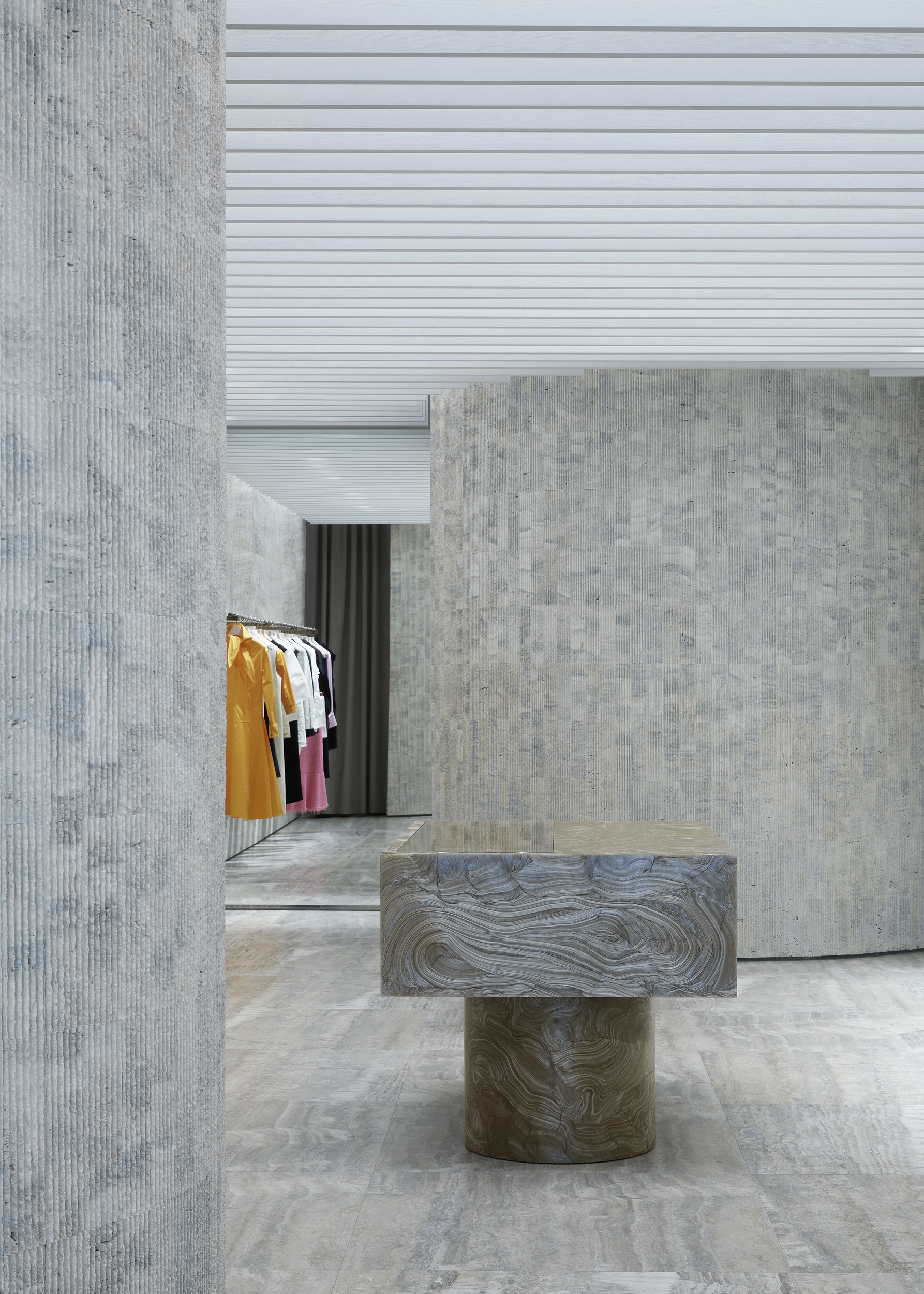
Images of artists’ studios, particularly in the soft interplay of light and surface, were also part of the inspiration for the space. A focus on small details, meanwhile – Lucie Meier points out the gently curved edge of the marble shelving on the basement floor – is designed to reflect the pair’s Jil Sander collections, which often reveal their construction only when off the hanger and onto the body. ‘We felt like we needed to enrich the space with little details, because that felt important in the language of Jil Sander,’ says Mueller, noting that it sets the space apart from being something monolithic, to something more intimate. ‘They are maybe details you don’t see if you aren’t looking for them,’ says Lucie Meier. ’But the accumulation of them all gives it a different feel,’ adds Luke Meier.
Indeed, despite the coolness of the material, the store itself manages to retain a mood of intimacy – a reflection of the Meiers’ continuing desire to shift the sometimes austere connotations of Jil Sander towards something softer, more poetic. ’I think the last thing we wanted is an intimidating store,’ says Lucie Meier. ‘We want people to stay a while; to enjoy the space. I think that’s why upstairs we wanted to divide the space with volumes [of marble] to divide the space to create more private moments, rather than one big space where you feel exposed.’
As for what feels like a continuing luxury retail renaissance – just a few doors down, Gucci recently revealed an enormous new store set in a converted art gallery, alongside numerous new openings and renovations in the area – the Meiers note that their own desire to open a store like this centres on a want to build a tangible world for their consumer to get lost in. ’I don’t think online shopping can ever replace the feeling of being inside of a store – it’s about the experience,’ says Lucie Meier.
’It’s like the fashion show,’ adds Luke Meier. ‘It was the same conversation during Covid. When shows had to shift online, you had people doing films, and all of these other ideas [to replace the runway show]. But when you are in the room, you're in the space, it doesn’t compare. It’s a sensory experience that you can’t replicate.’
Jil Sander, 134 Bond Street, London, W1S 2TF.


