We love a clever logo, and the design for the HAKUTO-R lunar lander is certainly that, packing a lot of meaning into its lovely looping form. But despite the ingenuity, some think the result has an unfortunate resemblance, which in hindsight may have been a little ominous.
ispace inc's lunar mission failed at the last hurdle last month when communication with the lunar lander was lost in the final seconds of descent after it made the furthest voyage of any privately-funded spacecraft to date. But a sad face is the one hidden meaning that wasn't intended in this logo design (see our guide to how to design a logo for tips for your own work).
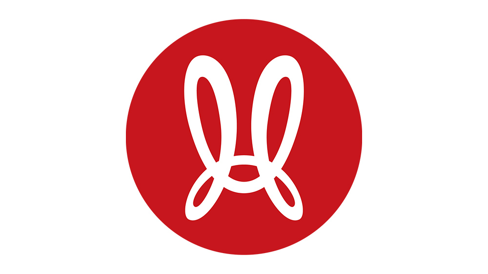
The logo for the HAKUTO-R lunar lander from r/DesignPorn
As redmercuryvendor notes on Reddit, the HAKUTO-R logo comprises a capital 'H' for the brand name of the Japanese lunar lander. The looping shape of the letter also represents the elliptic ballistic capture transfer orbit that was used to reach the moon. But the packed symbolism doesn't stop there.
The lower 3 segments also form the cheekpieces and domed top of a samurai helmet, while the two upper segments form the shape of rabbit ears ('hakuto' means 'white rabbit' in Japanese, and the 'moon rabbit' is a mythical figure in East Asian folklore. To top it off, the whole thing is presented on a red circle on a white background – the same design as the Japanese flag.
It's an ingenious combination and execution, but some can't help seeing something else. "I see a sad Mickey Mouse," one person wrote. "Sad bunny or Louise Belcher’s hat," someone else said. "That's a really clever design incorporating all those elements but I still just see ☹️," one person concluded sadly.
It just goes to show that even the cleverest design inspirations and connections can falter in execution when unintended resemblances creep into the design (the hilarious Tesla logo resemblance, for example. We've also seen many logos that look like other brands.