Earlier this year, I spoke to color specialists from a range of paint brands to explore all of the key design trends following the recently unveiled Color of the Years. While there were many standout themes, from nostalgic colors to warm tones, the emergence of 'quietly colorful' hues immediately stood out to me.
It was Benjamin Moore who imagined this paint trend with its Color of the Year and wider Color Trends palette for 2025 – focusing on liveable, grounding shades that offer a comforting take on decorating with color, moving away from anything too bold in favor of more forgiving shades.
And so, I spoke to a Benjamin Moore color expert to delve deeper into this emerging color trend, along with exploring interior designers' favorite 'quietly colorful' paint shades to bring this trending – but timeless – paint idea into your home.
What is the 'quietly colorful' trend?
In short, the quietly colorful trend is all about slightly muted, 'in-between' paint colors that introduce color subtly into the home. Rather than loud, saturated hues that make a statement, quiet colors don't demand attention yet allow for more depth and interest than neutral paints. Below, Helen Shaw, Director of Marketing (International) at Benjamin Moore explains how this paint trend serves as a focal point in Benjamin Moore's recent trend palette:
'Our 2025 Color Trends palette features nine ‘quietly colorful’ hues – ranging from gentle neutrals like Tissue Pink and Sea Salt to moodier colors like Ashwood Moss and Cinnamon Slate.
'What makes these hues special is that each is rich with undertones, creating a dynamic look that changes as light levels shift throughout the day. For example, in some lights, Cinnamon Slate looks more brown and in others more purple. As these hues are not oversaturated, they are easy to use in the home and won’t tire over the years as your style evolves and furniture or decor swaps in or out. In step change to the saturated color stories of recent years, these ‘in-between’ hues have an innate sense of familiarity and ease, without fading into the background.'
Designers have given this interior design trend the stamp of approval for the year ahead, too. Below, Natalia Miyar explains how it offers longevity and a timeless approach to decorating:
'The 'quietly colorful' trend, although I feel it has always been there, is an ideal background to highlight unique pieces, artwork, or architectural features. Nature is full of neutrals like blue and green.
'This trend provides flexibility for future changes – whether you're swapping out accessories or adding new statement pieces. The 'colorful' neutral backdrop doesn't limit your options, and the room evolves with your tastes over time. It’s versatile and timeless at the same time, and it gives your room color ideas a sense of sophistication and depth without being overly loud.'
Designers' favorite quietly colorful paint shades
From gray greens to toned-down blues, I've rounded up a selection of interior designers' favorite paint shades that feel perfectly aligned to bring the quietly colorful trend to life.
1. De Nimes, Farrow & Ball
'A soft, weathered blue with a touch of grey, De Nimes is quietly colorful without ever feeling overpowering,' says interior designer Tineke Triggs. 'It has a lived-in, timeless feel – almost like the perfect faded denim – that makes it an excellent option for kitchen island color ideas, mudroom ideas, or accent cabinetry.'
De Nimes is a subdued blue paint that works almost like a neutral, adding subtle color while creating a sophisticated look.
2. Silver Marlin, Benjamin Moore
Another favorite quietly colorful paint color for designer Tineke Triggs is Benjamin Moore's Silver Marlin, of which she says: 'A soft blue-green with a hint of grey, Silver Marlin is an excellent choice for walls or cabinetry in spaces that need a touch of color without feeling overtly painted.'
Technically a gray paint, Silver Marlin has tones of green and blue which give it a soothing quality.
3. Treron, Farrow & Ball
Tineke Triggs' third and final pick for quietly colorful paint shades is Farrow & Ball's Treron, a grounding gray-green: 'This muted, greyed-green is a softer alternative to deep olive or sage, offering an earthy undertone that pairs beautifully with natural materials like limestone, warm woods, and brass.'
This green paint is quietened down with its gray tones, making it a liveable backdrop color for plenty of rooms, from hallways to kitchens.
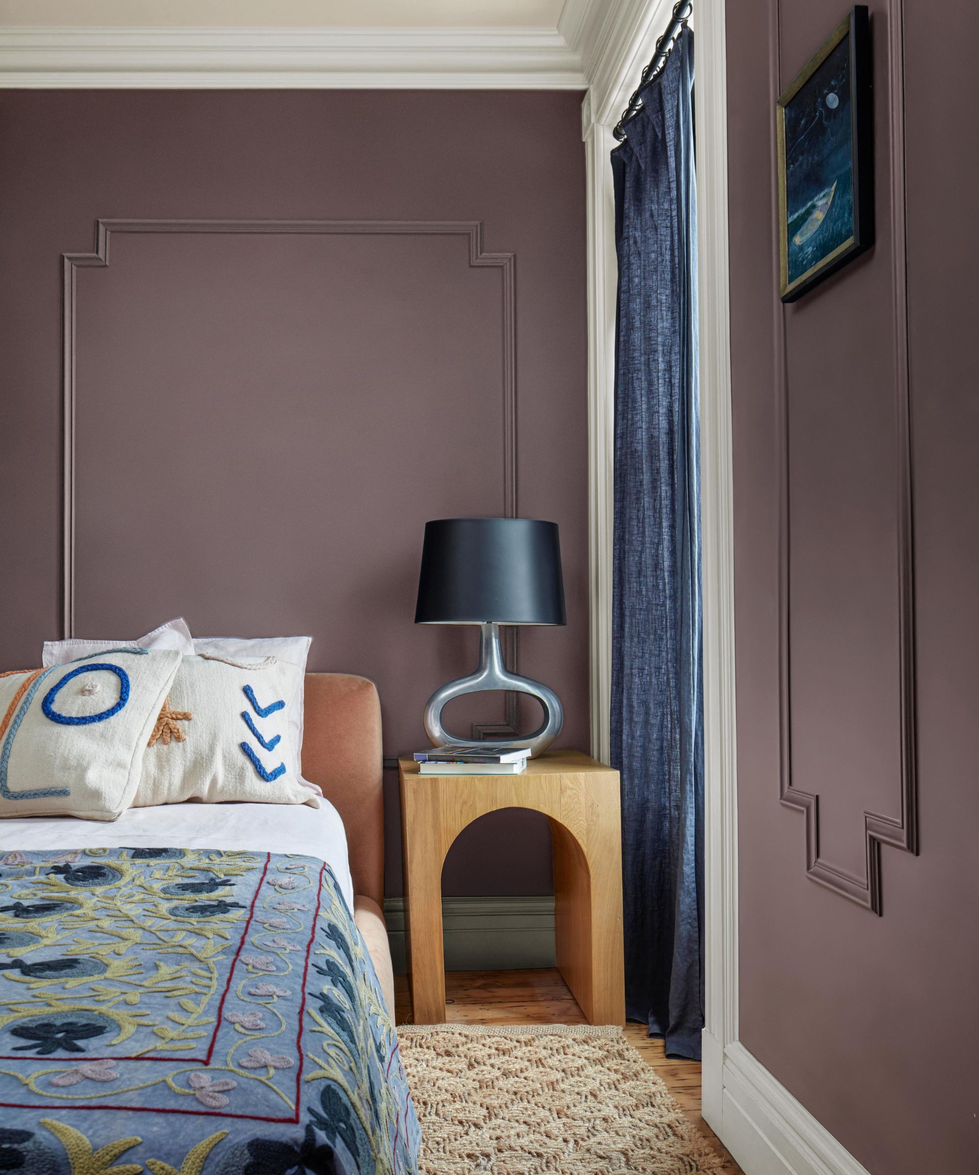
4. Iced Lavender, Benjamin Moore
Purple paints are often incredibly lively and bold, but Benjamin Moore's Iced Lavender feels slightly subdued for a grown-up take on this fun color, and it's one of designer Kathy Kuo's favorite quietly colorful paints. She says:
'When it comes to paint colors that are equal parts subtle and statement-making, I'm always partial to light and airy nature-inspired colors that strike a quiet balance between earthy and sophisticated.'
This soft purple paint is a great way to tap into trending purple without going too bold or saturated.
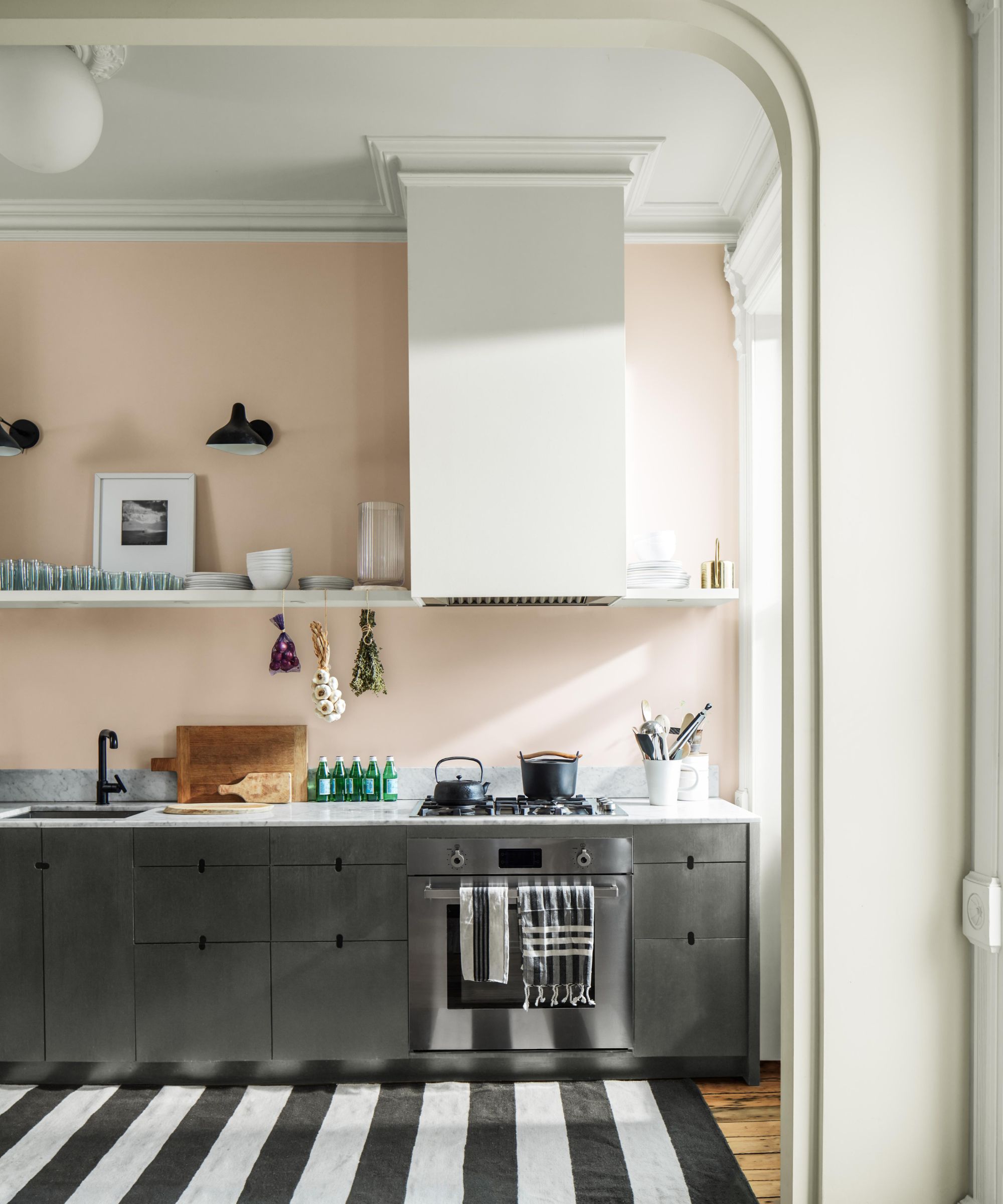
5. Healing Aloe, Benjamin Moore
Benjamin Moore's Healing Aloe is a light gray-green that feels immediately calming, making it a great choice for bedrooms or bathrooms.
'We recently painted beadboard ceilings in a house with Benjamin Moore’s Healing Aloe,' says interior designer Ann Wolf of Wolf Holden Design. 'It is a very soft, greyed-down blue that feels like the sky on a cloudy day.'
Use this pale green paint as a neutral for a calming feel, especially fitting for rooms you want to relax in.
6. Light Blue, Farrow & Ball
'One of my favorite ‘quietly colorful’ paint colors is Farrow & Ball's Light Blue – it’s a soft blue-grey that shifts beautifully in different lighting, never overwhelming a space but adding just enough personality,' says designer Jessika Gatewood of Gatewood Designs.
A cool pale blue, Light Blue provides just a touch of color to rooms while adding more interest than neutrals.
7. Redend Point, Sherwin-Williams
'Another favorite is a warm clay tone like Sherwin-Williams' Redend Point, which has a dusty, earthy warmth that plays beautifully with natural elements,' adds designer Jessika Gatewood.
'These colors work so well because they add subtle depth without feeling overpowering, making them perfect for walls, cabinetry, or millwork in rooms that need a soft, elegant feel,' says Jessika.
Redend Point is a muted brown paint with plenty of warmth, perfect for adding depth to living spaces or kitchens.
8. Hazy Skies, Benjamin Moore
'One of my foolproof tricks for picking out a quietly colorful paint color is to figure out what color you like and then find a very grayed-down version of it,' says designer Kelly Sutherland of Kelly Sutherland Designs.
'Hazy Skies by Benjamin Moore is a great example. It’s a putty gray-green that feels calm and inviting without the in-your-face saturation. The main advantage to going this route is that it reads more as a neutral, which commits you less to a 'color' so the room can evolve as you slowly decorate,' says Kelly.
Hazy Skies is a pale gray-green that provides a subtle warmth to rooms while emulating a calming feel.
As designers say, the beauty of opting for quietly colorful paint shades is that they offer longevity. While bold and statement wall colors can often feel very trend-led, these subtle shades offer a timeless feel, while adding more depth to your home than classic neutrals.
For further color inspiration, we take a look through Farrow & Ball's 12 new paint shades for 2025 – all of which work in elegant harmony with the 'quietly colorful' look.