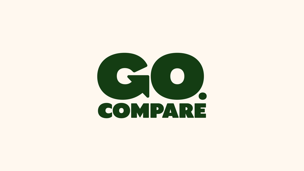
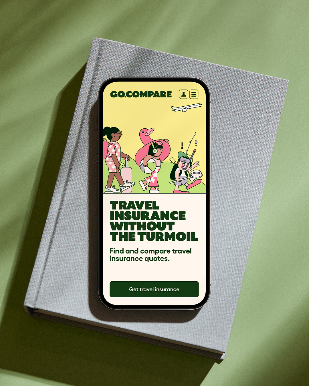
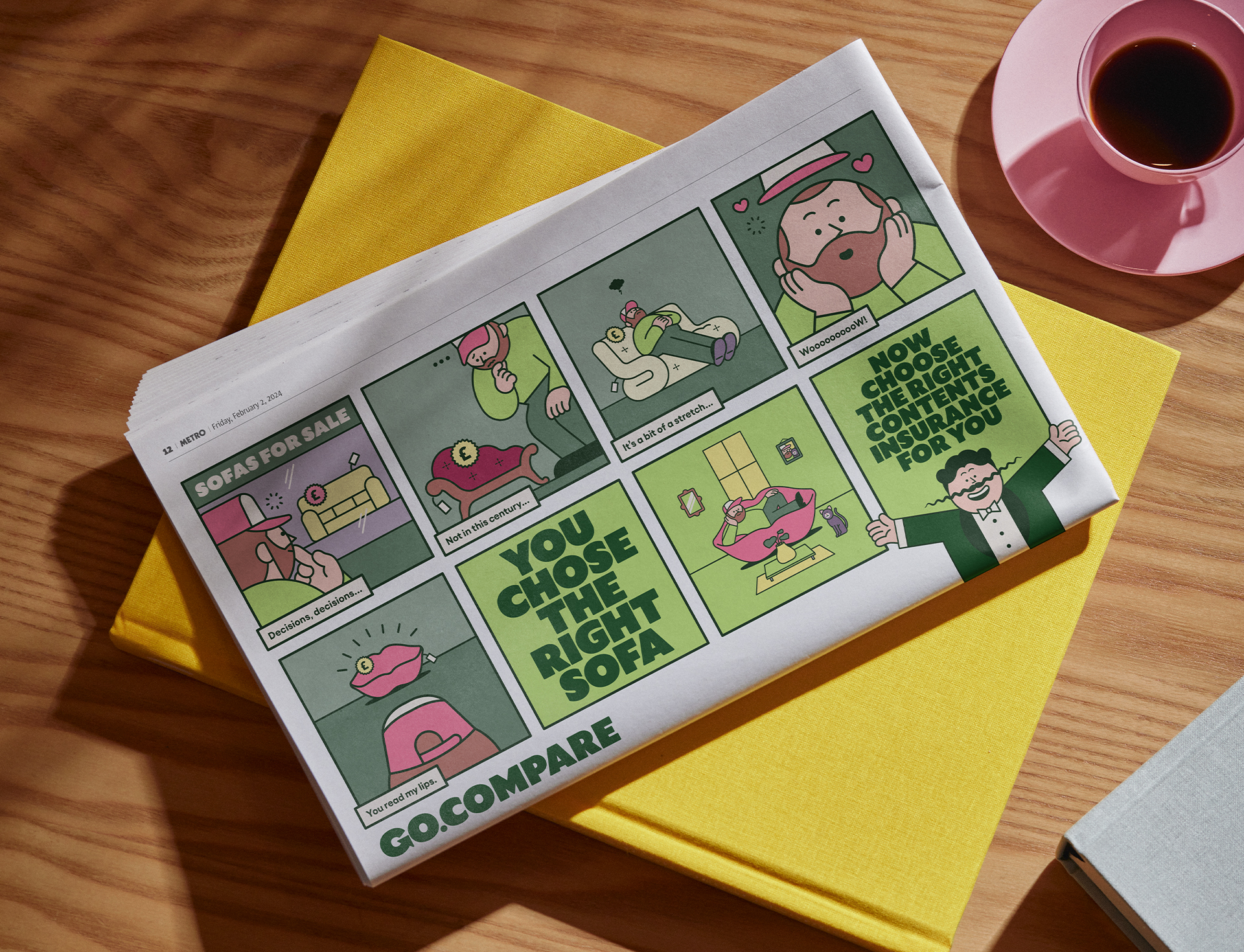
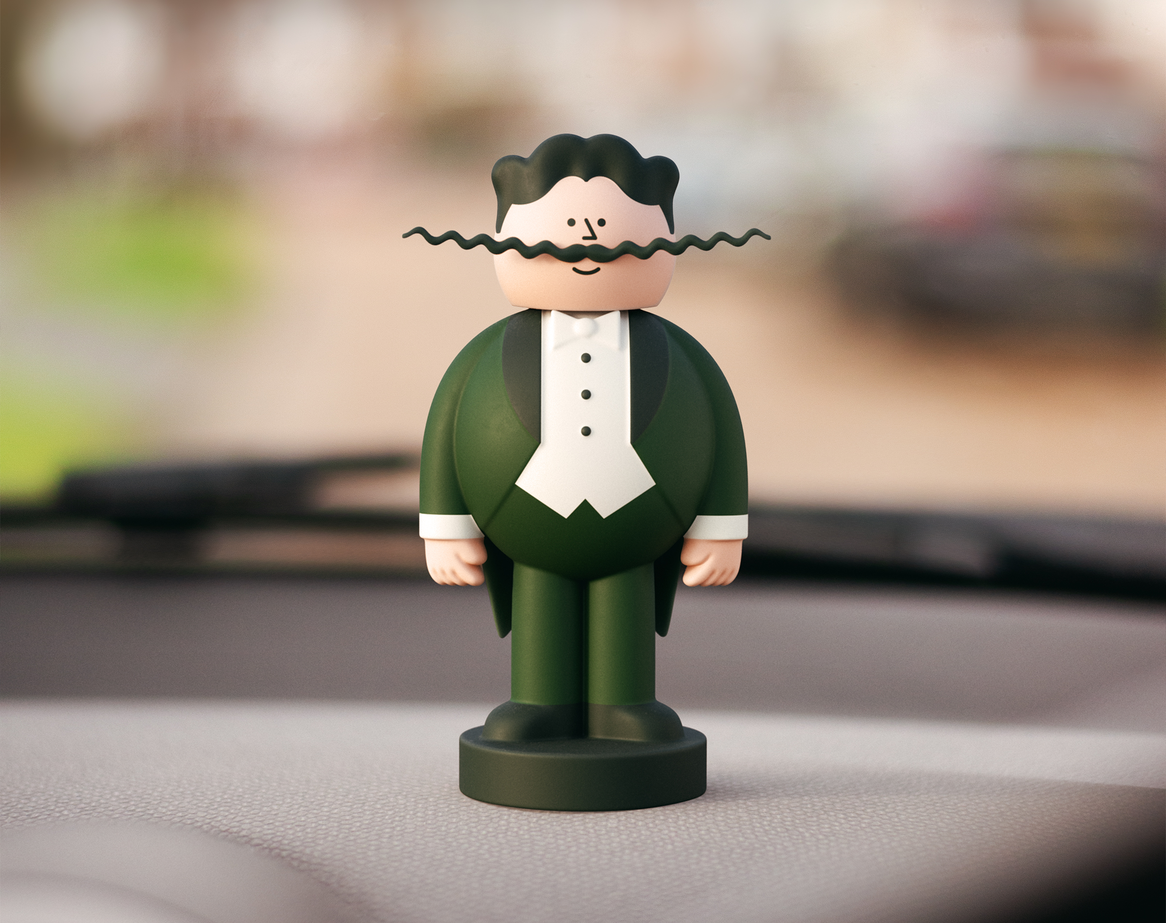
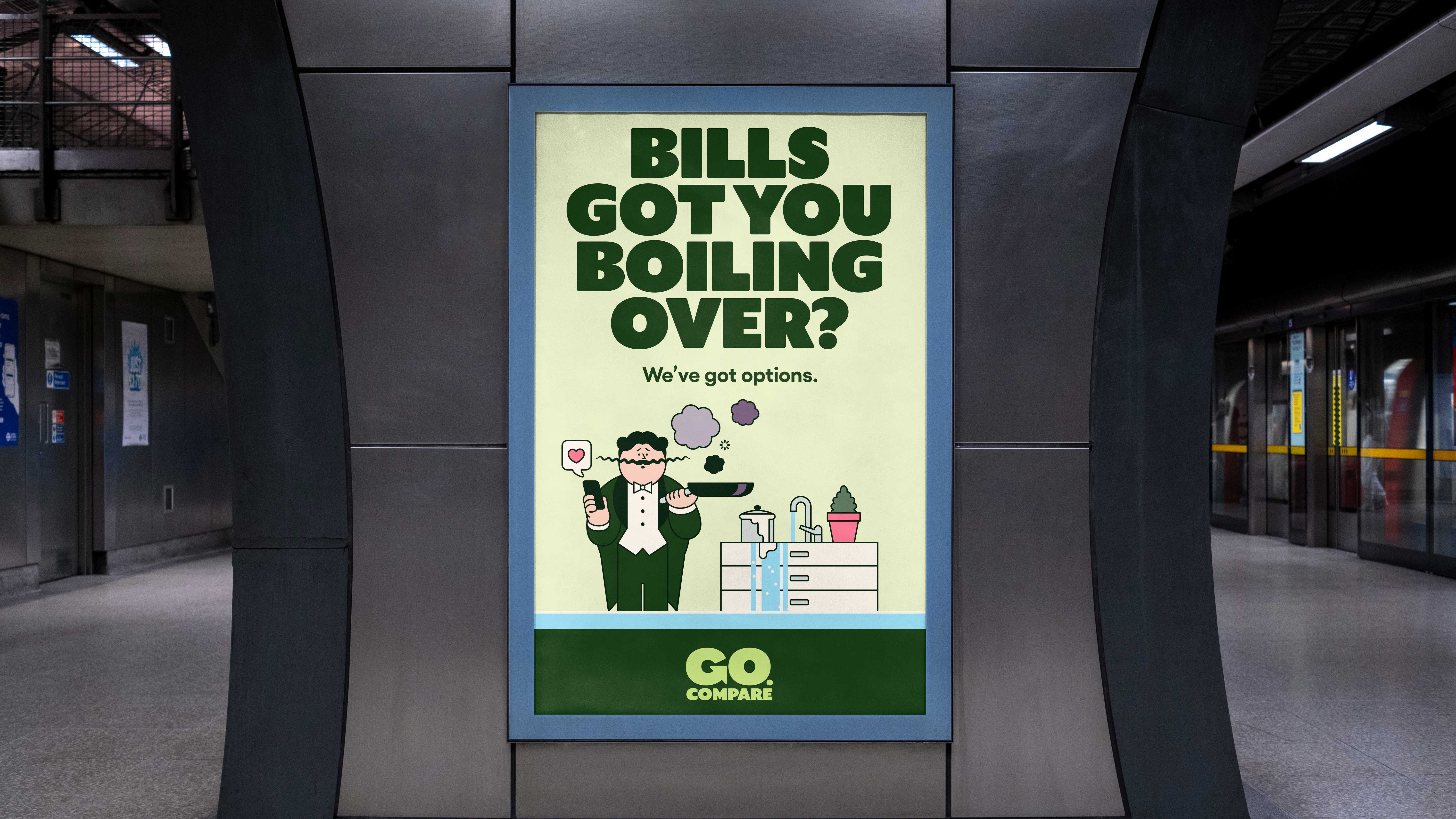
Price comparison website Go.Compare has undergone a stylish rebrand, enforcing the company's reliable yet playful identity. The creative new look puts mascot Gio Compario (yes, he has a name) at the heart of its design, bringing a welcome sense of character to the somewhat sterile insurance field.
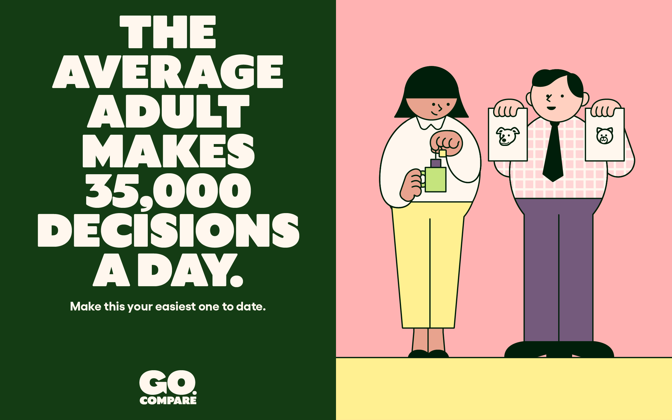
While there's divided opinion around whether brand mascots are still relevant, Go.Compare's rebrand proves that mascots can reinforce a brand's image for the better. With a fresh marketing tone carried by a warm, bespoke typography, the rebrand embodies trust, comfort and inclusivity.
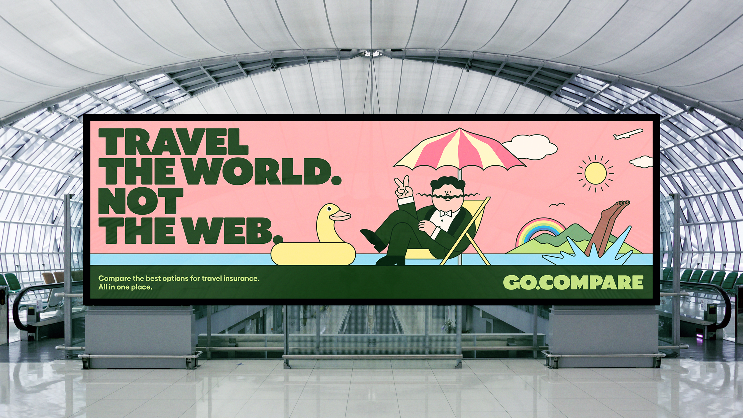
Created by design agency Ragged Edge, the Go.Compare rebrand breathes new life into the comparison site's identity. While some may remember Gio Compario's early ad debuts with mild annoyance, his transformed cartoon look is a masterful evolution, positioning him as a reliable old friend. Created in collaboration with artist Rami Niemi, Gio's new look is a valuable symbol of personability among a sea of gimmicky competitors.
The rebrand also comes with a redefined brand tone called 'the voice of choice', which "connects with customers through a relatable wit," according to Ragged Edge's case study. The custom typeface is "designed to echo the warm and characterful style of the illustrations," supported by a soft, earthy colour palette. Ultimately, the rebrand positions Go.Compare as the "Champions of Choice," according to co-founder of Ragged Edge, Max Ottignon.
The campaign-ready rebrand has redefined the insurance sector, which Go.Compare's Marketing Director Paul Rogers admits can be “heavy going" and somewhat of "a grudge purchase". In embracing a more playful and characterful identity "Ragged Edge has made it fun and rewarding" and given the brand "an even stronger sense of purpose" he adds.
For more design from Ragged Edge, check out the stylish insurance rebrand for Marshmallow. If you're after more inspiration, take a look at Switchboard's rebrand that puts a modern twist on LGBTQIA+ branding.