Typically I like to keep my home feeling fairly timeless, so buying into current trends is usually something I like to do with smaller items, like accessories, that can be switched up easily.
But there's something about the decorating with the burgundy color trend that feels so inherently traditional and very me. So, mid-renovation, I've set my sights on adding a pop of unexpected red in the form of deep and dark burgundy wardrobes to my master bedroom.
Which means, of course, that I'm now on the hunt for the best burgundy paint. Here, I take you through some of the most standout paints I've tested. From moody plum-based tones to smooth chocolate hues and enveloping wine reds, these are the 8 best.
My 8 Favorite Burgundy Paints

To give you some context, I'm currently almost two years into a home renovation and in order to save my sanity (and my sleep) we're putting all our efforts and budget into the main bedroom this fall.
So far I have color-drenched the room in Dimity by Farrow & Ball, a soft red-based neutral that is brimming with warmth and is the perfect base for introducing burgundy.
Oozing warmth and sophistication, I have made it my personal mission to find the best burgundy paints on the market. For my sake, and hopefully yours too.
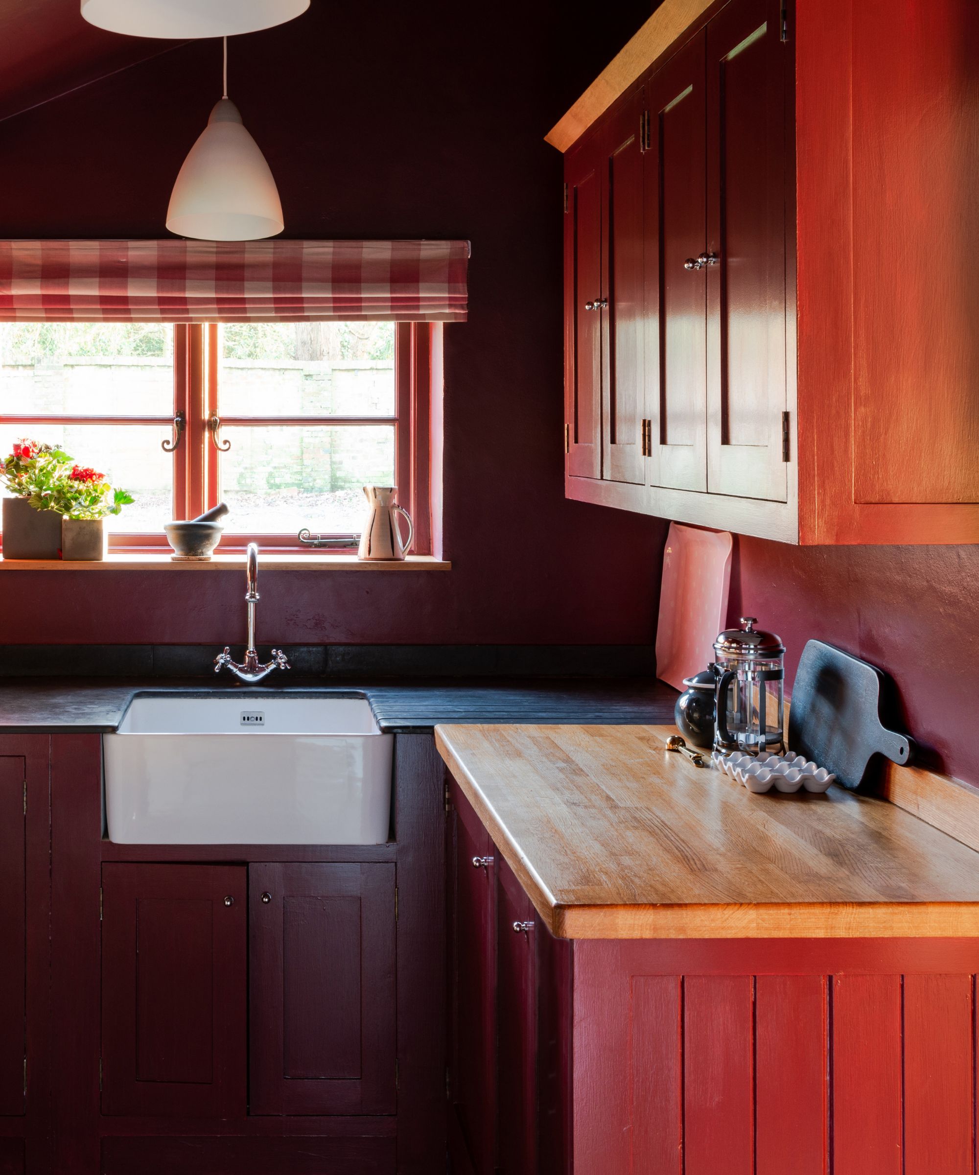
1. Etruscan Red, Farrow & Ball
Etruscan Red by Farrow & Ball was the first color I swatched in my bedroom as I had a leftover tin hanging around from painting an unexpected red cupboard in the corner of my neutral kitchen.
But while it worked perfectly in my kitchen – which gets less natural daylight and sits beautifully atop my terracotta tiles – upstairs in my super light, east-facing bedroom it just looked far too chocolate brown for the look I'm aiming for.
With deeper brown tones and less intensity than Preference Red (below), it's a wonderful grounding shade for more practical spaces like a kitchen, pantry, or mudroom.
2. Preference Red, Farrow & Ball
'Reds, once the doyenne of 1980s decorating, have somewhat fallen from grace in recent years,' says Patrick O'Donnell, Brand Ambassador at Farrow & Ball. 'However, when used judiciously, they can add drama and intrigue to many interiors,' he adds, giving me more confidence in my decision.
'Bordeaux rich reds, such as Preference Red by Farrow & Ball, make a great choice for cabinetry, especially when teamed with a flattering pink on your walls such as Setting Plaster, as both are warm and exude conviviality.'
Admittedly, I was a little bit intimidated by its depth but it really is a lovely vibrant shade. But because I already own a dark red headboard I am looking for something that reads less purple in my space than Preference Red to complement the bed better.
3. Bronze Red, Little Greene
'Dark reds such as Bronze Red by Little Greene exude warmth and a sense of luxury, making a room feel cozy and inviting. Perfect for spaces where you want to create a sense of comfort, such as living rooms, dining rooms, or bedrooms,' says Ruth Mottershead, creative director at Little Greene.
Bronze Red is a lovely warm dark red shade that felt quite bold in my well-lit bedroom. I think in a slightly darker space, this would look deeper and richer but in my home, it was just a bit too red... if that makes sense.
'Combine reds in a ‘Double Drenching’ scheme with other colors which include a red oxide,' Ruth suggests. 'Avoid white and drench your space with color, incorporating related hues on every surface from ceilings to walls and woodwork. If you wish to choose a lighter color for woodwork, opt for neutrals with a hint of red, such as Mushroom, a gentle neutral with a hint of red oxide for warmth which will create both contrast and cohesion with deep and dark reds.'
4. New London Burgundy, Benjamin Moore
Benjamin Moore's New London Burgundy HC-61 is described by Helen Shaw, director of marketing at Benjamin Moore as 'a deep red with violet undertones', which I think is perfectly illustrated in the image above.
'It will add sophistication and refinement to any space,' adds Helen. 'This elegant hue works particularly well with everyday earthy tones such as beige or taupe to create a feeling of rustic warmth. Opt for a matte finish to provide an almost chalky appearance, which in turn will help to soften the bold color, making it supremely liveable.'
Again, this was just slightly too purple for my liking but if the recently revealed Benjamin Moore Color of the Year is anything to go by, purple hues are going to be even bigger news than burgundy in 2025 so bookmark this now.
5. Bamboozle, Farrow & Ball
So I realized as soon as I opened the tester pot of Bamboozle by Farrow & Ball that I'd made a mistake. While it's an amazing, uplifting red it is far too vibrant for my first foray into decorating with red.
As the F&B website describes, this fiery hue's name was originally used to describe the deceit of pirates and is full of buccaneering spirit. Maybe not ideal for a restful space like your bedroom. I'm keeping this in mind for the inside of my understairs storage for a burst of unexpected energy.
'Spice reds, such as Bamboozle, can make a wonderful statement on bookcases or the interior of a cupboard, especially when teamed with a gentle neutral,' suggests Patrick. 'Why not reclaim the favorite room of red paint and look to the dining room? It’s said that red can increase your metabolism!'
6. Brick Dust, Glidden
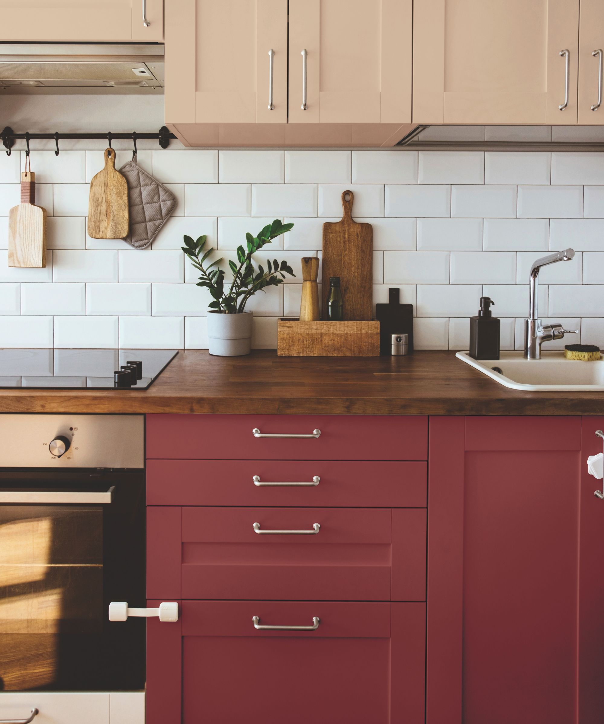
This is actually the only shade I haven't physically swatched at home but it comes highly recommended, so I wanted to give Brick Dust PPG1056-7 by Glidden an honorable mention.
A perfect front door color idea or kitchen cabinet hue as seen above, Brick Dust has an 'inherently cozy and grounded feel, which makes for a strong design statement,' says Ashley McCollum, PPG color expert at Glidden.
'Brick Dust is the perfect red to feature on cabinetry,' she suggests. 'Just don’t pair it with yellow (red and yellow combined can stimulate the brain’s hunger response) or else you’ll find yourself constantly in the kitchen snacking! Brick Dust creates a sense of warmth and coziness, making the kitchen a more inviting space for cooking and dining. Pair it with metallic accents for a sleek and glamorous appearance.'
7. Carter Plum, Benjamin Moore
'Reminiscent of the Renaissance period, Carter Plum’s rich hues add the perfect balance of drama and opulence, injecting instant character to any space,' explains Helen Shaw.
Carter Plum by Benjamin Moore feels like the perfect plum shade. To me, this felt like it would've worked better surrounded by cooler tones like a soft gray or light blue rather than my almost-pink walls.
'Cozy snugs, intimate dining rooms, and small-sized rooms work particularly well in this hue, especially when they don’t benefit from a huge amount of natural light,' advises Helen. 'Painting the room in this rich color from floor to ceiling can look particularly striking and create an ultra-luxurious feel.'
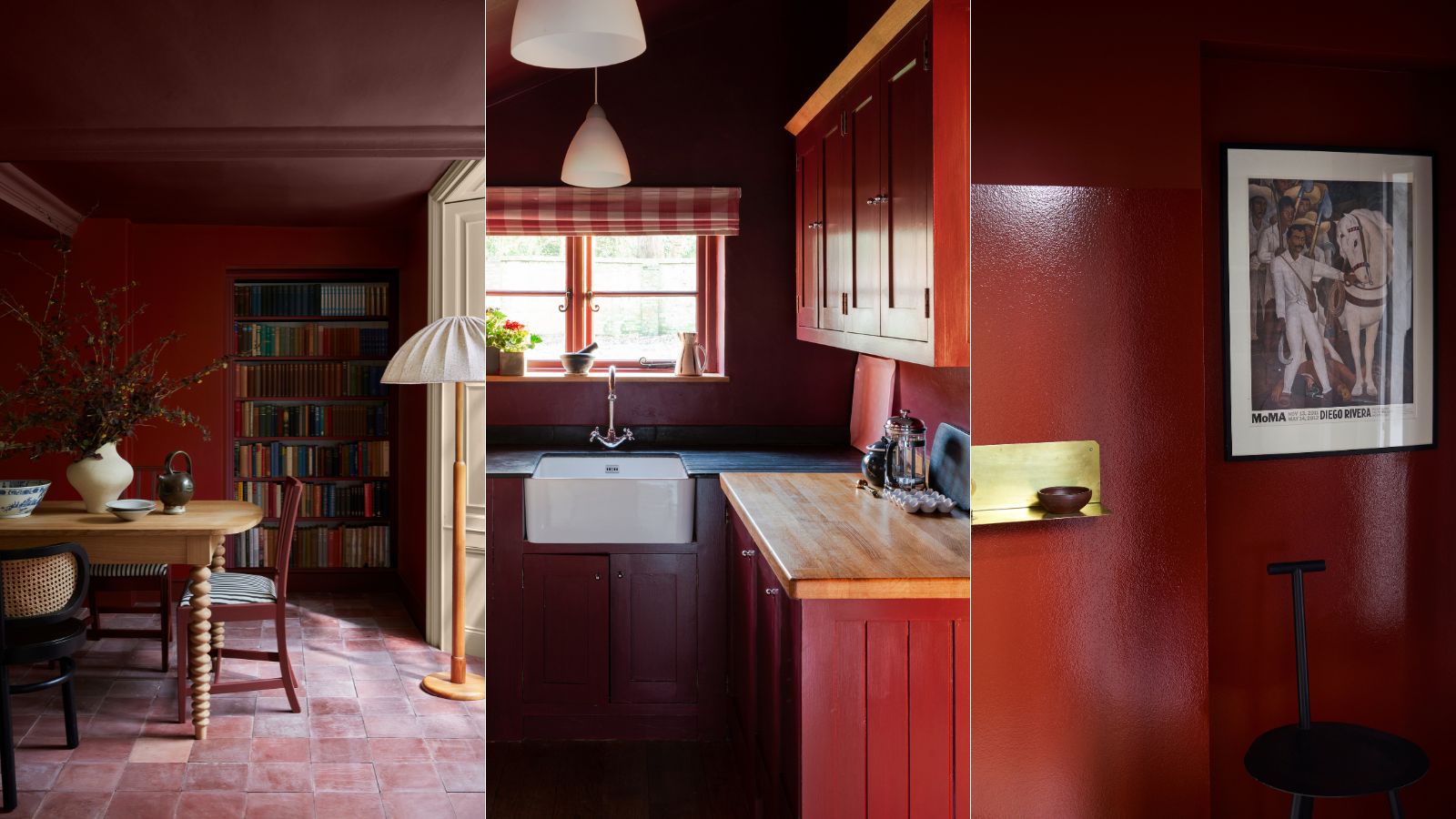
8. Arras, Little Greene
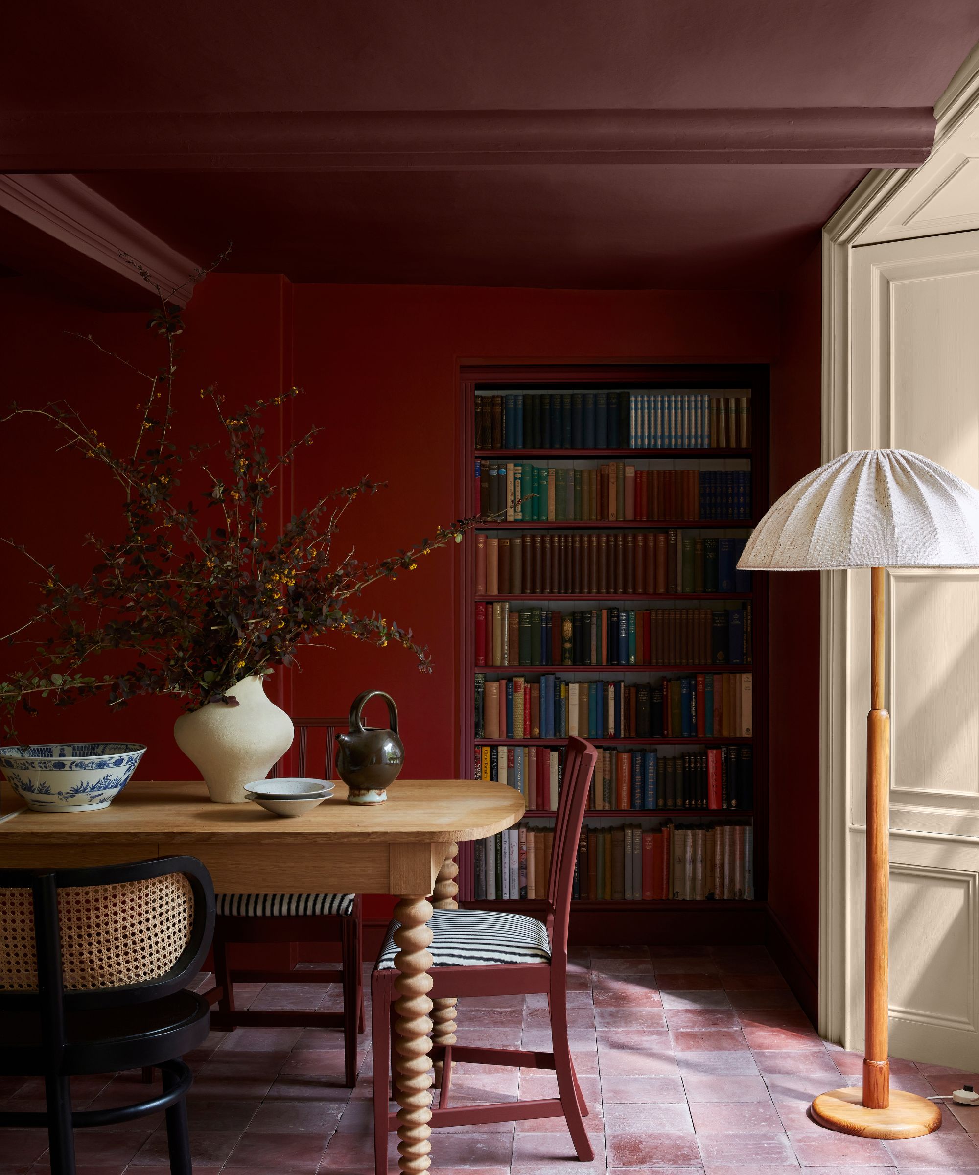
The winning shade? Arras by Little Greene, seen above on the ceiling of this cozy dining room space.
When trying to decorate with wine red the struggle has been trying to find shades that aren't too vibrant red, too purple, or too brown. Arras, part of the collection with the National Trust, is a classic earthy red that feels at home in vintage houses, like my 1900s home.
'A warm toned naturally occurring red such as deep earthy Arras will add coziness and intimacy to a north-facing room but may appear more intense in a south-facing room,' Ruth advised me. 'Try using a deep shade of red alongside a paler neutral to balance the room and add an interesting contrast,' she adds. 'For example, use the warm Elizabethan red Arras with the softer Castell Pink,' she suggested. Which is just what I've ordered for my wood trims in the room.
Testing paints in your own home and physically swatching them is such an important first step in making a decision on a color scheme for your home. You need to see that color in the morning, midday, and evening light as well as amongst your original furnishings and features to get a true representation of the color.
So be sure to really do your homework, especially when introducing such a bold hue as burgundy. Some of these paint colors looked so different on my screen versus on my woodwork, so the tester pots were really worth the investment.