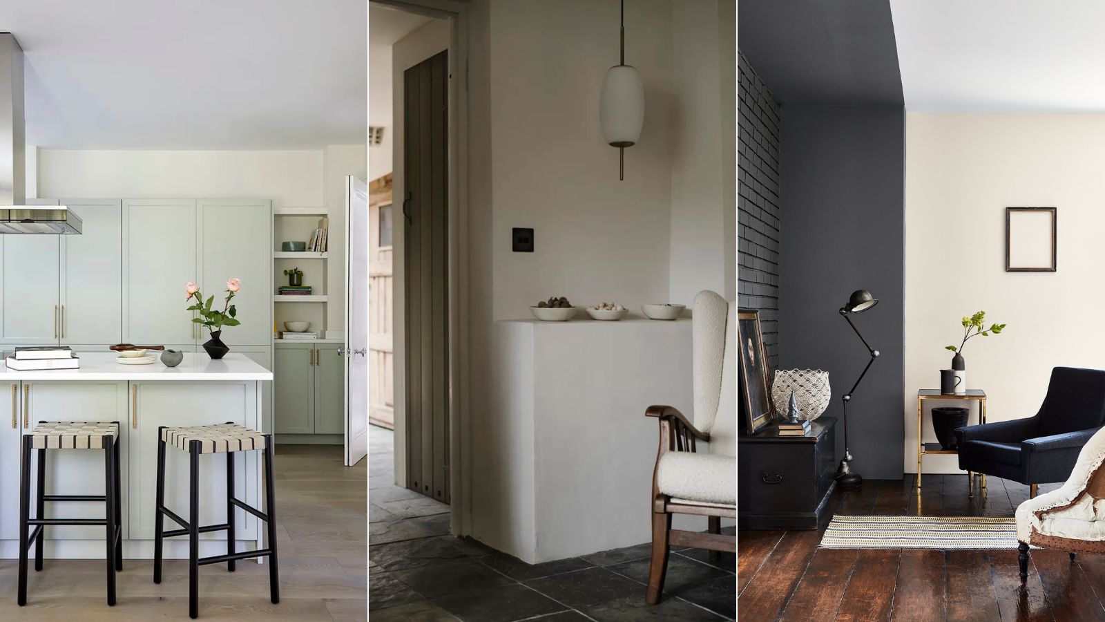
It's a bold statement, but I truly believe I've found the perfect paint shade, one that works in pretty much any space. In dull, north-facing light it takes on a richness, and in south-facing sunshine it seems to dance in the brightness, coming alive with a subtle gleam.
I love decorating with neutrals and this color is completely failsafe – perfect if you prefer neutral room ideas and serene minimalism to bolder options. I've used it in two homes now, once in a dark entryway and all the way up the stairs to a light-filled hall, and once in an entire apartment – kitchen, bedroom, living area, and all. The color is Slaked Lime – Mid by Little Greene.
And it's so much more than 'just' a neutral paint. Sitting somewhere between white and gray it has the soothing quality of gray and the dazzlingly uplifting quality of white. It enhances rooms during the day and makes them seem sophisticated at night. It glows in twilight, it glints in the morning and it's both relaxing and refined. Quite simply, it's a wonder-shade.
Why you should try Slaked Lime - Mid by Little Greene
And I'm not alone in my adoration for Slaked Lime – Mid. There is a whole tribe of designers who use it regularly and repeatedly, coming back to this go-to paint shade time and time again. 'Little Greene's Slaked Lime – Mid is the perfect calm neutral, its balance of warmth and subtle earthy undertones mean it is a shade that goes with absolutely everything,' says the designer Leoma Harper. 'It's such a versatile tone that I have used in many client projects and my own home over the years. What I love most is that it works so well in all light conditions, always retaining warmth.'
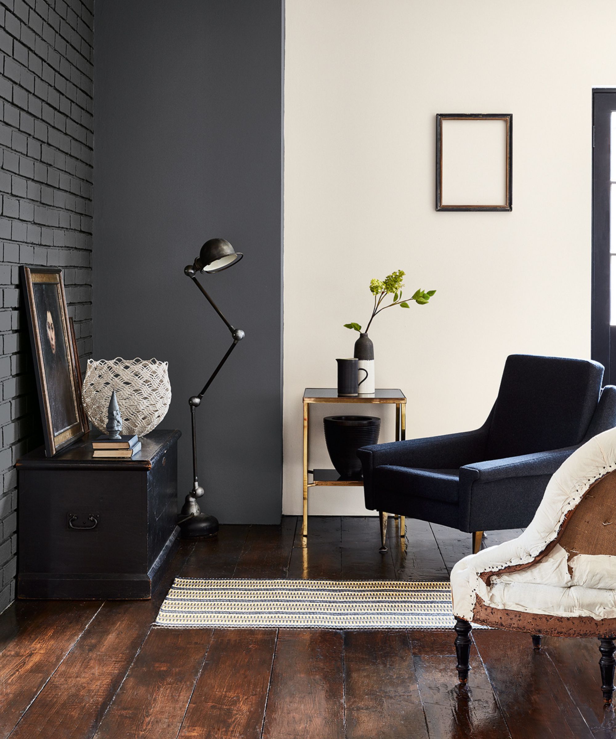
'We find Slaked Lime – Mid to be a versatile color with enough warmth and depth to work with both south and north-facing rooms,' says the designer Fiona Brass, founder of Fiona Brass Interiors. 'It has a simple pigmentation make up creating a balanced base for any of our room designs, ready to be built upon however the design progresses.'
It's a paint you can play with and match to others from the Little Green color card. 'The fact that Slaked Lime – Mid is part of a family of four colors only makes this shade more appealing to the team when we are creating new designs and schemes for our projects,' Fiona says. 'I've used Slaked Lime variants in my own home for many years and love it so much that it is still my favorite color to work with. It works so well as a strong base to which each room design grows and evolves!'
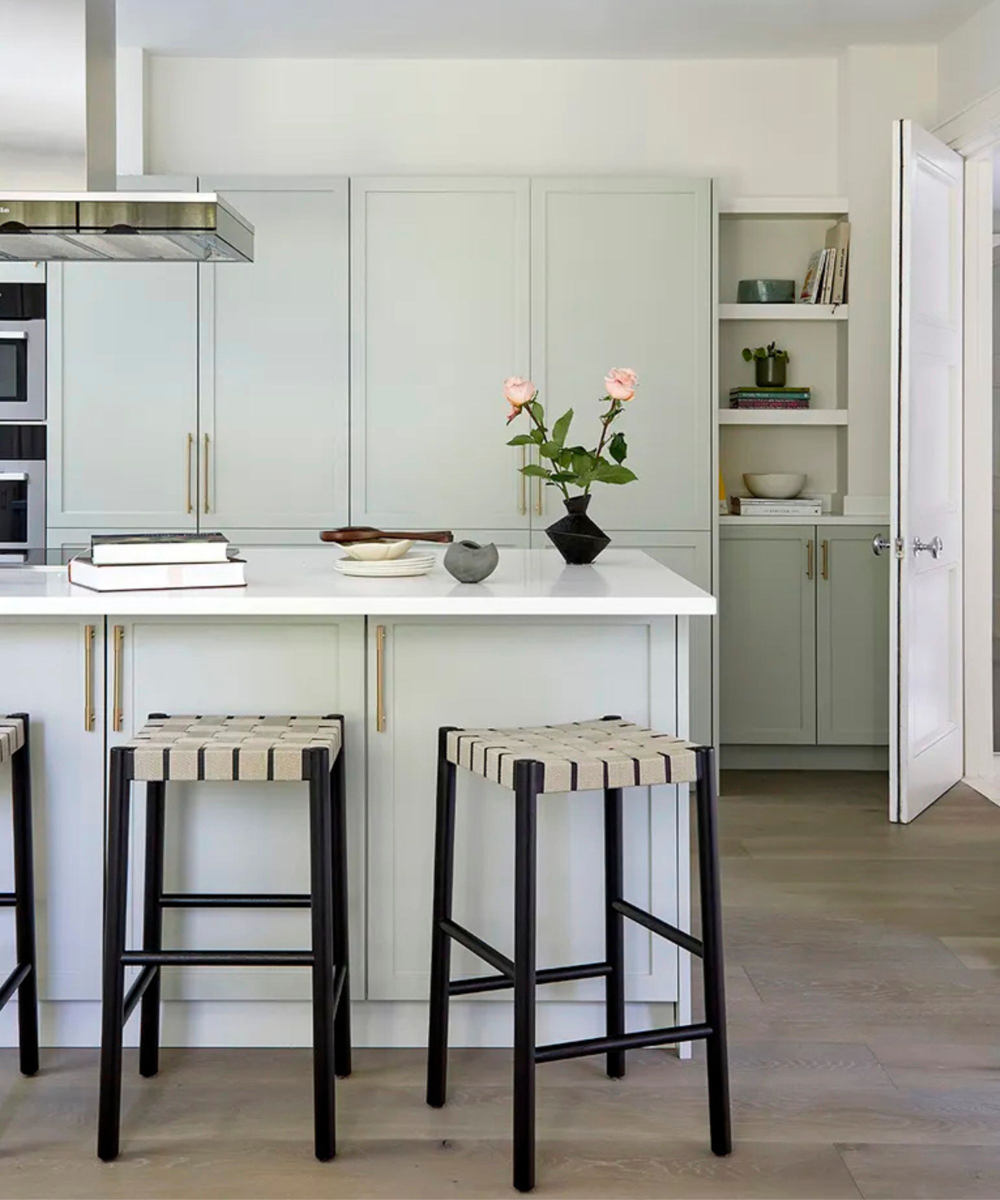
'I love the paint color so much because of its versatility, for its neutrality which is neither too warm nor too cold,' says the designer Margot Tsim, founder of Margot Tsim Interiors. 'A lot of people are not into gray tones anymore but they also don’t want anything too yellow so this shade strikes the perfect balance in my opinion. It is specifically suited for more contemporary or classic contemporary interiors.'
The mood it creates feels very right for now. 'It is a very calming and serene shade so it can definitely complement a more pared down aesthetic but equally it can also work when you contrast it with some darker tones within your furnishings,' Margot says, a case in point being this kitchen she used it in. 'For me it is a very peaceful tone which I love to bring in through my work.'

'Slaked Lime Mid is one of our go-to neutrals due to its depth and warmth,' says Samuel Pye, founder of the design studio Echlin. 'The Little Greene color scales are vital for us as we often need to vary the tone of a color to make the most of a space, whether that be going slightly lighter or slightly darker to create the right atmosphere. We've used the color in many of our projects and it works wonderfully with contemporary or period homes.'
As with many current schemes, most of Echlin's projects confidently traverse eras. In this living room by the studio, you'll see modern architecture and mid-century shapes. 'A lot of our projects include an element of modern and traditional, so we've found Slaked Lime – Mid a beautiful way to tie all the spaces together,' Samuel adds.
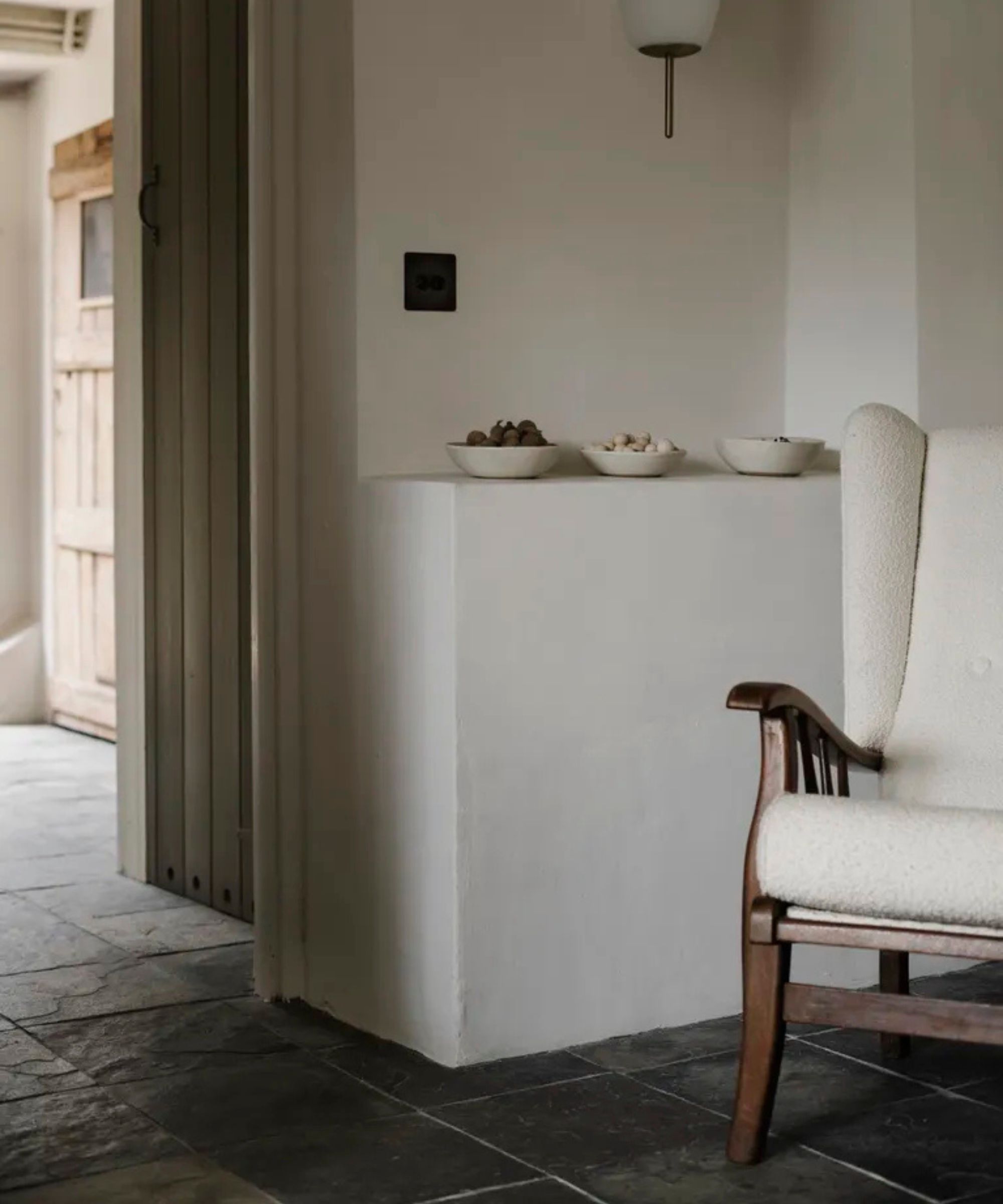
In speaking to designers about Slaked Lime – Mid, I found one fan who also wanted to shout about another Little Greene neutral. A reminder that even if half the design world is telling you they've found the perfect paint it's still worth sampling others as a contrast.
'Linen Wash is a color I use consistently in projects as it always adds depth and warmth,' says Justine Cook, founder of Harp Studio, who used it in this space, above. 'I love the quality of Little Greene paint and even got my mother obsessed with it - she’s also a Linen Wash-throughout-the-house convert. I then pair it with something deeper on the woodwork to add more depth.'
She still always has a place for Slaked Lime – Mid. 'I use Slaked Lime – Mid for a slightly cleaner, crisper look and the shaded tones are perfect for layering and depth,' she adds.


