The biggest difference between Android and iPhone will always be choice. When upgrading to one of the best iPhones, you only really have three decisions to make: Do you want three cameras instead of two? What size screen works best for you? And is it worth paying a whole lot extra for more storage?
With the best Android phones though, you have a whole lot more options when it comes to design and form factors as well as brands to pick from. Maybe you’ve been using one of the best Samsung phones and think that it might finally be time to give a OnePlus phone a try. Or perhaps, you want as close to a stock Android experience as possible on a tight budget and are considering switching to a Motorola smartphone.
I found myself in this exact same situation a few months ago. For years, I used Google’s Nexus phones but when that line was killed off for the company’s more premium Pixel phones, I went with OnePlus as its devices offered the most bang for my buck at the time. Then when OnePlus integrated OPPO’s ColorOS with its own OxygenOS, I decided it was once again time to try something new.
I considered both the Pixel 8 and the Pixel 8 Pro but as I was coming from the OnePlus 7T Pro 5G McClaren with its pop-up selfie camera, I realized I preferred having an Android phone with a gimmick over just another boring slate. As I was familiar with Carl Pei from when he co-founded OnePlus, I decided to look further into his new company, Nothing. While I was intrigued by the Nothing Phone (1) and its unique features, the refinements and upgrades in the Nothing Phone (2) had me sold.
I’ve now been using the Nothing Phone (2) as my daily driver for three months. Here are my thoughts on this one-of-a-kind smartphone and how Nothing might just be my new go-to Android brand.
What I love about the Nothing Phone (2)
Nothing OS is absolutely gorgeous
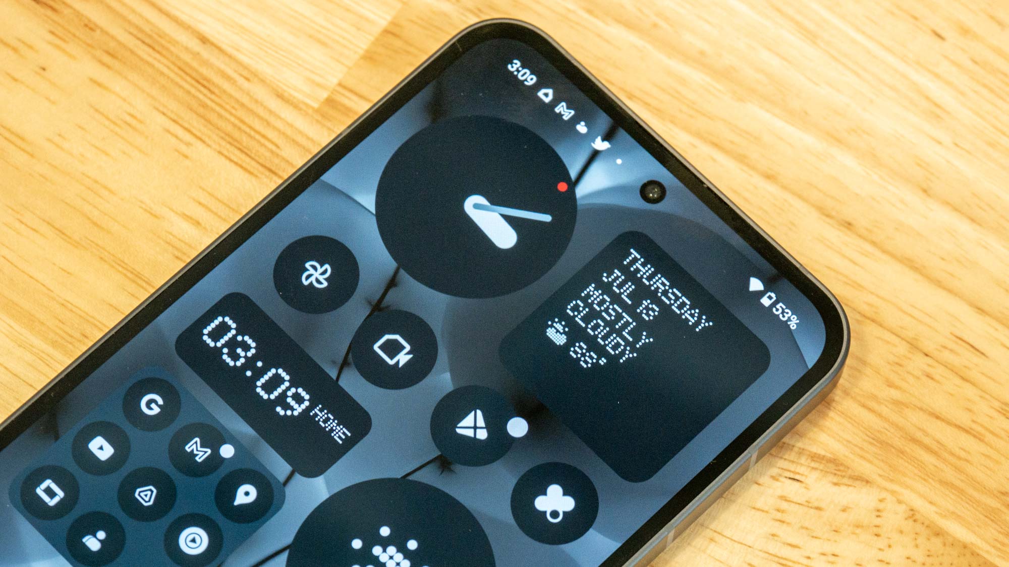
Android smartphone makers often offer their own skins or launchers to make their device stand out. While I personally prefer stock Android over Samsung’s One UI due to its simplicity, Nothing has managed to add a lot of interesting and useful features without detracting from what makes stock Android work so well in my opinion.
From hidden app icons in the launcher to its monochrome theme, Nothing has put a lot of thought into how it wants its smartphones to look and function. The responsiveness of Nothing OS is another big plus for me and this is the first Android phone I’ve owned that truly gives me an iPhone-like experience in terms of how well its software and hardware work together. I’m sure I would get a similar experience on a Pixel phone but then I’d lose out on Nothing’s unique approach to hardware and design.
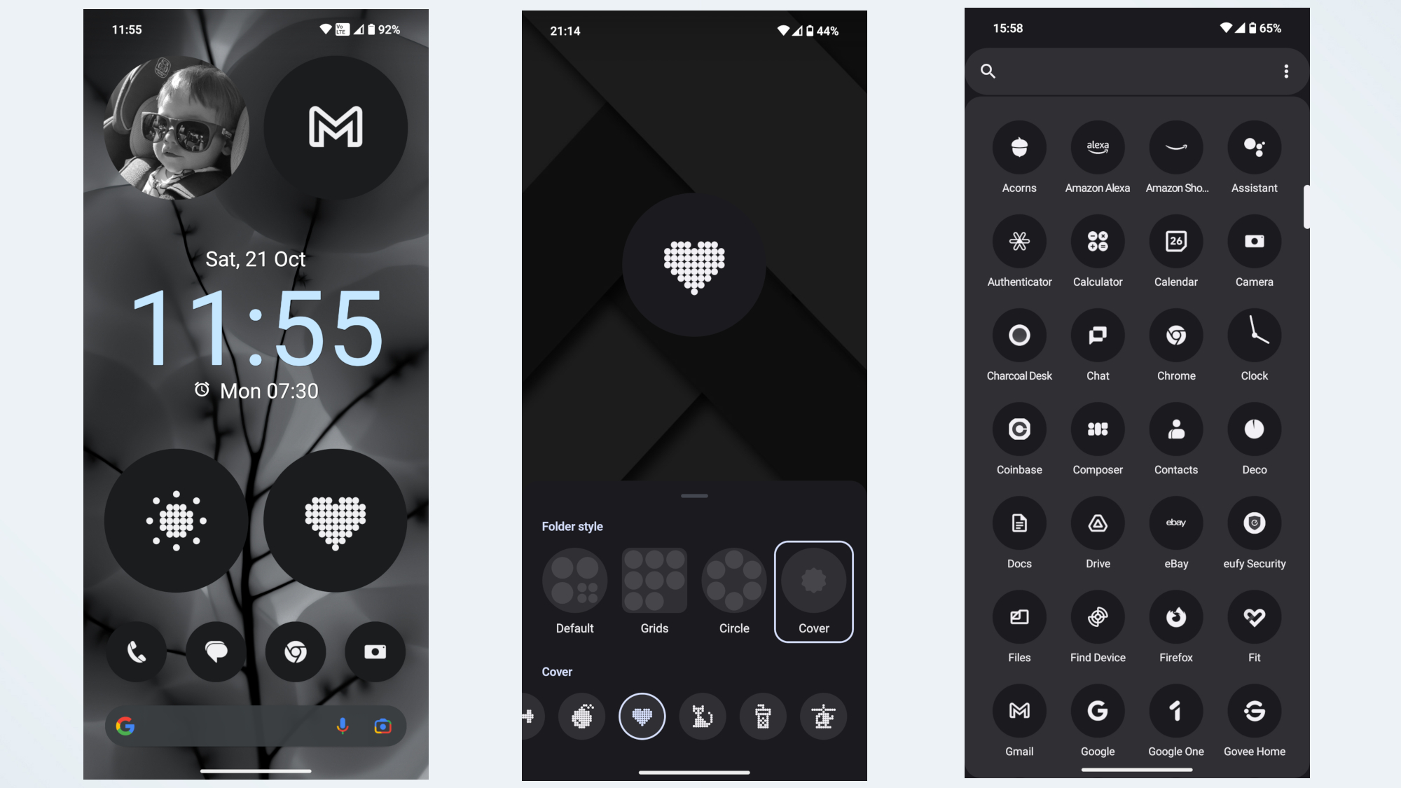
One of the things that Carl Pei has said in interviews about Nothing OS is that it’s designed in such a way as to remove distractions so you spend less time on your phone. Case in point, you can pick up the Nothing Icon Pack from the Play Store and apply monochromatic theming to every single app icon on your phone. Even if you download a brand new app that was just released, your Nothing Phone will still be able to change its icon to black and white.
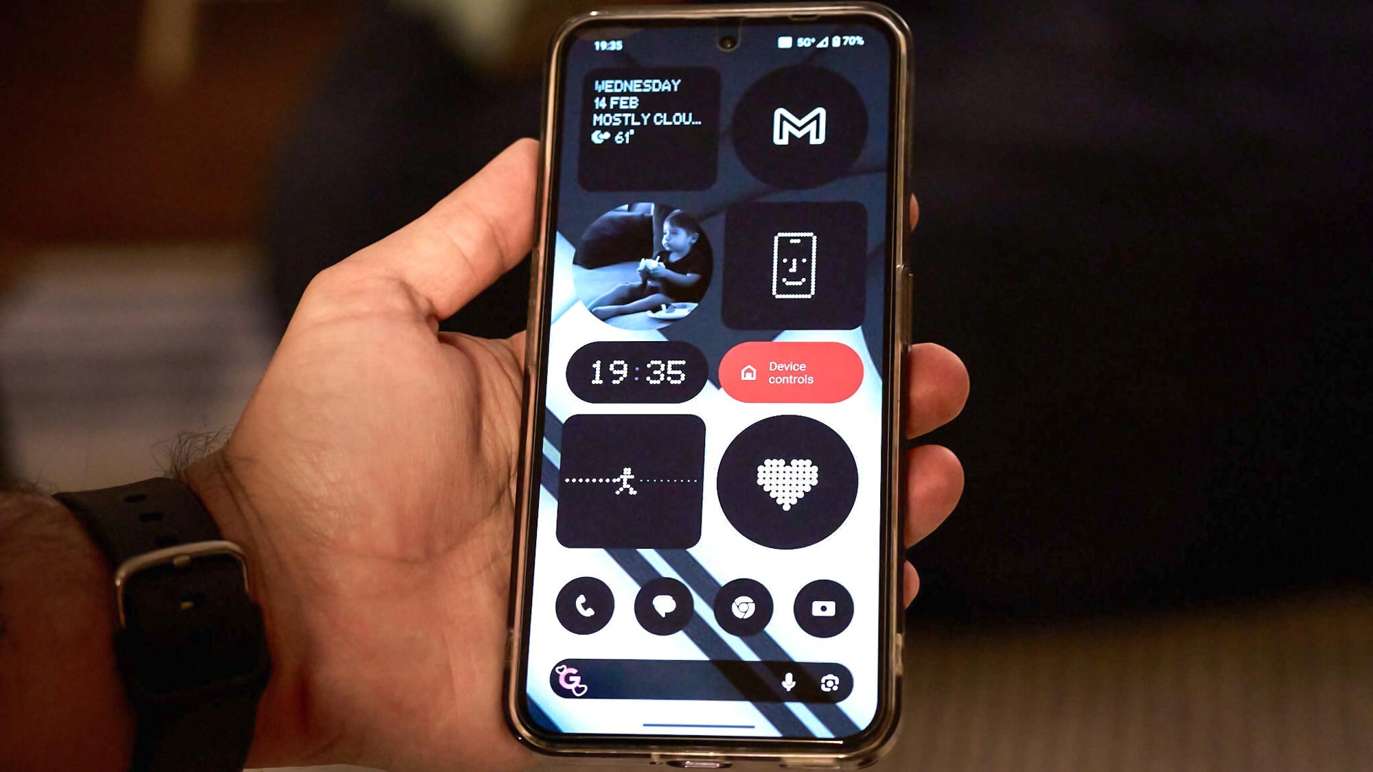
Since taking the screenshots above, I’ve redone my home screen layout several times and I’m now at a point where every single widget, folder, icon and even the Google Search bar at the bottom is completely black and white. The only splash of color on my home screen is the red Device Controls widget I use to control my smart lights.
In the past when I’ve had to use an Android launcher to add a Google Discover feed on the left side of my home screen, deep down, I always knew I was using a launcher on top of a manufacturer’s skin. This is because the settings menu doesn’t change when you enable a launcher. With my Nothing Phone (2) though, this same black and white look with pixelated lettering is present throughout my entire phone and honestly, I couldn’t be happier with it.
The Glyph Interface is actually useful
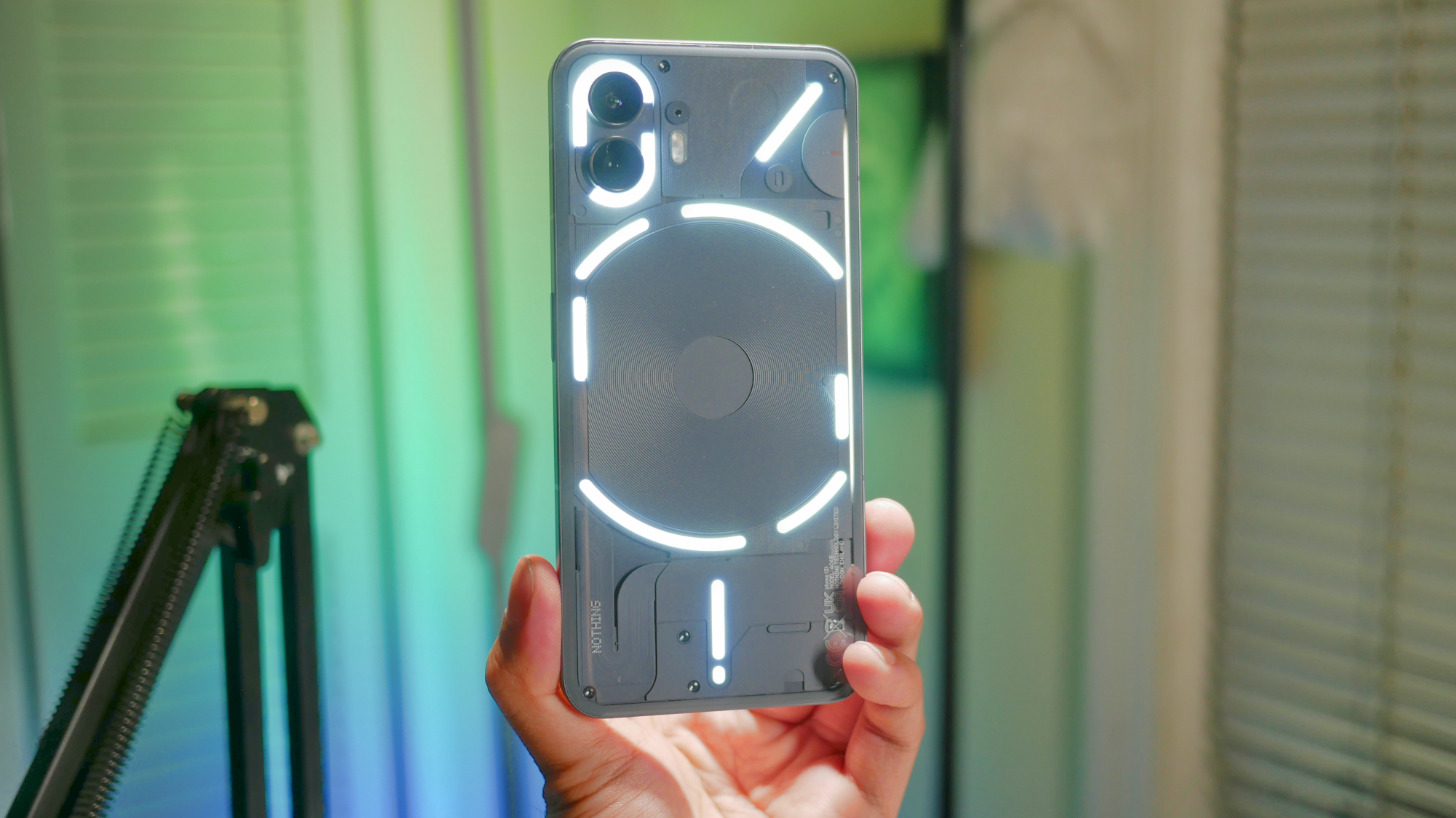
So I mentioned before that I wanted a phone with a gimmick and Nothing’s Glyph Interface is that gimmick. However, after using the Nothing Phone (2) for the past three months, I’ve actually found myself using it quite a bit more than I thought I would.
From a fill light for photos to a softer flashlight at night, the Glyph Interface has come in handy more times than I can count. I still can’t get over how its lights flash when I flip over the Nothing Phone (2) to put it into Flip to Glyph mode or the fact that one of the glyphs lights up when I adjust the volume. I’ve mainly been using wireless charging with this phone but I like how the lightstrip near the USB-C port at the bottom shows its charging progress.
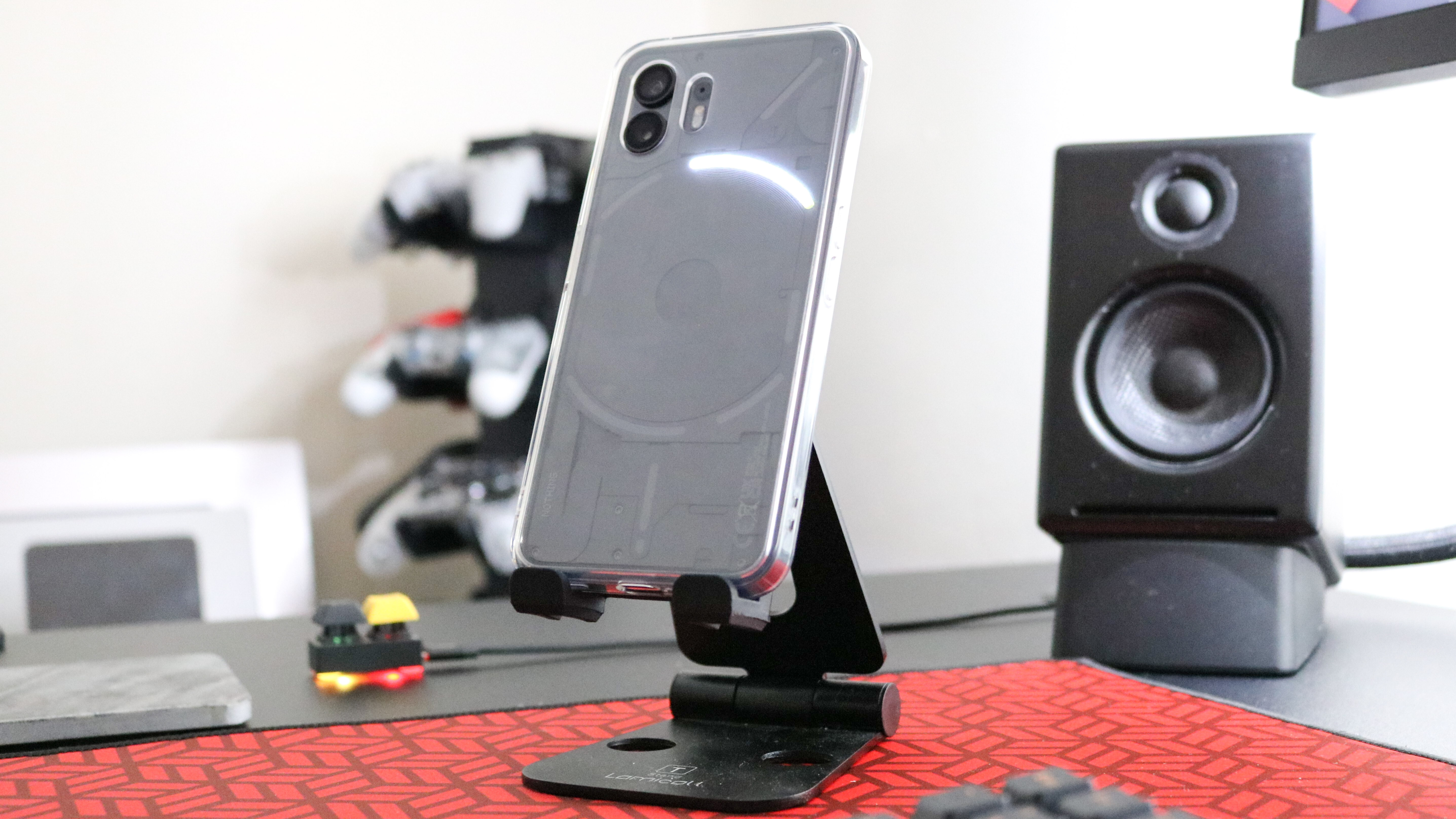
The Glyph Interface on my Nothing Phone (2) has also proven useful during my workday. I like how I can use a Glyph Timer for the Pomodoro Technique during those times when I want to focus and work without distractions. However, Nothing recently added the ability to have a glyph show a countdown before my next meeting in Google Calendar. Now with the release of the Glyph Developer Kit, it’s likely there will soon be even more integrations with third-party apps in addition to Uber and Zomato which can show the progress of a rideshare pickup or a food delivery order.
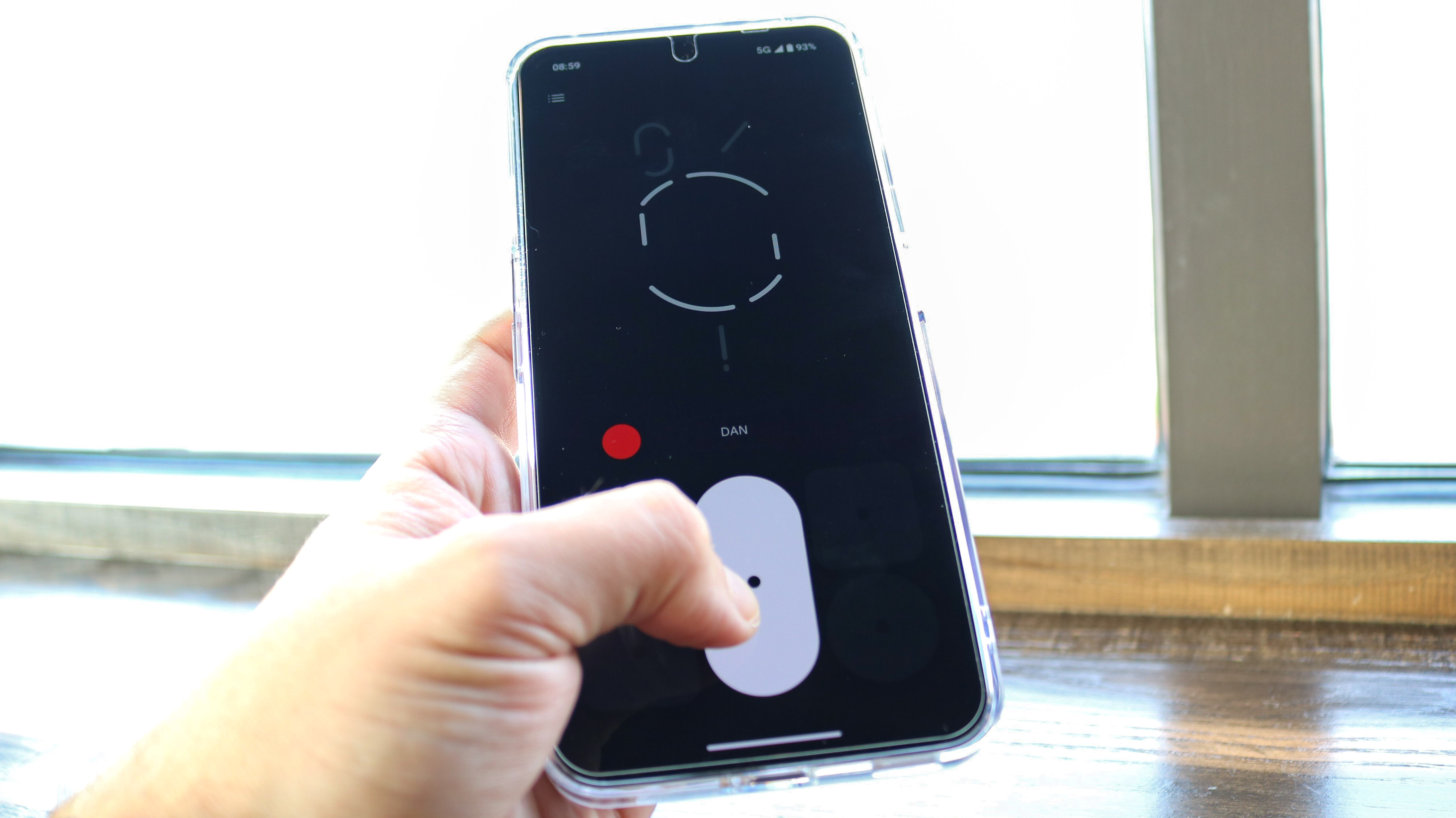
I keep my phone set on vibrate but you can use the Glyph Interface for ringtones. As part of this though, Nothing released its Glyph Composer app in the Play Store so that you can record your own ringtones with lighting effects. When I get bored — and especially when my toddler gets bored — I’ve found that taking out my phone and trying to come up with a beat or a short melody really helps pass the time.
My Android phone now gets mistaken for an iPhone
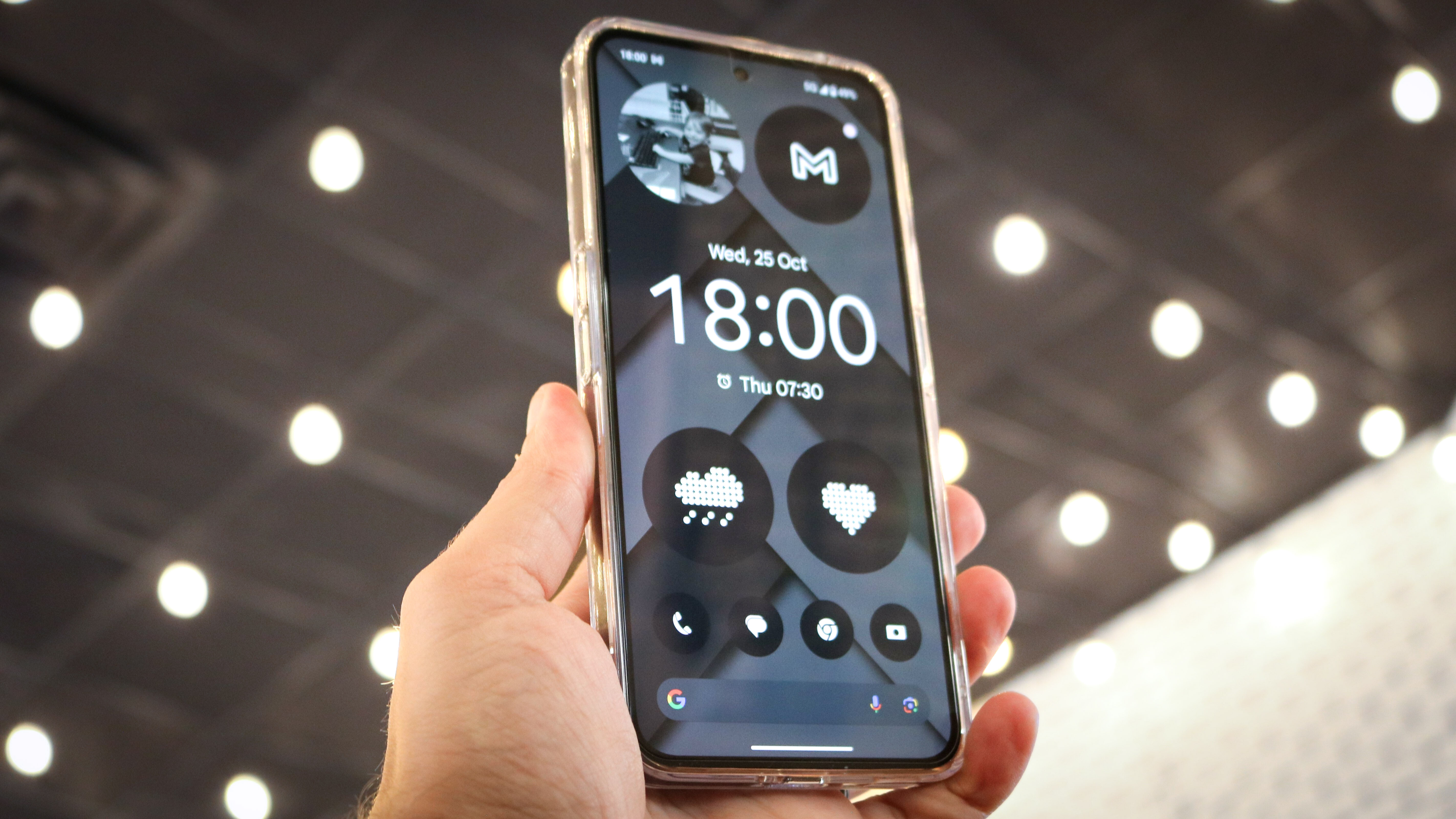
This one is a bit silly I know, but being the only Android user in a room full of people with iPhones can feel a bit weird at times. I’m not going to convince them to give up their iPhones and they aren’t going to be able to get me to switch to a much more closed off ecosystem. To each their own right? However, I’ve found it to be much easier to blend in now that I have an Android phone that closely resembles an iPhone.
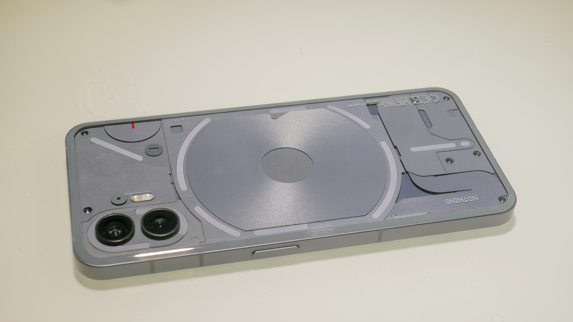
In fact, there have been several occasions now where, when my Nothing Phone (2) is placed down on a table at a social gathering, someone else might pick it up thinking it’s their iPhone. When I flip my phone over though, it’s immediately clear that it isn’t an iPhone. Unlike with my past Android phones though, the Nothing Phone (2) is the first device I’ve owned that has piqued the interest of iPhone users. Before, they would just kind of shrug it off but now, when they see what the Nothing Phone can do, they start asking questions and are generally intrigued by it.
I’ve put my Nothing Phone (2) side by side with my wife’s iPhone 14 Pro Max and while they do appear similar with their screens off, I think Nothing actually has an edge on the iPhone in some areas. For one, the volume and power buttons are closer to the middle than they are on an iPhone and with both devices in hand, my Nothing Phone (2) feels a lot lighter. Sure, I still have to deal with all of that green bubble nonsense in group chats but the extra features Nothing has packed into this phone more than make that worth it.
What I hate about the Nothing Phone (2)
Nothing happens when I connect it to a display
With three years of updates and four years of security patches, I went with the more expensive $699 version of the Nothing Phone (2). The price increase between the first and second phone from Nothing was one of the things we called out in our Nothing Phone (2) review but for me, the device offered enough features and functionality that I was able to justify its higher price. Plus, it was still cheaper than other Android flagship phones like the Samsung Galaxy S24 Ultra or the Pixel 8 Pro.
There is one glaring flagship feature that Nothing decided to leave out of the Phone (2) though: display out via USB-C. Sure, this is a very niche feature and most people probably won’t have a use for it. However, as I frequently test portable monitors and portable monitors with touchscreens, this feature really comes in handy. I was already sold on the Nothing Phone (2) due to everything else this phone brings to the table but I forgot to check to see if it could do video out via USB-C before I placed my order. While its omission isn’t a deal breaker by any means, I was a bit disappointed the first time I plugged my phone into a monitor and nothing appeared on the screen.
Hopefully, Nothing decides to add this in when the inevitable Nothing Phone (3) makes its debut later this year.


