The world of classical music is a mystifying one. Leaving aside the intricacies, complexities and nuances involved in actually trying to appreciate it, not to mention the slippery nature of what one actually terms 'classical music', attempting to navigate your way around the multitudes of impenetrable names, hundreds of interpretations and swathes of Italianate jargon is a labyrinth of confusion.
I’ve been listening to and playing classical music most of my life (rarely by choice; thanks middle-class British upbringing) and I’m no closer to explaining the difference between a cantata and an oratorio or why Rubenstein’s rendition of Chopin’s Waltz in C Sharp Minor is superior to Lugansky’s.
You’re also not helped by the fact that opera aside, most classical compositions are entirely lyric-free, so if you are keen on a piece and want to find out more, you’ll likely spend a frustrating afternoon humming tunelessly into Shazam or shouting down the phone to the people at Classic FM asking if “they can play that one that goes DUN DUN DUN DUN. You know. By the guy with the Saint Bernard named after him.”
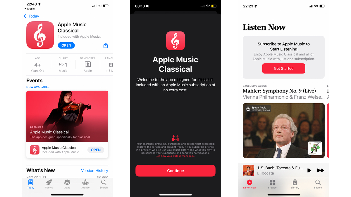
That, theoretically, is where Apple Music Classical comes in. Created after Apple’s acquisition of classical streaming service Primephonic in 2021, the free-to-download (for existing Apple Music customers) app promises to demystify and somewhat standardise the legions of various versions, recordings and interpretations of the most renowned works in history.
It basically builds on Primephonic’s efforts to build a classical music streaming database and, now that it’s an Apple product, gives it more exposure. There’s also the not-inconsiderable carrot of having pieces available in up to 24-bit/192kHz Hi-Res Lossless quality and spatial audio with Dolby Atmos.
The question is, then, has Apple made classical music more accessible? Having spent a good week scrolling through reams of Rossini and lists of Listz, here’s what Apple got right and what, in my opinion, could be improved.
I like: Choices, choices, choices
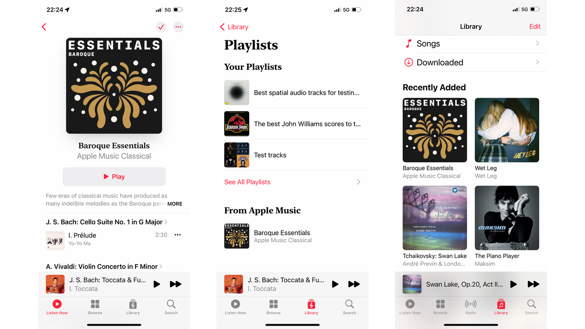
Apple promised the greatest digital repository for classical music and that’s exactly what it has delivered. There’s so much crammed onto the platform that it’s in danger of, rather paradoxically, becoming utterly overwhelming, with hundreds, sometimes thousands of works from the likes of big-hitters such as Beethoven, Bach and Mozart all ready to be explored.
This isn’t just a repository for the three names that everyone’s heard of, either, nor is it an app blinded by the blinkers of prudish snobbery. Modern artists get a fair showing thanks to a dedicated film-music genre section, as do experimental composers such as John Cage and Max Richter. Even Frank Zappa sneaks a few works in, although the image of the experimental rocker sporting his thick goatee and wild curly mop with the caption “Composer: 1940-1993” can’t help but raise a smile.
I like: Great Sound For Great Minds
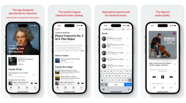
The best music deserves the best sound quality and the best features to match, so it’s pleasing to see Apple taking things such as spatial and hi-res audio seriously for its classical platform. The service takes after its parent app in delivering detailed, expressive and clear renditions of a vast catalogue of works and performances, the most revered and well-known of which are usually furnished with spatial or hi-res capabilities.
Most of the time they sound great, especially if you’ve got the hardware that can actually support these new tricks and that can bring out the music’s full potential. I was testing the app out mainly using a pair of Sony WH-1000XM4, so you’ll obviously have a richer, more rewarding experience if you’ve got an impressive headphones system at your disposal. If you want decent spatial audio, the new Sonos Era 300 isn’t a bad place to start.
I like: Game On
It’s fantastic to see the likes of John Williams and Ennio Morricone recognised alongside the heavyweight maestros with whom we more traditionally associate classical music. It certainly represents a step towards the reduction of snobbery and stigma that more modern or popular artists can face when facing comparisons with Brahms or Vaughan Williams.
One poor genre traditionally barred acceptance to the exclusive classical club, however, has been video-game music. There have been steps made to amalgamate such a maligned subset into the fold, such as the BBC’s Gaming Music At The Proms showcase in 2022, but there seems to be a psychological block preventing Mario from being on the same platform as Mozart.
That’s an issue Apple Music Classical is helping to address thanks to its broad catalogue of vibrant and acclaimed video-game scores. The Final Fantasy Suite by Nobuo Uematsu, Koji Kondo’s The Legend Of Zelda, Ilan Eshkeri’s work on Ghost Of Tsushima, not to mention compositions from Halo, Civilization and Ori And The Blind Forest, there’s a lot to choose from. I love that Apple has seen fit to include the great works of gaming, and I’m excited to see what additions are made to the platform in the future.
I like: Accessible Aesthetics
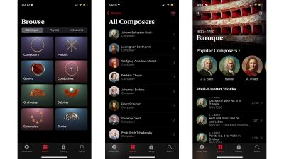
Presentation and aesthetics are where Apple traditionally excels, and once again the hub is clear, bold and stylish. Aesthetic touches such as composer portraits are a nice touch, as are curated lists of essentials for those looking to discover the major works of composers great and good. There’s a genuine sense of Apple trying to make the experience as user-friendly as possible for entry-levellers as well as evergreen enthusiasts.
Yes, a few composer portraits are missing and there are times when there’s just too much to even know where to start, but for the most part, Apple Music Classical rides the line between feeling prestige and popular pretty well.
I don't like: Some Interface Issues
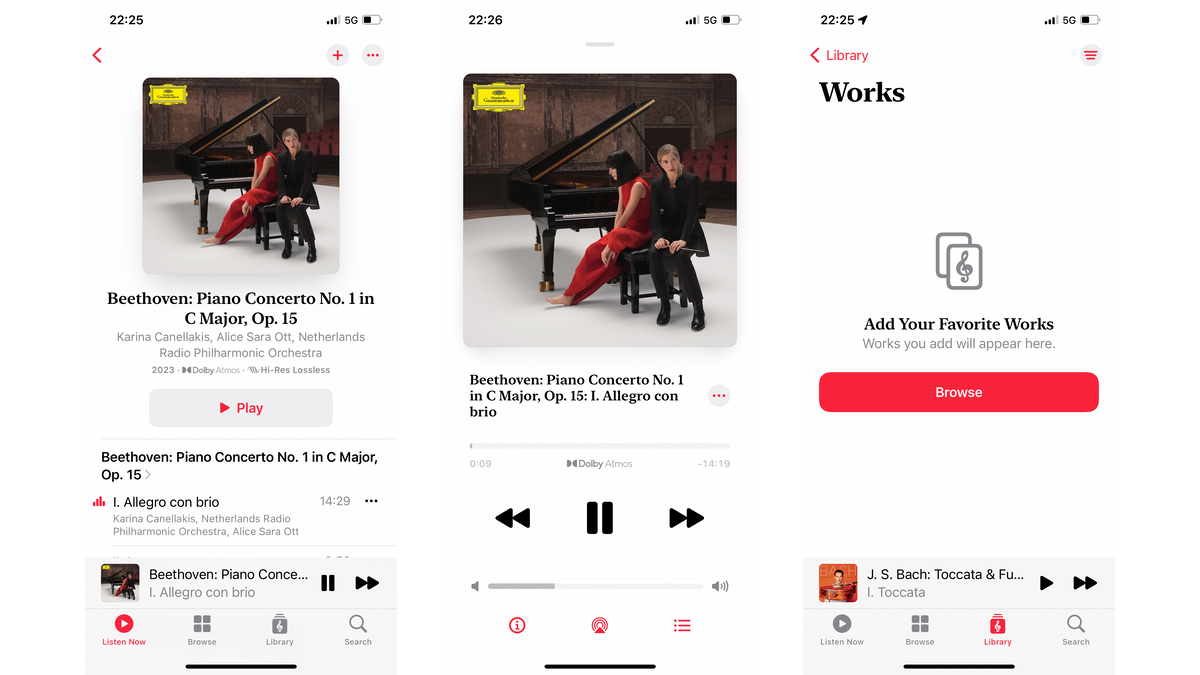
Let’s be clear; half of the point of Apple’s new classical platform has been to present its complex catalogue of music in a clear, cohesive and transparent manner, delivering its material in a way that anyone, be they conductor of the London Philharmonic or man on the street, could understand.
On that count, it’s a bit of a mixed bag. Yes, there’s plenty of material to choose from and the breakdown of categories for periods, genres and composers is helpful and clear, as are the choices to go through the app by instrument instead of artist. The problem, for me at least, was navigating the app once a composer or category had then been chosen. Tap a finger onto the face of Polish genius Frédéric Chopin and you’ll be directed towards his popular works, under which are the Latest Albums (strange for a man who died in 1849) and then a biography and related composers.
This seems like an odd way of doing things. Once a composer has been selected, you’d ideally like a helpful breakdown of their works into further, more useful sub-categories which could then be further subdivided and categorised accordingly. Something like: Mozart → operas, concertos, symphonies → violin concertos, piano concertos, oboe concertos → piano concerto numbers → performances. It’s not a perfect system by any means, but then again, I’m not a professional app designer.
I don't like: No Downloads? Seriously?
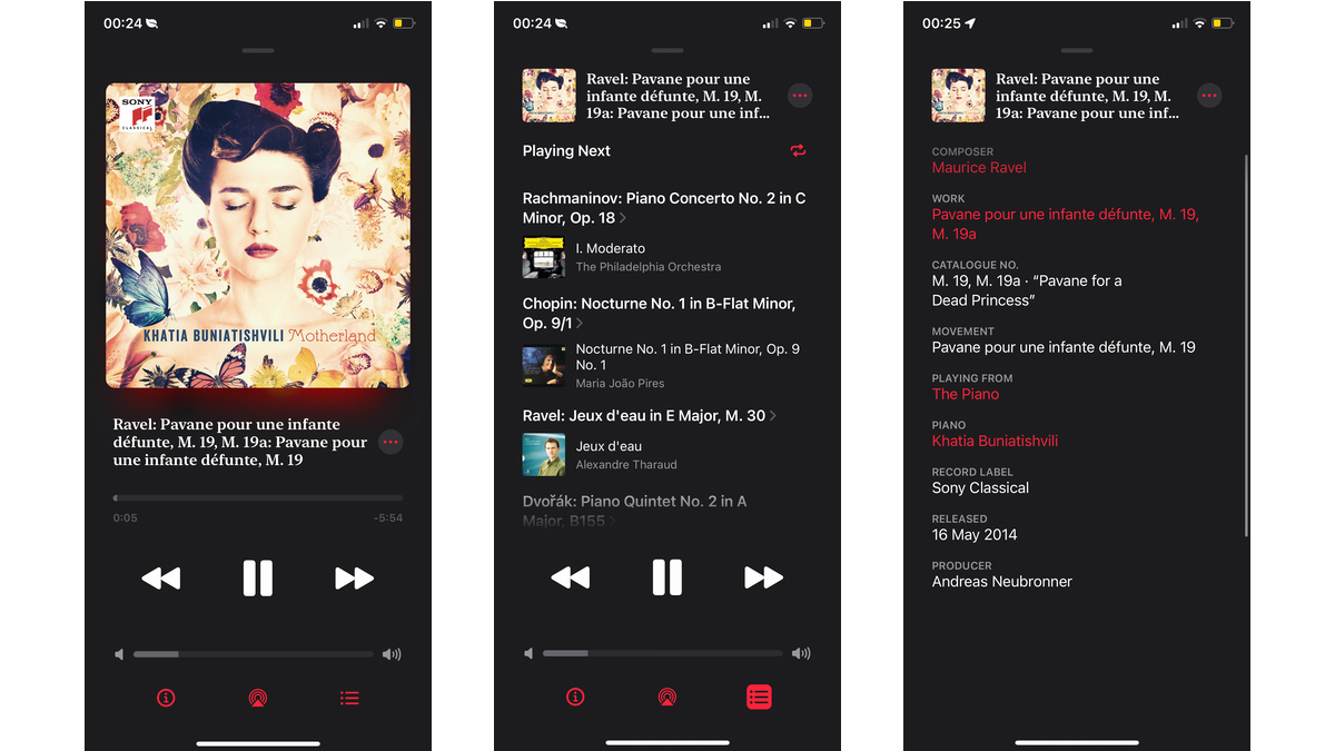
Initial responses, my own included, to Apple’s new classical platform have been almost unanimously positive. One issue that has been raised consistently, however, has been the fact that the platform is essentially reliant on a network, requiring constant access to actual streaming owing to the strange omission of downloadable tracks.
That, surely, is a glitch to be fixed for the future. Yes, we live in a more connected time than ever, but there are often instances when using any streaming platform (The Tube, the countryside, that one dark spot in your garden shed) where connections drop and the music stops. Admittedly, having your phone swallow down the entirety of Handel’s Messiah might not leave much room for your nephew’s baby pics, but at least give us the option, Apple!
Is Apple Music Classical Worth it?

If you’re already subscribed to Apple Music, that’s an easy question to answer. The new classical counterpart comes free of charge to anyone with an existing Apple Music subscription (Voice Plan excluded), so it’s only a case of downloading the separate app and delving into the classics right off the bat.
If you don’t already subscribe, is Apple Music Classical enough to tempt you? There’s obviously an element of subjectivity involved here, but overall it’s a fantastic repository of work that’s extensive, in-depth and (usually) easy to navigate.
Yes, there are interface aspects that could be improved and a lack of downloads is a bore, but overall the picture is an overwhelmingly positive one. If you’re yet to decide on which streaming service is right for you, the idea of getting Apple Music and its classical companion in one cohesive subscription package is an undeniably attractive one.
MORE:
Here’s everything you need to know about Apple Music Classical
Apple spatial audio: what is it? How do you get it? And is it like Dolby Atmos?
Read our five-star Apple Music review
