Color is one of the fastest ways to add character to your interiors. An unexpected dash of red here, a wall drenched in a moody green there. It can instantly elevate a space from simple to sophisticated. But part of why color is so intimidating is because of this drastic effect it has on a space — while some shades can expand a room , others engulf it.
Which brings us to advancing and receding colors. What are they? What do they do to our homes? Well, as their names suggest, when it comes to decorating with color, advancing colors are warm tones (think yellows and reds) that reach forward or pop in a room, while receding colors are typically cooler hues (like blues and greens) that tend to sit comfortably in the background. Strike the right balance? You get perfection.
To understand advancing and receding colors better, I spoke with Livingetc's color expert — and whiz on all things color theory — Amy Moorea Wong, to discover how best to incorporate them in a space. Here's what she told me.
What are Advancing Colors?
"Advancing colors do what you’d expect from their assertive name — they appear to move towards you, lean in for attention, and sit at the front of what you can see," explains Amy Moorea Wong.
The shades that tick this box are the warm tones on the color wheel, such as red, orange, and yellow. "These colors have longer wavelengths which our eyes interpret as moving forwards," says Amy.
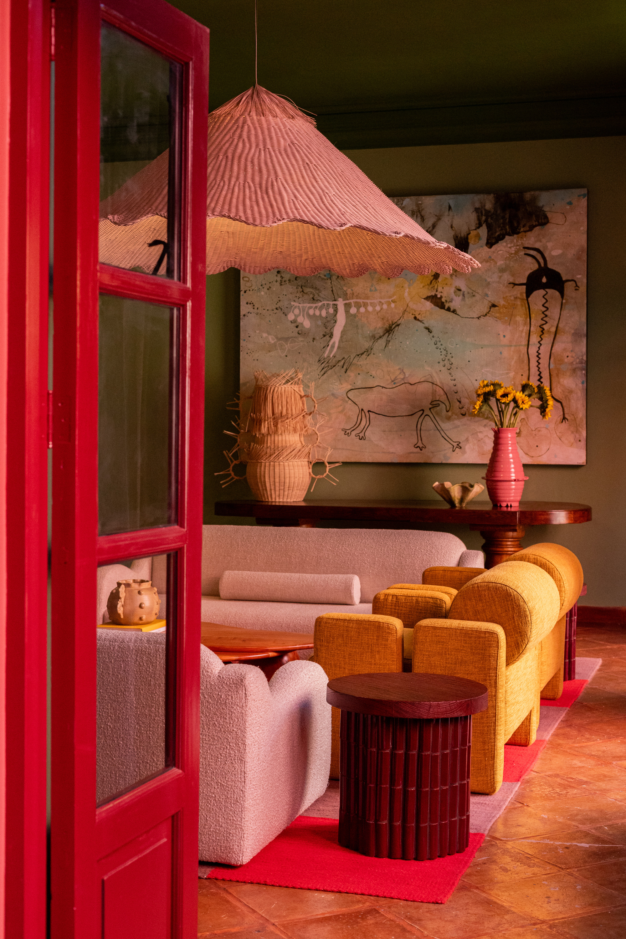
They create a sense of vibrancy and energy, making an object or area stand out, and feel louder and more prominent. However, as they come forward, they can also make a space feel closer, so you may want to avoid using a warm-dominate palette in an already small or restricted space.
On the other hand, advancing colors are perfect for making an open layout feel cozier or creating a warm, cocooning environment in a space such as a bedroom.
What Are Receding Colors?
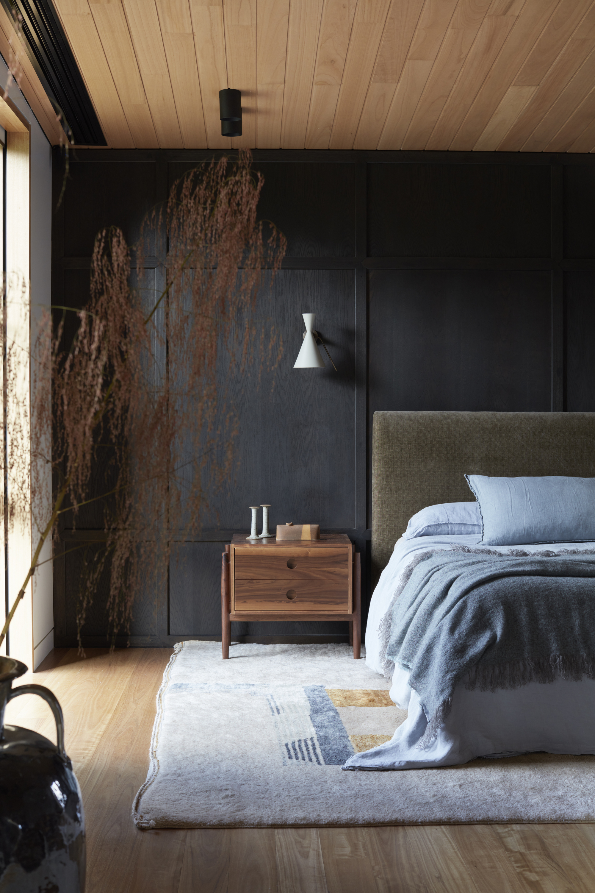
"Receding colors are those that don’t want any focus on them, that ease themselves quietly into the background," explains Amy. Classically this is the cold colors — blues, green and violets. "These colors have shorter wavelengths which the eye places at the back of what it’s looking at," says Amy.
Receding colors feel calm and unobtrusive, and they allow other shades to take center stage. "As they appear to move away from you, they create (the illusion of) depth, making objects or areas seem further away and fostering a sense of spaciousness," says Amy.
So a room full of receding colors will sit serenely with the eye, often feel more peaceful, and will even be a good base palette to work from.
Receding colors are a great paint trick for low ceilings, or if you have a small layout, they can make the space feel more expansive. Just be sure to balance the values (darkness or lightness) appropriately.
Working with Advancing and Receding Colors in Interiors
Though it may seem like a lot to digest, when it comes to decorating your home, "placing an advancing and receding color together is actually quite fun," says Amy.
Sitting alongside each other, the duo forms an illusion; the warmer color seems to slowly loom forward while the cold tone shrinks back. "Adding accents of opposing colors creates visual balance in interior design, tempering the effects of the leading tone and making a space feel harmonious while also somehow dynamic," adds Amy.
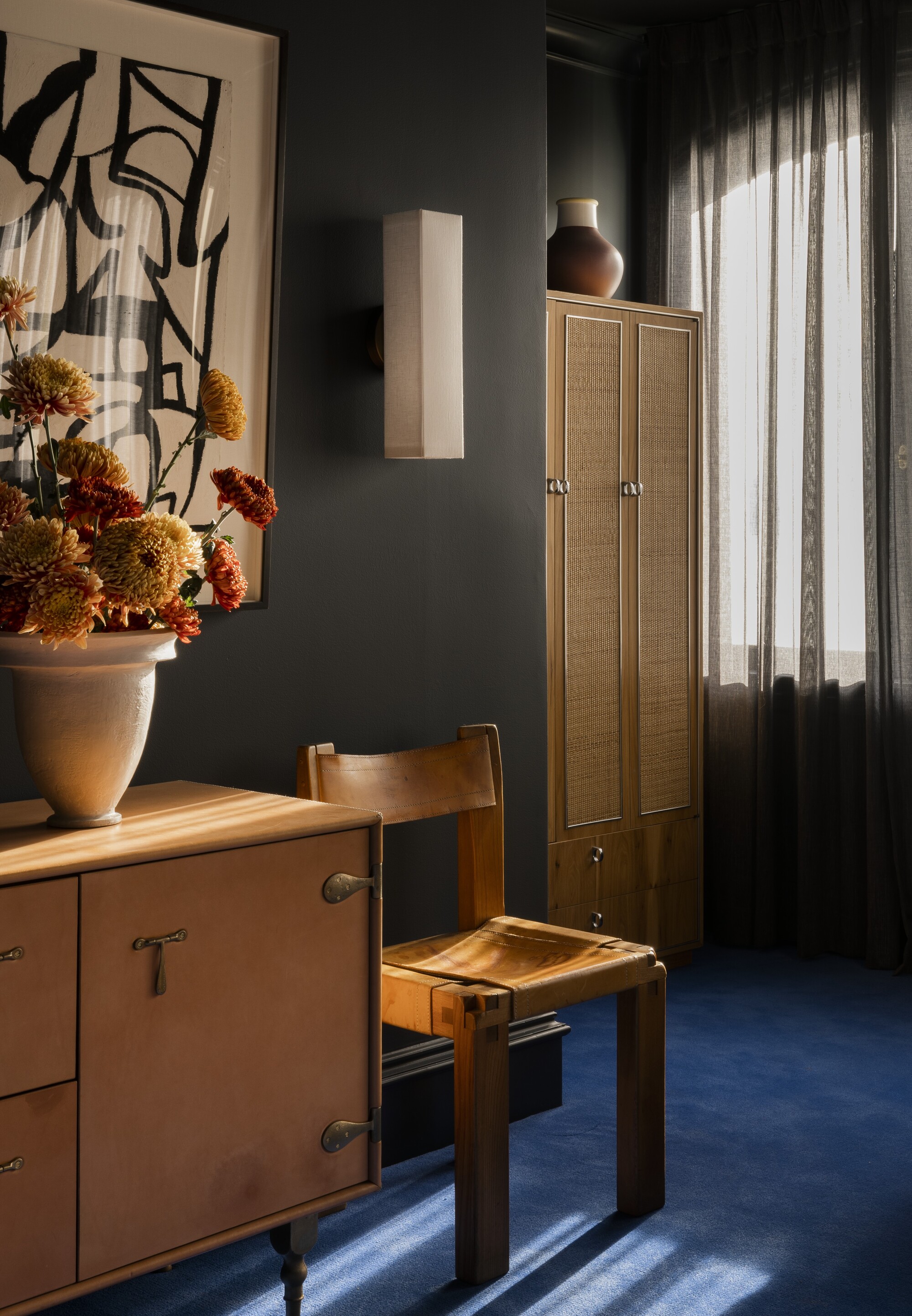
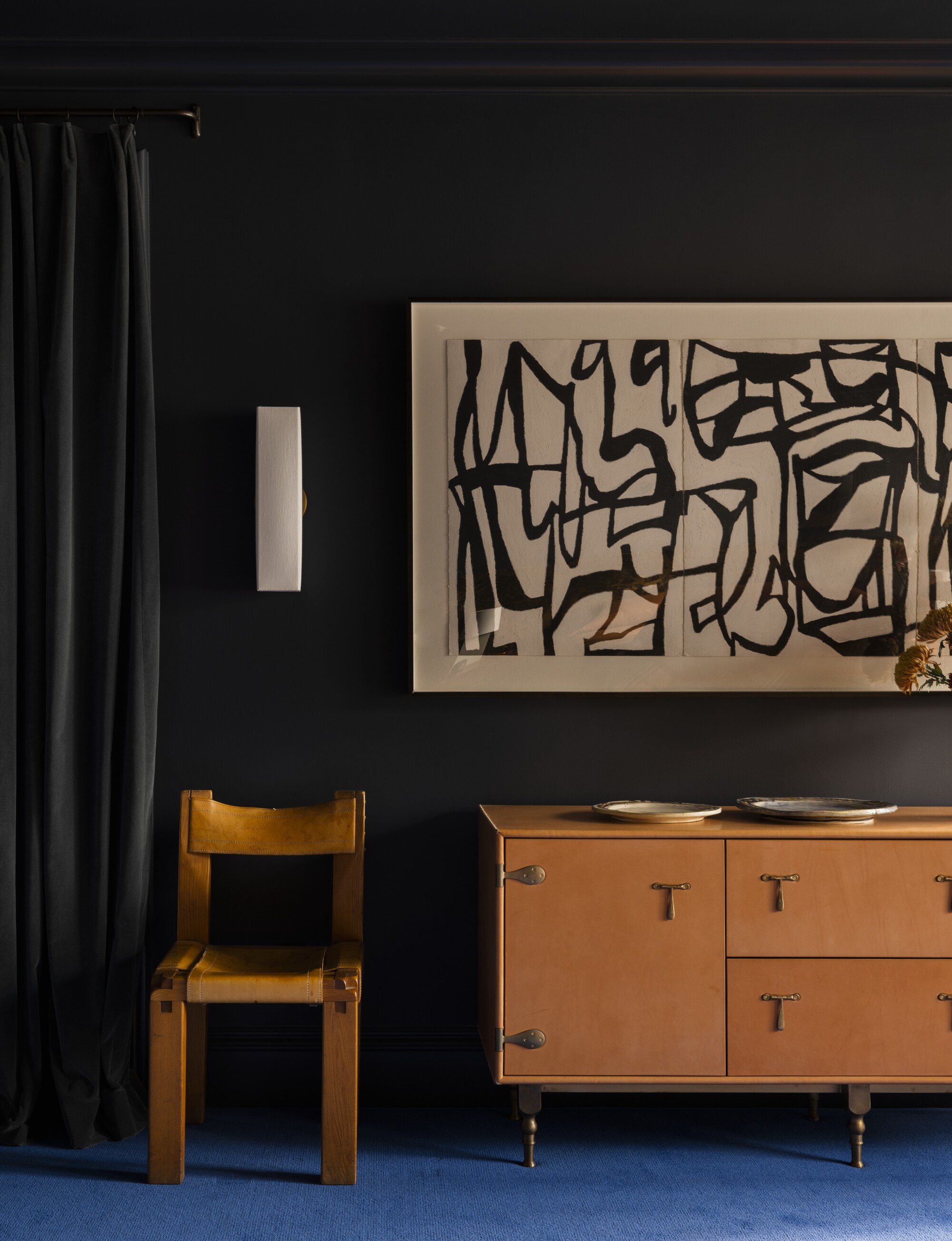
For example, a room color-drenched in a cool-toned deep olive green or navy blue (a receding color) will create the illusion of an expansive space that you can then accentuate with contrasting orange or terracotta (advancing) accents.
Alternatively, if you choose to paint a room in a warm color scheme, brick red, Amy says, "I’d go for big pieces of (receding) deep greens and blues for depth, contrast, and richness such as a chunky chair or sofa."
Understanding the relationship between advancing and receding colors is all about context.
"Advancing and receding colors come down to how they’re placed and what they’re contrasted against," says Amy. "As you’d expect the advancing/receding contrast is heightened and more noticeable if the colors are placed directly alongside each other, whereas if they’re spread out or layered with neutrals, everything softens."
As you create a color palette, watch the colors come together and mingle with one another. Soon you will figure out what colors work naturally with your eye and design style.