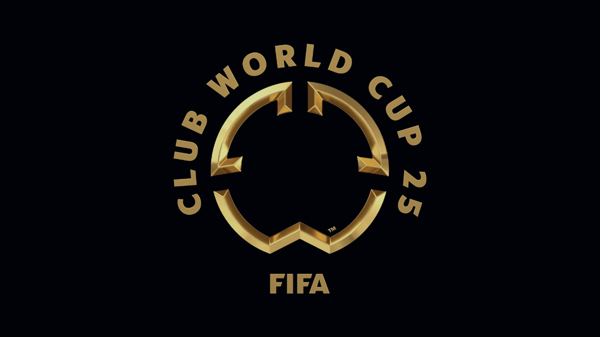
Fifa has unveiled its new logo for the upcoming Club World Cup – a unique competition that brings the world's greatest football clubs together in the ultimate sporting showdown. As football's newest tournament, the Club World Cup faces the challenge of standing out in a sea of sporting competitions but judging by fan reactions, it seems the unique logo has failed to score with supporters.
The best sports logos are often packed with powerful symbolism, something that the Club World Cup logo seems to lack. With on-the-nose nuance and a painfully minimalist design, it's a tepid logo that feels like style over substance.
The design features a rough circle inspired by football's most important tool – the ball. While it's not the most nuanced symbolism, the shape is comprised of three abstract 3D shapes that mimic the tournament's initials 'CWC'. Complete with a gaudy black and gold colour palette, the logo has a visually sleek appeal but lacks substance, leading to some scathing reviews from fans.
One fan on X claimed that the design "feels hollow," while another added that it "looks like someone tried to redesign a fast food restaurant." Users also drew comparisons to other famous logos, with some claiming that the negative space in the design resembled the Disney logo while others said the design reminded them of the iconic MGM logo (minus the ferocious lion).
The new FIFA Club World Cup logo dropped today. Generally, I don't dislike the stylized CWC – my affinity for art deco and minimalism undoubtedly helping that along. But it still feels hollow. (1/2) pic.twitter.com/tOl1EZ2OUjSeptember 4, 2024
FIFA Club World Cup logo looks like a United passing map pic.twitter.com/kj3SpDbYeWSeptember 4, 2024
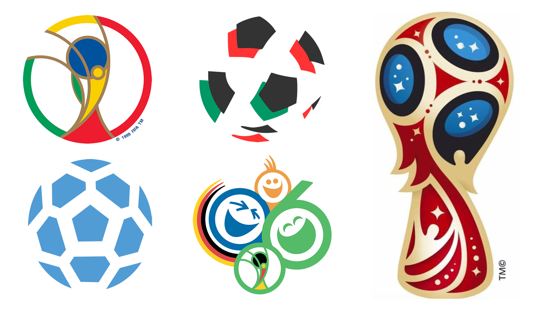
It's certainly a world away from previous World Cup logos, which have been full of detail and life. You can see our favourite ones in our best World Cup logo piece, or see a small sample below.
For more sporting design inspiration, take a look at the important meaning of the Paralympic Games logo. To see how sports branding can inspire the wider world of design, check out the creative campaign for Deathsprint 66.