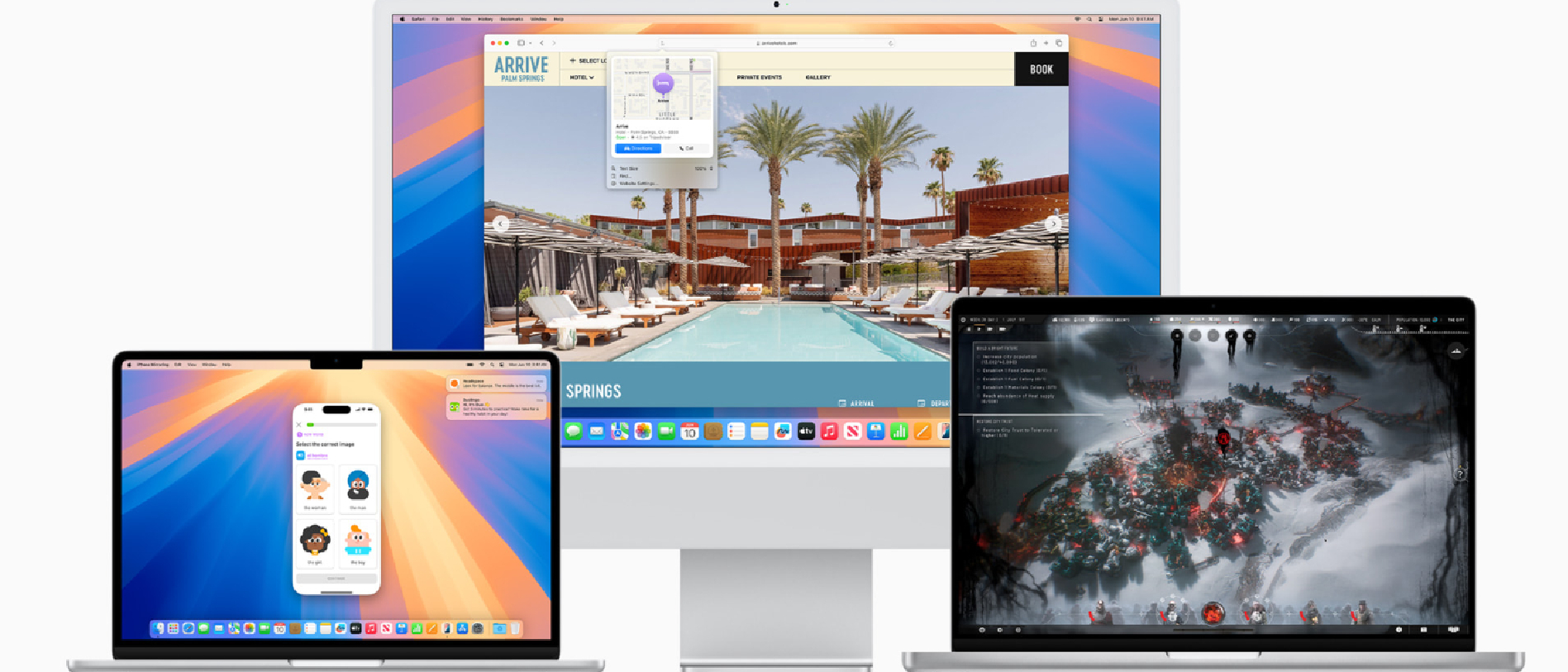
I have a confession to make, reader. Despite my enduring tenure as the News Editor of an Apple website, I use Windows. Not exclusively — I’ve had a Mac of some description for nearly a decade — but I’d say the split of my Windows vs. Mac usage is about 90:10. I’ll happily use macOS to do one thing in full screen (although my colleagues tell me that using full screen on macOS is questionable behavior) — but I simply refuse to rely on macOS to do anything that requires multiple windows, tabs, moving files, and any level of precision or speed.
Naturally, then, I am the perfect candidate for a hands-on first impressions write-up of the new macOS Sequoia update, the beta of which is now available to download. As with our iOS 18 hands-on, and our iPadOS 18 first impressions, macOS Sequoia suffers from the same glaring absence of Apple Intelligence, which isn’t coming out until the fall in beta form. My task is made easier (and more difficult) further still by the lack of two other standout macOS Sequoia features, iPhone Mirroring, and Safari Highlights. But what about the new features that actually are available? Nose held, I’ve taken a deep dive into the very first iteration of macOS Sequoia to give you my honest thoughts on all the new features this year.
Wallpapers
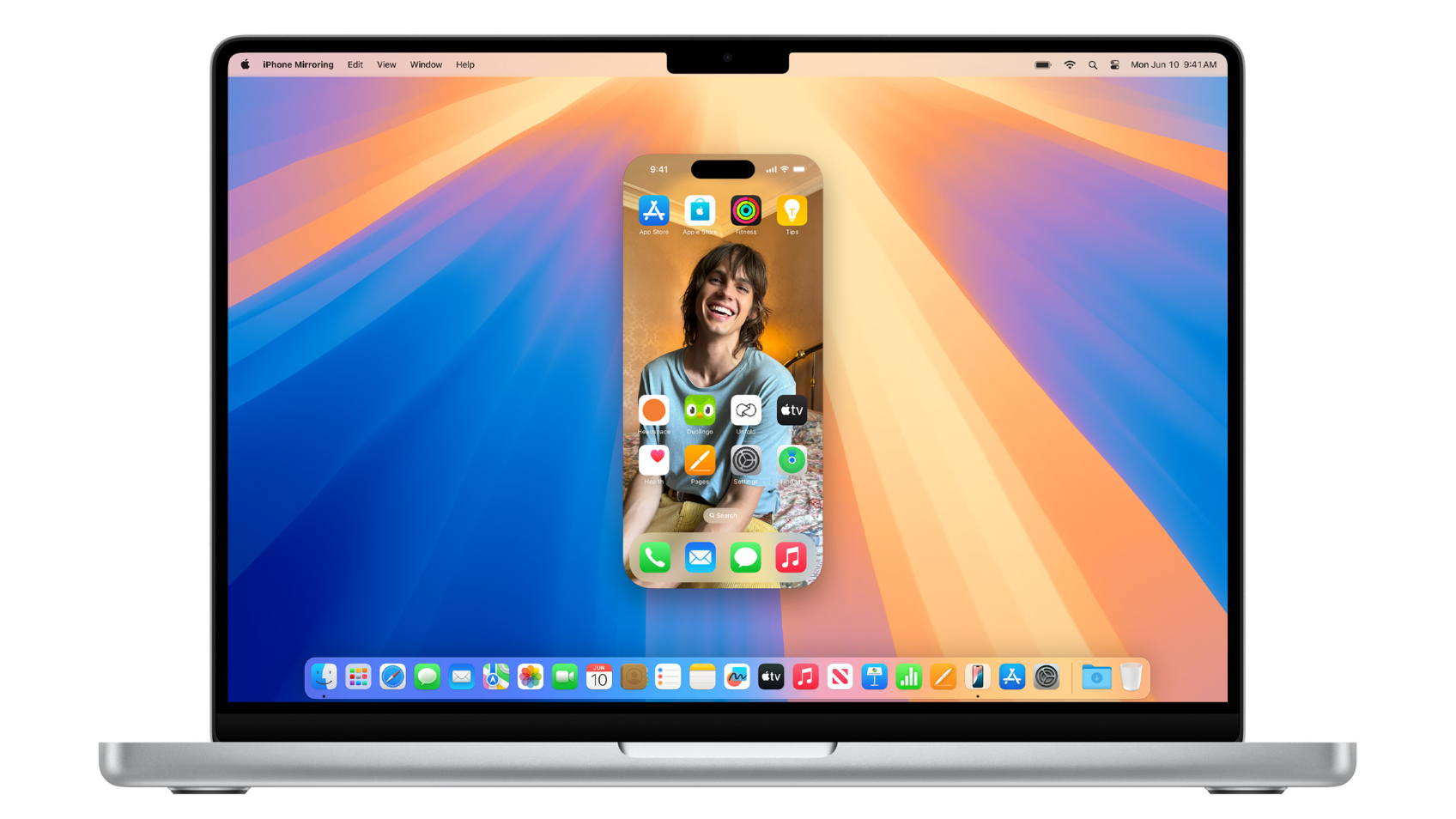
Not a new feature per se, but worth noting nonetheless, Apple continues to dominate the computing wallpaper scenes. Sequoia arrives replete with not one but two smashing wallpaper options, including a stunning retro collection that can be tailored to several colors. Likewise, the Sequoia piece for 2024 and beyond is a real head-turner.
Notes
My first stop on my tour of macOS was the new Notes app. Fresh to Mac is a new audio transcription feature that lets you record audio sessions and type notes as you go. The target market here is clearly the student, with the new interface for recording a handy sidebar that lets you track your recording as you go, so you know it hasn’t stopped accidentally. By recording and typing notes at the same time, you’ll always have a recorded record of college lectures or classroom lessons, replete with the notes you typed alongside. The feature also includes live audio transcription, but you’ll need Apple Intelligence for that.
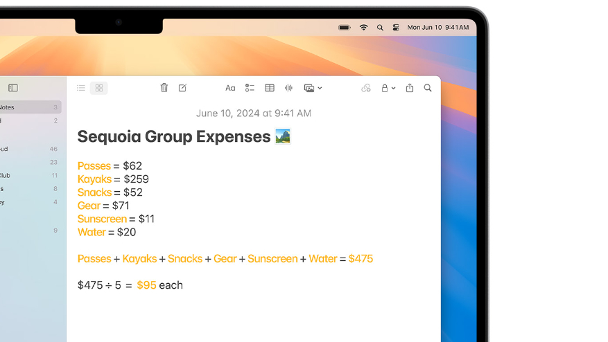
I love the formatting boost that lets you include collapsible sections within notes, and you can now highlight notes to make them stand out. The biggest notes upgrade, however, is Math Notes. A headline of the iPadOS 18 launch, Math Notes lets users generate sums, equations, and more, solving them as they go. In Notes on macOS, you can now use the feature to great effect. You can simply type sums into Notes and macOS will generate the correct answer in real time. While the feature can be used for expressions and equations, it’s most useful in Notes on Mac for things like budgeting, expenses, and planning. For instance, if you were to tally up the cost of moving house in a quick note, you can use Math Notes to add up all the various expenses, rather than switching to your calculator app. All of these features make Notes much more useful and versatile, and at their heart ensure that users who rely on Notes for anything at all don’t have to dip in and out of the app if they want to start a recording, divvy up a restaurant bill, or anything else.
Video conferencing
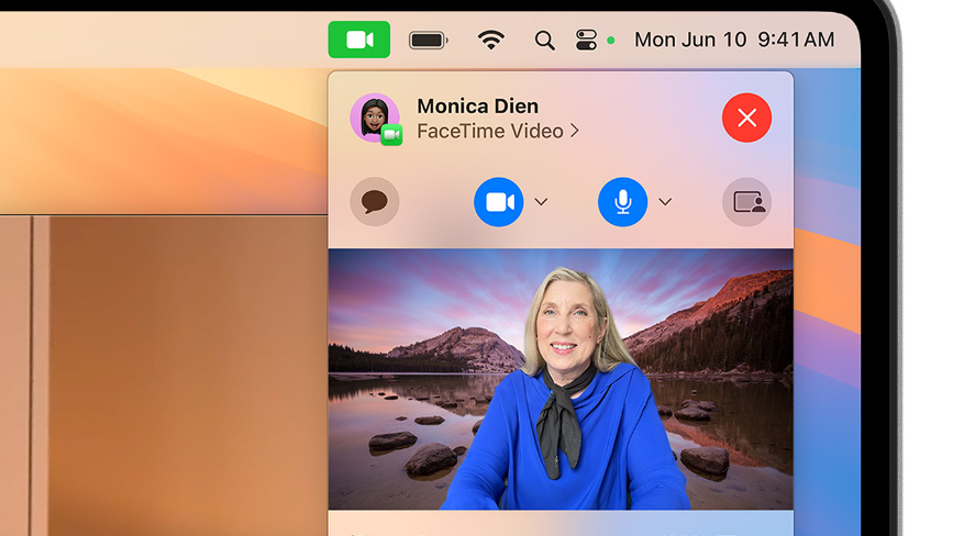
Whether you love to show off in Zoom calls with fancy backgrounds, make your colleagues giggle with a funky-looking spaceship, or want to hide a messy backdrop with blur or some nice mountains, video conferencing backgrounds are a staple of the remote worker and the office-goer alike. To that end, macOS Sequoia includes some snazzy new system-level backgrounds that you can apply to your video when on calls. As noted, these are system-level, so you set them by clicking on the green video icon in the menu bar. Once applied, they show up in whichever video feed you’re using, be it Zoom, Google Meet, or of course FaceTime. Right now there’s a limited selection of colors and the macOS High Sierra mountains. You can also add any background of your own choosing, so really the possibilities are endless. The video processing on these backgrounds is noticeably better than software clients like Google or Zoom, with edges of the subject much more crisp and the overall animation much smoother. If you use video backgrounds in calls, you’re going to love Sequoia. The new presenter preview mode also gives you a quick look at your presentation view before you share it with the group, so you can make sure you’ve only given access to the right presentation tab and not your embarrassing side chat with a colleague or the background movies you pretend not to watch.
Passwords app
The Passwords app is one of the few truly new things in macOS, and it definitely shines on the computing platform. While the Passwords app is available on iPhone, iPad, Vision Pro, and even my beloved Windows, using it on macOS for any kind of password admin seems to make the most sense. Here the expansive interface makes all of the information readily digestible, and I personally consider changing passwords (and booking flights) to be a laptop job. The app is quite rudimentary — it only has three main fields and six categories — but simplicity is what’s needed here and the Passwords app has that in spades. Whether or not this means I’m now going to attend to my several hundred security recommendations remains to be seen.
Messages
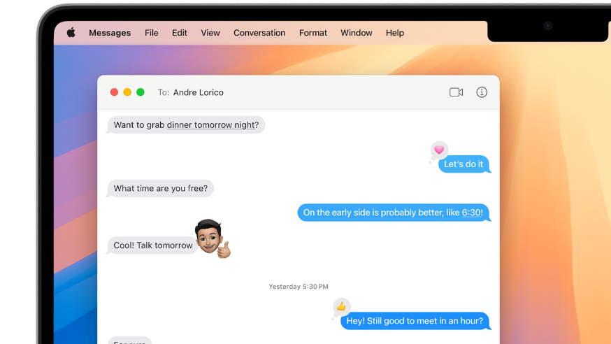
Messages on macOS Sequoia come with all the new flavors and spices of iOS 18. That means you can send messages with flair such as bold text, italics, and more. These can all be accessed with a right-click on the highlighted text you want to jazz up, but accessing the menu is definitely not as intuitive as using shortcuts. The usual array of CMD + B, I, etc, will generate bold, italic, and other effects as you’d expect. Right-click on Mac also gives access to the new emoji tapbacks. What’s more, all of these effects also display on macOS just fine, letting you get in on all the mobile fun of messaging. Scheduling messages is also just a click away and very easy to use.
Maps
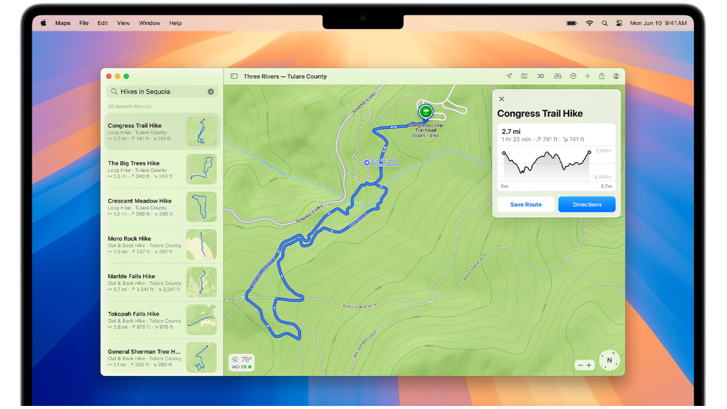
Keen hikers will be pleased to know that macOS Sequoia now comes with Apple’s fancy topographical maps, which give vital data about elevation and incline on prospective hikes. Only available in the U.S. and Japan right now, the new maps include trails from all 63 U.S. national parks. Sadly, there doesn’t seem to be a filter or way to search routes that have topographical support, so finding them is basically the luck of the draw. Naturally, the Sherman Tree Trailhead demoed by Apple works and looks wonderful, with a route and elevation readily available to be added to your library or navigated too. Apple awarded AllTrails its prestigious iPhone App of the Year award in 2023, but now planning a hike can be done without any third-party help whatsoever.
Photos
The Photos app got one of the biggest overhauls of any app at WWDC 2024. Many of the iPhone-centric upgrades, like the Carousel, are notably absent, but the new Photos app on Mac does at least automatically organize your library into topics like Trips, and People & Pets. The Memories and Days collections are also nice, and all the changes stack up to make browsing your photos much better, especially at a glance.
Calculator
I rarely reach for the calculator on my Mac, preferring the tactile feel of the iPhone version. However, both now come with an epic conversions feature with options for weight, measurements, and even currency powered by Yahoo Finance. On Mac, clicking Math Notes simply opens your Notes app.
Calendar and Reminders
As promised, you can now generate reminders directly from within the macOS calendar app in macOS Sequoia. The ‘+’ icon that once only created events now includes a clear option for setting a Reminder, selecting this opens up all the options you’d expect in this field, with spaces for notes, as well as settings for alerts and timing.
Windows tiling and Stage Manager
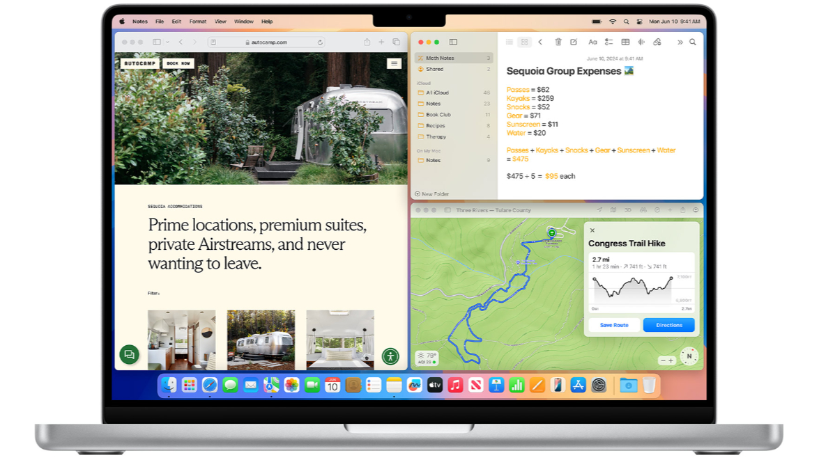
Stage Manager on macOS Sequoia has not changed since its advent in macOS Ventura two years ago. It’s a divisive feature, but one that some find useful. As such, if you like Stage Manager and want to keep using it, you’re going to be pleased with Sequoia. If you still don’t like Stage Manager, you can still turn it off. However, the most noteworthy multitasking shift in macOS Sequoia is the brand-new easy window tiling, which you can use with or without Stage Manager. That’s right, macOS Sequoia stole Windows’ best feature, killing off notable third-party apps like Rectangle in the process. As a Windows user who thrives on the Redmond outfit’s immense multitasking capabilities, I was overjoyed to see this feature unveiled in macOS. It’s one of the biggest obstacles keeping me from macOS adoption, and I was really excited to try it. The news is, I’m afraid, mixed. The new tiling in macOS improves macOS window management by orders of magnitude. However, in other ways, it is a pale imitation of the Windows feature that keeps me from macOS. To start with the good, you can now grab a macOS window and snap it to either side of your main display. Using the mouse in this way, there are only two options, left and right. You can arrange two windows in a side-by-side configuration, resizing them to taste if you don’t want a 50:50 split. Perhaps more enticingly, hovering your mouse over the green full-screen button in the corner will bring up a list of various window configurations. That includes a vertical side-by-side, but also a horizontal, landscape 50:50 split. You can also pick from various combos that arrange four apps, one in each corner, and holding down the Alt key shows more options.
As noted, however, the feature is not perfect. Firstly, macOS puts a gap around your windows so they don’t touch the dock, menu bar, or the far edge of your screen. That’s a design choice I would broadly file as “psychopathic” and one that needs to be rectified immediately. Secondly, while you can grab any window by its title bar and move it around, you cannot grab the tab from an internet browser and snap it the way you can on Windows. As someone who uses browser tabs more than anything else in the pursuit of multitasking, this is another criminal oversight. Less egregious, but still leaving room for improvement, there’s no “auto-suggest” option like that of Windows. If you have two apps floating on your Home Screen, and you choose to snap one to the left side, you’d have expected Mac to automatically offer to snap your second window to the right side, and vice versa. Instead the remaining window just kind of floats wherever it's left, and you have to do it manually.
I don’t want to overstate the weaknesses of tiling in Sequoia, because it truly is a massive improvement on every iteration of macOS that has gone before. With a bit of tweaking, it could be a game changer, but it’s not enough to tempt me away from Windows just yet. With the feature still in beta, I’m hopeful for some improvements before the fall public release.
In conclusion
By all accounts, there’s not a lot going on in the new macOS beta. Without Apple Intelligence, and without the impressive new iPhone Mirroring Continuity upgrade, the two headline features are still missing. macOS 15 Sequoia shows great promise, but in its current form, it’s more of a refinement than an upgrade.
More from iMore
- The era of Apple Intelligence is here — Apple AI unveiled at WWDC 2024
- ChatGPT 4.0 is coming to iPhone, iPad, and Mac free with iOS 18 and beyond
- Here's everything Apple Intelligence can do on iPhone, iPad, and Mac
- Apple unveils iOS 18 at WWDC 2024
- watchOS 11 officially revealed at WWDC 2024
- Apple's tvOS 18 arrives for Apple TV — new features for AirPods and Home coming soon
- visionOS 2 announced at WWDC 2024 — Apple Vision Pro's first major software update
- Apple Vision Pro goes international this month - here's where you'll be able to buy it
- iOS 18 offers the "biggest redesign" for the iPhone Photos app - here's what's new
- WWDC 2024 brings our first look at Severance Season 2
- macOS 15 is macOS Sequoia, unveiled at WWDC 2024
- iPadOS 18 announced at WWDC 2024 — with all of iOS 18's greatest hits in tow
- AT LAST: Apple adds support for RCS Messaging


