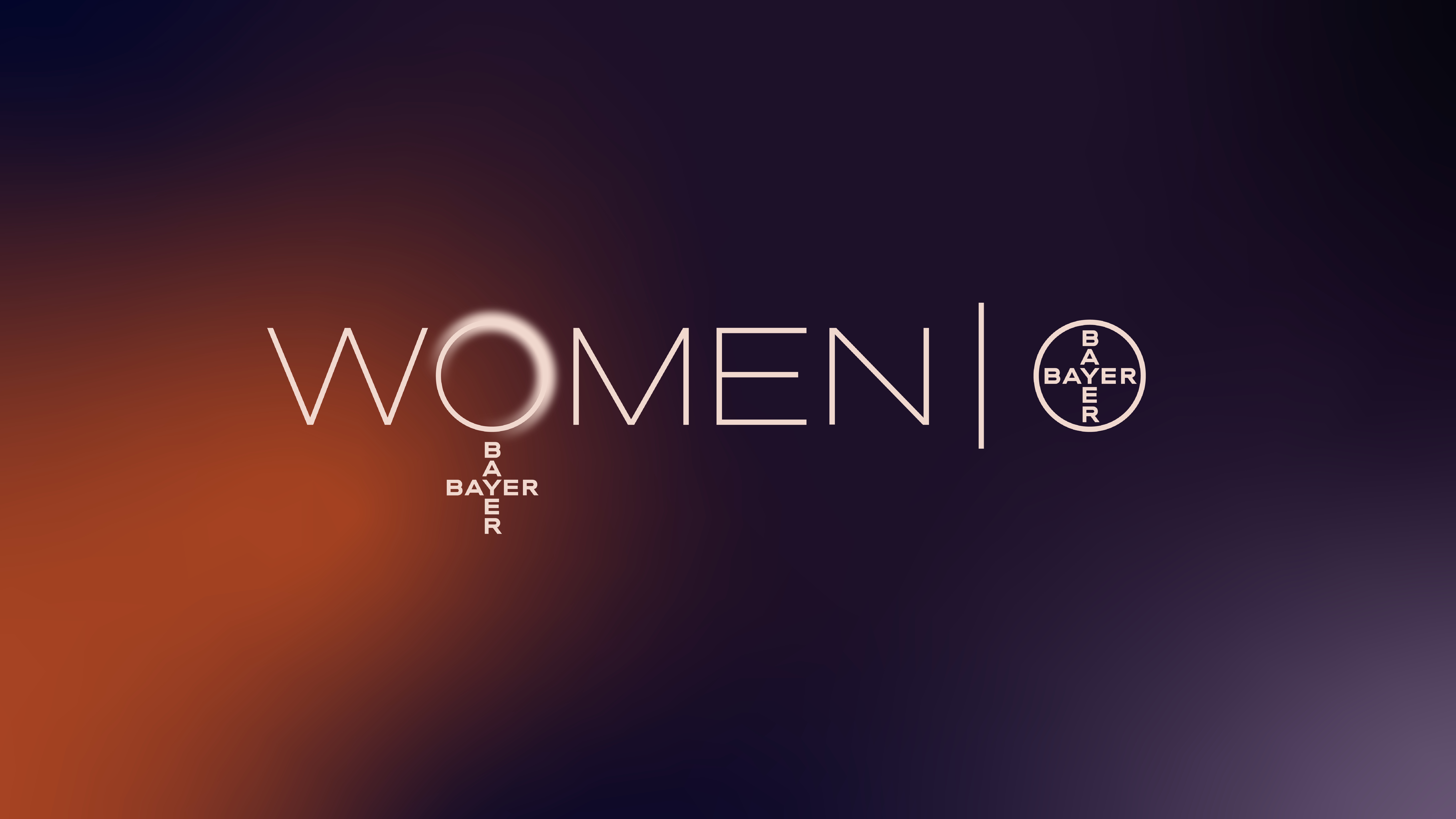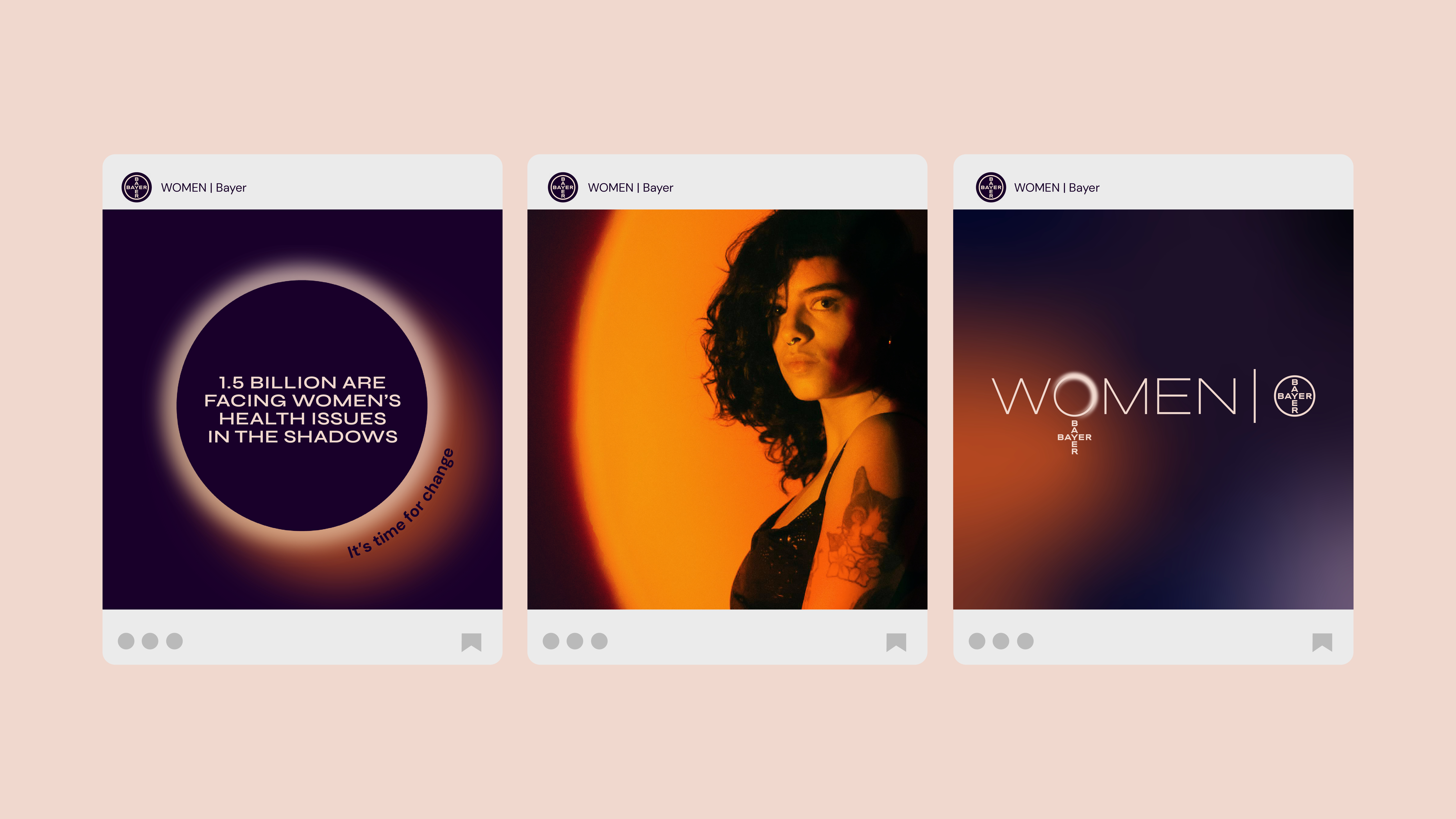
German pharmaceutical and life science company Bayer AG has launched WOMEN | Bayer – a transformative new women's health brand. Created to "dispel myths and misconceptions, simplify complexities, research in the unknown, and cast a light on the overlooked and misunderstood," WOMEN | Bayer is a brand of action with ambitions to close the gender health gap.
Looking back at the most iconic brands, a successful identity is often supported by a strong sense of purpose and individuality. Combining heritage and expertise with an innovative vision of the future, WOMEN | Bayer displays how concise design can excel an emerging brand.
Created by award-winning global brand design agency Design Bridge and Partners, the new identity started by dissecting the gender health gap. "Women receive healthcare in a man’s world, a world filled with taboos misconceptions and shame due to huge gaps in research, data, information, care, and trust," reveals Katherina Tudball, senior creative director at Design Bridge and Partners. "Half the world’s population – from every walk and stage of life – feel ignored by medical professionals and are all united by what is missing. So, we set about exploring ways to visualise the gaps," she adds.
Central to the brand identity is its logo which embraces the iconic ‘Bayer Cross’, widely regarded as "a beacon for health." Katherina tells Creative Bloq "The logo itself has been lighting up the sky in Bayer’s hometown in Germany for over 90 years in the form of a huge, illuminated sign. The ‘Leverkusen Bayer Cross’ is 51 meters in diameter making it the biggest trademark in the world."
"We drew inspiration from Leverkusen, and Bayer’s history of illumination, to create a new beacon for Women’s health. Expressing the gender-gaps as darkness and shadow the WOMEN | Bayer brand seeks to enlighten the way to women’s health, dispelling shadowy myths and casting light on the overlooked or misunderstood," she adds.

When reimagining the logo, Katherina reflects on the "unique visual gift" hidden within the logo. "Composed of a circular ring and a typographic cross the Bayer logo was already built from the two geometric elements that – when rearranged – signify womanhood. In one simple motion the Bayer Cross reconfigures to create the Venus symbol, and a new icon of women’s health. It’s this connection to Bayer’s significant heritage and it’s ability to evolve its visual iconography to symbolise its deep-rooted commitment to women that allows us to signpost the cause in a way that only Bayer can," she says.

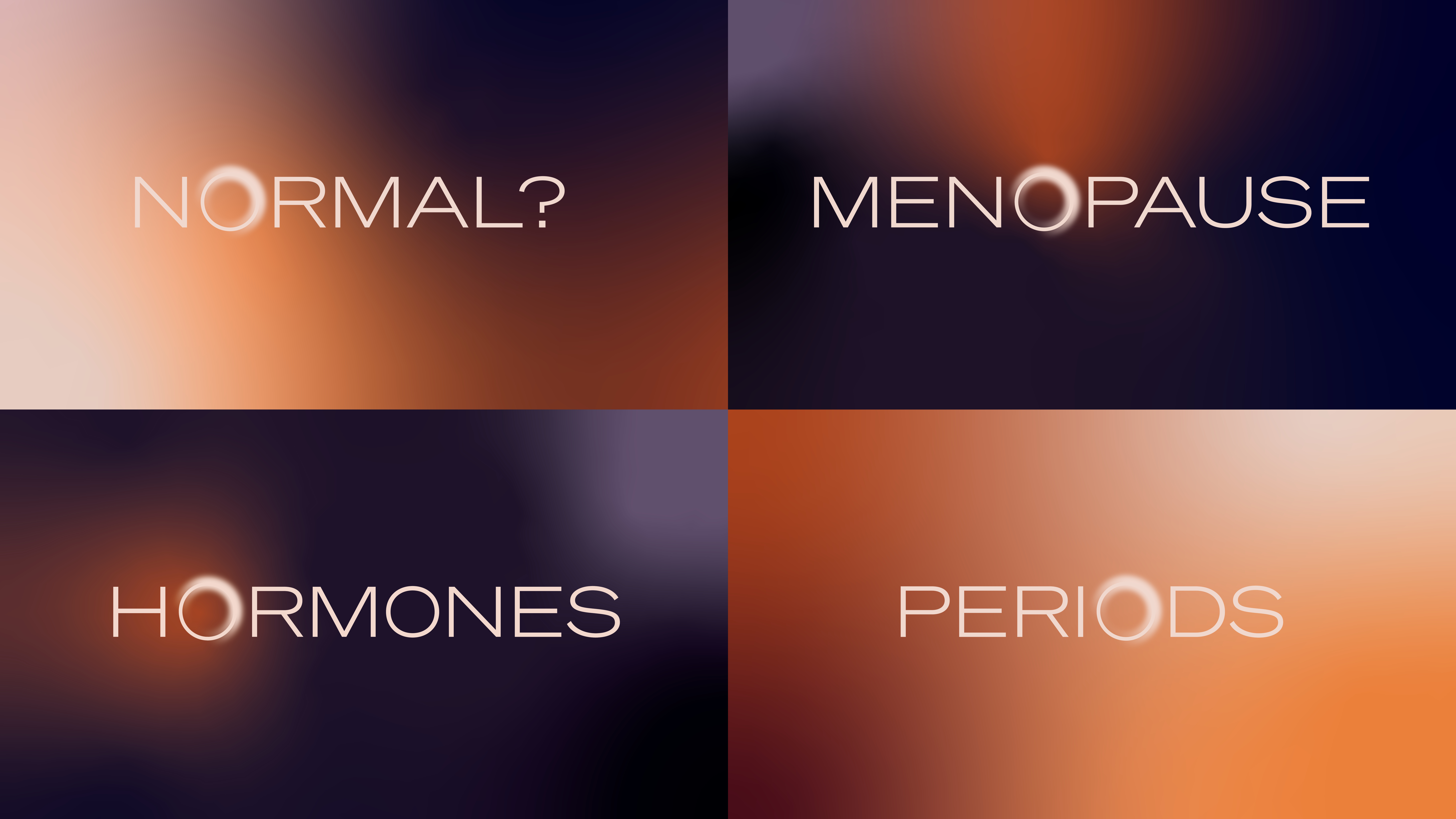
The design is informed by the motif of 'enlightenment', which appears in the 'O' of the new logo. "A subtle glow on the edge of the ring nods to the concept of enlightenment and is echoed in glowing graphic devices, bespoke typographic assets and illuminating motion behaviours," Katherina says. "Overall, the identity uses the visual language of light across graphics, animation and photography. Highlighting bright, positive solutions as well as exposing the shadowy gaps and problems," she explains.
"At one stage we experimented with a lot of different colour palettes before finally settling on the right balance of depth and optimism," Katherina says. The final gradient colour palette of purples and golds avoids stereotypically gendered tones and "Once all the elements fell into place conceptually the design itself flowed quite naturally as we had a very single-minded point of focus," she adds.
Reflecting on the highlight of the creative process, Katherina reflects: "Of course, the graphic designer in me finds the logo symbol very satisfying, but the purpose behind this brand and its ambition to make meaningful change is what’s most exciting. Working on WOMEN | Bayer has really highlighted to me just how little we, as women, understand our own bodies and how badly we are being let down by institutionally sexist healthcare systems and norms."

For more creative inspiration, check out Camden Town WFC’s new kit that's actually designed for women. If you're after more industry insight, check out why the VFX industry has a diversity issue, and more importantly, what we need to do about it


