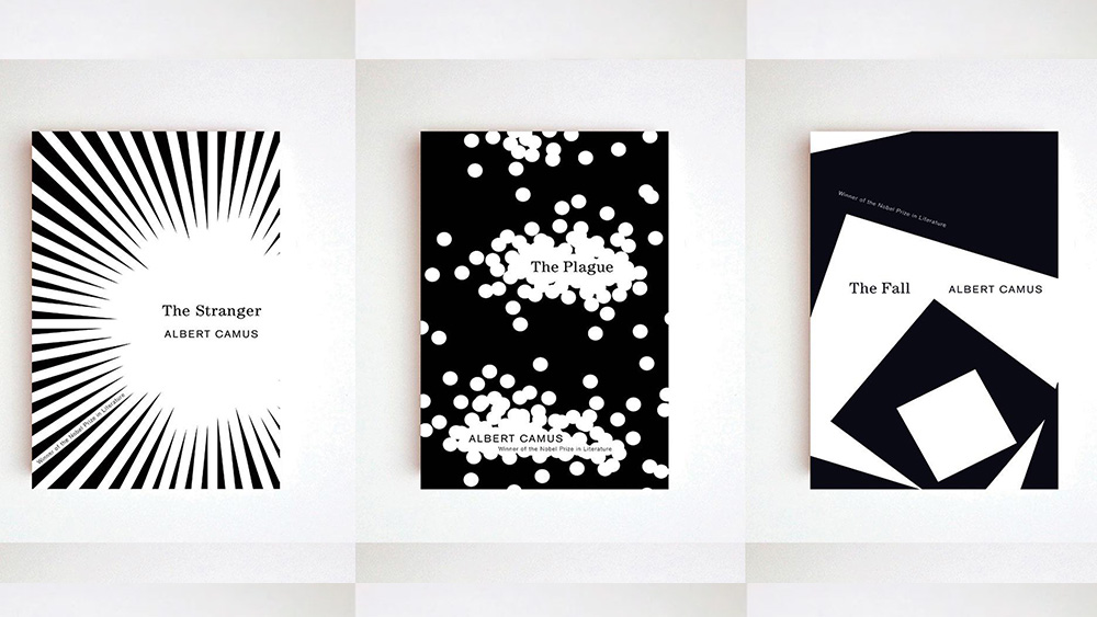
They say you should never judge a book by its cover, but as a man intrigued by the concept of judgement, the French philosopher Albert Camus would allow us to make an exception. Happily the covers for Vintage Books' Albert Camus collection are sublime on multiple levels.
At first glance, the black-and-white cover art appears to comprise striking but random abstract geometric patterns. That's not a criticism. The stark, incisive minimalism of the perfectly complements Camus's concise style and existential concerns.
Trying to seek meaning in such abstraction may seem as absurd as Camus believed it was to seek meaning in life. But meaning there is. Look deeper, and the covers also have thematic links to each book in the collection (see our pick of the best graphic design software or the best digital art software if you're getting started in cover design).
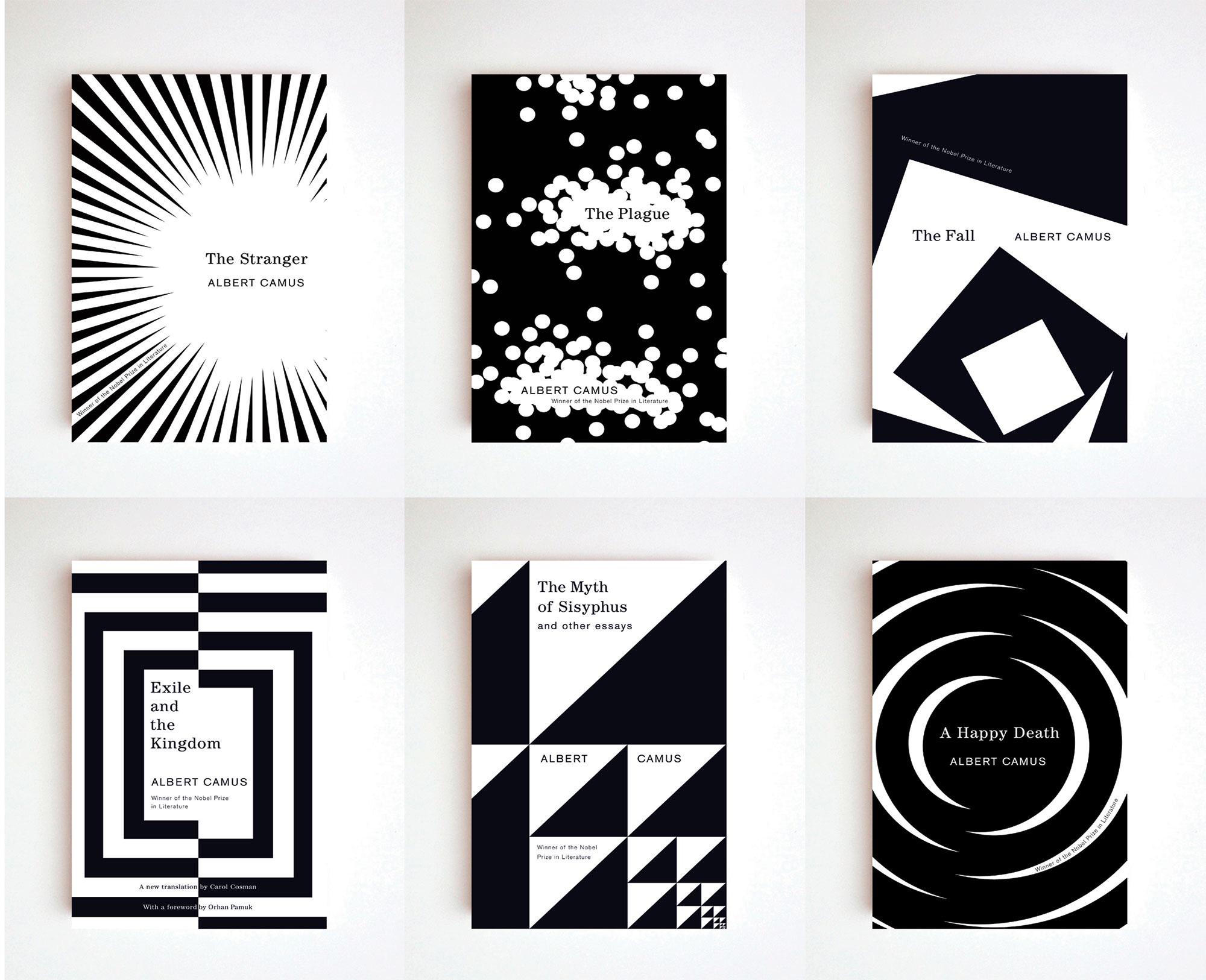
The abstract cover art for the Camus Collection was created by the cover designer Helen Yentus for Vintage. Designers have been giving it a lot of love over on Reddit of late, so I decided to take a look at it again.
The covers stand out immediately with their bold contrast and geometric forms. The overall style seems to fit the themes of Camus' work: the sense of loneliness and isolation. But many of the covers also turn out to have more figurative connections.
The cover of The Stranger features a kind of optical illusion of white and black shards. This reflects the novel's themes of detachment and emotionlessness and creates a sense of anxiety and danger through the sharp angles and contrast.
But it can also be seen as a blazing sun, which is a recurring motif in the novel, associated with movements of emotional pressure, such as the murder scene and Meursault's trial.
Helen's cover for The Myth of Sisyphus shows repetitive triangular forms, reminiscent of the Sierpiński triangle. This seems to be a reference to Sisyphus's eternal punishment in the underworld, which Camus compares the the absurdity of human life.
The cover of The Plague, features dots, resembling spores – the plague propagating. The cover of The Fall depicts echoes of squares inside of squares, creating a sense of vertigo, which reflects the novel's title.
People hasten to judge in order not to be judged themselves, Camus said, and perhaps that's why we love to judge a book by its cover. This work would pass any jury.
For more cover and packaging design inspiration, see our pick of the best book covers of the month and Coca-Cola's vibrant Bodyarmour rebrand.
For existential dread of another kind, check out the Black Mirror Thronglets game. And if you like graphic novels, don't miss news about the Eternaut on Netflix.