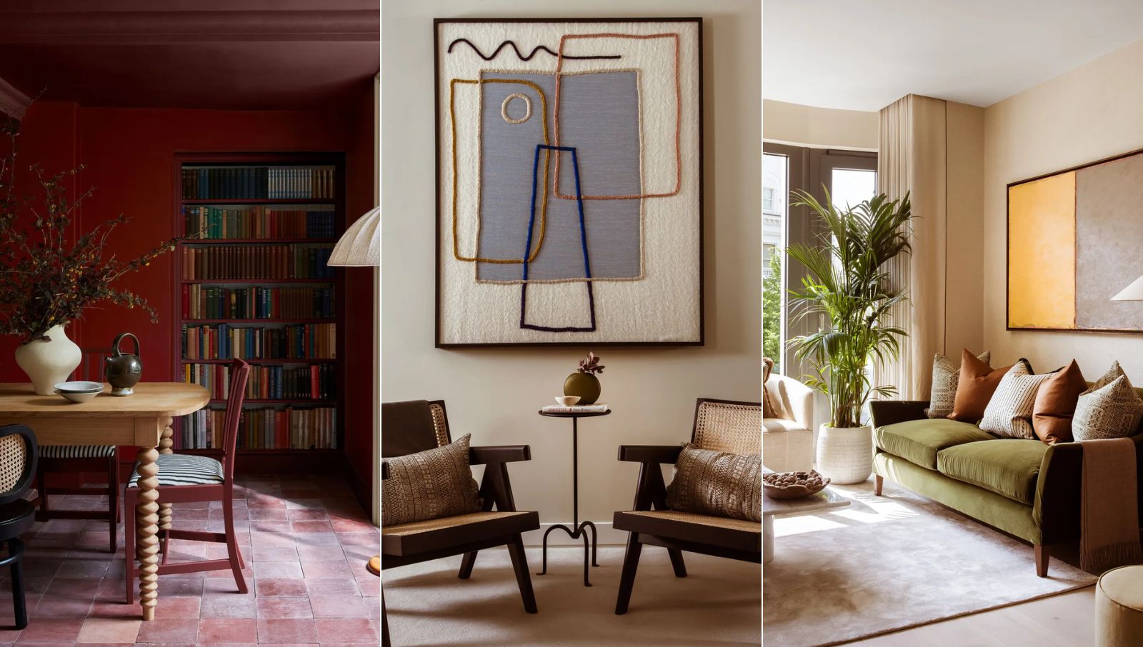
Each time I visit a new country or city, I like to take note of the many interior design styles I can spot. Home decor is my kryptonite, after all.
I am also naturally partial to a bit of shopping, but I also consider myself a conscious shopper, never wanting my home decor ideas to feel overly trend-led or too frivolous. Because of this, I find it particularly useful to keep an eye out for any interior decor trends that are timeless, and classic – ones that will have longevity.
I must admit, I didn't know much about the Belgium design scene before my visit. Axel Vervoordt is usually my go-to inspiration when thinking about the Belgium style. However, I'm newly inspired to welcome in some of the capsule staples I spotted over again in the Belgium city of Antwerp – a creative city with a profound arts and cultural scene. I implore you to visit this great city if you are ever in Europe.
In the three or so days I spent there, I kept seeing the same decorating ideas and styles crop up. So below, I've charted the five key interior design trends that are currently worth knowing about, and I predict that will be everlasting.
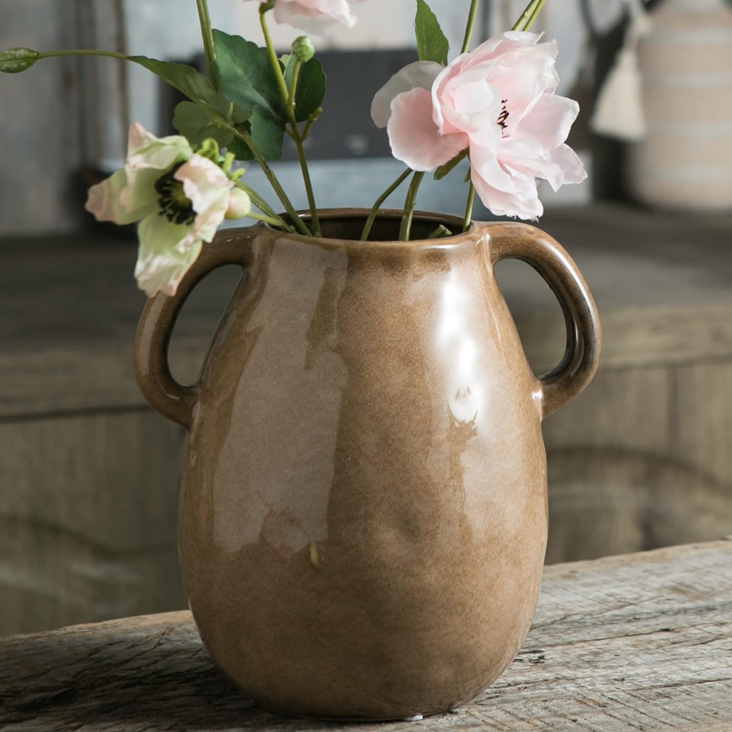
1. Warm, rich colors
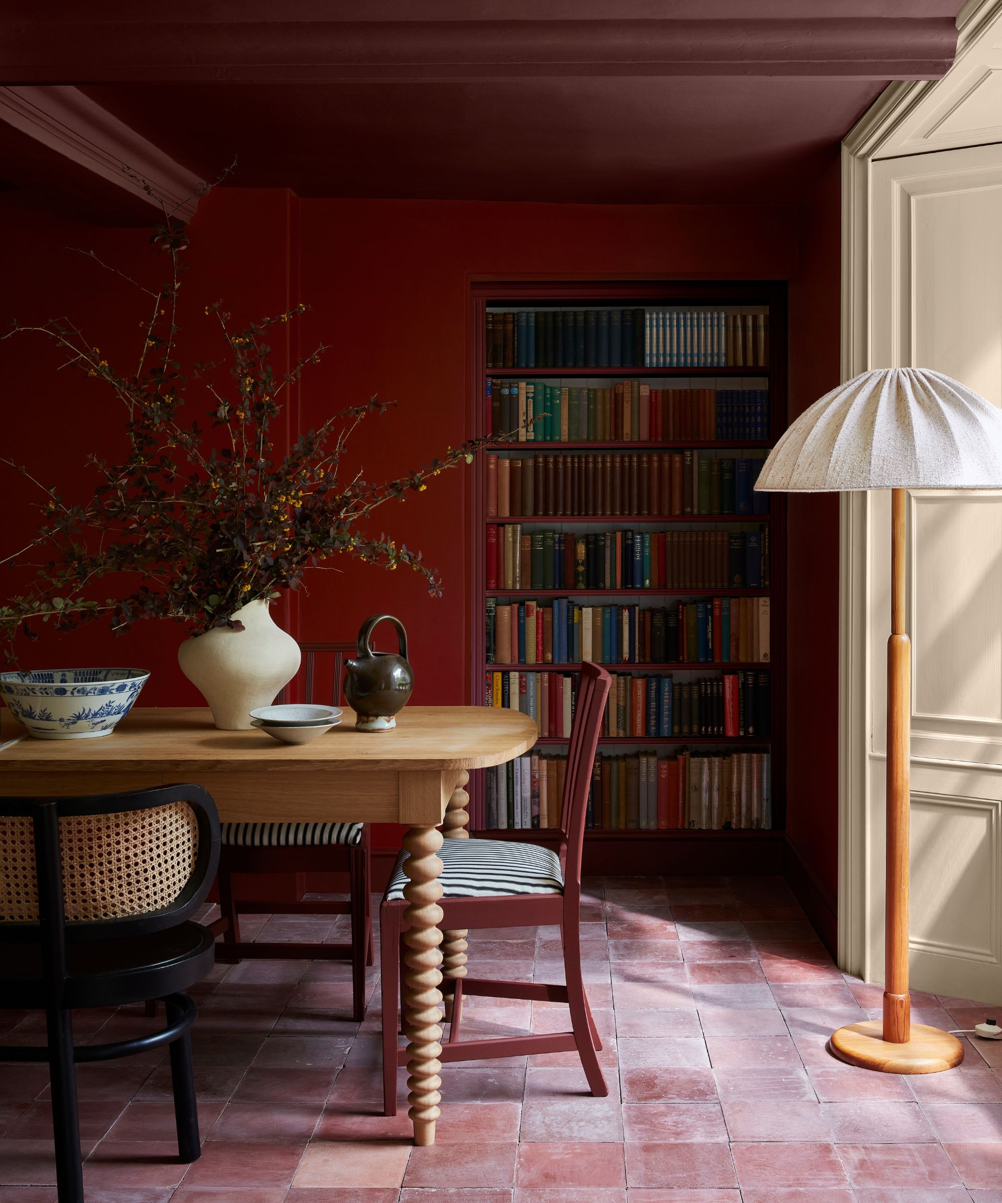
A warm, rich, nature-inspired color palette is the room color idea of choice for many in Belgium.
Offering myriad warm hues that sit harmoniously together, the fall-inspired Belgium color palette is loved by designers for its ability to create relaxed, grounding spaces with enduring appeal.
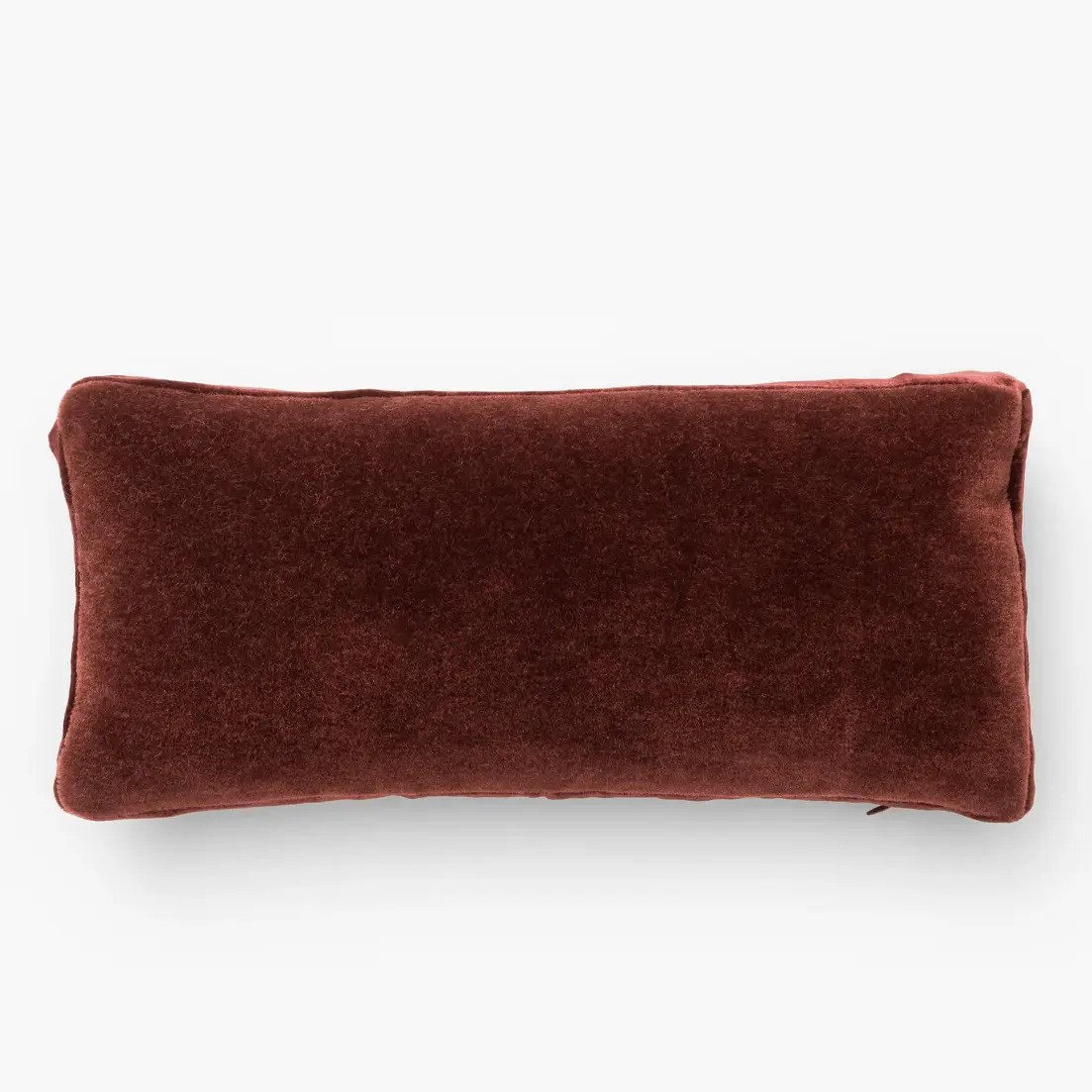
Colors of rust, terracotta, stone, taupe and umber give interiors a calmness and a feeling of serenity. They sit back in a room and don’t jump out at you,’ explains fabric designer Vanessa Arbuthnott.
‘Natural colors go beyond the neutral palette of off-whites and soft browns – this warm color palette presents us with an array of glorious rusty reds, dusty pinks and ochre yellows that naturally pair well together,’ adds Sue Jones, creative director and co-founder of Oka.
In the space above, Little Greene's Theatre Red is the color of choice for fall/winter 2024.
2. One statement focal point
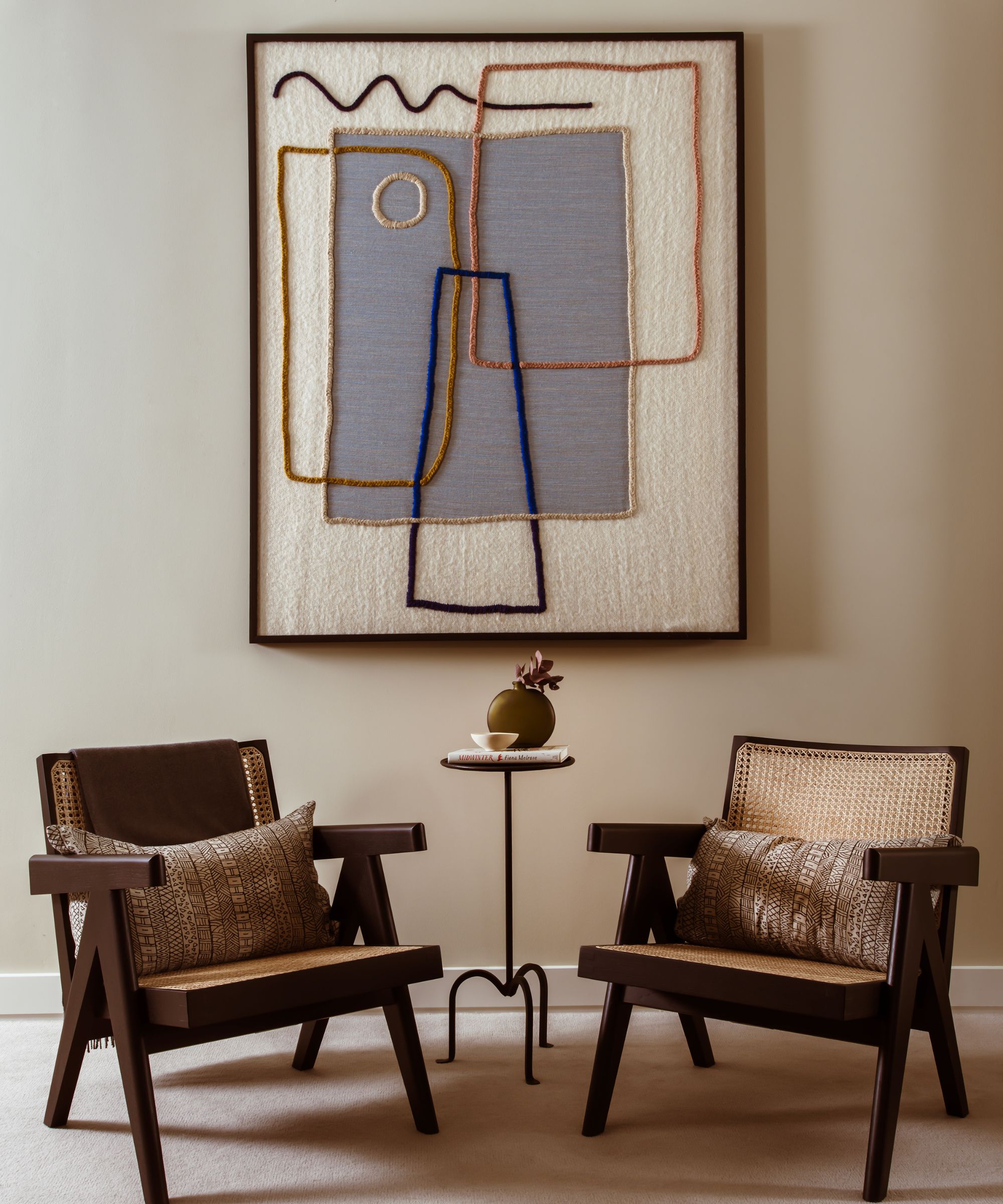
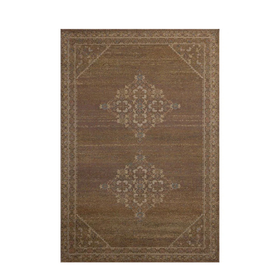
Every room needs a focal point; a place in which the eye is drawn into the beauty and depth of a scheme.
Also known as emphasis, a focal point is an important basic interior design rule that helps bring attention to specific parts of a room, crafting one strong focal point can uplift a scheme with eye-catching visual interest and memorable character.
You can create emphasis through furniture, lighting, color, pattern, texture and shape, decorative accents, and architectural elements, and the key is to use these design features to create a point of focus in a space.
My favorite, and perhaps the easiest way, is by decorating with art. A single piece of art can also help define a space. It serves as a handy visual device within a room – to draw the eye to a certain area. It can also create a narrative that dictates the color or style of the rest of the space.
3. Low-key luxe textures
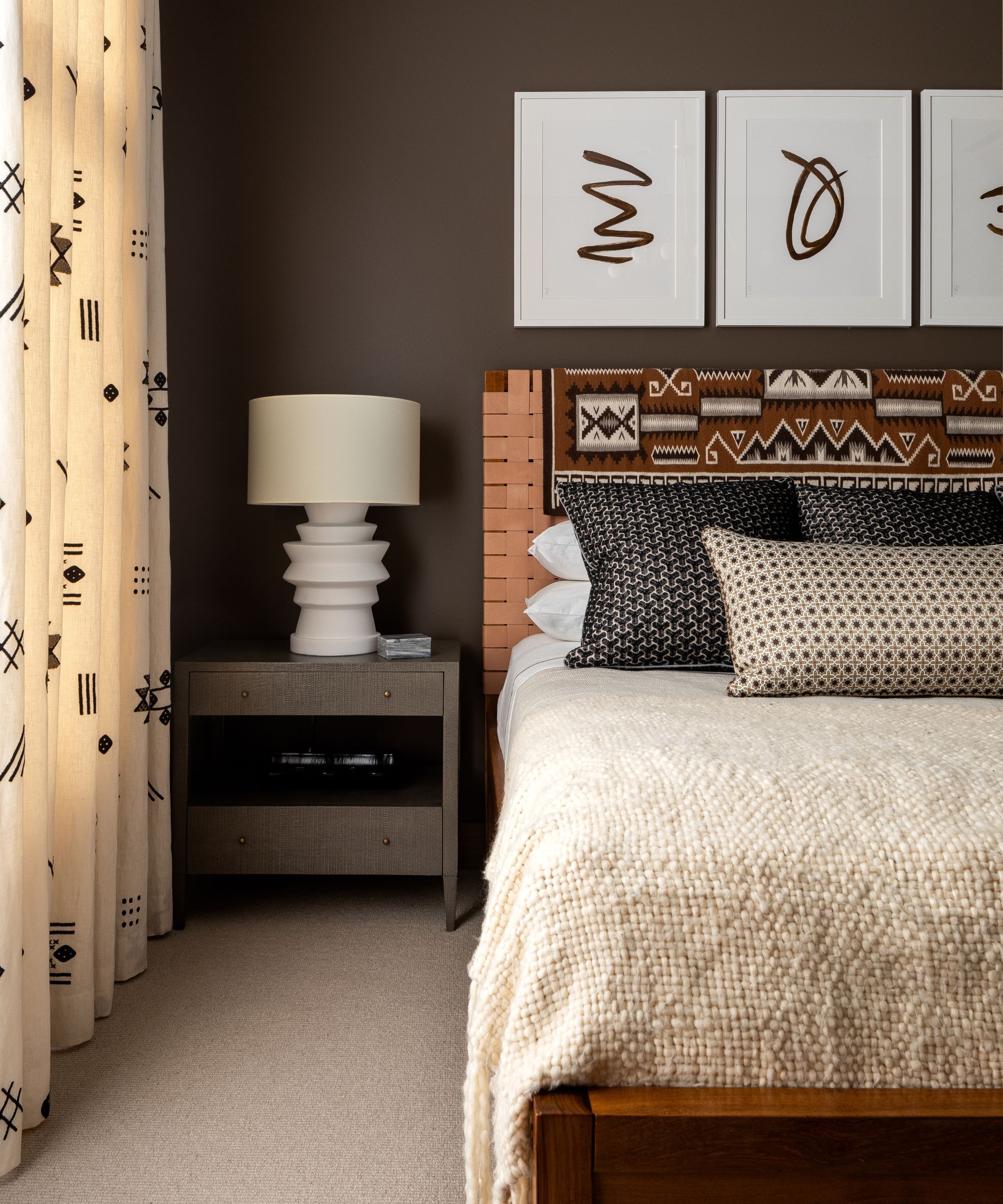
If there is only one 'trend' that you take away from this list, it is this one. Using texture in interior design is the best way to take a space from drab to fab. It is a notion that will continue to ring true forever.
Creating texture is not simply just about how decor and soft furnishings feel, but it's also about 'visual texture' – using different materials to add interest and breathe life into a room. The Belgians understand this concept perfectly.
Quite simply, without texture, a space will fall flat. It's crucial to look at the room as a whole and bring an area together with mixed materials for vibrancy and warmth. It's a way of adding depth and dimension to a room as well as comfort.
Tiffany Leigh, of Tiffany Leigh Design, explains: 'Texture is all about creating tactile moments that invite touch. It refers to the feel, appearance or consistency of a surface or material. Textures help to keep a space from feeling flat or one dimensional.'
The simplest way to do this is by layering. Layering textures helps to add depth too. 'The layering of materials, colors and shapes all amount to give your interiors an overall texture which can define the look and feel of a space,' says Martin Waller, co-founder of Andrew Martin.
For a multi-layered look, tactile weaves like bouclé look amazing when layered against the luxurious feel of silk or rough-hewn timber to give a room some depth and a sense of history.
4. Belgium minimalism
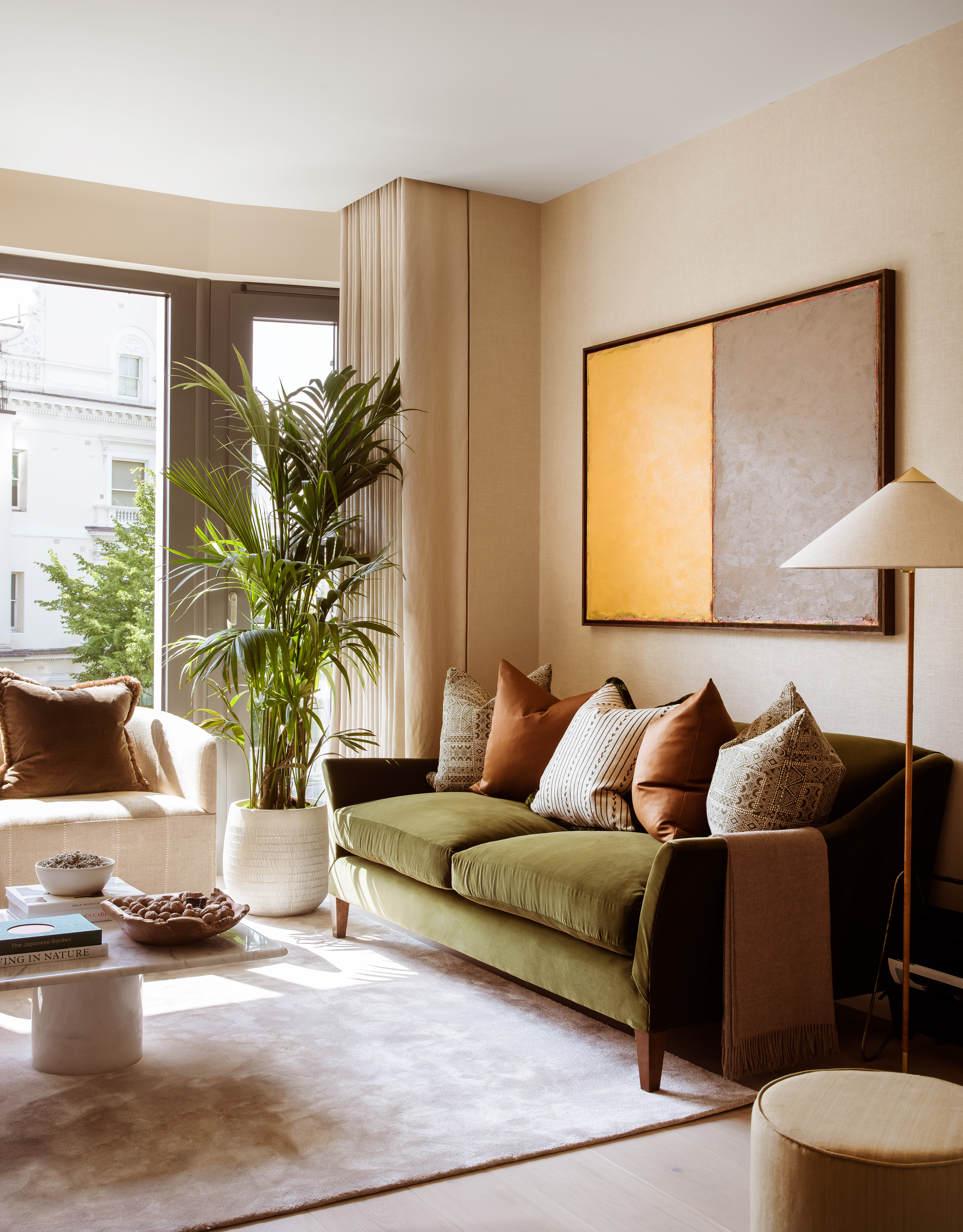
The minimalist trend has been around for a long time, and the design-conscious Belgians take it very seriously. However, their version is much warmer and welcoming.
Unlike its colder, more clinical sister, a warm minimalist interior promises to exude more character and comfort into a clean and functional space.
The easiest way to achieve this look, as design firm Albion Nord has done, is to mimic nature at its finest. Inspired by colors from the natural world, warm minimalism adds a gentle and soothing touch to interiors that can be layered with textures and tones to ebb and flow with the seasons.
There are so many wonderful benefits to opting for a minimalist aesthetic. A pared-back scheme is rooted in the principle of ridding your home of clutter. It is about harnessing the power of a 'clean' space that is not only easy-on-the-eye, but one that is restful, contemporary and purse-friendly. It's not a simple as 'less is more', it is more about 'less but better quality, more texture and biophilic color.'
5. Well-dressed windows
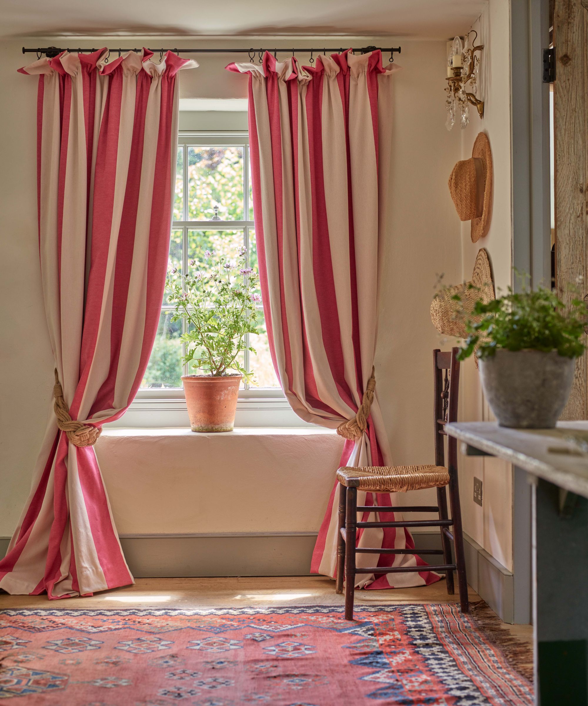
Beautiful window treatment ideas are integral to the way a room feels and functions. Providing control over light and privacy, as well as an extra layer of insulation, blinds and shutters are practical yet beautiful solutions.
Curtains have an integral role to play – beyond just that of decorative – as they keep the warmth in and absorb sound. Curtains are an investment, and many Belgium homeowners will often spend more to get it right, according to interior designers. In terms of design, curtains can bridge the gap between traditional and contemporary – it all pivots on factors such as the fabric chosen, the type of pleat, the way they are lined (or not) and how they hang. 'Beautiful handmade curtains, heavily interlined, will look wonderful for many years to come,' says designer Susie Watson.
Having them made-to-measure is the best way to ensure they perform effectively – something many designers and homeowners take seriously in Belgium. Many companies offer an in-home measuring and fitting service. If buying online, you can do this yourself, but precision is key.
I also noticed many homes also had shutters as well as curtains. Styles varied but cafe style was the most notable. A cafe-style half-height shutter offers privacy while still letting plenty of light in. However, traditional solid shutters (seen more commonly in American homes) are great for noise and heat insulation, but be aware that they lack the flexibility of louvered or tier-on-tier designs.


