We humans love our furry, scaly and feathered friends, but when it comes to pet products, design isn't often at the forefront of our minds. Recently, pet brand Omlet has flipped the script, undergoing a stylish rebrand that puts pets at the forefront of its branding.
With playful graphics, colourful character and a pioneering brand initiative, Omlet's contemporary refresh is a shining example of thoughtful innovation and standout packaging design. It marks a modern shift in the marketing of pet products and restores my faith that branding can still be vibrant, fun and delightfully creative.
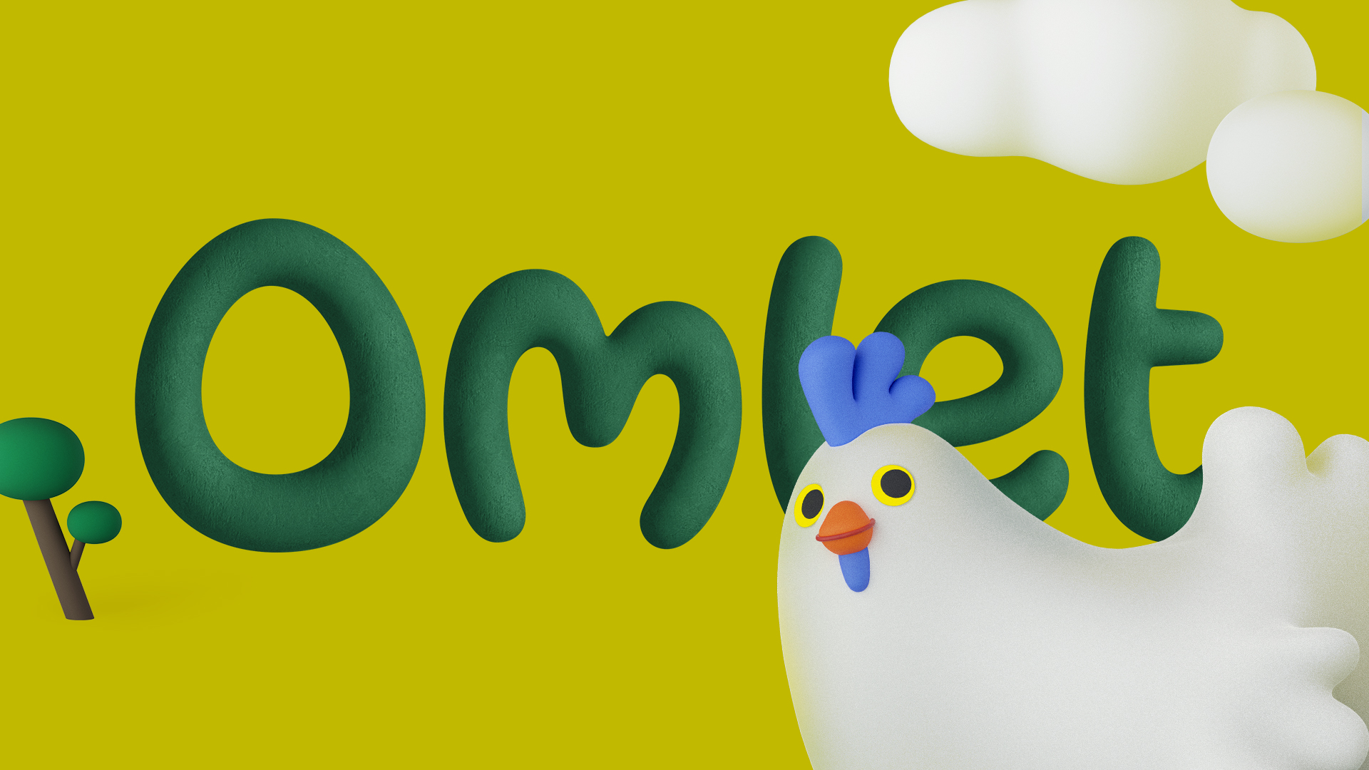
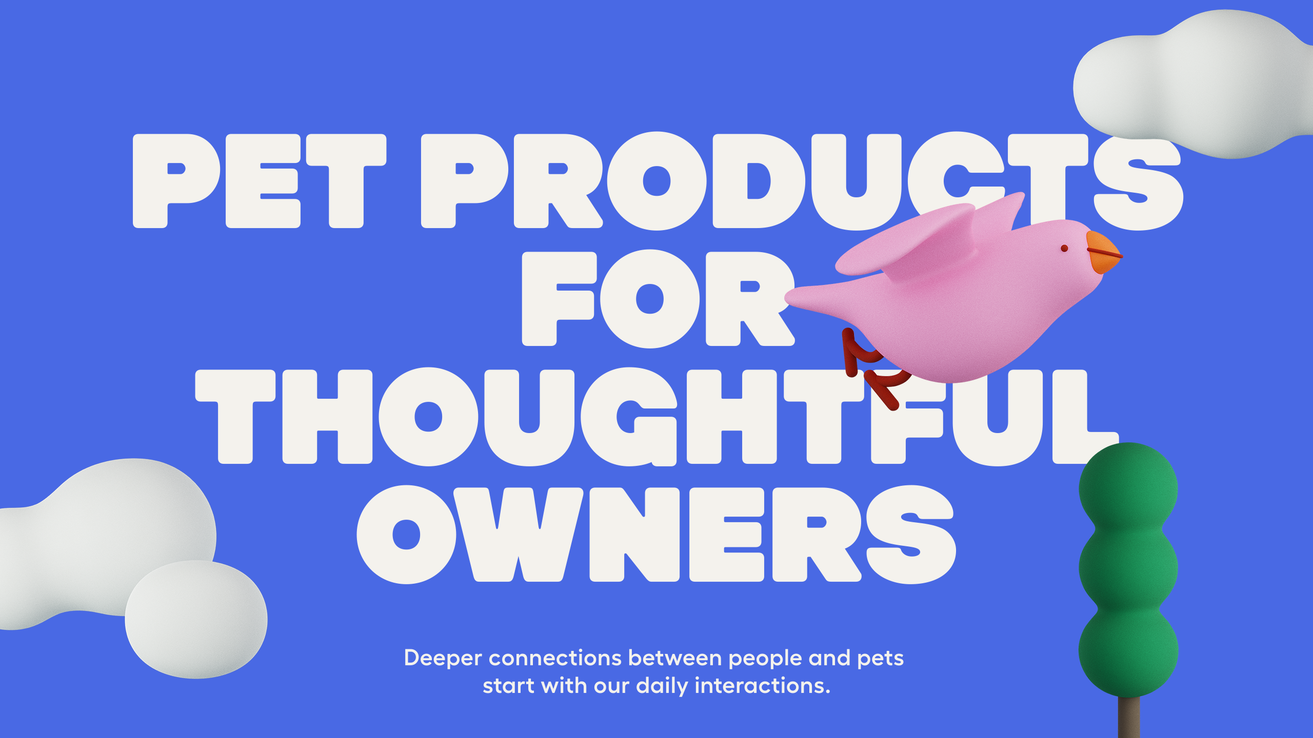
Created by branding agency Ragged Edge, the rebrand aims to capture Omlet's mission to prioritise the needs of pets over humans. The animal-guided design is reflected through the rebrand's playful assets – particularly the introduction of a new 3D illustrative style that mimics the brand's playful approach.
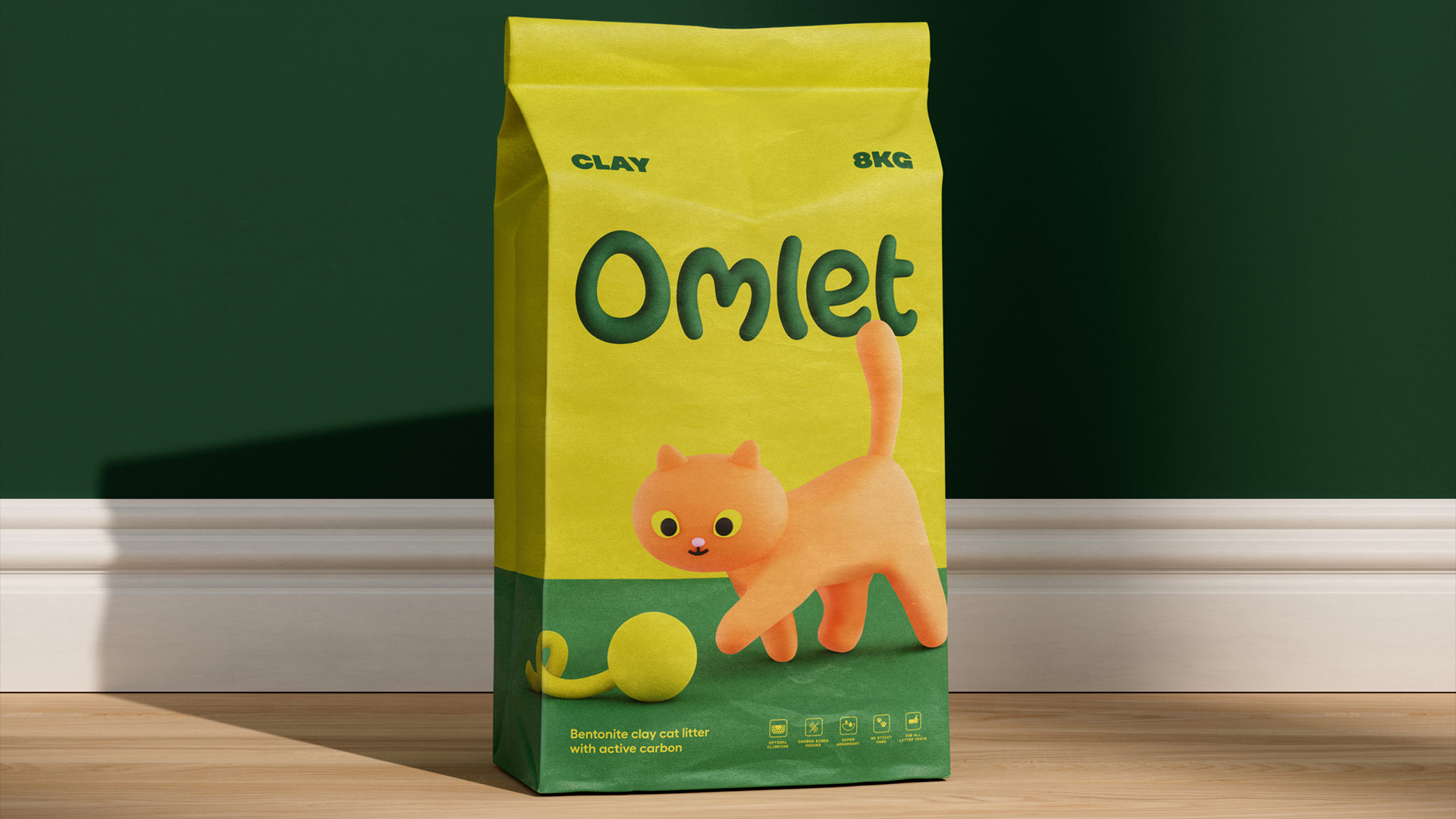
The tactile illustrations not only represent the brand's ethos figuratively but also in a material sense. Max Ottignon, co-founder of Ragged Edge told Creative Bloq that "the forms and textures of the illustrations mirror the products themselves," resulting in an "exaggerated" sprightly illustrative design that embraces imperfection. "We wanted the illustrations to echo the solidity and roundness of their products but also the weirdness of each animal we build for," he adds.
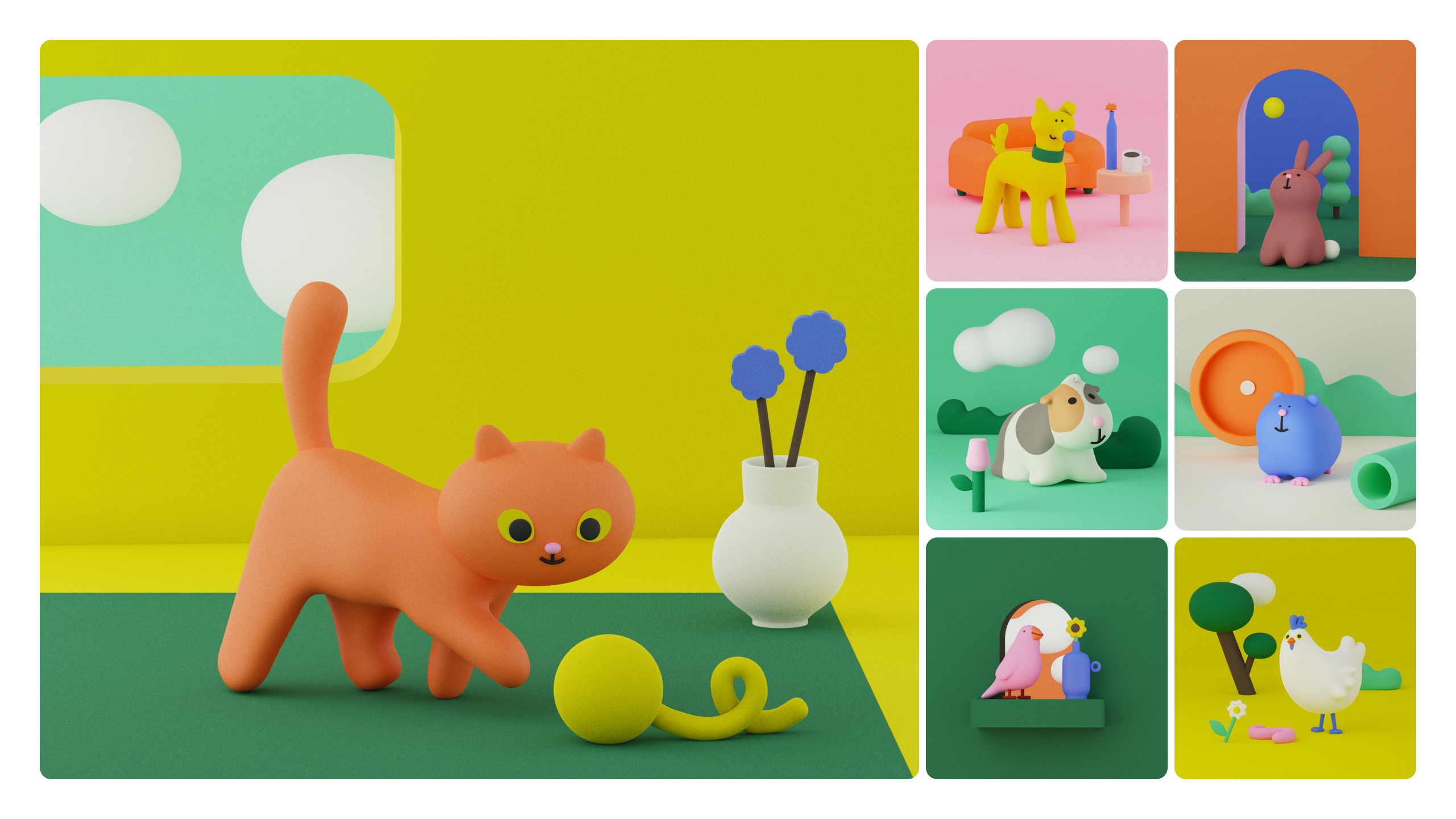
To Ottignon, the 3D assets were the most exciting part of the rebrand, created in collaboration with illustrator Holly Szczypka and animator Adam Garbutt. In the search to design the perfect Omlet chicken, the team landed on the "charmingly wonky" Barbara, who served as a launchpad to create more delightfully curious creatures. The colour palette is earthy yet bright, combining the habitats of pets in and out of the home to dismantle the domesticity of competitor brands.
Omlet's new identity is equally shaped by its headline typeface, which mimics the organic shape of the character design and captures the witty yet inquisitive tone of the branding, "The questioning nature of the identity, and particularly the tone of voice, brings Omlet’s design approach to the fore," says Ottignon. "Most pet product brands don’t have a strong point of view, and the whole category has become fairly commoditised," he adds, making Omlet's unique identity instantly recognisable.
In a press release, Omlet co-founder Johannes Paul said, "The new Omlet brand propels us toward a future that celebrates the bond between pets and people, challenging people’s assumptions about pet ownership around the world.” The design system will be implemented across Omlet's products and online platforms, injecting the market with a stylish and contemporary distinctiveness that's delightfully original.
To find out more, visit the Ragged Edge website and for more brilliant design, check out the design agency's ingenious insurance rebrand.