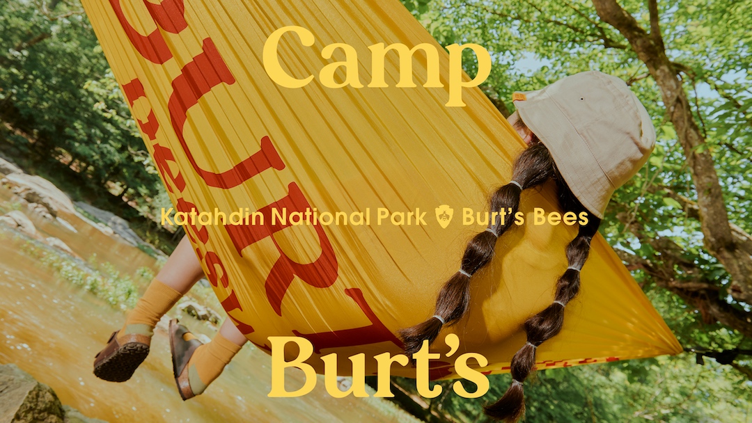
Personal care brand Burt's Bees has unveiled a delightfully retro campaign in celebration of its 40th-anniversary collection. With a selection of stylish clothing and accessory options, the merch drop echoes an endless summer vibe with a playful '80s camp couture twist.
When we think of iconic brands, often our minds will revert to minimalist timeless design and clean-cut graphics, yet Burt's Bees' wholesome campaign bucks the trends with its organic and rustic style. It's a design that feels both nostalgic and contemporary, reinventing the aesthetics of the past to create a warm and welcoming homage to its heritage.
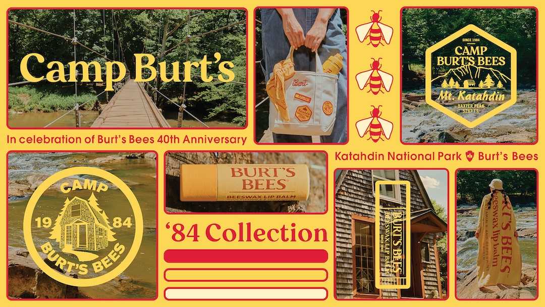
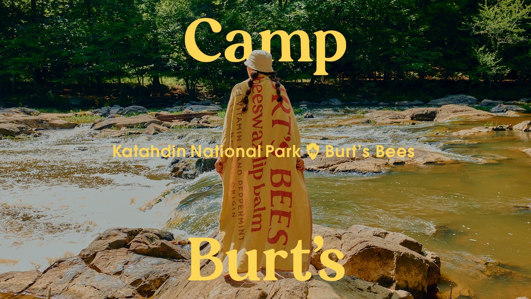
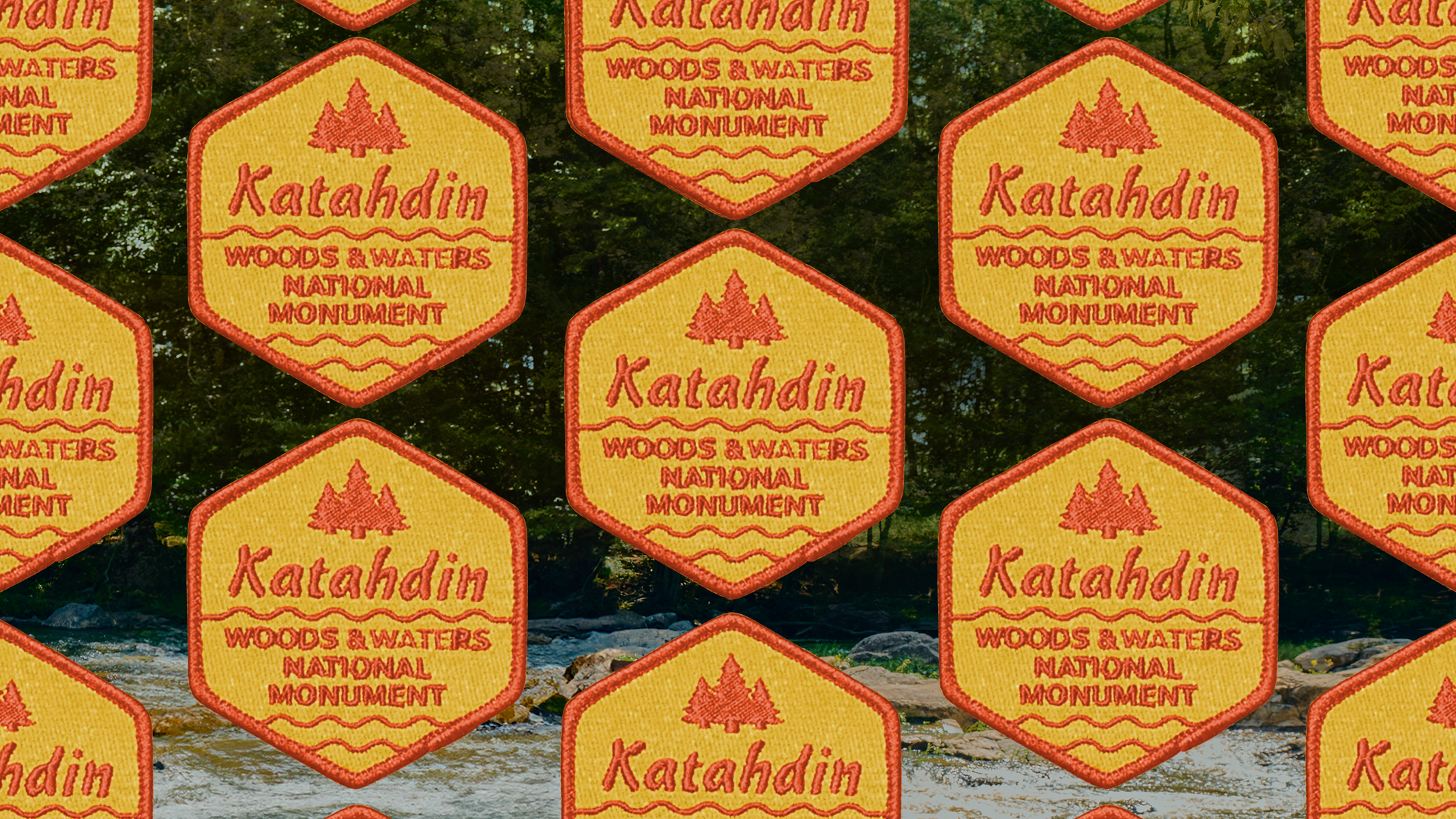
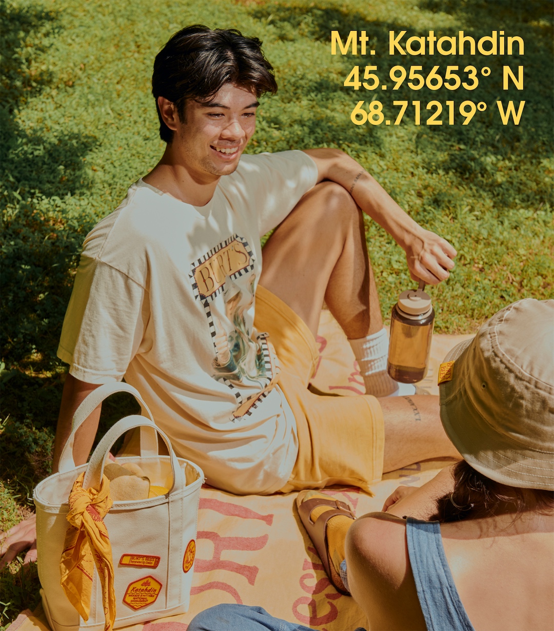
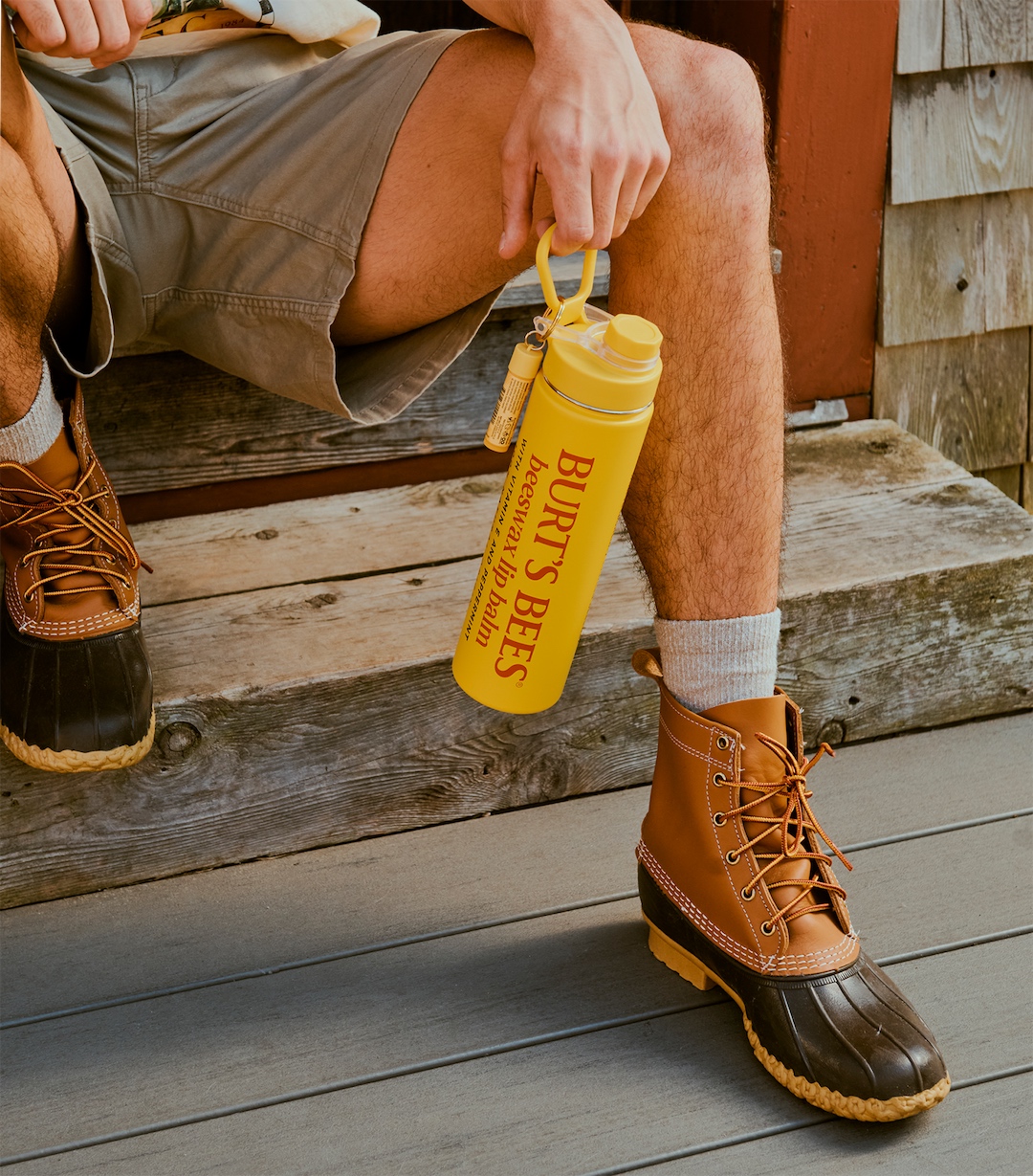
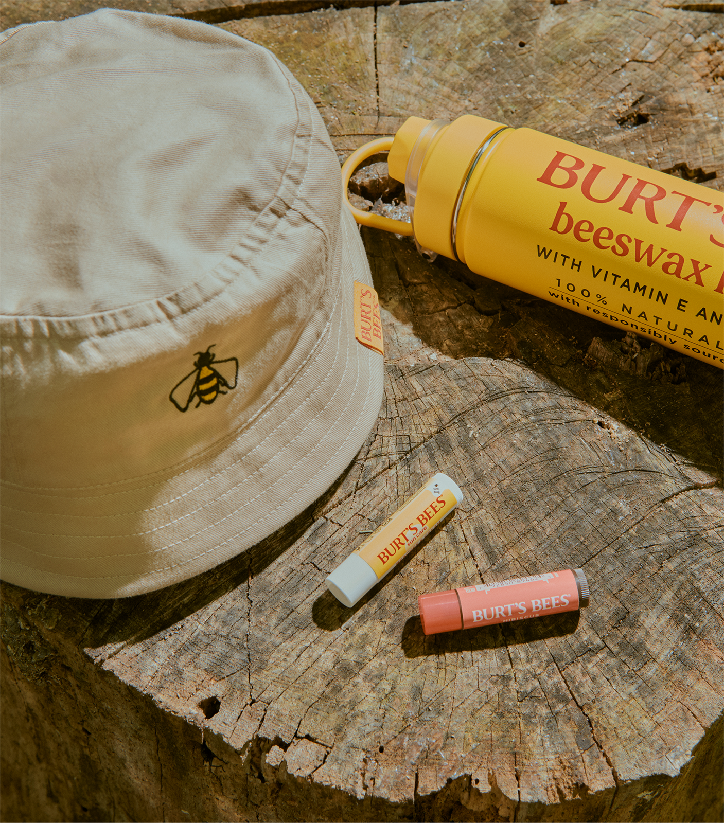
Created in collaboration with design agency Tavern, Camp Burt's Summer of '84 collection is a celebration of the brand's partnership with Katahdin Woods and Waters National Monument. The limited edition merch features vintage tees and bucket hats, as well as outdoorsy accessories like a custom towel, a hammock, and even a water bottle inspired by the brand's iconic red and yellow chapstick design.
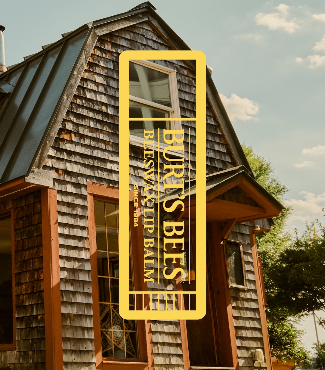
Across the campaign, the nostalgic visuals echo a rustic '80s summer camp aesthetic, with retro typography and charming camp cabin illustrations. Gestures to the Burt's Bees brand appear in the logo design, which features a subtle honeycomb-shaped frame made to resemble an embroidered camp patch. The yellow colour palette brings a palpable warmth to the design, giving the campaign a bespoke, natural appeal that radiates sunshine and positivity.
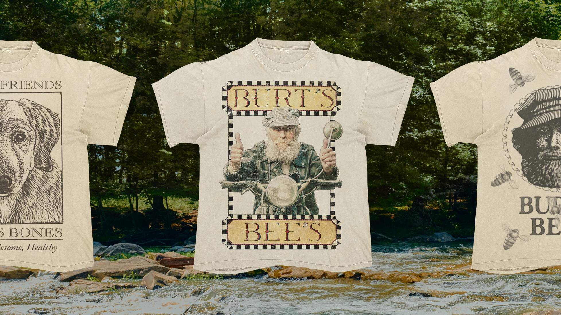
According to Tavern's case study, the design takes the brand "back to its roots" as "each piece in the collection borrows its inspiration from vintage design sourced from the brand’s archives." Featuring photography assets taken at founder Burt Shavitz's original cabin, the campaign is a celebration of heritage and a masterful example of idyllic back-to-nature branding.

For more design inspiration, check out the stunning national park rebrand by How&How that's packed with natural symbolism. If you're after more beautiful branding, check out the new National Landscapes rebrand that celebrates the delightfully imperfect world of the great outdoors.