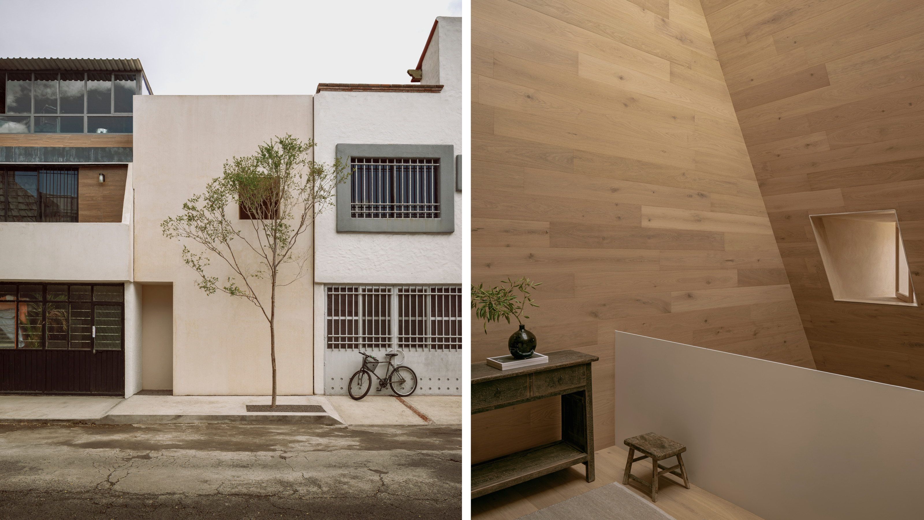
A compact puzzle box of a house, the 54 sq m of Casa Emma is a tightly plotted series of spaces that belie its modest external presentation. HW Studio, led by Rogelio Vallejo Bores working with Oscar Didier Ascencio Castro and Nik Zaret Cervantes Ordaz, approached this small terrace house in Morelia, in the western Mexican state of Michoacán, with several influences in mind. First up was Eduardo Souto de Moura’s Casa das Histórias Paula Rego, just outside Lisbon.
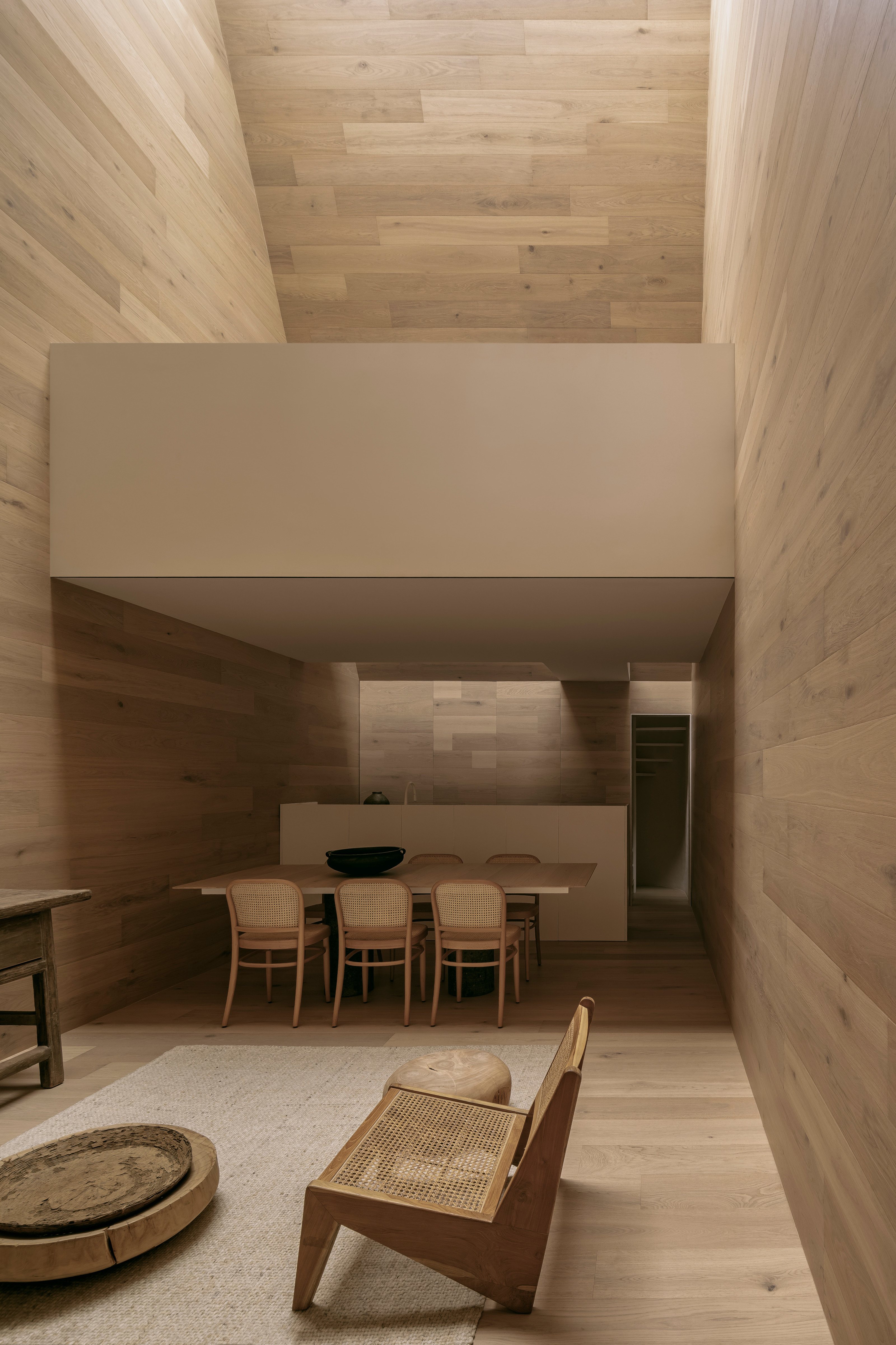
Step inside Casa Emma
‘Beneath one of the pyramids, [we] were enveloped by a sense of awe and indescribable serenity,’ they say, describing how the Portuguese architect manipulated the way light entered the galleries. ‘Light filtered gently through a high skylight, cascading like golden rays on the museum’s surfaces. It felt as if every corner of the building was bathed in soft, velvety, warm light that touched everything and brought it to life.’
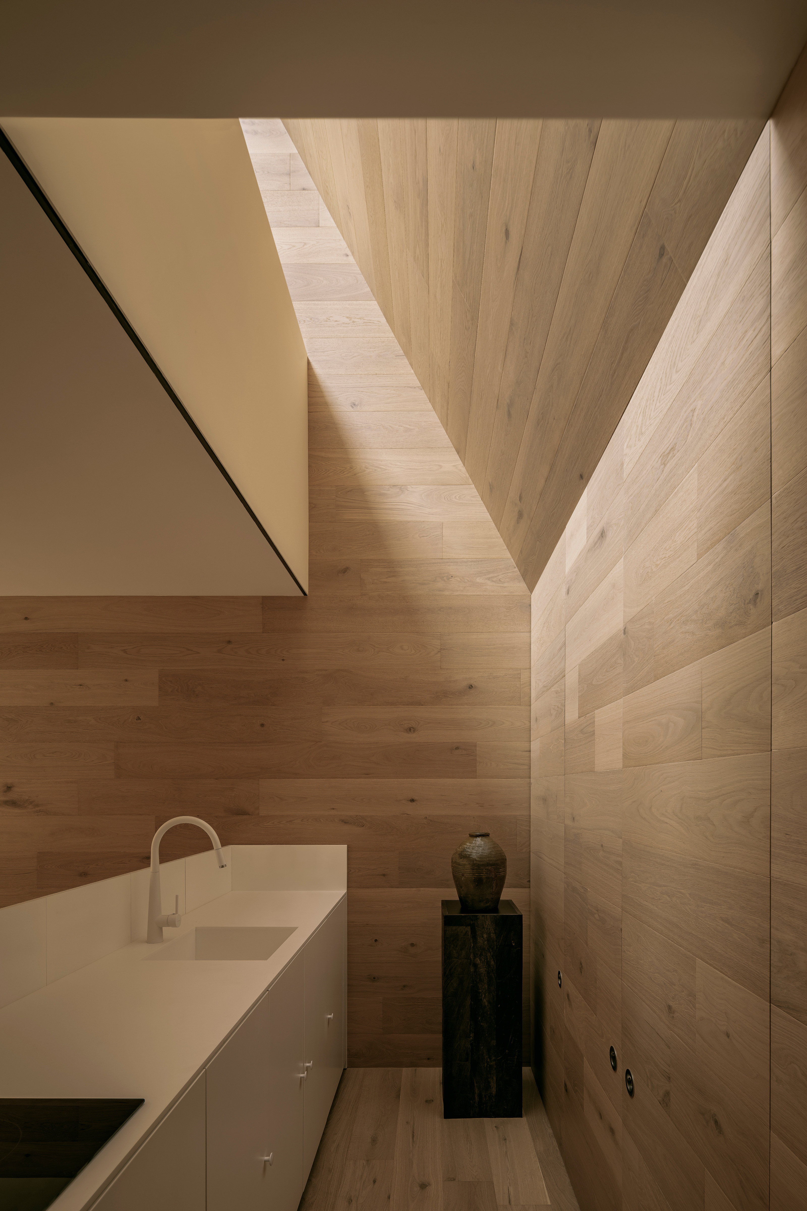
A gallery devoted to one of the great modern painters is a very different proposition to a small family house, but this ethos of calm was the overriding quality HW Studio sought to bring to the project. Casa Emma is a concrete and masonry shell plastered with the vernacular natural coating known as chukum, made using resin from the chukum tree mixed with water and stone powder, to create a monolithic, mysterious exterior.
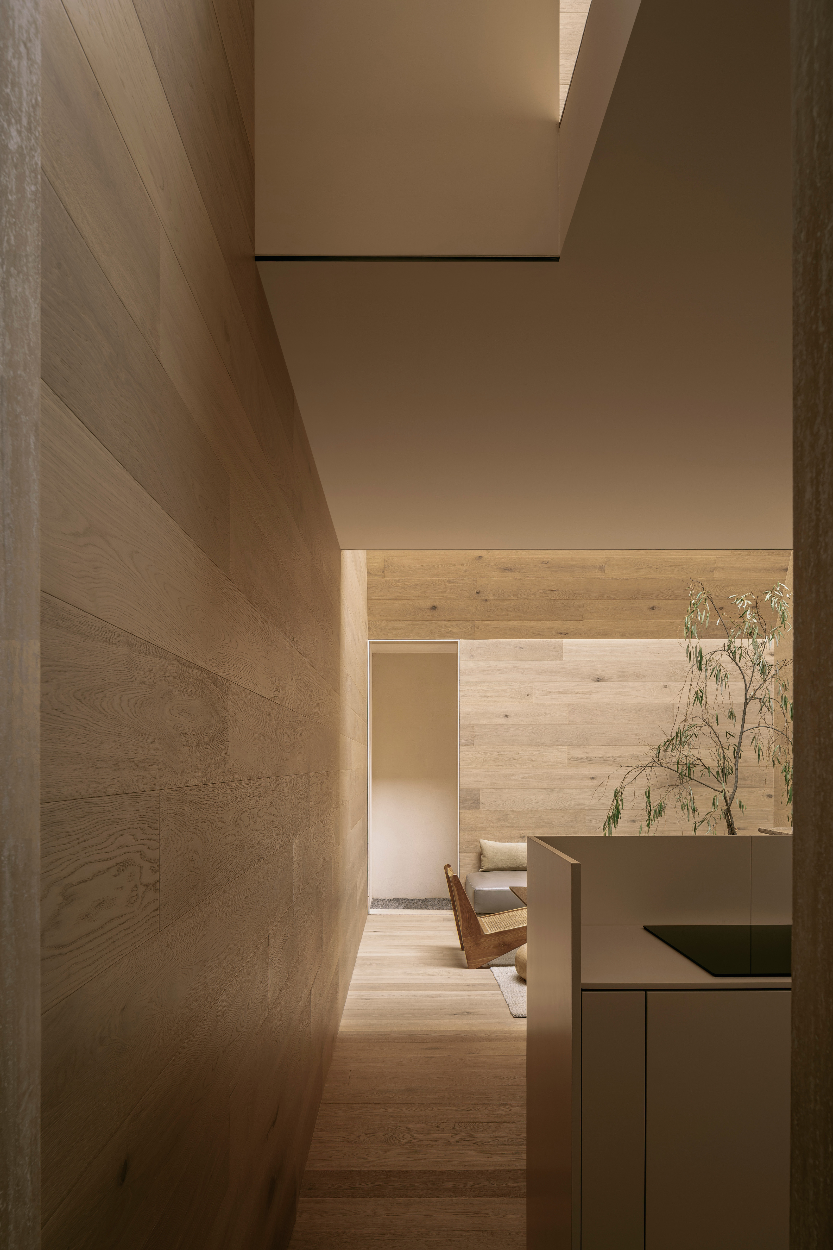
Inside, the primarily top lit space is clad throughout in engineered wooden, with chukum finishes in the entrance way and bathroom. It gives the impression of being inside a piece of furniture, a sense enhanced by the relatively tight dimensions, sharply cut angles and feeling of descending into drawers within drawers. The other guiding light was the simple, rough carpentry of the traditional granary structure, the Troje, developed by the pre-Columbian Purépecha people.
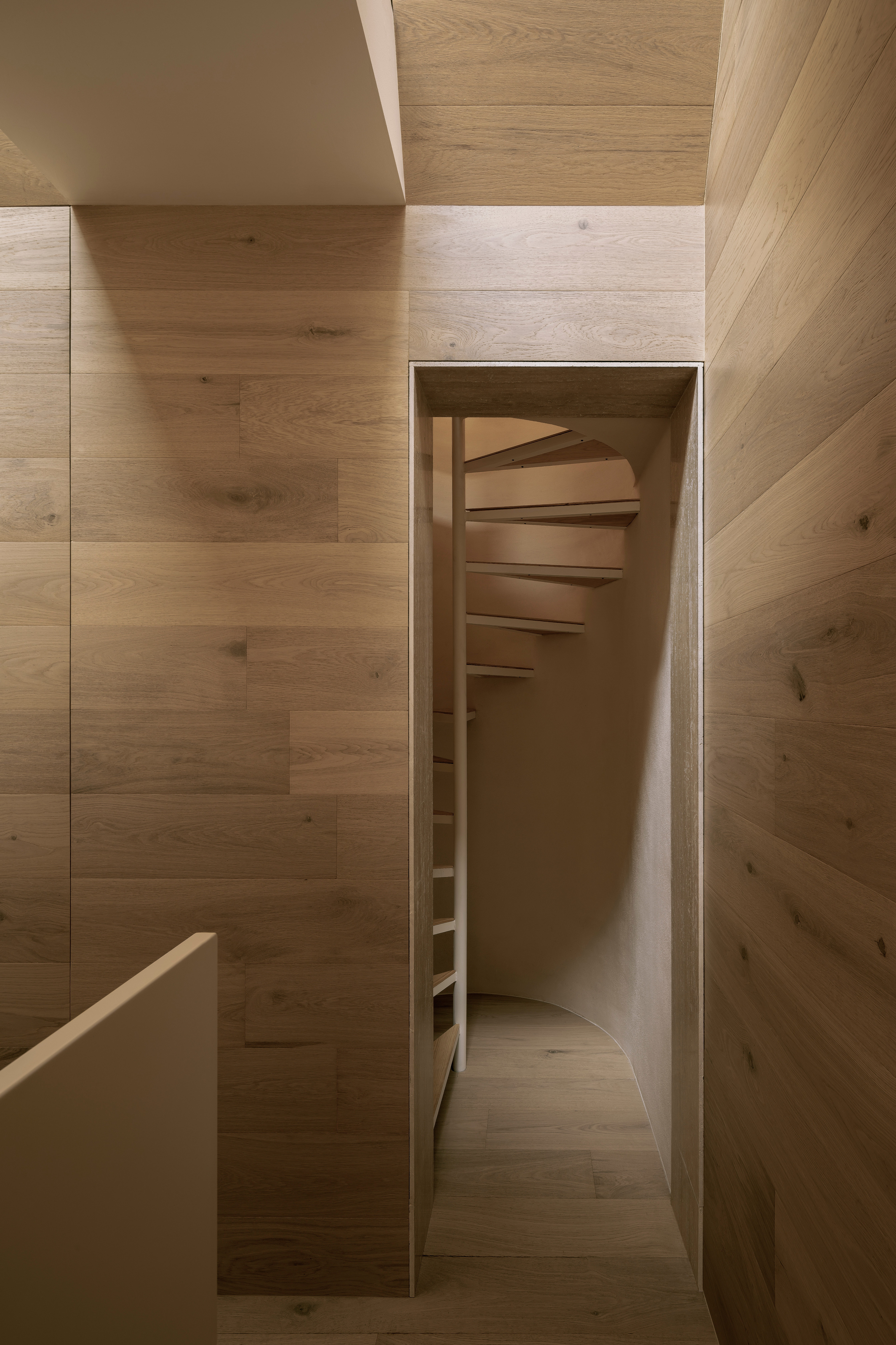
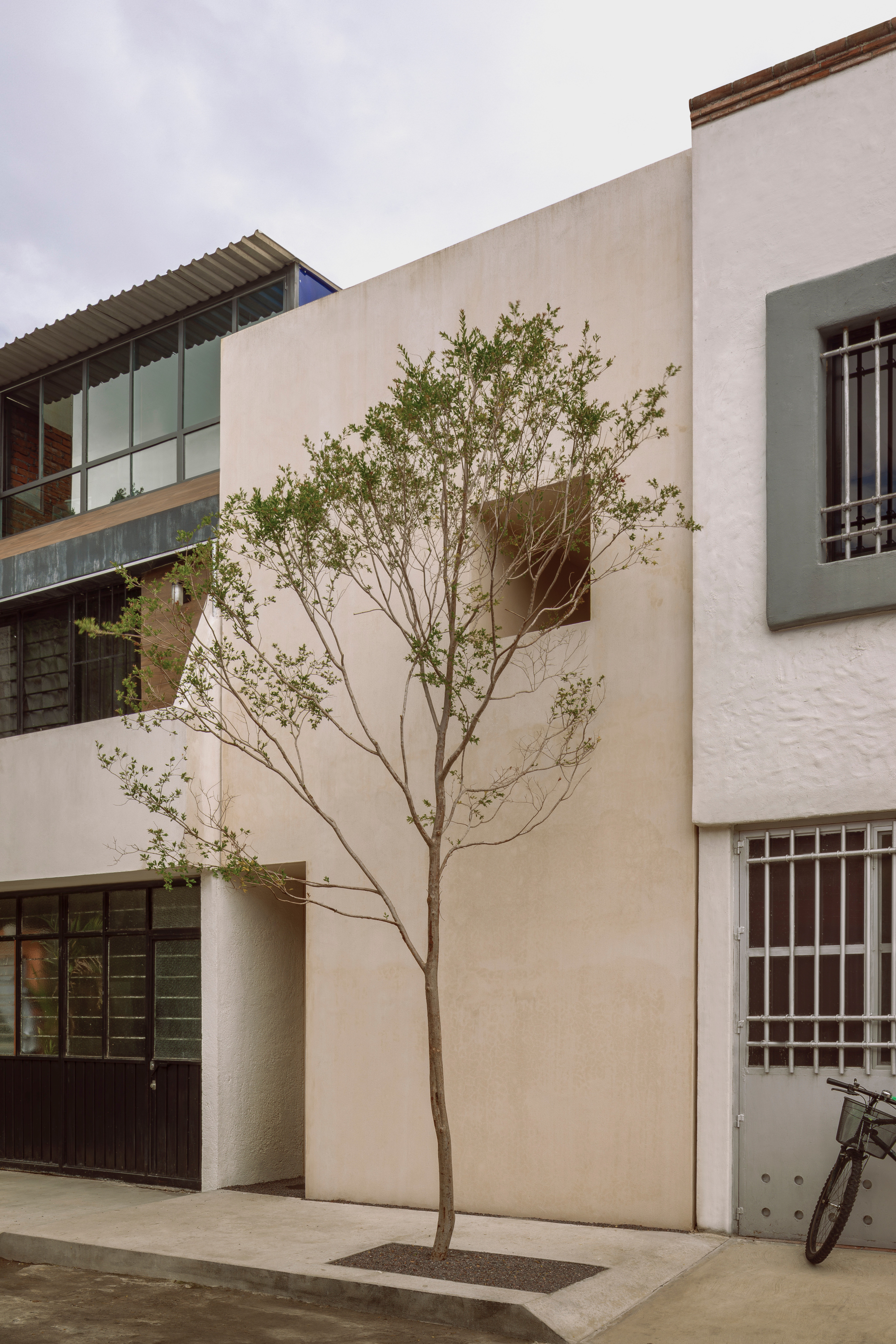
At just 4m x 10m wide, the tight plot set the architects many constraints. The design strategy treated the house as if it were a solid mass, with the façade giving way to an interior that had been carved out from within. From the street, there is no sense of the steeply sloping roof structure, or the skylights, with just a front door and a single square window with deep reveal that appears to puncture the façade.
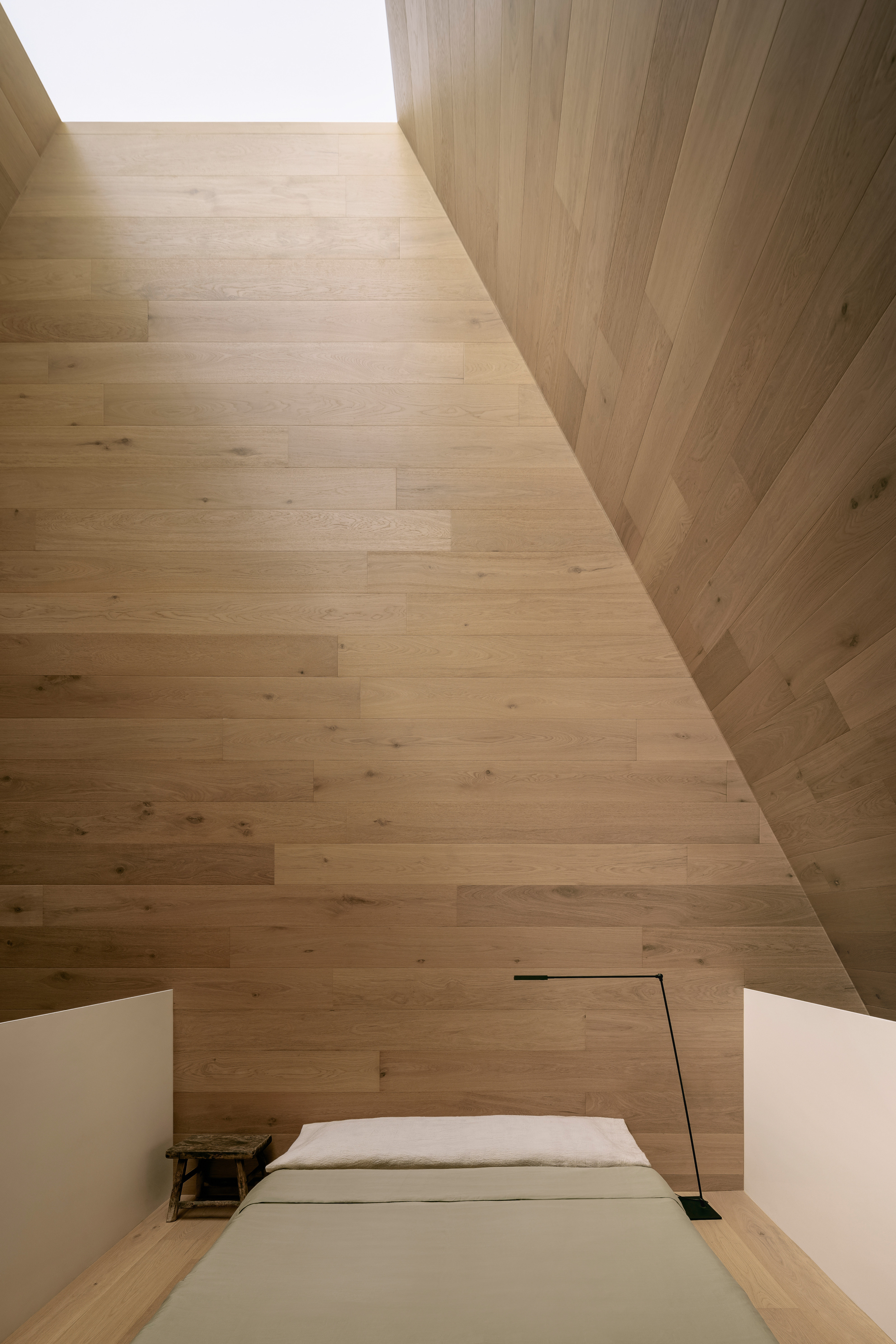
The front door leads down an access corridor that kinks back and forth as it leads the main living space, with a kitchen and dining area set at the rear of the site, with utility areas and spiral staircase beyond. This leads up to the mezzanine level, where a solitary bedroom sits beneath the skylight. Here there’s a shift in materiality, with slender white balustrades replacing the solidity of the wood.
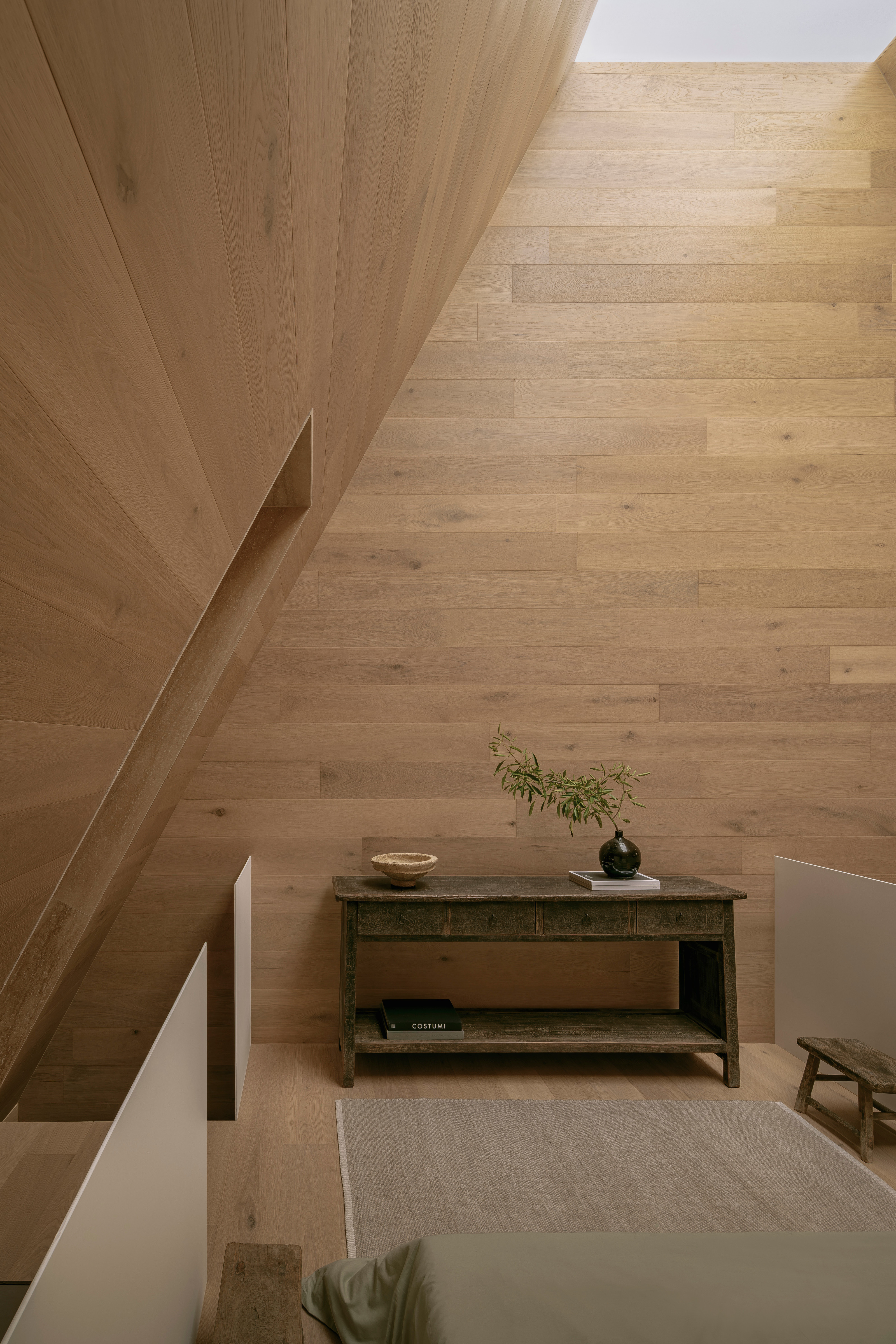
The architects describe the bedroom as a ‘white volume that floats within the house’, with material that ‘aims to blur its presence or make it appear lighter, as if it were a piece of cotton floating in space’. On this level, the rear utility wall conceals a small bathroom whilst the spiral stair continues onto a roof terrace located at the rear of the property.
The relatively low cost of the project is a far cry from the monumental modern mansions being built elsewhere in Mexico. The studio gave itself a name that embraced both aspects of its approach – ‘The letter H is considered the silent letter in Spanish, thus graphically representing silence; the letter W comes from the Japanese tea ceremony, Wabi-cha.’
Every HW Studio project encompasses what the architects describe as ‘the three universes’, ‘the universe of the future inhabitant, the universe of the place, and our own inner universe as designers’. Shaping an almost spiritual interior space from a humble terrace house epitomises their approach.


