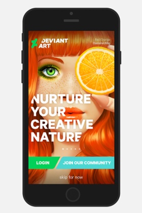
DeviantArt (DA), the online art gallery and community, developed its first official mobile app as part of a journey that began with a rebrand to reflect how our community of 33.8 million registered members has changed and evolved over our 14-year lifespan. Our 65 million unique monthly visitors generate 2.5bn monthly views to more than 300m original artworks. With more than 2,500 self-defined art categories and such a broad variety of use cases among those accessing the website, creating an app that packed all of that into one easy-to-use and navigate app was no easy task.
Successful image-based apps are easy to use and have a clear and mostly singular function, such as Snapchat, Instagram or Vine. The presentation of art, however, requires a less “instant” approach. An artwork is a considered offering that reflects the personhood of the artist. In a special sense, the artwork also belongs to the public for display and not just as a fleeting communication.
During the rebrand process, we were fortunate to create a formal identification of a number of “persona” who use and rely on DA. They became the purpose of the app design: to produce a valuable user experience for each of them.
Initial user testing found that traditional content feeds on mobile often forced users to move too quickly and imposed image grids that were too uniform. The art on DA varies by subject, style, medium, size, aspect ratio, colour and encompasses works as tiny as an emoticon to those that have no visual prompt, such as literature. Our solution was a fresh design we called “torpedo grid”, which allows for minimal cropping of the art. This design would cause the variety of image sizes to natively align (ie they “fit” together seamlessly). It also had the effect of slowing down the speed of users as they swipe through the grid, which gives the app a sense of moving through a designed space, like a series of real-life galleries.
We think of the way users engage with the app as experience layers. The first layer is a simple browse experience, for users who want to make quick and frequent visits to find new art and artists. The entire collection on DA is made available and each image provides details about the artist and the work. The next layer is collections and editorial content about the artists and works on DA, made accessible through a curated “today” page, complete with categories and themes. The app also contains a hold function, which means users can pause over any image, and the app will show them “more like this” – an algorithmic selection of similar works based on the combined aesthetic intelligence of the collections made by members.
For frequent users, the app lets you drill down into the artist profile pages and to an artist’s full portfolio of galleries. This capability was also critical to artist members of the site, who intend to use the app as a presentation tool on mobile devices. Artists told us in testing that they needed the ability to really look at the works – to appreciate the technique, even if it was on a small mobile screen, so we added an enhanced zoom capability and higher resolution images.
Members of the website can use the mobile device camera and submit directly to their accounts and the image immediately enters the DA ecosystem. This required designing a more efficient submission process with touch-screen capabilities. We also added hashtags at submission so that the search function can deliver groupings based on topics, events, competitions and general subjects.
Again for members, the app offers the ability to send status updates with or without camera phone images – to report “found” objects, works-in-progress or to display other artworks the user might just be standing in front of. This feature is completely new to DA and may transform the level of communication possible among members. But at this layer we also learned, from testing, that members didn’t think it was that important to geolocate to each other or to objects, so we left it out (for now).
We also streamlined membership through the app. The core of DA involves commenting on works and collecting favourites – functions that are on the app for which a free membership is required. Commenting is how artists express solidarity, provide support and offer learning. It’s also how viewers reward the effort and give the kind of open feedback that aids the creative process.
The app received more than 400,000 downloads in the first two weeks, with largely positive comments from users.
We have already ported some of the mobile functions, such as status updates, watch feeds and hashtags over to the website. The real fascination will be observing how the ecosystem changes with mobile participation, now that art can be sent in, shared and experienced from any location. Our company’s mission is to “Bleed and Breed Art” and we hope to continue to develop the DeviantArt Mobile App to do just that.
App facts
Length of the project: seven months
Companies involved: DeviantArt’s in-house team and Moving Brands (agency)
Size of the team: eight app and back-end developers, four user experience designers, two product managers, two product marketers, one editorial designer and one content strategist.
More App stories
• How we made the Hidden Newcastle app
• How we made a circus app for children with autism
• How we made the Dozens & Trails library app
Ian Campbell is vice-president of user experience at DeviantArt
Join our community of arts, culture and creative professionals by signing up free to the Guardian Culture Pros Network.