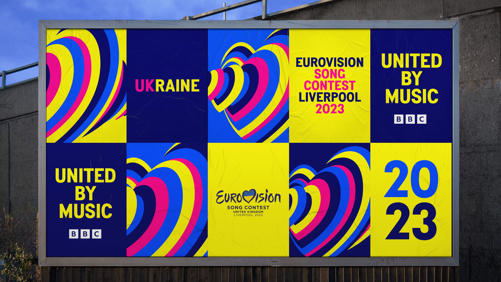
For anyone who hasn't indulged in Eurovision 2023, first of all, where have you been? And second of all, you've really missed out. Even if you're not a fan of what is quite probably the greatest song contest in the world, you can at least appreciate the visual identity, which elevated the event through its fresh, fun and vibrant visuals.
As Ukraine won the contest last year and the UK came second, the UK was hosting on behalf of the Ukraine this year, which makes the collaboration between a UK team at Design Bridge and Partners (formerly Superunion) and Ukrainian agency, Starlight Creative on the branding all the more fitting.
To find out more about the identity, we caught up with creative director of Design Bridge and Partners, Katherina Tudball, Stuart Radford, executive creative director of Design Bridge and Partners, and Olena Martynova, CEO of Starlight Creative and CMO of Starlight Media. Here's what they had to say. (And if you're inspired by the fantastic work, don't miss our best branding books to provide more inspiration.)
What was the inspiration behind the identity?
Katherina Tudball: There were a lot of elements to consider as this was such an unusual year for Eurovision. But we knew it was crucial to be single minded.
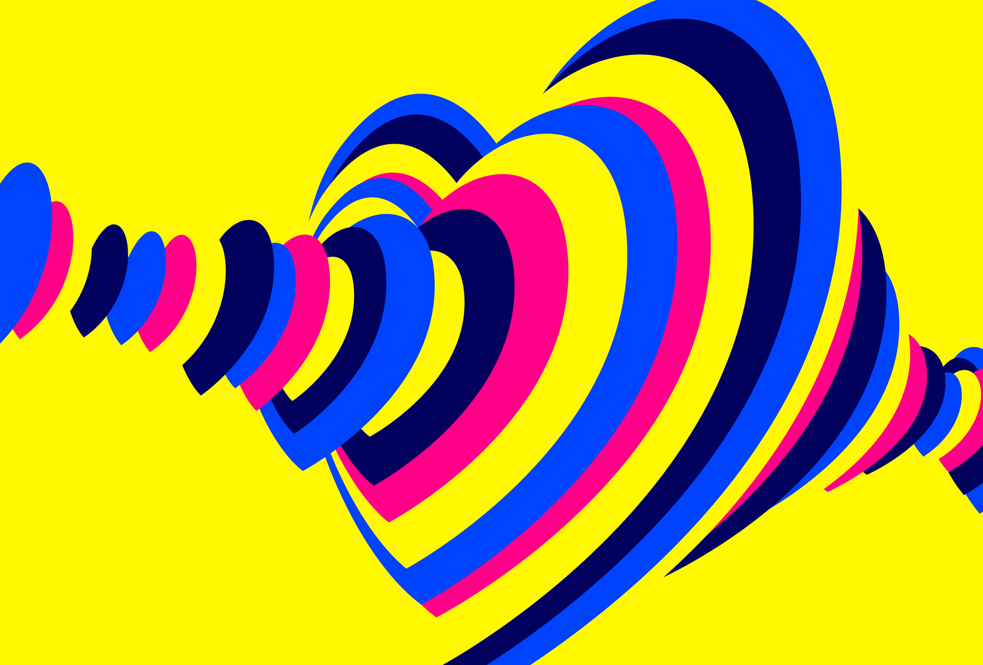
We had a moment of inspiration when we discovered some fascinating scientific research showing that when we experience live music together – whether singing in a group or just being part of the audience – our heartbeats physically synchronise. This inspired the creative idea: "160 million hearts beat as one", encapsulating this year’s theme 'United by Music' and reflecting Eurovision’s massive global viewing figures.
The visual expression is a sound wave of many hearts that beat together as one. A universal concept that is as culturally relevant and accessible in the UK and Ukraine, as it is across the world.
Were you inspired by Eurovision past/previous identities?
Stuart Radford: Rather than taking inspiration from past Eurovision identities we chose to take a very different visual approach. We knew Eurovision 2023 would be much more than one night of TV, we saw it as a two-week music festival, with some real musical credibility as well as a lot of fun and excitement. This inspired our execution, design decisions and system.
The design has a simple and bold look influenced by music festival graphics. We embraced a bright limited colour palette, graphic shapes, and a strong, condensed type style reminiscent of typographic music posters.
How did you collaborate with Ukrainian agency, Starlight Creative on this project?
SR: We collaborated with Starlight Creative in Ukraine across the project from initial concept and design exploration to the final execution.
We worked together daily via Teams calls and email, using shared online Miro boards to work on research, inspiration, and design. We quickly built a strong rapport despite limited time, some natural communication issues and at times extreme difficulties for the Kyiv team due to the war.
As well as their great broadcast design experience Starlight gave us invaluable cultural insight into the war, the significance of music and Eurovision in Ukraine, and their view of an optimistic, modern country, not merely defined by current struggles.
Olena Martynova: It was important for the identity to work internationally and unite all of Europe whilst representing the UK and Ukraine in a positive light. It was very important for Ukraine to promote itself as a part of Europe through this project as well.
SR: Our UK team has a history of BBC channel design (BBC Two and BBC Three) so we brought that branding expertise along with an understanding of the nuances for the local British audience. This combination worked so well to really represent both nations.
What challenges did you come across when creating the scheme?
KT: The biggest creative challenge we had was to ensure that the idea reflected all the elements of this year’s Eurovision: the UK broadcasting on behalf of Ukraine, the 'spirit' of Eurovision, Liverpool as the host city, the 37 other competing countries, and of course this year’s specific theme United by Music. All of this needed to come together in the visual identity.
There was a tension in creating something to reflect that this is Ukraine’s year and happening in Liverpool whilst feeling inclusive of all the competing nations. We naturally explored symbols of Ukraine and the UK initially, and both nations are represented in the final design, but creating a much more universal story was something we all agreed was right for the concept.
Time was also a factor. In a normal Eurovision year planning for the next event can begin straight after the grand final in May. This time the final decision on Liverpool as host city didn’t come until October which meant that everyone involved had to make everything happen very quickly.
And on a very serious note, we were always concerned for the Starlight team in Kyiv who worked under extremely challenging conditions, suffering missile strikes and massive power cuts as we approached our deadline. Their commitment and positivity was incredible.
OM: Starlight had to organise their process in special ways, because it was a very high priority and a big responsibility for us. Sometimes we worked without power or Internet connection. But we got through it all because this project meant a lot, and that motivated the team.
SR: It was great when Olena made it over to London on the day of our final concept presentation, and we finally got to meet in real life.
What's your favourite part of the finished identity?
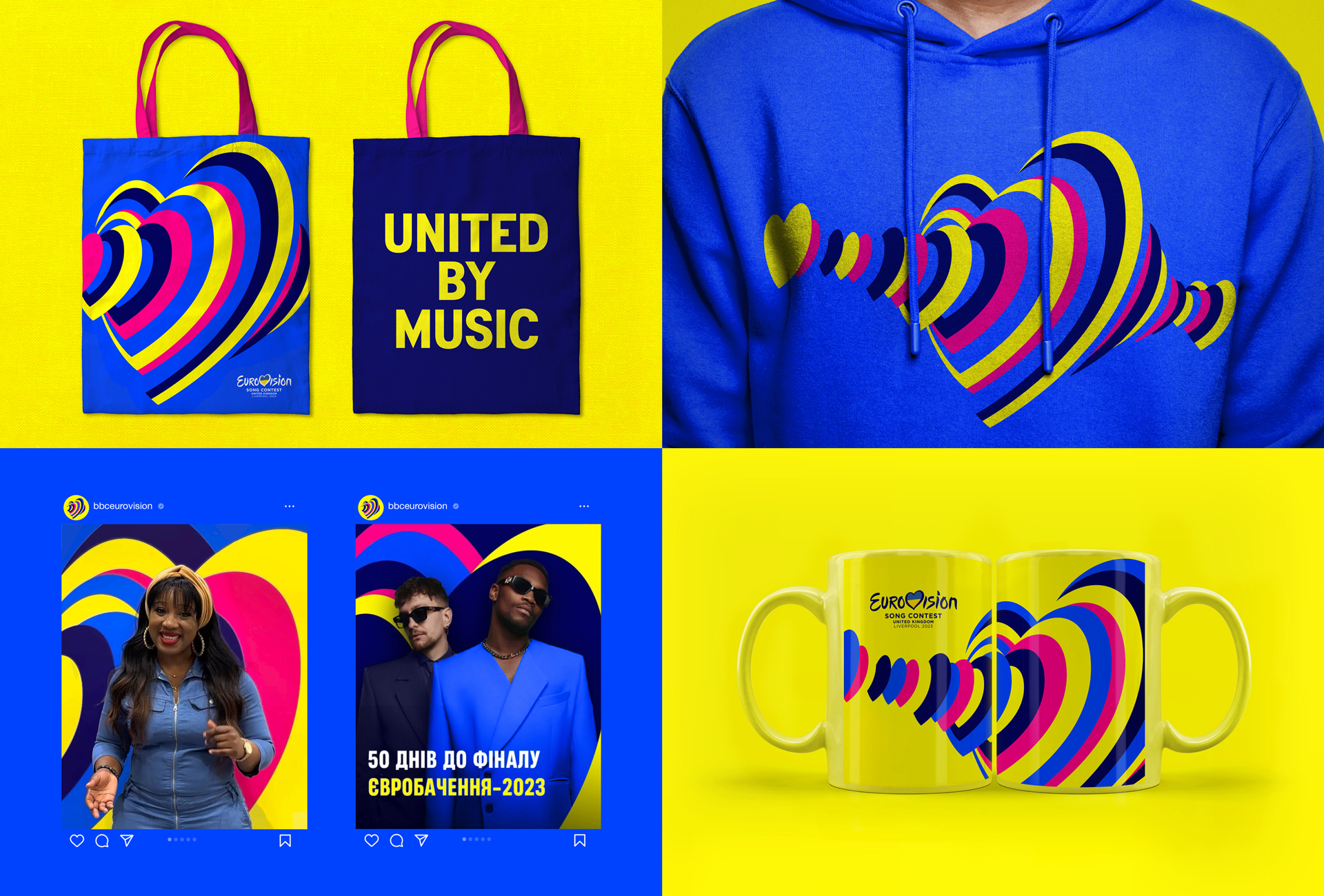
KT: The finished identity really came to life in the last few weeks. Seeing the heartbeats take over Liverpool was great. The city looked like a huge music festival and really felt united by music. Images and videos were all over socials with the performers posing in front of our graphics and the crowds of fans loving the posters and merch. And of course, watching it on telly and knowing that millions were watching was huge.
OM: Me and some of the Starlight team were in Liverpool for the event itself working on aspects of the show production. When you come to Liverpool you understand that everything works together. The fonts, colours, and branding looked cool and worked for Liverpool, for Ukraine and for Diversity. The colours were everywhere, and it suited the city very well.
What was the best part of the process?
KT: Working in partnership with Starlight opened our eyes to the Ukrainian spirit. We’ve seen that echoed in the event as Liverpool embraced Ukraine in every aspect of the celebrations. For us it was an unusual collaboration process, but the final work was so much stronger for it.
OM: I liked the brainstorming process, because it made us take a fresh look at Ukraine internally, as well as in our discussions with our UK team.
How do you feel the identity reflected the event?
SR: The theme 'United by Music' and the concept of "160 million hearts beating as one" are very universal and that was important. Eurovision is so welcoming and inclusive, now in its 67th year, the contest was originally set up post-war to bring Europe closer together through a shared televised experience. We wanted the identity to capture that spirit. And this year more than ever, expressing our empathy and support for Ukraine with the heart as a symbol of unity felt right.
There was a very satisfying moment, when we discovered that the right camera angle on the composition of the sound wave, made our graphic heartbeats visually echo the asymmetric, distinctive heart shape from the existing Eurovision logo. We loved the fact that the use of the heart symbol strengthened the overall recognition of the Eurovision brand, whilst fulfilling the brief to express this year’s specific story.
In terms of representing Ukraine and the UK together, the colour palette is a vibrant, celebratory interpretation of both nation’s flag colours.
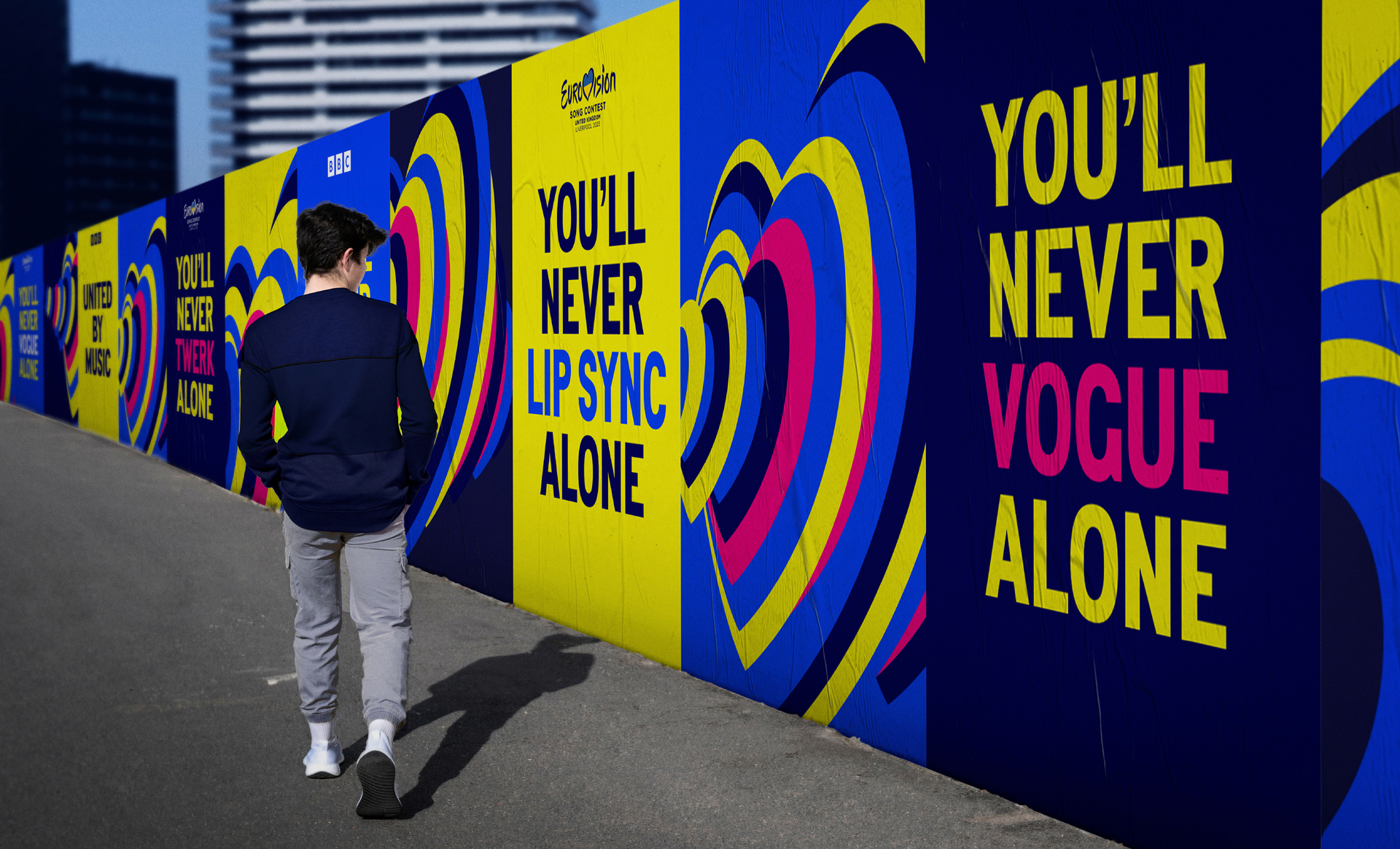
As a nod to the host city the typeface is Penny Lane designed by a Liverpool typographer, who grew up in the era of The Beatles, it is inspired by the city’s street signs. And copywriting pays playful homage to Liverpool’s famous song You’ll Never Walk Alone.
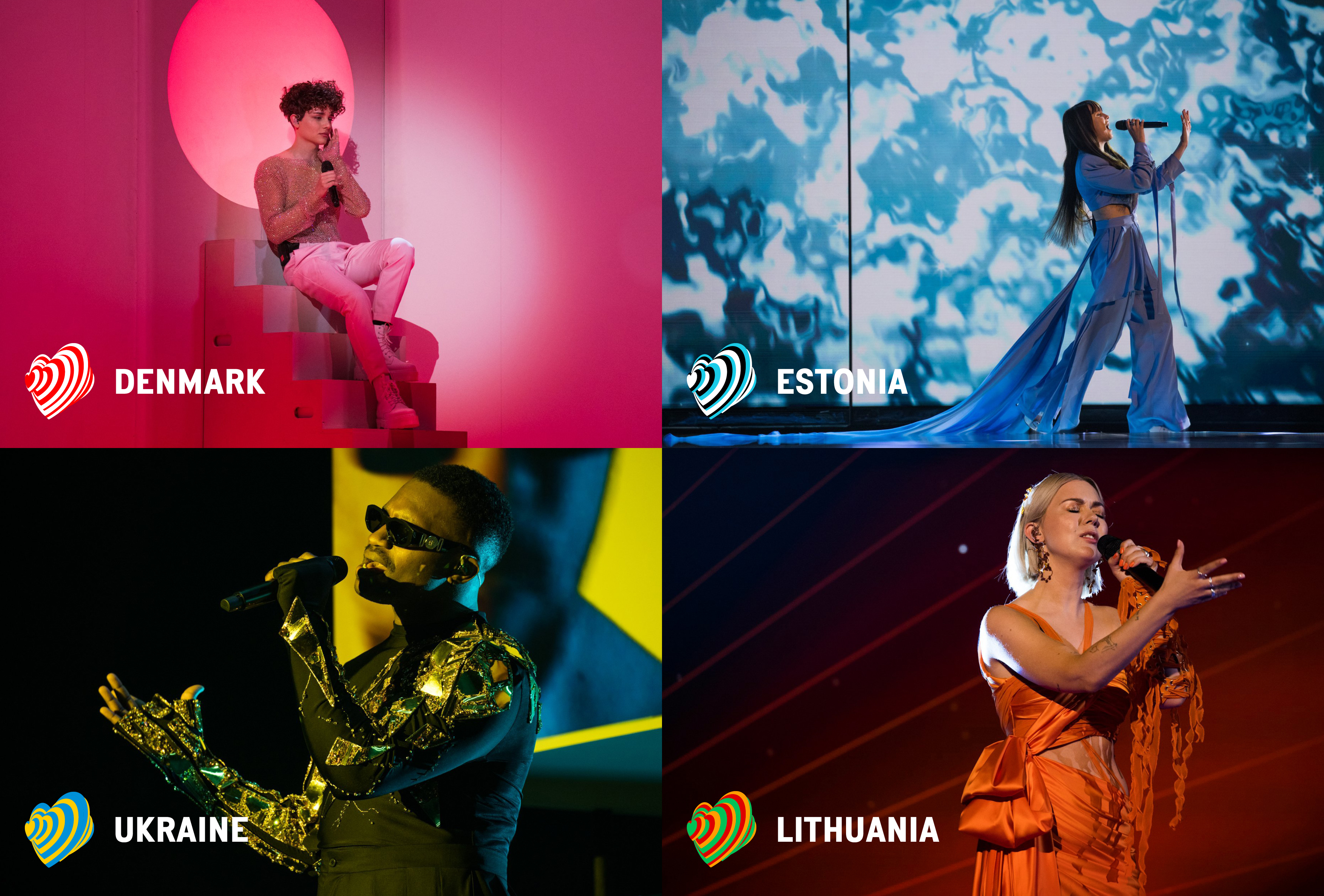
The heartbeat graphics can also adapt to take on the colours of all 37 competing nations’ flags.
OM: The bracelets handed out worked really well with the idea and branding. As the contestants walked around the stage with their flags their bracelets would light up in the colours of their country's flag, everything connected and worked as one.
If you've created some branding you're proud of this year, why not enter the Brand Impact Awards – celebrating 10 years of world-class branding.
