Having worked extensively as an illustrator using Procreate and other digital art software, I’m often asked how I get my ideas. I honestly recycle a lot of my favourite features and themes to fit what I’m trying to express in an artwork. Preferring a balance of beauty, edge and the surreal, I use the human form to hint at undertones of emotions.
If you want to find out more about this Apple-exclusive digital art app ahead of reading by tutorial, read our Procreate review. We also have a new guide to Procreate tips to help get you up to speed. Also, take a look at our guide the best iPad for Procreate, if you're considering upgrading to a new tablet.
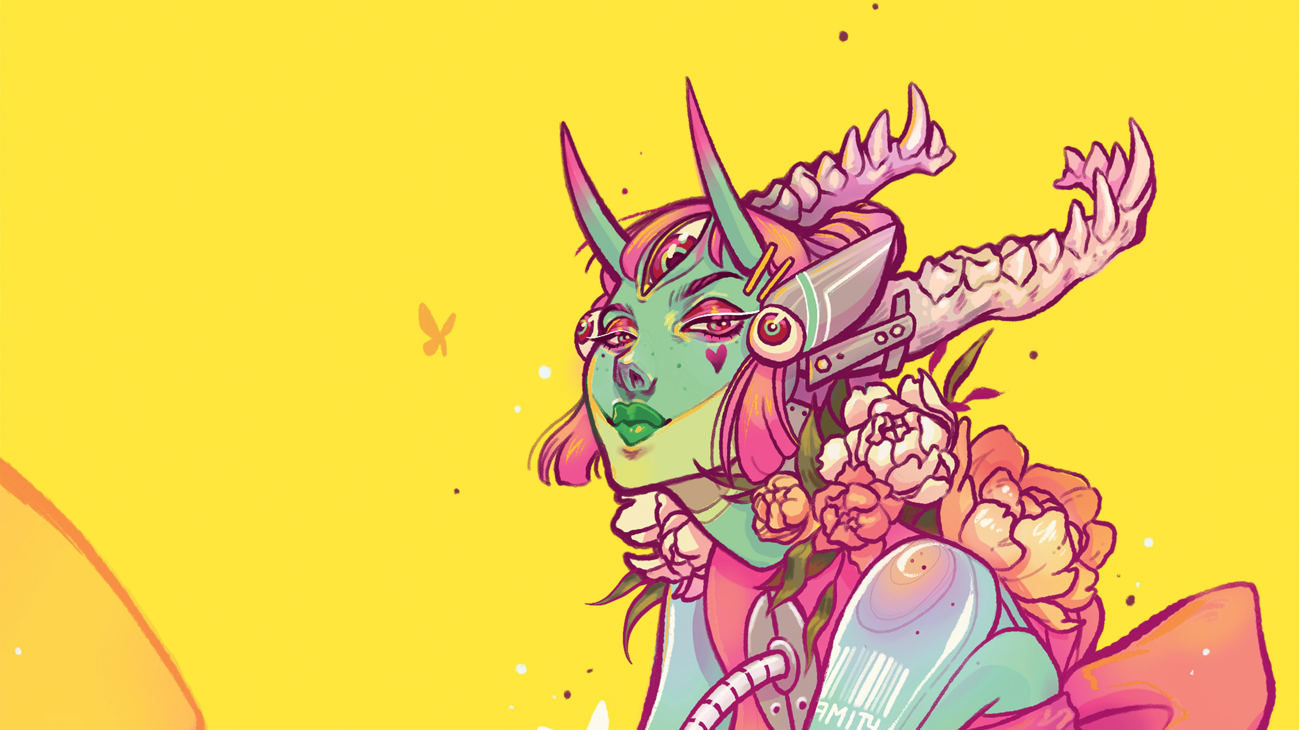
You can express a lot through something that appears merely aesthetic. A mask is a nod towards disassociation, a huge third eye expresses existentialism, a demon’s horns symbolise the dark side of humanity, and bright colour is used as a juxtaposition against dark undertones.
Let your brain take you where it naturally wants to go
Audra Auclair
Using anatomy in this way isn’t new, but that’s okay. To me, art is firstly a form of therapy, secondly a relationship, and thirdly a skill or job. Artists usually desire to be unique, but it’s important to remember that most ideas have been done before. If you relieve yourself of that pressure, you allow yourself to experiment and grow. Let your brain take you where it naturally wants to go.
If you can’t express what you wish to, then it’s likely you need to focus on fundamentals. Learning fundamentals helps considerably when exploring surrealism. If you’re too stiff and focused on fundamentals you should loosen up in a sketchbook or use abstraction to create new shapes and ideas. My Procreate workshop will show you the technical side of how I created my cover art and explain my inspiration behind it.
My favourite Procreate brushes
These are the brushes we'll be using for this workshop.
Custom Brushes: Matt Pencil 02
Pencil created by artist Mateusz Urbanowicz. I use this for sketches.
Dry Ink Pen
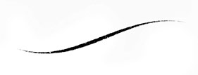
This pen is ideal for creating clean but grainy final lines and details.
Soft Brush Airbrush
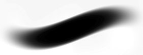
Used for gradients while frequently adjusting the Opacity level.
Studio Pen
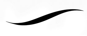
This clean-edged pen is good for erasing and colouring in flats.
Studio Pen
Use Procreate to create a surreal sci-fi character
01. Inspiration and concept
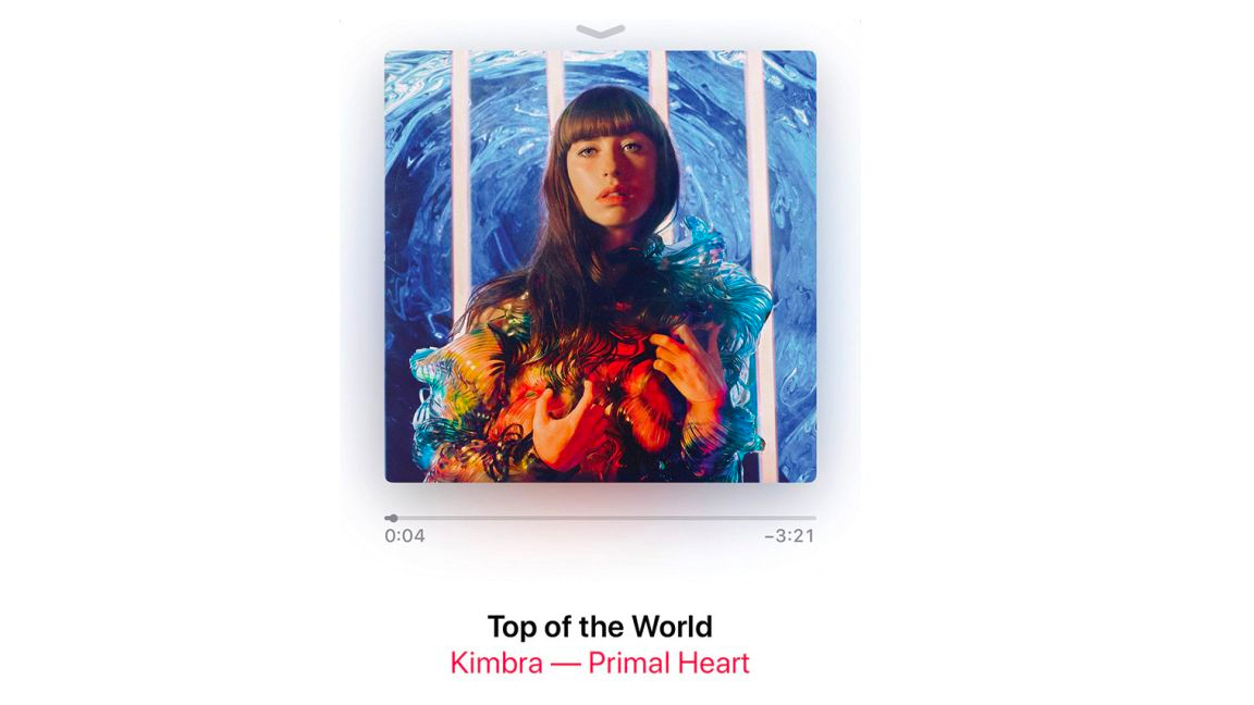
Music, emotions, nature and societal issues have driven my art in the past. I know I want to create a character that’s robotic and cold, but is balanced with natural vibrant elements. To help me get into this mind space I listen to Grimes and Kimbra. Their music channels the feelings I want to communicate with this image.
02. Drawing loose thumbnails
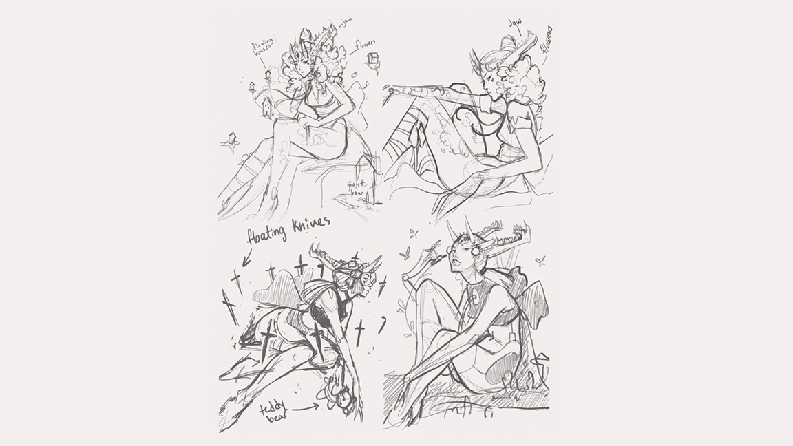
I begin with rough thumbnails on a grey background. The grey is easier on the eyes. It’s also a mid-tone so it’s easy to add quick highlights and shading if needed. I try a few different poses that fit my brief and avoid settling on my first sketch. After I’ve warmed up a bit by sketching, I find my concepts improve drastically.
03. Using real-life references
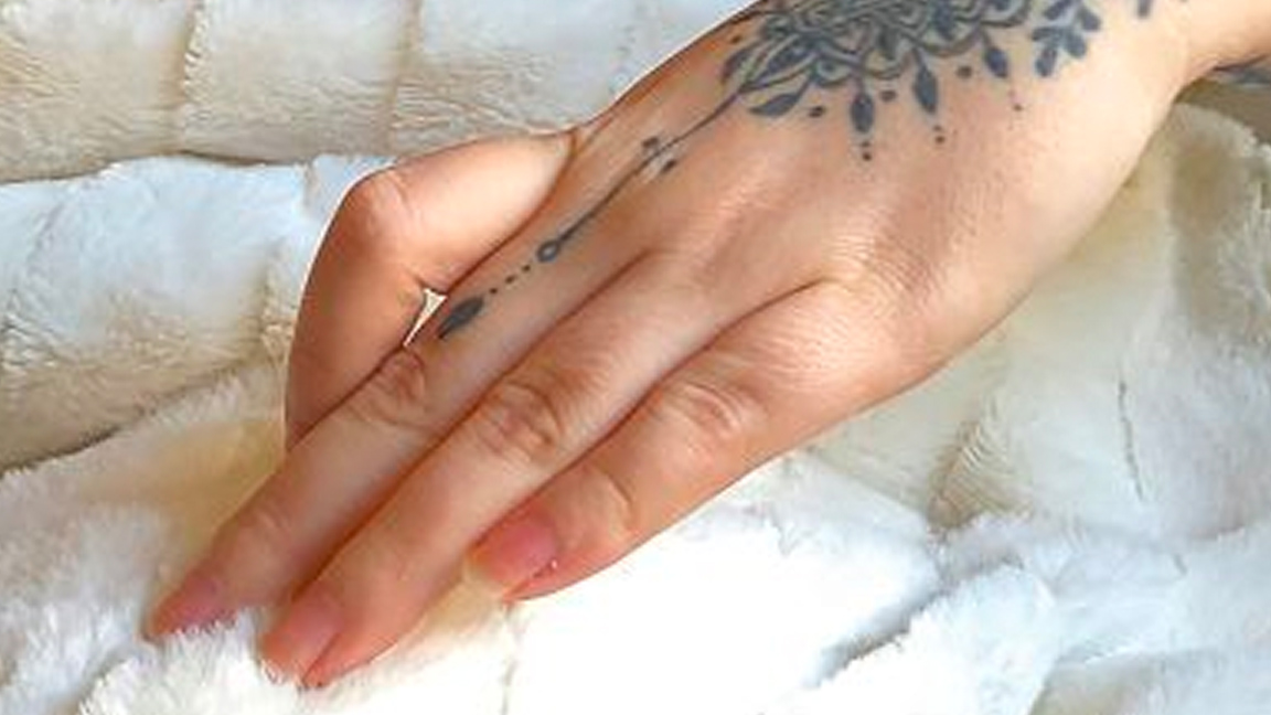
I consider if I need any reference material for the painting. For the headpiece I think about how it’s put together and anchored to her head. I have some knowledge of teeth after studying anatomy in my spare time so I’m comfortable creating the jaw without reference. I’ll often source hand references using a photo of my own hands, which I then accentuate and stylise.
04. Creating a tight sketch
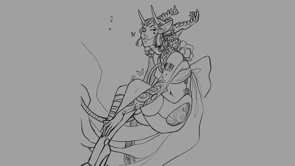
Tightening the concept sketch is my favourite part of the process. I tap the N on my sketch layer and slide the Opacity down to 30 per cent or lower. Then I create a new layer above it and draw smoother lines and solidify my ideas on this layer. I’ll add and remove different items, try different hairstyles and correct anatomy
05. Inking the clean sketch
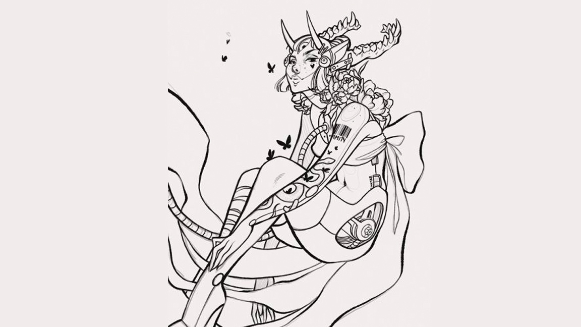
Much like in step three, I reduce the Opacity of the clean sketch to 30 per cent or less and uncheck the box from the original rough sketch so that it’s hidden. I select my ink brush and trace the clean sketch, paying more attention to line weight and exaggerating some of the shapes slightly so the line art doesn’t look stiff. After the final lines are complete I’ll hide the sketch layer.
06. Generating a simple background
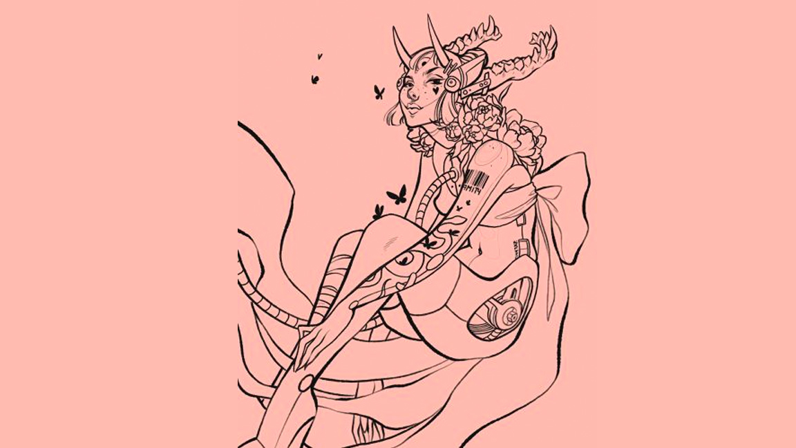
For this step I change the background colour by clicking the background layer and experimenting. Sometimes I have a colour palette in mind when I begin a painting, sometimes I don’t and often the palette changes as I go along. With digital art it’s easy to compile different swatches in the top right of the canvas, enabling you to see what you think is best.
07. Sectioning the flats in the artwork
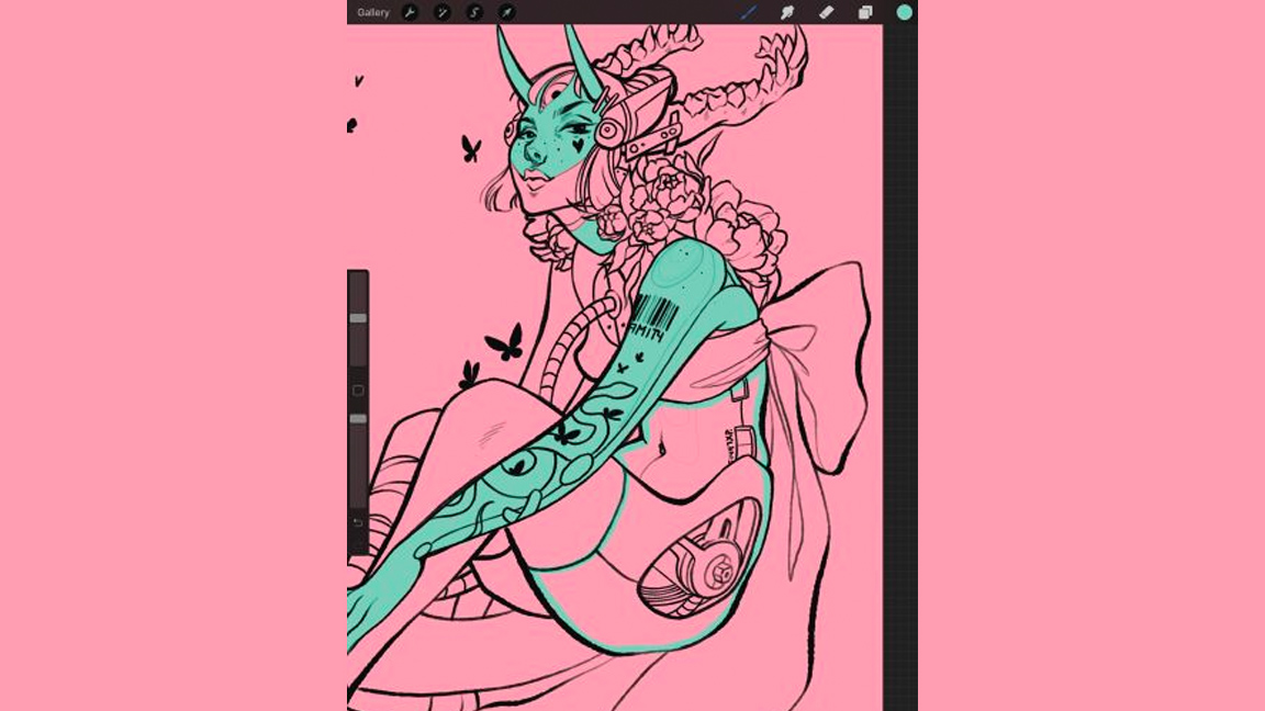
Now I’m going to colour the character. To begin this process I like to use a technical ink brush that has sharp edges. This will be important for the next step. I use the brush to outline a specific area with the colour that I want to apply
08. Filling the flats
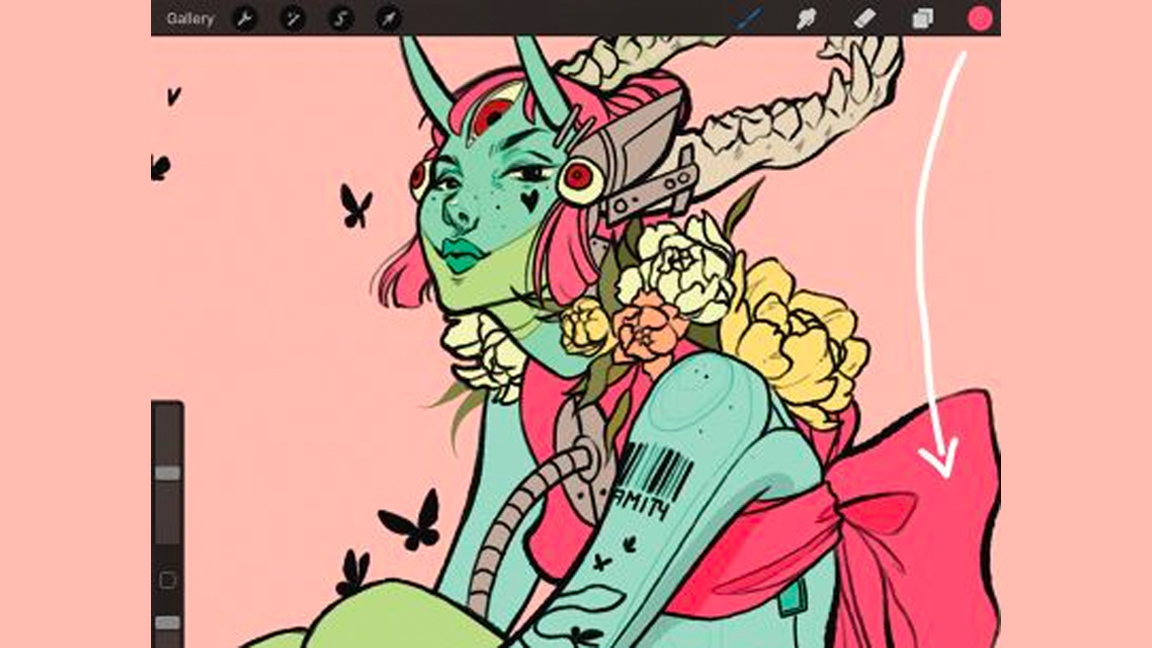
To fill the section I drag a colour from the top right into the area that I wish to fill. If it doesn’t completely fill the area then try dragging the colour over again, but this time hold your stylus/pencil in the section until a blue bar pops up at the top of the screen. Drag left and right while still holding the pencil down: this changes the threshold of your colour fill.
09. Bringing in a shadow layer
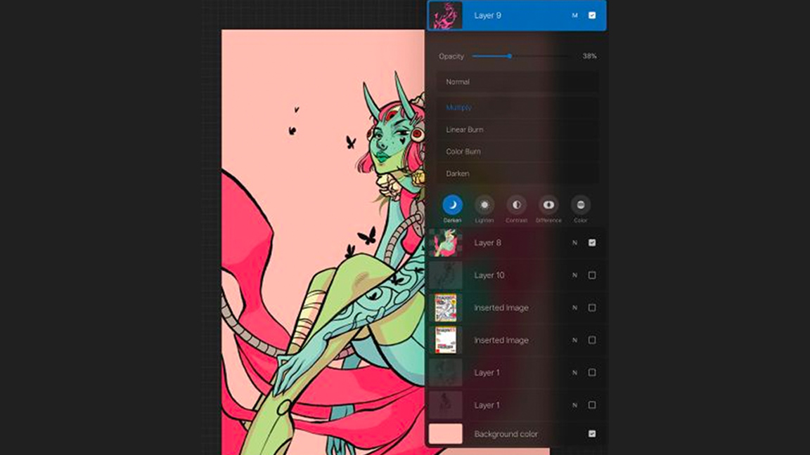
After I decide on the light source’s location I create a shadow layer between the line and flat colour layers. I set the layer to Multiply and reduce its Opacity. Avoid using black/grey for the shadows; using a colour adds more life. I try out several colours before deciding to use magenta. I clean it up with the Eraser tool, which is set as the Technical pen or Soft airbrush for softer gradations.
10. Locking layers for accurate painting
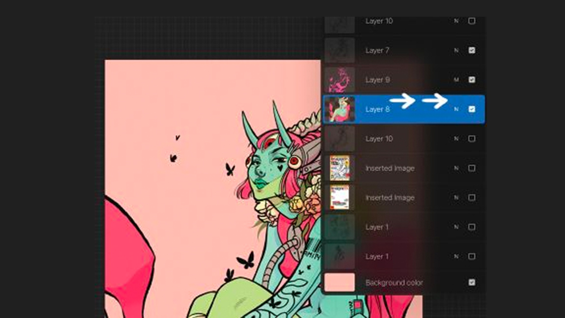
At this point I want to begin adding some various tones to the character. But to do this I need to lock the flats layer first. I select the flats layer and lock it by swiping right on the layer with two fingers. This ensures that we can paint on the layer freely without spilling out of the flats layer.
11. Airbrushing the horns and skin
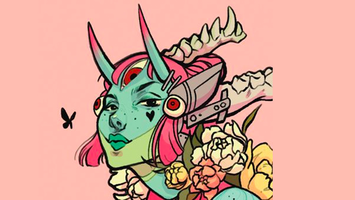
I’d like to create a feeling of warmth in her skin, and I love the look of the pink on the turquoise because it still feels cold and unnatural. On the locked flats layer I select the Soft airbrush on a low Opacity and begin to add pink tones. You can also use the Selection tool and select specific areas to use the airbrush on.
12. Colouring the lines
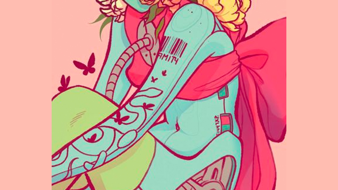
Now that I have my colour scheme sorted out I begin to adjust the colours of the lines. I select the lines layer, then swipe right with two fingers on the layer to lock it. We can now change the colours of the lines easily! You can use any brush for this: the Technical pen is good for easily covering sections, but you can also create smooth gradients on your lines with the Soft airbrush.
13. Detailing the character
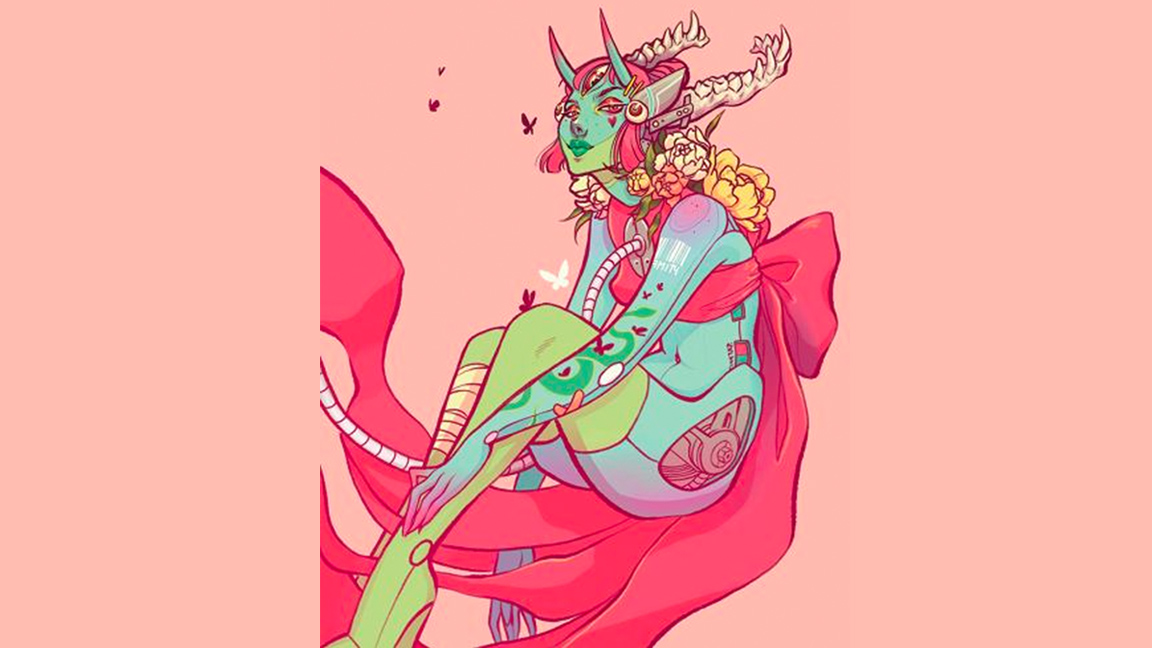
This is another of my favourite steps. I create a layer at the top of the other layers – this will be the detail layer. On this layer I add different skin tones and details to the eyes, and enhance her tattoo and hair piece. I use a variety of brushes for this portion, but I really favour using pencils and dry brushes/pens for this stage.
14. Acting on feedback and final edits
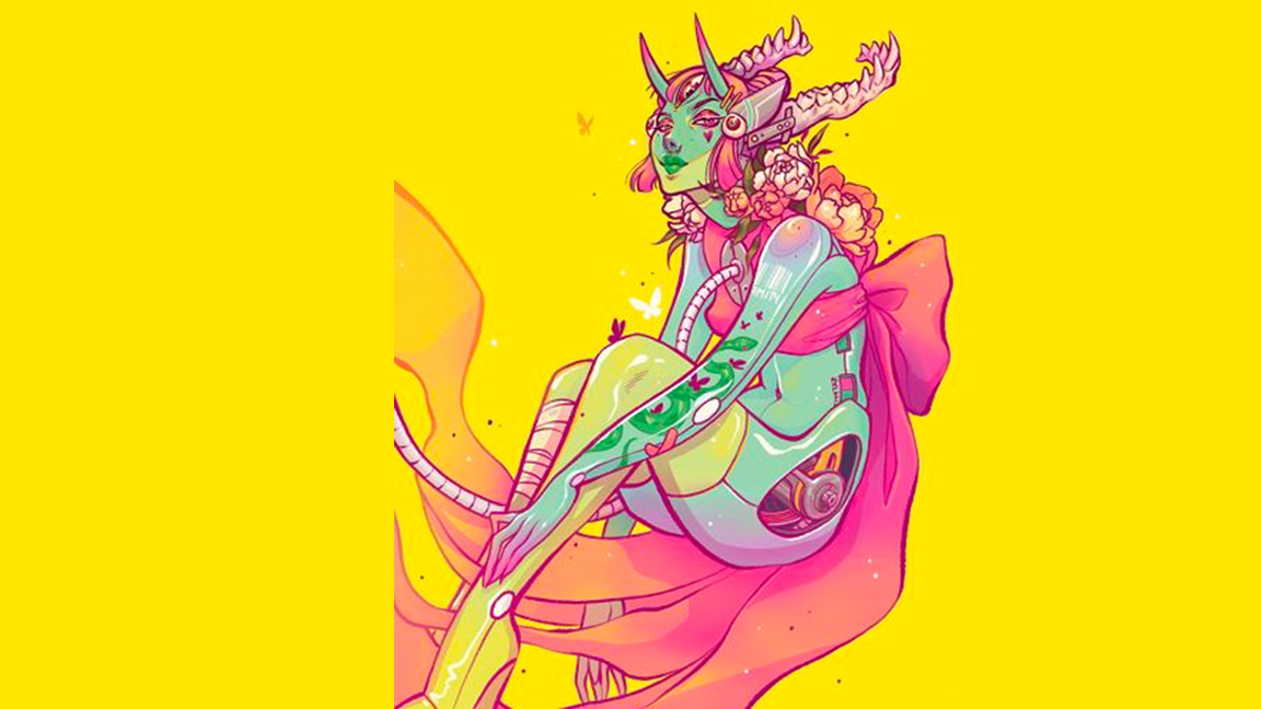
Using yellow as the background really helps to create contrast against the turquoise. I take a final look over the piece, and make minor tweaks, add texture and highlights, and completing the details of the mechanics. I could spend more time during this stage but I want to keep the art clean and simple, to retain the focus on the face. Now the image is complete!
Get more Procreate tutorials in ImagineFX
This content originally appeared in ImagineFX magazine, the world's leading digital art and fantasy art magazine. ImagineFX is on sale in the UK, Europe, United States, Canada, Australia and more. Limited numbers of ImagineFX print editions are available for delivery from our online store (the shipping costs are included in all prices)
Alternatively, you can access us instantly through our digital options:
• Apple app (for iPad or iPhone)
• Pocket mags (multi-platform app, great for Android users)
• Zinio (multi-platform app for desktop or smartphone)
