So you’ve fallen in love with a coastal, romantic or English country cottage look. But how to tastefully theme a room without getting too literal?
Because let’s face it, there's just a small step from vintage charm to stuffy museum mood if you overload a space with too many heavy antiques. Likewise, a romantic bedroom can easily tip into naff, lovey-dovey boudoir with the wrong color and too much cutesy print. If you’re considering picking out a theme for one or two rooms, read on.
We uncover the expert tips and tricks that make any interior design style or trend look tasteful and timeless – rather than a stage set. As US interior designer Lucie Ayres says: 'This is a BEAST of a topic and essentially what I think sets a great designer apart from a good designer.'
How do you tastefully theme a room?
For the professionals, navigating a particular interiors theme without going OTT is all about balance and subtlety
'Balancing key elements of a chosen interior style is crucial for maintaining authenticity and avoiding the risk of a space appearing overly staged,' explains Annie Harrison, founder at London-based design studio FARE INC. 'It’s important to carefully select a few signature furniture pieces or decorative items that exemplify the desired look.'
For instance, with coastal decor, incorporating aged wood furniture or rattan accents works well. For a farmhouse style, rustic wooden furniture, vintage-inspired fixtures and woven textiles can enhance its charm.
8 Design Takeaways To Tastefully Theme A Room
Whether you prefer nautical or boho, theming a space certainly has its potential pitfalls. According to the designers, it's just as much about what NOT to do in a room as it is about what to include.
Don’t stick rigidly to a theme at the expense of everything else say the experts. Otherwise you’ll end up with a home that feels contrived and lacks authenticity.
'In the pursuit of adhering strictly to a theme, there’s a risk of creating an environment that feels more like a stage than a lived-in space,' declares New York based designer Kati Curtis. 'This can result in décor choices that prioritize a specific appearance over comfort, style or personal resonance, making the room feel tacky rather than tasteful.'
1. Add texture to the 'quiet luxury' look

The quiet luxury trend has captured the imaginations of interior designers across the globe. The combination of warm minimalism and pared-back sophistication is spot on for creating timeless spaces, big or small. But how to make sure the quiet luxury theme, distinguished by neutral hues and simple shapes, doesn’t become stark, staged and unliveable?
Annie Harrison believes the key to stylish, elevated luxury – rather than a show-home look – is to layer different textures. 'Mixing materials like wood, stone and linen against aged metals can create a layered and inviting environment,' says Harrison.
Here, a luxurious tadelakt finish on the walls is offset with reclaimed floorboards, a fabric headboard and a blackened steel desk. 'As for the fireplace, the Edwardian centerpiece found a new home elsewhere in the house, making way for a custom Arabescato surround that harmonizes seamlessly with the bathroom’s marble motif,' she explains.
2. Consider longevity (especially in a kid's room)
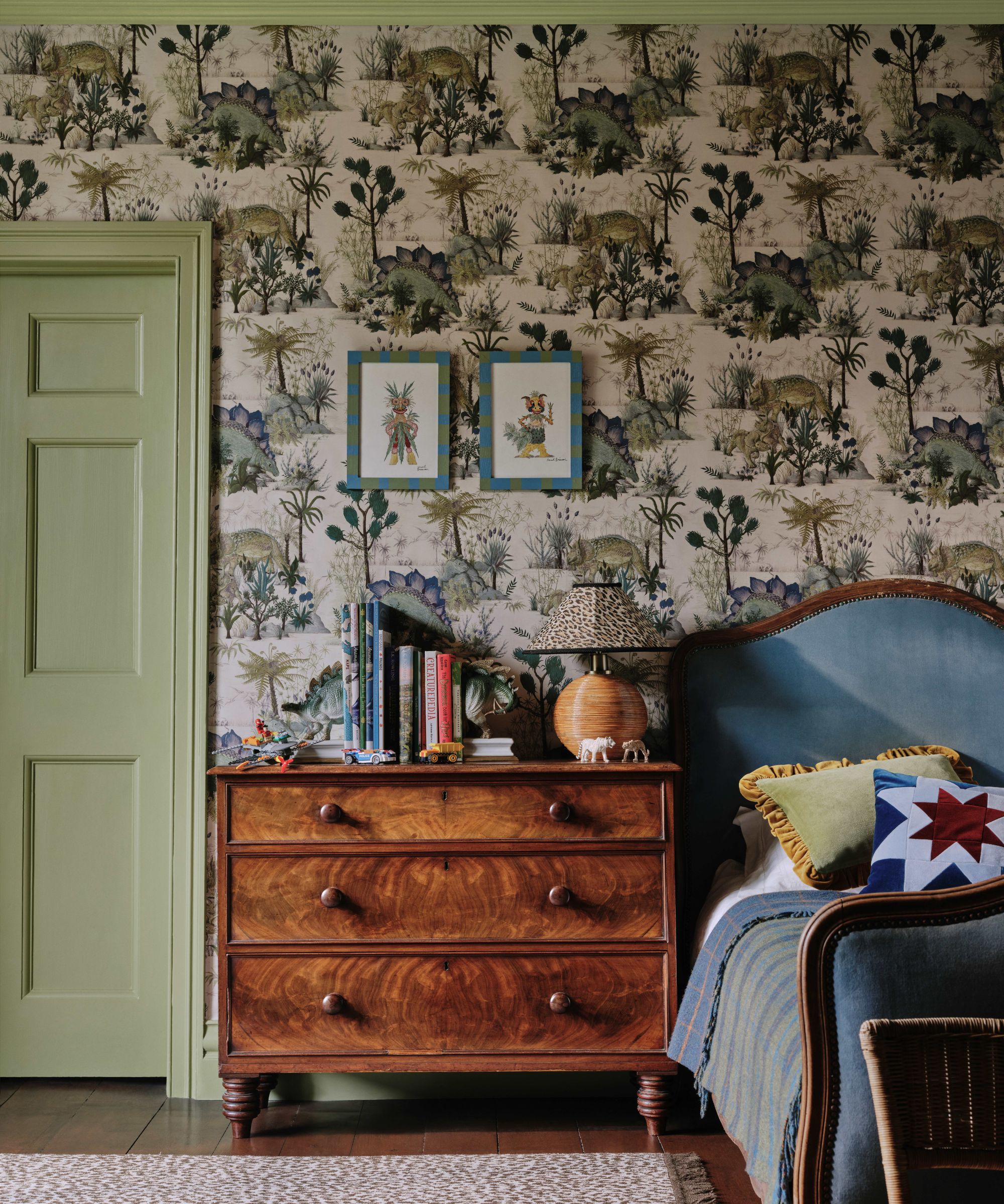
Younger members of the family might be really keen to overhaul their bedroom in a specific theme or motif. So how to decorate with dinosaurs, fairy tale woods or butterflies and still create a cool rather than cliched design?
The team at design emporium House of Hackney strongly advises picking a palette of warm pastel hues rather than sugary colors and stark primaries. 'I would look to cherry red or umber accents paired with soft turquoise or butterscotch tones. These mature pastel tones will give a less saccharine look,' says Caroline Aston, interior design executive at House of Hackney. 'Our Dinosauria print in Ecru or Dusk is fantastic for this. The design has beautiful warm tones and looks incredible with vintage pieces.'
Then there’s the issue of how to stop a children’s bedroom motif from looking dated very, very quickly. The key is to limit the theme, using it on window treatments or upholstery only – and certainly not everywhere.
'Another way to add the theme without it looking too childish is to add panels to the wall to frame the wallpaper,' she says. 'The rest of the walls and woodwork can then be changed over time to create a more mature look as a child gets older.'
3. Add an element of surprise
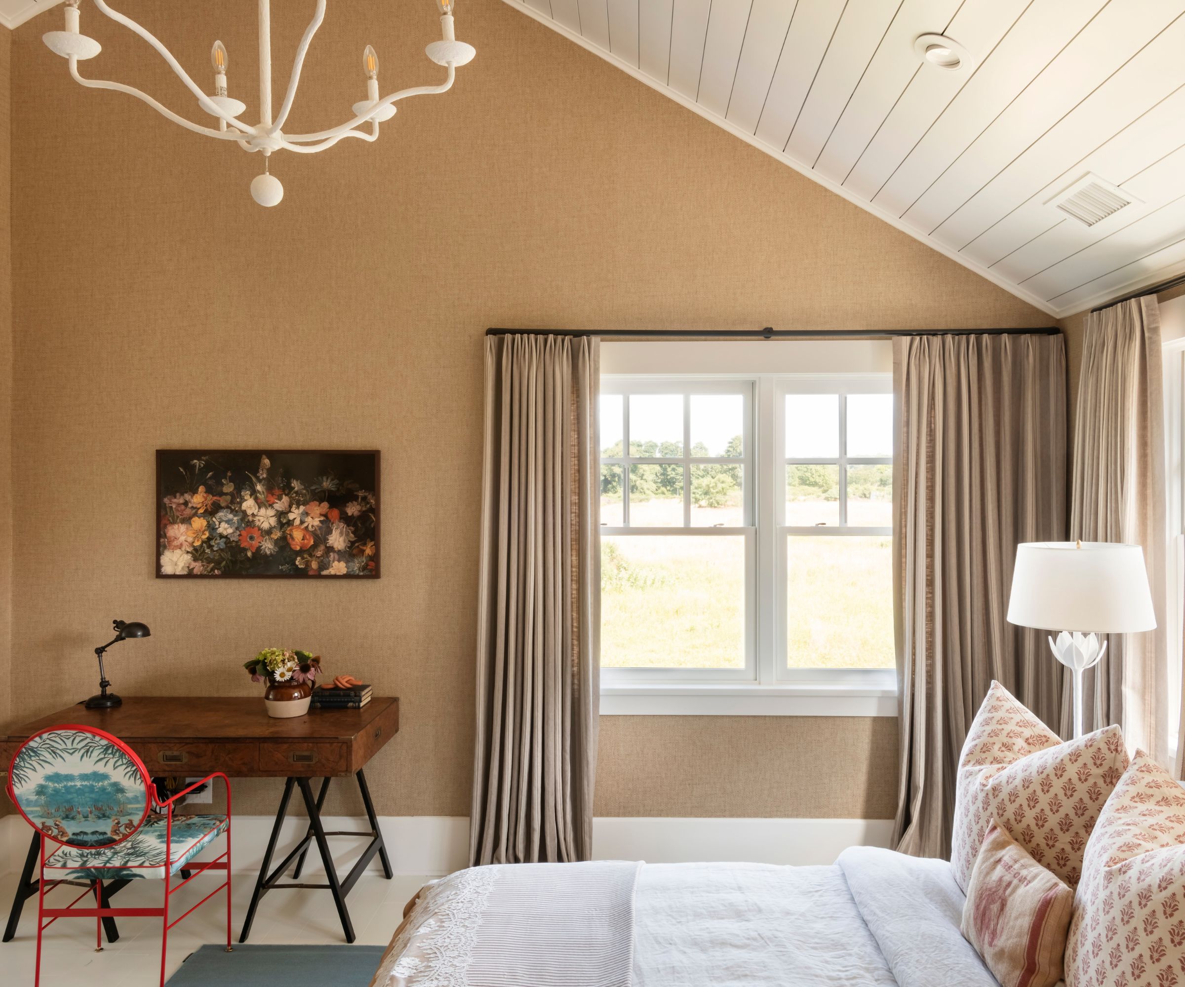
'To make sure a room doesn’t feel like a set or look too staged, always add an element of surprise, something that doesn’t quite fit,' declares Lucie Ayres, principal of US interior design agency 22 Interiors. 'For example, in this farmhouse bedroom we added a very contemporary Italian design chair. The style and color are unexpected and playful.'
The bedroom is part of a Dutch Colonial home built in 2019 in Amagansett, New York. 'They have a barn in their backyard that dates back to the 1800s for when the property was a working farm,' adds Lucie. 'The clients wanted warm tones and a nod to traditional farmhouse style but updated.'
4. Don't go too heavy, introduce a theme in accents
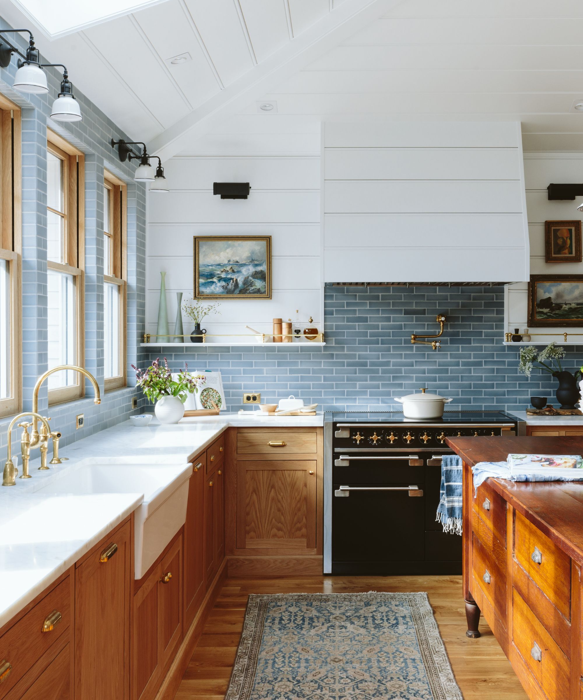
To create a fresh, eclectic farmhouse kitchen, try not to go overboard with rustic finishes and heavy antiques tells US stylist, designer and author Emily Henderson. Instead, introduce a few treasured vintage finds.
It’s a design rule that Henderson has stuck by in her own American Foursquare home – particularly the kitchen where a vintage store counter doubles up as a striking island unit.
'My goal for our farmhouse kitchen was for it to be functional for the family, feel happy and fresh,' says Emily. 'I wanted some special vintage and vintage-inspired moments like our island, the cutouts in the upper cabinets, and the unlacquered brass details.'
5. Think cool rather than kitsch (with beach decor in particular)
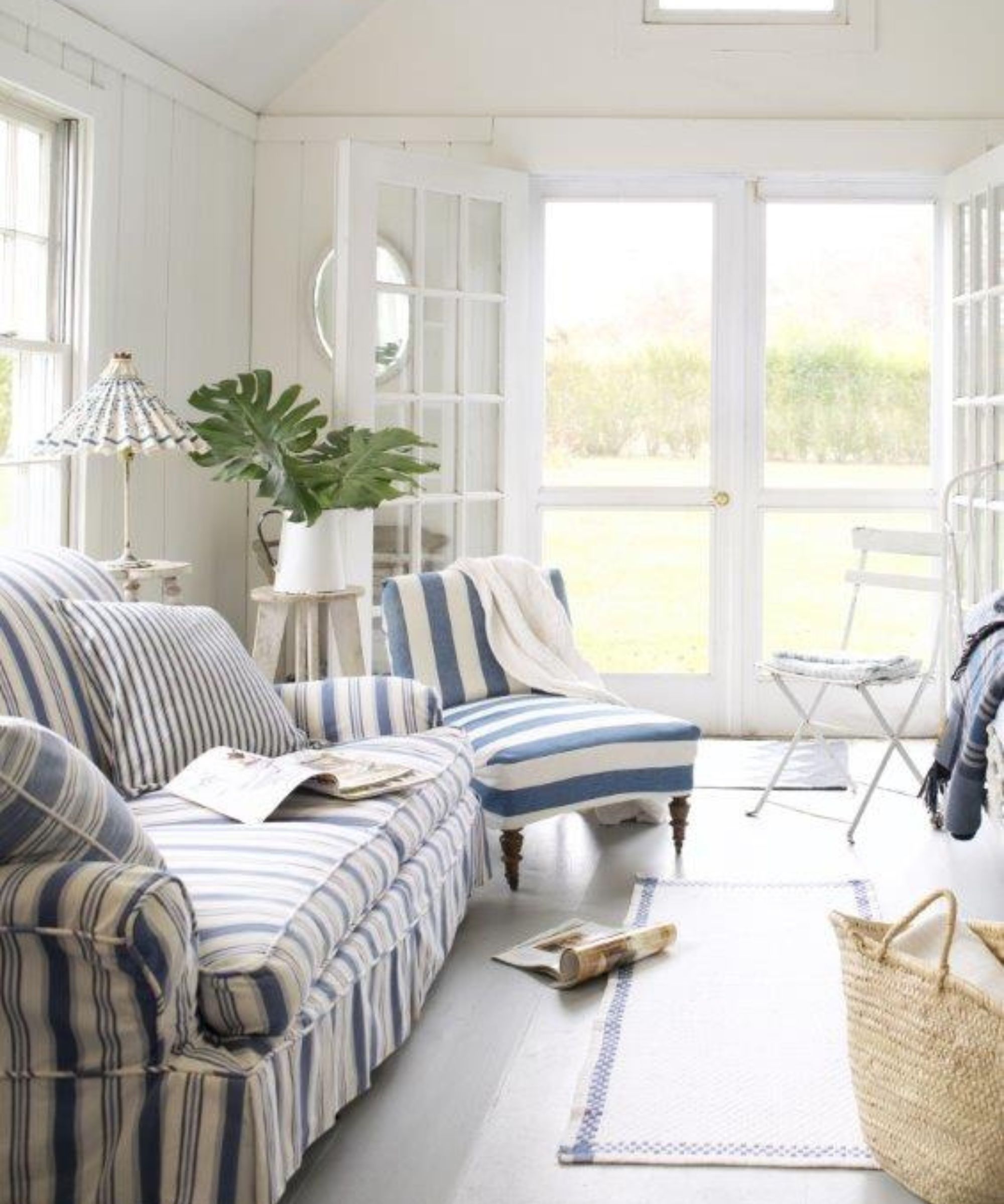
It’s easy to see why beach house decor is really popular for any home, no matter how far from the sea. Who can resist sunny hues and joyful prints to create a vacation-at-home mood all year round. But it’s how to nail a cool, coastal decor rather than a kitsch seaside look that can be the difficult part to get right say the experts.
The key is to subtly interpret motifs like fish, water, sunshine and sea birds, rather than using them too literally says Texas-based interior designer Kim Armstrong.
'It’s about tastefully implementing them into a room without feeling like you’re stepping into a themed carnival act,' smiles Kim who has completed a number of beach house projects including her own. 'So instead of choosing artwork, pillows or an area rug with a beach umbrella motif, be inspired by the striped fabric. You can use that stripe on a chair, or some accent pillows to it give the flavor of the beach.'
Then balance with neutrals such as grays, whites, and creams so the space doesn’t feel overwhelming.
6. Balance old and new

Even if you love decorating with vintage, steer clear of decorating head-to-toe in antiques. It’s this sort of design vernacular that can make a space feel heavy and themed say the experts.
'To lean into the vintage aesthetic authentically, consider incorporating vintage pieces sporadically into your space rather than overwhelming it with too many at once,' explains Texas-based interior designer Audrey Scheck. 'Mix vintage items among new pieces for a balanced look.'
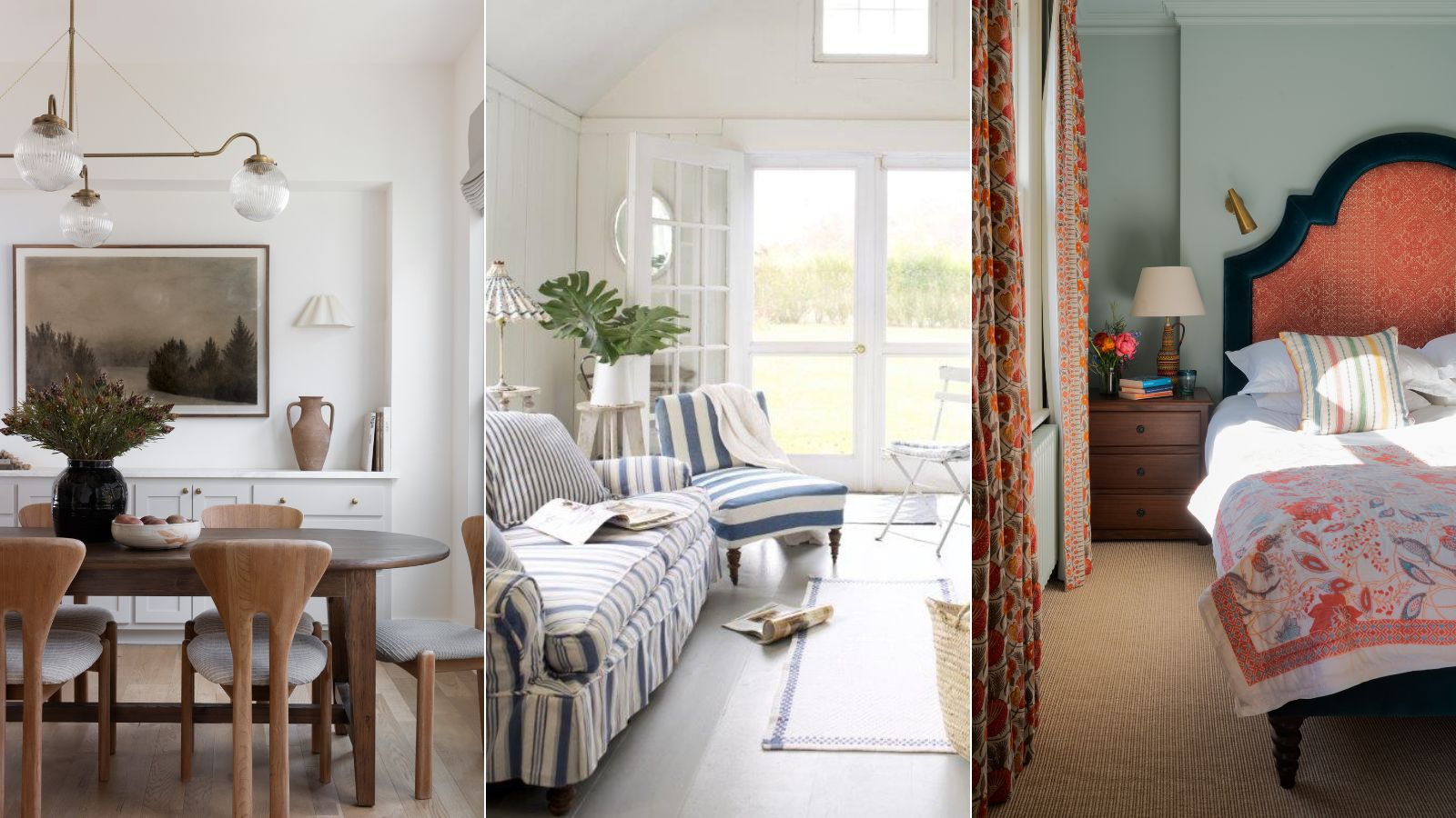
The owners of this newly built home in South Austin love vintage charm so Audrey introduced touches of antique throughout each room. In the dining room, for instance, a set of vintage 1960s Dutch chairs is paired with a new oval table.
'When it came to decorative accents, I again mixed new with old,' adds Audrey. 'The vintage terracotta urn from Turkey is put with new books, vases and bowls to balance the styling throughout the room. The lighting and artwork is all new but each piece exudes a feeling that is reminiscent of something vintage.'
7. Dial down a romantic bedroom theme
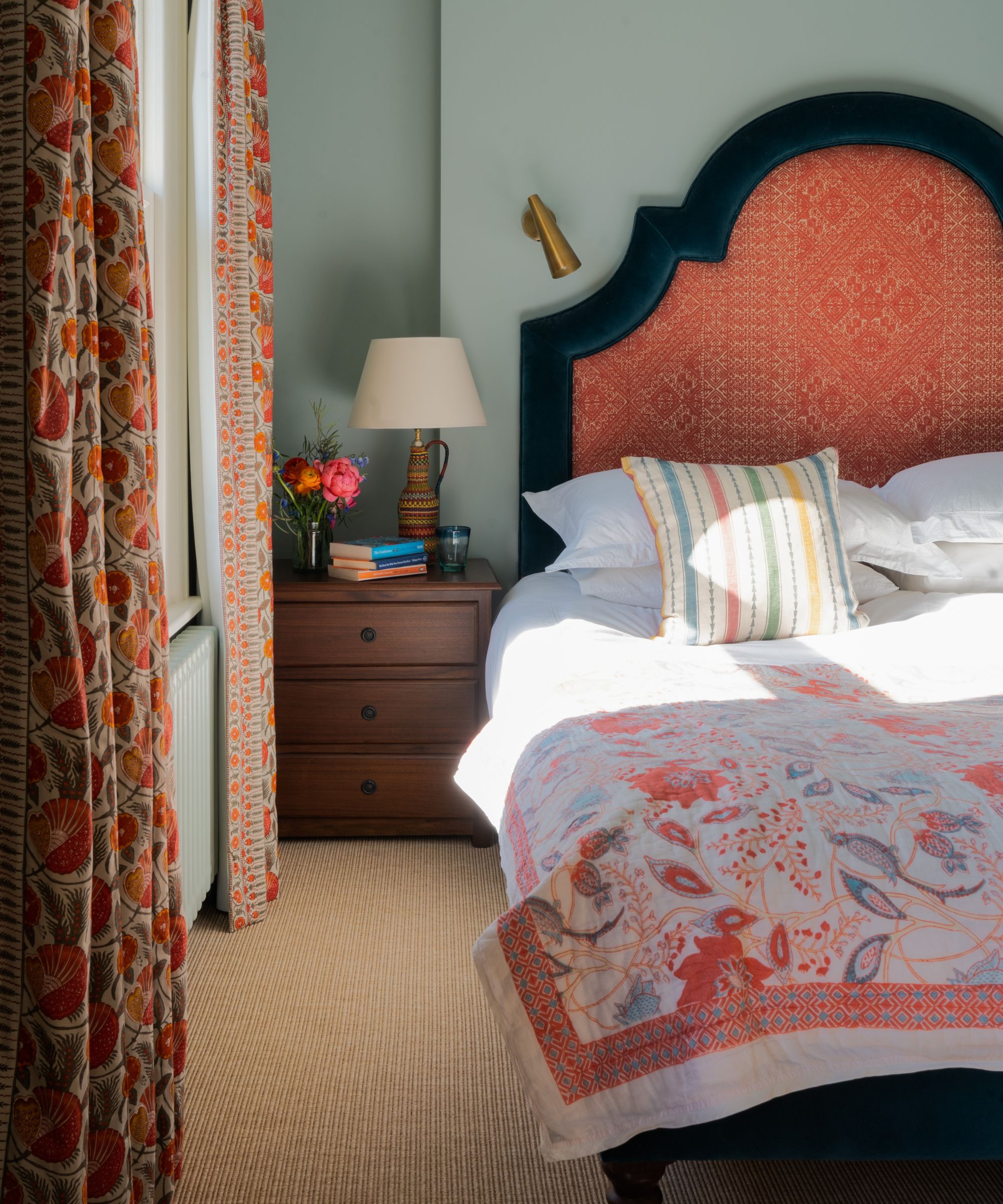
There is certainly more than one way to create a romantic bedroom space. Flower power prints and all-over pink can look tacky and too obvious. Instead, try folksy patterns and heritage fabrics in color combinations that are pretty yet sophisticated. Coral and sea green are a fresh look for a charming bedroom scheme. And choose a starting point such as a curvaceous headboard as a starting point.
'A great place to start is with a color palette that would fit within that ‘theme’,' Caroline Aston. 'Mid-century furniture for example is generally warm in tone so pick a color or print that enhances this.'
8. Take an abstract approach to pattern
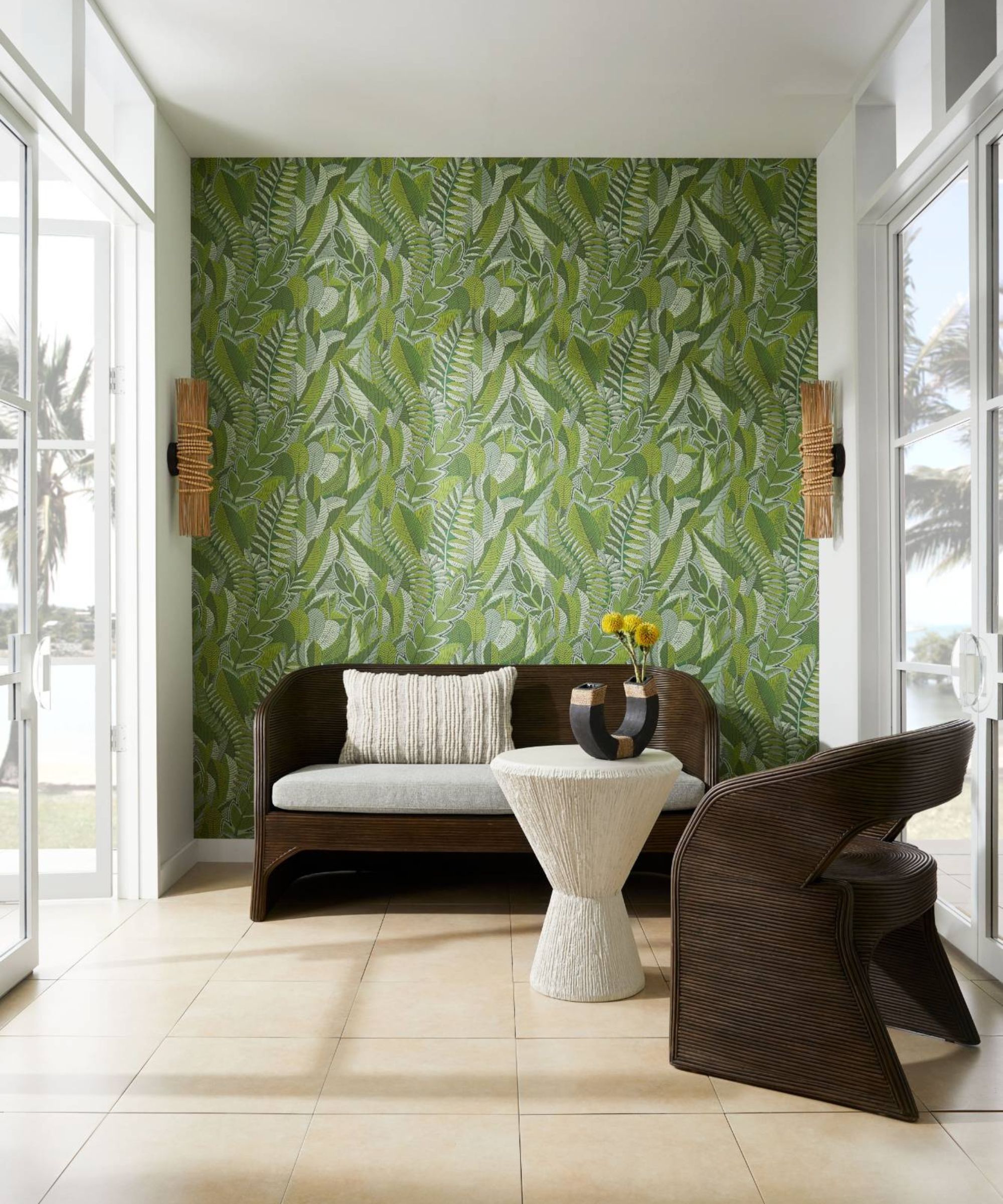
'Tastefully leaning into a look without being clichéd is not as difficult as it might first seem, especially if you focus on beautiful objects, materials and shapes,' explains Helen Pett, design ambassador for Arteriors London. 'Hone in on a restricted palette of colors and use them sparingly, perhaps with emphasis on just one wall or a few exquisite pieces of furniture.'
The botanical motif in this sitting room is kept fresh and contemporary by using a bold, leaf print wallpaper and interesting furniture with natural textures.
'By playing with shapes and surfaces, and taking particular care of color, you can achieve a delightfully modern, slightly abstracted version of the theme and avoid overwhelming the senses.'
There are no hard and fast rules when it comes to theming a room, and while a lot of these tips do help create that balance between theming a room and going too far, if you love a style, lean into it. You just want to be creating rooms that are more transitional and timeless, they you will love for years and won't date too fast.


